Studio Marcus Kraft designs a living identity for Klangwelt Toggenburg
With a bespoke typographic system inspired by overtones and Alpine landscapes, the new identity for Klangwelt Toggenburg balances precision and poetry, transforming a niche cultural site into an international destination.
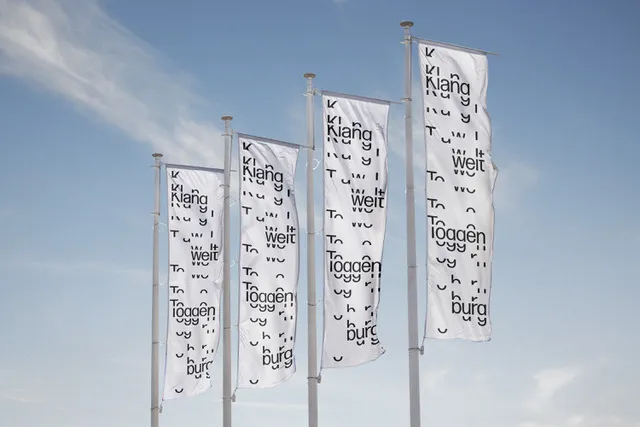
What does sound look like? It’s a question that guided Studio Marcus Kraft through three years of work for Klangwelt Toggenburg, an institution nestled in the Swiss Alps that weaves together music, nature, and tradition.
The answer is rich, flexible, and deeply resonant. These are three principles that underpin the institution’s brand identity, which was created to reimagine the visual language of sound while giving the organisation a voice of its own.
Klangwelt Toggenburg – which translates as “Sound World Toggenburg” – comprises four venues across the region, including the newly built Klanghaus, a striking timber structure known as a “walk-in instrument”. However, for creative director Marcus Kraft, the identity had to extend far beyond architecture.
“Since the Klangwelt also has three other buildings, so we didn’t want to focus too much on the architecture of the Klanghaus,” he explains. Instead, the design zeroes in on the institution’s broader mission: to make the world of sound – from alpine folk traditions to experimental music – accessible to a wider, international audience.
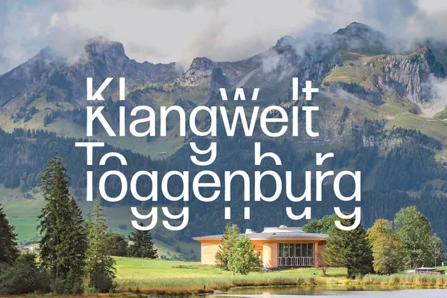

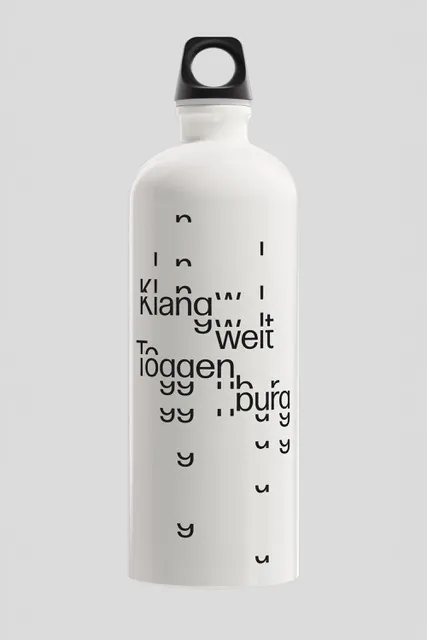
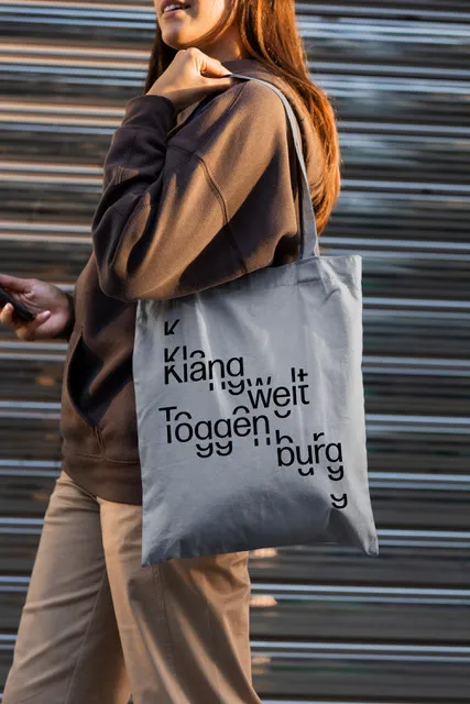
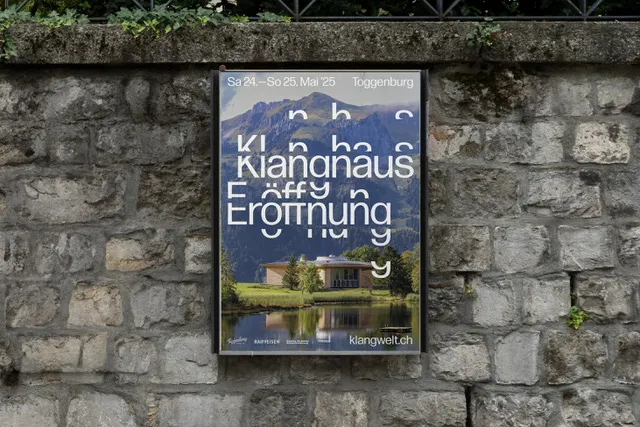
With this in mind, Marcus and his team developed a bespoke typographic system that acts as the cornerstone of the new identity. Rooted in the science of overtones, the modular letterforms mirror the harmonic patterns found in nature and music, subtly nodding to the rhythms of both. “Visually, we wanted people to see the design and inevitably think of sound and resonance,” he says.
Far from being a quick fix, the project unfolded over three years (a rare luxury in today’s design landscape), which shaped the nuance of the outcome. “It was a great opportunity to be involved in the entire process so early on,” Marcus reflects. “This gave us time to let things mature.”
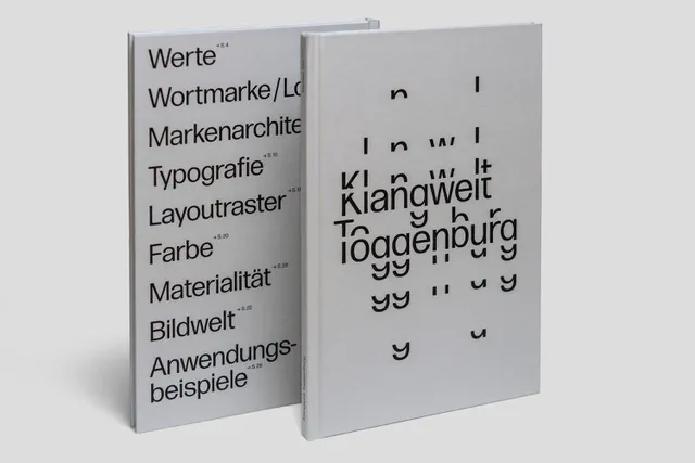
That maturity is visible in the restraint and refinement of the visual system. Typography does much of the heavy lifting, with a single font – used only in regular weight – serving as the backbone of the entire identity.
“The visual toolkit is very minimalist,” Marcus says. “We consistently use only a single font. No light, no bold – only regular. This is intended to help prevent the appearance from becoming too diluted and to maintain high recognizability. However, you can play around within the fairly strict and clear rules.”
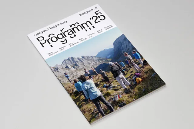
It’s not uncommon for brand identities to balloon into overly complex systems, yet this stripped-back approach is strikingly effective. Across wayfinding, digital touchpoints, printed materials and even animation, the tone remains consistent, coherent, and confident without being showy.
Of course, sound plays more than just a conceptual role. The project includes a sound logo, developed in tandem with the visual identity, to reinforce the sensory connection at the heart of the brand.
Meanwhile, subtle motion design adds another layer of expression, mimicking the fluid, oscillating behaviour of acoustic resonance. Together, these elements create a brand that doesn’t just speak but sings.
Klangwelt’s new identity also had to strike a balance between audiences: from niche cultural institutions and avant-garde composers to casual tourists looking for an afternoon’s escape. “We wanted to give the institution a contemporary graphic identity that would also help it transform from an insider tip into an institution with international appeal,” says Marcus. The solution? “By trying to give the institution ‘its own voice’ … very simple, but also very recognisable.”
Images and editorial content play a vital supporting role, allowing the graphic identity to focus on its core theme—sound—while communicating the richness of the region and programme through visuals and language. The overall effect is immersive, elegant, and grounded.
This isn’t the first time Marcus Kraft has applied this level of conceptual rigour to a place-based brand. A few years ago, his studio led the rebrand for Zurich Tourism, a project that, like Klangwelt, demanded clarity, flexibility, and cultural specificity.
However, he sees Klangwelt Toggenburg as a particular milestone. “Together with the rebranding for Zurich Tourism, which we completed a few years ago, this project is probably the most holistic one,” he says. “It would be great to be able to realise more projects within this scope.”
Through typographic rhythm, tonal simplicity, and careful restraint, Studio Marcus Kraft has translated the intangible into the tangible. Klangwelt Toggenburg doesn’t just look like sound – it looks like its sound.
Editor's Picks





Trending





Latest Jobs
Growth Strategist (Ecommerce) at Tribe
Full-time·Exeter / London·£50k + Bonuses
Content Editor at ITV
Full-time·Birmingham·£41,284 - £57,412
Client Partner at Halo
Full-time·Bristol·£30k–£36k
Multidisciplinary Designer at Formation Games
Full-time·London·£40k–£50k
Senior Designer at Definition
Contract·London·£45k–£50k
Brand Designer at Adfin
Full-time·London·£30k–£50k