Thisaway rebrands London kids' sports provider to unify its offerings
The Bath-based design agency's work for The Foxes Club sets the stage for the expansion of this popular franchise.

The Foxes Club is one of London's leading providers of sports classes, camps and academies for kids. It began in 2007 by organising games and activities in a local park and was previously known as The Little Foxes Club. Today, the organisation is a market leader in delivering community-based children's play programmes, holiday camps and football academies.
Following a period of strong growth, and with ambitious franchise plans in the pipeline, they asked Bath-based branding agency Thisaway to help them clarify their proposition and create a brand that stood for something beyond their practical offering.
The brief
The challenge for Thisaway was to unite the brand, clarify the offer, and make it compelling to kids at both ends of the age spectrum. They also needed to ensure it would resonate with parents and B2B audiences, such as schools and local councils, who are looking for trust, expertise, and a proven track record.


There was also a more immediate challenge. From a customer's perspective, the brand architecture was proving confusing, with different identities and websites for the kids club and the football academy (Foxes FC), which spoke to very different audiences and age groups. It wasn't clear that these two offerings were part of the same brand.
Brand concept and new name
Thisway based its brand idea on The Foxes Club's reputation for taking play seriously, with inherent professionalism, quality coaching, and a belief that play isn't just important for a child's development; it's vital.
The concept of 'Well Played' helps position the brand as a beacon for wholesome, life-enriching experiences that are accessible to all children. It leans into the sporting vernacular and the language of coaching, which helps with internal buy-in and resonates with kids of all ages. It's also a promise of quality and trust that communicates expertise, which is key for parents and the B2B audiences.


Meanwhile, dropping 'little' from the name was a no-brainer and helped the brand be more recognisable to its audiences. But the Foxes Club also needed to appeal visually.
Visual identity and messaging
Thisaway knew the identity needed to be bold and iconic to resonate with different age groups and stand out across kits and in the busy environments where the brand lives. The team took inspiration from the crests and shields of sports teams and added a playful twist.
The result is a simple but memorable logo that informs a wider kit of parts made up of patterns, dividers and illustrations. The logo can also flex to accommodate Foxes FC, which was repositioned as a product falling under the wider Foxes Club brand.


Flexibility was baked into the assets to help appeal to the different target audiences. For the older kids, Thisaway used more confident imagery and darker colours from the brand palette.
They also added more attitude to the messaging, which is all set in upper-case. For the younger kids, they used lighter and brighter colours within the palette, pairing these with fun, playful imagery and messaging set using more of the quirky lower-case.
Audience appeal
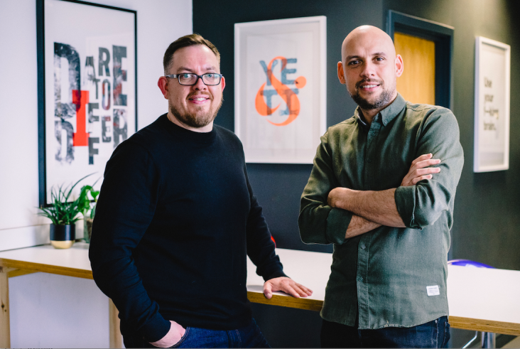
"The real challenge with this project was finding a way to appeal to three different audiences at once: young kids, teens and their parents and teachers," says Adam Cale, design director at Thisaway.
"To help solve this problem, we took inspiration from age-agnostic brands like Nike and sought to create a bold and iconic identity that can easily be adapted depending on context.
"Having a sturdy set of core assets to build on allowed us to have lots of fun as we seamlessly dialled between playfulness, attitude and authority – cute, cool and credible."
"Choosing the right agency during such an important time for our business was one of the most significant decisions I've made," says Michael Kusi, founder of The Foxes Club. "Especially since we'd never gone through a branding process before.


"We spoke to a number of agencies, but as soon as we met with Thisaway, we knew we'd found the right partner," he adds. "Their enthusiasm for the project really stood out, and their ability to guide us through the process and get everyone on board was really valuable to us. We couldn't be happier with our new brand, and 'Well Played' aligns perfectly with our business and where we want to go."


