The Working Assembly blurs the lines for Pinky Swear's genre-defying identity
Blending art, dining, and social play, Pinky Swear's new identity, created by The Working Assembly, invites guests to interpret and explore, just like the experience itself.
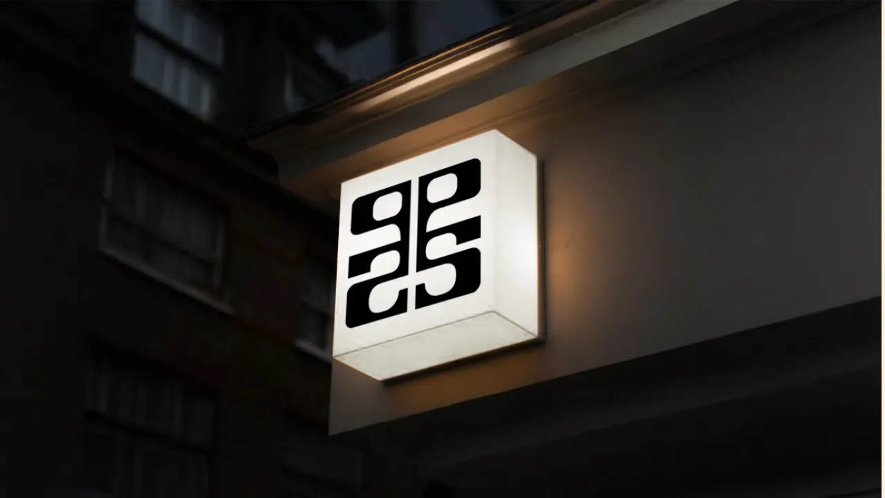
Some places defy neat description, and that's exactly the point with Pinky Swear, a new hospitality experience opening this month with a soft launch in New York's Lower East Side. Pinky Swear is a deliberately genre-blurring hospitality experience that combines upscale dining, interactive art, and social play under one roof.
For creative agency The Working Assembly, the challenge was clear: build a brand identity as fluid and unpredictable as the destination itself.
Rather than trying to impose structure on a space designed to resist it, the team leaned into the ambiguity. "Pinky Swear was never meant to fit neatly into one category," says Jolene Delisle, founder and creative director at The Working Assembly. "It was built to be fluid, experimental, and a little hard to pin down. So instead of trying to define it too tightly, we focused on creating a brand system that could stretch."
That flexibility became the foundation of a design language that holds space for contrast. It might be bold and playful on one side, but it also shows restraint and retains an elevated feel.
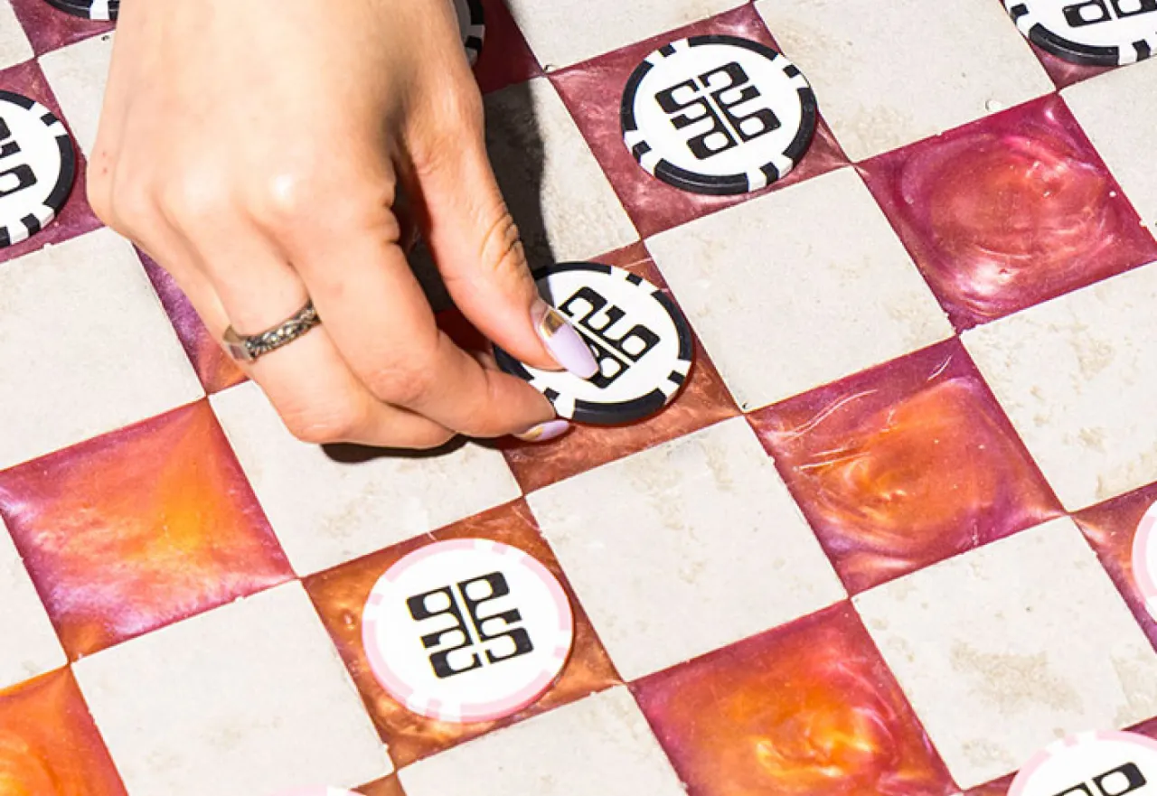
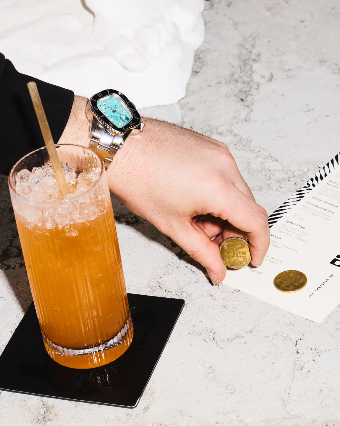
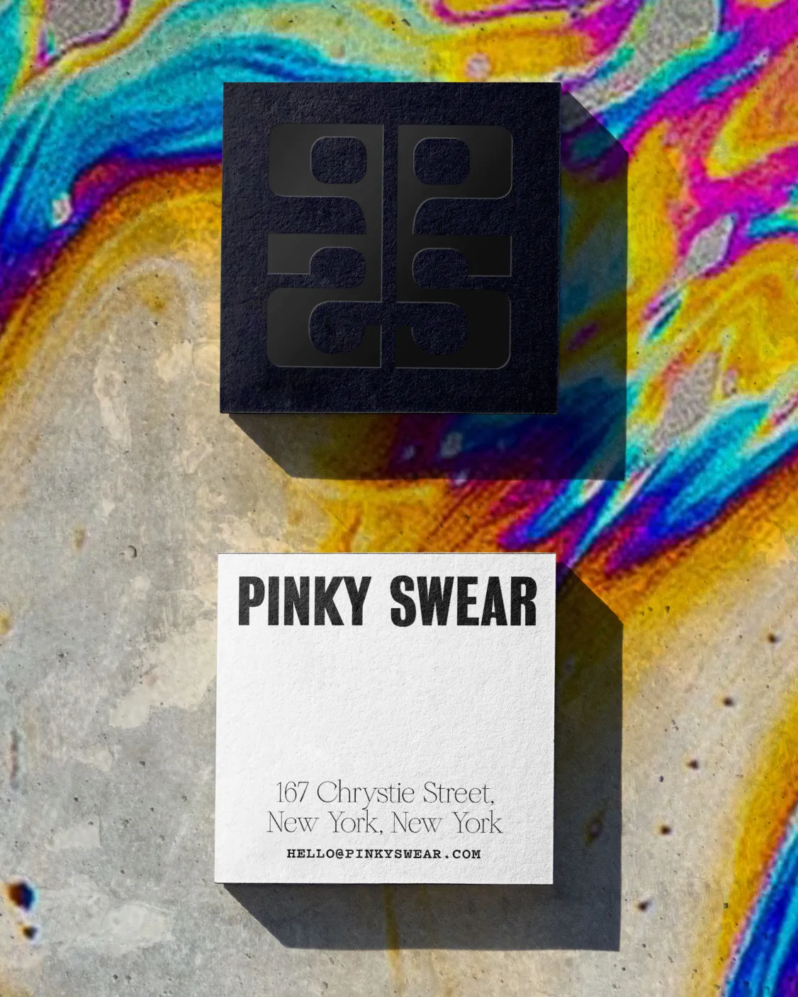
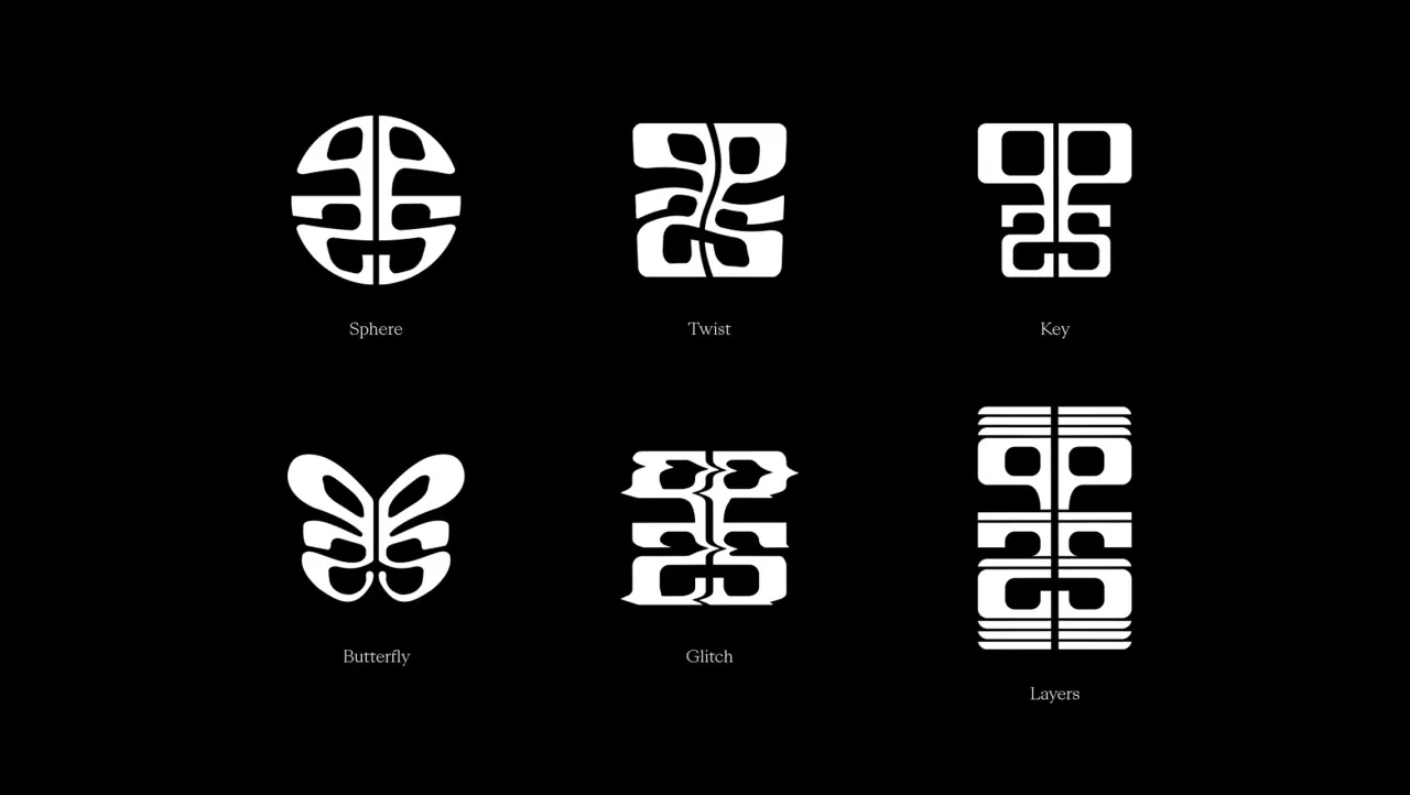
At the heart of the visual system is a reference to the Rorschach Test — the psychological inkblot designed to invite subjective interpretation. It's a fitting metaphor for a venue where no two visitors will have the same experience. One night might lean heavily into the bespoke cocktail list, while another might find guests immersed in interactive art installations or engaging in competitive social games.
"The Rorschach felt right because it invites interpretation, as does Pinky Swear," explains Jolene. "The space is designed to be experienced differently depending on who you are, who you're with, what time you arrive. We loved the idea that no two people would walk away with the same impression."
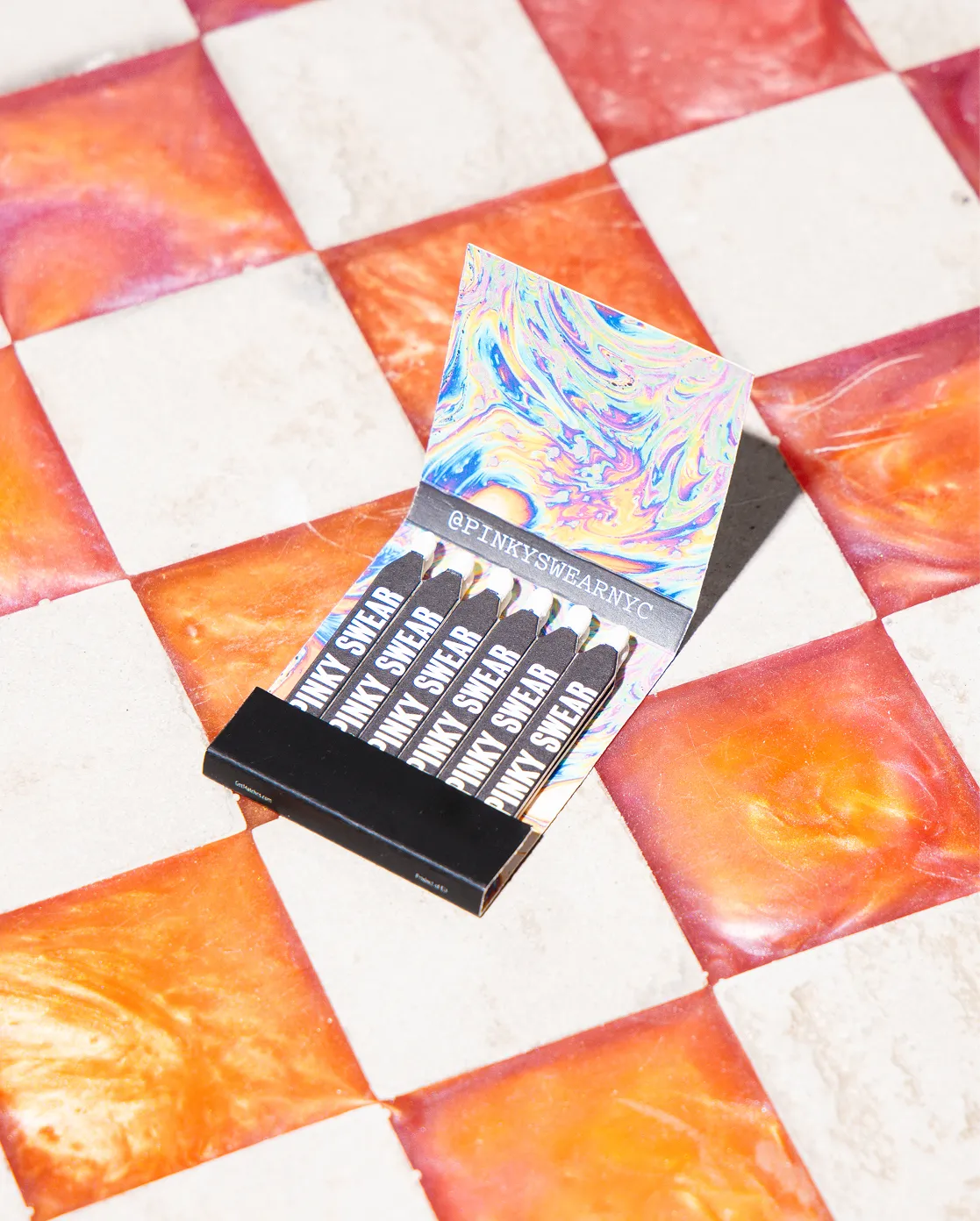
Visually, the Rorschach motif unlocks a system rooted in symmetry, abstraction, and contrast — structured enough to feel intentional but fluid enough to evolve. Inkblot-inspired forms spill across print and digital, hinting at familiarity without ever settling into a fixed shape.
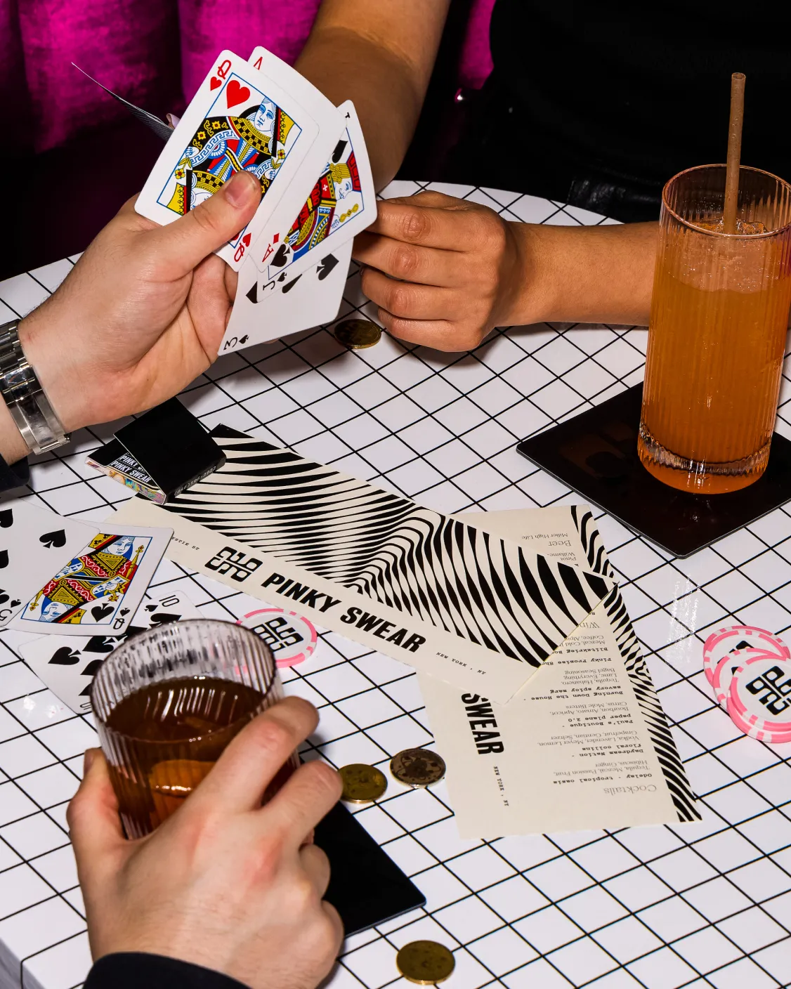
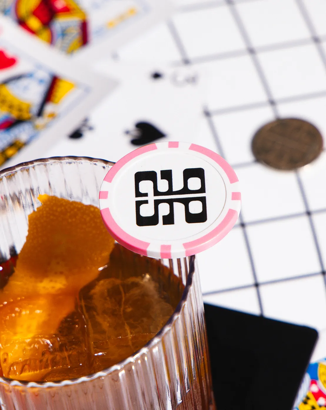
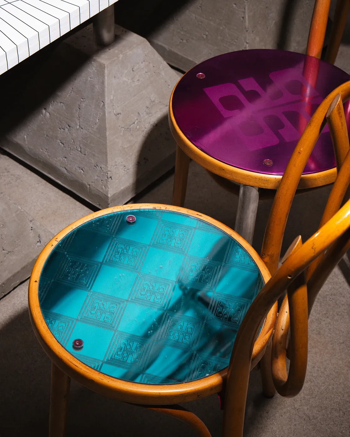
Inside Pinky Swear's physical space, the branding is subtly woven in. Rather than dominate the interior, it lingers in the details: etched into mirrors, printed on coasters, and hinted at in lighting choices. "The brand was always meant to be a backdrop, not a billboard," says Jolene. "Everything was calibrated to feel intentional but never overbearing."
The restraint ensures the space itself remains the star, but it also creates a quiet sense of cohesion. It's an approach that allows Pinky Swear to feel immersive without slipping into sensory overload, a balance that many hybrid venues struggle to achieve.
Beyond the physical, motion design plays a crucial role in extending the brand's energy into the digital realm. Animation and projection bring the identity to life, reflecting the venue's sense of movement and unpredictability.
"Pinky Swear isn't static, so the brand couldn't be either," Jolene explains. "Motion gave us a way to reflect the energy of the space with a sense of movement, surprise, and unpredictability. It helped us play with tempo and tone, offering moments that were sometimes hypnotic, sometimes disorienting, but always intentional."
It also futureproofs the identity, giving Pinky Swear a toolkit that can adapt and shift alongside its programming, ensuring the experience stays fresh with each visit.
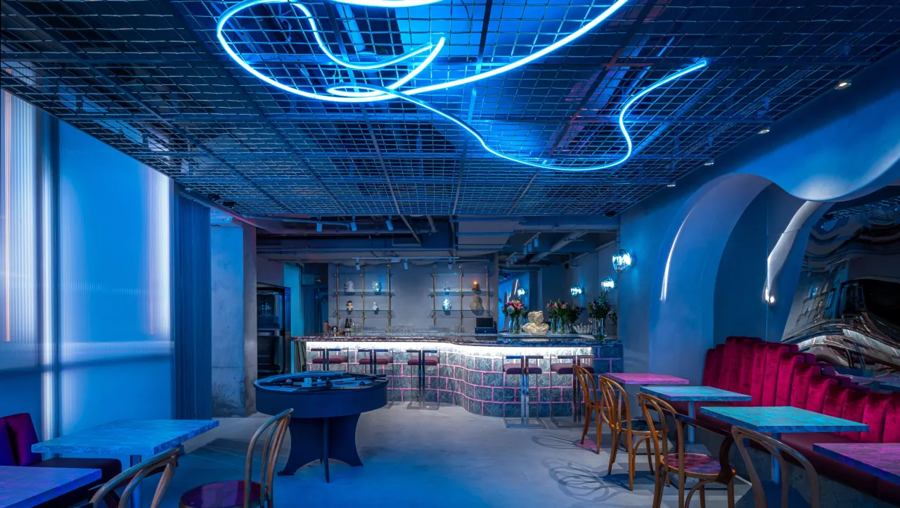
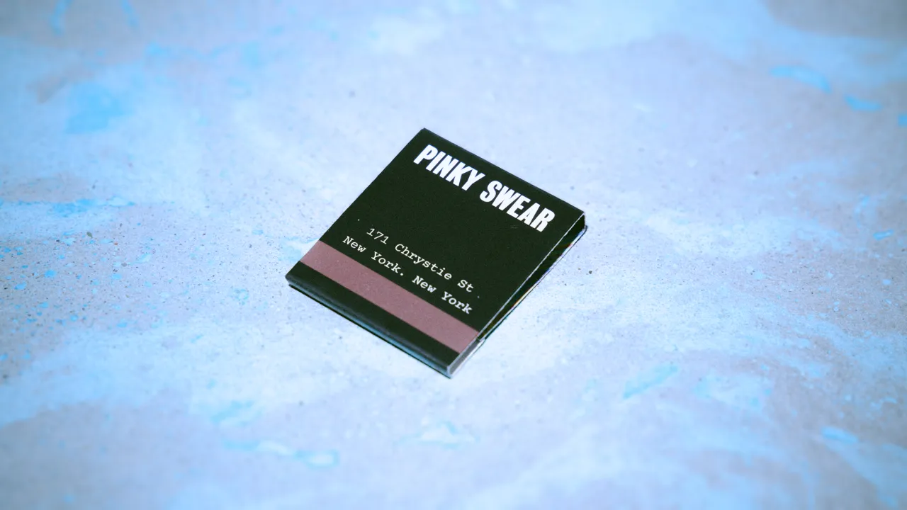

While the concept is experimental, it's anchored by a clear ethos: "exclusivity for inclusive people." For The Working Assembly, that mantra shaped everything from tone of voice to the overall atmosphere. The goal was to create something that felt special without feeling closed off (more of a discovery, not a gatekept secret).
That sensibility is increasingly in demand. As hybrid, immersive hospitality spaces gain momentum, the shift points to a broader cultural craving.
"People are craving something they can't scroll past," says Jolene. "Especially now, when we have more choice than ever in how we spend our time and money. Hybrid concepts speak to that by offering more than one note, inviting curiosity, and giving people a reason to show up."
In the case of Pinky Swear, those invitations are layered into every corner of the experience. From interactive checkerboard tables to a seemingly unassuming phone booth that, when dialled correctly, unlocks an audio-visual surprise, the space rewards exploration and curiosity.
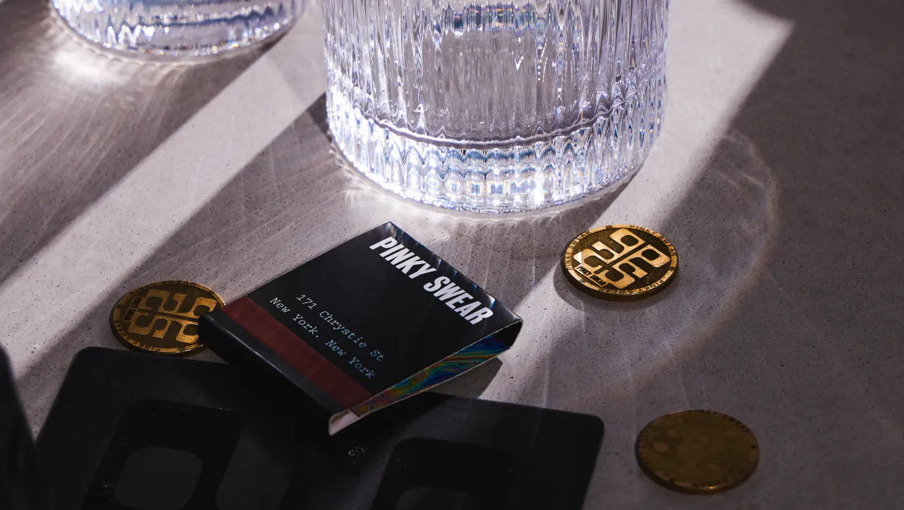
"One of my favourite details is the phone booth," says Jolene. "It looks unassuming at first, but when you pick up the receiver and dial a special number, you activate an audio-visual experience that transports you somewhere else entirely. It's playful, a little surreal, and completely in line with the spirit of Pinky Swear."
That open-ended, playful, and slightly mysterious spirit is what holds the project together. Much like the Rorschach test at its centre, Pinky Swear resists easy explanation, inviting guests to interpret, explore, and return again and again, knowing no two visits will be quite the same.
Editor's Picks





Trending





Latest Jobs
Senior Designer at Definition
Contract·London·£45k–£50k
Creative Director at Koto
Full-time·London·£95k-£130k
Multidisciplinary Designer at Formation Games
Full-time·London·£40k–£50k
Senior Graphic Designer at MoMA Retail
Full-time·New York·$72k-$80k
Marketing Manager at University of Birmingham
Full-time·Birmingham·£36,636 to £46,049
Principal Software Engineer at BBC Media Tech
Full-time·Glasgow·Up to £83,790