Girlguiding launches biggest design refresh in 113 years
The worldwide organisation for girls gets a new look in partnership with Landor & Fitch. We explain how it was made and the concepts behind it.
Some might think of the Girl Guides as old-fashioned. But Girlguiding – the worldwide organisation first launched in 1909 as The Girl Guides Association – is still going strong in 145 countries. And in the UK, it remains the largest youth organisation devoted to girls, with around 370,000 members and 70,000 adult volunteers.
So it's big news that to celebrate International Women's Day, it's today launching the largest brand refresh in its 113-year history. The new look, five years in the making, is driven by the notion that girls can do anything, championing imagination, adventure, exploration, and curiosity.
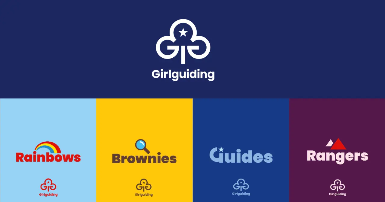
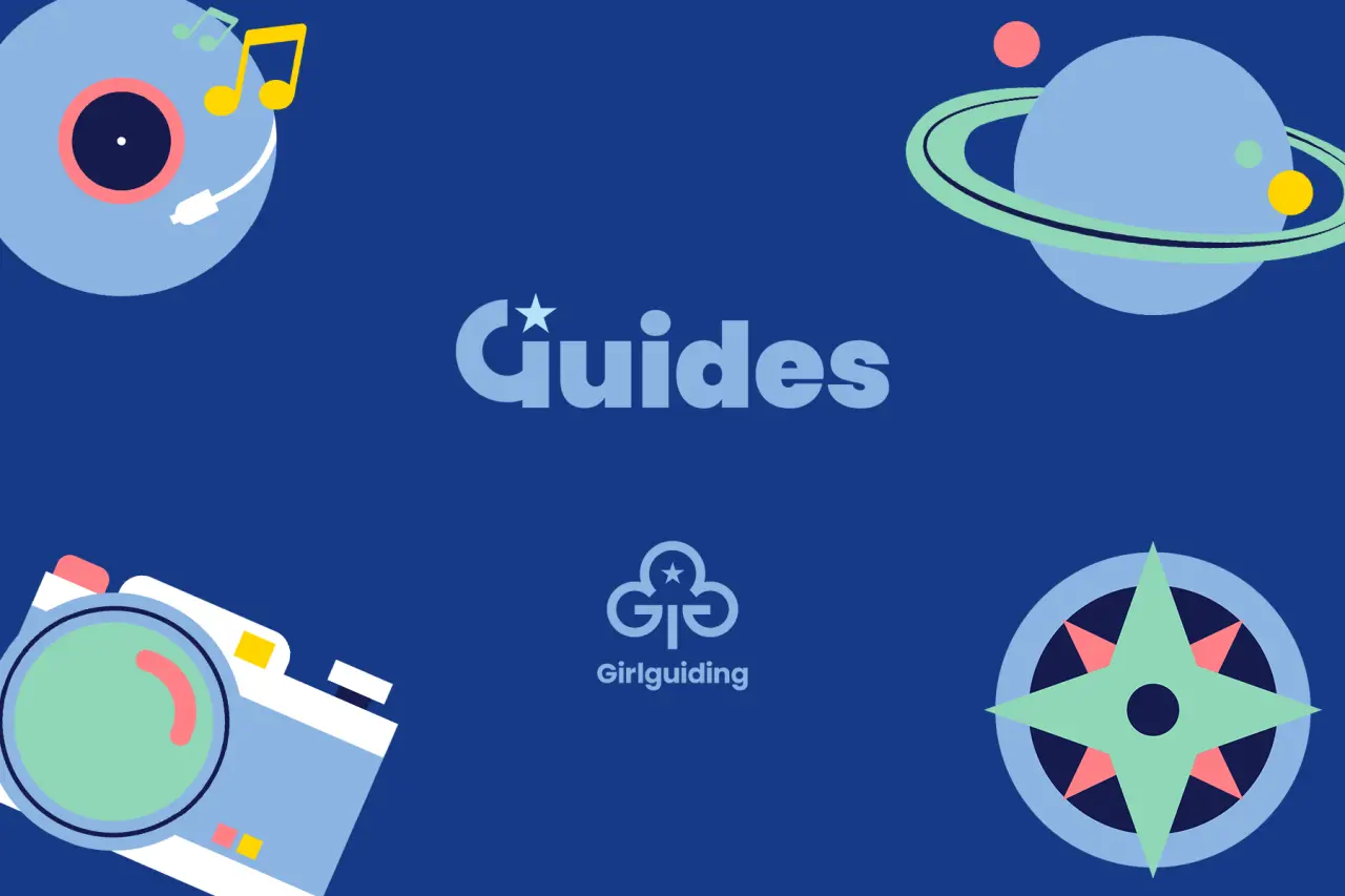
Undertaken in partnership with brand and design consultancy Landor & Fitch, media agency VCCP Media, and earned creative agency Seven Communications, the rebrand is designed to appeal to a new generation of girls and encourage more volunteers. All four of Girlguiding's individual sectors – Rainbows, Brownies, Guides and Rangers – are being given fresh colour palettes, and icons, with other assets that retain their iconic colours while showcasing modernity and vibrancy.
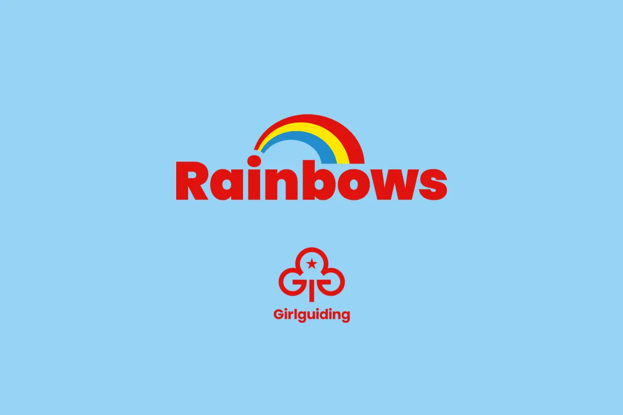
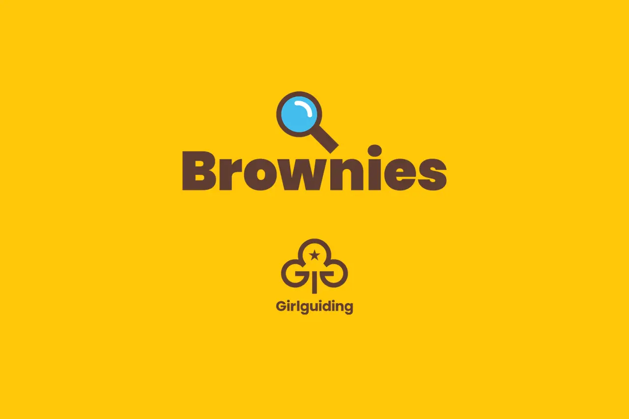
In a survey, 83% of volunteers and around 75% of parents and children said they favoured the new brand designs, with around half of the girls in Rainbows and Brownies agreeing that the new designs would make them more likely to join.
Years in the making
The design refresh process began in 2018 when Girlguiding recognised an opportunity to refresh its brand to bring it in line with its newly overhauled programme of badges and activities and core goals: to increase appeal amongst girls in the UK, to attract new volunteers, brand partnerships and investment, and to present itself as a modern and dynamic youth organisation that equips girls for the future.
In 2019, the rebrand's aims would be to champion imagination and celebrate collective adventure, exploration and curiosity across all four individual Girlguiding sections while fulfilling its new purpose of helping girls to know that they can do anything.
When Landor & Fitch was appointed in 2021, their brief included creating an identity that leverages the historic iconicity of Girlguiding but also made the brand relevant for today and tomorrow.
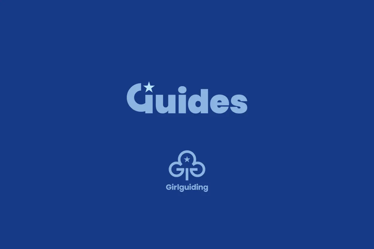
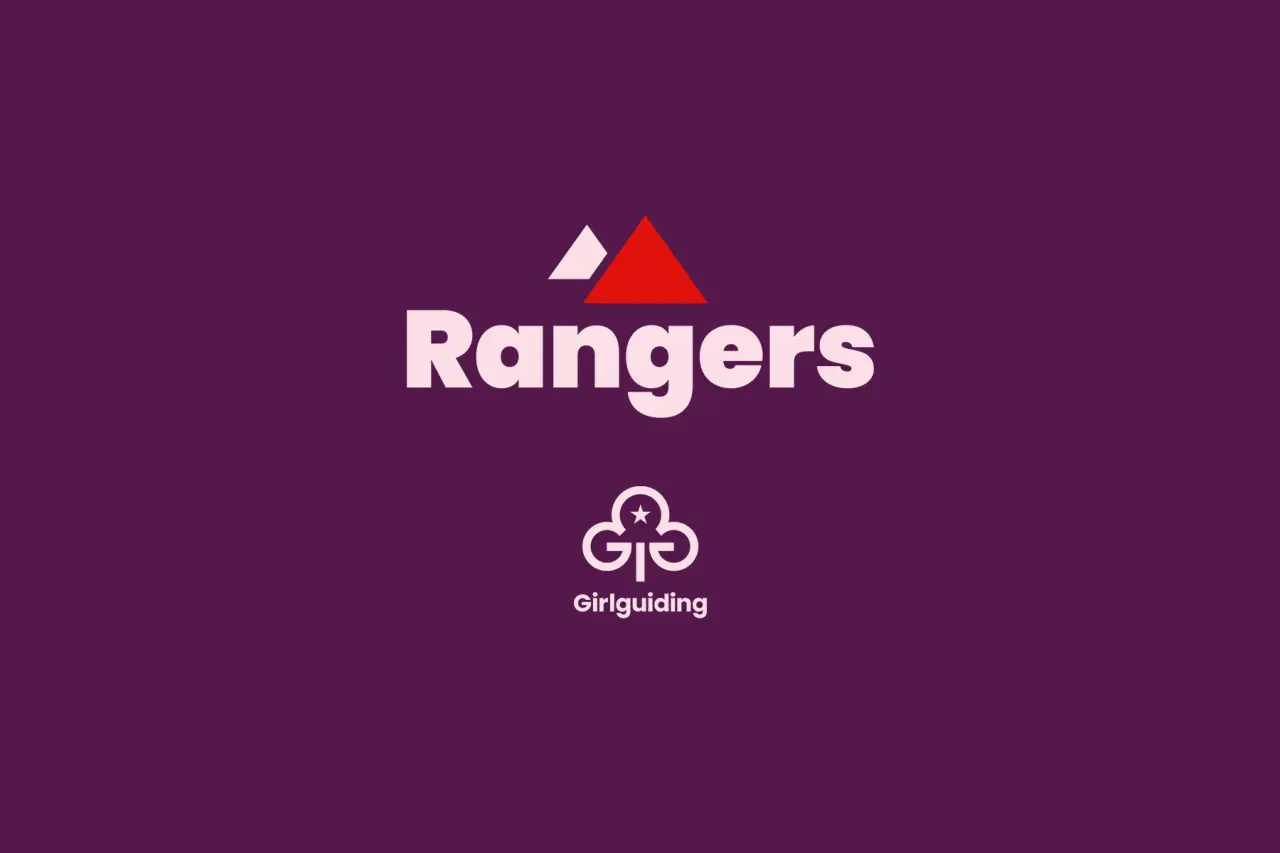
Raising awareness was an essential improvement area after research identified that of all the brand logos of Girlguiding's sections (Brownies, Guides, Rainbows, and Rangers), only Brownies (80%) had near universal awareness, and only a third (33%) knew about Rangers.
Logo and icons
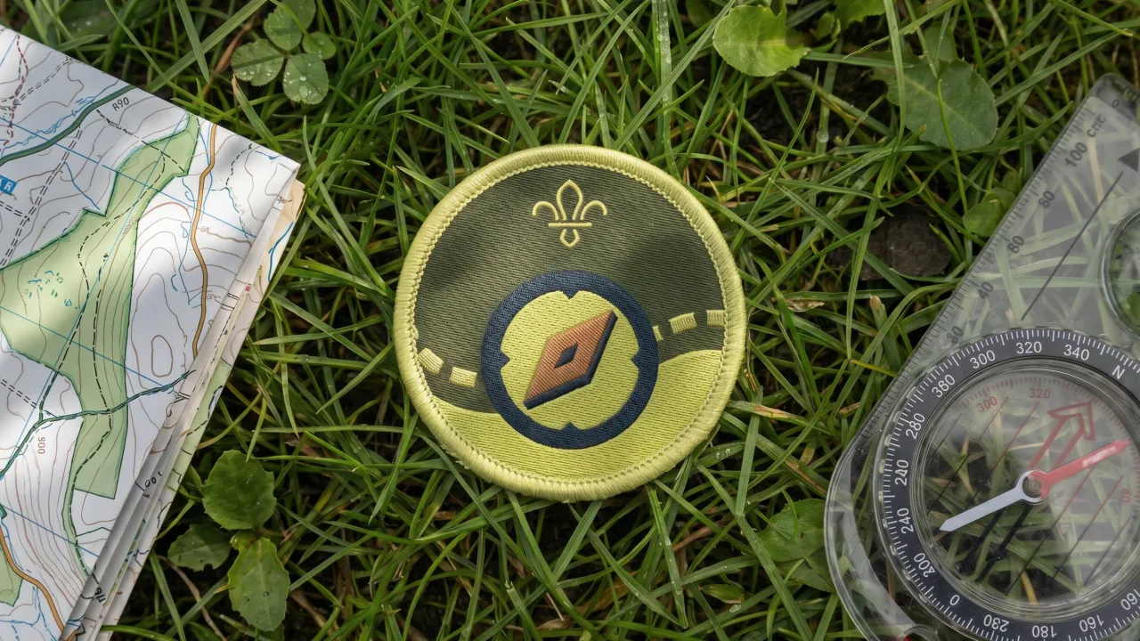
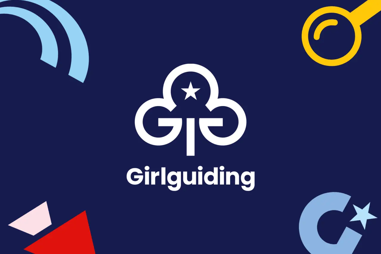
The iconic Girlguiding trefoil logo has been retained but refreshed, as have the historic colours that defined Rainbows, Guides, and the yellow and brown of the Brownies. The new colour palette is designed to showcase modernity and vibrancy while building strong variation between the Girlguiding sections.
A new suite of icons has also been developed for each section to enhance storytelling and encourage girls to build upon their curiosity and express themselves throughout their Girlguiding journey.
Data shows the new brand designs appeal much more to girls, parents, and volunteers alike when compared to the old designs, who spontaneously mentioned the bold and bright designs and colours. When asked to choose between the new and current designs, all audiences overwhelmingly preferred the new ones, including approximately 83% of volunteers and around 75% of parents and children.
The new designs show initial effectiveness at generating interest and encouraging people to join, with around half of the girls in Rainbows (58%) and Brownies (48%) agreeing it would make them more likely to join after seeing the new designs.
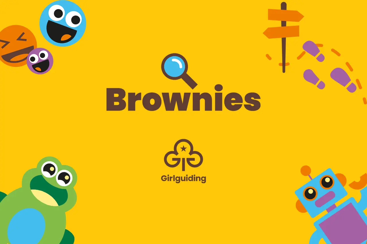
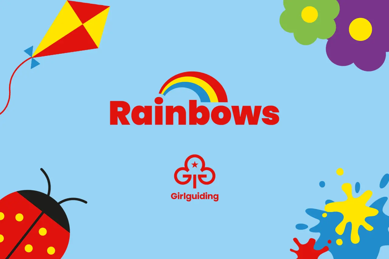
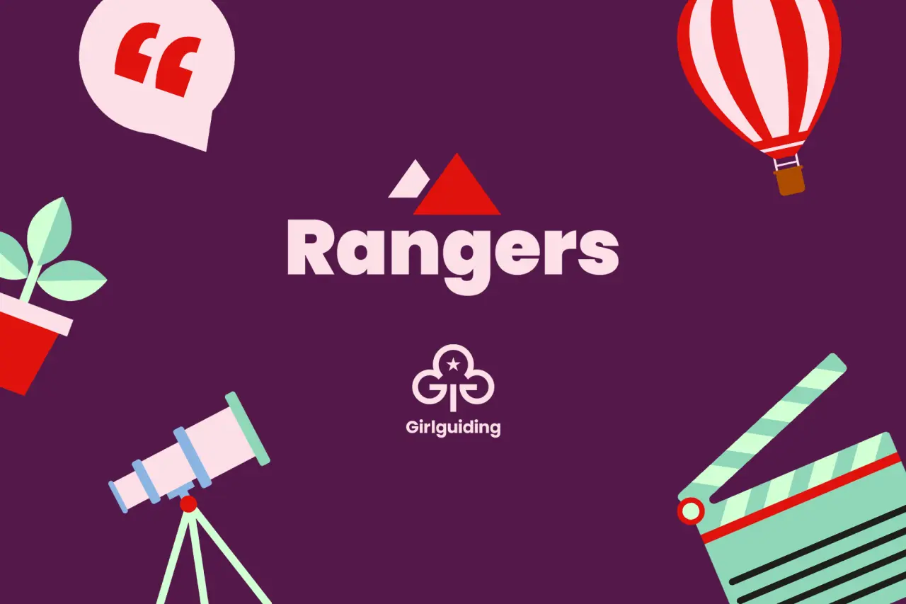
The redesign impacts all aspects of the Girlguiding brand, including badges, stationery and icons. The Girlguiding brands, Girlguiding itself, followed by Rainbows, Brownies, Guides, and Rangers sections, have been recreated under a new Masterbrand identity to ensure consistency and accessibility.
Collective voice
"We've been creating unforgettable, empowering experiences for girls for over a century," says Amanda Azeez, director of communications, marketing and fundraising at Girlguiding. "To enable us to continue our mission and reach even more girls and volunteers, we needed to look at how we've evolved over this time and address outdated perceptions holding us back.
"Working closely with Landor & Fitch, Seven Communications and VCCP, we're excited to relaunch on International Women's Day as part of our continued drive to inspire all girls that they can do anything. Girlguiding is the UK's largest youth organisation dedicated completely to girls. Girls can do anything. We help them know this, whether they're four or 18 or in between.
"All girls have a home at Girlguiding, whoever they are, and wherever they are," she adds. "We show them a world of possibilities, big and small. We help them think big and be bold in a space where they can be themselves, get creative, explore, and have fun. We're a powerful collective voice – with girls, led by girls – changing the world for the better."
Editor's Picks





Trending




Latest Jobs
Associate Web Designer at Planhat
Full-time·London·£30,000 – £35,000
Marketing and Communications Co-ordinator at Ulster University
Part-time·Belfast·£33,020 – £35,628
Senior Designer at BKC
Full-time·£50,000 – £60,000
Branded Content Producer at KQED
Full-time·San Francisco·$92,068 – $115,085
Designer at BPD
Full-time·London·£30,000 – £34,000
Director of Communications at Royal Exchange Theatre
Full-time·Manchester·£65,000