Ladybird rebrand is the publisher's biggest change in over 100 years
Publishing giant Ladybird Books has today unveiled a fresh new look that captures the playful spirit of the iconic brand. Long-time readers will be relieved to hear that its distinctive red with black spots haven't flown away, though.
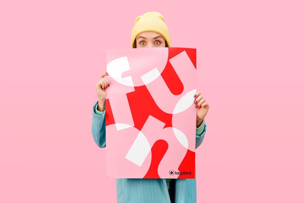
If you grew up in the UK, chances are you've picked up a Ladybird book at least once in your life. The distinctive brand, a branch of Penguin Random House, has helped generations of children learn to read in its long history, which stretches back over a century. And today sees the biggest shake-up Ladybird has seen in all that time.
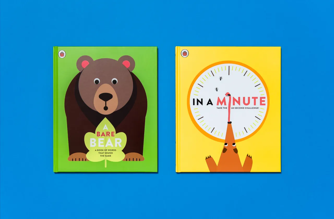
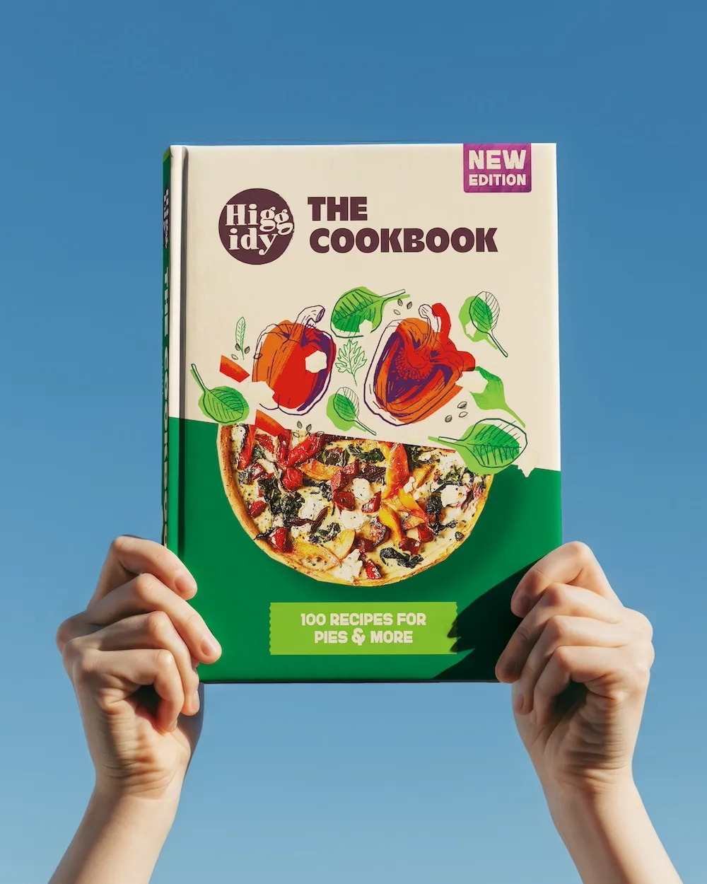
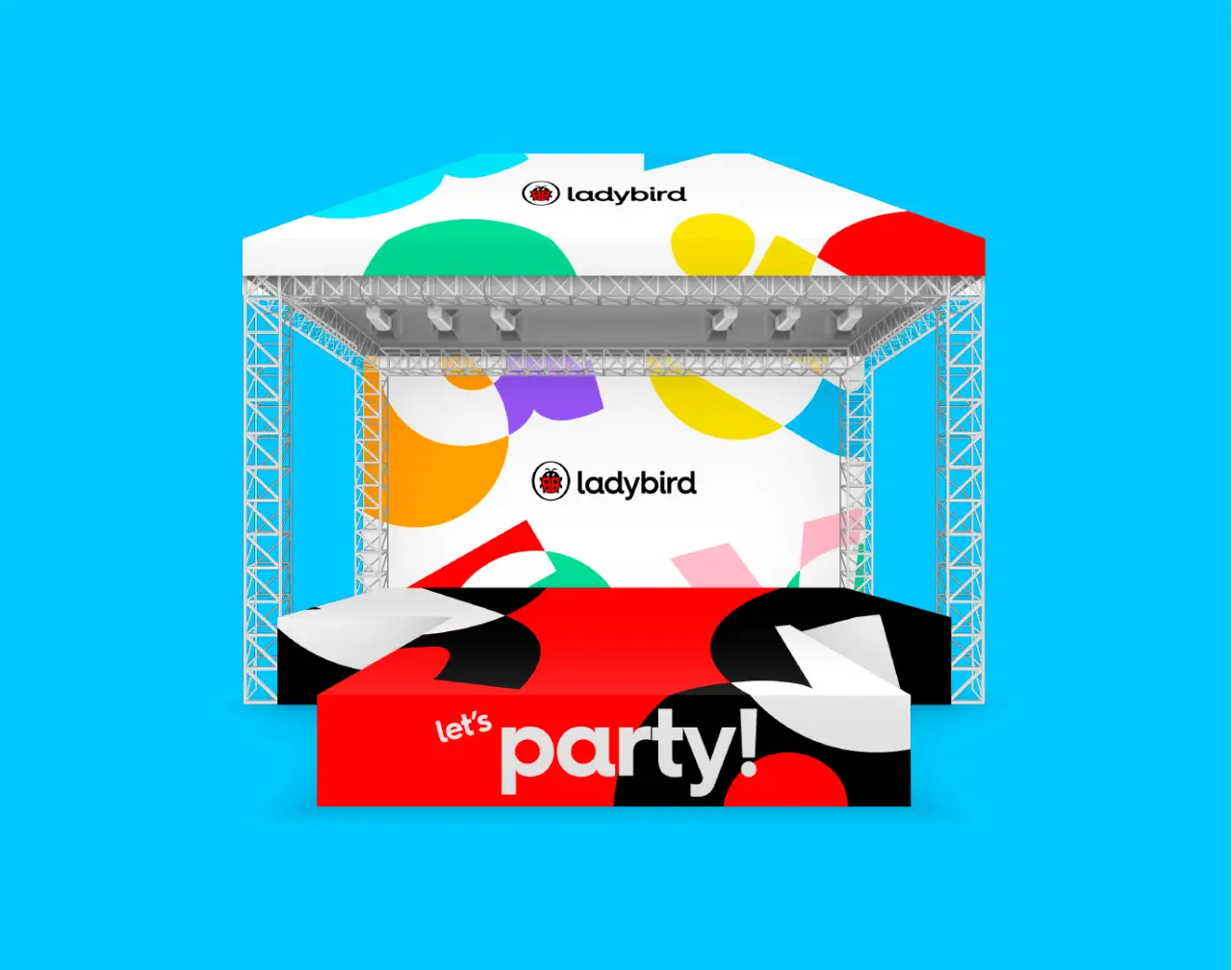
Working with innovation and design company CreateFuture, Ladybird has developed new brand guidelines that retain the familiar brand's essence. These new guidelines include a suite of fun, flexible contemporary colours, patterns, shapes and stickers, allowing Ladybird to get its message across to existing audiences.
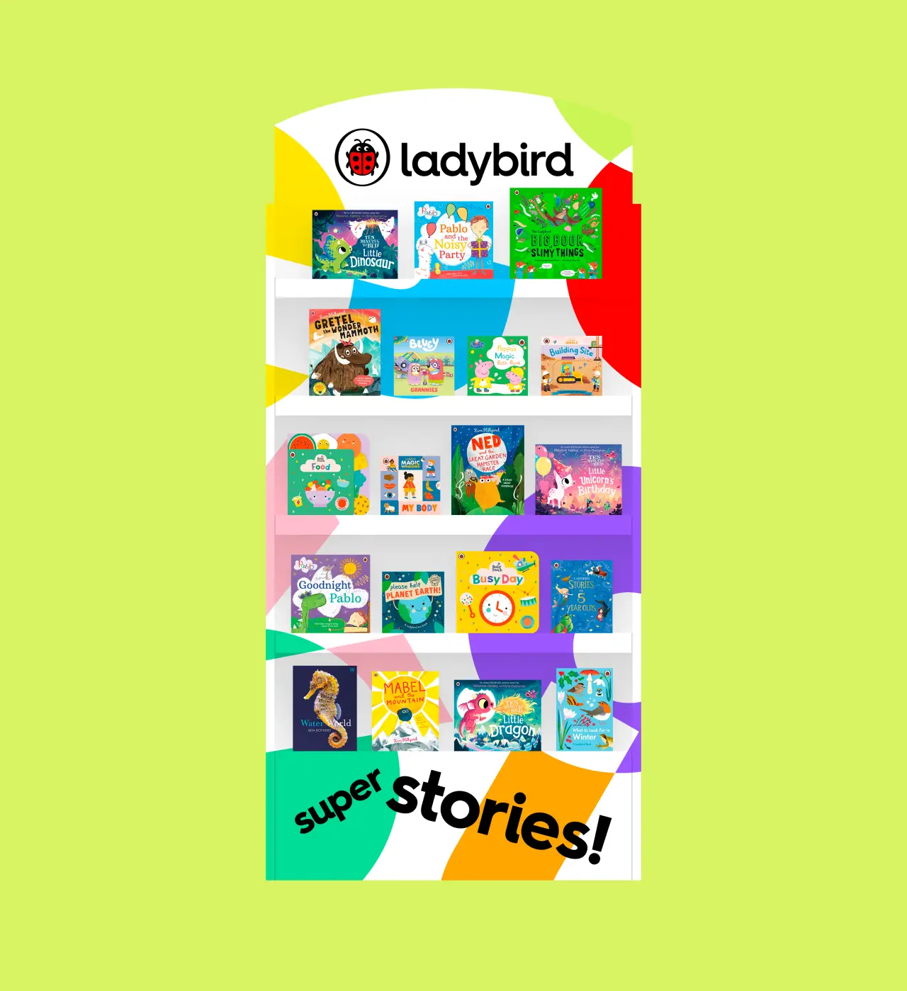
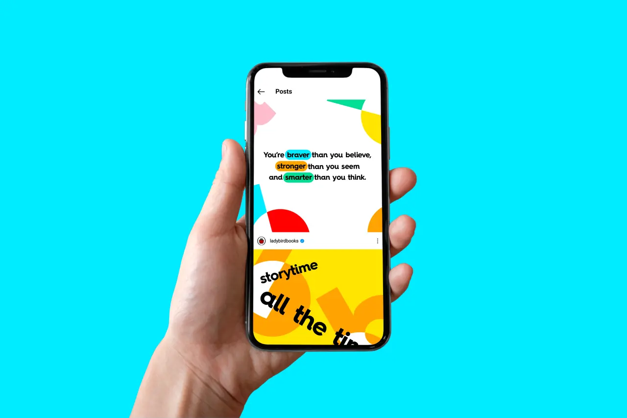
Crucially though, the familiar Ladybird icon remains unchanged. With such a deep-seated legacy in readers' minds, this is a welcome choice. It would be like changing the Apple logo or doing away with the Nike swoosh. Some logos are too iconic to go tampering with. However, the Ladybird icon has been expanded with a new font that creates a "clean and modern homage" to the publisher's history.
"Ladybird is an iconic, global brand, beloved by generations as the gateway to reading for millions of children," says Alex Moyet, Brand Director at Penguin Random House Children's.
"We're incredibly proud of Ladybird's rich history, and the best way for us to honour it is to make sure that the brand continues to appeal to parents and children today. We're thrilled to launch this new look for Ladybird, which combines stylish design with the Ladybird sense of playfulness."
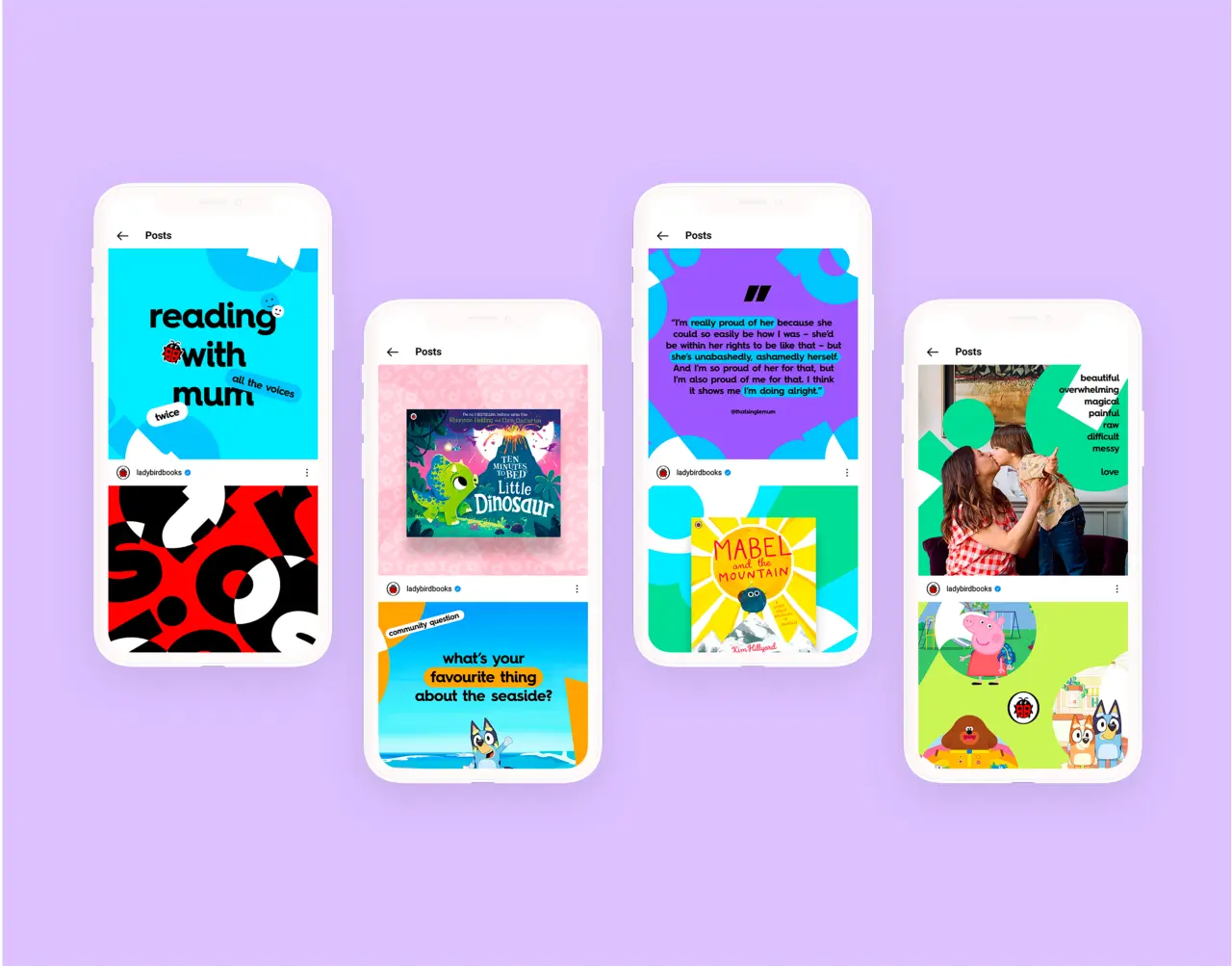
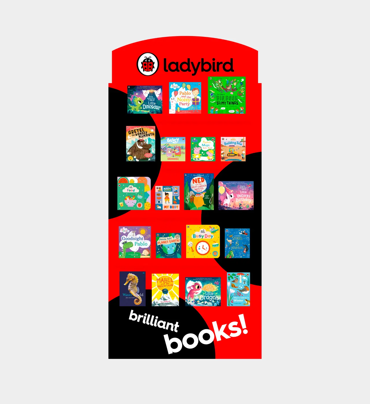
Dave Ward, Creative Director and Founder at CreateFuture, added: "The team at CreateFuture worked closely with the Penguin Random House Children's team to refresh the ladybird brand system. We are very proud of the relationship and the result. It was a great privilege to be trusted with a brand that children have loved for generations.
"The challenge was to create a modern, inspiring, digital-first brand toolkit that the teams at Penguin Random House would be excited to use. Designed to bring to life the books that children love today and to engage parents and caregivers across every brand touch point."
The brand update coincides with Katherine Halligan's recent appointment to the role of Ladybird Publishing Director and sees the brand take a big step into the digital world with a design system that works across websites and apps.
Editor's Picks





Trending






Latest Jobs
Graphic Designer at Crux Product Design
Full-time·Bristol·Up to £36k
Head of design at Cog Design
Full-time·London·£55K
Senior 2D Motion Designer at Art&Graft
Full-time·London·£50k-£65k
Mid-Senior Designer at Something Familiar
Full-time·Bristol·£32k–£40k
Client Success & Growth Director at Revolution Growth
Full-time·Manchester·£60k-£70k
Senior Designer at Definition
Contract·London·£45k–£50k