Pentagram designs identity for first-of-its-kind gender equality mapping tool
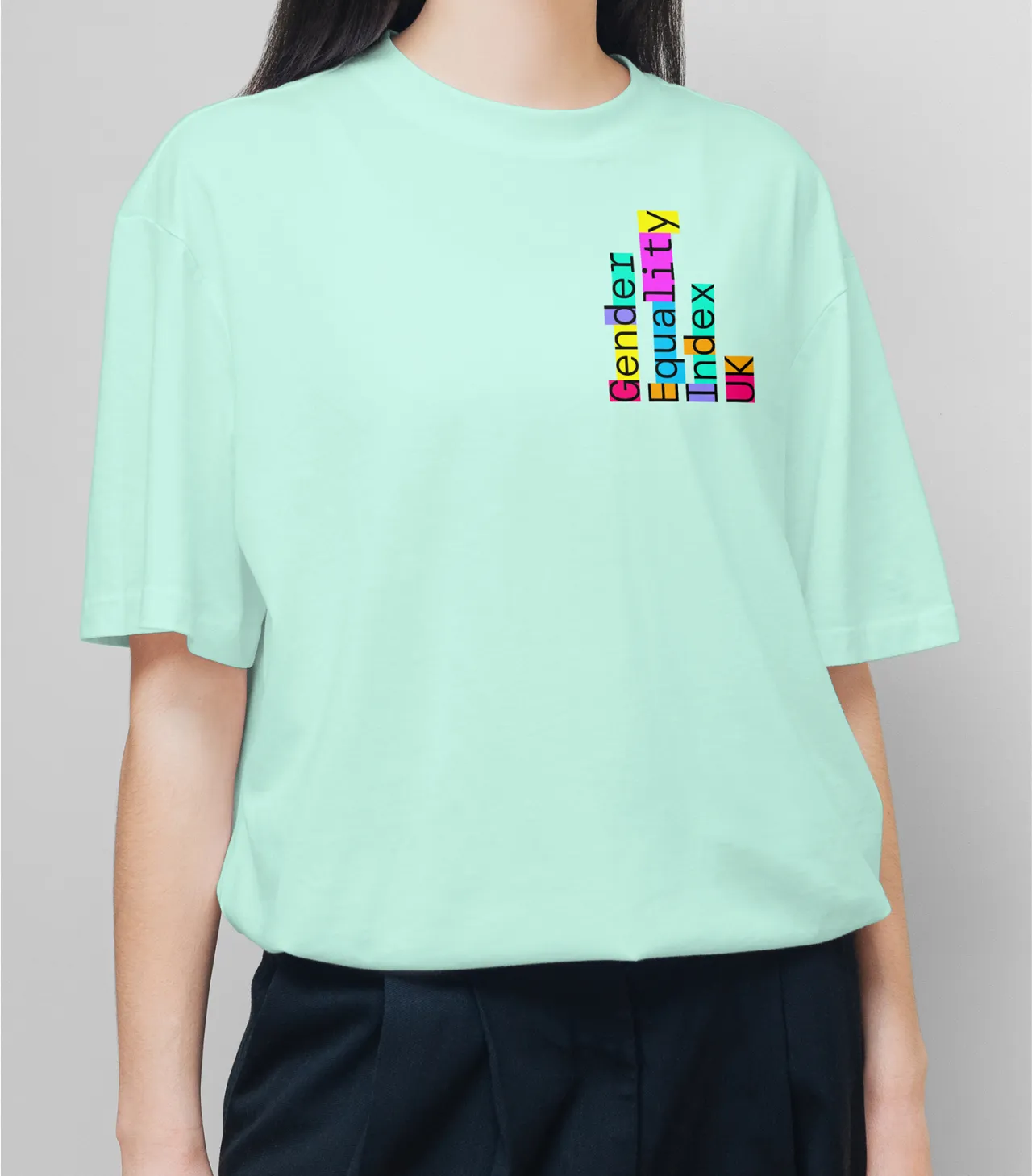
The patchwork feel of the identity was chosen to celebrate the beauty and power of diversity, without distracting from the data itself.
Pentagram is behind the visual identity for the UK's first tool for measuring, mapping and monitoring gender inequalities. While some existing tools and reports provide a national overview, the Gender Equality Index is the only tool that examines data at local authority level.
The brief was to create an identity for GEIUK that would inspire change and communicate with policy-makers, organisations, activists and equality advocates alike. To be able to stimulate any meaningful public debate, Pentagram also had to ensure the findings could be understood and used beyond academia.
Marina Willer, the lead Pentagram partner on the project, revealed that this was one of the biggest challenges. "We had to create something that made science feel human and celebratory, that focused on the wonderful change that a tool like that could help to promote," she explains.
As a result, the team opted for a visual language that celebrates the diversity of audiences and supports the beauty in the science of organising information. In situ, it appears as a patchwork pattern, representing different tonalities and voices, even within the logo.
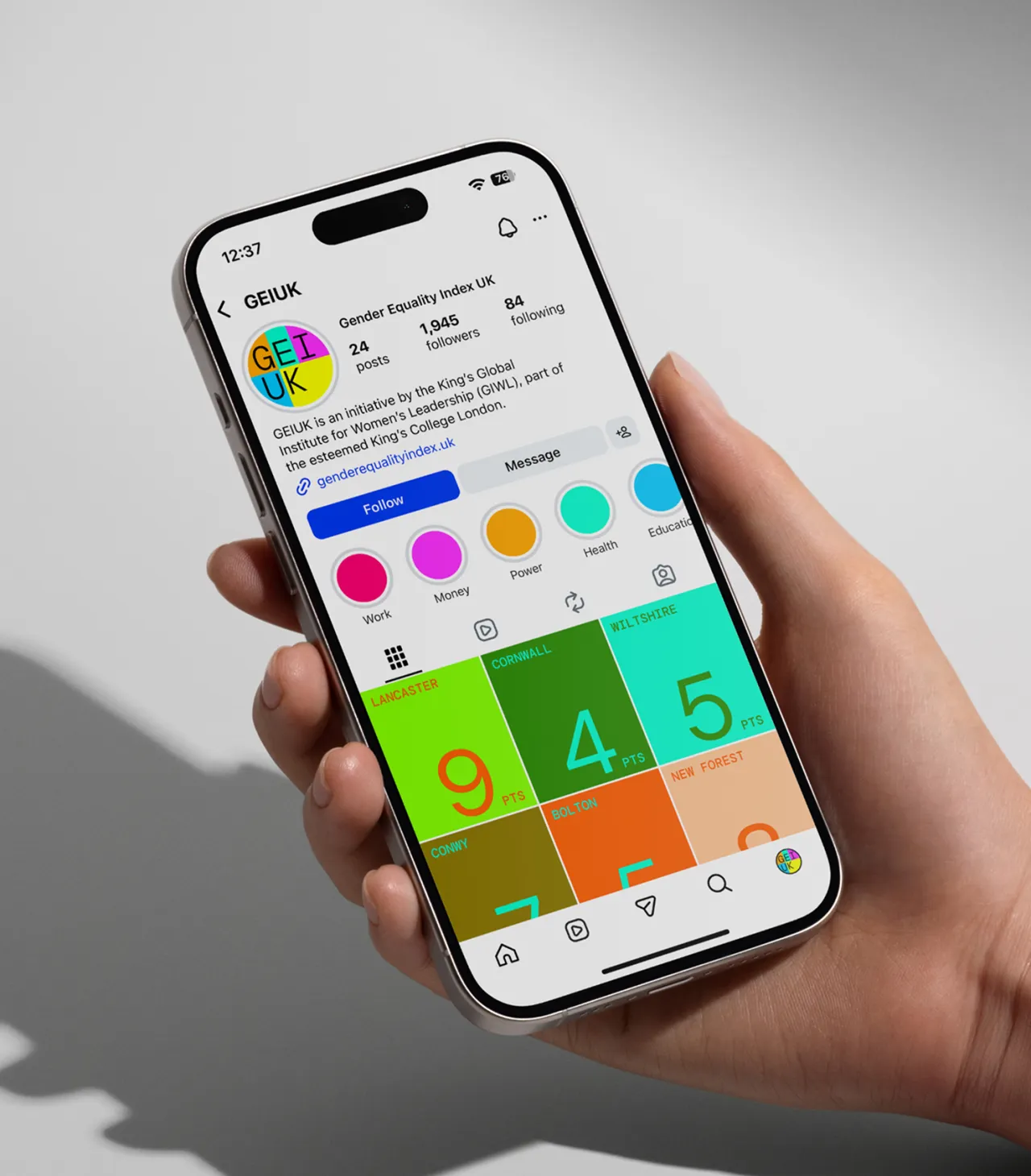
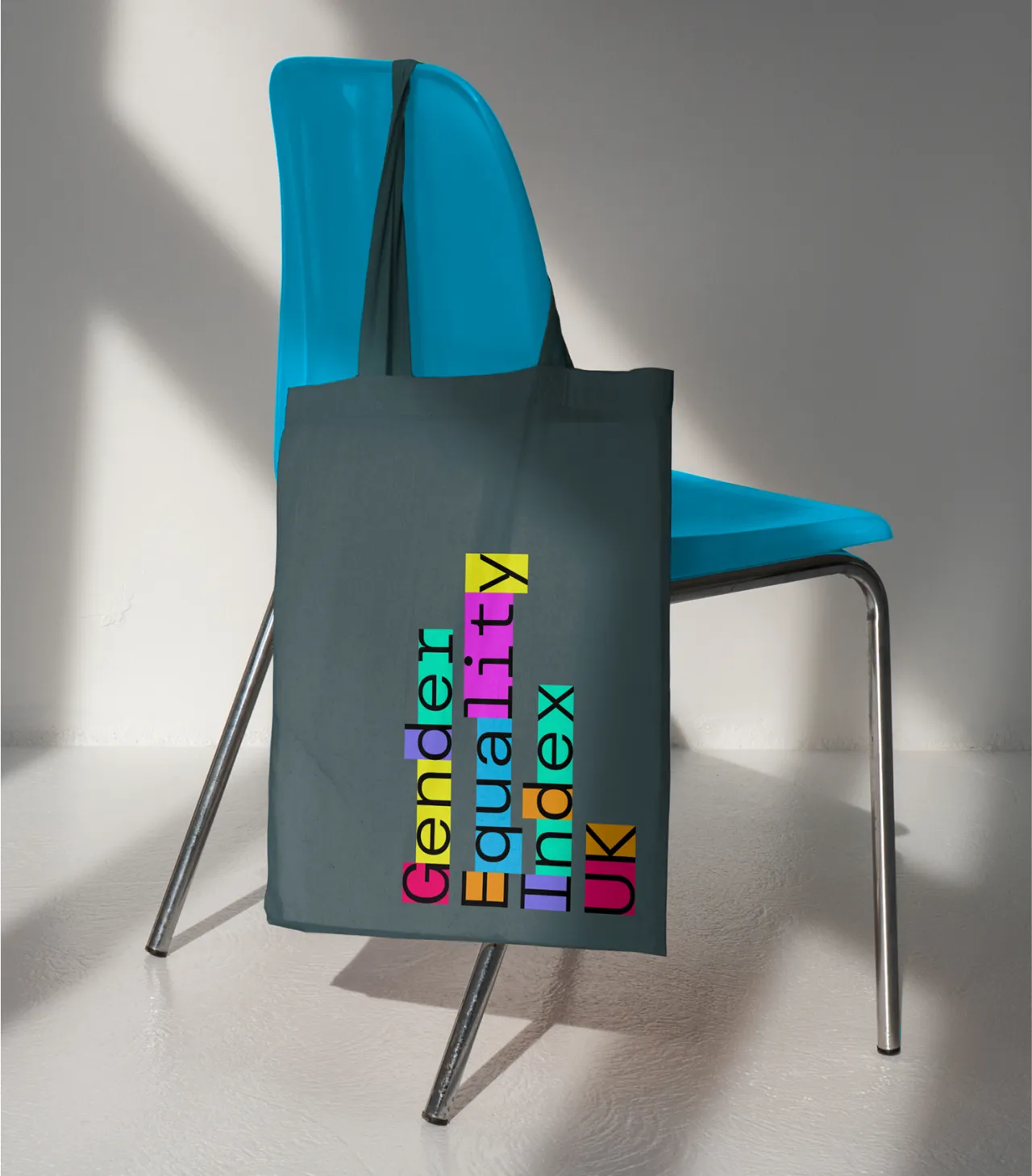
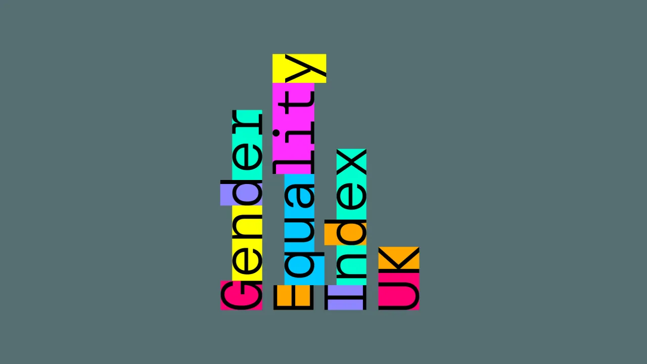
Built from flexible, colour-blocked structures inspired by indexing and data visualisation, the identity celebrates diversity without directly representing gender, using motion and colour to humanise complex data and reveal local insights. On the patchwork approach, Marina says: "The idea came from a utopian view of a world where diversity is a strength, not a compromise."
Often when we talk about gender equality, people are quick to assume we're just talking about women. While that is, of course, a huge part of the discussion, this identity for the Gender Equality index is much more balanced and not coded to a single gender. According to Marina, this was one of the first points Pentagram raised with their team.
"This is a complex initiative which has been developed by their scientists for decades as a tool, using the UK census, which is available, but there is no data available yet for LGBT," says Marina. "This was defined by the evidence they had been able to gather and work with over the years."
She further explains how this is "the first step to work for change in one basic area of inequality and, step by step, this ideally would grow to cover a less binary approach, once data becomes available."
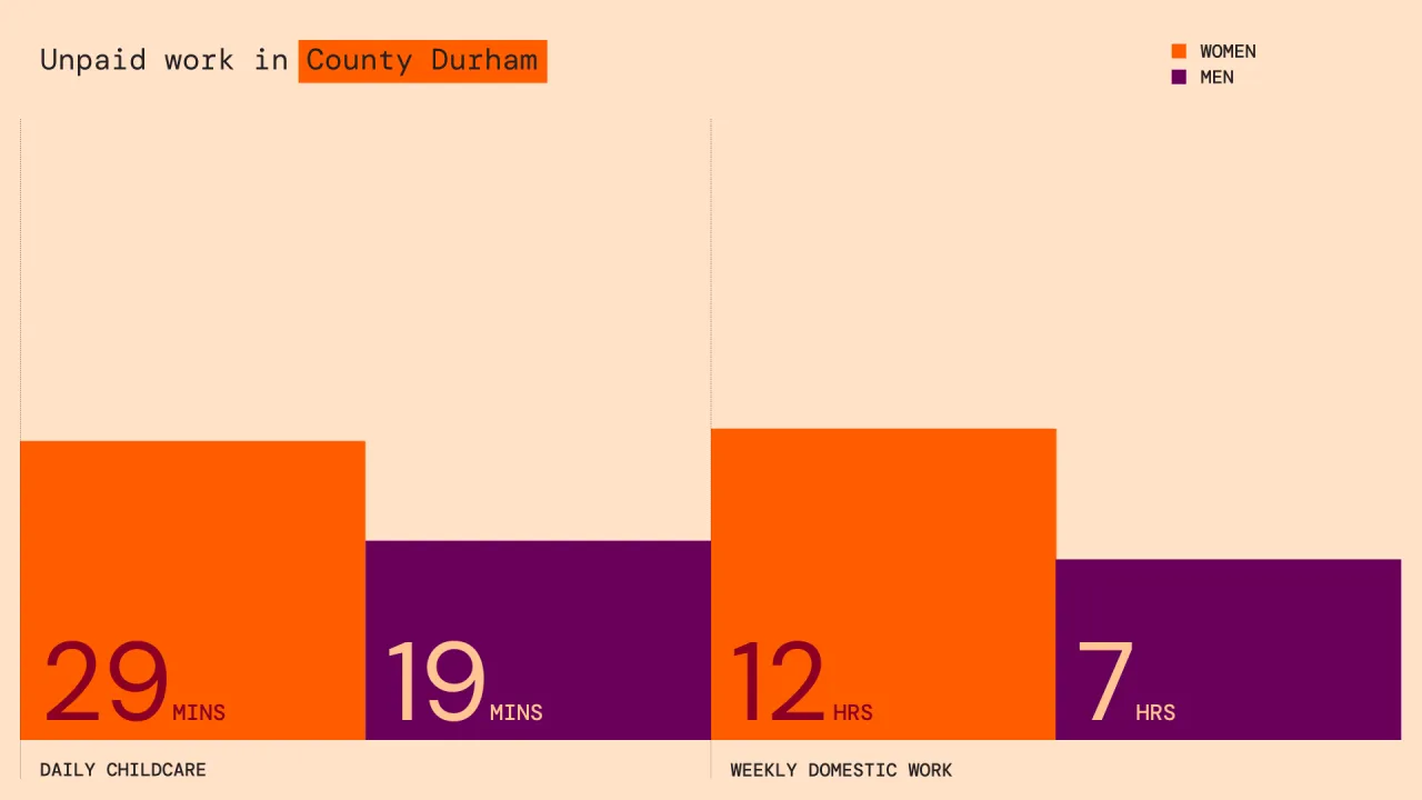
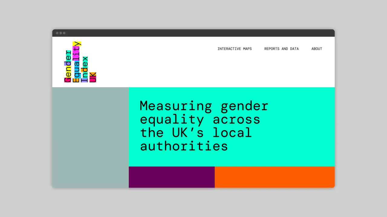
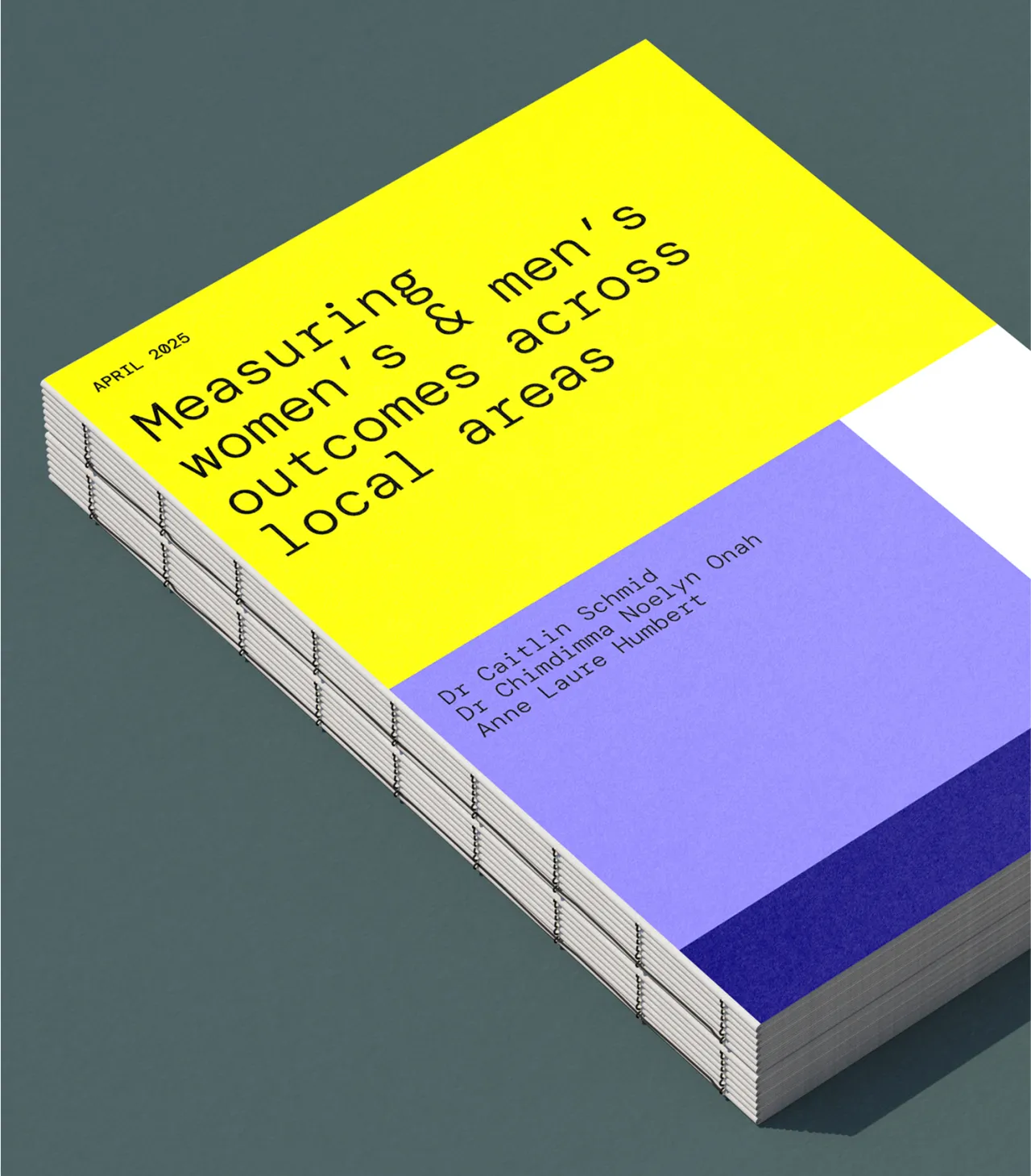
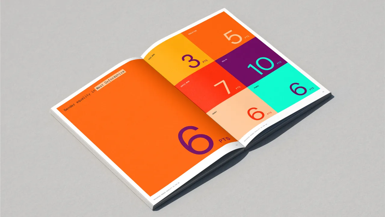
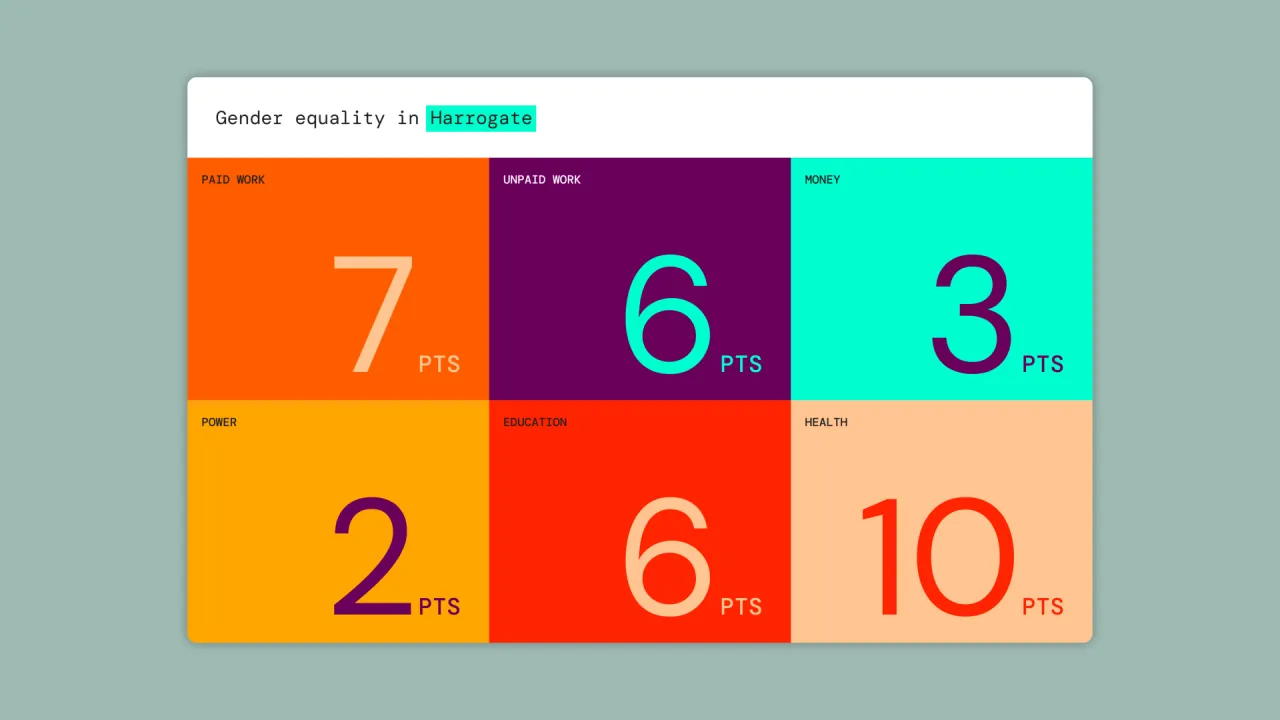
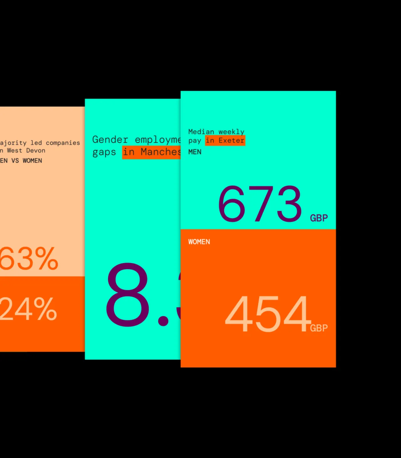
Despite its limitations, the index does a brilliant job of presenting the data in a digestible, understandable way. It has three clear data set comparisons: Gender Equality Measure, which captures gaps between women's and men's outcomes in a local authority; Women's Outcomes Measure, which highlights the gaps between women locally compared to women nationally; and Men's Outcomes Measure, showing gaps between men locally compared to men nationally.
At the best of times, reports and data can still be – well – pretty dry, but Pentagram has managed to design an identity that's both engaging and doesn't distract from the importance of the data. Marina says they were able to do this by "always focusing on the benefit that an organisation brings to the world, in that sense we chose to celebrate diversity – and here we mean in every colour and shade, not as a binary brand but a philosophy of inclusivity".
She adds: "That makes the identity celebratory and joyful, as a tool for social change."

Editor's Picks





Trending



Latest Jobs
Lead Product Designer at Monzo
Full-time·London·£90,000 – £120,000
Creative Director (Social) at Known
Full-time·Los Angeles·$125 per hour
Staff Producer, Studio Central at DoorDash
Full-time·San Francisco·$176,800 – $260,000
Designer, Marketing at The New York Times
Full-time·New York·$85,000 – $100,000
Marketing & CRM Manager at Unity Theatre
Full-time·Liverpool·£30,000
Creative Director at Ad Council
Full-time·New York·US$145,000 – US$155,000