Ragged Edge tilts the odds with a new identity for US fintech
The London studio has rebranded Empower as Tilt, a financial technology company reshaping access to credit for millions of working Americans.

Ragged Edge has unveiled its latest project with US fintech Tilt, creating a new name and identity for the company as it seeks to redefine access to credit for millions of working Americans. Formerly known as Empower, Tilt is challenging an industry that leaves more than 100 million people locked out of fair credit, using 250-plus non-traditional signals of financial health to expand opportunity beyond the wealthy few.
The rebrand arrives at a pivotal moment, as Tilt has expanded its suite of products and made key acquisitions, prompting the need for a stronger identity that signals a long-term partnership rather than short-term relief.
"Traditional lending sees people through the lens of risk. We look for potential," says Stephanie Lin, Tilt's CMO. "The new Tilt brand reflects the intelligence of our underwriting and our conviction that millions more people deserve a fair shot at credit and cash. We're building a new credit system that sees people fully and helps them rise."



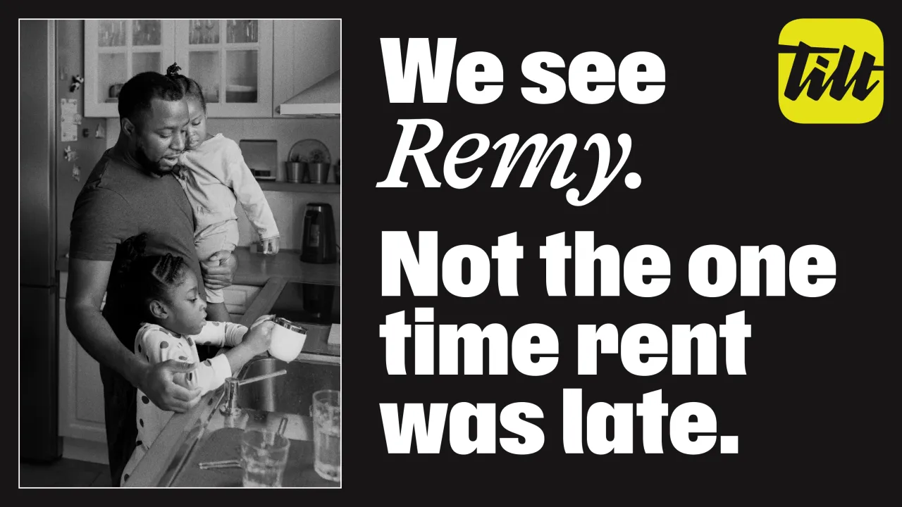
Changing the name from Empower to Tilt was in aid of reframing the company's role in the market, tilting the odds back in favour of everyday working people. The new logo, with its signature-style typography, underlines this intent as a direct commitment to the communities Tilt serves.
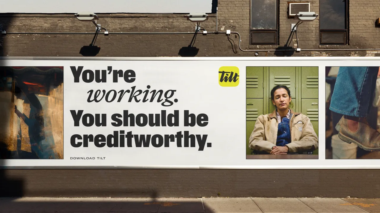
That attitude extends across the brand world. A stark black-and-white palette signals clarity and straightforwardness, with flashes of chartreuse injecting energy and optimism. The type system is equally confident, with a customised headline script literally tilted to convey urgency and movement.




For Ragged Edge, the challenge was to balance financial authority with human grit. Collaborating with illustrator Pearl Chuaynarong, the team developed painterly textures and brush-stroke details that embrace imperfection. This visual language sets Tilt apart in a sector that too often feels cold, transactional, and overly "friendly" in its tone.
Jessica Bong-Woon, associate creative director at Ragged Edge, explains: "We wanted Tilt to welcome newcomers while still resonating with those who've felt let down by the system. "That tension between grit and warmth became central to the brand."
The verbal identity pushes just as hard. Rejecting the casual friendliness that dominates fintech marketing, Ragged Edge gave Tilt a voice that is "urgent and unwavering," says copy director Fia Townshend. "So many brands try to act like your friend. But Tilt customers don't need another friend. They need help kicking down doors. So the Tilt voice has an urgent and unwavering belief that emboldens people to keep pushing."




Executive Creative Director Matt Smith explains more about how the brand refuses to sit quietly within the category, saying, "This wasn't about creating another friendly fintech. Tilt needed a brand with teeth that could challenge outdated systems and credit people for their potential. That clarity of purpose is what makes this rebrand transformative."
It seems the strategy is already paying off. Meta campaigns tied to the new identity have delivered a 70% higher click-through rate, with customer acquisition continuing seamlessly during the transition. Internally, the rebrand has also helped align Tilt's growing team under a shared mission.



While the new name is short and simple, the ambition behind it is anything but. Tilt wants to reset how credit works in America by evaluating people through more than 250 non-traditional signals of financial health.
By moving beyond limited credit scores, the company hopes to support those who are often overlooked, like people with limited history, recovering records, or finances still in the making.
Ragged Edge ultimately sought to design a brand that could serve as a lever for systemic change, providing the company with a platform to challenge an outdated system.

Editor's Picks





Trending






Latest Jobs
Midweight Designer at All Purpose
Full-time·London·£30k–38k
Client Director at Koto
Full-time·Berlin·€70k-€85k
Senior Graphic Designer at MoMA Retail
Full-time·New York·$72k-$80k
Brand Strategist at DNCO
Full-time·London·£45k-£60k
Midweight Editor at Earworm
Full-time·Bristol·£28k-£32k
Growth and Client Development Director at 3800
Part-time·Sheffield·£60k-80k