Robot Food cuts the confusion around debt with a new identity for StepChange
Empathy and pragmatism are the significant themes behind a revamped identity for StepChange, the national debt charity. The work by Robot Food hopes to break down any stigma around managing money.
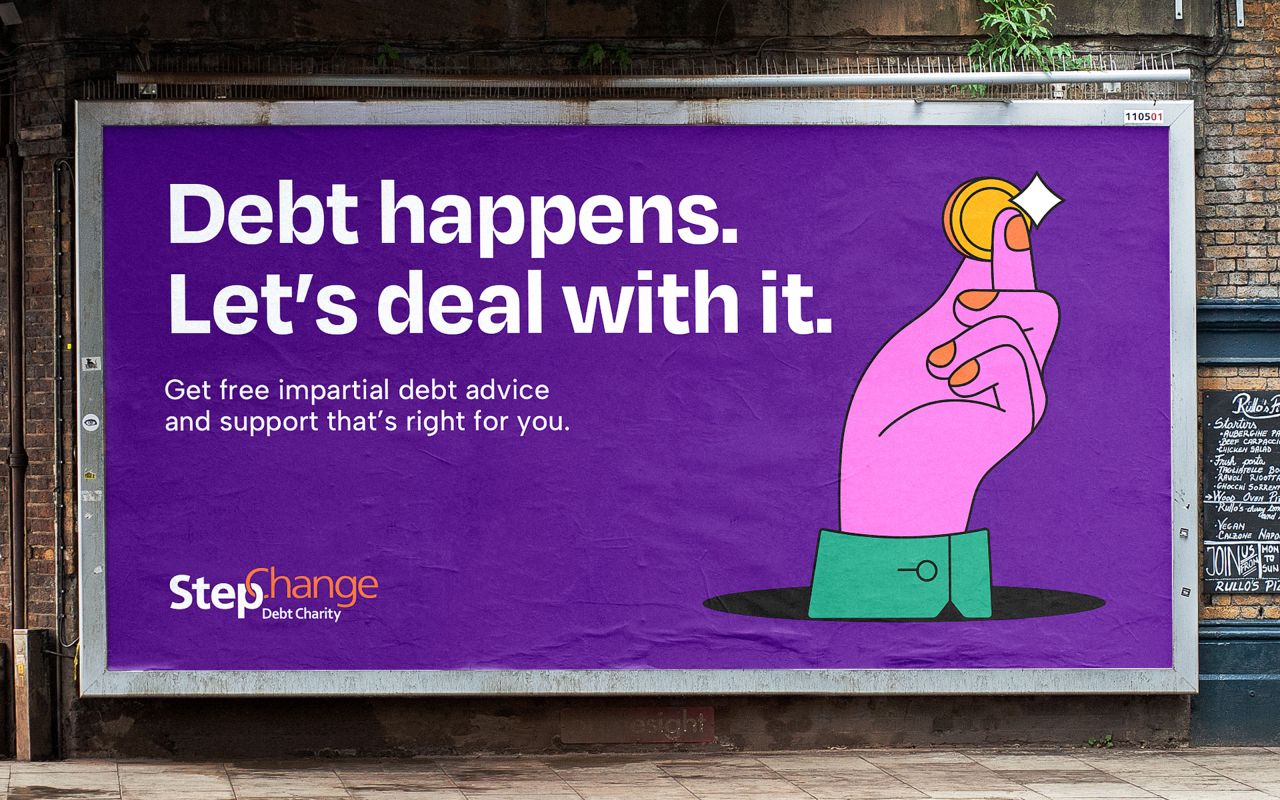
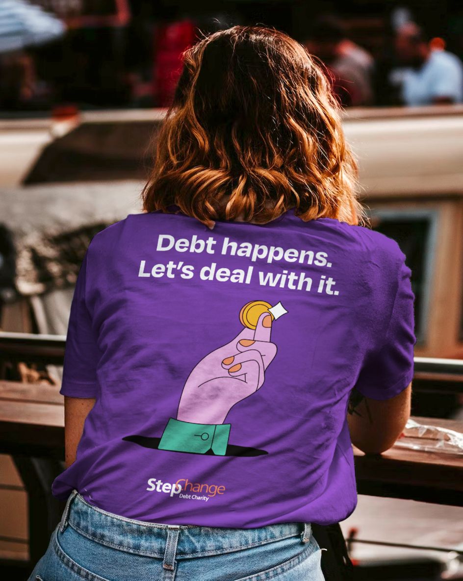
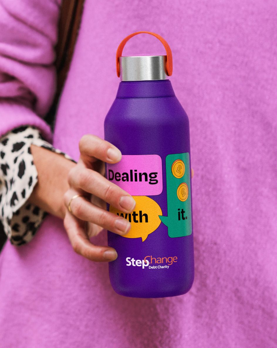
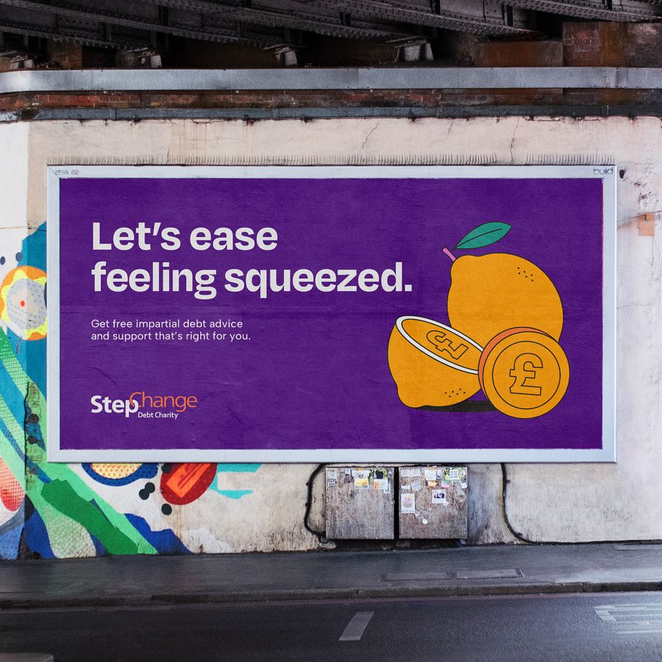
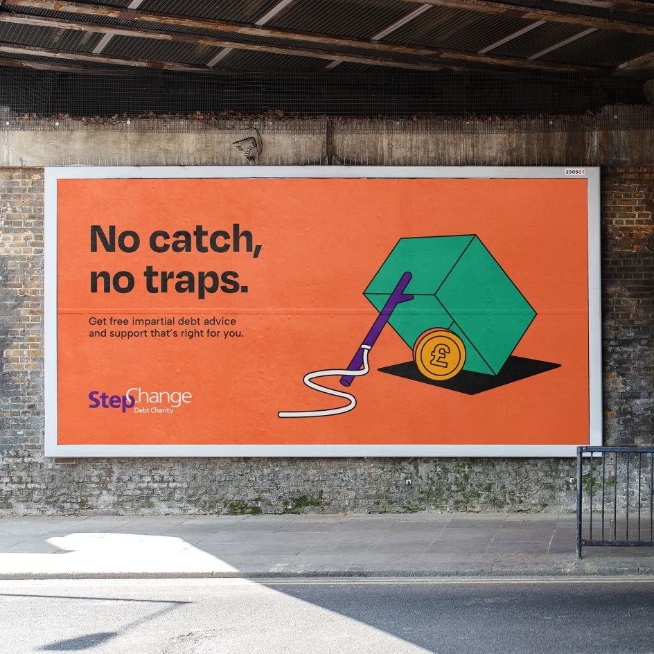
The Leeds-based studio has modernised the branding for StepChange, creating a bold new positioning based on the creative platform 'Debt Happens. Let's Deal With It'.
But what is StepChange? Founded in 1993, it's a charity that offers free, impartial debt advice and solution servicing. Today, it's become the largest provider of debt management advice in the UK, campaigning for policy change at government level and beyond to "make debt less harmful".
Looking closely at the brand, Robot Food discovered that StepChange's funding comes from the government and lenders rather than public donations. This meant that the brand had to consider its consumer-facing aspect and how it should communicate why it exists and how it can help. At the same time, StepChange needed to position itself as a leading authority for lenders to give their support and refer any clients who might need help with debt.

For Robot Food, this approach was a real 'roll up sleeve' moment. "One of the key challenges was communicating exactly what StepChange does – people don't immediately understand what a 'debt charity' is," says Jess Cook, Robot Food client director. "There's so much stigma around debt that stops people seeking help when they need to. StepChange needed clarity around what they do, why they do it, how they do it, and how it's relevant to people."
So what to do?
It's been ten years since StepChange last addressed its branding, and a lot has changed during that time. The FCA's regulation of debt advice in 2016 transformed the industry. The market has also seen an increase in competitors, with more commercial providers of debt who charge users for their services, and crucially, the emergence of digital-first financial platforms has led to a massive shift in how StepChange's audiences interact with financial institutions.
Modern fintech platforms such as Klarna, Monzo and Revolut have changed the financial landscape, too. With all this in mind, StepChange's new branding had to appeal to this audience while not alienating older generations and existing StepChange users. That's quite the design dilemma. "Many popular financial brands have a contemporary approach adds Cook. "For StepChange, these innovations are changing how people approach and manage their finances and the brand needed to be able to live comfortably in that world to feel accessible when people needed them."
During that initial research phase, and considering the competition, Robot Food found that many brands are struggling to stand out from one another, often falling back on vague messaging and outdated stock photography. "No one is leading the conversation or cutting through the confusion," explains Natalie Redford, Robot Food's senior creative strategist. "Debt shouldn't be a no-go subject, and StepChange is breaking that stigma. We had to make sure that this foundation of positive proactiveness was being communicated, flipping the narrative of dated stereotypes and misconceptions to tackle the subject head-on."
So, let's take a recap. StepChange's new branding not only had to show the charity's progressive, future-facing outlook, but it also had to prove its worth and showcase its position as distinctive and disruptive – a leader in the category. As such, Robot Food crafted a brand identity based on a succinct, direct creative platform: 'Debt Happens. Let's Deal With It' – a stance that becomes the foundation for everything else – from the tone of voice and mission statement to palette and typography.
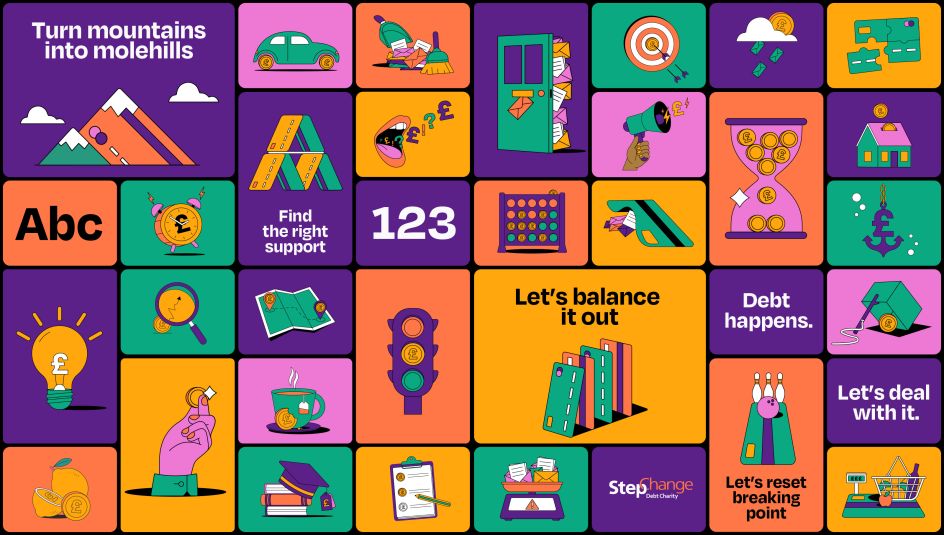
The former StepChange logo was retained as part of a radically updated "brand world" that prioritises inclusivity and oozes confidence. Building on StepChange's previous primary colours, the charity's distinctive purple, orange, and green have been updated to "further amplify its sense of progressiveness and positivity," as the studio puts it.
Degular Bold, a friendly sans serif by OH no Type Co., was chosen as the new headline font for StepChange thanks to its awesome legibility and subtle quirks, such as the character style of its percentage mark, which brings a little more character. It's supported by a secondary typeface, Albert Sans (of Andreas Rasmussen fame), a modern geometric sans serif that feels trustworthy and honest.
But where StepChange's new branding really comes to life is through its striking illustrations and icons, which use bold black linework and the charity's ownable brand colours. Created in-house by Robot Food designer Ryley Devine, icons are often used to signal information about certain topics, such as housing costs, and can also symbolise more abstract ideas, such as the way debt "weighs you down" (illustrated by an anchor formed from a £). Robot Food also developed a suite of simplified icons for applications such as web UI, PowerPoint presentations and animations.
"The illustrations are metaphors for debt and the help StepChange provides – but they're not limited to a single use," says Devine. "They're both open enough and specific enough to be useful across a variety of occasions."
The tone of voice builds on this trustworthy and compassionate feeling. Where financial language is often complex and confusing – packed with jargon and legalese – StepChange really wanted to prioritise clarity and spell out exactly how it can help people through a direct, fluff-free copy style typified by "no-frills language" and tight, short sentences.
The idea of 'empathy' is the true champion behind all messaging. "It's about making a human-to-human connection, so we made StepChange's language engaging, relatable, and personable," says Robot Food copywriter Lizzie de Jong. "Where possible, things are written how we speak, and there's gentle humour in headlines when it's appropriate. It's about using words to show that StepChange truly understands what people are going through – and never judging them."
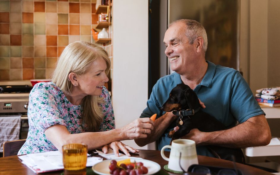
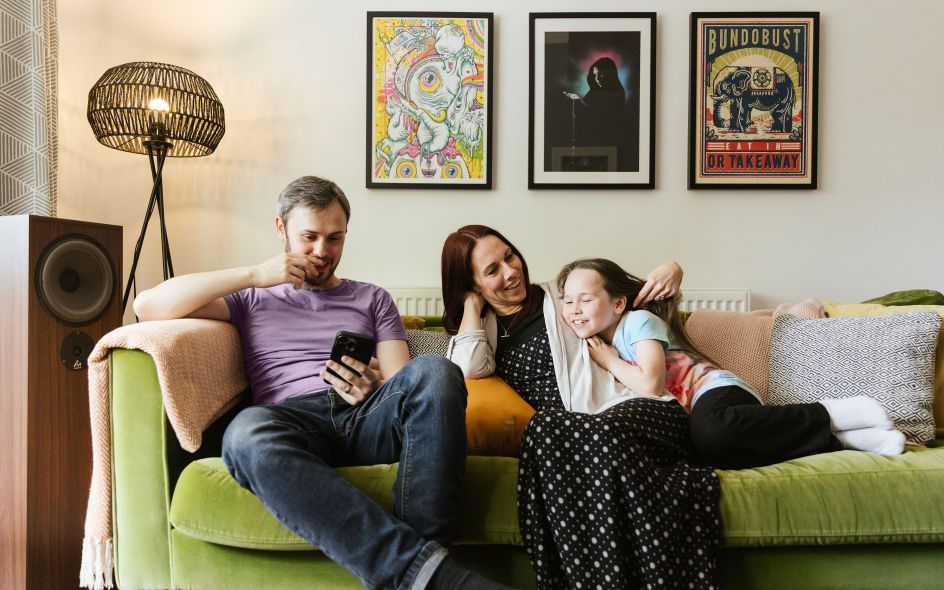
And finally, there's the photography. Shot by Joanne Crawford, the new naturally-lit images feel authentic and unstaged, reinforcing the idea that StepChange can make a positive difference in people's lives.
Launching over the coming weeks, the new branding for StepChange will be rolled out across all of the charity's touchpoints, including its website, social media posts, email templates, digital ads, OOH advertising, and printed guides to its range of services, plus reports, internal posters, branded stationery, lanyards and even future merchandise such as mugs and t-shirts.
"It was quite a different project for us: with FMCG, you're selling things like beer or cake – it's quite easy to see why people would want it and what's appealing," says Cook. "One of the big challenges of the StepChange brand and the consumer landscape was the fact that the world of money can be really murky. It's hard to understand the nuances."
She continues, "Since debt is a highly regulated area, there's also lots of parameters you have to work in. We had to apply a really dynamic, accessible branding solution that balanced the B2C needs of the service's users with the B2B needs of the partners funding it, and which also gave StepChange the flexibility it needed. It was a very different and enjoyable challenge."
Editor's Picks


Trending


Podcasts


Editor's Picks
Further Reading