US discount retail behemoth Nordstrom Rack unveils new identity from JKR
Jones Knowles Ritchie (JKR) is behind the new brand identity for American department store chain Nordstrom Rack, creating a strategy and branding system that celebrates customers' "confidence and savviness".

Nordstrom Rack was founded in 1973 and is a sister brand to the luxury department store chain Nordstrom that sells off-price goods across 41 US states and three Canadian provinces.
JKR was brought in to work with the company in order to help Nordstrom Rack stand out in a "competitive and loud" off-price retail market with a new brand identity that would help attract new customers and better connect with existing ones.

"As we began work with Nordstrom Rack, it immediately became clear that their customers are bold, confident and savvy and that we had an opportunity to embody that spirit and the brand's unique proposition through its visual identity and brand experience," says Lisa Smith, JKR executive creative director. "We created this identity system to be distinctive to Rack, responsive across all touch points and ultimately to connect with the Rack customer, wherever they interact with the brand."
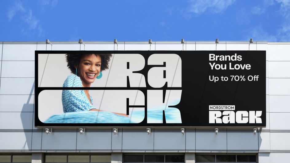
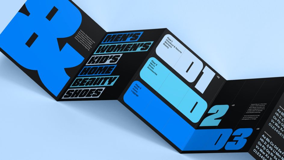
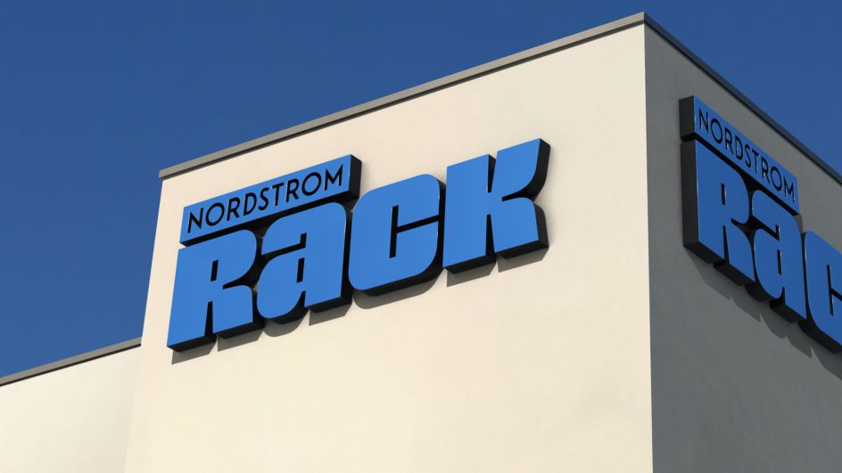
The new logo is inspired by Nordstrom Rack's past, looking o the logo used in the 1970s and 80s and reimagining it in a modernised form. The entire brand system was built with flexibility and digital responsiveness front of mind, including the logo, which was designed on a modular grid to be responsive for all sizes and platforms. This ensures that the brand remains consistent across digital and physical experiences and wherever a customer interacts with the brand.
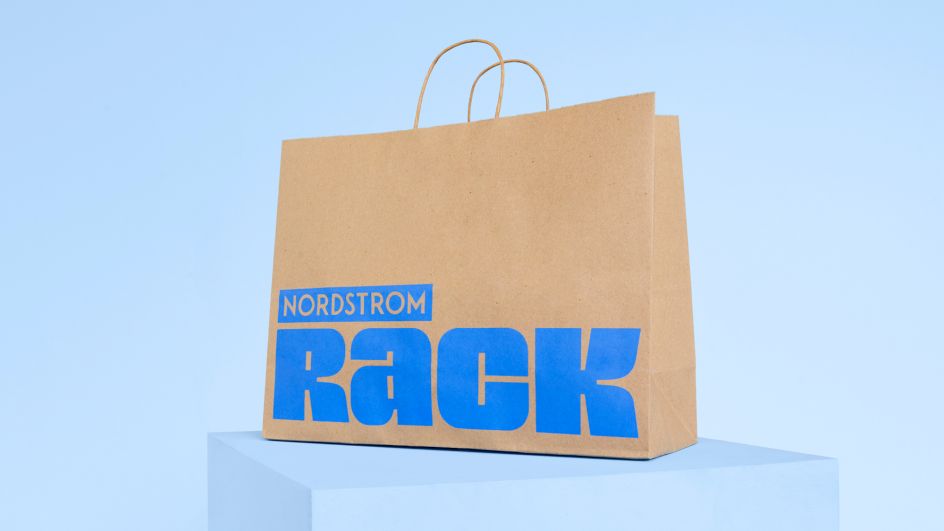
The former mid-tone colour palette was refreshed and expanded to become more "vibrant and exciting," says JKR. The previous Nordstrom Rack blue was used as the jumping-off point to the new set of multiple "signature blues" to give the brand more visual variety. Revamped secondary and tertiary palettes were introduced for signposting seasonal changes and highlighting sales and promotions.
JKR worked on a distinctive, bold tone of voice for Nordstrom Rack that would work for a wide range of brand messages demonstrating its personality and easily communicating practical information such as pricing and sales.
"Through this new comprehensive and cohesive brand identity system, we aim to evolve our brand expression so we can effectively communicate our brand proposition, great brands at great prices, and invite customers to Rack their way," says Red Godfrey, vice president of creative at Nordstrom, Inc.
Godfrey adds that the new identity "reflects our customers' authentic, empowered and expressive spirit and communicates the 'more-ness' of the Rack – more fashion, more of their favourite brands, more deals, more access in-store and online".
The new designs will begin rolling out this spring, with the logo and identity first appearing across marketing campaigns and on digital channels, including the Nordstrom Rack website, app, social media and emails, as well as on exterior and interior signage at new and remodelled stores.
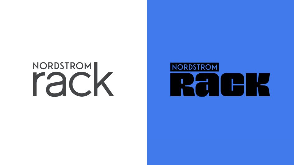
The old logo next to the new one