JKR redesigns online grocery behemoth Ocado
JKR has created a new visual identity for online grocery delivery service Ocado, creating a new version of the brand for use across all touchpoints, including packaging, digital, film and motion and more.
The team at JKR set about forming a collaborative partnership with the creative and branding team at Ocado with the aim of "crafting a brand identity that looks as good in the home as it does online".
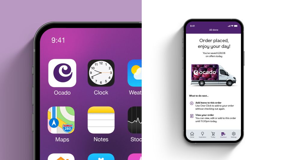
The new "grape" purple brand colour was introduced, aiming to give the brand more visibility "in a market crowded with greens," says JKR. The high level of colour contrast between the purple and white also helps make the Ocado site and apps more accessible.
The swirl brand mark was also redrawn, and the wordmark was updated using a more distinct double-story lowercase 'a', "making it more legible and recognisable on screens of all sizes," says JKR.
A new brand typeface, Ocado Full Fig, has been introduced, which was designed in collaboration with Rick Banks' F37 Foundry. The typeface is "inspired by the organic personality of the Ocado Swirl," according to JKR, and aims to be recognisable across all platforms and all sizes.
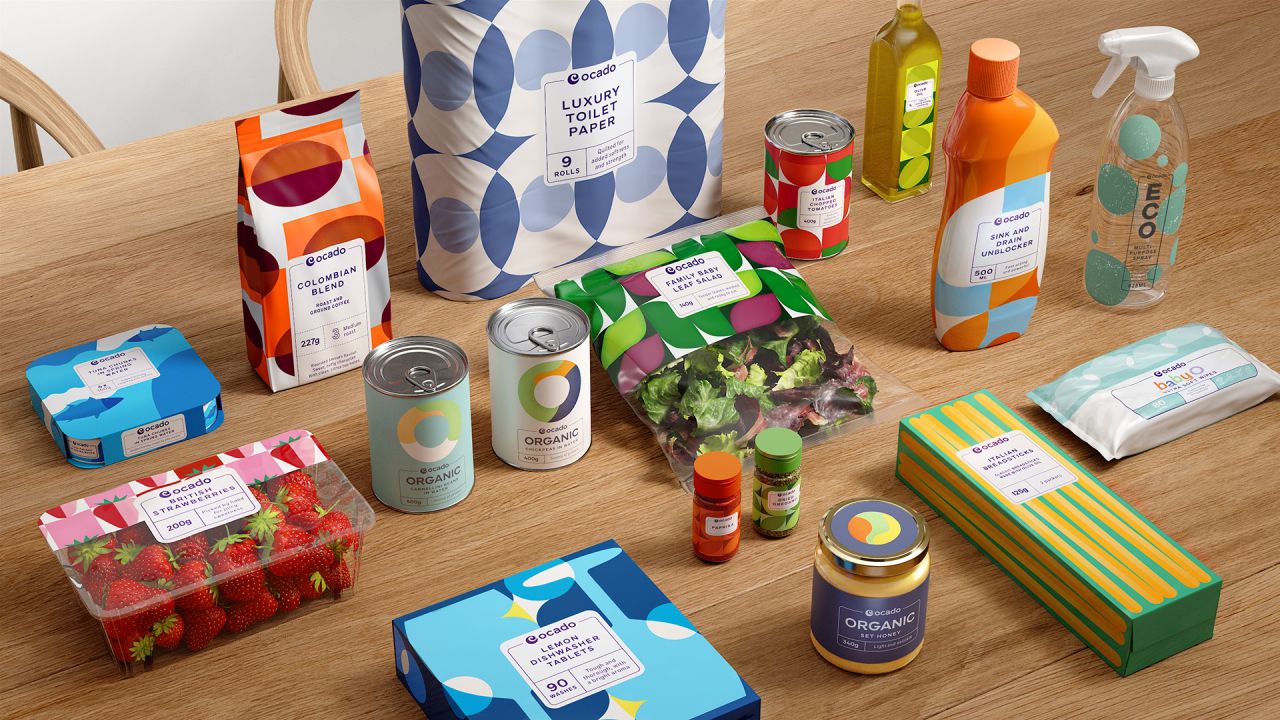
The Ocado Own Range packaging has been redesigned to achieve unity and consistency across the range and help it stand out to consumers on the "digital shelf" and look good on consumers' shelves at home. "The challenge was to create a system that allows flexibility across multiple categories and sub-ranges, whilst bringing out the character and personality of Ocado, showing off the quality of each product," says JKR, which developed a playful illustration style that aims to bring the packs' personality to life.
On packs, the brand frame device is used as "a seal of quality that cues craft, whilst housing both functional and emotional product information," says JKR, and it's also used to offer immediate brand recognition across the ranges.
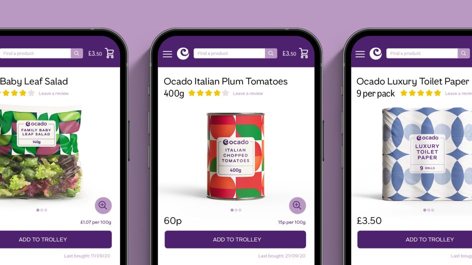
A key aspect of the on-screen new look is the Ocado search bar, which is now a distinctive brand asset that is both a graphic device and a tool that powers the user journey.
JKR says, "the search bar now plays a central role throughout the whole brand experience, standing for discovery, choice and exploration." The search bar also continues into the "Ocado frame" which creates continuity throughout the consumer journey. "We focused on how we could evolve the Ocado brand identity to become more accessible and future-proofed, so customers have the best experience possible when interacting with the brand," says Laura Harricks, customer director at Ocado retail.
Editor's Picks


Trending


Podcasts


Editor's Picks
Further Reading