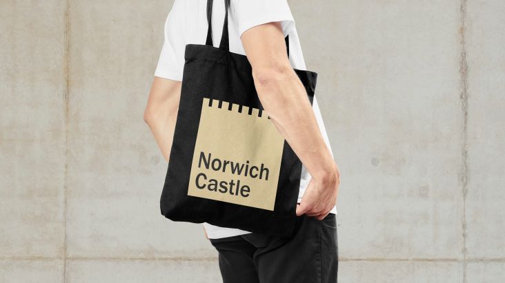
The Click crafts new logo and branding for legendary retailer Jarrolds
Jarrolds is a retail institution and an important part of Norwich's heritage. We explore how The Click updated its identity for the 21st century while still paying homage to its 18th-century origins.
In a world where more and more of our shopping occurs online, it's reassuring to know that much of our bricks-and-mortar retailers remain in business, especially when we're talking about establishments as firmly founded as Jarrolds in Norwich.
Founded in 1770 by a 25-year-old, John Jarrold, the roots of the business were originally in shopkeeping with grocers and drapers. More than 250 years later, Jarrolds remains an established family-run independent department store – offering a unique and contemporary shopping experience over five floors.
Its departments include fashion and beauty, home and lifestyle, books, art and stationery, sport and toys, as well as four restaurants, a coffee bar and wine bar, in addition to a well-stocked food hall. But it's not just a place to buy things. In the words of author and media personality Stephen Fry: "The Jarrolds story chronicles more than the history of one very special company… it tells the story of a city, a county and a people."
Seeking a refreshed modern identity for the store, Jarrods turned to award-winning design studio The Click, a local firm led by Bobby Burrage.
Design inspiration
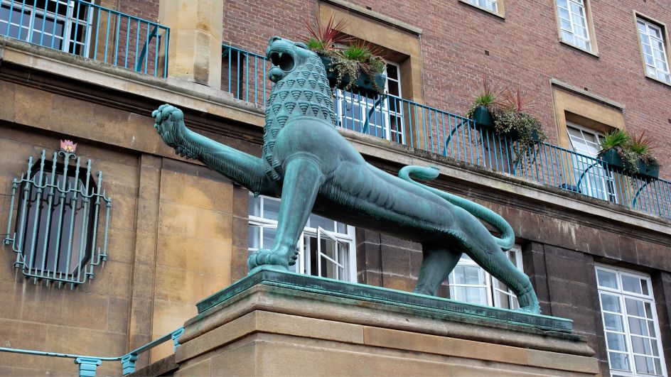
The team got their inspiration from a pair of heraldic lions located just across the medieval marketplace from the grand facade of Jarrolds' flagship store.
These sculptures were crafted by sculptor Alfred Hardman back in 1938 to celebrate the official opening of City Hall. And Jarrolds quickly adopted the iconic civic Norwich lion as their own.
At the time, they even went one step further by cheekily positioning it to lean a raised paw on the J of Jarrolds – creating a logo that would live on for many years to come. As time passed, the lion, for some people at least, became more synonymous with Jarrolds than that of the city.
Brand concept
"The debate of whether to retain the lion in the redesigned logo did come up during our creative process," explains Adam Ewels, design director at The Click. "However, we quickly realised the lion contributed a huge amount of brand equity."
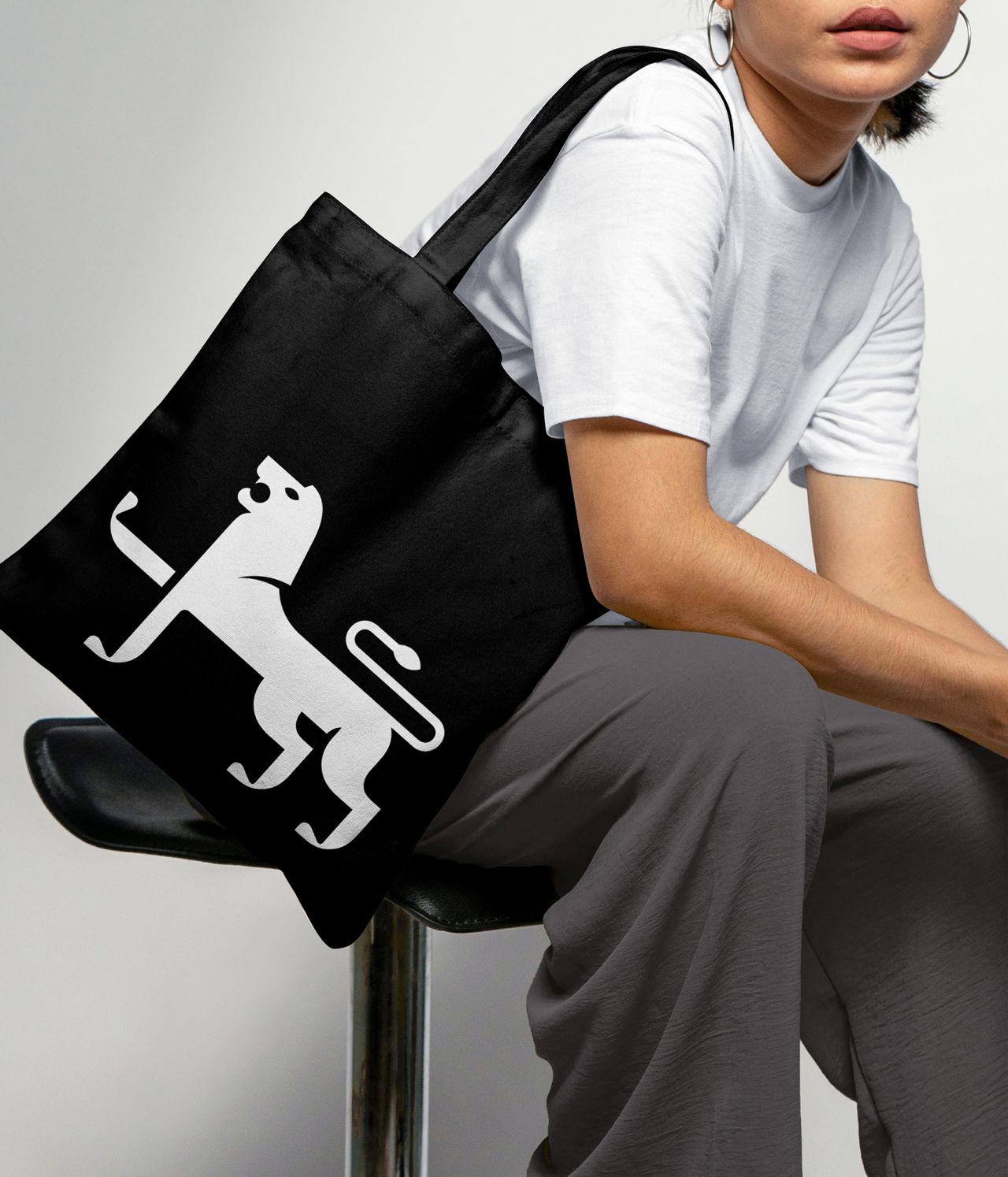
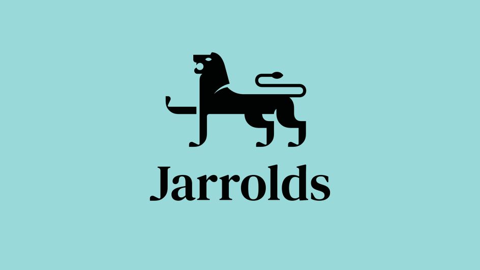
As such, they decided to search for a clever way to give it a new and more meaningful lease of life by integrating the 'J' for Jarrolds into the lion itself.
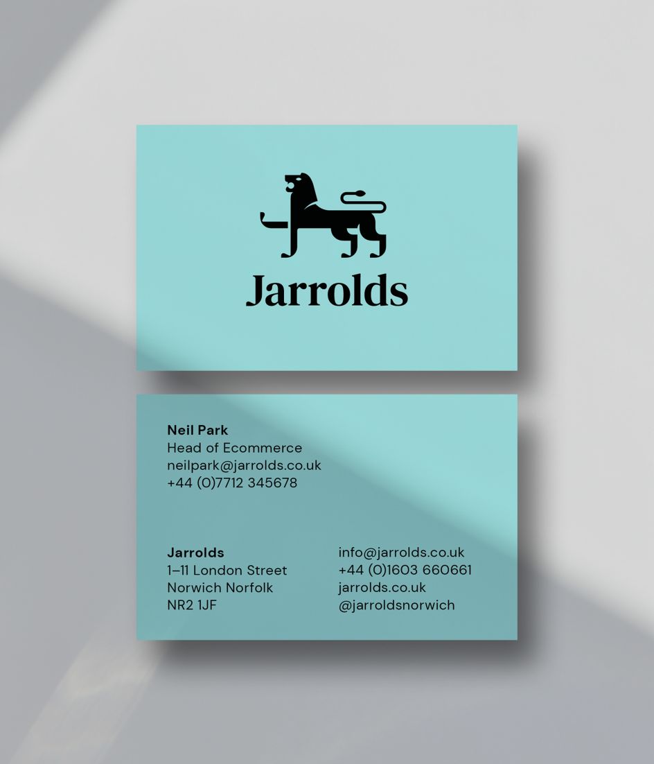
"By completely redrawing the lion from scratch, we were able to craft a new, more iconic and fit-for-purpose brand mark that performs more effectively at varying scales across all channels and applications," says Adam. "Best of all, this now means the lion is finally truly ownable by Jarrolds, becoming unique to them and, ultimately, more memorable."
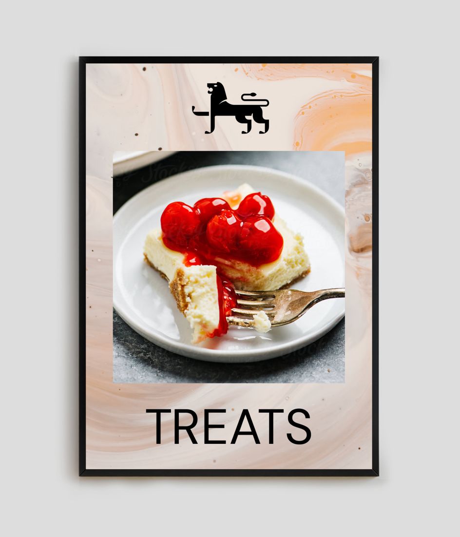
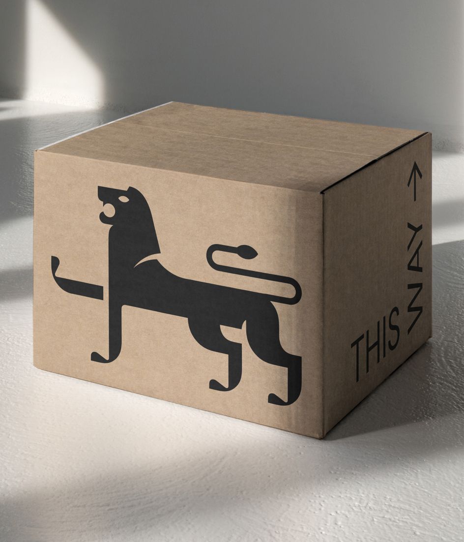
Another significant addition to the new branding is the infamous 's'. Over their 250-year history, Jarrolds has never quite decided whether to be Jarrold or Jarrolds. The Click's team elected to deliberately reintroduce the 's' based on various factors.
Whilst Jarrolds was founded by John Jarrold, it later became Jarrold & Sons, and eventually, there would be eight generations and counting of the Jarrold family. As such, the team felt it important to pluralise the name once and for all. They believe that Jarrolds not only sounds more friendly but also points to the fact that it's already what people call the business colloquially.
Colour palette and logo
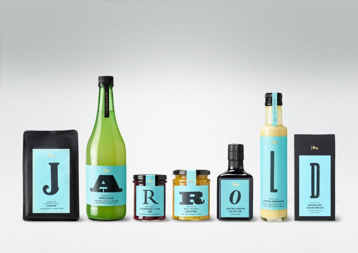
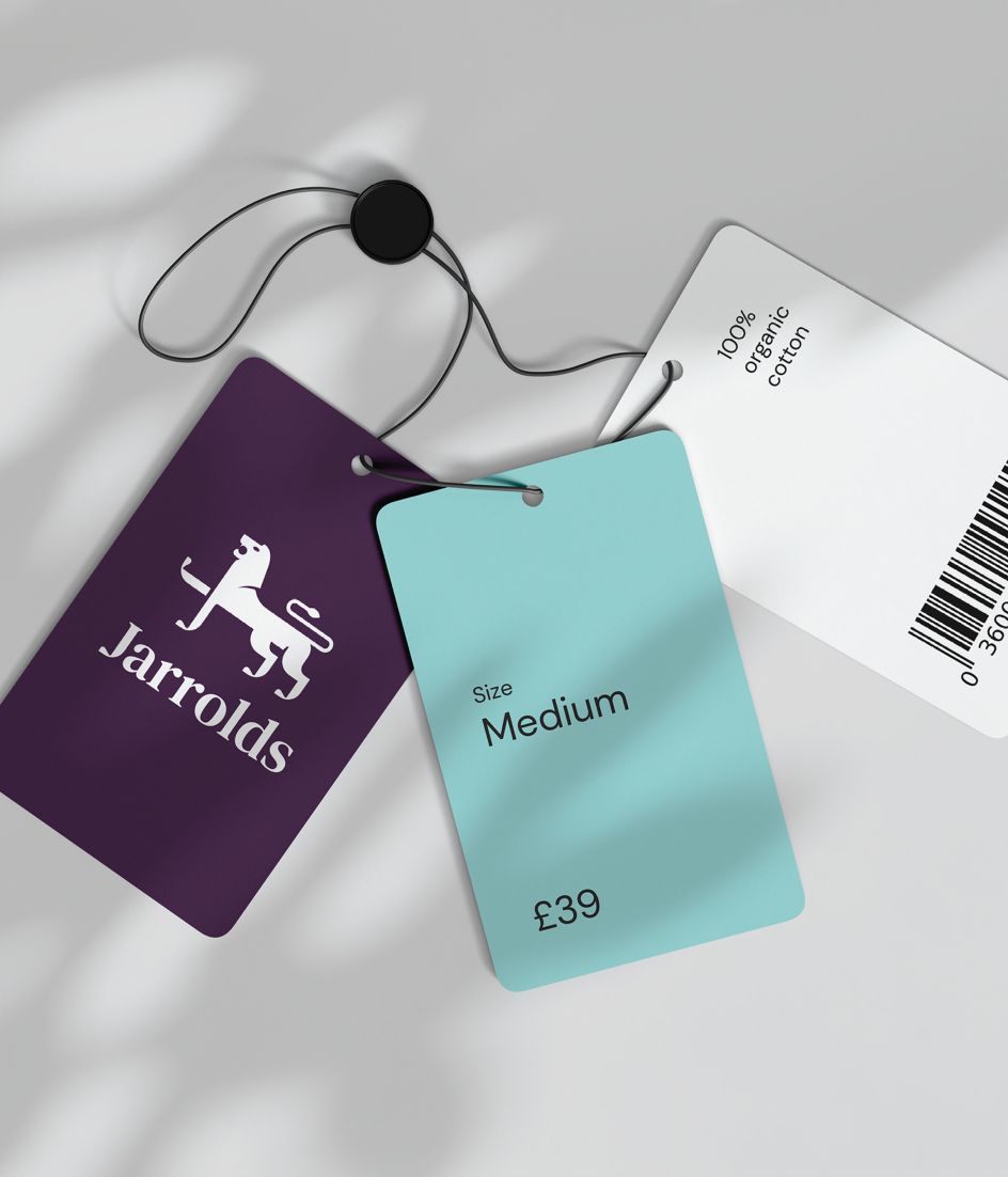
Much like the core brand logo, The Click applied gentle and sympathetic modernisation to the existing brand colours, retaining but optimising both purple and blue. The Jarrolds Purple is designed to evoke a sense of luxury, while Verdigris Blue pays tribute to the bronze lion statues discoloured by atmospheric oxidation.
Previously, the two colours were often used together. However, moving forward, they will strictly be used separately from one another. The Jarrolds Purple will form the background to white, and the Verdigris Blue is paired with black. This achieves optimum legibility and provides more flexibility in application.
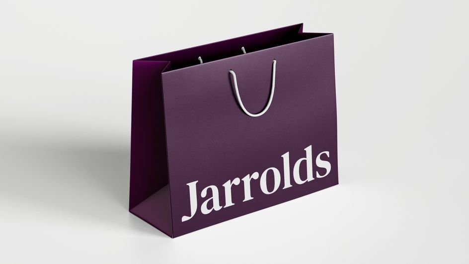
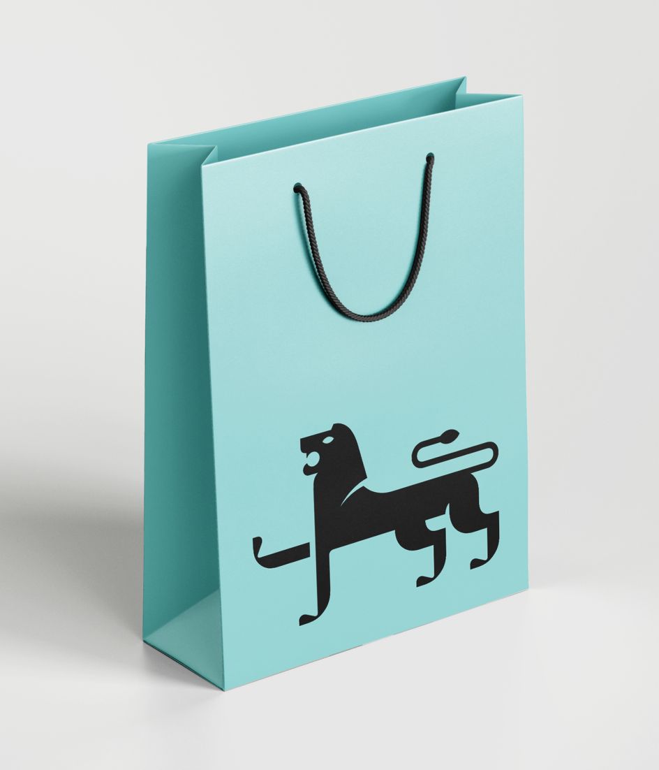
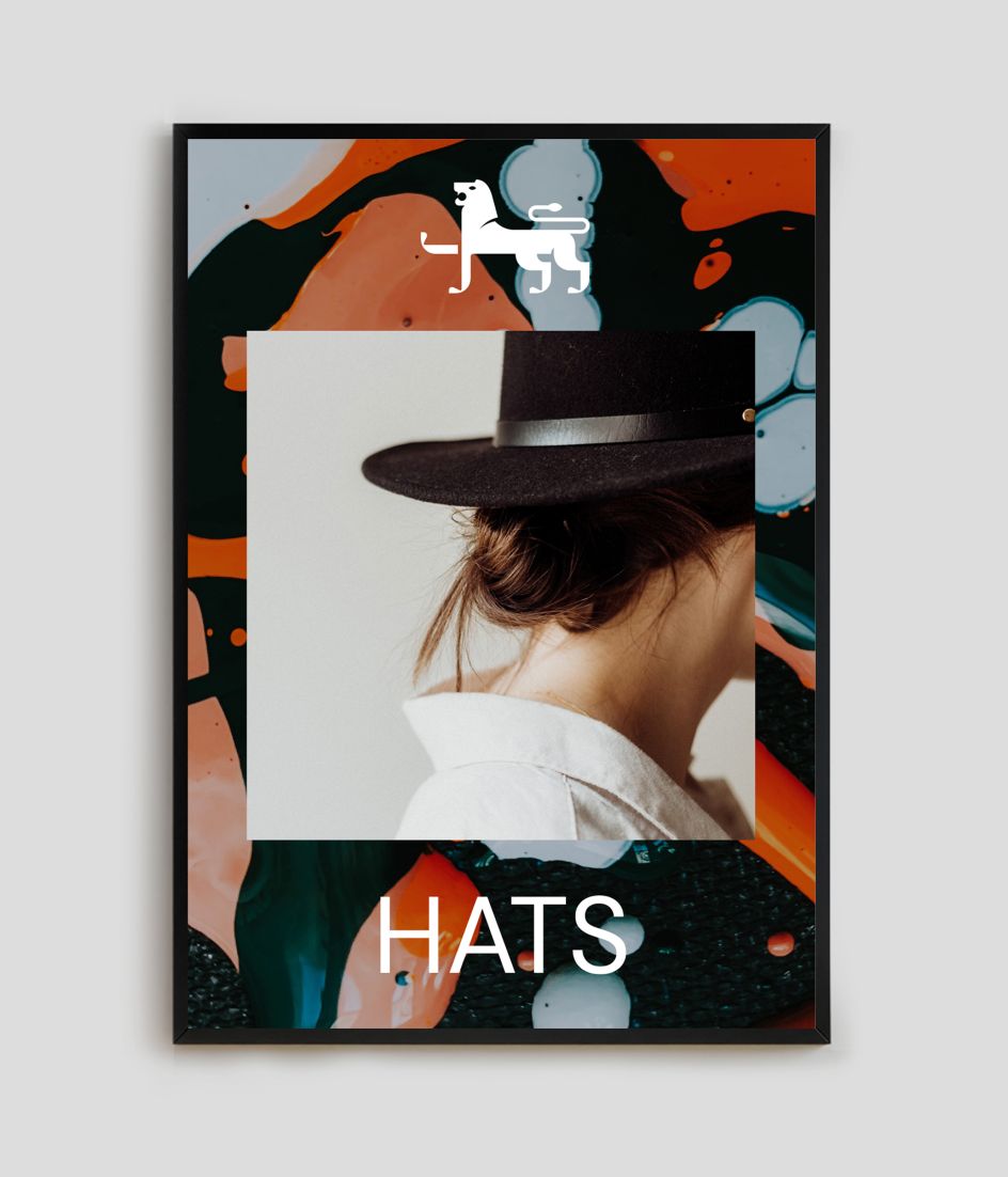
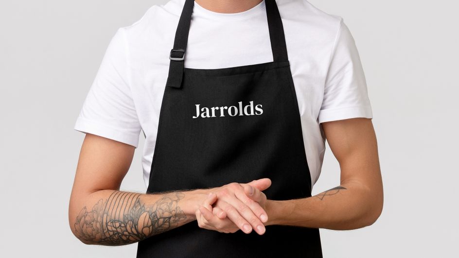
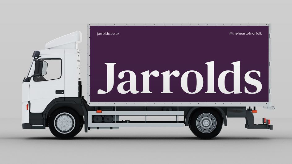
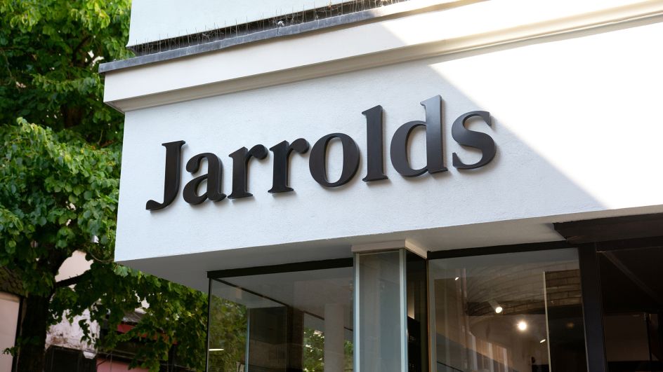
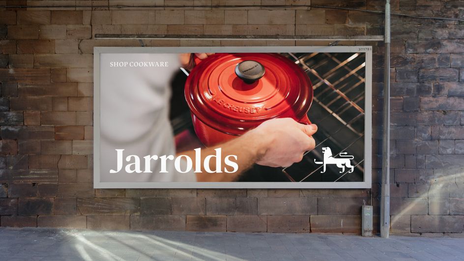
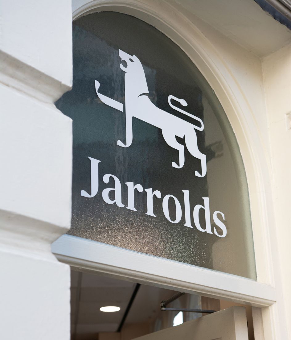
The new Jarrolds logo includes a logotype and a logomark. These key brand assets can be used in isolation or as a combined logo, depending on the format and hierarchy of the application. The 'J' within the logotype is custom-drawn and is exactly the same scale and ratio as that of the front standing foot of the lion logomark. This detail is paramount in fusing the two elements, creating perfect harmony and balance across all logo variations.
Typography and artwork
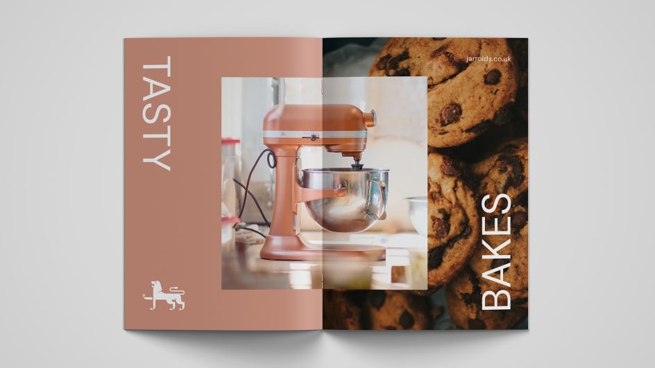
The Click has introduced two brand typefaces to the branding system. Lapture is a traditional, luxurious and characterful serif, while DM Sans provides a neutral, modern and timeless aesthetic.
These two typefaces work in harmony together, as well as in isolation from one another. Importantly, they allow for greater brand stretch and the ability to reflect a huge range of products and experiences for all ages, tastes and interests.
A mixture of vertical and horizontal axes is used for headline-type alignment, a playful element derived from the sideways 'J' within the logomark (lion's right raised leg).
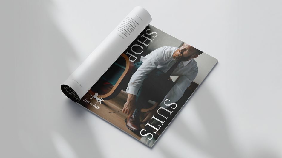
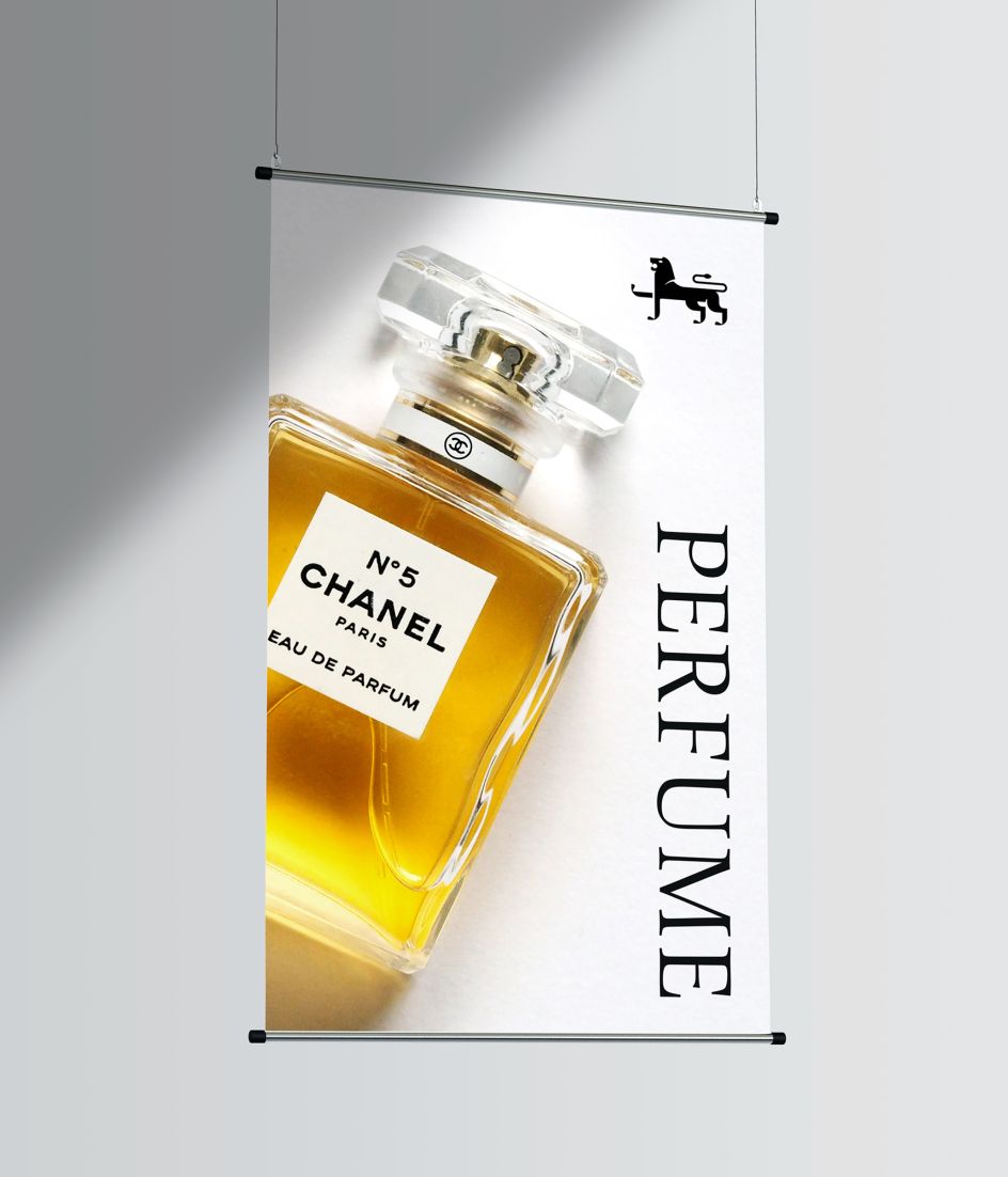
Further inspiration also came from Jarrolds' heritage as a leading printer and publisher during the 19th and 20th centuries. In 1878, they printed and published the first edition of Anna Sewell's Black Beauty, one of the most famous children's books. Over the years, printing evolved to be a big part of the family business, which, in more recent times, has been recognised in the form of the John Jarrold Print Museum.
The Click drew inspiration from this rich heritage, imagining just how many millions of printed pages passed through the Jarrolds presses. This led them to develop a range of ink-inspired artworks to add dynamism and depth across point of sale, advertising and brand awareness campaigns.
Jarrolds already benefitted from a high level of brand awareness well before The Click was appointed. But overall, this new identity scheme offers greater freedom in terms of application, expression and visual recognition. There are numerous typographic treatments and templates available within the brand guidelines and toolkit – all of which retain cohesion and consistency across brand-led posters, printed collateral and point of sale.
"Working with The Click was a true partnership, and they weren't afraid to push us where necessary," says Helga Clarke, head of marketing at Jarrolds. "The result is a bold and confident evolution of a heritage brand fit for the future."
Editor's Picks

Trending

Podcasts
Editor's Picks
Further Reading