JKR brings 'unique perspective' to the B2B tech space
Data centre company Centersquare's new identity features assets created by a custom data visualisation tool and a UI system designed to eliminate confusion.
Jones Knowles Ritchie (JKR) is behind the naming, positioning, and visual identity of the new B2B data centre company Centersquare. It is designed to emphasise adaptability and stand out among the rigid, fortress-like security cues that dominate the sector.
Centersquare is the result of the merger of Cyxtera and Evoque earlier this year. While the client knew JKR primarily for its work in the B2C space, the studio responded to their proposal request with a submission highlighting our preliminary thoughts on the category and B2B branding.
JKR account director Becca Keith adds that they also sought to showcase their "unique perspective" and "clearly articulate how [their] creative approach can work across any category". Although this is technically outside of JKR's usual wheelhouse, Keith says the team was excited to be pushed into "a mindset of exploration and growth right from the jump".
The brief was to build a new brand and create everything it needs to drive growth, relevance, and love, from defining its market positioning and creating its name to designing the website. "The opportunity to craft a cohesive and connected brand experience from the ground up, especially for this sort of company, seemed like it would be an incredibly compelling and rewarding challenge," says Keith.
Taking a highly collaborative and fast-paced approach to building the brand, JKR wanted to create a momentum where every step informed and inspired the next to ensure everything came together seamlessly.
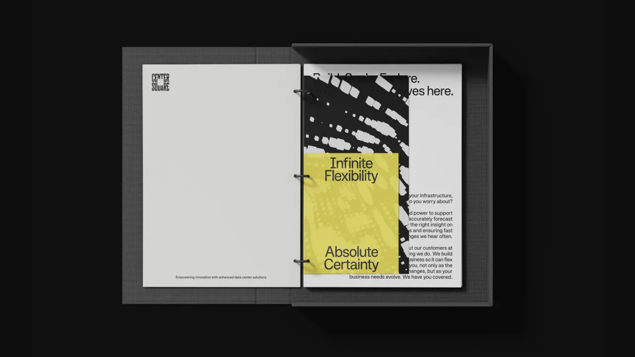
Speaking on the strategy behind the visuals, JKR group strategy director Scott Fogel says: "The design system comes straight from the brand's positioning: Infinite Flexibility, Absolute Certainty.
"It's about creating a sense of adaptability in a changing world, paired with the trust and reliability clients need."
This required a level of sophistication that avoided being too cold, professionalism without being sterile, and approachability without losing the sense of aspiration or authority that will attract businesses.
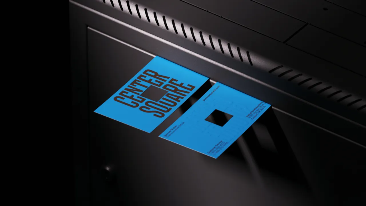
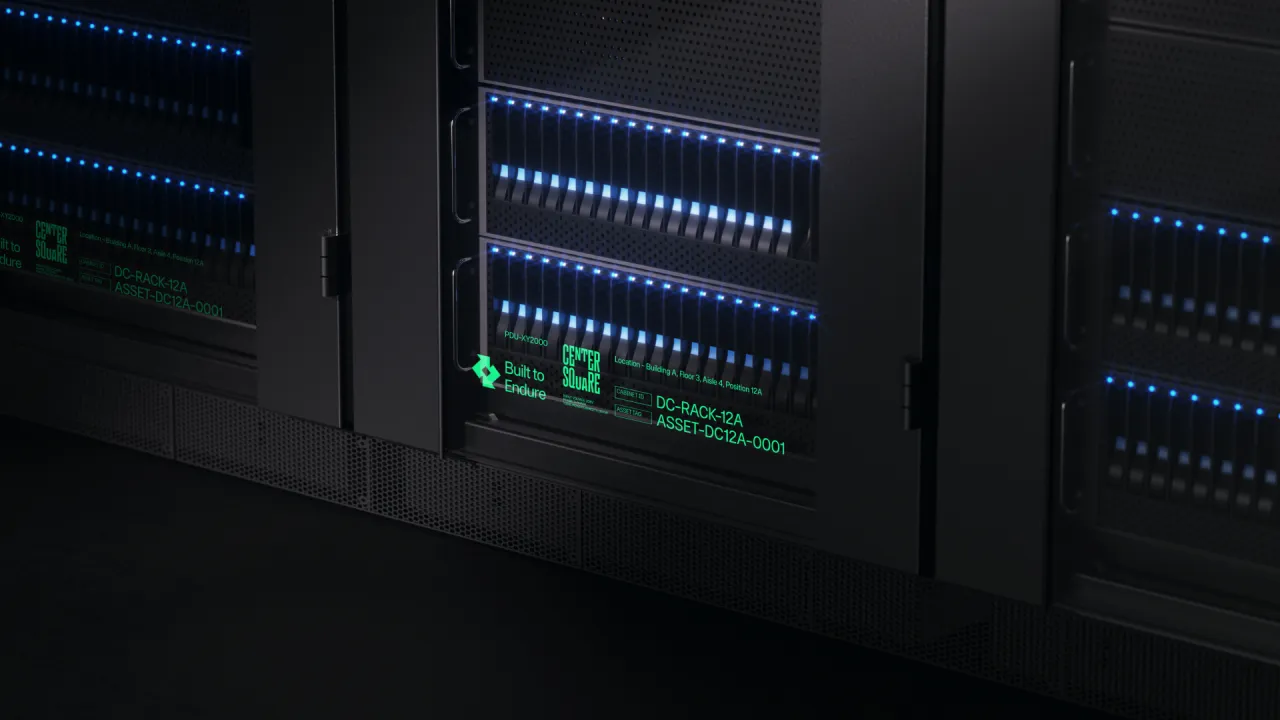
When it comes to names in the data centre category, Fogel says they often feel "overly literal or jargon-heavy", whereas the client wanted to be "memorable and distinctive". Centersquare was chosen for its combination of stability and approachability.
"'Center' reflects focus and being at the heart of things, and 'square' suggests trust and connection, bringing to mind community hubs or marketplaces where important exchanges happen," Fogel explains. In his view, it is "timeless, flexible, and designed to grow with the company" and can resonate with different audiences.
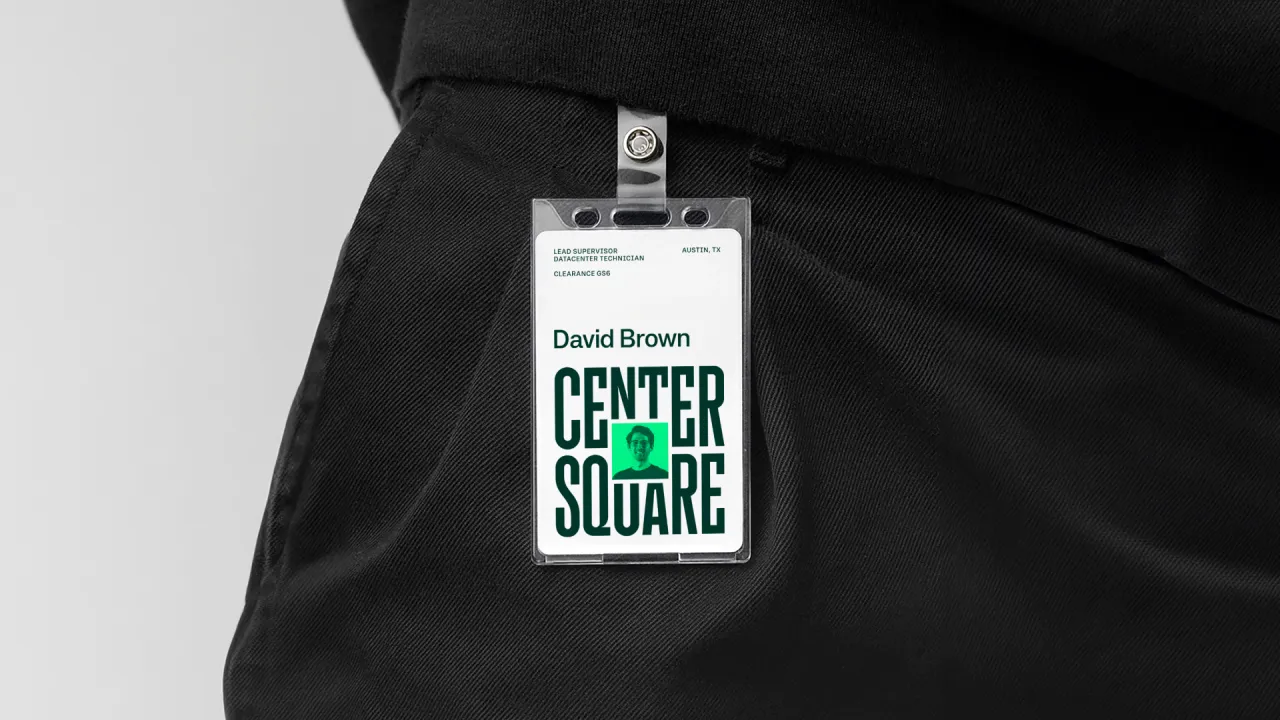
At the brand's core is a nested square logo created by custom letterer Simon Walker to symbolise stability within a dynamic structure. A secondary wordmark complements this compact primary logo.
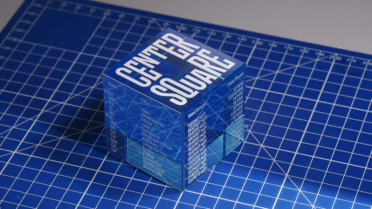
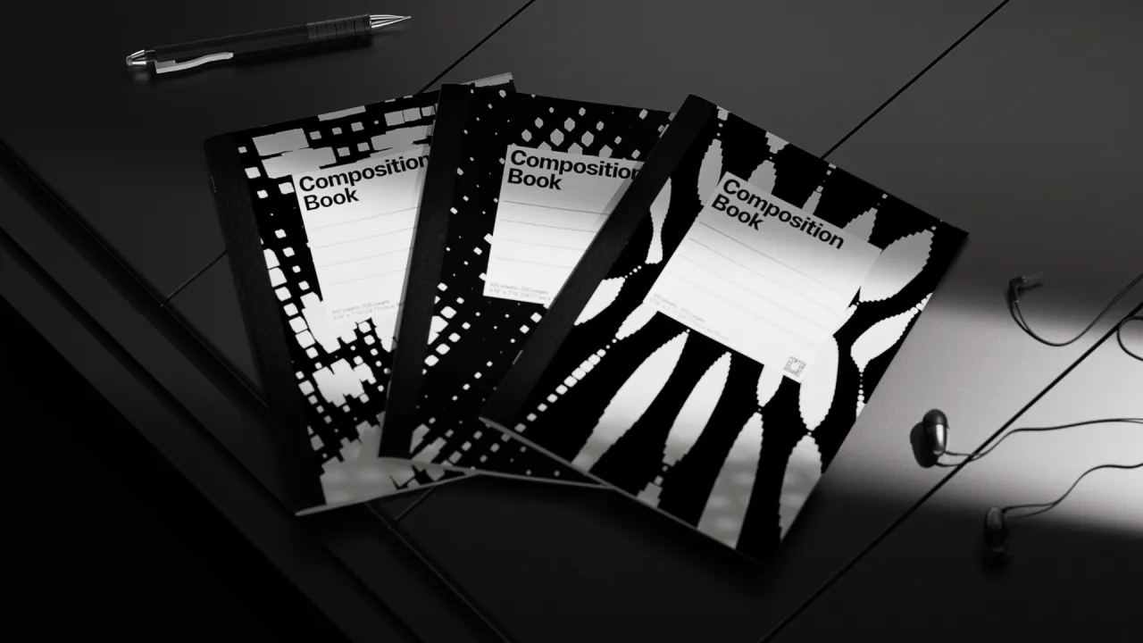
In partnership with digital studio Variable.io, JKR developed a custom data visualisation tool that turns open-source data into dynamic and infinitely unique centrepieces for the logo. This means that global metrics, like population growth and R&D spending, can be brought to life while adhering to a distinct visual style rooted in square and cubic DNA.
The static and motion outputs of the tool also appear across a variety of branded communications, not just the logo. JKR's interface director, Lee Sherman, says, "Offering remarkable flexibility, the tool lets you customise elements like colour, size, position, and frequency while enabling unique data stories tailored to specific countries.
"As the world evolves, so does Centersquare's identity, seamlessly blending real data with artistic expression."
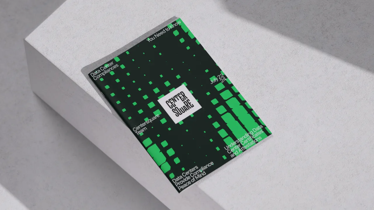
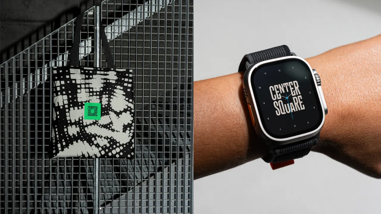
A warm, vibrant colour palette was curated to contrast with the cold, corporate aesthetic often associated with tech, while custom iconography, based on square grids, was designed to ensure consistent recognition of its products and services.
JKR also incorporated isometric-style illustrations to clarify complex information, such as product specs and maps.
Centerspace's new UI system and website were developed with an elevated user experience in mind. Sherman believes this sector "often relies on similar UI methods that feel cold, unwelcoming and complex, leading to confusing and unclear user experiences".
However, he explains how Centersquare's UI integrates stability and flexibility as well as "creating a reassuring environment for clients, enabling exploration while also providing unique moments and treatments rooted in the Centersquare DNA". The system's robust modular foundation is complemented by an accessible colour palette, bringing life to the experience.
Sherman adds that the navigation was built around "the concept of the Centersquare as your central hub, offering a straightforward and intuitive way to explore and engage".
Editor's Picks





Trending

Latest Jobs
Design Director at Koto
Full-time·London·£72k-£90k
Technical Designer & Illustrator at Reuben Read
Full-time·Harlow·£30k–£35k
Senior Designer at BKC
Full-time·£50k-£60k
Senior Front End Developer at Crown Creative
Full-time·Belfast·£50k–£60k
Senior Designer at Definition
Contract·London·£45k–£50k
Account Manager at Moxie and Mettle
Full-time·Cheltenham·Up to £35k