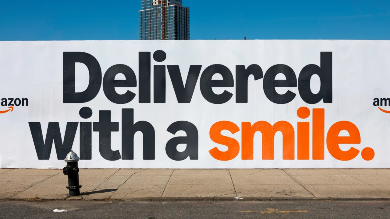
Supermarket giant Walmart unveils brand refresh
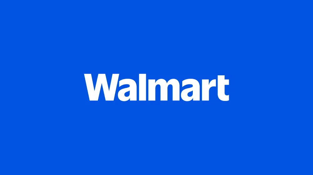
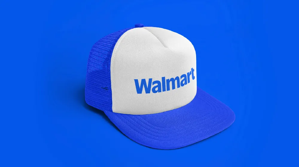
The new identity centres on an updated wordmark inspired by the founder's classic trucker hat and an evolution of the iconic blue and yellow colour palette.

For the first time in 20 years, Walmart has thoroughly refreshed its brand identity to demonstrate its position as a people-led, tech-powered omnichannel retailer.
Though we now recognise it as a global supermarket giant, Walmart started out in Bentonville, Arkansas, in 1951 with the same goal that it has today: to help people save money and live better. While this core sentiment remains, its brand identity has evolved to more accurately reflect what the retailer offers today, from affordable prices to digital and health services.
Rooted in the legacy of founder Sam Walton, the contemporary updates seek to show how Walmart continues to evolve for our customers while staying true to its founding principles. Building credibility and connection was one of the main goals of the identity, as it was better to communicate Walmart's convenient digital-first services and position it as a more modern, culturally dynamic brand.
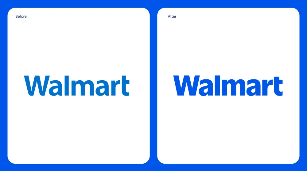
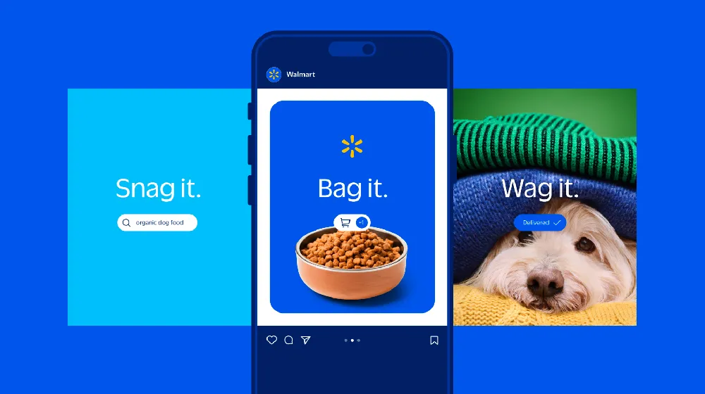

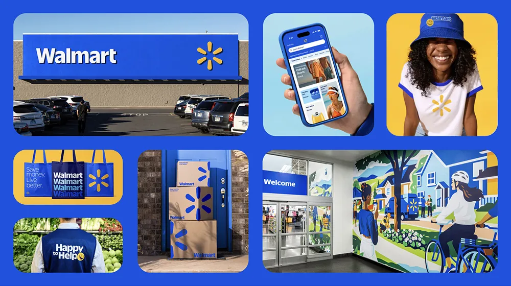
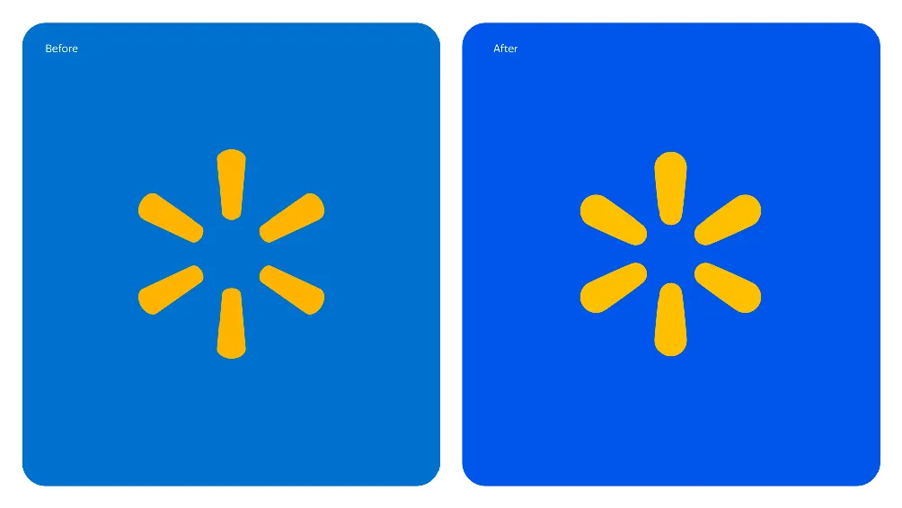
Walmart's updated wordmark is inspired by Sam Walton's classic trucker hat, which has been brought to life with a modern, custom font designed to differentiate Walmart from the crowd. The spark graphic is another asset optimised to convey Walmart's energy and act as a beacon that guides customers through all facets of the Walmart experience.
True blue and Spark Yellow are the hero hues in the colour palette, leaning on the retailer's most recognisable tones and its heritage of blue while ushering in new updates to keep the brand fresh.
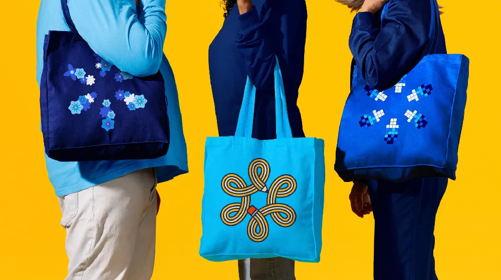
For the overall tone, Walmart wanted to come across as relatable, approachable, and representative of the millions of customers who shop there, whether conveyed through its brand voice, illustrations, or photography.
Walmart U.S. senior vice president and chief marketing officer William White says, "While the look and feel of our brand are more contemporary, our refreshed brand identity reflects Walmart's enduring commitment to Sam's principles and serving our customers however they need us. As our customers evolve, we will, too.
"Our Walmart will always be their Walmart, and our brand will always be a testament to how we innovate and change alongside them."

The redesign speaks to how heritage and innovation can coexist and also aims to save its customers and members time while enabling people to be healthier, build their wealth and strengthen communities and the planet.
"Walmart aims to be an inspirational, digital retailer that provides all the products, brands and services our customers need and want," says White. "This update, rooted in the legacy of our founder, Sam Walton, demonstrates our evolving capabilities and longstanding commitment to serve our customers of today and tomorrow."
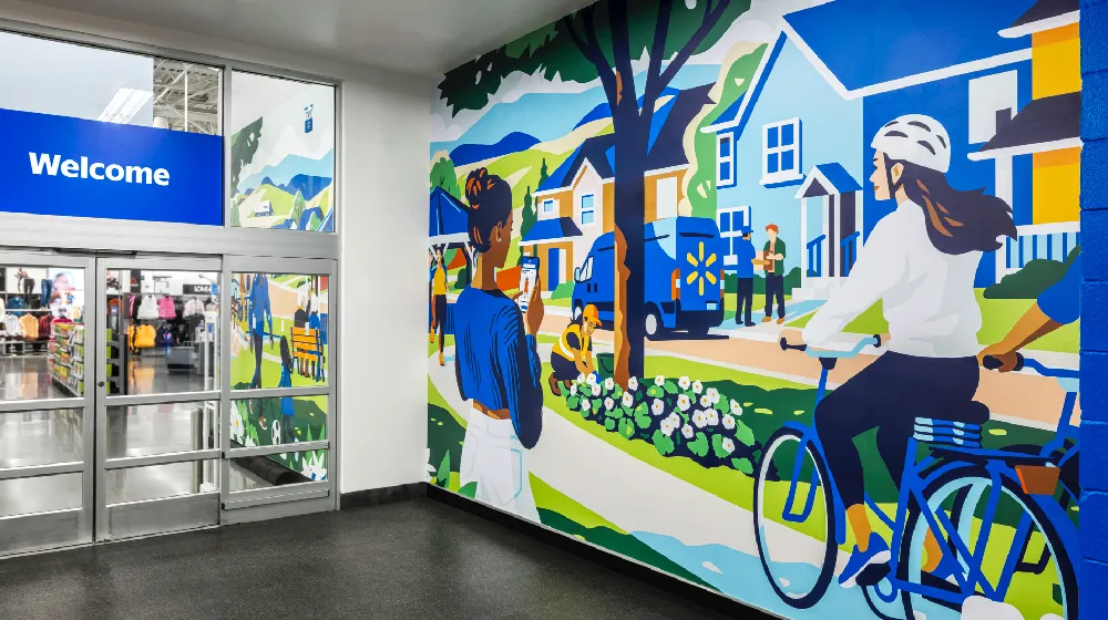
Walmart will apply the refreshed brand across various channels and customer touchpoints, from its website and app to its stores and new Home Office, which will open in Bentonville, Arkansas, in January 2025.
The rollout in physical stores began in October 2024 in Springdale, Arkansas, and the remaining stores will continue to be redesigned over time. The brand will also officially launch on Walmart.com, the Walmart app, across marketing campaign assets, and the corporate site in January, with the remainder of Walmart's assets rolling out throughout the year.
Editor's Picks





Trending






Latest Jobs
Junior Project Coordinator at Colorido Studios
Full-time·Twickenham·£28k–£32k
Senior Digital Designer at Red Antler
Full-time·New York·$95k-$130k
Senior Designer at Definition
Contract·London·£45k–£50k
Account Director at How&How
Full-time·London·£73k-£79k
Design Lead at Madeo
Full-time·New York City·$85k–$120k
Senior 2D Motion Designer at Art&Graft
Full-time·London·£50k-£65k