'Inclusive' men's grooming branding 'disrupts' traditional notions of masculinity
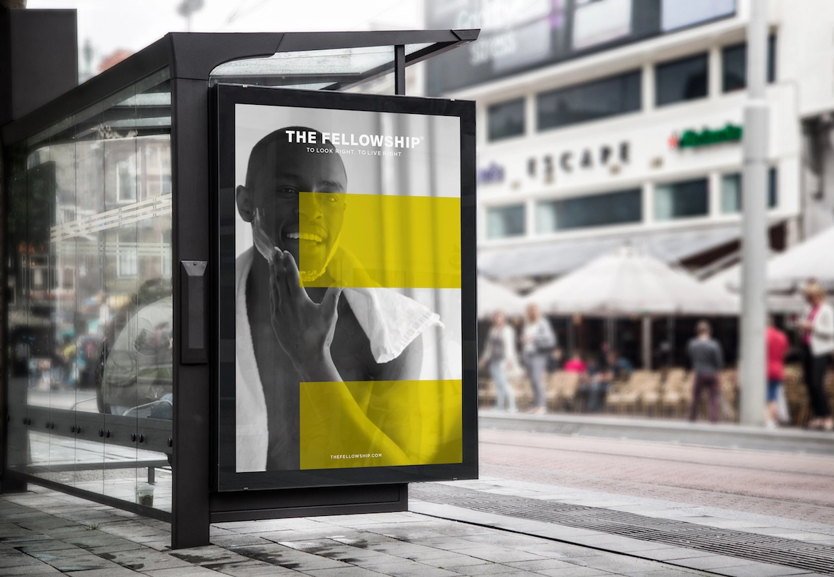
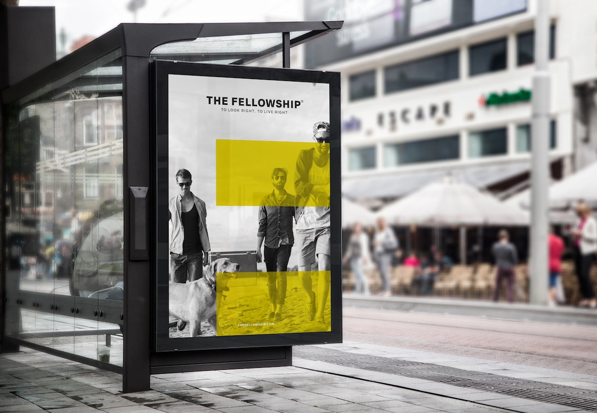
Creative agency Free The Birds has designed the brand identity for the newly launched, "inclusive" men's grooming brand, The Fellowship. Launched by model and entrepreneur Andrew Cooper and marketeer Duncan Morris, The Fellowship aims to "disrupt more traditional notions around masculinity," according to the agency, which worked across branding, packaging design, typography and tone of voice.
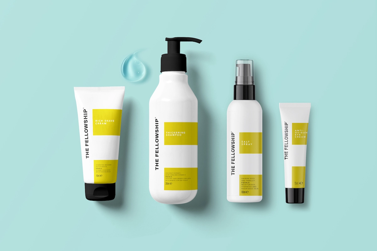
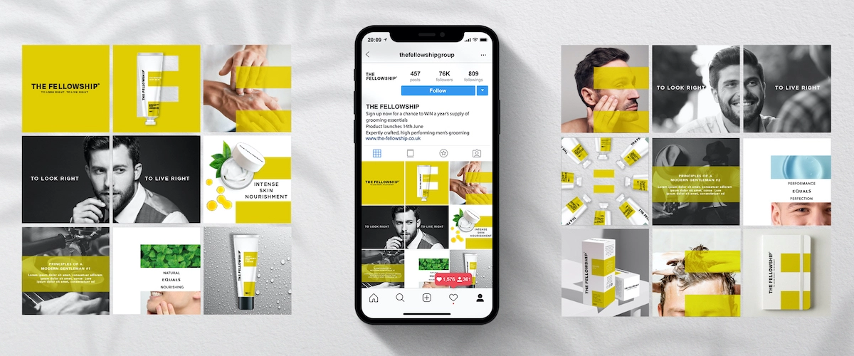
The branding looked to communicate ideas around "community and equality – what it describes as the 'ethos of the modern gentleman' – in an eye-catching and engaging way," says Free The Birds.
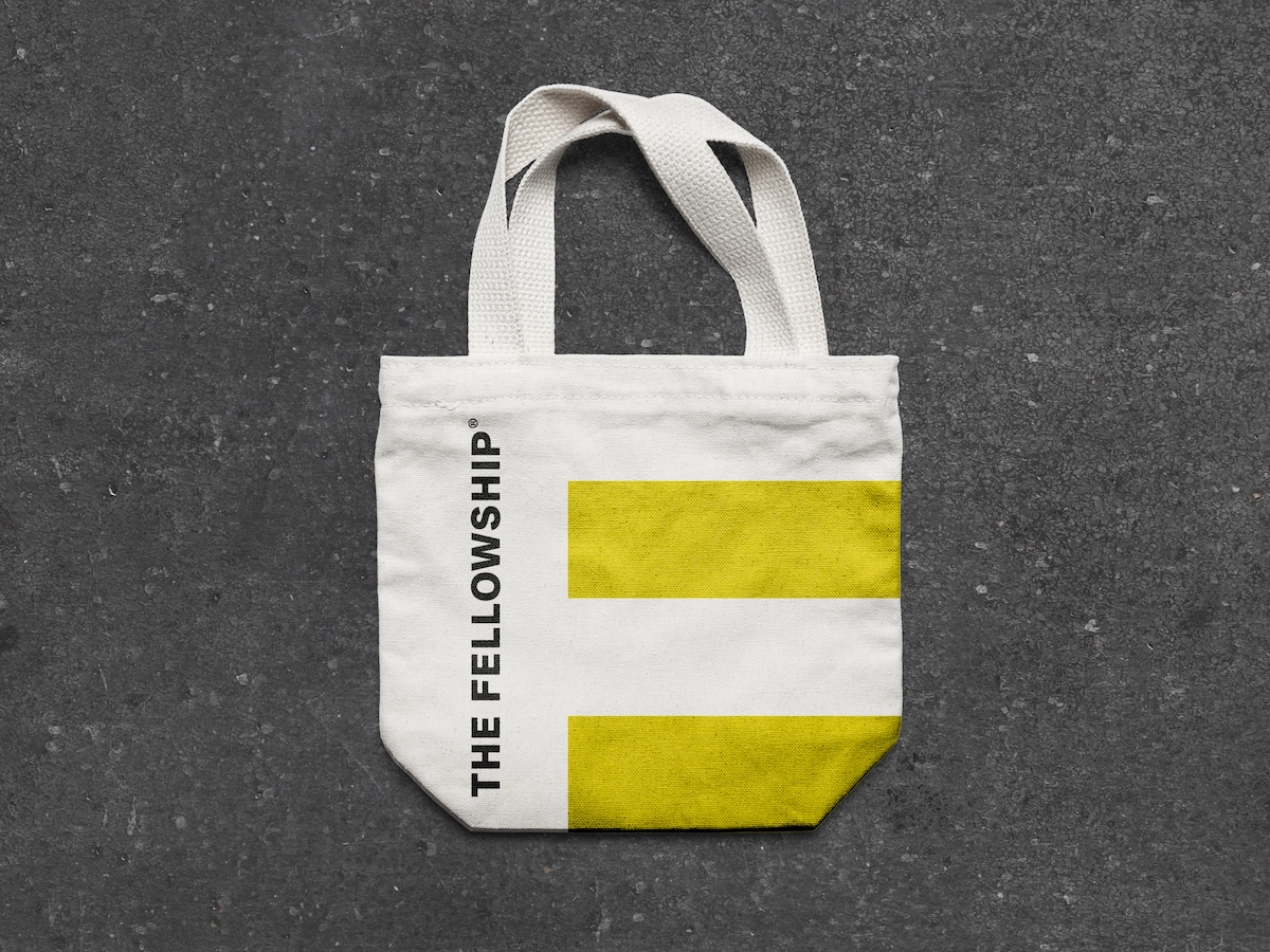
As such, the colour palette is based around a bold chartreuse in a bid to separate the brand from the typically rich, heavy tones associated with the category.
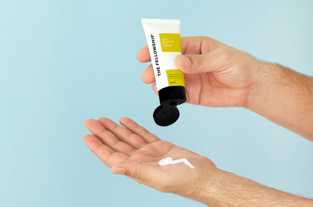

"The tradition with men's grooming products is to opt for greys, blacks and browns. But notions of masculinity are changing, and with that, our gendered preconceptions of colour," says Nick Vaus, creative director and partner at Free The Birds. "The bright, accented colour palette we've chosen conveys just the sense of modernism that The Fellowship and its target customers embody, and also ensures the products catch the eye of the customer straight away, which is particularly important for new brands entering this competitive category."
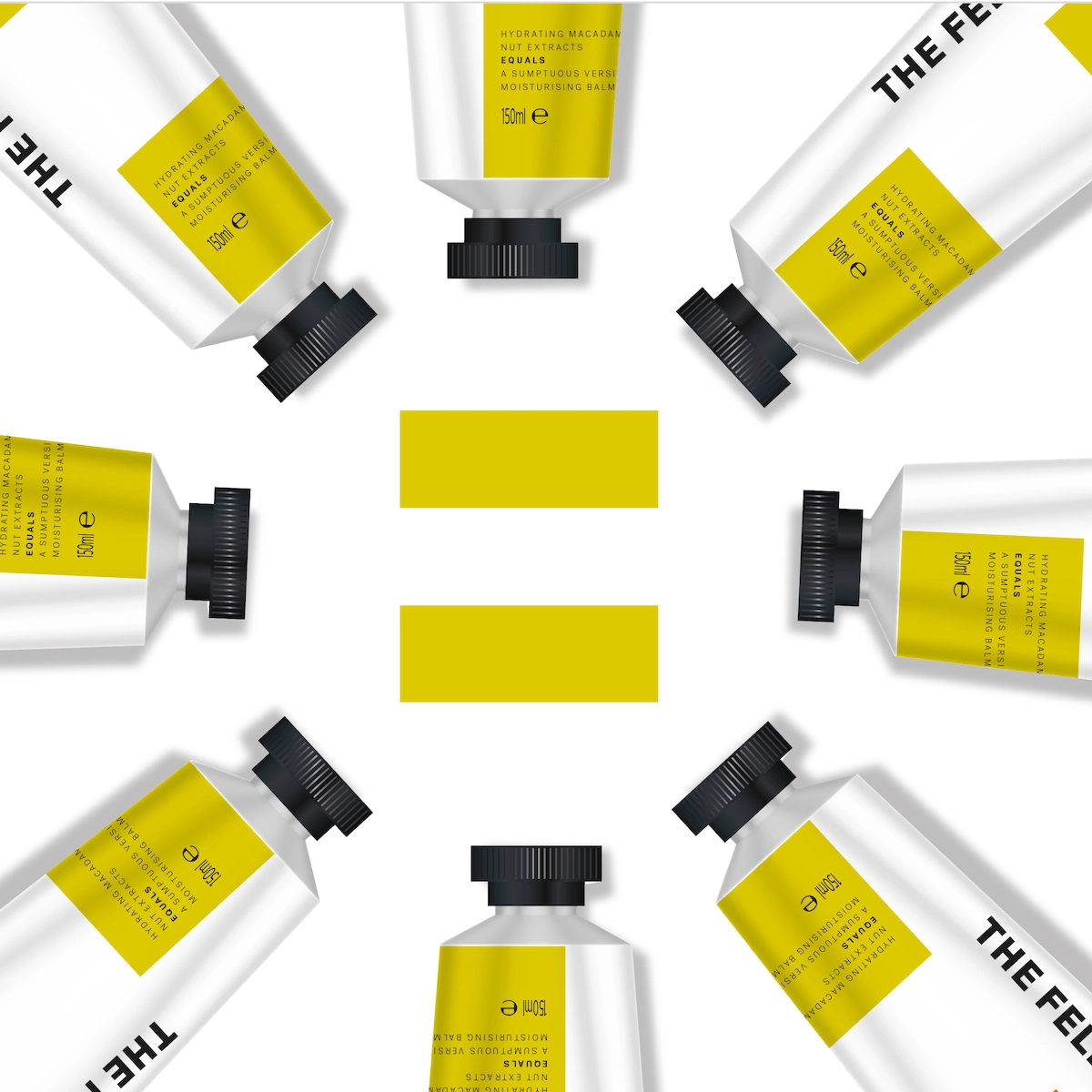
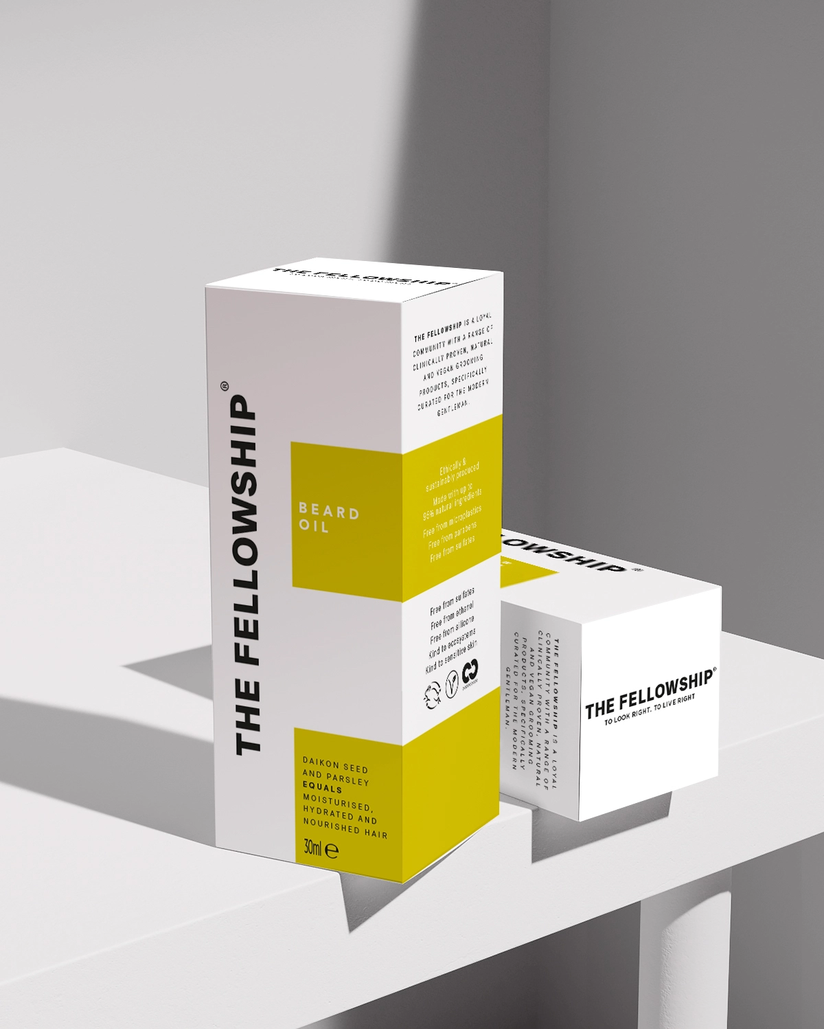
On each product, bold information labels are placed over a plain white background in the shape of an equals (=) sign. The symbol looks to communicate the brand's values around equality.
Labels use simple sans-serif typography to facilitate clear and direct messaging around each product's benefits, while the "equals" motif appears again in each description ("coconut extract…equals healthy hair growth").
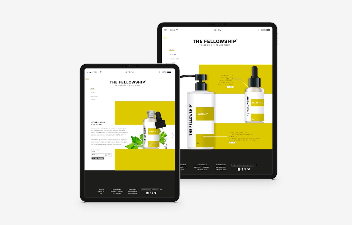
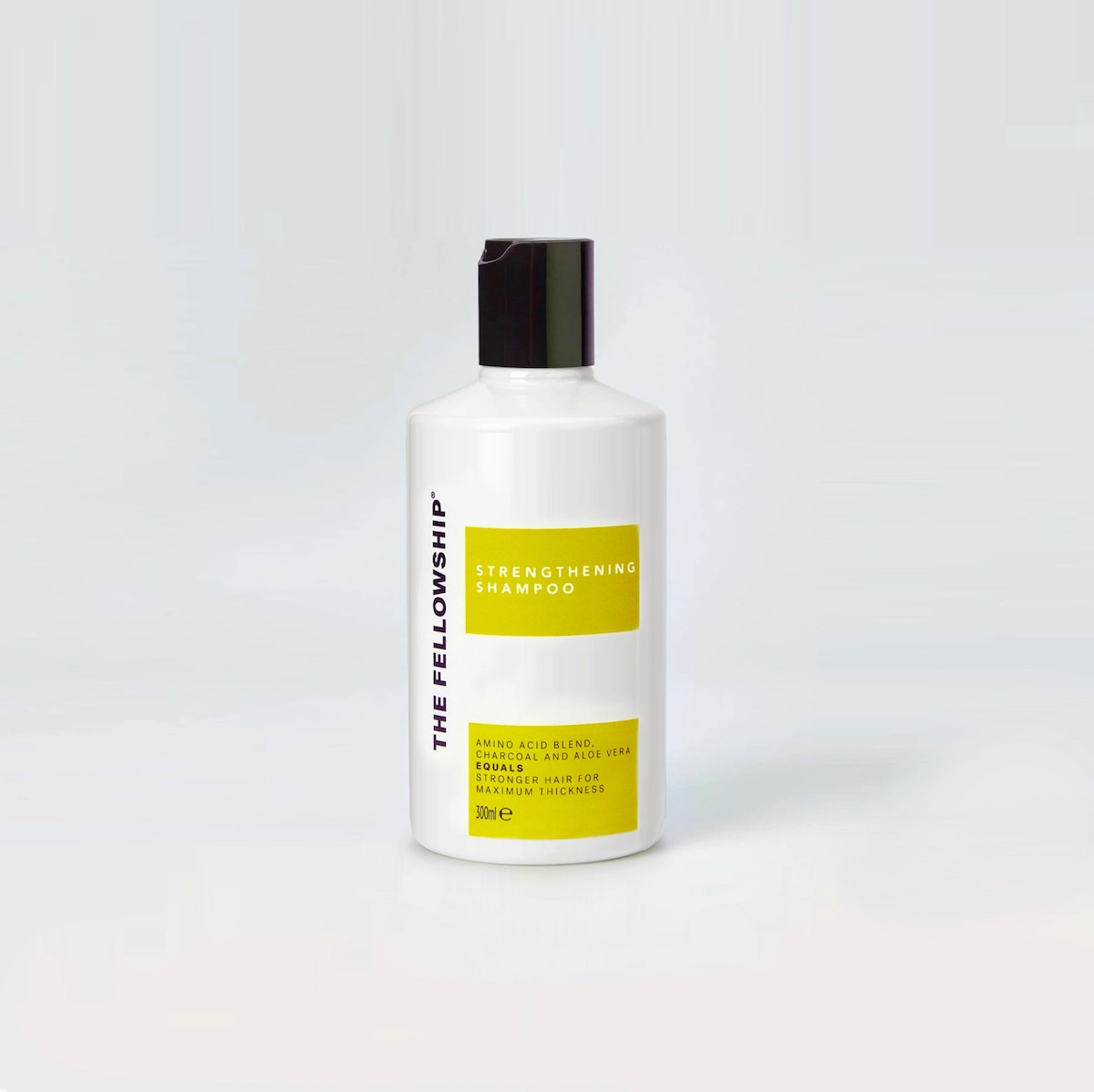
Black lids, pumps, and text work together to offer a more industrial feel to communicate maturity and quality. The Fellowship's name and logo are printed in bold black type along the side of each pack in the negative white space.
The brand identity will first appear on The Fellowship's "Essential Founders' Kit," which launched earlier this month and includes a body wash, body cream, moisturiser, shampoo, and conditioner, before being rolled out to more products later in the year.
Editor's Picks





Trending






Latest Jobs
Growth and Client Development Director at 3800
Part-time·Sheffield·£60k-80k
Brand Designer, Product Launches at Figma
Full-time·New York·$127k–$269k
Growth Strategist (Ecommerce) at Tribe
Full-time·Exeter / London·£50k + Bonuses
Account Manager at BUILDHOLLYWOOD
Full-time·London·£34k–£38k
Junior Project Coordinator at Colorido Studios
Full-time·Twickenham·£28k–£32k
Senior 3D Motion Designer at Art&Graft
Full-time·London·£50k-£65k