Hip Pop gets real with a punchy rebrand by Robot Food
Robot Food has reinvented the fizzy favourite with bold visuals, a no-nonsense attitude, and a flavour-first brand world fit for mainstream success.
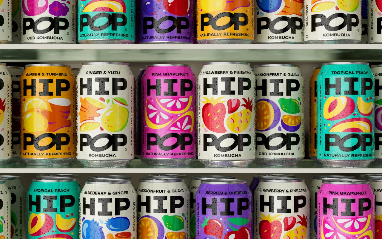
Leeds-based studio Robot Food has collaborated with soft drinks brand Hip Pop, rolling out a vibrant new identity that reframes kombucha and alternative sodas as unfiltered lifestyle drinks, not functional health fixes. Designed to shift Hip Pop from indie challenger to mainstream category leader, the rebrand certainly isn't short on flavour, character and attitude, yet it's grounded in Northern charm and honesty.
Launched in Manchester in 2019, Hip Pop gained a loyal following for its gut-friendly ingredients and bold taste combinations. But, in a soft drinks market saturated with pastel palettes and overworked wellness puns, founders Kenny and Emma Thackray realised the brand needed a new look – and a fresh mindset – to stand out.
As Emma puts it, "Robot Food has pushed us to create a new positioning that really sets us apart, and the new brand not only stands out but offers us the category leadership we hoped for." The full brand overhaul comprises a new strapline, packaging, tone of voice and identity system that embraces Hip Pop's real roots.

Popping off
The new brand platform, 'Best Enjoyed Live', positions Hip Pop as the antidote to sterile soda branding and invites consumers to embrace life in all its fizz and imperfection. From sweaty gigs to supermarket aisles, the identity speaks to a generation craving unfiltered connection and joyful experiences rather than another product that moralises their drink choices.
"Pop isn't heavy, it's quite the opposite," says Chloe Stacey, creative strategist at Robot Food. "So to be a category leader, they needed to harness this fresh perspective. Whilst the rest of the category adds to consumers' health stresses and worries, Hip Pop offers people a real lift."
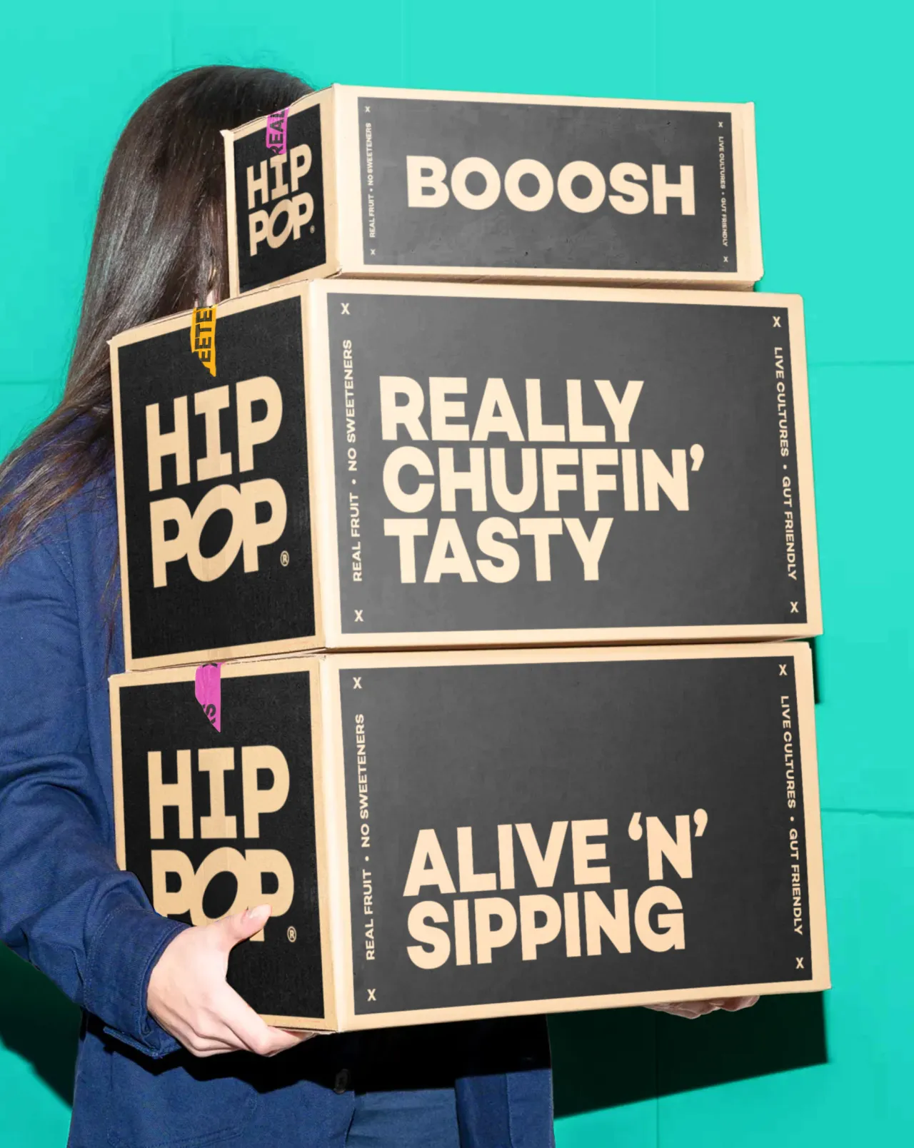
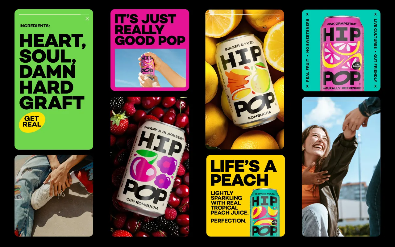
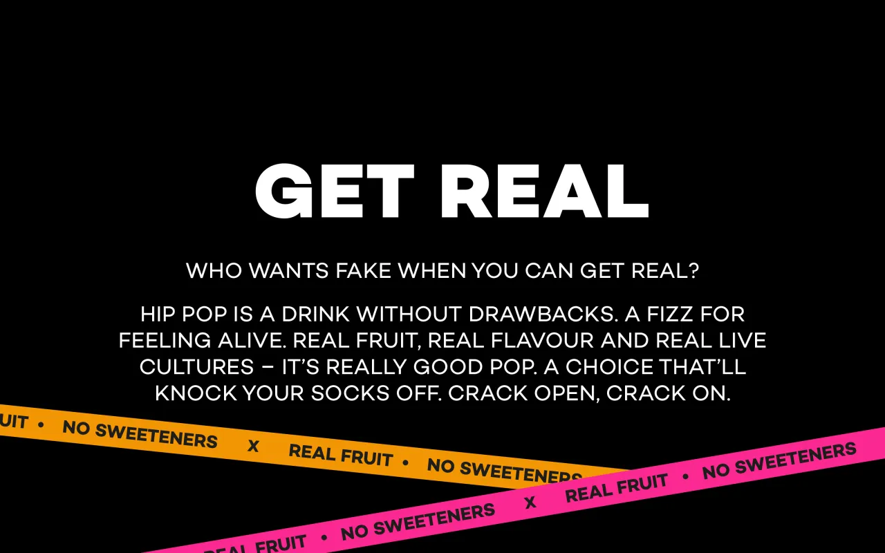
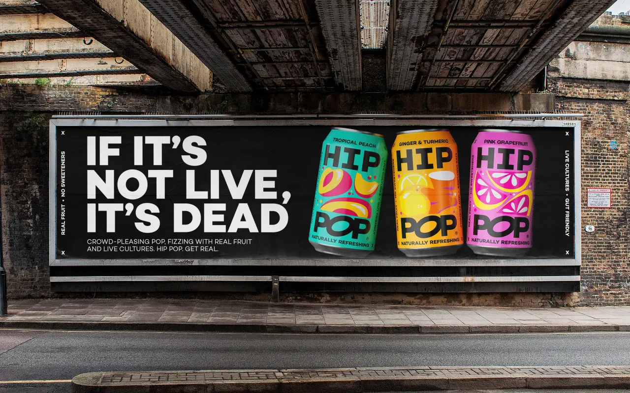
That sense of levity is captured across every touchpoint. 'Get real' isn't just a strapline – it's a full-blown mindset, reflected in everything from the frank messaging ("pop that won't preach") to the confident, slightly tart tone of voice. It's refreshingly blunt in a market full of vague virtue.
A new visual identity with bite
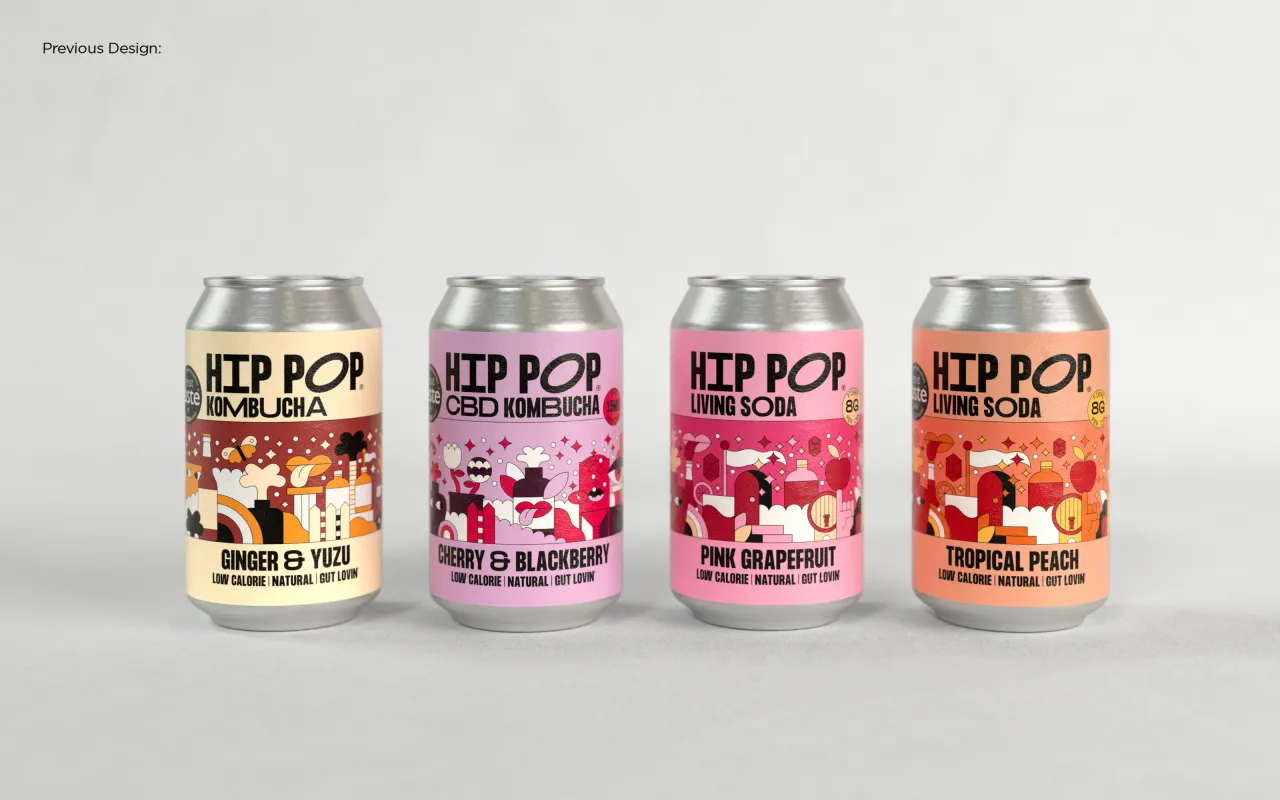
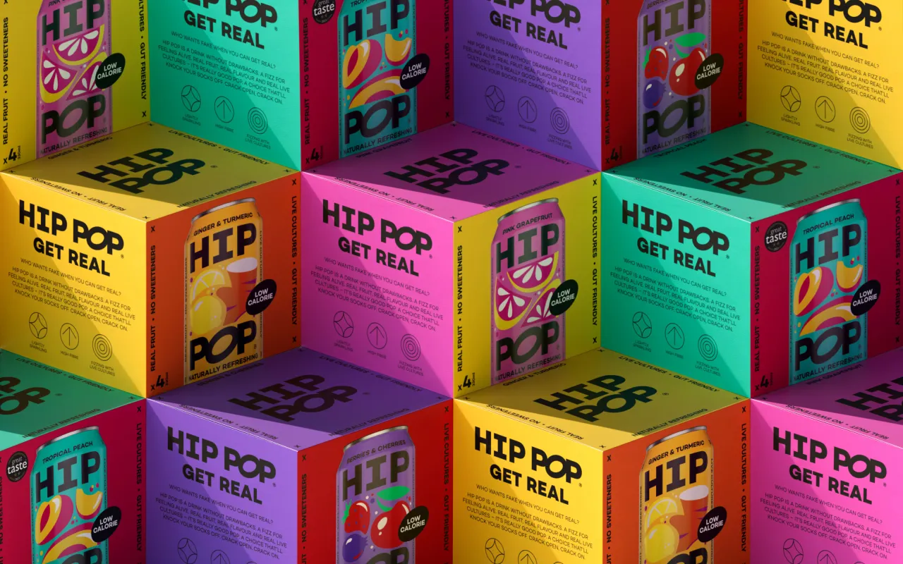
The visual shift is equally arresting, as Robot Food opted to ditch the old indie-craft cues and delicate colourways in favour of a design system built to pop. Black dominates the new look – a rarity in the health drinks aisle – with vibrant fruit illustrations and flavour-coded colours punching through the darkness.
It's a confident, instantly recognisable palette that helps consumers distinguish between kombucha, CBD variants and sodas.
Craig Lindsay, senior designer at Robot Food, explains: "We wanted to take Hip Pop from a challenger to a category leader and very much lead with the brand name.
"Splitting it over two lines maximised impact and created visual consistency while making flavour the centre of attention."
That attention to detail extends to the wordmark, where the distinctive 'O' – a nod to the brand's gut-health origins—adds a subtle layer of meaning without relying on overused kombucha tropes. With Manchester's vibrant music and arts scene as a creative backdrop, the whole brand pulses with energy.
No fluff, just fizz
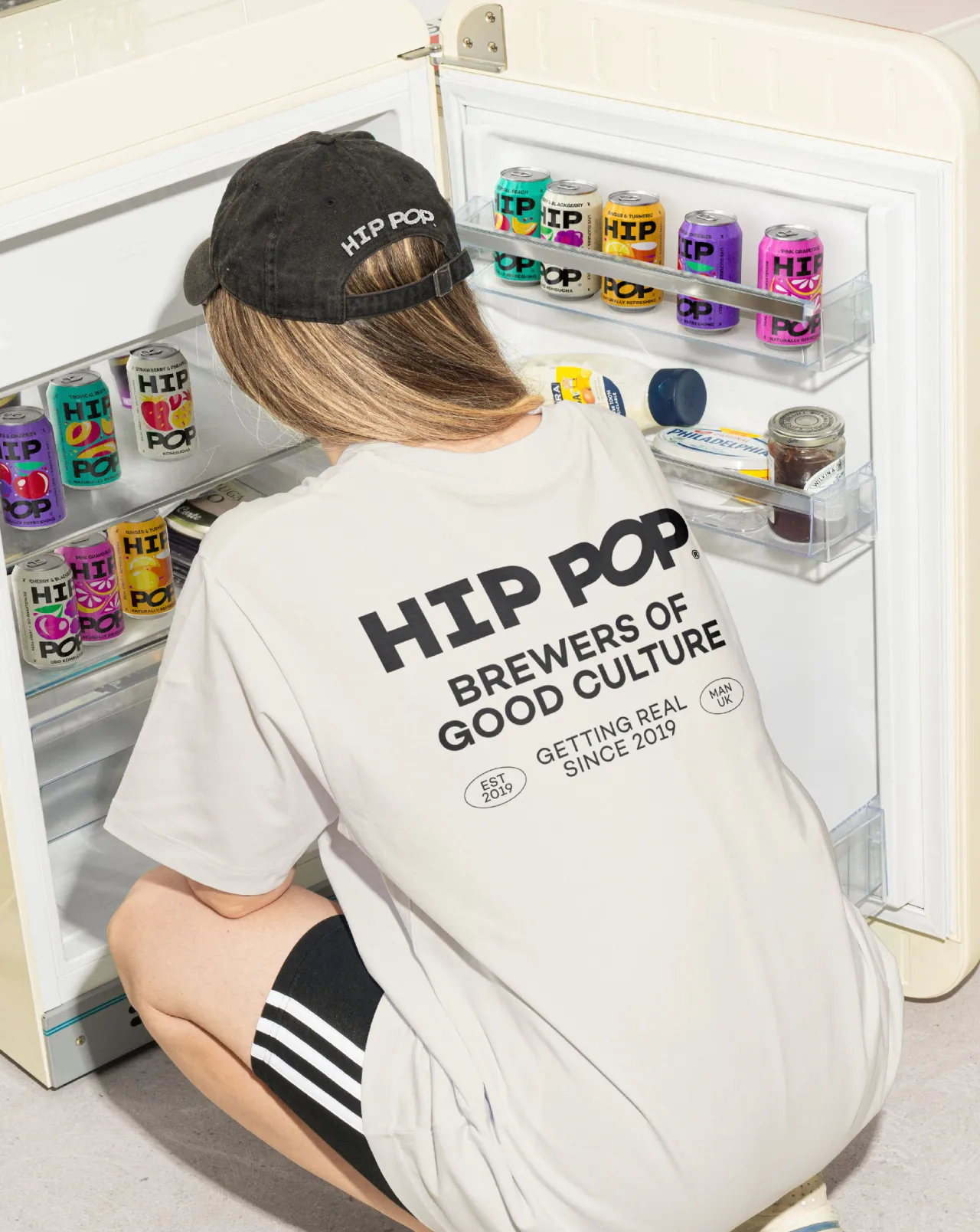
Robot Food also dialled up Hip Pop's northern roots in its verbal identity, rejecting hollow health promises for something far more honest—and far more fun. The copy is bold, real, and delivered with a knowing smirk.
"Hip Pop's tone of voice is straight-talking and slightly tart—just like the drinks," says Stacey. "Rooted in the founders' no-nonsense northern spirit, it's honest, self-deprecating, and refreshingly unfiltered."
That approach has already paid off. Since launching in February, the rebrand has helped unlock key new retail partnerships and expand Hip Pop's footprint in-store and online. It's not just about gut health anymore – it's about becoming the go-to drink for real people and real moments, from festivals and co-working spaces to down the local.
And there's plenty more fizz to come. With a brand built for expansion, Hip Pop has big plans—including entering the US market and extending its reach beyond drinks into experiences and culture. "They'll soon be everywhere, but they'll feel like they're part of the furniture," says Stacey.
Editor's Picks





Trending






Latest Jobs
Brand Designer at Adfin
Full-time·London·£30k–£50k
Senior Designer at Definition
Contract·London·£45k–£50k
eCommerce Web Designer at on/Sight
Full-time·$75k–$95k
Senior Designer at Jubba
Full-time·London·£50k-£60k
Design Director, Opinion at The New York Times
Full-time·New York·$160k–$180k
Creative Social Content Producer at Bompas & Parr
Contract·London·£32k–£40k