Robot Food's design overhaul of Urban Eat injects some life into the food-to-go aisle once more
When you think of readymade sandwiches on the supermarket aisle, what springs to mind? Uninspiring perhaps? Dull and drab? In which case, Leeds studio Robot Food is about to whet your appetite with its new identity and packaging design for Urban Eat, the Samworth Brothers' food-to-go range.
Urban Eat approached Robot Food to overhaul its brand and create a "vibrant" identity that "amplifies new and familiar flavours and inspires consumers looking for unique and exciting lunchtime offerings". As such, the new look hopes to "implode" the sector with bold, high-energy designs that "shake up" this particular corner of our shop aisles and "shatter the preconceptions of what 'grab and go' can be," as the Leeds studio explains.
"Everything we did from the visuals and tone of voice is about breaking people out of lunchtime zombie mode and their regular habits," says Robot Food's creative strategist Natalie Redford.
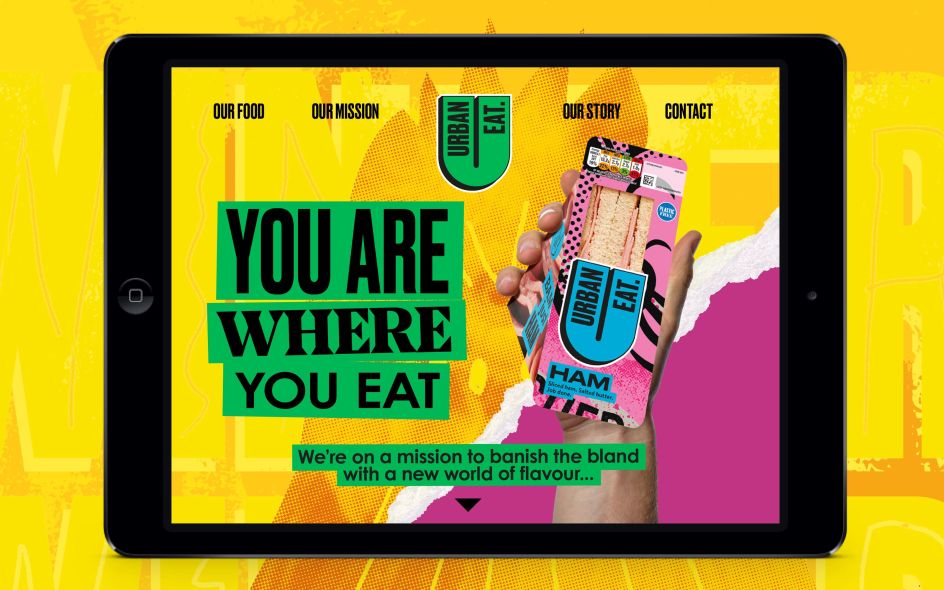
The studio also wanted to create a more emotional connection with Urban Eat, tapping into the brand's story and getting behind the notion that "you are where you eat". The resulting identity is therefore unorthodox in terms of its textures, fonts, styles and colours – tapping into city communities. “The urban environment is about a rich mix of styles and colours, characters and cultures,” says Simon Forster from Robot Food. "We were visually and verbally trying to translate how eclectic people are in cities and harness that vibrancy to represent everyone who buys Urban Eat."
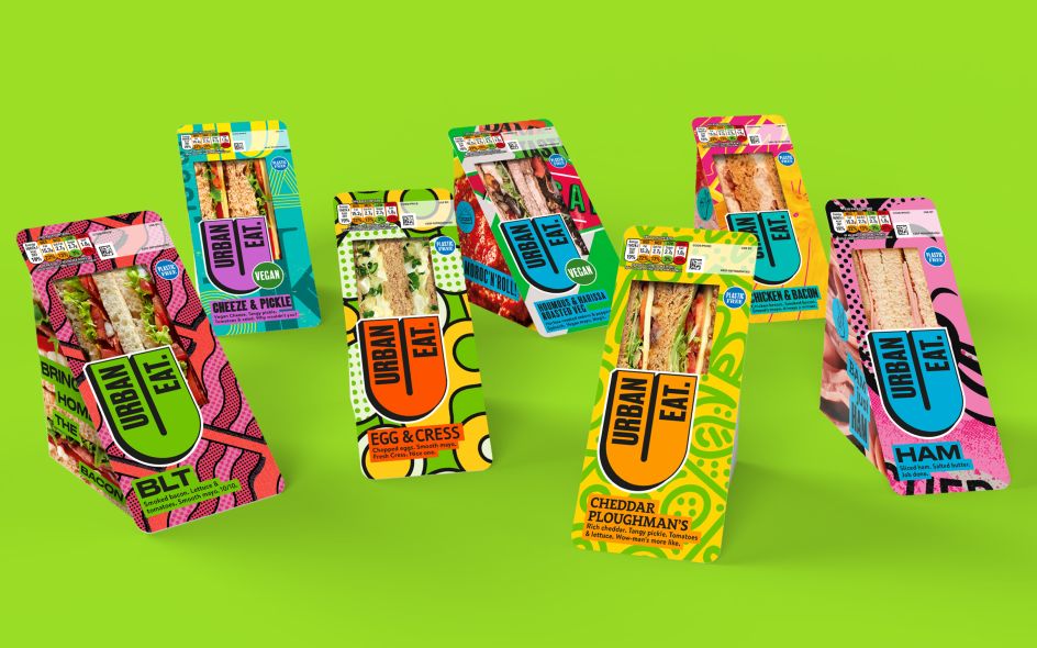
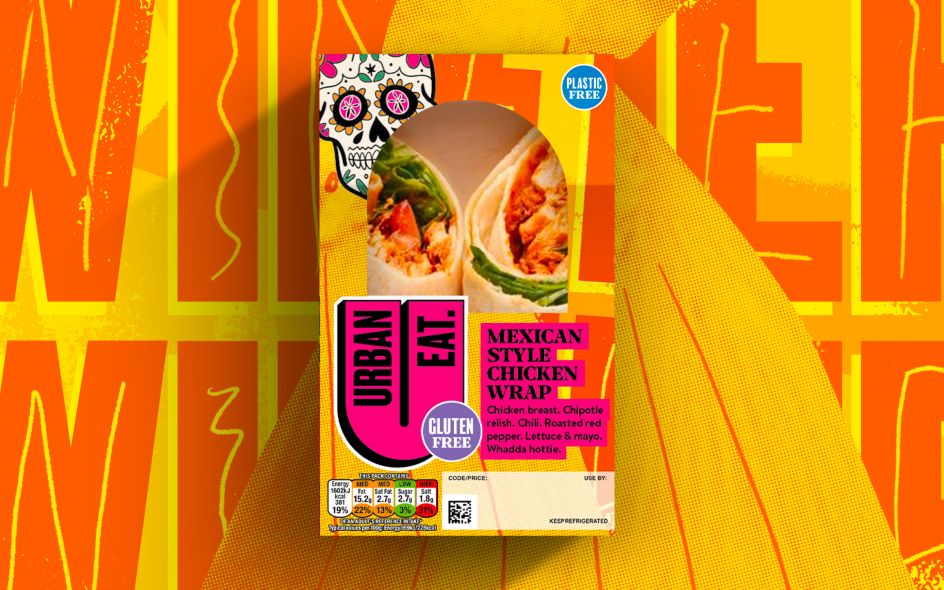
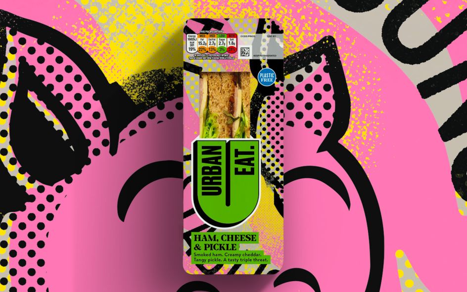
Looking across the Urban Eat range, Robot Food played on the various existing flavours with bright and bold colours, interesting pattern designs and illustrative elements, all pointing to ingredients. It's just a hint at what's to come. "The ambition is to become this really exciting, innovative brand," explains Redford. "But in the short term, they still have to big up a cheese sandwich – sometimes it's the only thing that hits the spot."
The main challenge, though, was to create an identity that is "colourful and crazy but tasty and approachable," as Chris Shuttleworth puts it, the senior designer who helmed the creation of all illustrations in-house.
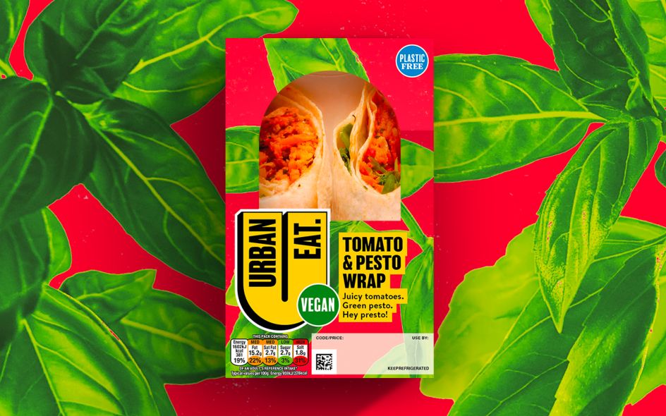
In fact, the illustrative styles play a key role in the Urban Eat brand, used on-pack to "heighten the sense of excitement and dynamism of the range and create a rich brand world", and also to help with the navigation of the range with added traditional, familiar cues such as pink for ham and yellow for chicken. Styles range from textured patterns to Memphis-like repeating shapes to Keith Haring-style line drawings, Matisse-Esque cutout effects, colour-washed photomontage, type-led graphics and more.
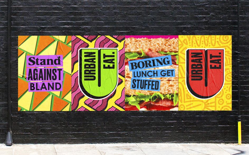
The side of the packs also uses vibrant pop-art style photography of key ingredients with punchy slogans to "add a touch of the unexpected," according to Forster. "It's going into a category with fresh eyes and shaking it up – it's a dream job. Our design is more akin to a craft beer than a sandwich."
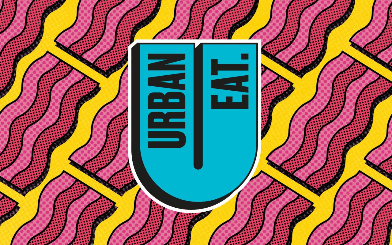
Looking at the new master logo, it's set in a bright yellow tone with a dramatic drop shadow, while secondary logos are used in any colourways. A suite of ten fonts only adds to the eclecticism, including a mix of Druk, Century Gothic and Balboa for title fonts; and Brandon for body copy. These fonts are used in any combination across packaging and branding applications.
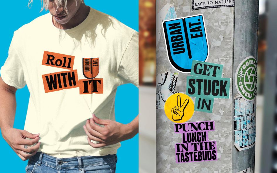
What's particularly fun about this project by Robot Food is its straightforward tone of voice that gives a nice tongue-in-cheek type feel with phrasing that's packed with puns.
"We wanted the copy to be as strong and different and ownable as the design," says Lizzie De Jong, Robot Food's copywriter. "There was nothing that stood out in similar products; the language was either very frilly or very basic. The copy needed attitude but without feeling forced or cliched: getting rid of all those empty adjectives that don't mean anything, being 'foodie' in a way that feels down to earth and real and approachable. "It was about being celebratory around the food and giving people permission to explore."
Urban Eat's new brand by Robot Food is rolling out now and can be found on 'grab and go' shelves at Moto, Welcome Break, Londis and Budgens.
Editor's Picks


Trending


](https://www.creativeboom.com/upload/articles/90/908fdb6378db1e95d12595416f54e6336d5e80b8_732.jpg)
Podcasts


Editor's Picks
Further Reading