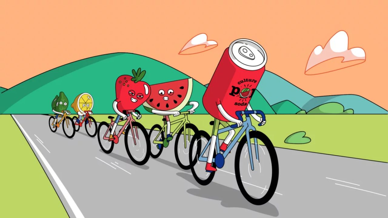
Culture POP shakes up how people view soda with edgy cartoon characters
Probiotic soda company Culture POP has teamed up with Barcelona-based animation studio Niceshit to add some fizz to people's flat perception of soft drinks. And they've done it with the help of characters inspired by adult cartoons.
Soda has been around since the eighteenth century, but it's fair to say that the drink has lost some of its sparkle in that time. Fears surrounding the ingredients have caused people to become wary of soda, but that shouldn't be the case. That's the mission statement behind Culture POP, a soda brand that wants to reposition the drink and remind customers that it isn't bad. It's all about what you put into it.
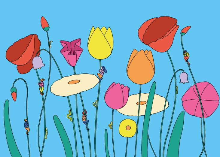
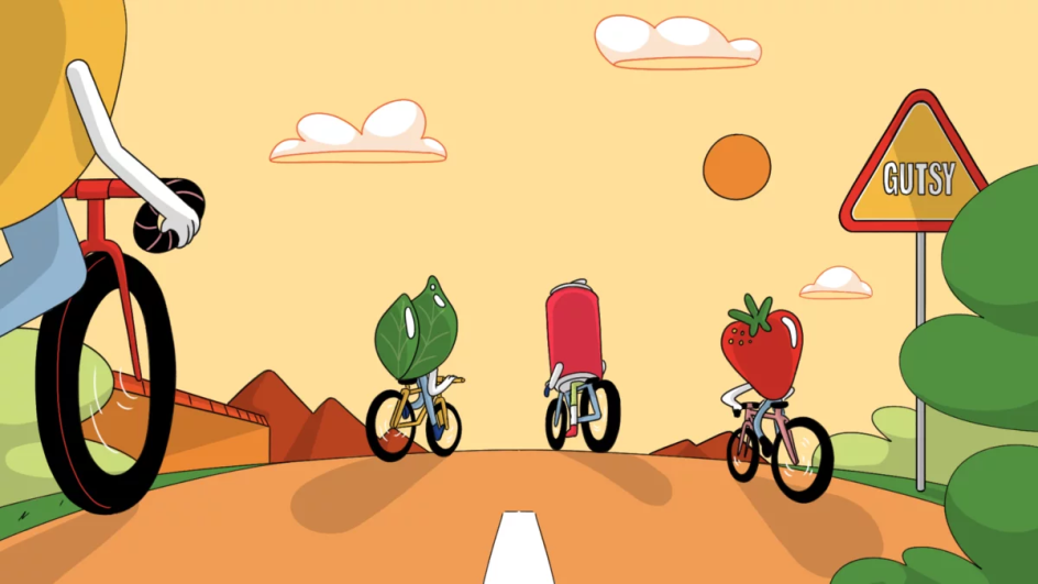
To do this, Culture POP has enlisted the help of Niceshit and Boston-based creative studio Fair Folk. Together, the three developed a new look and feel for soda and put their case for the drink across via edgy cartoon characters and animated shorts where all the ingredients (not to mention a Culture POP can) embark on wholesome activities like cycling and skydiving.
Bursting with colour and blessed delightfully fluid motion, these animated spots are a joy to watch. Not only that, they're wrapped up with the tagline cum play on words' good for you, soda', which cleverly encapsulates both the idea that soda can be healthy and that the drink is enjoying a positive change.
When it came to repositioning soda, Niceshit creative director Guido Lambertini tells Creative Boom that its brief was fairly open. "There were a few key messages that we needed to communicate: this soda is doing something new, it is made with natural fruits and spices, and that is fizzy and delicious," he reveals.
Fair Folk were on hand to help devise the script, and together they created two "mirror episodes" where the fruity ingredients and the soda can go on a little adventure before being plucked out of a chiller cabinet and heartily downed.
"When working on campaigns like this one, we really like to make sure each episode has a similar structure and momentum," Guido adds. "This helps to make the brand recognisable by the campaign. It's fun, modular, and can be applied to other flavours with different adventures!"
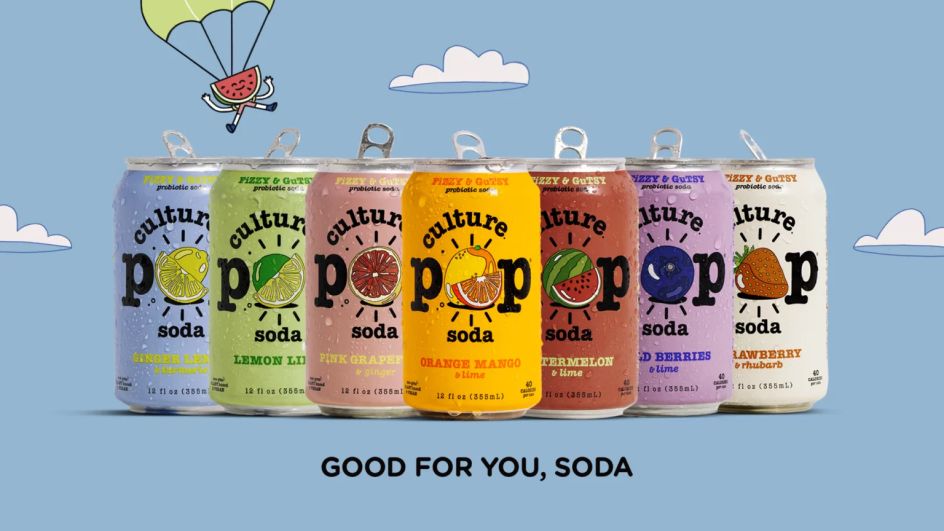
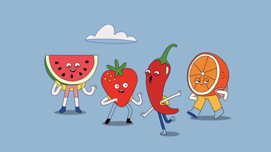

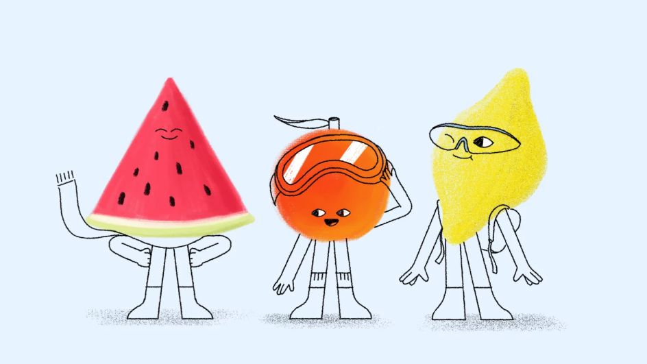
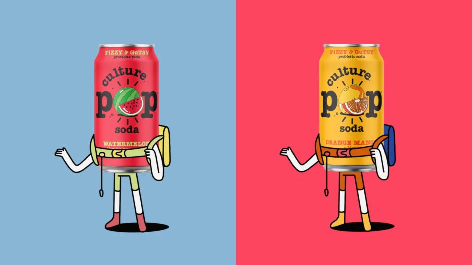
Speaking of the flavours, the ingredients themselves are just as much the star of the show as the Culture POP can itself. Taking their lead from the lemons, limes and watermelons that make up a can of Culture POP soda, these characters see fruits adorned with faces overflowing with personality.
"The character process was tricky, yet super fun," Guido explains. "We explored many ways to go, including starting with a more textured, brush-style approach which mixed colourful bodies with limbs drawn with simple black lines. It looked really cool and placed all the attention on the cans and the fruits, leaving the rest of the body to be seen on a second viewing.
"We even tried realistic 3D cans. This would have been cool, but we finally moved to a more vector-looking aesthetic inspired by all the illustrated fruits and spices depicted on the Culture POP cans themselves."
He adds: "Everyone on the team is a huge fan of all the amazing cartoons (both for adults and kids) that have come out in the past 20 years, from Adventure Time, Regular Show, Rick & Morty and so on. We've wanted to do something in this style forever, and this seemed like the perfect opportunity!"
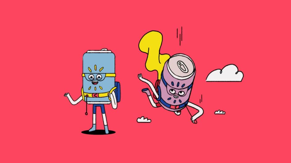
And while designing the characters of the ingredients was fun, the soda can itself proved to be a bit of a hurdle. This was because the facial features would have had to sit where the most important piece of a brand's real estate tends to live, so instead, it was decided that it should go without.
"The biggest challenge was to tell these stories when one of the main characters didn't have a face," says Guido. "It was a bit of a push and pull while we were looking for different solutions, but the face was right where the logo was, so we lost that battle."
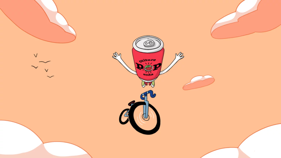
"This being said, having the characters be as expressive as they could was a great challenge. We played with body language, key poses and arm movements so the viewer didn't feel something was missing. We think it worked out very nicely."
It's a clever creative solution to a technical problem. But will they help to change how people view soda? "This might be too much of a responsibility!" laughs Guido. "But I think seeing a can of soda hanging out with all these fruits and spices is what will make people look at this product differently."
Editor's Picks


Trending


Podcasts


Editor's Picks
Further Reading