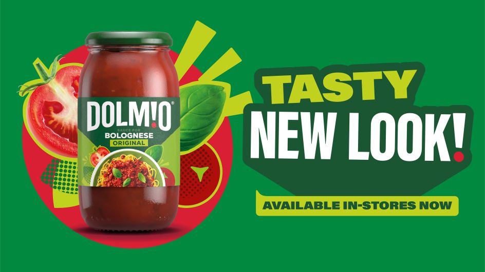
Elmwood's fun new Dolmio branding captures the joy of Italian cooking
Global brand and design consultancy Elmwood has today unveiled its bold new identity for Dolmio, which aims to attract a younger audience and celebrate the generous spirit of Italian cuisine.
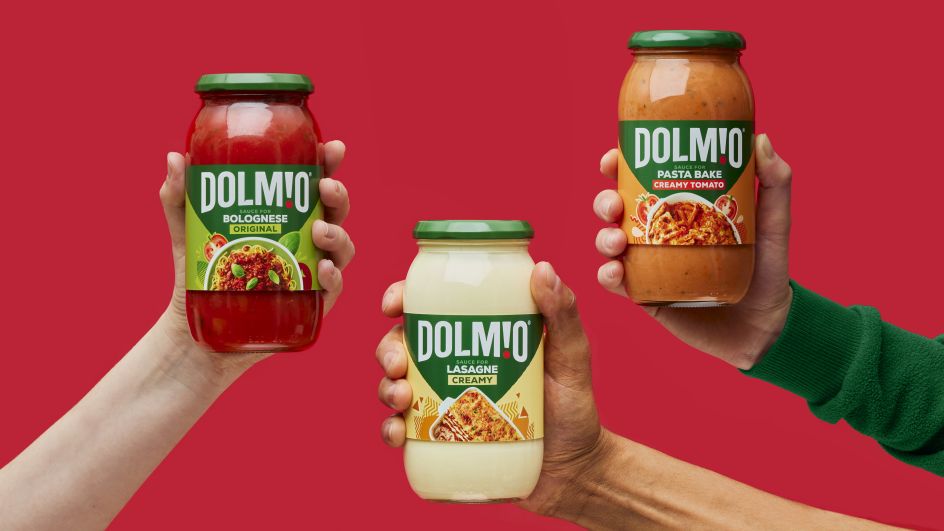
More likely than not, shoppers in the UK will be familiar with Dolmio. The Italian-themed jars of sauces have become the go-to choice for shoppers looking to whip up a spaghetti bolognese or cook a delicious creamy linguine. And thanks to the help of an accompanying puppet family, the brand has effectively managed to maintain its place in the nation's heart.
No good brand stands still for long, though, including Dolmio. And for its latest rebrand, the company wanted to strengthen its foundations and reach out to new demographics who may not have given its sauces a go, namely younger millennial and Generation Z customers.
To do this, Dolmio teamed up with Elmwood to create a full visual identity refresh. It included the development of new graphics, messaging, photography and voice, which will give Dolmio the tools to be more flexible and exciting, crucially allowing it to better engage with customers online. After all, that's where the young audiences they hope to reach spend most of their time.
The development of this new identity involved some surprising market research from Elmwood, which found that customers love the Dolmio brand but feel that the way they cook with its sauces has changed. Whereas before, most people just poured it on and stirred it an – as the label directs – now shoppers were more likely to be experimental and not stick rigidly to traditional Italian flavours.
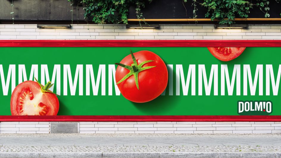
With these findings in mind, Elmwood wanted its new Dolmio brand design to tap into a desire for freedom and fun. "While the new brand identity includes flashes of Italian heritage – for example, the red, white and green colouring on the packs – this has been done in a completely modern way, shifting the focus from provenance to delicious and eclectic taste," it explains.
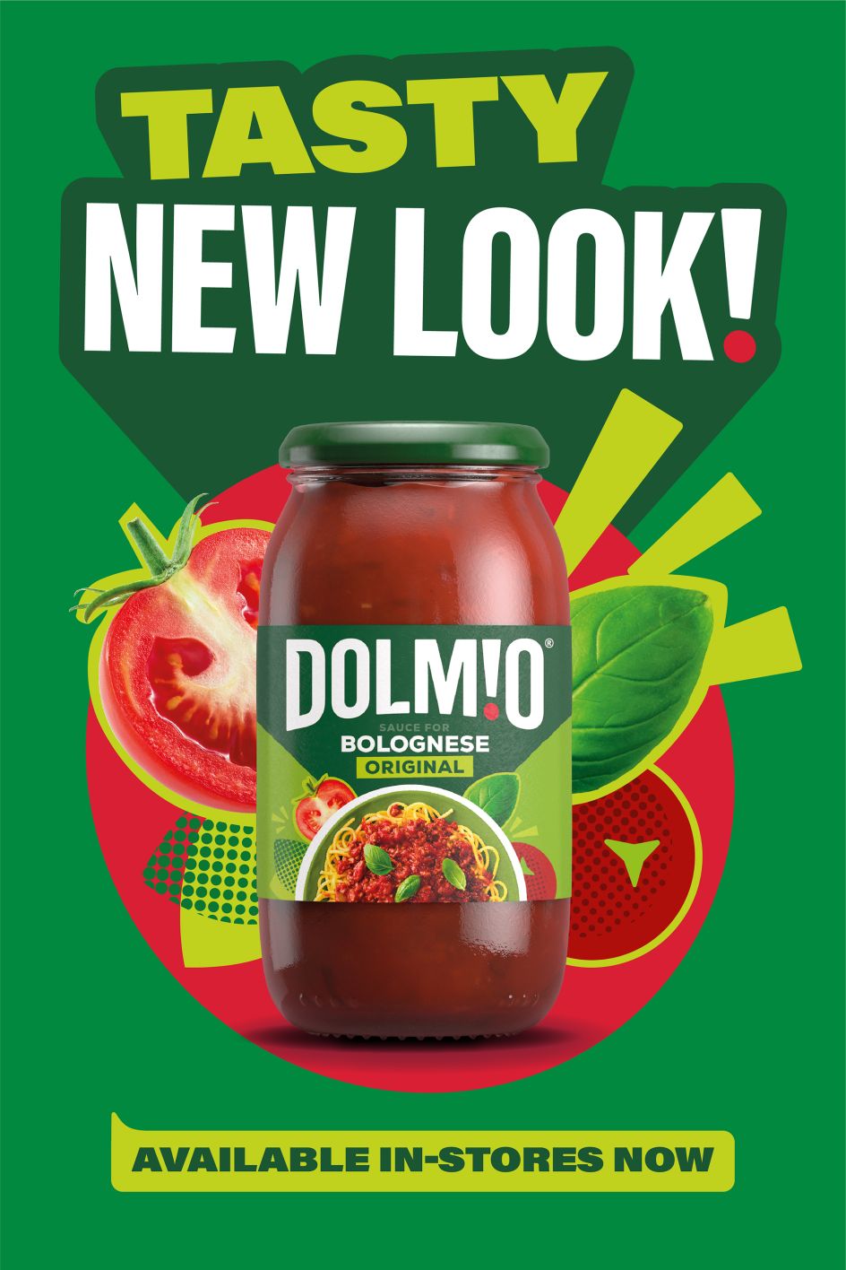
Perhaps the most significant departure in the whole rebrand is Dolmio's new word mark. Standing apart from its previous version and the world of pasta sauces in general, the new word mark aims to capture the joy and community people feel when rustling up a big, hearty Italian meal for their friends and family.
It takes shape as an exclamation mark, the perfect embodiment of excitement and warmth. Along with its red dot, the exclamation mark acts as a lens into the world of Dolmio by providing an overhead glimpse of people and their meals or a close-up shot of a simple fork getting stuck into some delicious bolognese sauce.
Accompanying the exclamation mark is a new shape to the lettering itself, namely the counters of the letter D and the flicking of the letter L. These gave the designers room to morph the letter shapes into speech bubbles so that it looks like the brand is talking to the customer directly as they scroll onto it on their phone screens.
Commenting on Dolmio's refreshed brand identity, Elmwood's global provocation officer, Greg Taylor, said, "Through our partnership with Dolmio, we've reinvigorated its brand identity with new, distinctive brand assets that create the perfect balance between 'Big Heart' and 'Great Taste'.
"Dolmio's heart comes from the generosity, accessibility and inclusivity of its brand identity, offering people the freedom to use the sauce how they want. But its big heart doesn't come at the expense of great taste. It's been a pleasure working with Dolmio to reinvent branding in the pasta sauce market."
Editor's Picks


Trending


Podcasts


Editor's Picks
Further Reading