Mindful Chef unveils a new brand refresh by Mother Design
Building on its recent overhaul by Ragged Edge, Mindful Chef has unveiled a new brand refresh by Mother Design, expanding its identity with a more expressive, editorial and craft-led approach.
Mindful Chef has unveiled a brand refresh today, created in partnership with independent branding and design studio Mother Design. It marks the next evolution of the UK's premium healthy recipe box service.
In all honesty, it doesn't feel that long ago since Ragged Edge overhauled the identity, sharpening Mindful Chef's positioning and visual clarity in a crowded meal-kit market. While this latest refresh builds on a solid foundation, much has changed since those early post-pandemic days. Mother Design was appointed to expand the brand world into something more expressive and craft-led, with an editorial approach that puts health, provenance and chef-quality cooking firmly back in focus.
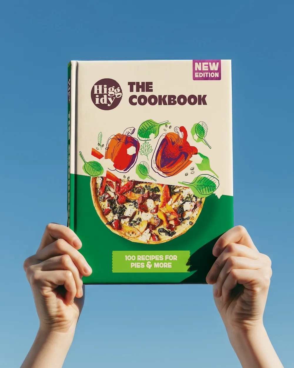
The project is a complete brand system refresh, spanning identity, typography, colour, photography, layout, motion and tone of voice. Mother Design's brief was to move Mindful Chef away from category conventions that prioritise speed and convenience, and towards a richer expression of care, quality and the joy of cooking. It fits the lipstick-effect moment, too: consumers trading big-ticket purchases for smaller everyday luxuries, with food chief among them.
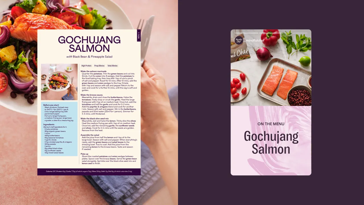
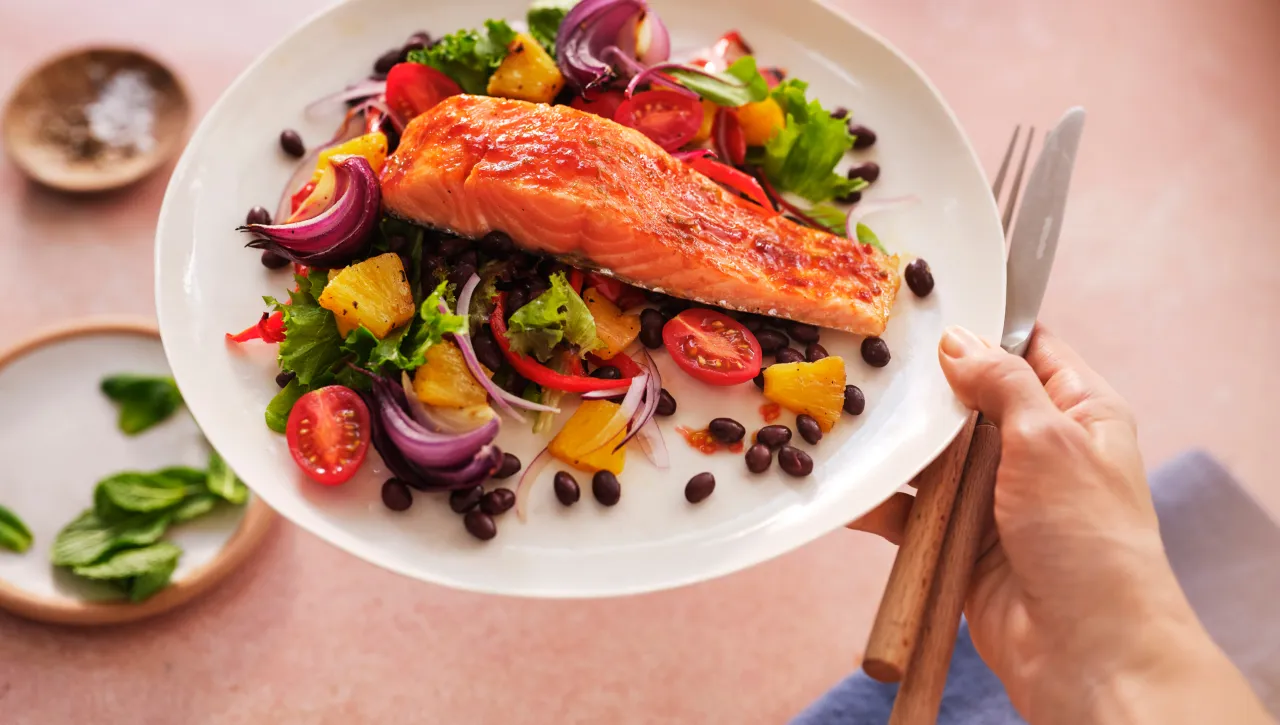
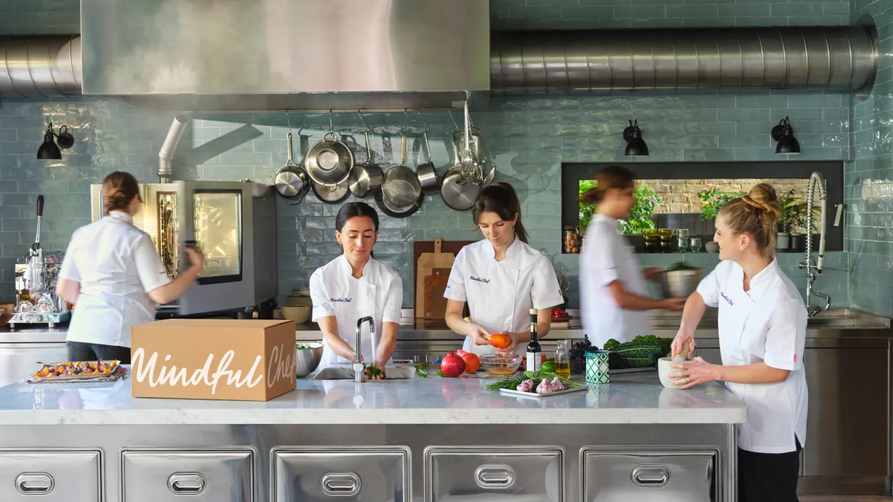
Visually, the studio has deliberately stepped away from familiar meal-kit tropes such as overhead food photography, flat lighting and dense, information-heavy layouts. Instead, the new identity draws inspiration from contemporary cookbooks and food editorial.
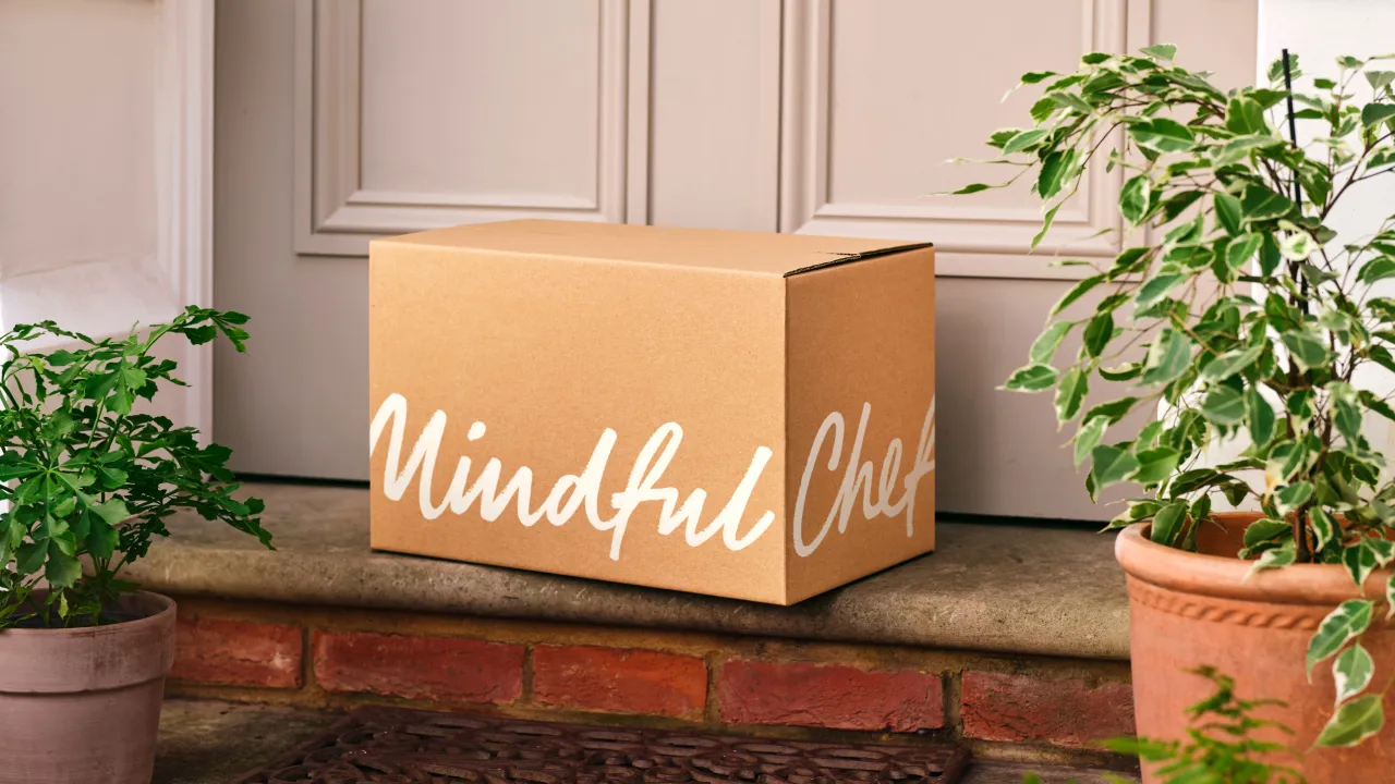
Typography carries much of it, with a distinctive pairing that brings rhythm and hierarchy across recipes, packaging, and content. This is reinforced by motion design that wraps type around the edges of the recipe box itself, introducing a new and recognisable brand behaviour.
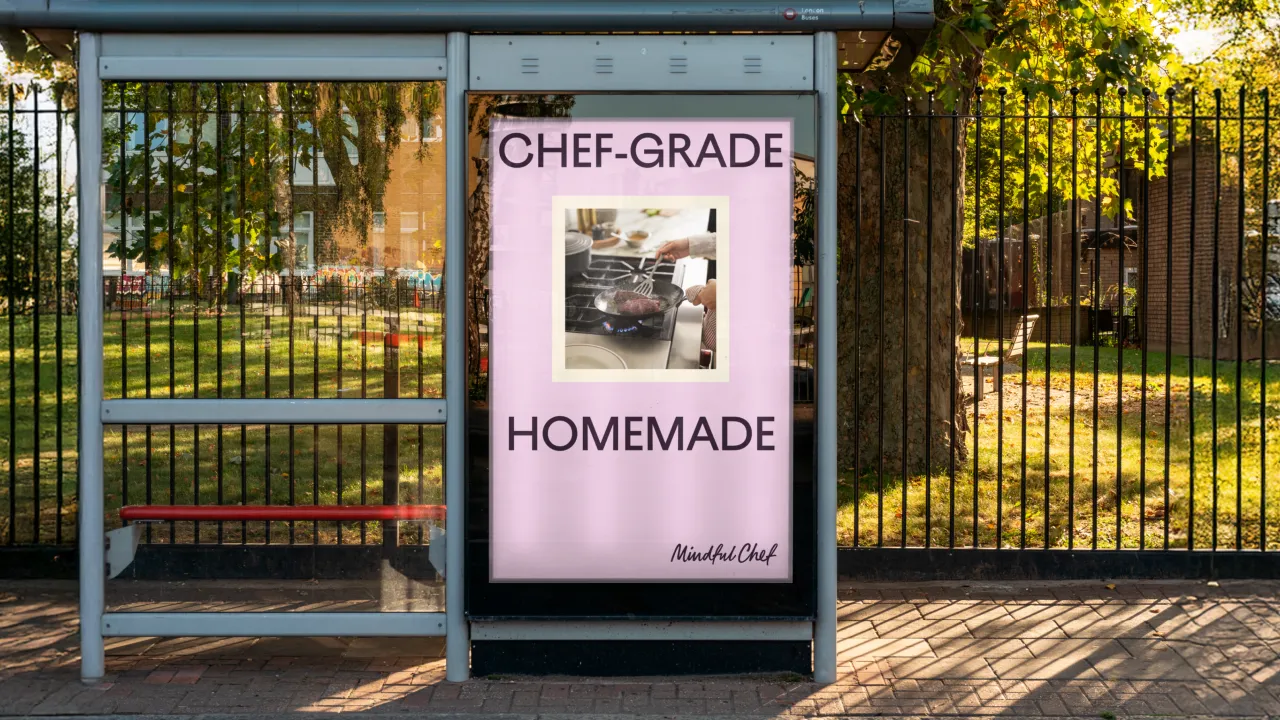
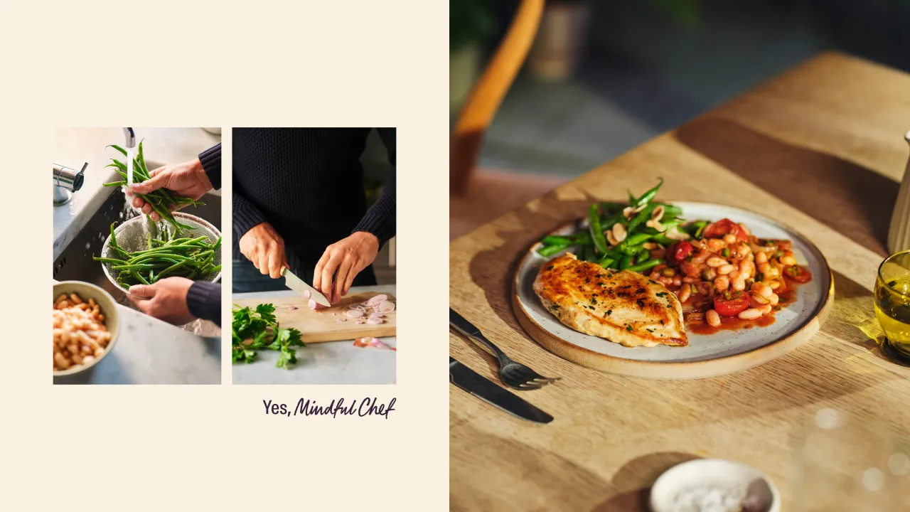
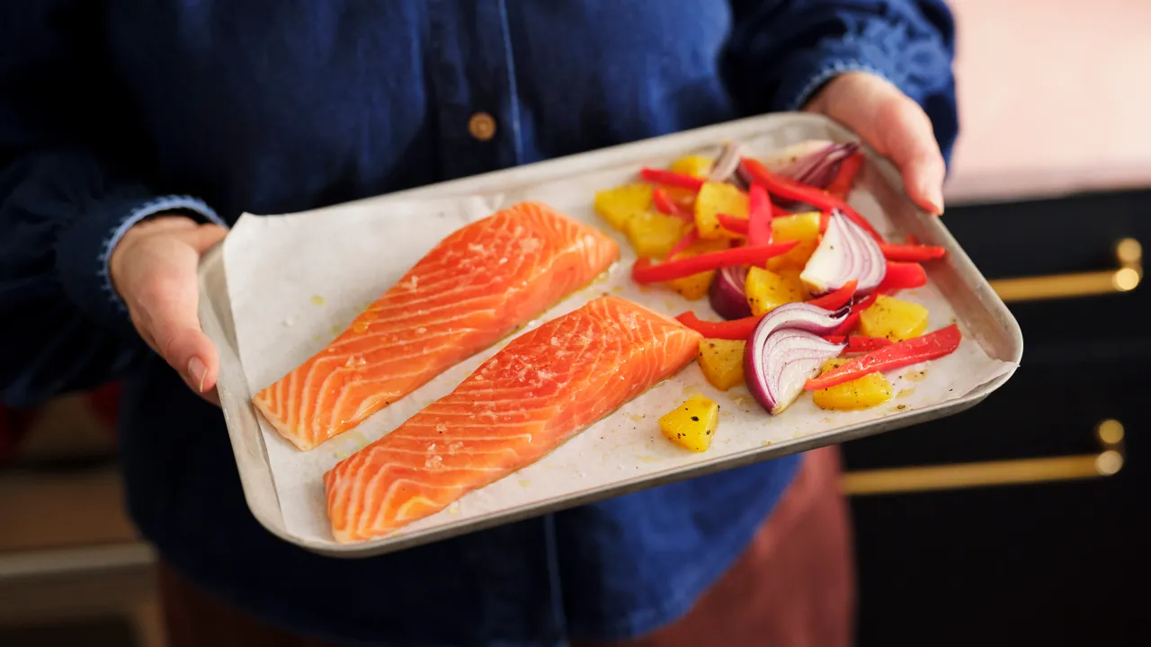
The refresh also introduces a renewed approach to photography and art direction. Developed with photographer Yuki Sugiura and specialist food stylists, the imagery uses natural light, warm tones and tactile styling to show the full cooking journey. Real hands, real kitchens and thoughtful finishing touches position the customer as the chef, celebrating the sensory pleasure of preparing and plating food. It's the kind of visual language more commonly associated with high-end restaurant culture.
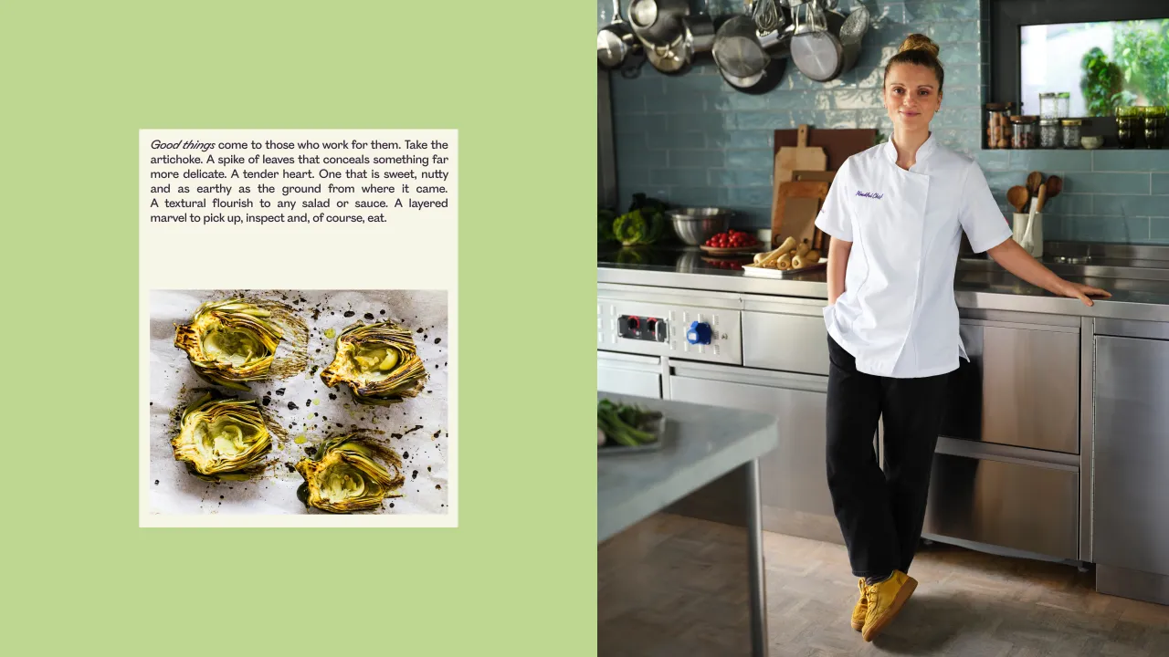
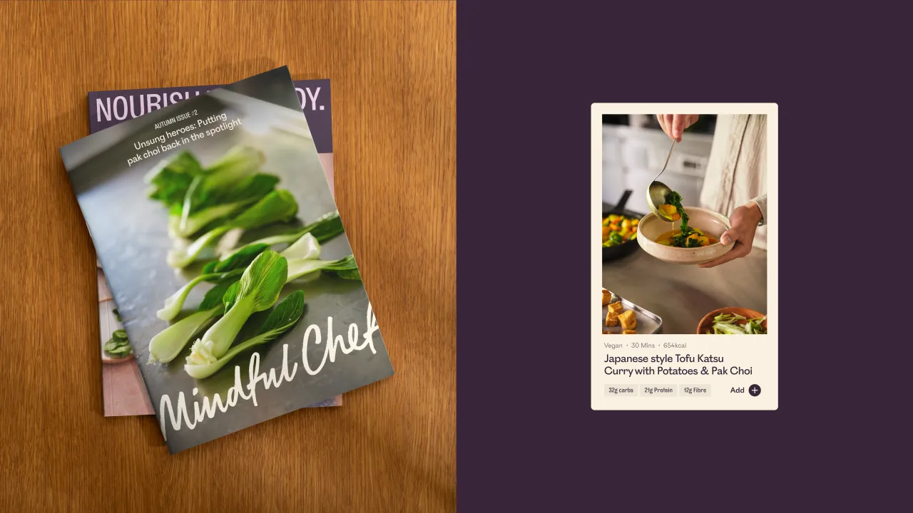
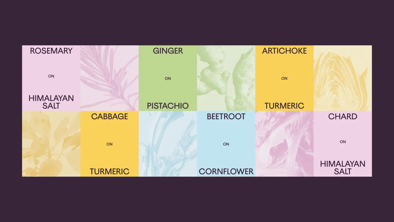
Layout systems feel balanced and clear, handling information-heavy recipe content while leaving space for bold visual moments. Graphic textures are used sparingly, treating ingredients as crafted objects and reinforcing Mindful Chef's emphasis on provenance and mindful prep.
A refined tone of voice completes the system, once again bridging the gap between professional chefs and home cooks. The language is warm and encouraging, without slipping into pretension.
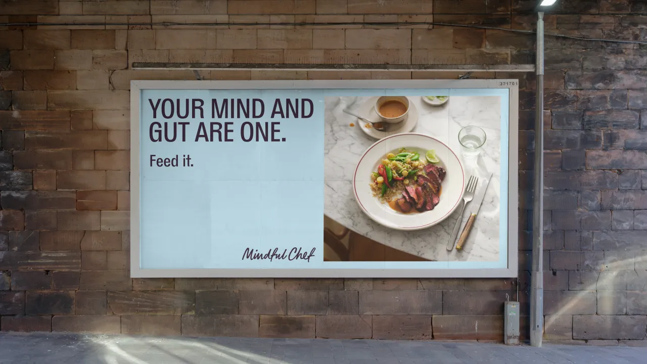
The refresh is now rolling out across Mindful Chef's website, magazine, packaging, delivery boxes, social channels, email and wider digital touchpoints, following its first public appearance in a nationwide Telegraph feature earlier this month.
Mary Rochester Gearing, chief marketing officer at Mindful Chef, said the refresh "places joy, warmth and chef-quality at the centre of its expression", while Mother Design described the work as a way to bring "clarity, distinction and a renewed sense of craft" to the category.
The result is a brand that feels indulgent without being showy, grounded in the belief that healthy eating should be desirable. It's perhaps why Mindful Chef continues to attract loyal customers, even at a higher price point.
However, if I were to be critical of anything (as one of those happy customers), it would be the recipe numbers in the newly designed recipe books... make them bigger, and all will be perfect.

Editor's Picks





Trending



Latest Jobs
Content Writer at Loom Digital
Full-time·Bristol·£27,000 – £30,000
Marketing Manager at Southbank Centre
Full-time·London·£45,800
Senior Digital Designer at Flamingo (Mammoth Brands)
Full-time·New York·US$91,000 – US$120,000
Visual Development Artist - Feature at Sony Pictures Animation
Full-time·Los Angeles·$53.37 – $83.75 per hour
Senior Social Media Manager at Whitney Museum of American Art
Full-time·New York·$95,000 – $100,000
Copywriter & Content Strategist at Chapel
Full-time·London·£30,000 – £40,000