Koto crafts a Mediterranean culinary story for Gustini
A taste of 'the good life' at the heart of revitalisation brief for growing Italian food brand.
Global brand and digital studio Koto has completed a new identity and built a new e-shop for the Italian food marketplace Gustini.
Founded in Leipzig, the company focuses on sourcing and selling food from small Italian producers to a predominantly German audience. Its success over the last 15 years was built on authenticity and has led to strong growth, which prompted a fresh look at its identity.
Naturally, there was a lot of equity in the brand that Gustini did not want to lose, so the brief was centred on embracing the Mediterranean essence of 'La Dolce Vita/The Good Life' and the stories surrounding producers, dedication to quality and culinary adventures while aiming to expand its reach to a broader audience and attract a younger demographic.
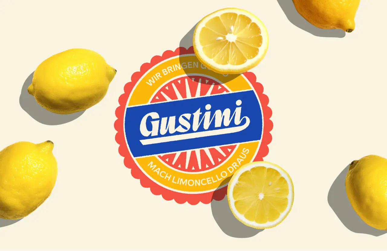
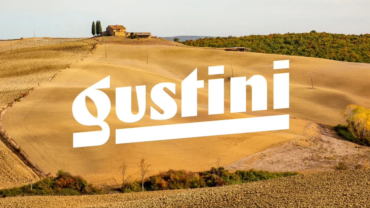
The result is a clean, image-led site that showcases Italy's producers and rich culinary heritage, sitting alongside a newly crafted logotype by Koto, which pays tribute to classic Italian graphic design, echoing the bold and ornate lettering found on packaging and signage across Italy.
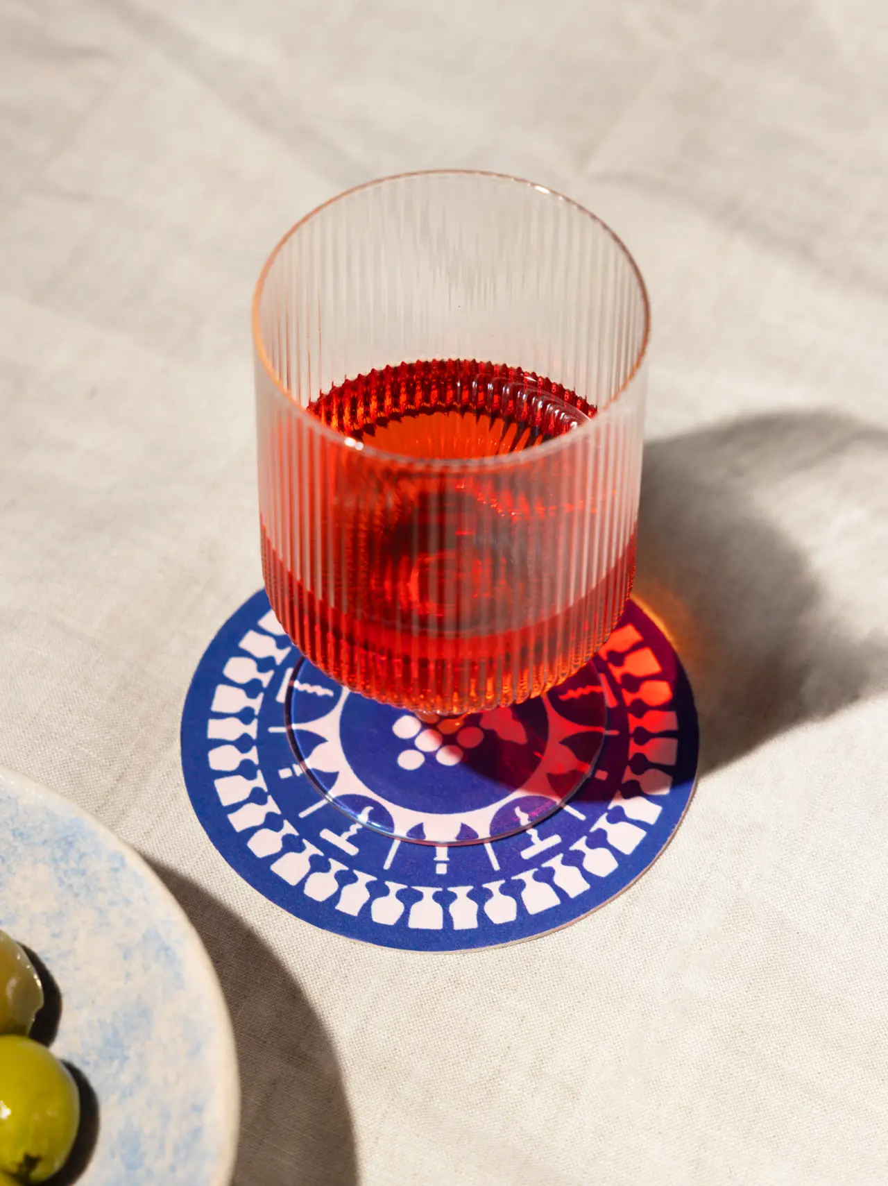
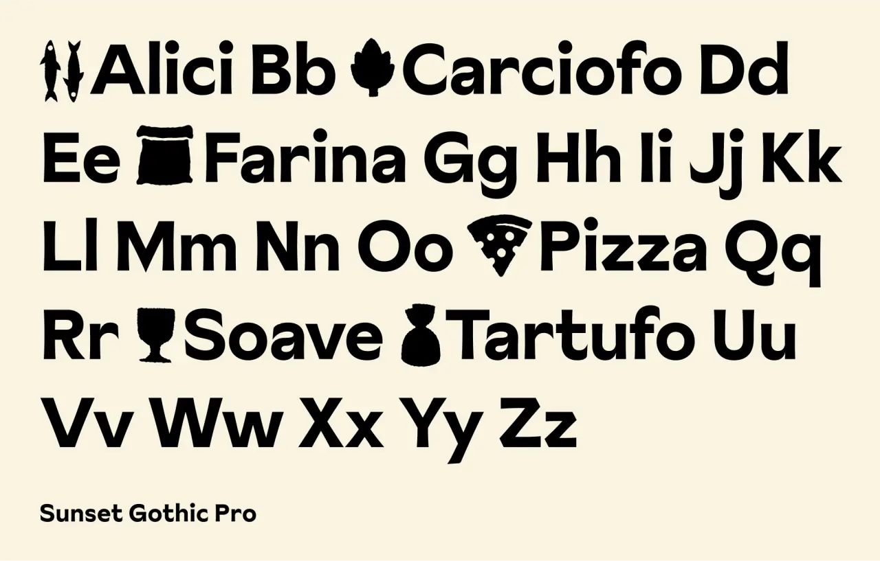
Sunset Gothic by Colophon – the chosen typeface – strikes a balance between character and legibility, while the new colour palette mirrors the punchy and emotive essence of Italy: red terracottas, the sea and the warmth of the sun.
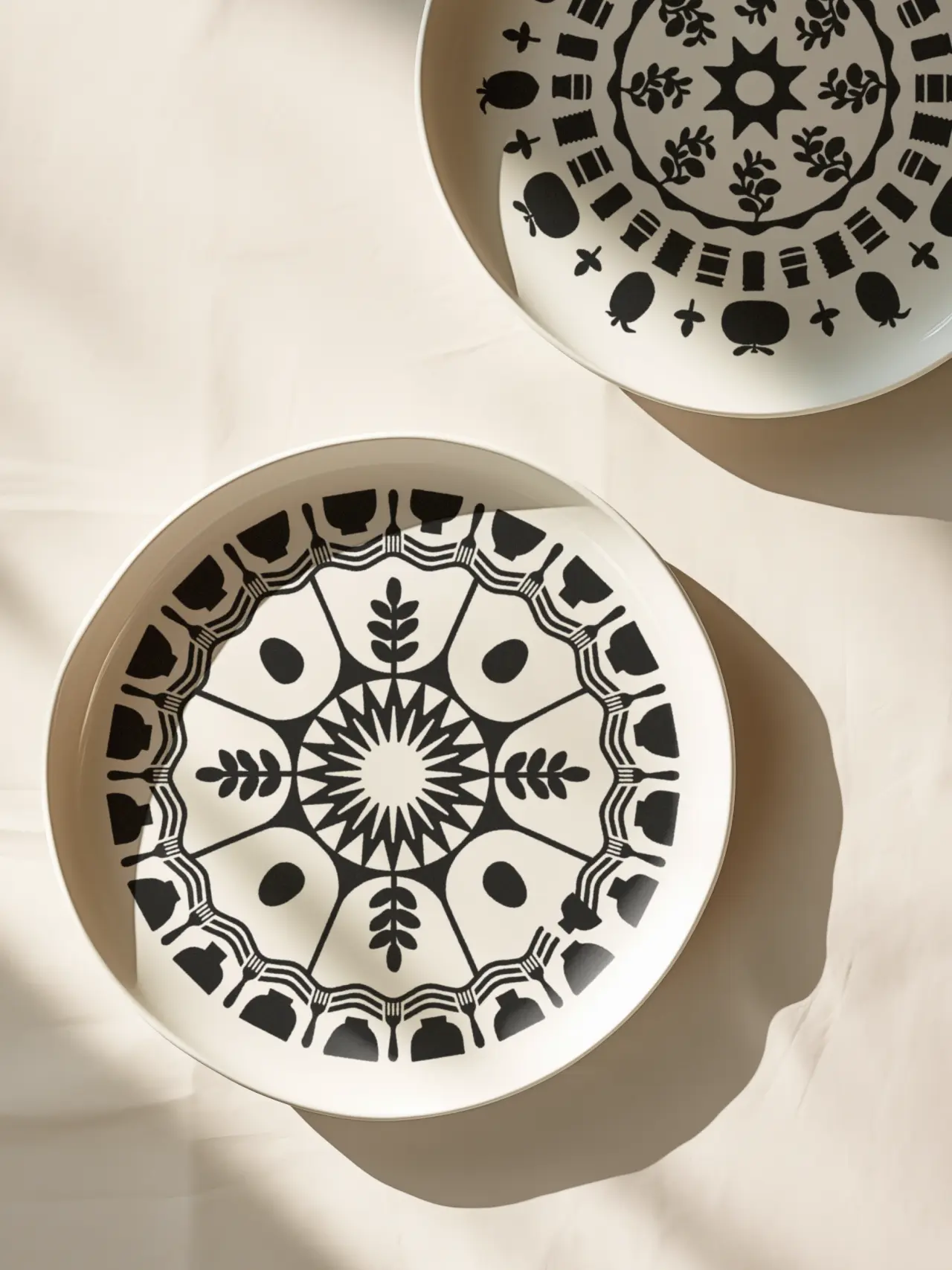
Complementing these visuals are brand patterns that portray the growth and production of the 11 distinct categories of products featured on the Gustini website. Drawing inspiration from the traditional fruit wrappers often seen at Italian market stalls, these patterns hint at the intricate stories behind each product.
A series of secondary logos injects a sense of playfulness, providing a range of logo variations perfectly suited for packaging and various brand touchpoints.
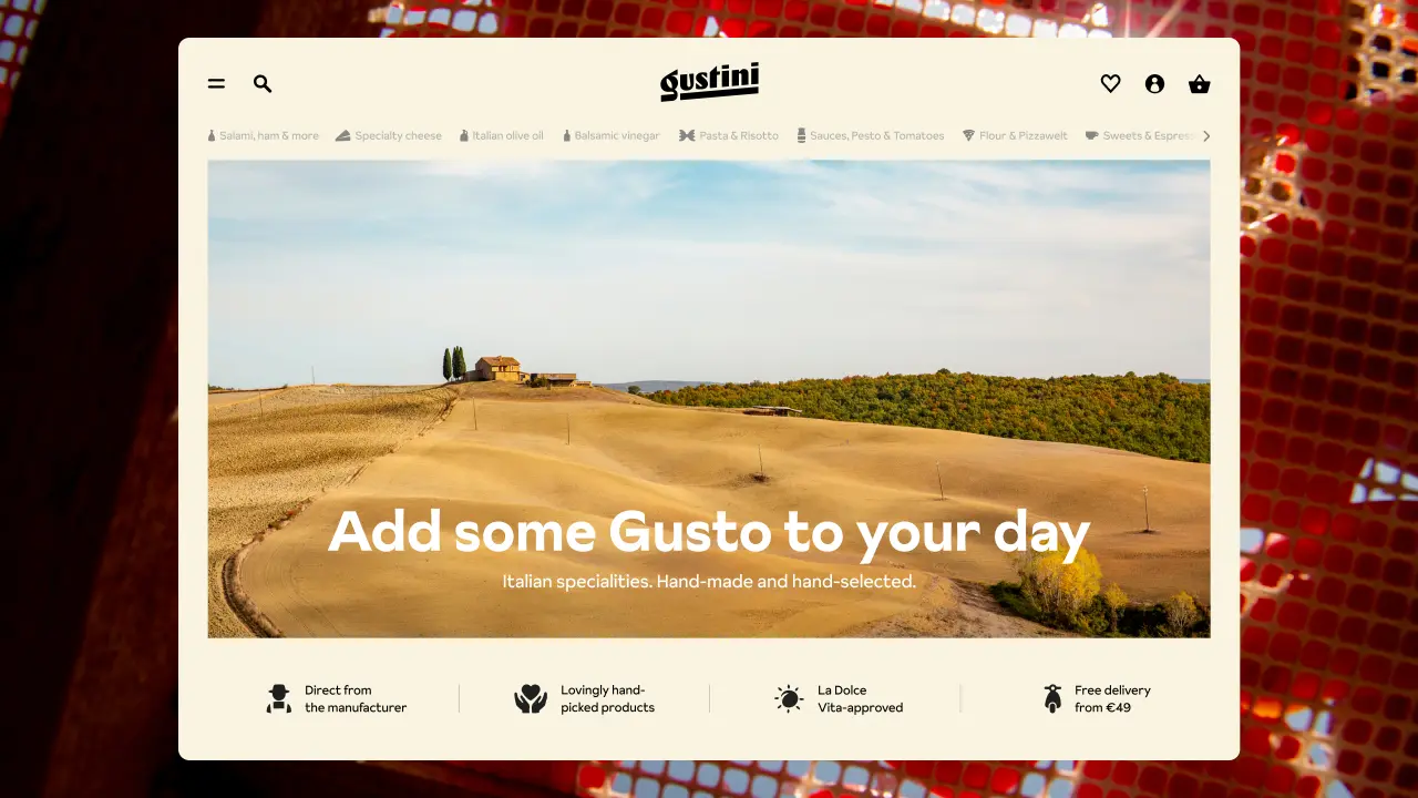
Fred North, creative director at Koto, adds: "Beyond the visual aesthetics, we undertook the task of modernising and restructuring Gustini's e-commerce website. The goal was to enhance user navigation, with a special focus on showcasing products and special offers at pivotal moments of the user journey.
Koto, which has helped shape brands such as Airbnb, Amazon Music, Netflix and WhatsApp, also ensured that the new website design would enhance user navigation, focusing on showcasing products and special offers at pivotal moments of the user journey.
By improving the user experience, Gustini wanted to make it even easier for customers to discover, purchase and have their favourite products delivered directly to their doorstep.
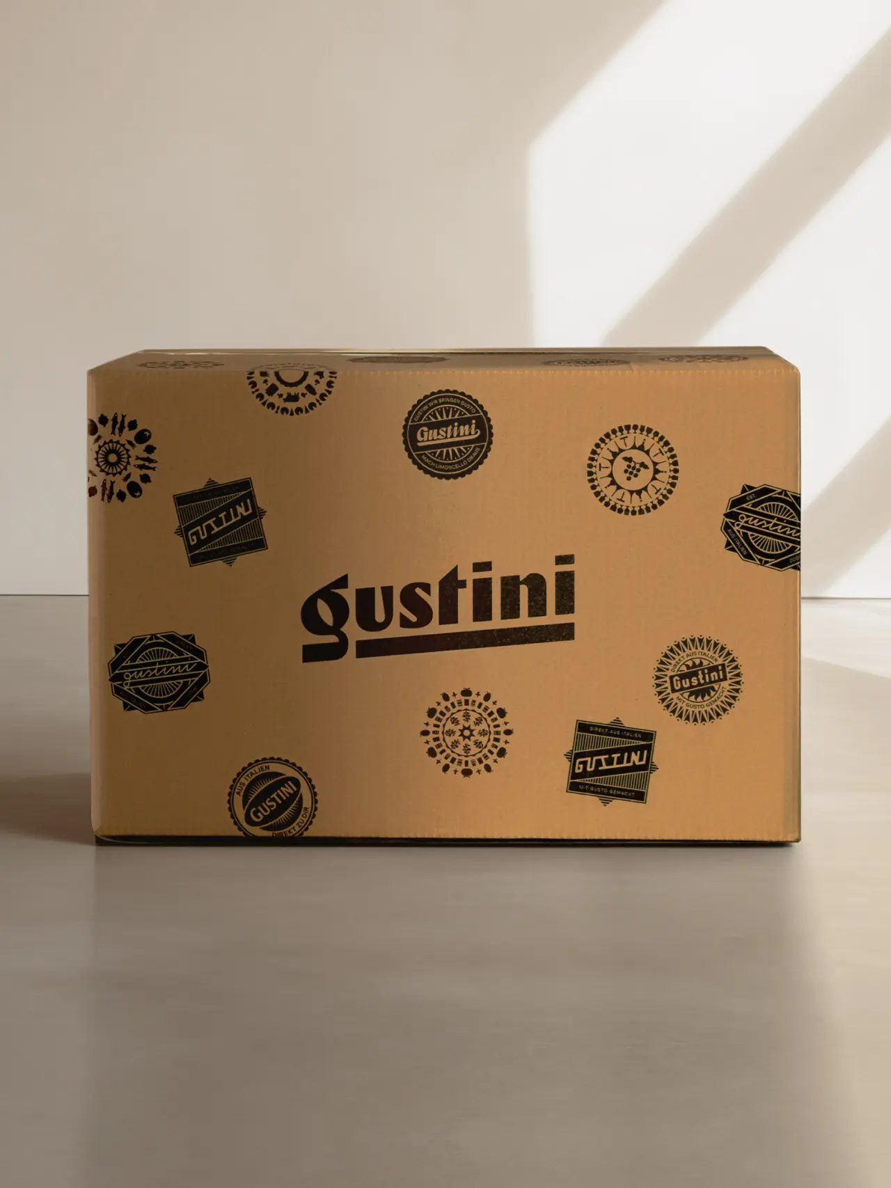
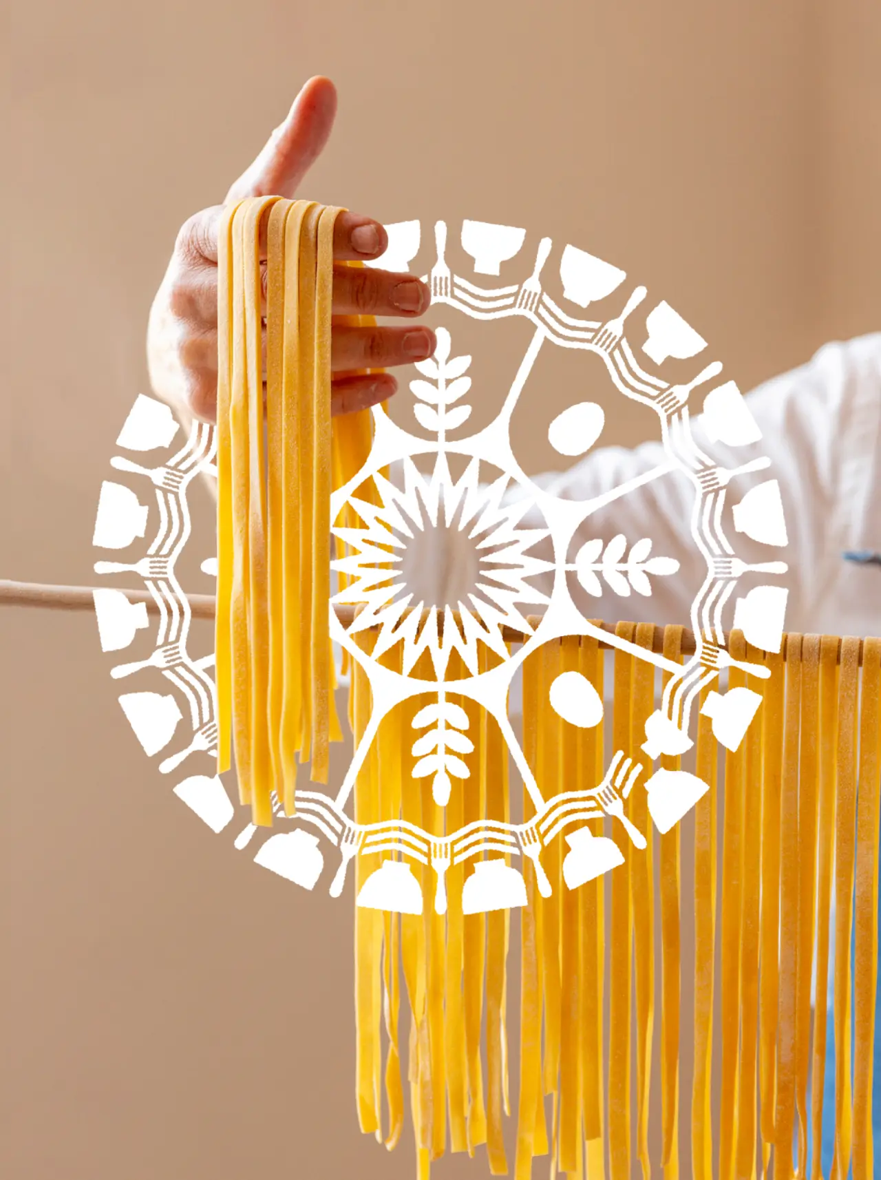
"Celebrating Italy's culinary heritage and capturing its vibrant essence was at the heart of our collaboration with Gustini. We aimed to create an identity that mirrors the rich flavours and immersive stories of Italian cuisine, drawing inspiration from the country's incredible history of graphic design for food and packaging.
"Our goal was to craft a brand that not only resonates with their loyal fanbase but also invites a new, younger audience to experience the excellence of Italian products, understanding the Gustini passion for quality and the brand's commitment to 'The Good Life'," adds Fred North.
The site also serves as a platform for telling the compelling stories of the hard-working producers behind the Italian products, something which has always been central to the company's appeal.
Gustini founder and CEO Jens Depenau adds: "With Koto on board, we didn't just land a brand agency; we got ourselves a creative partner. Together, we've infused vitality into our brand, adding significant value to the Gustini experience. The successful rebranding process reflects our vision and passion for offering high-quality Italian specialities with a fresh, modern twist."
Editor's Picks





Trending






Latest Jobs
Senior 2D Motion Designer at Art&Graft
Full-time·London·£50k-£65k
Account Manager at Moxie and Mettle
Full-time·Cheltenham·Up to £35k
Marketing Copywriter at ustwo
Full-time·London·£40k-£50k
Creative Content Executive at Cognition
Full-time·Birmingham·£28k–£35k
Senior Brand Designer at Analogue
Full-time·Leeds·£38k-£45k
Design Director, Opinion at The New York Times
Full-time·New York·$160k–$180k