Type foundry Dinamo creates riveting new dot font based on furniture screws
German type foundry Dinamo has collaborated with art and design studio BNAG to create a new dot matrix font that works hand-in-hand with their new line of spontaneous metal furniture brackets.

Most furniture is specially designed to carefully hide its inner workings. Smooth surfaces and sharp corners cleverly hide the screws working away beneath the surface, keeping the whole structure together. And while this results in beautiful, functional items, is it robbing people of something more fun and personal?
According to design studio BNAG, the answer is yes. To combat this, they've launched a range of easy-to-use metal brackets called ABC C-o-n-n-e-c-t-o-r-s. These furniture-making tools help DIY designers to join pieces of wood together to their heart's content and produce personalised objects that wear the screws on their sleeves.
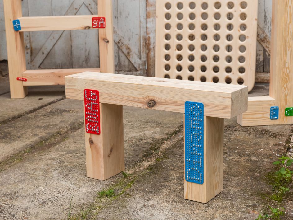
It's a fun, quirky project that will appeal to adults who never grew out of Lego or Mechano. The brightly coloured brackets take the edge of exposed rivets, and the grid system of screw holes allows people to jazz up their constructions with letters and images.
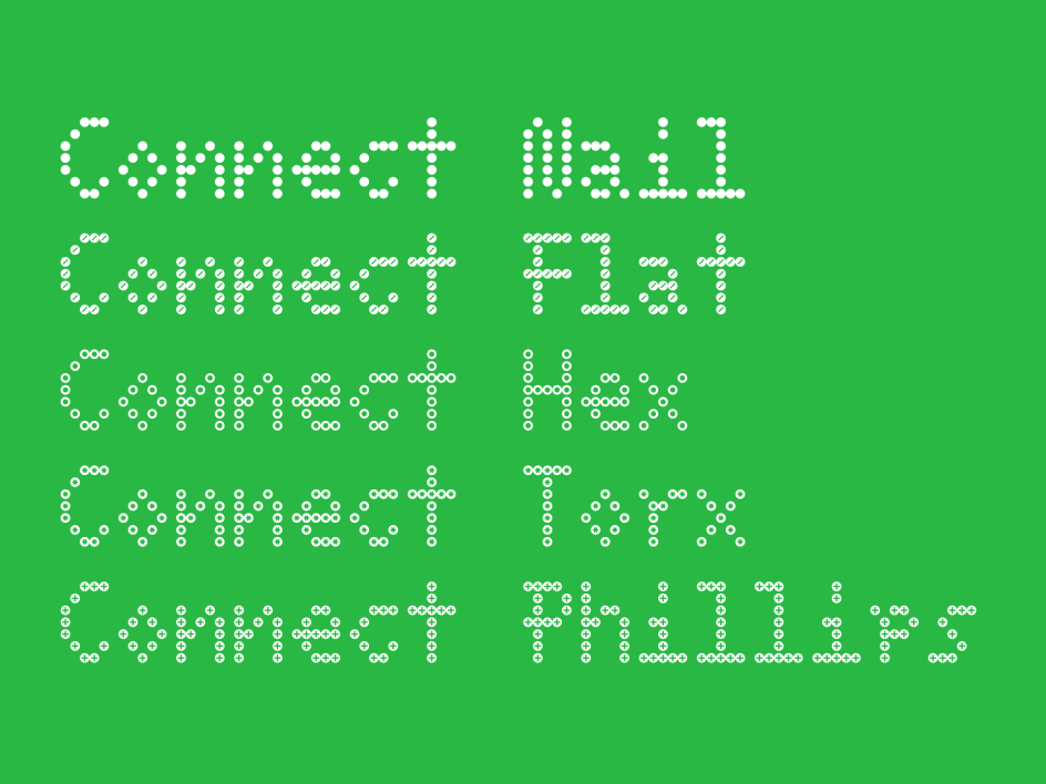
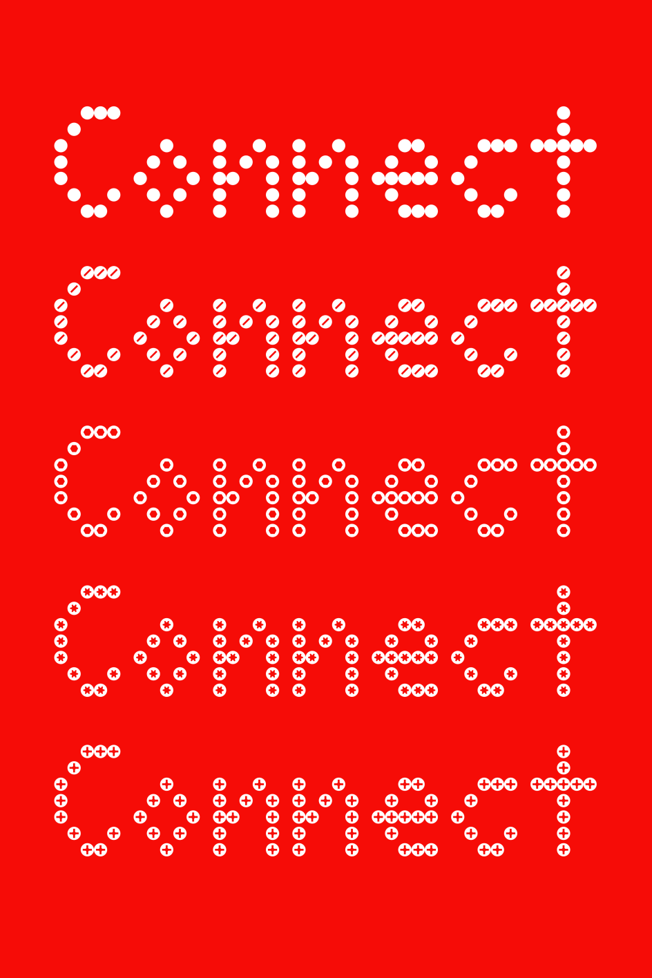
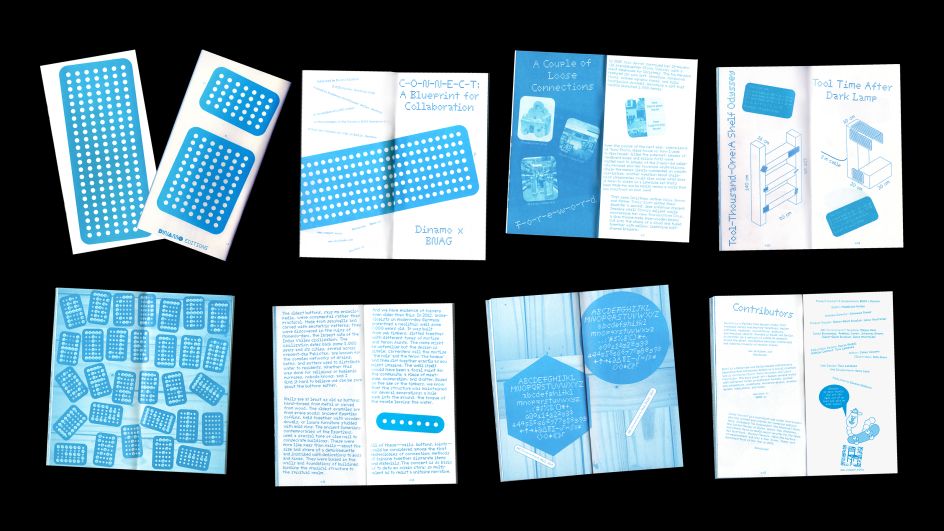
But a fun product needs a fun font, and that's exactly what type foundry Dinamo has delivered. Using the brackets as their blueprint, Dinamo has produced ABC C-o-n-n-e-c-t, a dot matrix font which spells out letter shapes with rows of dotted screwheads.
More than just a gimmick, ABC C-o-n-n-e-c-t packs a lot of functionality you would expect from a new font. It's available in five styles inspired by different types of screws – including Flat, Torx, Hex, Nail, and Philips – as well as monospaced and proportional variants. It may also be the world's first Italic dot font.
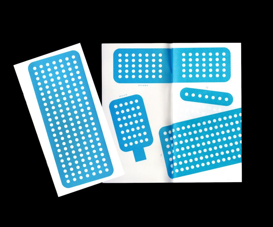
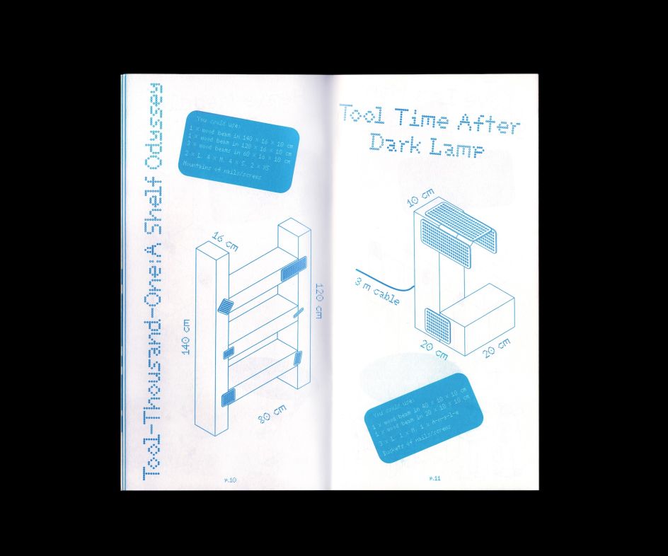
As well as the font itself, a special accompanying zine which shows off its potential has been released by Dinamo Editions. This zine also "explores the meaning of physical connection in our networked times", thanks to an essay by author and technology journalist James Vincent, as well as explaining to readers how to use the brackets and screws to create letterforms.
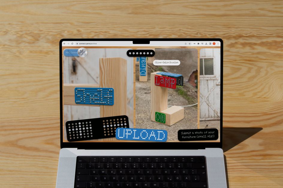
The fun and interactivity don't end there, either. Dinamo has also set up a website where people can share their experiences with the ABC C-o-n-n-e-c-t font and explore community designs.
Designed by Dinamo graphic designer Tina Lehmkuhl and developed by creative coder Marco Land, this platform is something of a throwback to the good old days of the web, where sites were more personal and whacky, which is perfectly in keeping with the ABC C-o-n-n-e-c-t-o-r-s themselves.
Want to see the font in action? If you're based in Berlin, you're in luck. Dinamo is holding an ABC C-o-n-n-e-c-t-o-r-s launch event at the Haus der Kulturen der Welt (HKW), which includes a two-day workshop installation.
Visitors will be able to join BNAG in spontaneously building a pop-up Dinamo Hardware store, as well as create their own furniture using the ABC C-o-n-n-e-c-t-o-r-s brackets.