Unfulfilled: A home for a designer's axed logomarks that 'deserve to be seen'
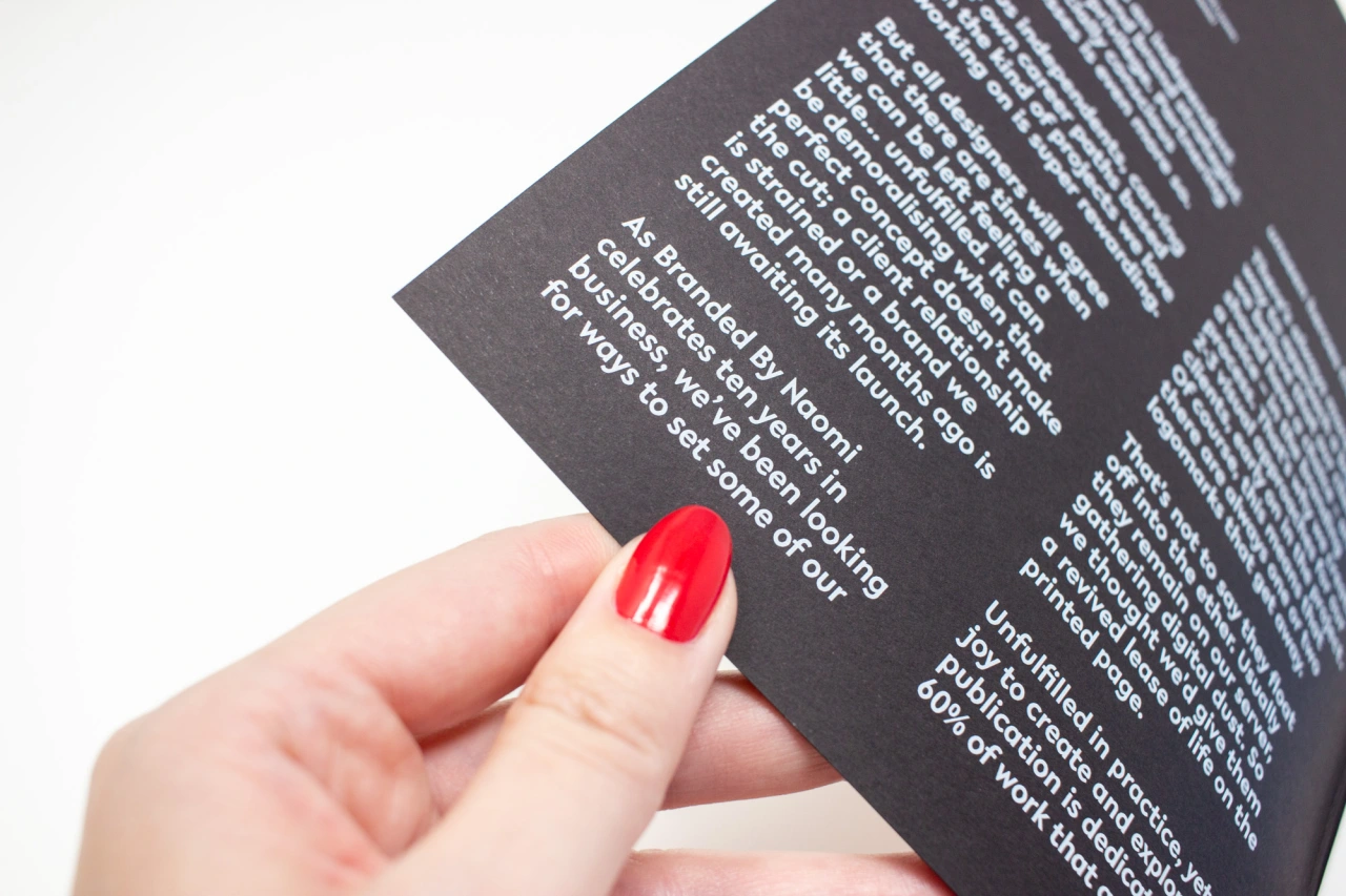
Of all the logos that never entirely made it, have you ever wondered what might have been? As designers, you'll likely have a few favourites that clients turned down, for whatever reason, but you've always treasured. For Naomi White, she's decided to celebrate her own rejections in a new zine.
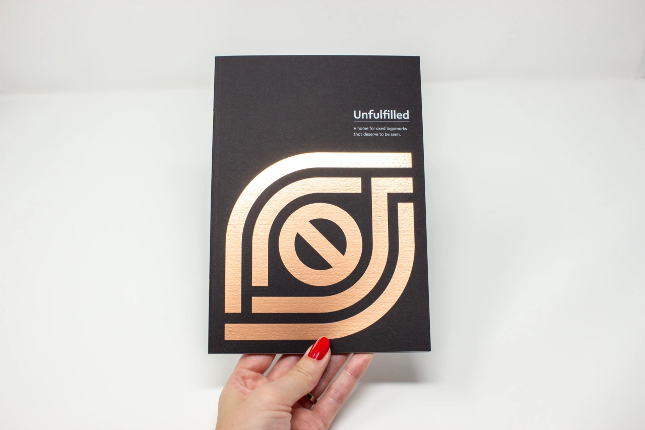
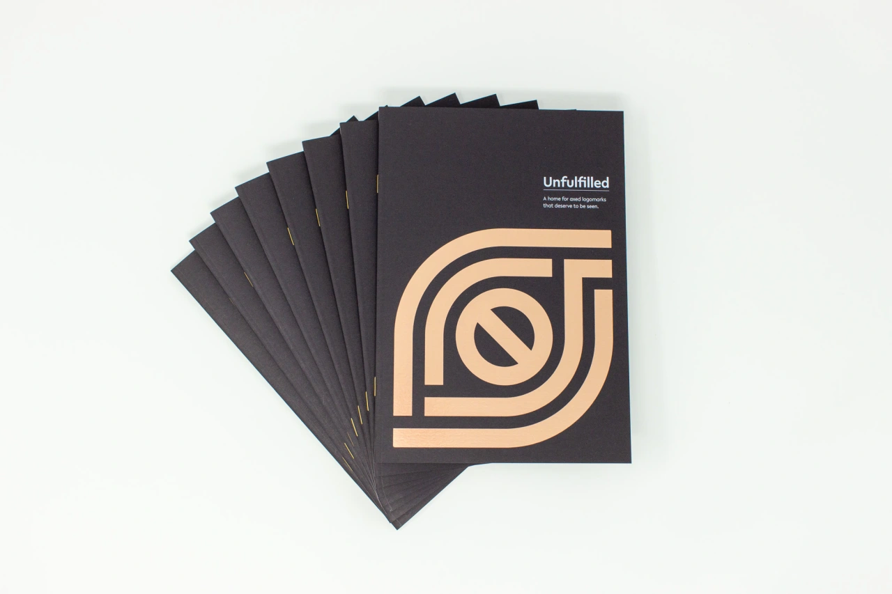
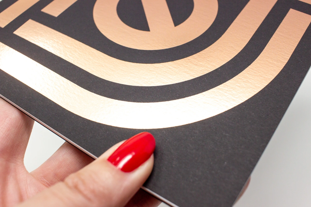
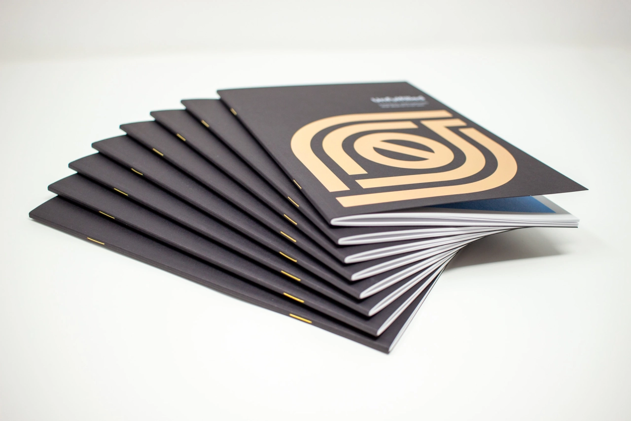
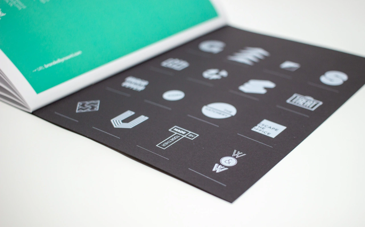
Called Unfulfilled, the 32-page booklet is what she calls a "home for axed logomarks that deserve to be seen" and "dedicated to the runners-up, the logos lost, the what could have been". It's also to mark a decade of running her design studio, Branded By Naomi.
The zine was created during the recent lockdown when Naomi finally felt she had time to reflect: "I started to consider my branding studio and output as a whole," she adds. "I started to question why I often feel disheartened by the end of a project – which, of course, is the absolute opposite of how we should feel.
"As designers – or creators in general – a sense of fulfilment is one of the ways we internalise and measure our success. And it's certainly a gauge for our happiness. So, what about the weeks or months of strategic and conceptual work? The work that is created, discussed, and finally dismissed – shared only with our clients, to simply live life on our server. This is where the idea for Unfulfilled was born."
Does Naomi have any favourites? "It would be the Generator G, and Social Engine S. This type of letter-based mark works hard for any brand, especially in an avatar filled world. Generator was part of a naming exploration – where the final decision was to rename the company to Citizen (a social housing association). This was 100% the right call, so the Generator mark was never really going to make it through.
"On seeing the 'S' mark, Social Engine instantly got reminded of a Scalextric – which made them want to dismiss it immediately. This goes to prove that my 'good old want' to always show a logomark in its simplest black and white form – doesn't always help the conversation!"
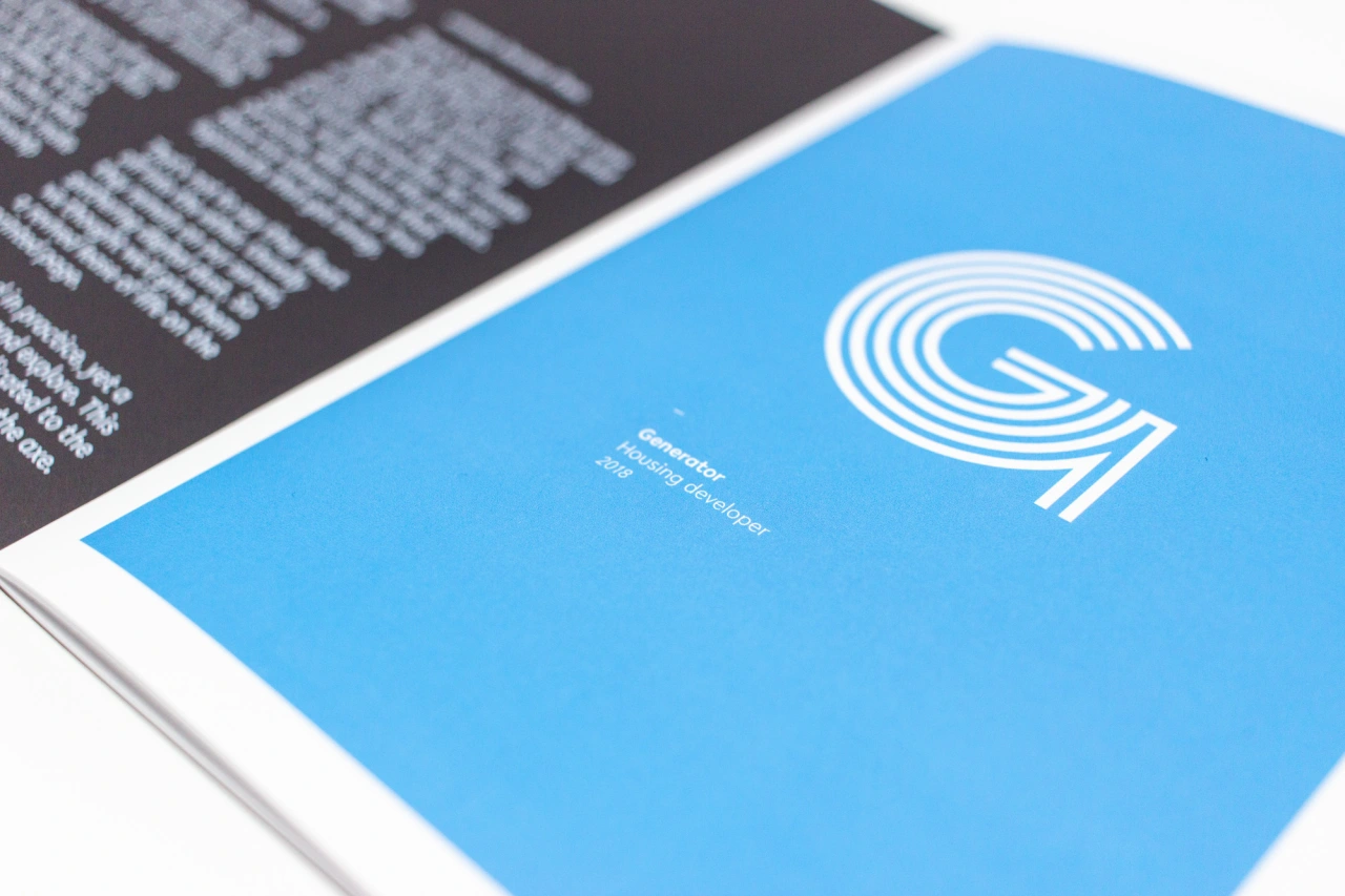
Generator
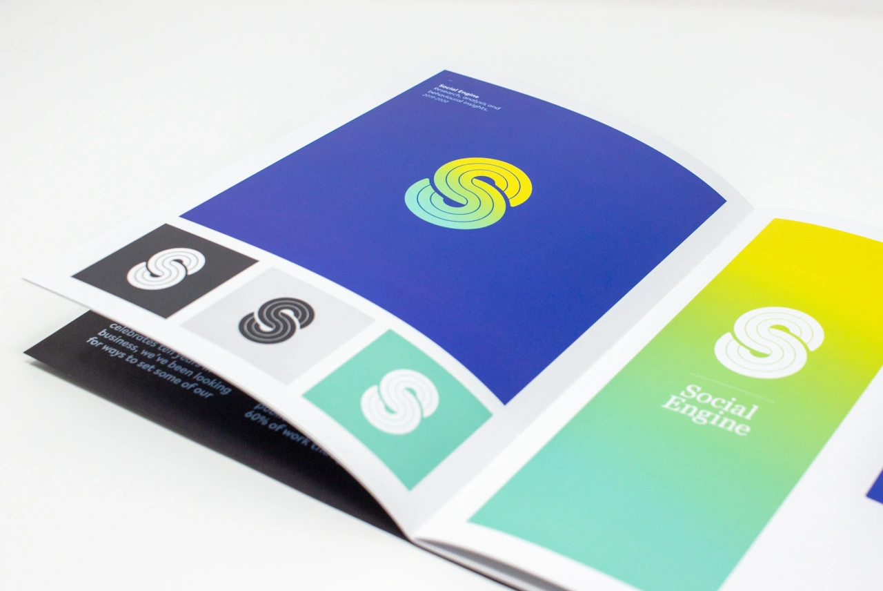
Social Engine
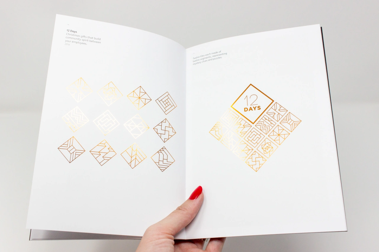
12 Days
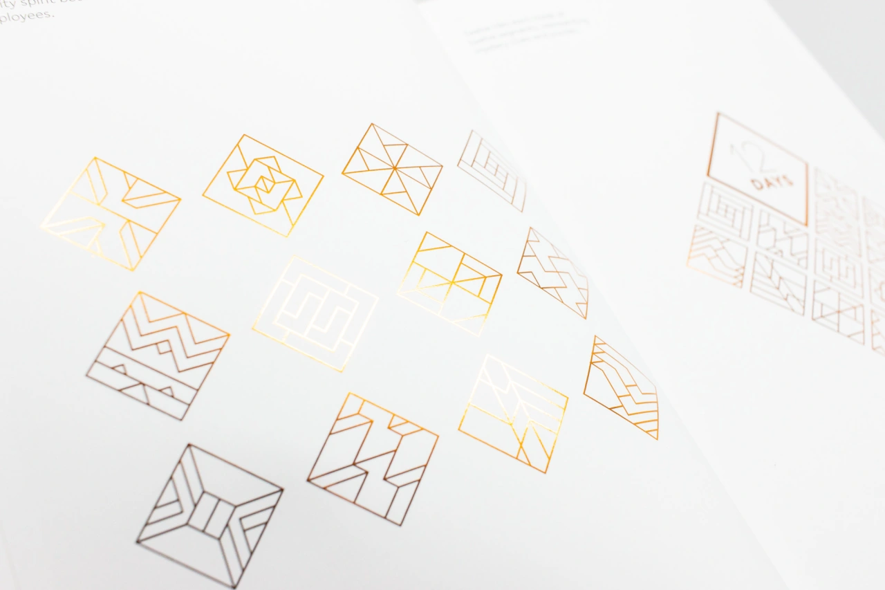
12 Days
But which logomark was she most disappointed to see rejected? "12 Days was a mini-brand created for our amazing friends and charity client Child.org. A luxury Christmas gift for employees – there would be 12 days of clues, riddles, fun and treats. We were all super excited to use this flexible branding playfully… but unfortunately, the product just never quite made it to market."
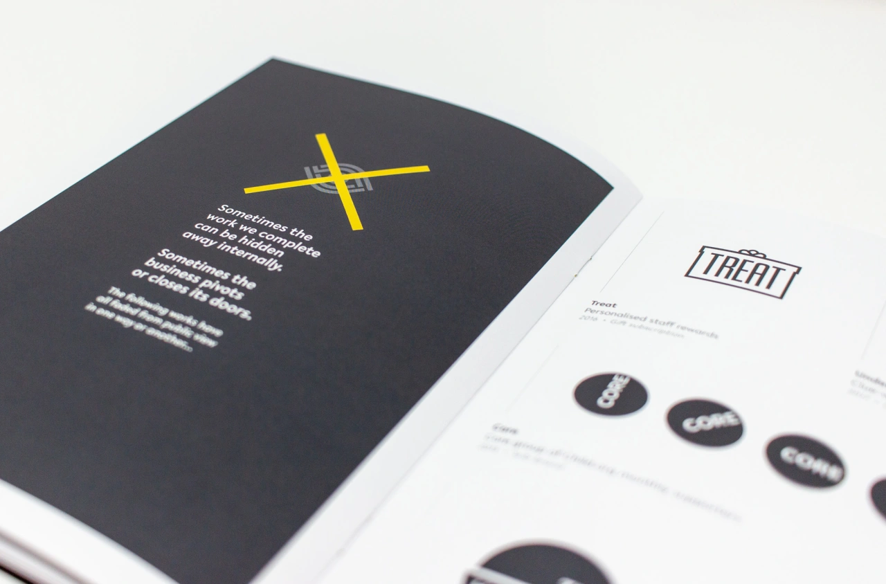
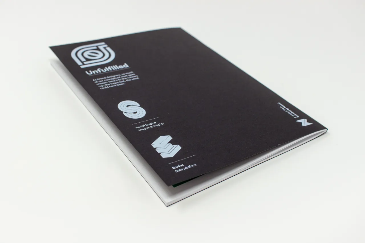
To find out more or to purchase a copy of Unfulfilled, visit brandedbynaomi.com.
Editor's Picks





Trending





Latest Jobs
Senior Designer at Jubba
Full-time·London·£50k-£60k
Design Director, Opinion at The New York Times
Full-time·New York·$160k–$180k
Growth Strategist (Ecommerce) at Tribe
Full-time·Exeter / London·£50k + Bonuses
Growth and Client Development Director at 3800
Part-time·Sheffield·£60k-80k
Graphic Designer at Crux Product Design
Full-time·Bristol·Up to £36k
Digital Marketing Executive at Arise
Full-time·Sheffield·From £23,750