These 6 book cover designs show what Gen Z actually wants to buy
New Penguin data confirms it: younger readers do judge a book by its cover. And these award-winning jackets highlight what's currently hitting the mark.
You've spent your whole life hearing: "Don't judge a book by its cover." Yet new data from Penguin suggests that young people do exactly that. And so for designers wondering whether their work actually shifts product, here's the evidence.
The YouGov survey, conducted in March across 2,097 UK adults, found that 49% of 18- to 24-year-olds consider a book's cover an important factor when buying, compared to just 27% of over-55s. More striking still: 15% of younger readers said they'd buy a book based on the cover alone, a figure more than three times higher than the older age group.
It doesn't stop there. Some 40% of 18 to 24-year-olds like to display books at home, with nearly a third using them as interior design objects or art pieces. Among the over-55s, that figure drops to 8%. The message to anyone who has ever had their cover brief dismissed as "just packaging" is clear: for a significant and growing part of the book-buying public, the cover is the product.
What a good cover looks like
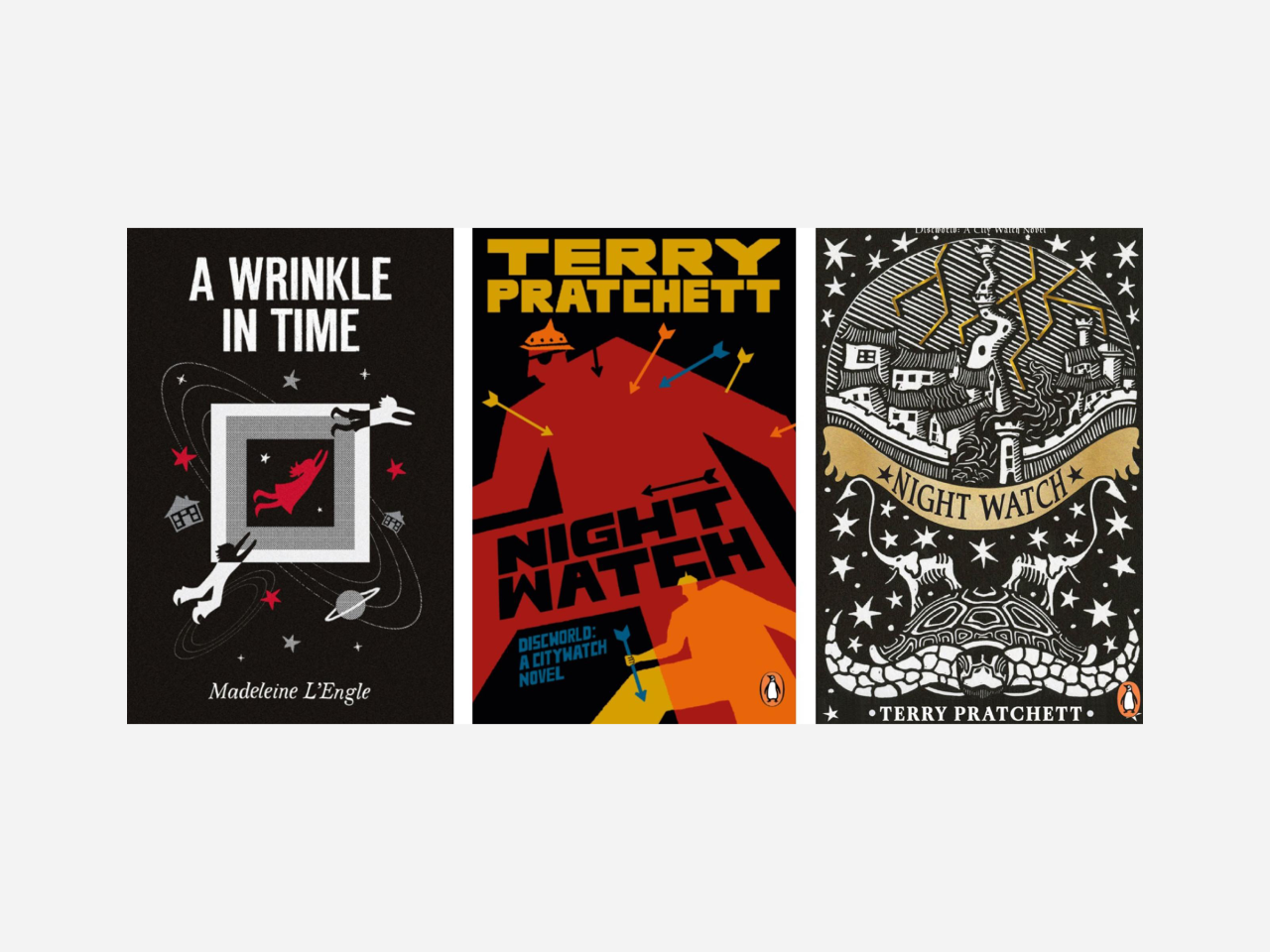
Penguin's 2026 Cover Design Award, now in its 19th year, provides a useful lens for understanding what that actually looks like in practice. This year's brief asked entrants to reimagine either Night Watch by Terry Pratchett (2002) or A Wrinkle in Time by Madeleine L'Engle (1962). Both are canonical texts with existing, well-loved visual identities. So the challenge was not just to make something beautiful but to make something that earns its place alongside the originals.
Entrants had to have no more than one year of paid creative experience, and 60% of those on this year's shortlist were students. The rest were at the early stages of their careers or, in two rather wonderful cases, working somewhere else entirely. The third-place finisher in the adult fiction category is a contracts manager for a vegetation management company, and the third-place finisher in children's fiction is a head barista. Genuine design talent, it seems, can find a way through.
Here are the six designs that made the cut.
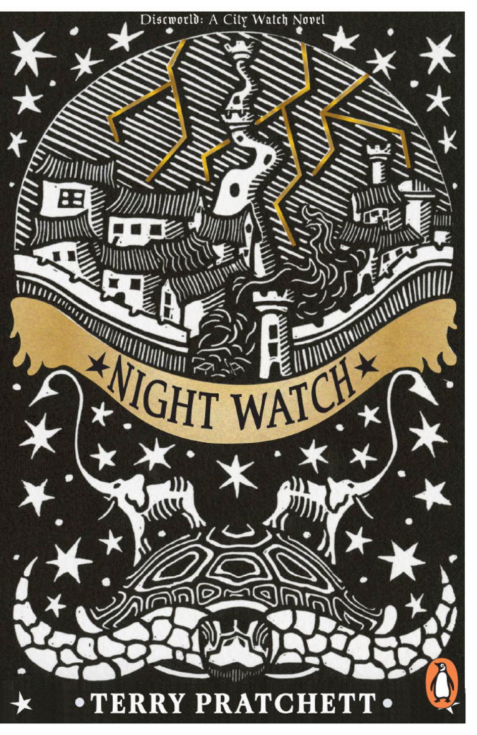
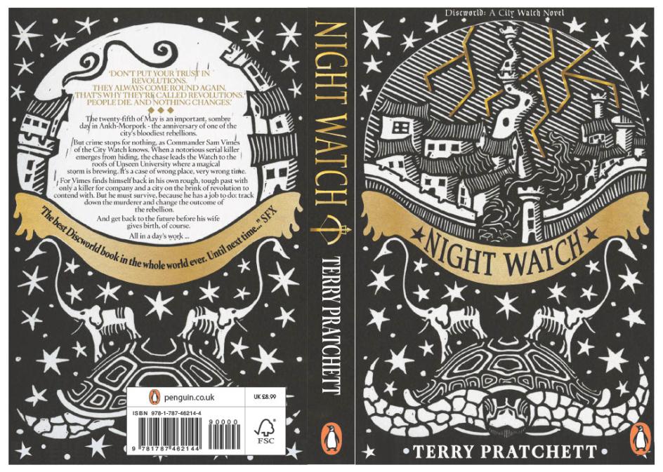
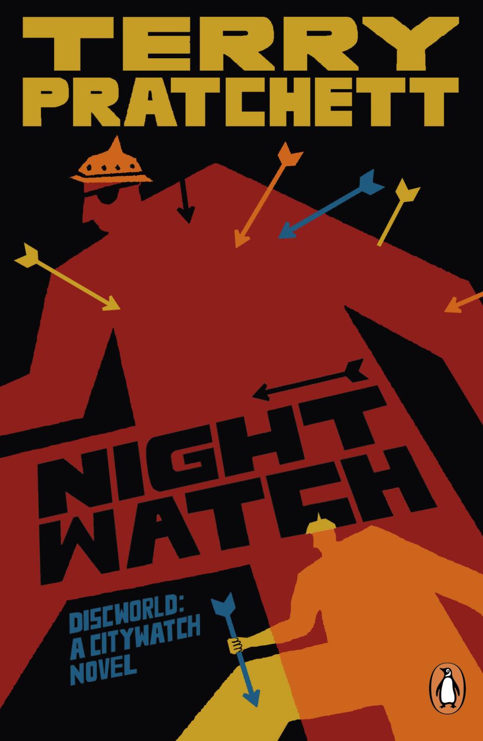
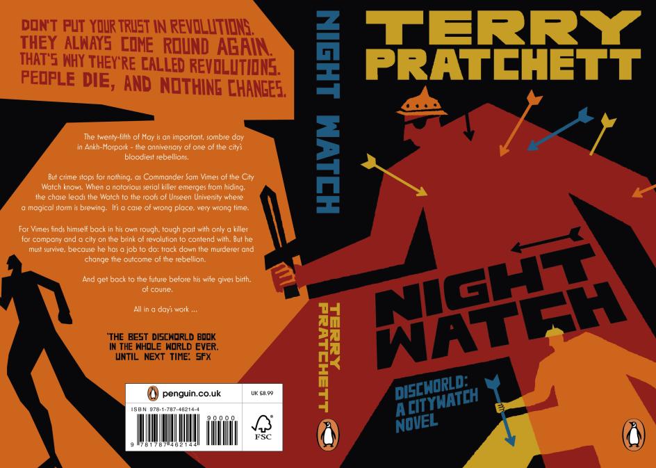
Joe Bundock, Night Watch, first place (adult fiction)
A visual communication student at Leeds Arts University, Joe Bundock, made the quietly radical decision to go analogue in a field increasingly shaped by digital tools. His cover draws on historical techniques, and the judges noticed immediately.
"The concept for my artwork arose from the traditional printmaking artwork of medieval illuminated manuscripts," explains Joe. "The style I used was heavily influenced by the aesthetics of medieval woodcuts, and I used linocut printmaking to achieve a similar look in my work."
This use of historical styles and methods, he adds, "was done to visually cement the book into the fantasy tradition by highlighting a chain of influence and importance from the starting point of the genre to modern entries such as the work of Terry Pratchett. The Discworld and magical storm imagery capture the absurd, hectic nature of the novel."
Beci Kelly, art director at Transworld, says: "What struck me most was the very obviously hand-crafted work that's gone into the making of this cover, which is so impressive and great to see in this age of digital. It has a look that feels classic and could be adapted across a whole series."
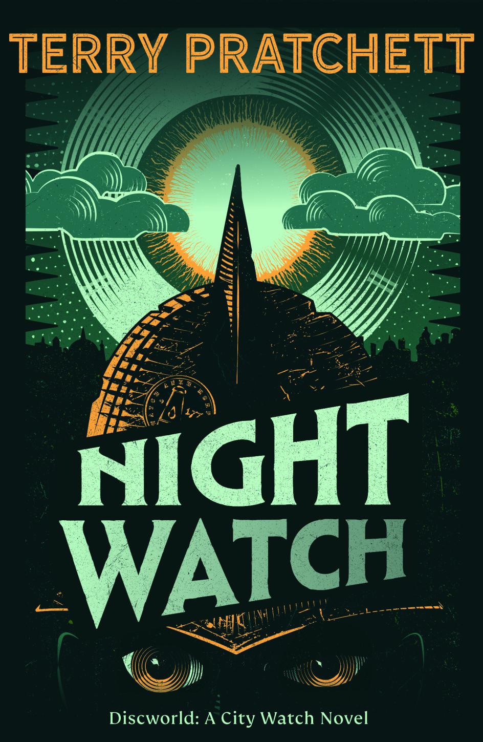
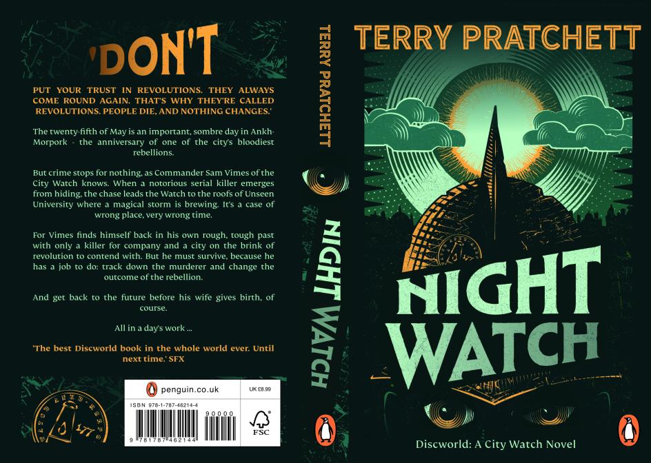
Sunny Tsang, Night Watch, second place (adult fiction)
A student at Duncan of Jordanstone College of Art and Design, University of Dundee, Sunny Tsang's entry impressed the panel with its typographic confidence and considered styling.
Beci says, "We loved the accomplished styling of this work. It feels like it challenges the audience to reflect on what they get from a Terry Pratchett reading experience. It also has a classic feel to it that will stand the test of time, and the type feels considered and of a piece with the whole design."
Peter Goddard, Night Watch, third place (adult fiction)
A contracts manager by day and cover designer by weekend, Peter Goddard produced something that clearly moved the judges, even if the top spots were taken.
Lee Motley, art director at Penguin Michael Joseph, says: "We loved this beautifully executed and considered design. So much thought went into telling the story through the cover. The colours and imagery had multiple meanings: it was so clever. This design would be a wonderful addition to the Pratchett archive."
Rob Wilkins, head of the Terry Pratchett literary estate, sums up the difficulty of the judging process. "What a strong shortlist, an even stronger top four and impossibly difficult to turn into a top three," he enthuses. "I'm so impressed with how the designers have engaged with the brief and captured the spirit of Terry's work."
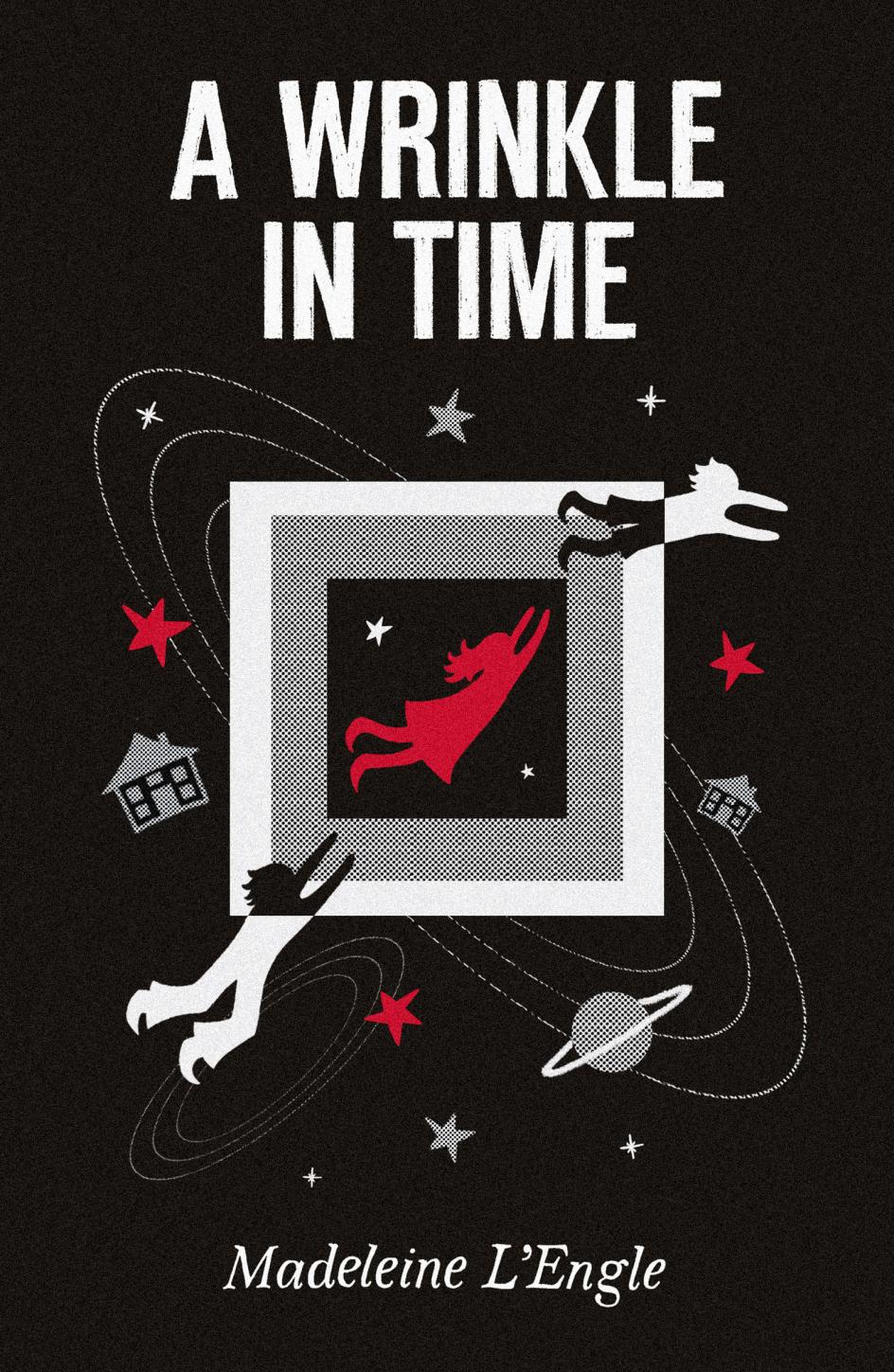
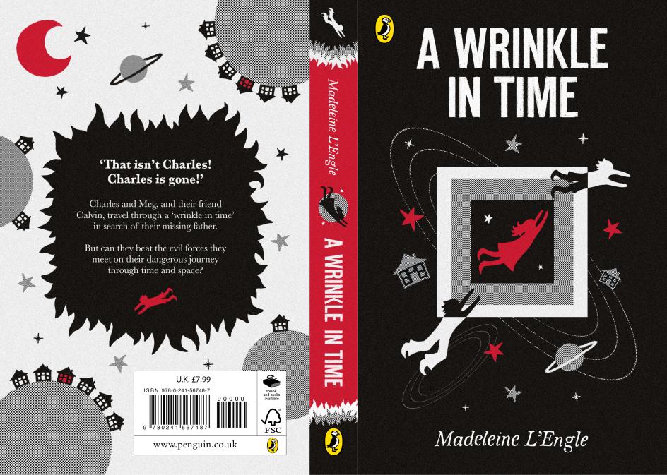
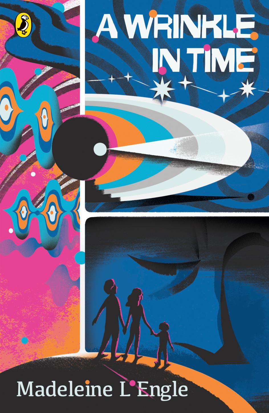
Ivy Watts, A Wrinkle in Time, first place (children's fiction)
Ivy Watts, a self-employed graphic communication designer, took the children's fiction prize with a cover that impressed on both conceptual and craft levels.
Ivy describes her approach with the kind of clarity that marks out a designer who's really lived with the brief. "My design explores the binaries at the heart of A Wrinkle in Time through both visual form and material process," she begins. "Combining hand-drawn and digital elements allowed the cover to embody contrasts between imagination and logic, softness and structure, and individuality and conformity.
"The tesseract became a portal-like device, transforming the book itself into a threshold between darkness and light. Red symbolises Meg and the power of love at the centre of the narrative. The cover celebrates difference, positioning imagination and humanity as forces capable of disrupting control and restoring freedom."
Anna Billson, art director at Penguin Random House Children's, calls it: "A striking and accomplished design. The restricted colour palette and deceptive simplicity of the illustrations combine to create an intriguing and engaging cover. The concept carries across from front to spine to back in an effective and cohesive design showcasing a strong design eye and understanding of the target market."
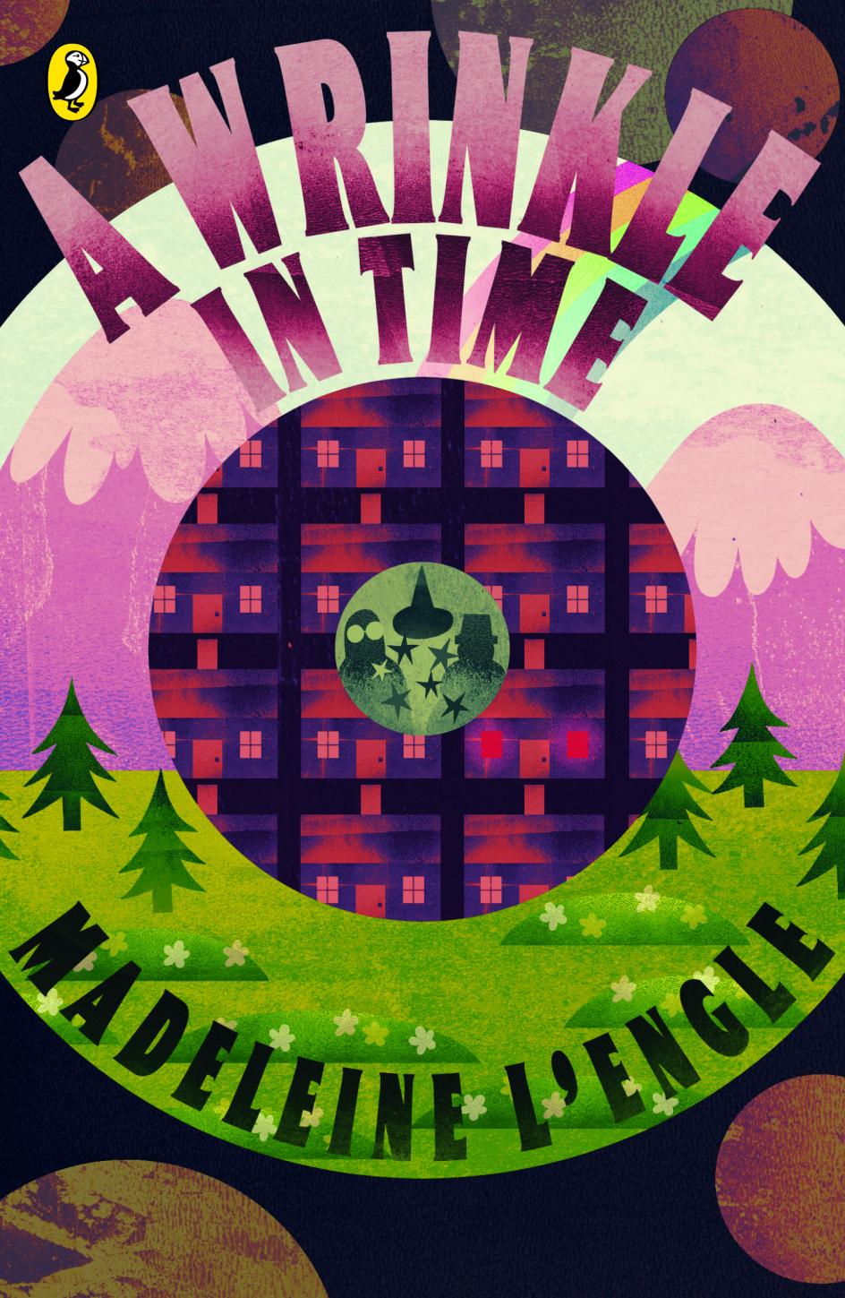
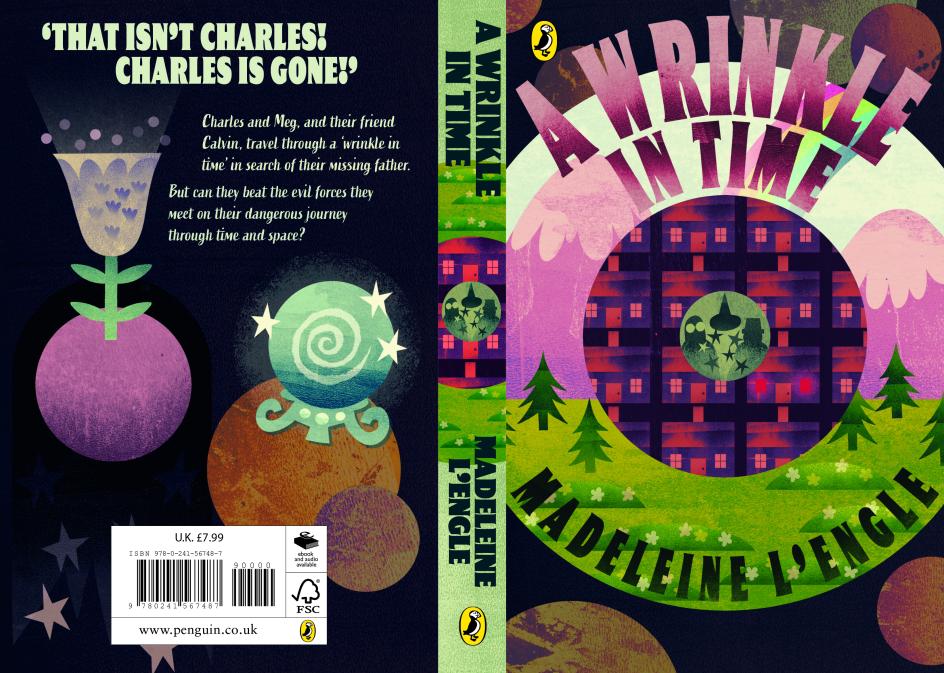
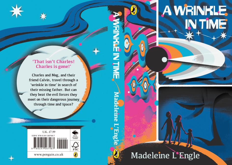
Em Kirsten, A Wrinkle in Time, second place (children's fiction)
A retail assistant outside of her design work, Em Kirsten produced a layered, intricate piece that showed a strong grasp of the book's interstellar scope.
Jacqui McDonough, art director at Puffin, says: "This is such an intriguing and layered design, which is so appropriate for this book. The concentric circles combine cleverly with the planets to convey interstellar travel, and the details within pique our interest further, particularly the way the designer has solved how to subtly depict the Mrs W characters."
Jiazhen Cai, A Wrinkle in Time, third place (children's fiction)
Jiazhen Cai, a head barista and freelance illustrator, rounded out the children's fiction category with a design that charmed the panel with its attention to detail.
Iqbal Hussain, author of The Night I Borrowed Time, says: "This is a beautiful graphic interpretation of the book. There are so many lovely little details amongst the bigger picture."
Taken together, these six designs make a compelling case that the audience for great book cover design is younger, more engaged and more discerning than the industry has sometimes assumed. They're buying books for their walls as much as their shelves, and they know the difference between a cover that means something and one that doesn't. It might be time to stop apologising for caring about it.
For more information and to see the full 2026 shortlists, visit the Penguin website.
Editor's Picks


Trending


Podcasts


Editor's Picks
Further Reading