Raw Wine gets a delicious new identity thanks to The Counter Press
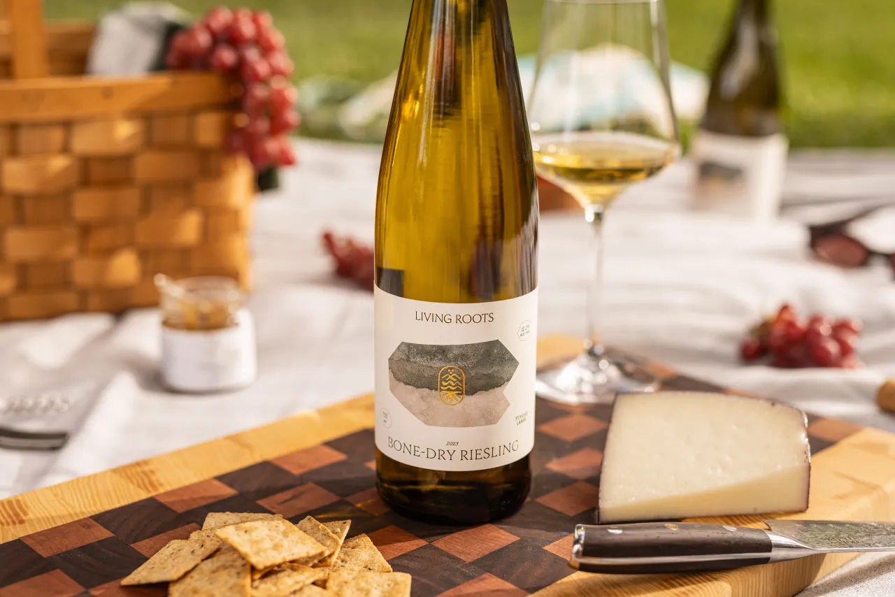
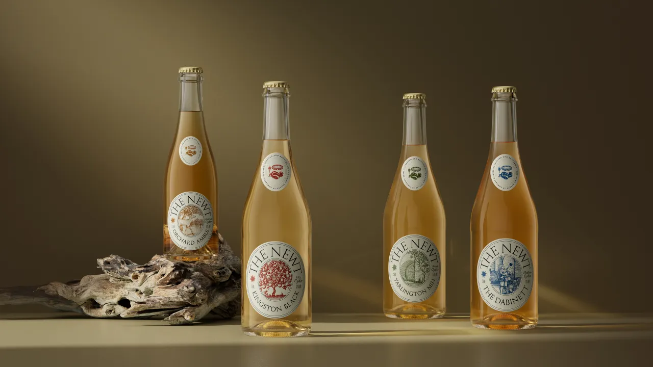
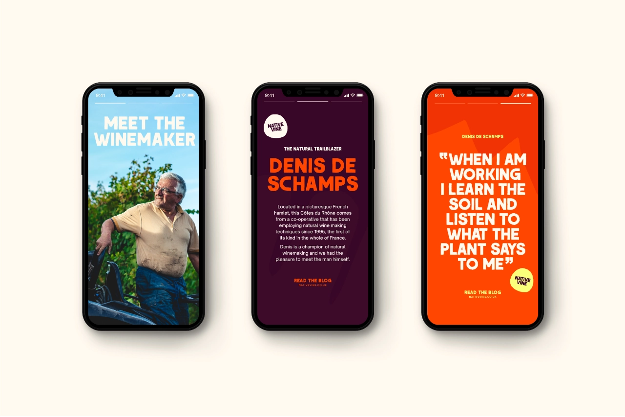
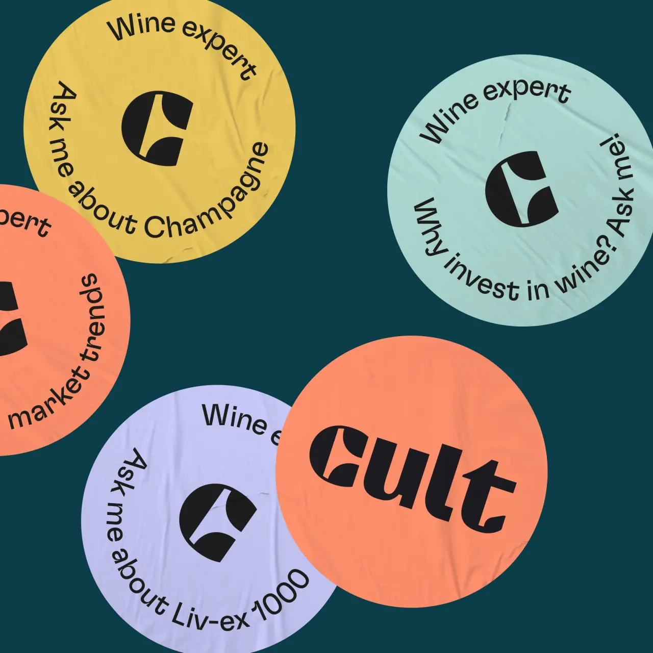
"Wine is complicated, and that's before you even get to all the processes, additives and slick tricks employed by some modern, industrialised producers," saysThe Counter Press when introducing its branding project for Raw Wine.

Founded by Deborah Lambert and Isabelle Legeron MW (France's only female master of wine), Raw Wine brings together growers, makers and buyers in a celebration of the best organic, biodynamic and natural wines from around the world. These are wines made with the lowest intervention possible, in both the growing and production. Traditional methods for a new audience.
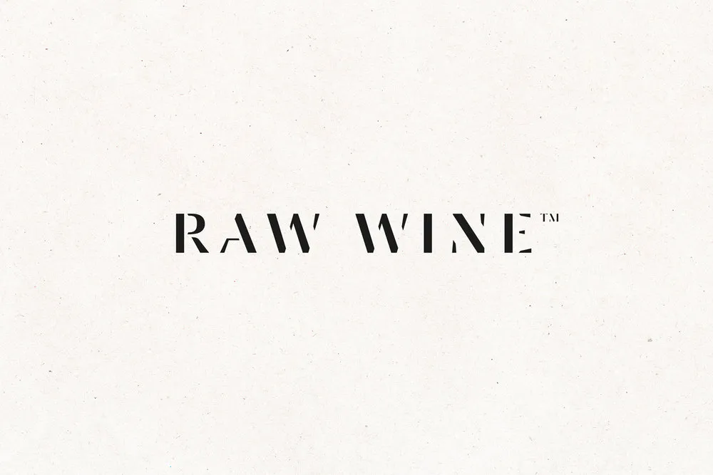
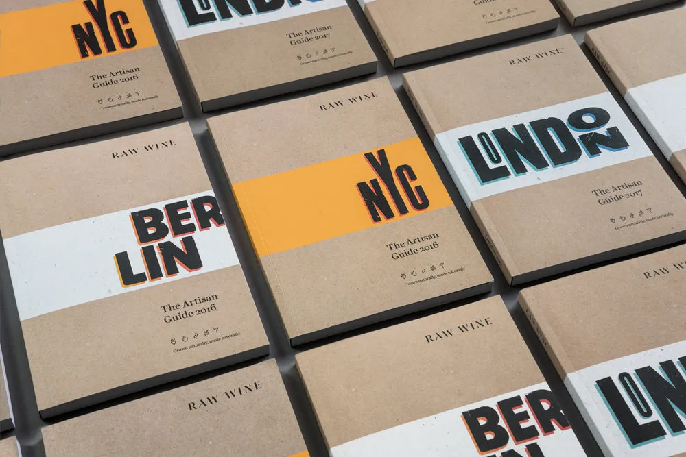
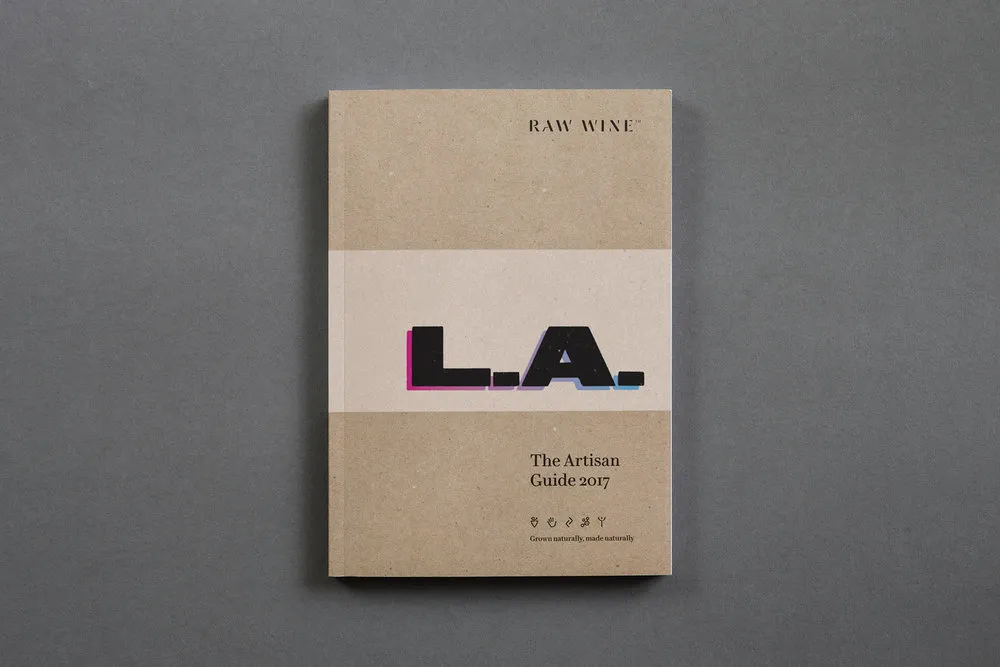
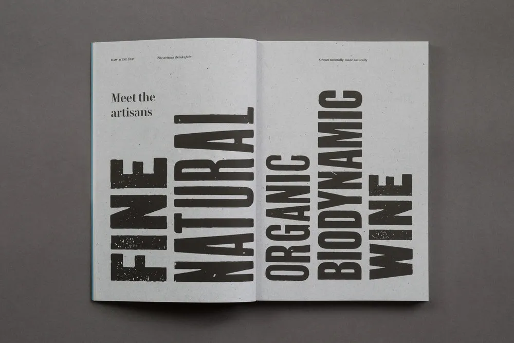
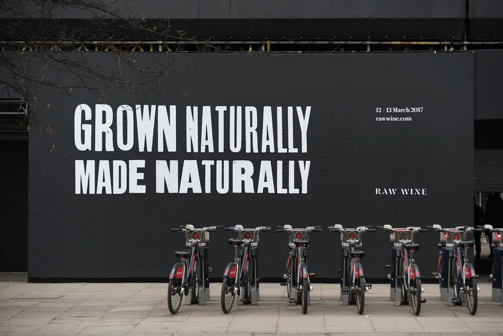
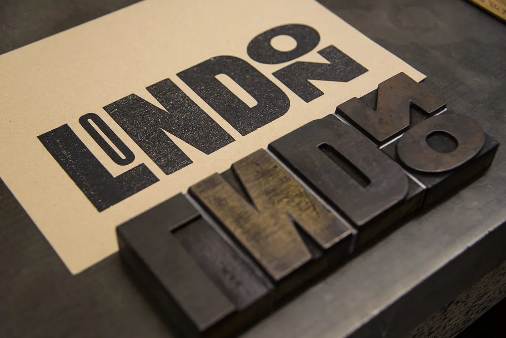
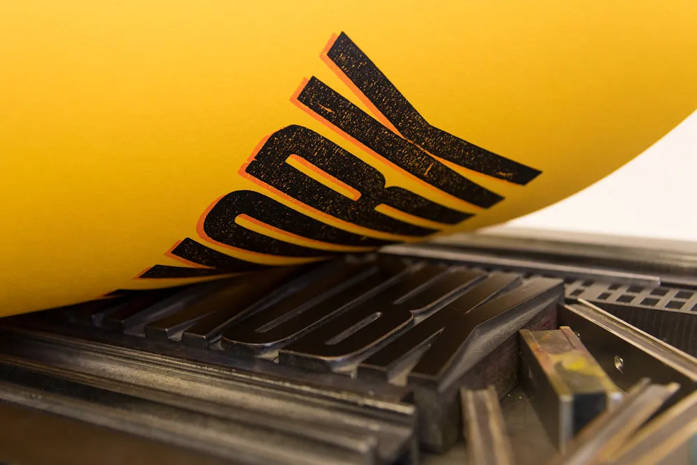
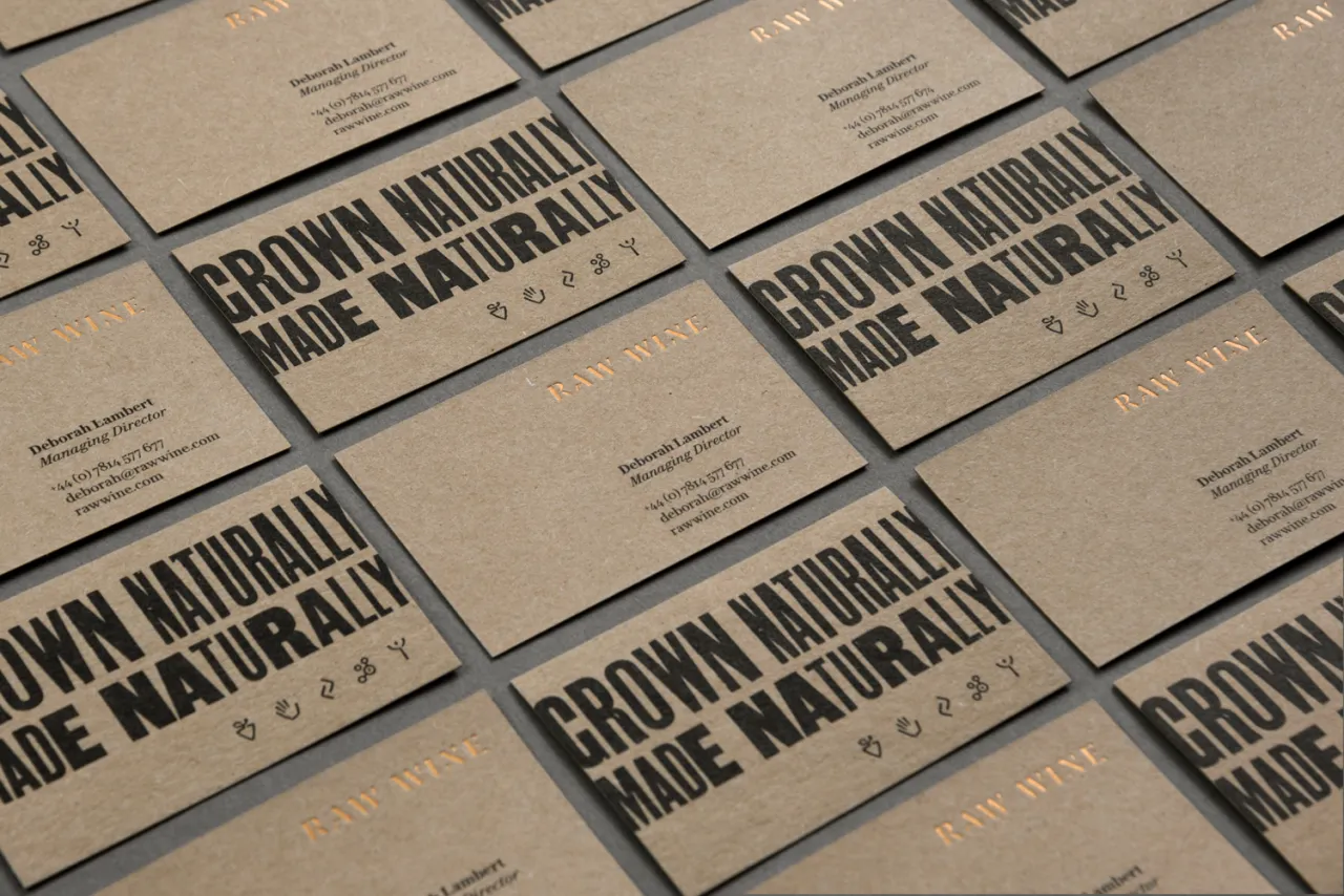
The Counter Press worked with brand consultant, Dan Rowe, to create a new identity that would capture both the quality and the individuality of these wines and their artisan producers. It explained: "This balance is perfectly reflected in the idiosyncrasies of wood-letter typography and the crafted production of letterpress, which sits at the heart of the new brand identity.
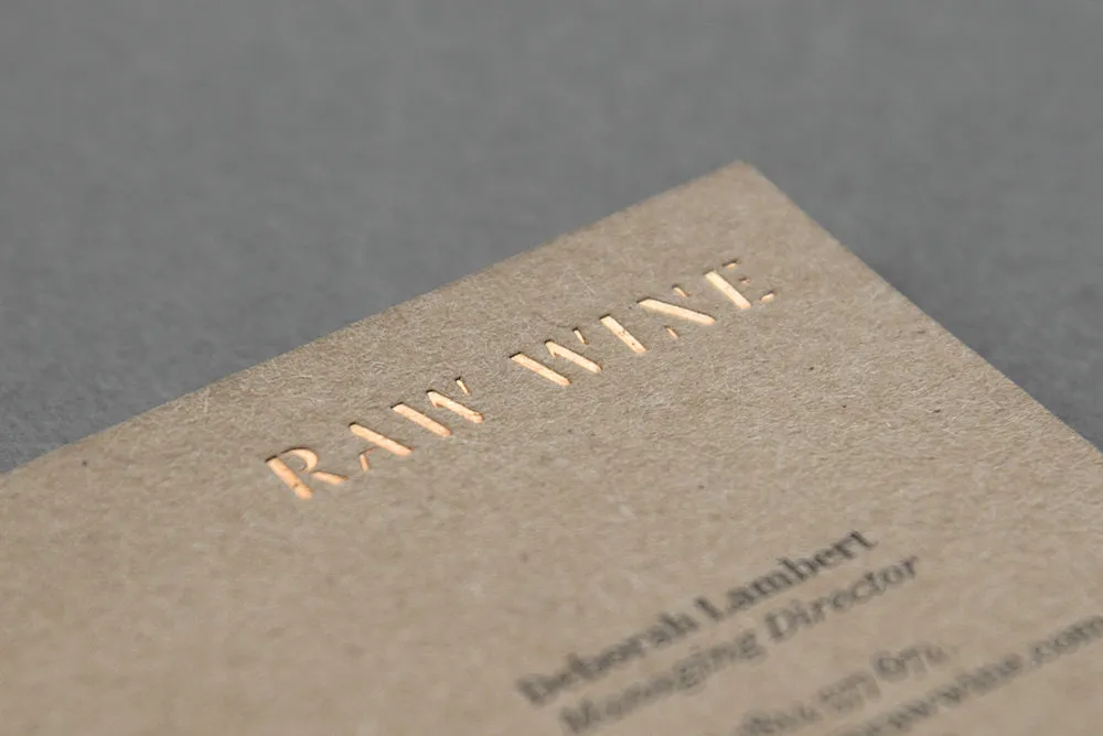
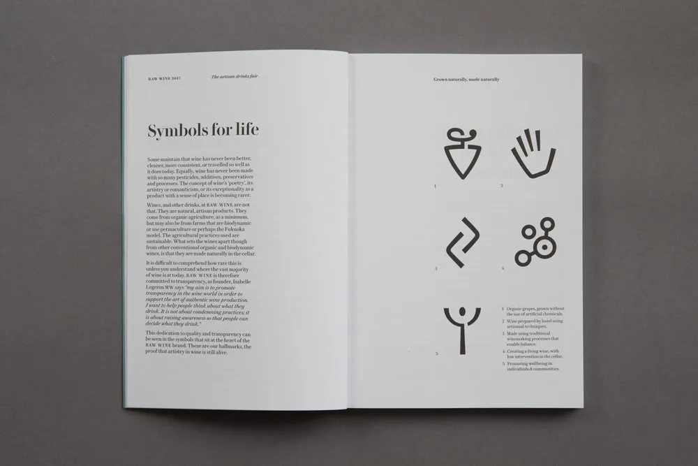
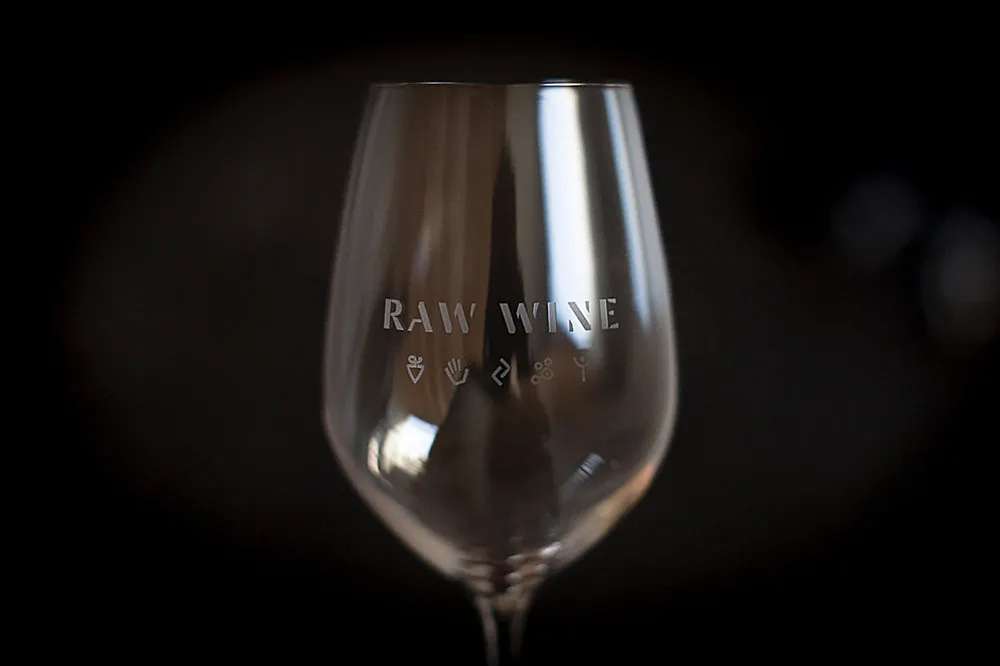
"In addition we also created a new bespoke logotype (inspired by the long established use of stencils in wine making) and a suite of custom icons, which represent the five fundamental principles of Raw Wine."
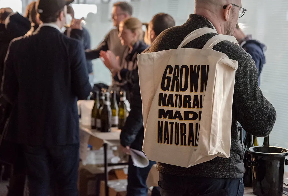
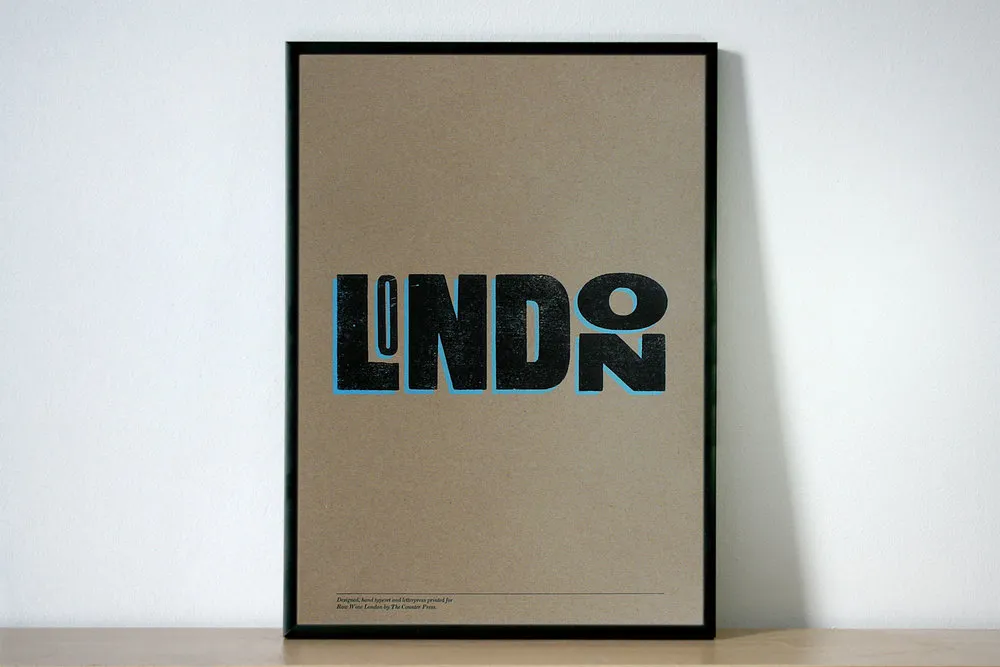
The identity has been developed across signage, catalogues, bags and promotional material for the four fairs around the world, as well as stationery and the new website. It's a perfect combination of traditional letterpress and modern production. A limited edition letterpress print, based on Raw Wine's London fair, is available in The Counter Press shop.
All images courtesy of The Counter Press
Editor's Picks





Trending






Latest Jobs
Midweight Designer at Catalyst Creative
Full-time·London·£32k-£36k
Agent & Producer at The Jacky Winter Group
Full-time·London·£35k–£40k
Art Director at The New York Times
Full-time·New York·$120k–$130k
Account Manager at Moxie and Mettle
Full-time·Cheltenham·Up to £35k
Head of design at Cog Design
Full-time·London·£55K
Brand Designer, Product Launches at Figma
Full-time·New York·$127k–$269k