The Roaring Twenties inspires Design Bridge's identity for a new rosé drink by Sacha Lichine
Inspired by the lavish parties of the 1920s (and perhaps the 2020s if things go to plan), Design Bridge's identity for a new rosé wine features eclectic graphics and a bespoke bottle structure designed to connect with the "contemporary wine drinker".
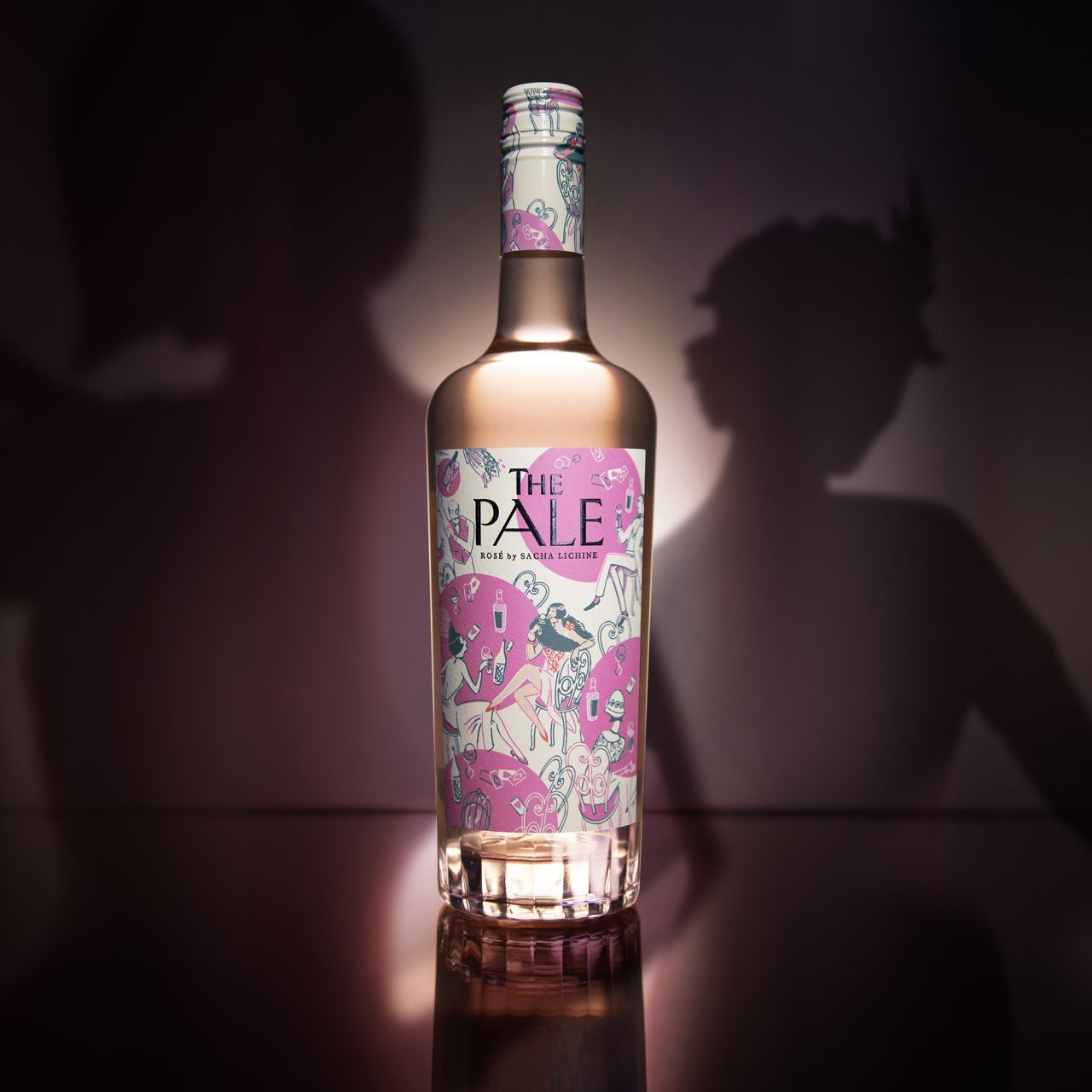
The London arm of the studio created the brand design and bespoke packaging for The Pale – in its latest collaboration with wine producer, Sacha Lichine. It's a fun and hedonistic design that aims to "transport a young female audience back to the parties and decadence of the 1920s, balanced with a modern twist to remain relevant to today's rosé drinkers", as Design Bridge puts it.
"Sacha Lichine is a true trailblazer in the wine industry, and he has always embraced creative thinking and understood the power of design in achieving commercial success," says Jemma Akister, senior client director at Design Bridge London. "Having partnered with him for over 20 years to build stories and brands for his Chateau d'Esclans portfolio, Sacha came to us to launch his latest wine, The Pale. We collaborated with Sacha from the outset to create a quirky, celebratory brand that would stand out on shelf this rosé season and beyond."
Looking to the decadent parties and speakeasies of the 1920s, Design Bridge conceived the idea of the 'flamboyant soirée: "an exuberant party scene where The Pale would be the perfect drink". The work was carried out during the Pandemic and its visual concept looks to a "post-lockdown world when consumers' appetites for socialising will be higher than ever".
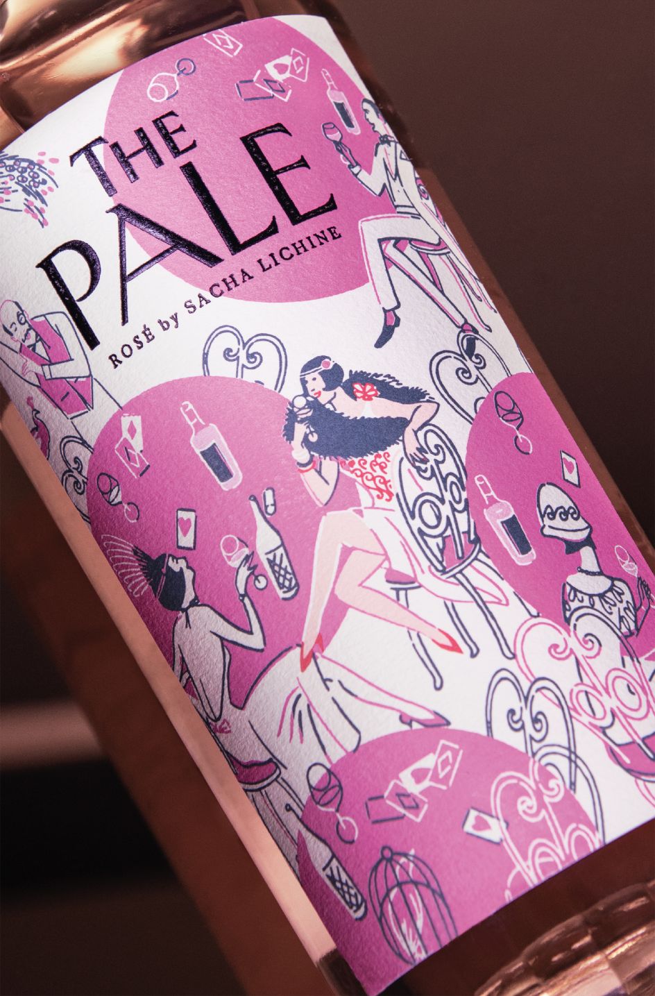
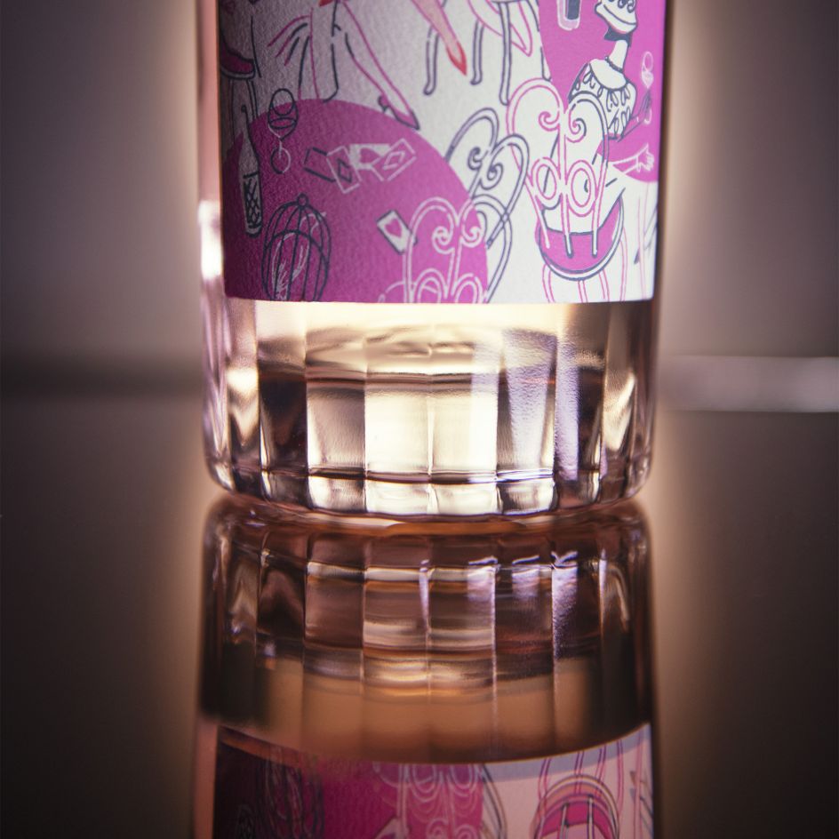
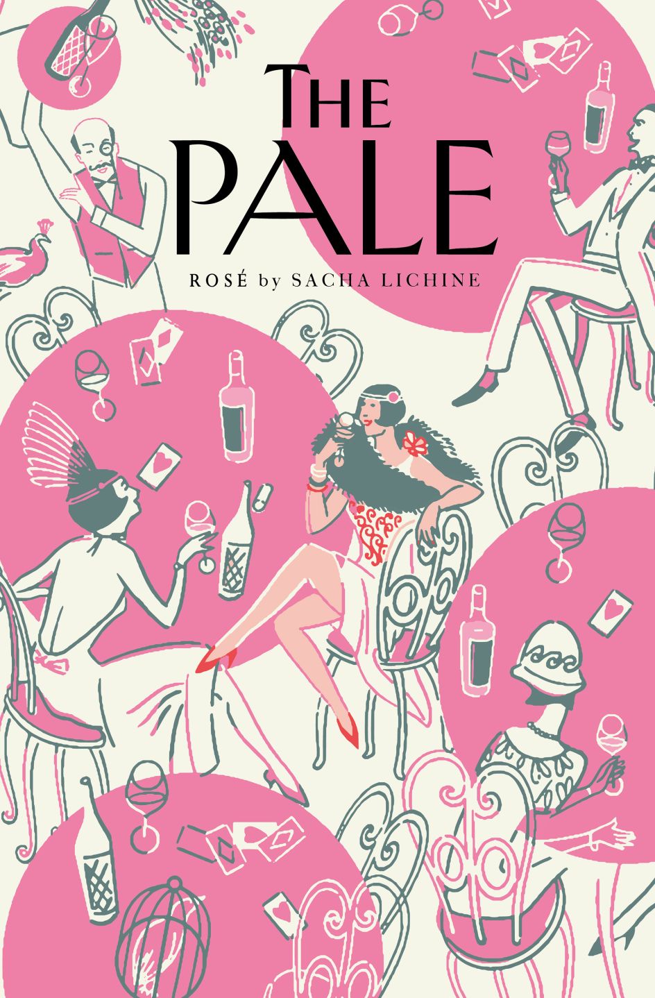
Living up to its name, The Pale is exceptionally pale in colour, so Design Bridge chose a striking hot pink and off-white colour palette for the visual identity to emphasise the wine's unique lightness by comparison. Says Design Director Natalie Hughes: "We hand-illustrated a vibrant soirée scene full of eclectic elements for people to discover. From peacocks to playing cards, our unique design offers drinkers a playful journey of discovery every time they pick up the bottle."
The unusual angles of the featured illustration add to the energy of the design, while a bespoke typeface is a modernised version of 1920s typography – making for quite the contemporary, stand-out design.
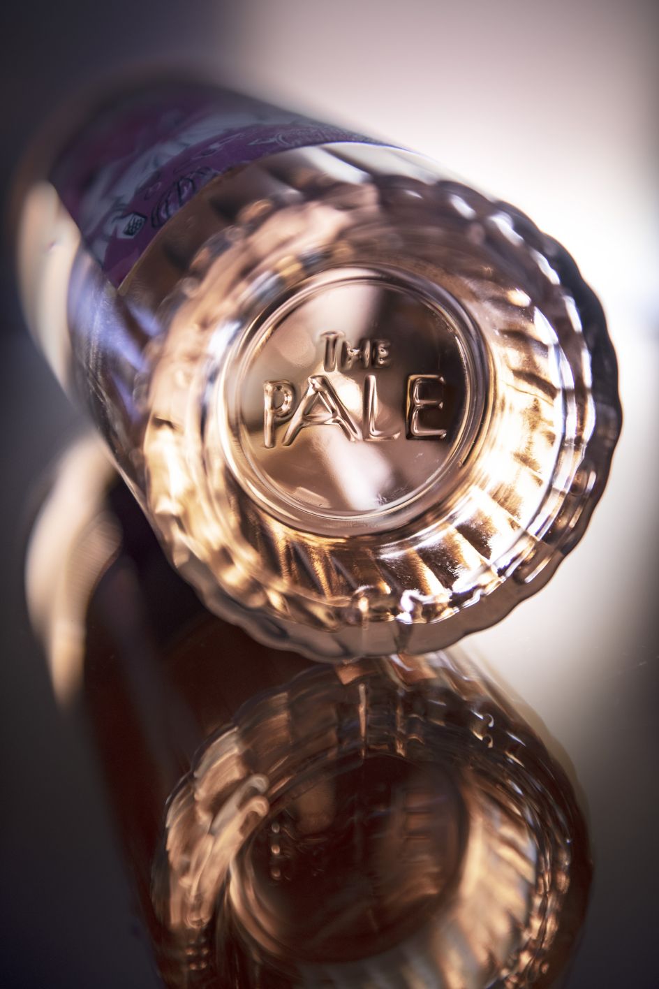
Luke Burley from Design Bridge adds: "To echo the decadence of the graphic design elements, we created a bespoke 3D structural design for The Pale to further set it apart from competitors. Featuring a slightly squat shape and tapered body, which was partly inspired by traditional whisky decanters, the bottle's inverted punt refracts light into the facets, giving the bottle a dazzling quality to elevate the liquid inside.
"You can even see The Pale's unique bottle shape hidden on the tables in the label illustration, which adds to the playful secrecy of our Prohibition-inspired design."
Editor's Picks


Trending


](https://www.creativeboom.com/upload/articles/90/908fdb6378db1e95d12595416f54e6336d5e80b8_732.jpg)
Podcasts


Editor's Picks
Further Reading