Studio AS-CC creates 'straightforward, honest' designs for canned wine startup, Defy
White wine in a can might not sound like the classiest thing; but that's about to change when you take a look at the new cans from "design-led" wine startup brand, Defy.
Aiming to create packaging that's convenient and sustainable packaging, the brand says that its target audience is "people with a desire for high-quality wine yet are afraid of and don't have time for the complexity and the elitism that accompanies wine culture."
The simplicity of the packaging designs reflects the straightforward, direct approach of the brand more generally. The initial brand strategy was developed by Oliver Dixon and brought to life by Studio AS-CC's Adam Spink and Calum Crease.
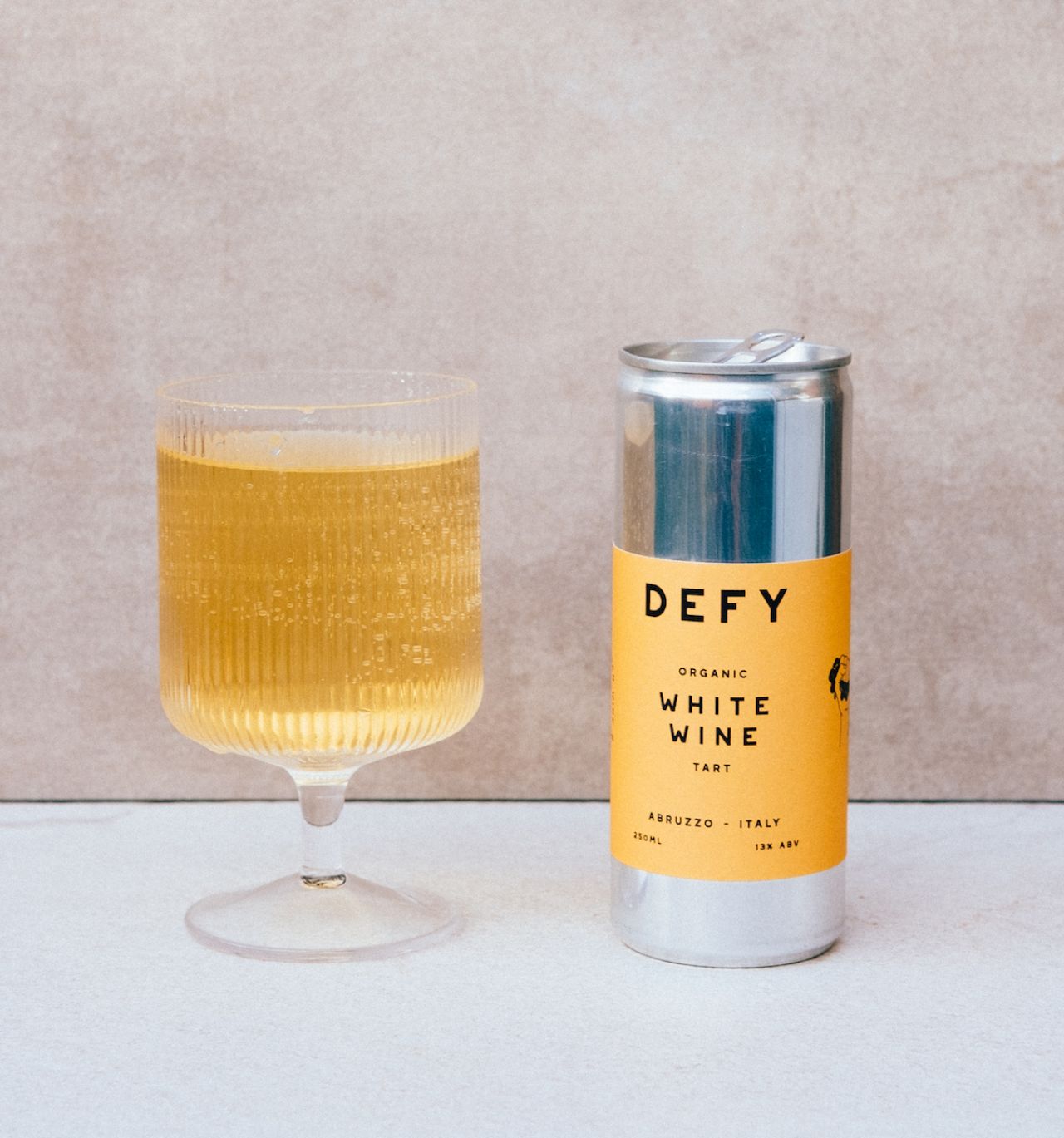
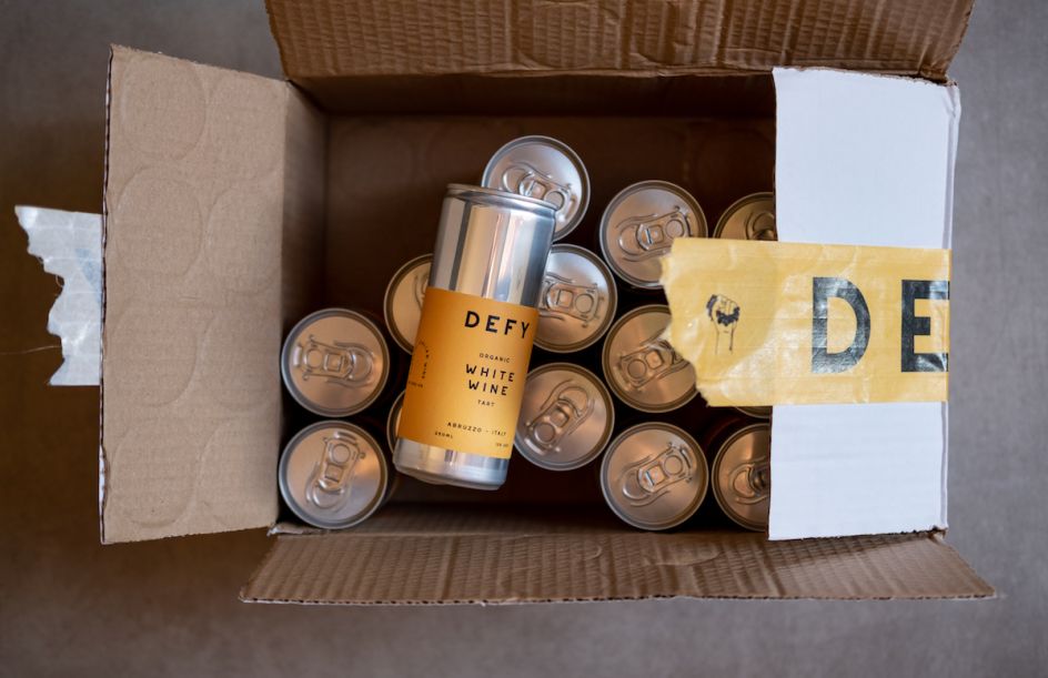
"What is important was the cans themselves," says Defy founder Leslie Owensby. "They are packaging the wine in 250ml slimline cans, and we knew these needed to be able to stand alone on the shelf, next to other drinks, and still stand out."
Studio AS-CC and Owensby wanted the cans to have a "strong design aesthetic" for the brand, making it "something which people would be proud to have it shown off in their homes."
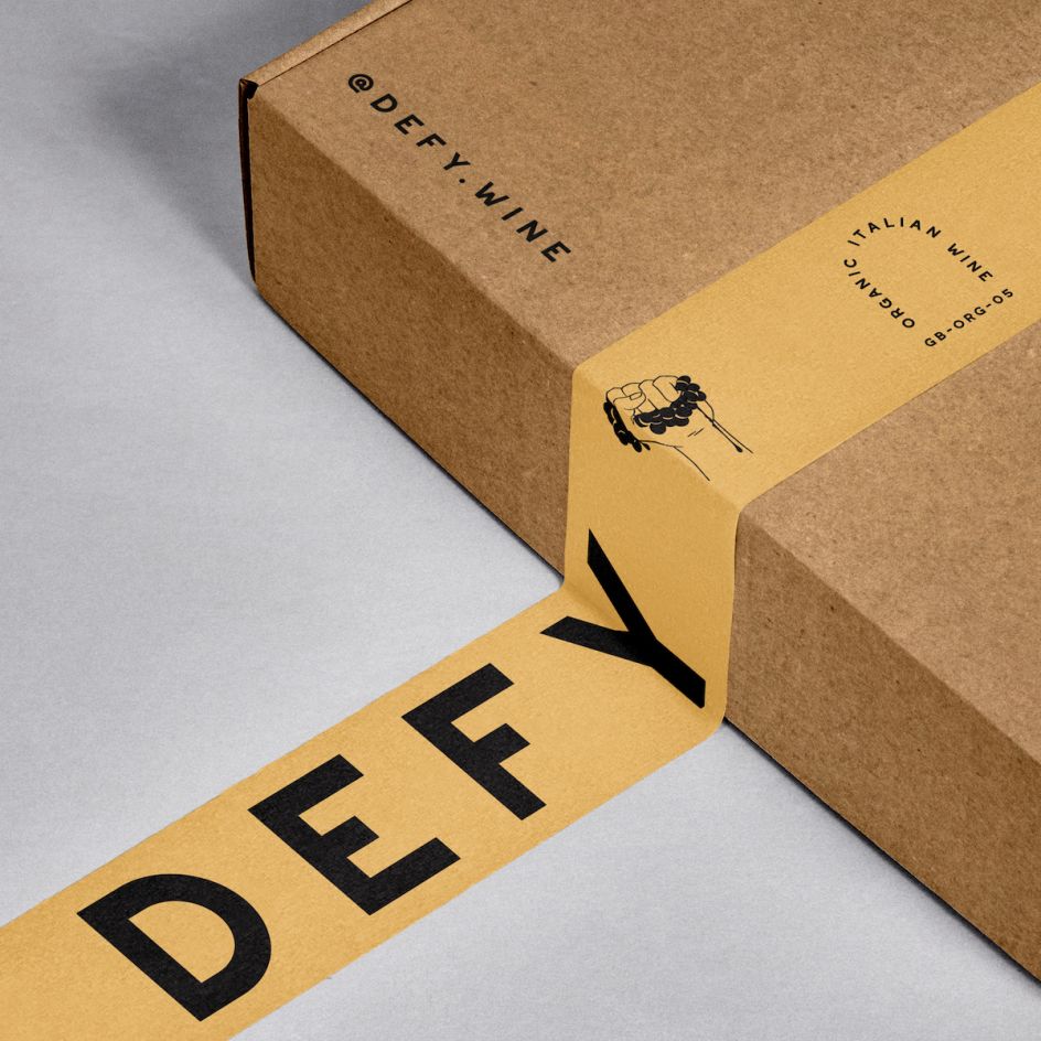
The leading brand font is geometric sans Westmount by Rook Supply, an independent design studio based in Montreal, Canada. It's used alongside NB Grotesk Std Regular. Owensby says that he and the designers arrived at the "orangish colour" naturally: partly it was to avoid cliches while not fighting customer expectations. "We decided to lean into the flavours rather than the colour characteristics of the wine itself," he says. "So thinking about what other food flavours are in the wine and what colours are those foods. The yellow one we did a test printing of, and it just worked. It's bold enough but also hints at the colour of white wine."
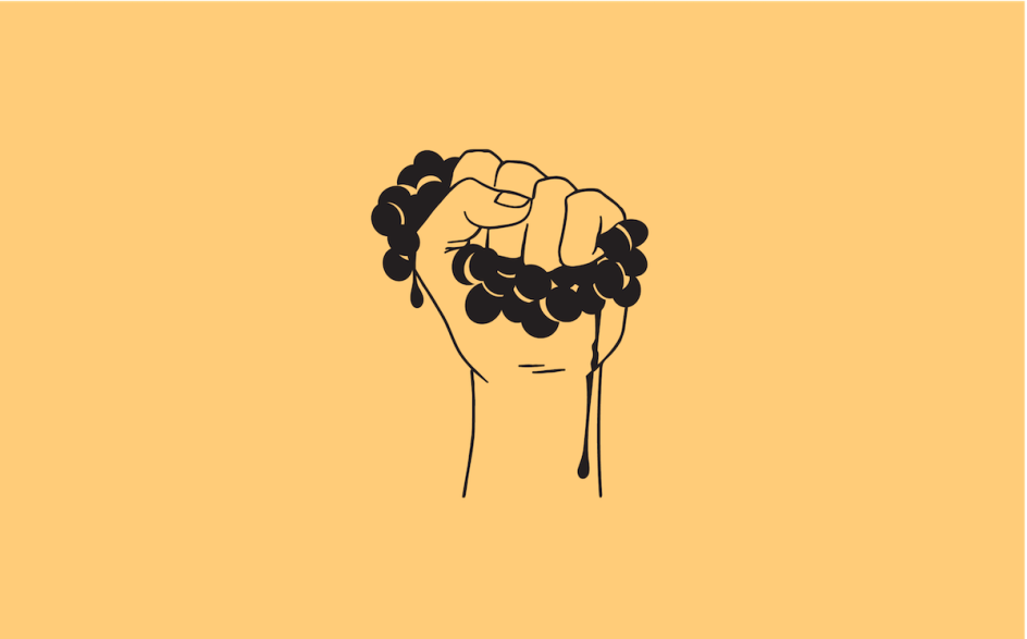
In-keeping with the branding and the ethos of Defy, the illustrations are also deliberately direct and straightforward, with solid black line-work that sits next to the block lettering on solid colours. Studio AS-CC came up with the concept of the "word-arch" as a design element that hinted at the wine's Italian origins by reflecting the archways found on the entrance to vineyards.
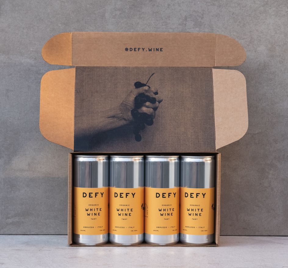
The physical packaging materials incorporate grainy textures to demonstrate the natural, organic product and the craft that's gone into the brand. "The printing on the inside of the box even has a slightly raised look and feel," says Owensby. The can labels are created using paper sourced from a wine bottle label maker in Italy. "It has a beautiful finish to it, and a great, high-quality feel when you get one in your hand," she adds.
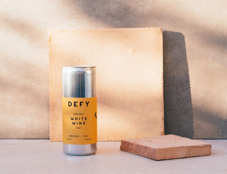
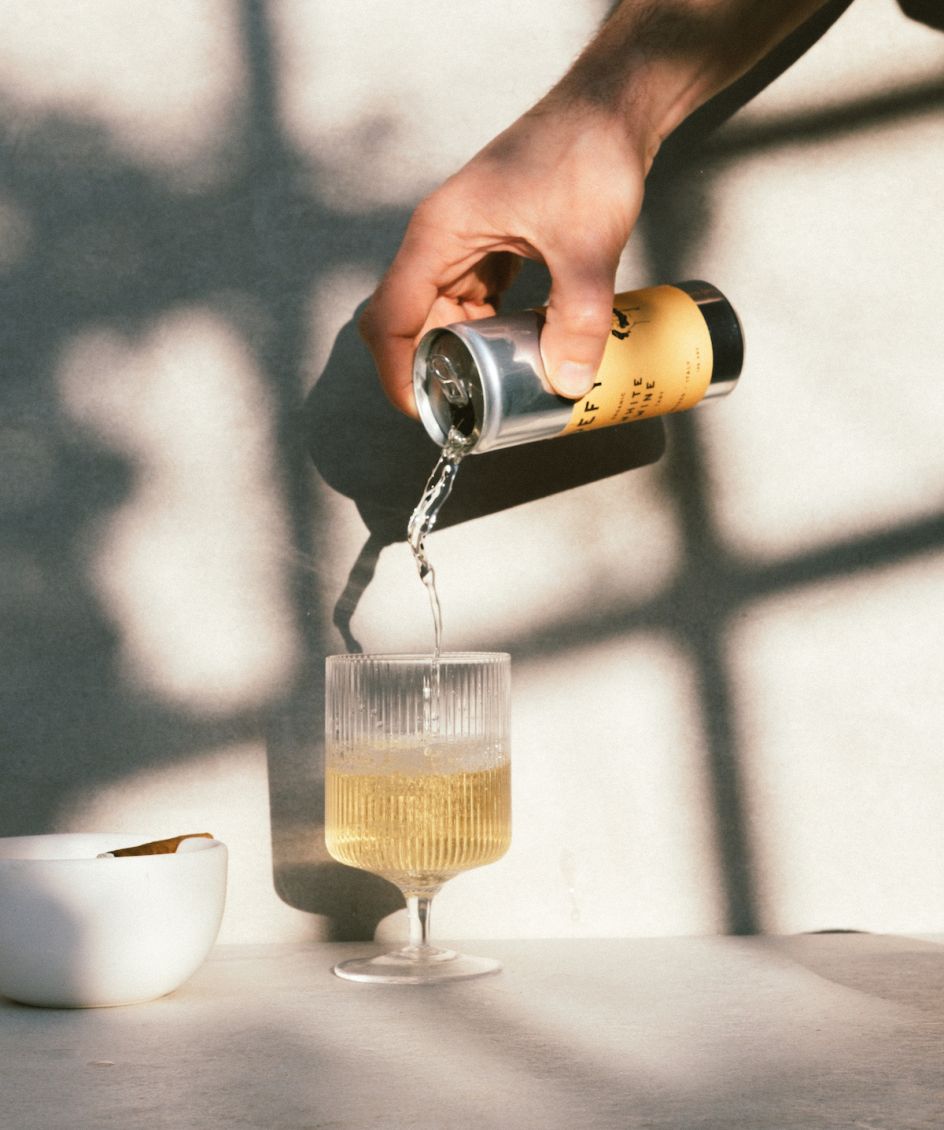
The art direction of the product imagery is created with three main concepts in mind: texture, demonstrating the material and grain; natural light; and honesty.
"The use of natural textures, fruit that evoke the flavours and tart tastes, natural sunlight and sometimes more traditional glasses and just glassware, in general, all adds to the playful, honest direction of Defy," says Owensby.
"It also gives the nod to traditional wine while playing with the idea of what high-quality wine is. All the shot stylings are very simple to keep that directness and simplicity in the visuals to go along with the message."
He adds, "All the imagery on the website and Instagram is shot by me using the things he has around his house. Maybe that's too honest!"
Editor's Picks


Trending


Podcasts


Editor's Picks
Further Reading