Pentagram launches new brand identity for Rolls-Royce to appeal to a 'younger audience'
When we think of Rolls-Royce, the word "luxury" immediately springs to mind; a brand often reserved for the very rich (and perhaps famous), not something meant for anyone below the age of 60. It's no surprise, then, that Pentagram has today revealed a fresh identity to help modernise the company and appeal to a younger (equally well off) audience.
Since the words, "Take the best that exists and make it better", were spoken by the marque's co-founder, Sir Henry Royce, Rolls-Royce has experienced evolutionary change. The company's products are renowned for their hand-craftsmanship, born from the finest materials, while the brand and its illustrious figurine, the 'Spirit of Ecstasy', have become icons for the best of the best.
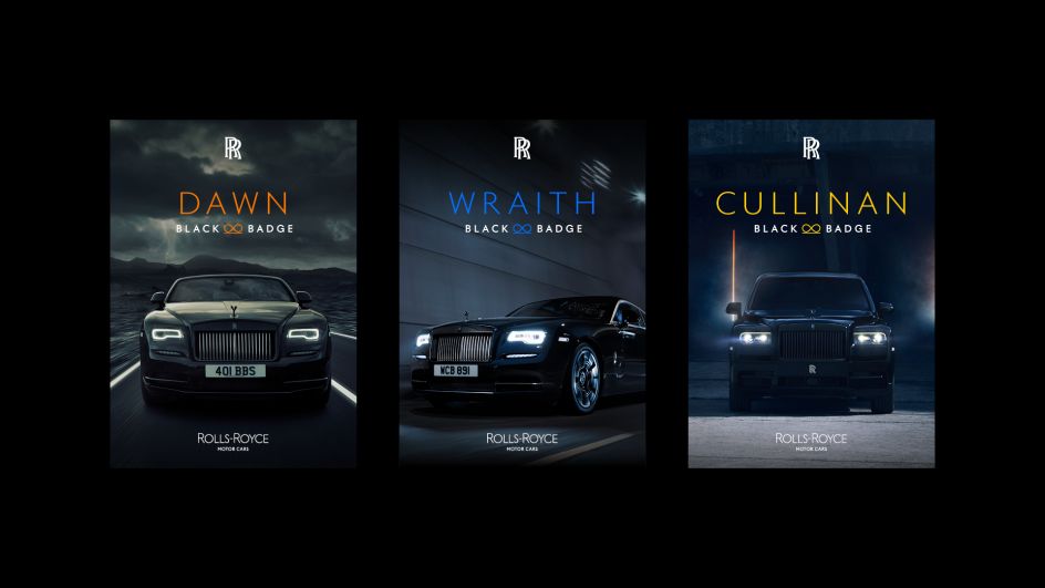
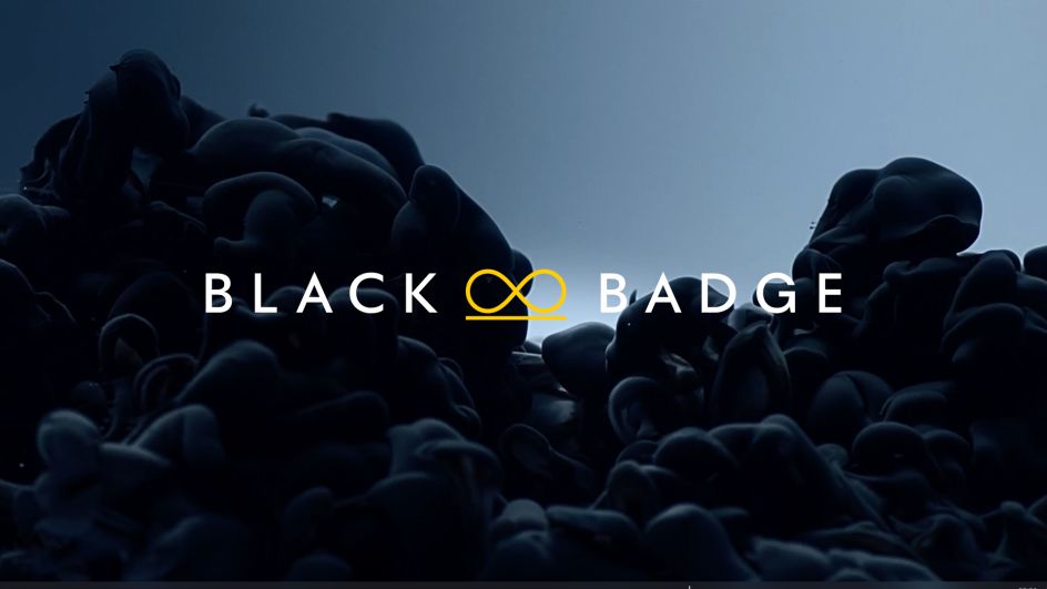
In recent years, the Rolls-Royce portfolio has expanded to five models, each with their own distinct character, and almost every motor car created at the marque's plant in Goodwood, West Sussex, is bespoke – tailored to the lifestyle requirements of diverse and discerning patrons. The introduction of Black Badge, the marque's alter-ego, has met the needs of a subset of these clients, answering their call for an edgier, alternative Rolls-Royce, one that carries an "assertive and dominant" persona. As such, the age and demographic of the marque's clients have decreased significantly to an average of just 43.
How then, does Rolls-Royce present itself and remain true to its heritage while speaking to its bright and contemporary future? "As the marque's digital presence increases, there has never been a more important time for the visual language of the company to reflect our standing as the leading luxury brand in the world," says Chief Executive Torsten Müller-Ötvös. "We have embarked on a fascinating journey of modernising our brand identity to echo those changes seen in our portfolio, our client demographic, their lifestyle and the luxury world that surrounds them."
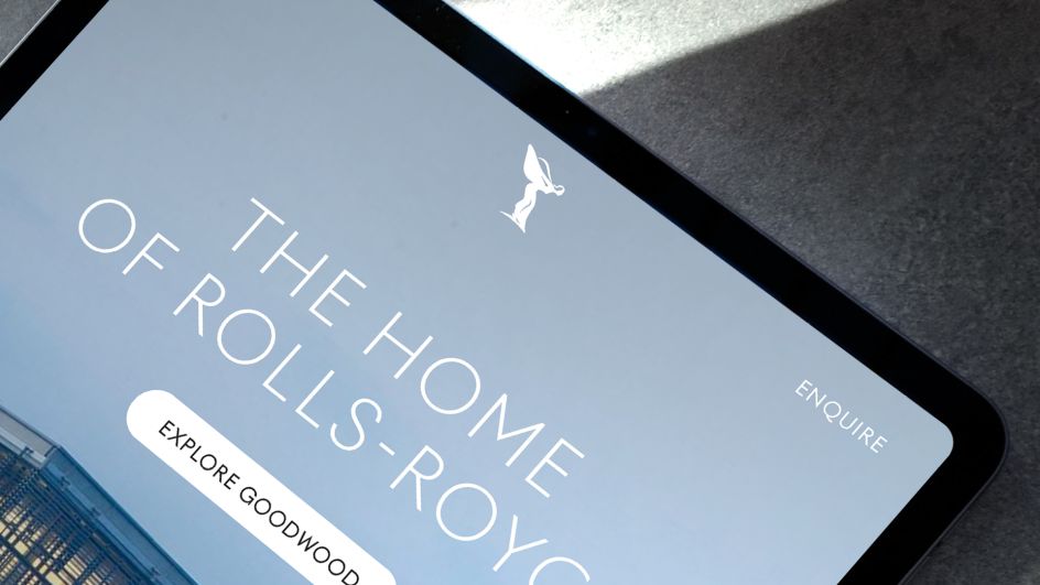
Rolls-Royce appointed Marina Willer, partner at Pentagram, to create the new identity that could "move beyond the mechanics of being the 'Best Car in the World', to encapsulate the brand's presence and standing as a true House of Luxury". The identity was designed to appeal to the new demographic of clients and all that they represent both digitally, and physically.
Pentagram embarked upon a deep exploration of Rolls-Royce, including its products – both new and old, its design ethos, its designers, items that are sacrosanct to the marque, and, the unique relationship the marque maintains with its clients. "What soon became apparent is that Rolls-Royce has evolved from being regarded as an automotive manufacturer into a leading light in the world of luxury," says Marina. "It was essential for us to ensure that the brand's new identity reflected this shift. We needed to present Rolls-Royce in a forward-facing, fresh and relevant way - speaking to new audiences while respecting the company’s loyal clients."
Marina was able to approach the re-design from a completely fresh perspective. "I do not come from an automotive background. This vantage point provided me with the opportunity to observe Rolls-Royce as a manufacturer of luxury products. My ambition was to celebrate the luxuriousness of the brand while providing it with the means to visually communicate with Rolls-Royce's younger, increasingly diversified audiences," she adds.
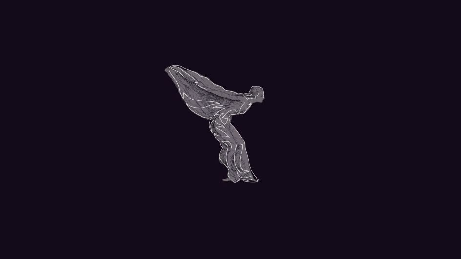
The refresh begins with the Spirit of Ecstasy, an instantly recognisable, modern icon of British luxury. Having graced the prow of Rolls-Royce motor cars since 1911, today, she remains one of the world's most famous symbols, embodying "beauty, luxury, style and perfection". Pentagram has made her more prominent in the marque's brand identity. While the sculpture that leads each motor car in silent grace remains unchanged, an iteration of the enigmatic figurine has evolved into the form of an illustration.
The original figurine was drawn and sculpted by British artist Charles Sykes. In homage to this historical commission, leading illustrator Chris Mitchell was appointed by Pentagram to envisage the distilled form of the iconic statuette. When depicted in two-dimensional form, her direction has changed from left to right, boldly facing the future, reflective of the marque itself.
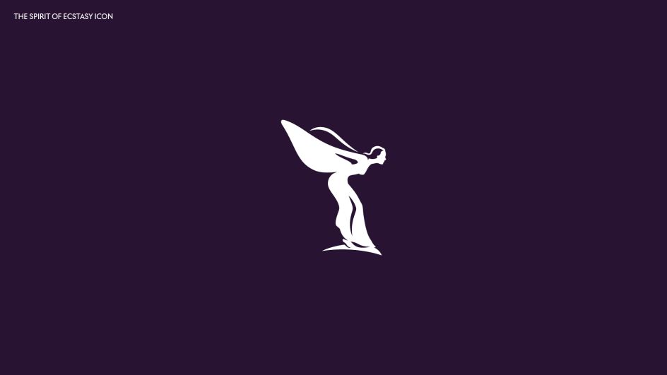
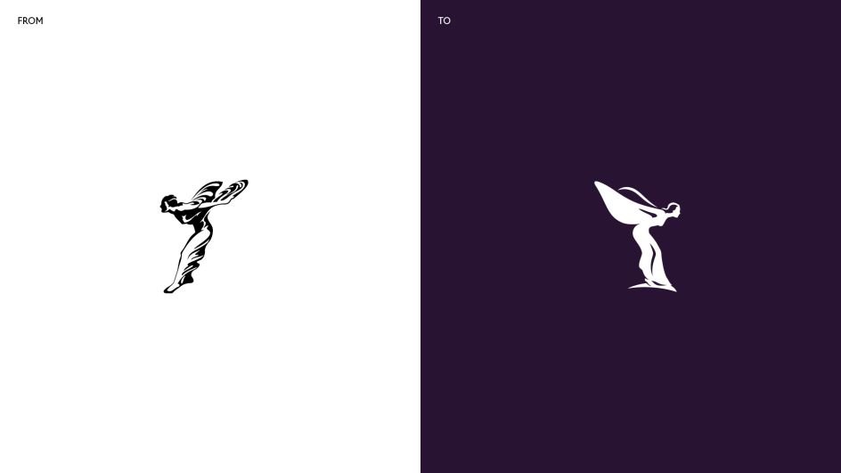
"The use of the Spirit of Ecstasy marks a shift in the resonance of the brand – from an automotive to a lifestyle context," says Marina. "She commands an aspirational quality in the luxury sphere and by placing her at the centre of the visual language. The Spirit of Ecstasy can now be interpreted as the muse for the marque, in addition to the motor cars themselves."
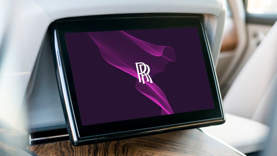
When choosing a colour palette for the new identity, Pentagram's design team initially turned its attention to the company's products. "Rich in textural materiality, wooden brown hues and graphite coloured technical fibres complemented a colourful array of Rolls-Royce leathers," says Pentagram. "Although true to their artisanal origins, brown and slate palettes confined the identity to the past. The desire was to seek a more expressive, luxurious colour palette, one appealing to both male and female clients, one with a future vision."
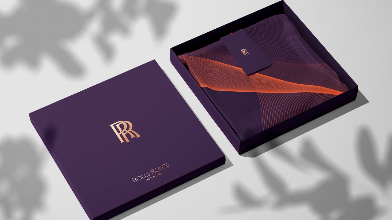
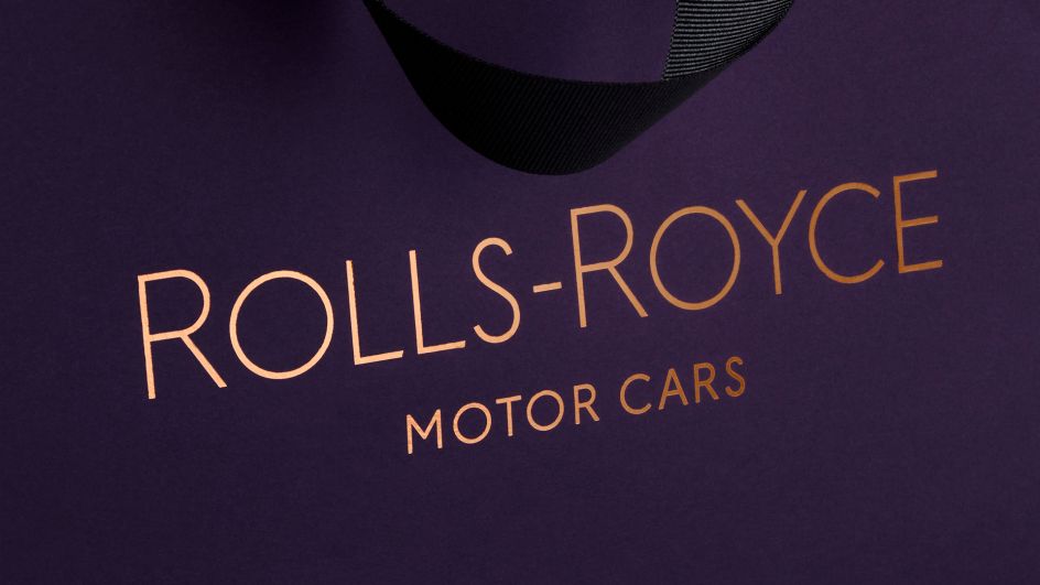
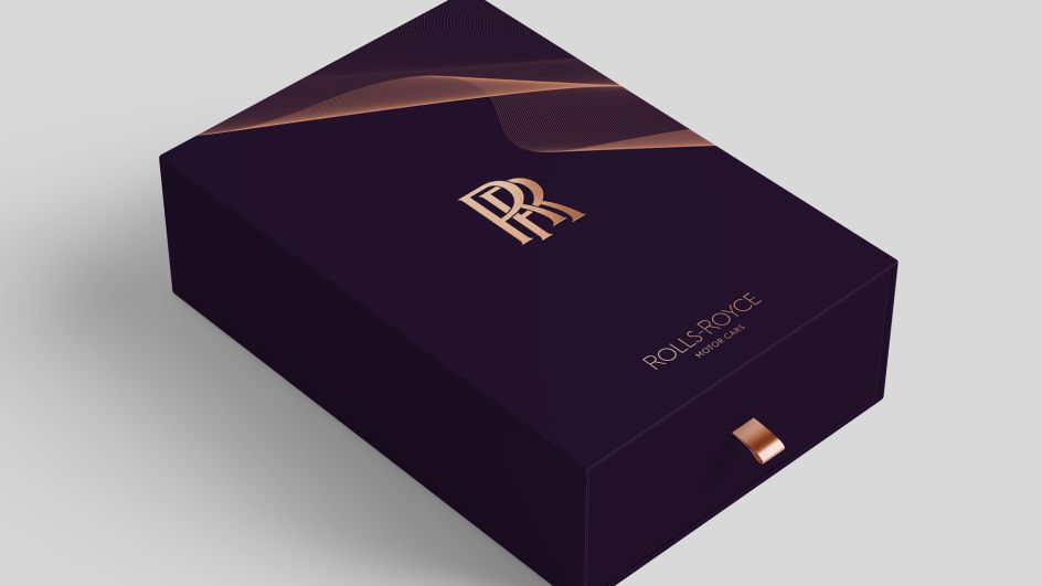
Pentagram was drawn to purple hues, specifically those with a deep and majestic tone, claiming that with "roots in mythology, art, piety and royalty, purple has always signified wealth and power". As a result, a colour named Purple Spirit will pave the way for the future of luxury by becoming Rolls-Royce's signature colour. A metallic Rose Gold was chosen to complement this colour and will only be used in printed form. A wider palette of colours will also be used alongside these primary tones.
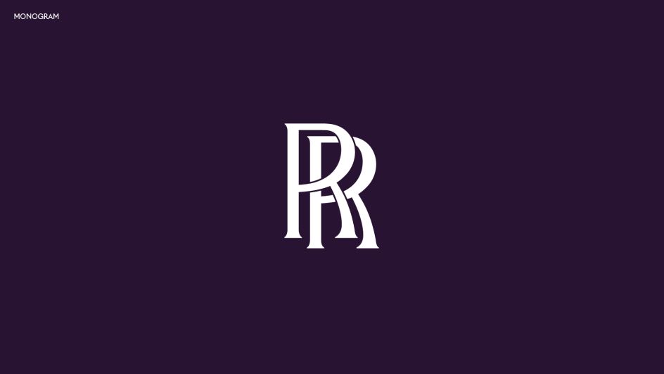
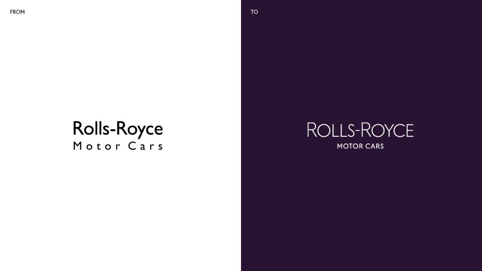
Meanwhile, the double 'R' badge of honour, which represents Rolls and Royce, the marque's founding fathers, remains unchanged. The monogram also keeps its original form but replaces the badge of honour on collateral, while the wordmark 'Rolls-Royce Motor Cars', as found presiding above the door of the marque's establishments, was found to be corporate and unrepresentative of the marque's standing as a 'House of Luxury'.
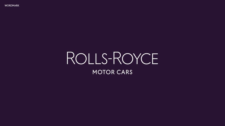
Instead, Pentagram uncovered typography in the marque's archives from the 1930s and used an art-deco style as the basis from which to envisage a new, more modern wordmark. The words 'Motor Cars' have reduced in size, with the emphasis reverting to Rolls-Royce, in recognition of the marque's "significantly wider influence outside of the automotive industry".
The wordmark has also become more refined in its appearance, depicting the "quiet, whispering power of contemporary Rolls-Royce". Special significance has been paid to the letter 'R', to boost the prominence of this important character in the Rolls-Royce script.
In terms of the brand's typeface, Pentagram's design team explored multiple options in search of a font that depicts luxury, without being overly decorative. They believed the font must also demonstrate the connection with the marque's rich history. The chosen typeface, Riviera Nights, stems from the same family as Gil Sans Alt, the marque's previous font, but with additionally crafted and bevelled letters.
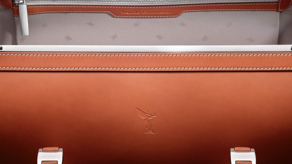
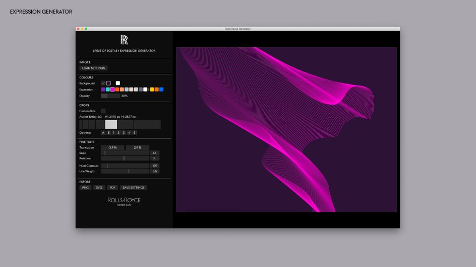
Finally, a wholly new visual treatment of the Spirit of Ecstasy has been created, called The Spirit of Ecstasy Expression. With an ethereal yet tech-like feel, it adds a cutting-edge aura to the new visual identity. Akin to a silken fabric, The Expression adopts a fluid form and is versatile in nature. It's an innovative digital tool that uses coding, developed by Pentagram, to enable it to be used on any surface, from projection to embroidery, printing to engraving. It can be found in both physical form at the marque's global establishments and in digital form – connecting the elements of the marque's portfolio.
Editor's Picks


Trending


Podcasts
Editor's Picks
Further Reading