Drawing from the source: Pentagram's bold new identity for the Royal Drawing School
As the institution celebrates 25 years, a rebrand by Pentagram's Harry Pearce and team captures the soul of a place where drawing still matters... not just as a skill, but as a way of seeing, thinking and connecting.
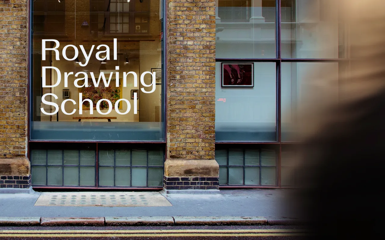
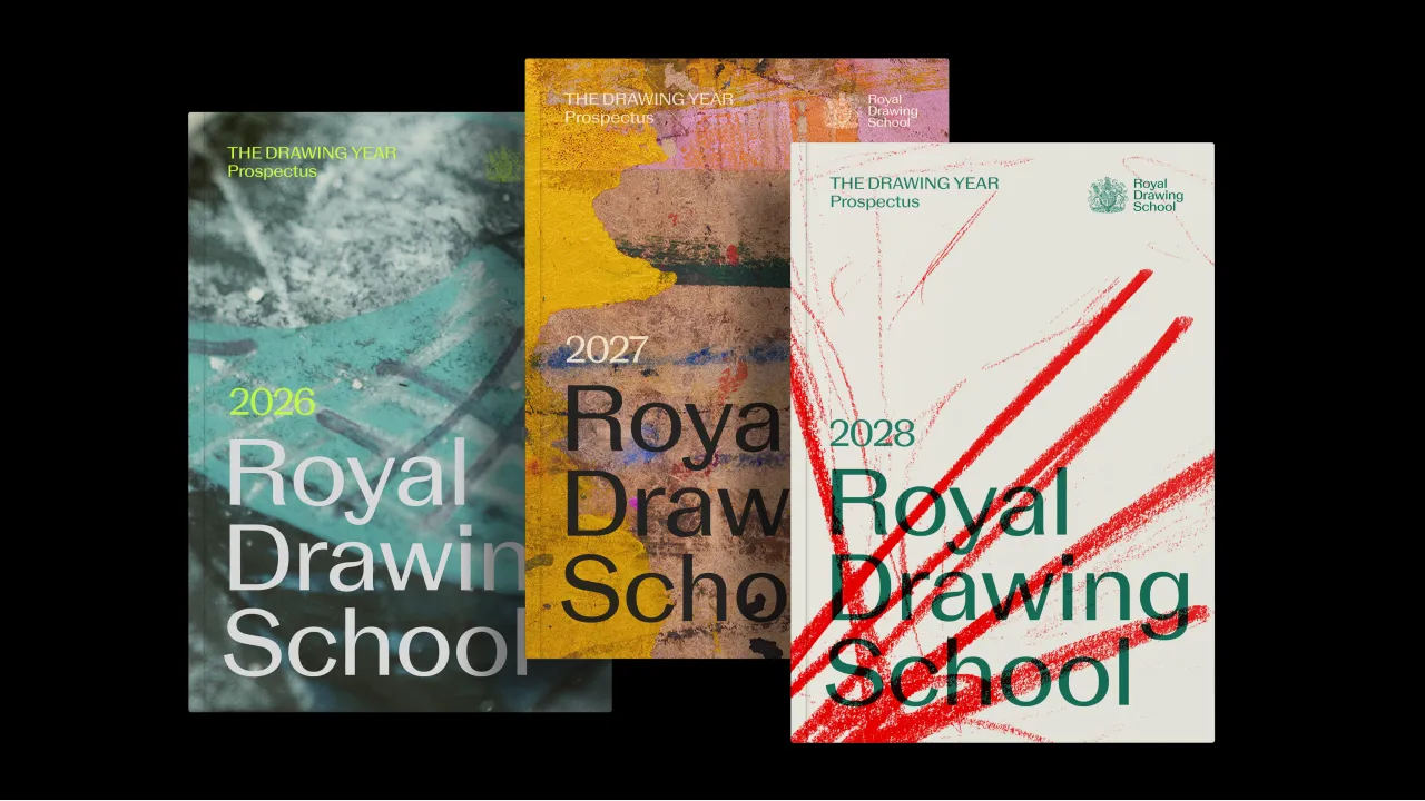
To mark its 25th anniversary, the Royal Drawing School has revealed a brand new visual identity, courtesy of Pentagram partner Harry Pearce and his team. And I must say, it's a real beauty.
Unveiled at a celebratory reception hosted by HM King Charles III and Queen Camilla at St James's Palace, the new look captures the unique spirit of the School: creative, generous, open, and rooted in the timeless power of drawing.
Founded in 2000 by King Charles and artist Catherine Goodman, the Royal Drawing School is one of the only institutions in the world dedicated to the practice of observational drawing. It offers world-class tuition to artists and creatives of all ages and backgrounds – from total beginners to seasoned practitioners – through its postgraduate Drawing Year, public courses, and programmes for young artists. It's independent, artist-led, and not-for-profit, driven by a belief in drawing as a fundamental tool for seeing, thinking, and expression.
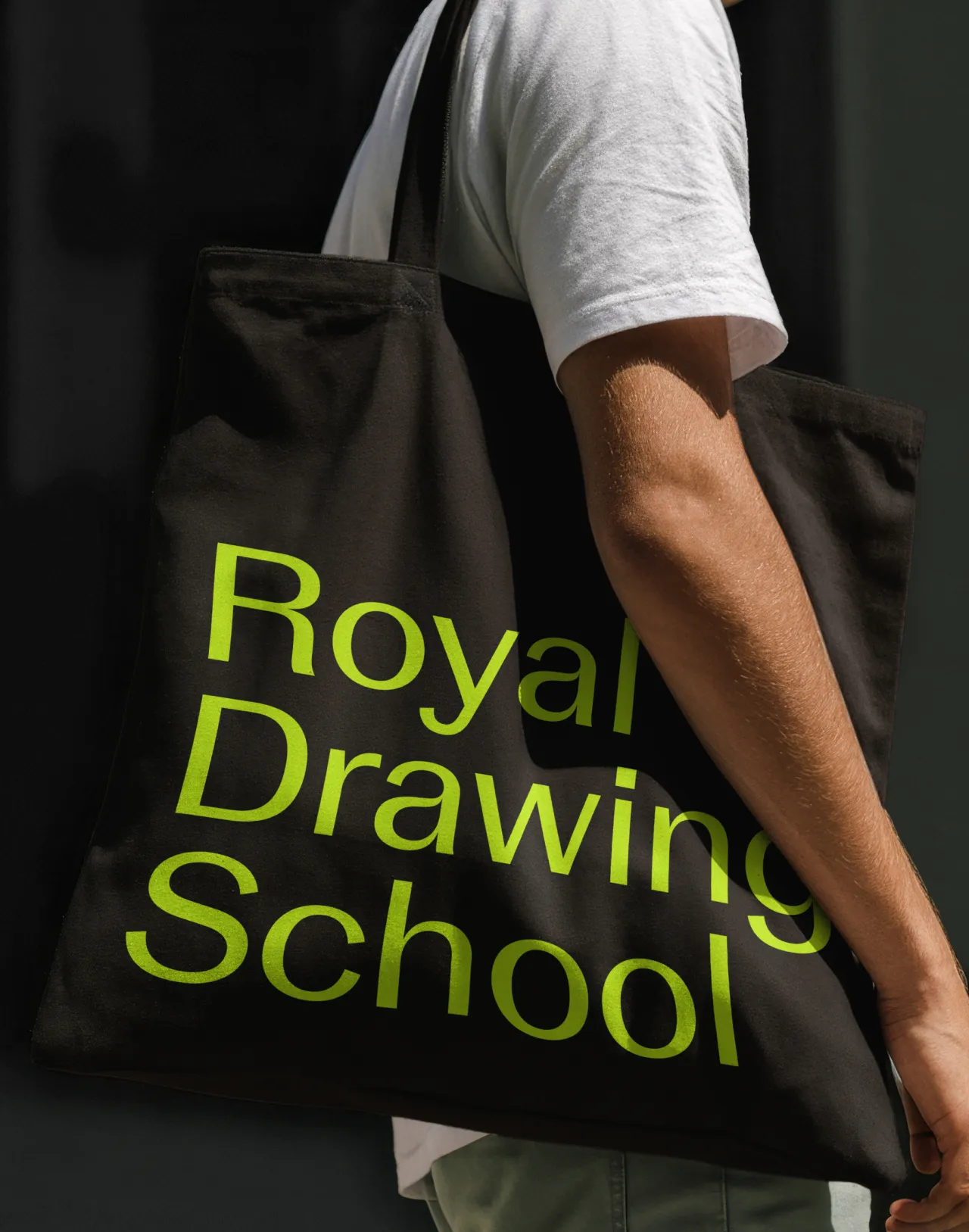
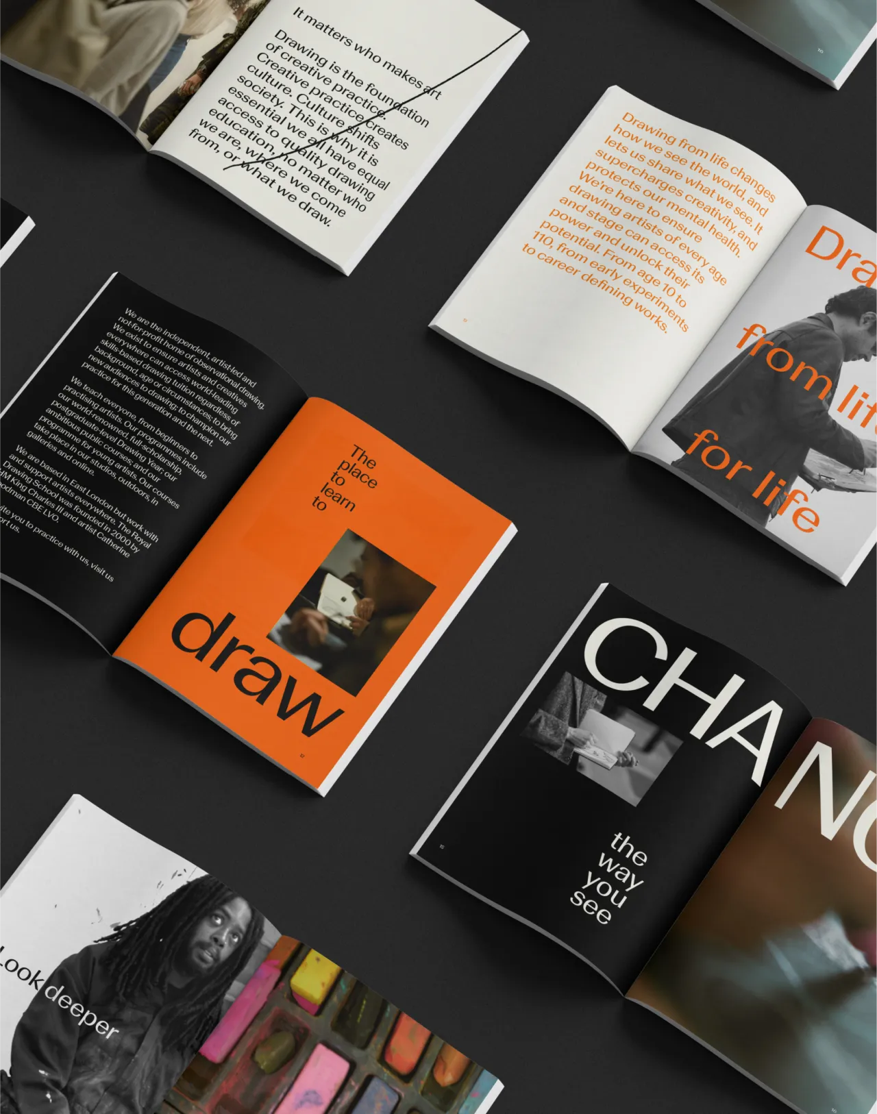
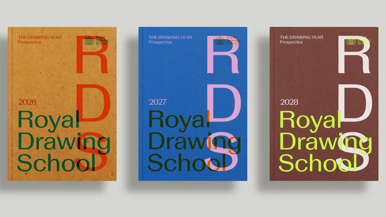
As it approached its quarter-century milestone, the School wanted a refreshed identity that reflected both its heritage and its future – something that could sit comfortably across everything from sketchbooks and signage to international fundraising campaigns. The brief called for warmth and rigour, clarity and character. In short, something that felt as alive and human as the drawings made within its walls.
Harry and his team began, fittingly, by drawing and sketching the letterforms for a new logo by hand. Starting with a basic sans serif, they introduced sculptural quirks and subtle flares to give the type a painterly, human quality. This bespoke wordmark led to a custom typeface with echoes of classic grotesques, but softened and refined to feel contemporary and quietly distinctive.
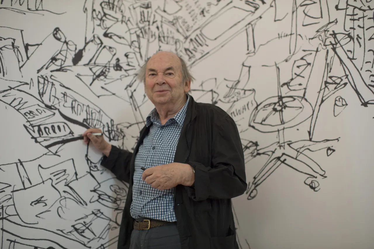
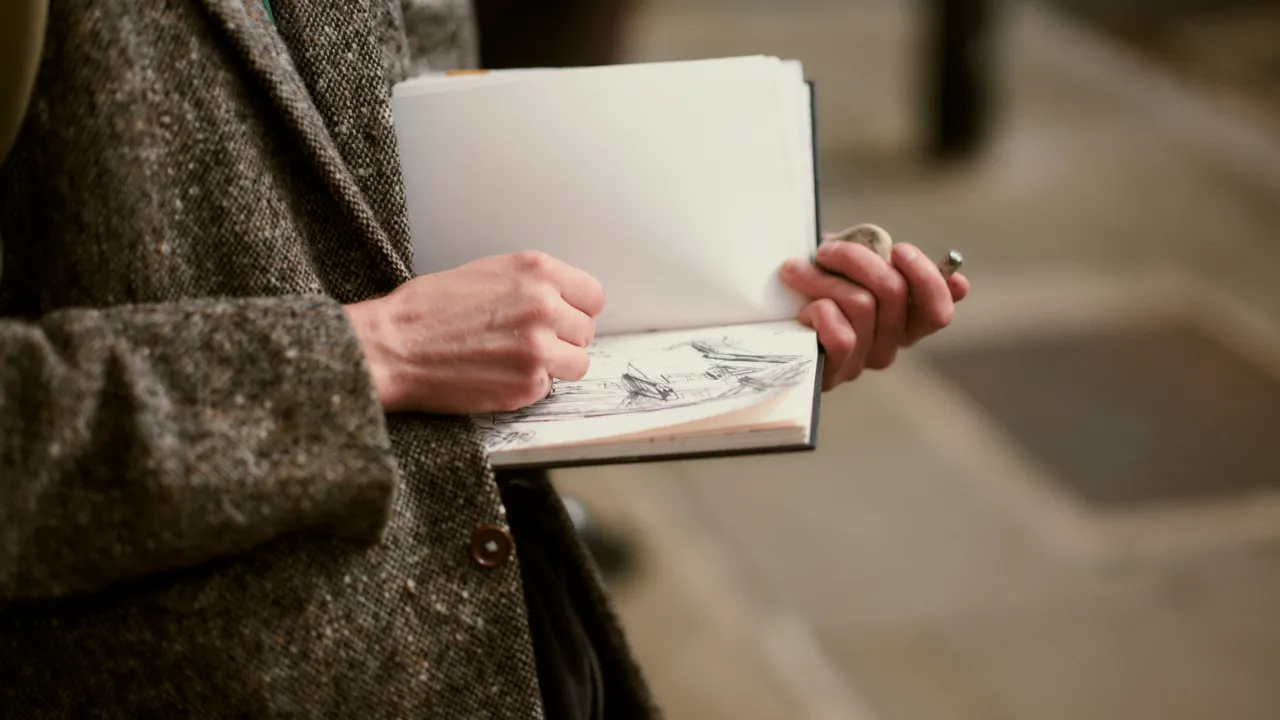
The supporting visual language leans heavily on photography, with Rory Landon-Down commissioned to document life at the School. His images capture much of the creative process, from inky fingers and silent moments of concentration to figures hunched over easels in full flow. There's a warmth and intimacy to the shots that feels right at home with the facility.
To coincide with the rebrand, the School also curated The Power of Drawing, an ambitious exhibition celebrating 25 years of artistic output. It pairs works by household names like David Hockney, Es Devlin, Tracey Emin and Tim Burton with pieces by Royal Drawing School alumni – a thoughtful reflection of the School's reach and ethos. Even the King himself contributed a drawing, displayed as part of the show.
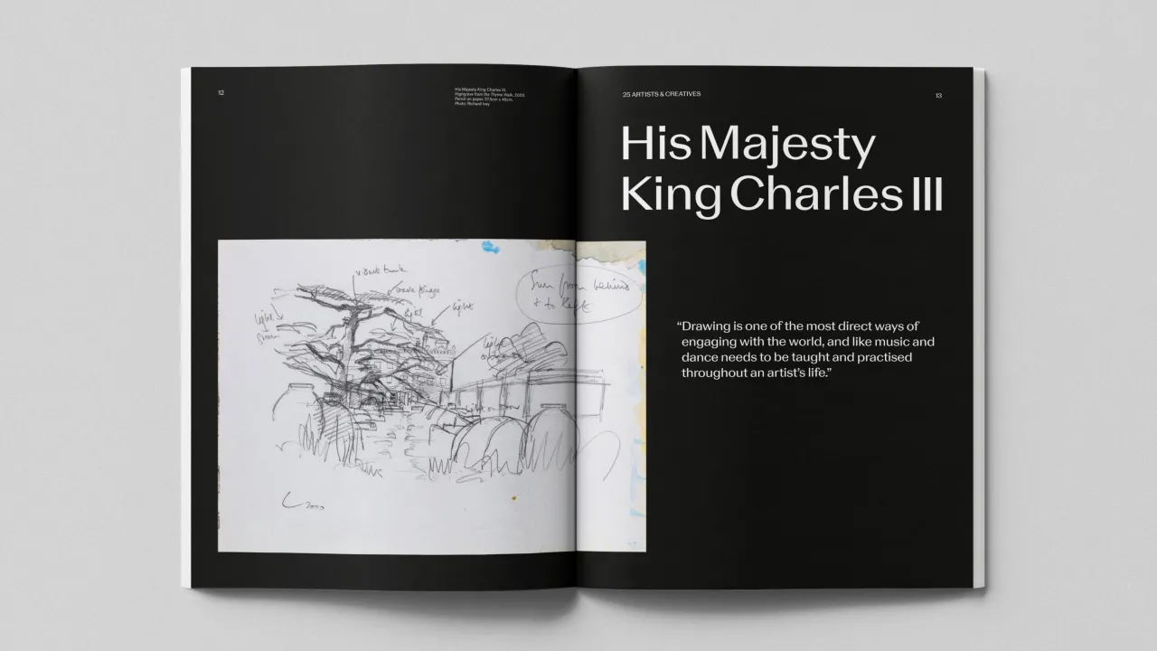
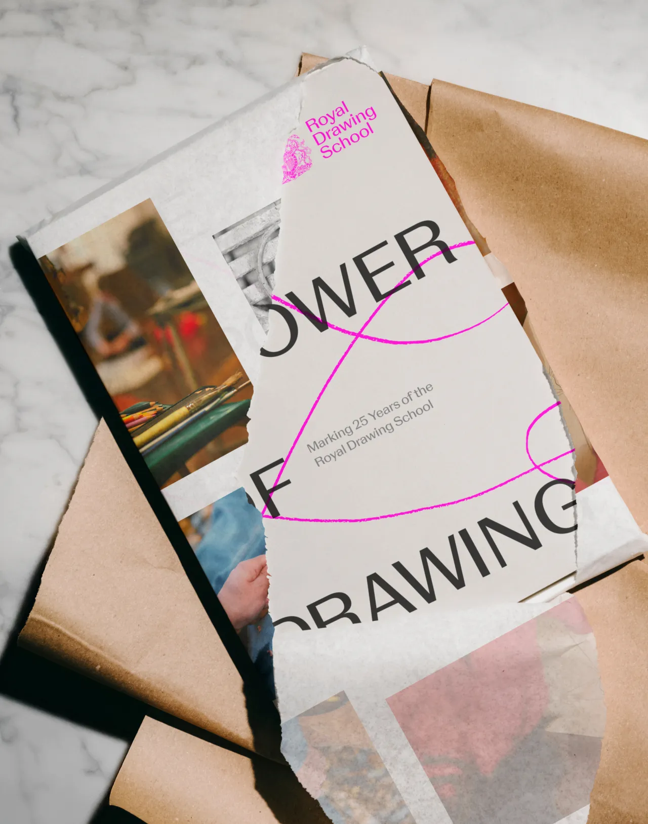
The exhibition catalogue – oversized, lovingly crafted, and printed on Fedrigoni stock – is another Pearce and Pentagram creation. Designed as a keepsake, it features fluorescent pink detailing and a wrap-around cover. Inside, each contributor reflects on what drawing means to them – a reminder that even in a digital world, the pencil still has power.
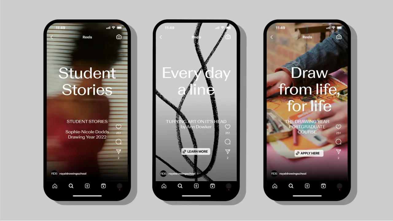
The School's new identity will now roll out across its website, marketing materials, signage, and merchandise. But it's already doing the thing it set out to do – supporting a growing global presence while staying true to the School's original mission: to make drawing accessible to all.
It's always a joy to see thoughtful design meet meaningful purpose. Even better when it's done with such care. Hats off to Harry and the team, and here's to the next 25 years of drawing, learning, and making.


Editor's Picks





Trending






Latest Jobs
Design Director at Koto
Full-time·London·£72k-£90k
Senior Designer at Definition
Contract·London·£45k–£50k
Midweight Graphic Designer at We Are Your Friends
Full-time·London·£36k–£44k
Design Director, Opinion at The New York Times
Full-time·New York·$160k–$180k
Lead Digital Designer at Together
Full-time·£55k–£75k
Account Manager at Moxie and Mettle
Full-time·Cheltenham·Up to £35k