Omlet's playful new identity celebrates the special bond between pets and people
Leading consumer pet brand Omlet has collaborated with Ragged Edge to create a unique new identity which considers the world from a pet's point of view. By doing so, it hopes to propel the company into international popularity.
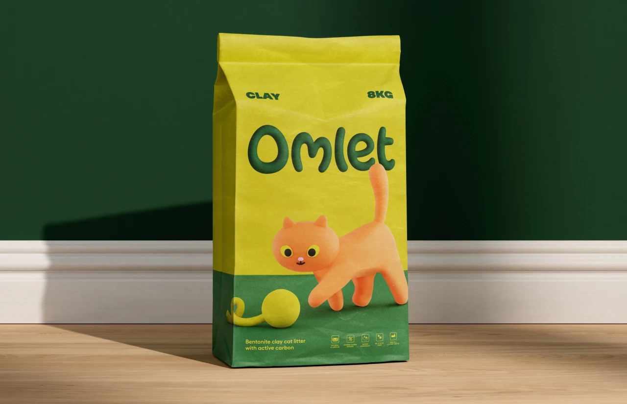
When it comes to pet branding, it's all too easy for companies to fall into the familiar tropes. And while there's nothing inherently wrong with a classy photo of a happy fur baby on a tin of cat or dog food, this usually prioritises the owner's assumptions over the pet's needs.
That's where Omlet comes in. Regarded as a pioneer in the pet products industry, Omlet shakes things up by factoring in pet behaviours when it comes to designing its offerings. Thanks to this innovative approach, Omlet has amassed a huge, loyal fanbase, and now, with the help of Ragged Edge, they have a suitable brand identity to match.
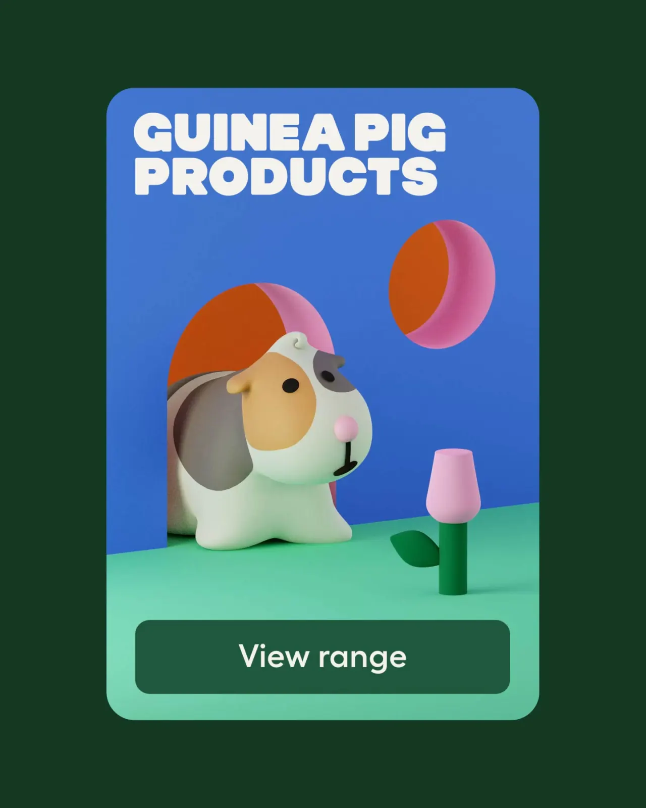
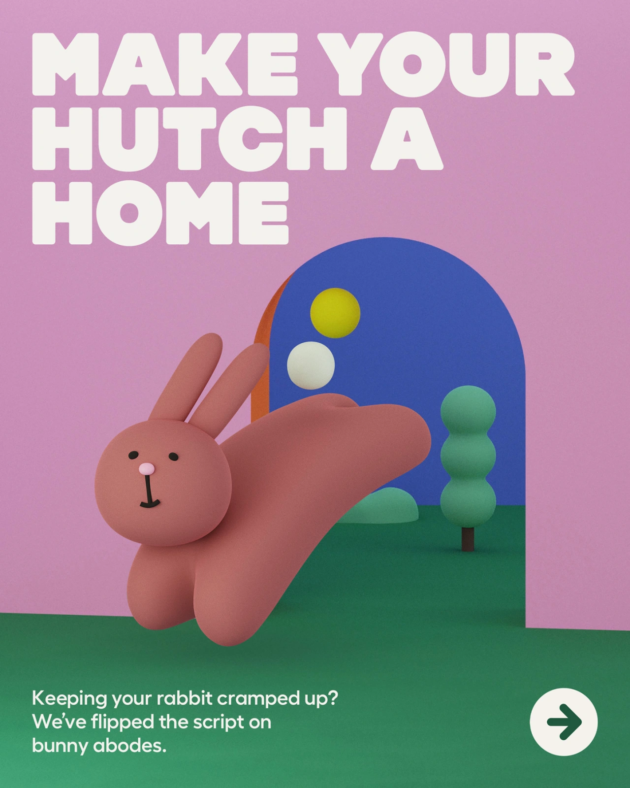
Designed to encapsulate the fun and whimsy that Omlet is known for, the new identity is a charming and colourful delight. Boasting bold colours and cute 3D-sculpted critters, Omlet's overhaul not only reflects its core values it also stands out a mile from the competition.
"The pet product category is full of stuff designed for humans – wendy-house coops and toys that look like fast food," says Max Ottignon, co-founder of Ragged Edge. "We've projected ourselves onto pets instead of designing for them.
"Omlet takes the opposite approach, starting from scratch to design solutions for pets, not people. Every product they create aims to deepen the connection between pets and their owners. That gave us rich territory to create a brand fundamentally different from anything out there. A world of wonder for pets and pet owners alike."
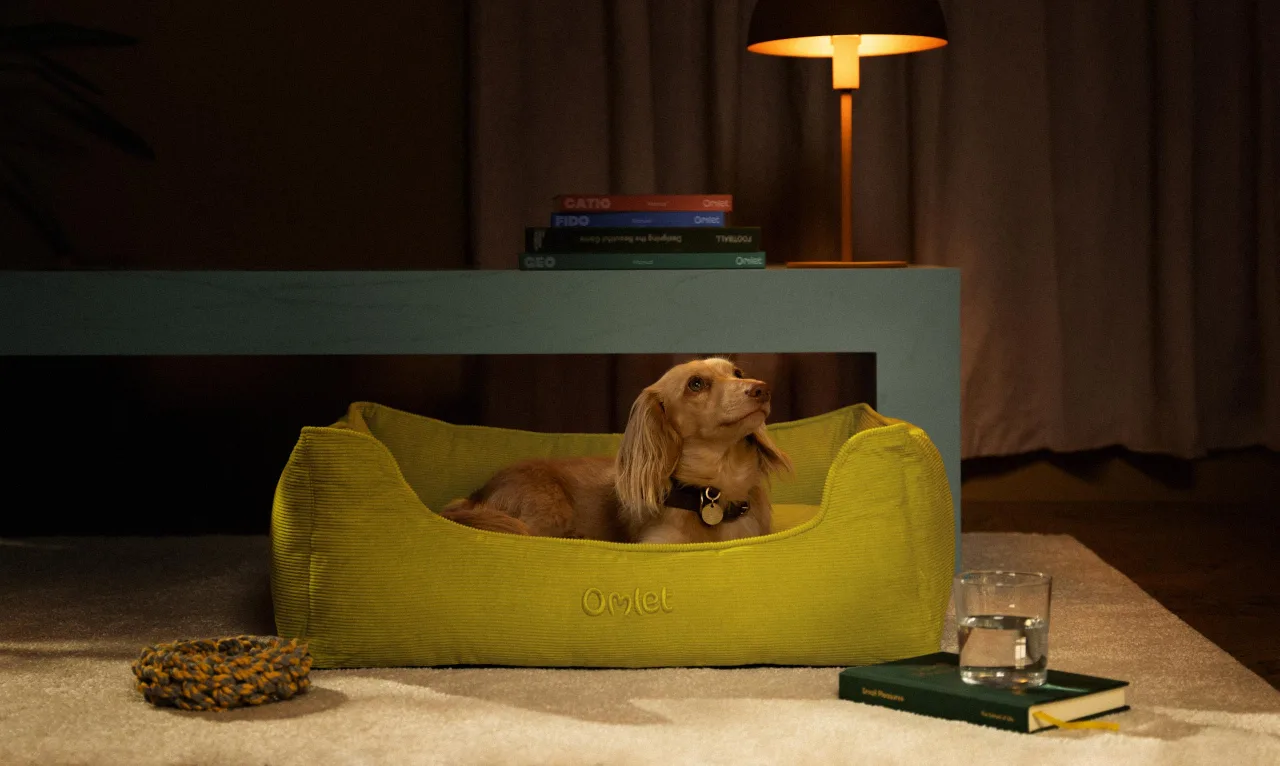
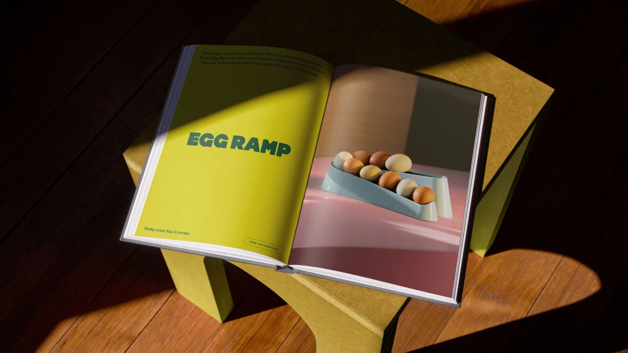
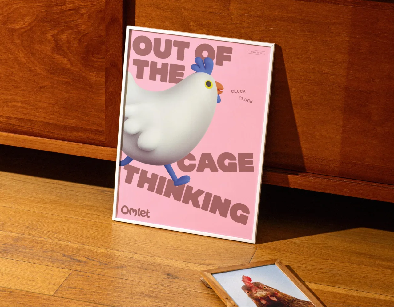
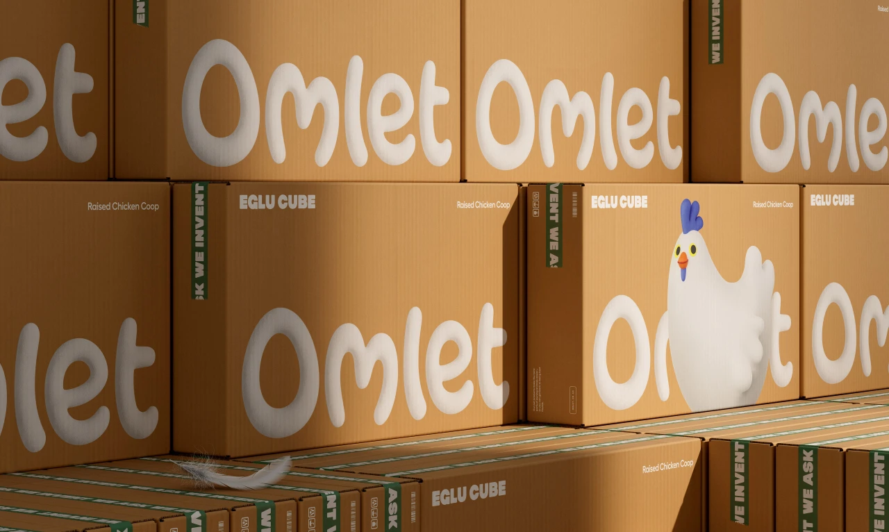
Appearing across print, packaging and online, Omlet's new identity revolves around tactile illustrations that reflect a world of wonder. Inspired by product design prototypes, these graphics look like they could be picked up and played with, thereby embracing the humour and imperfection of interacting with our pets.
Outside of the 3D illustrations, the type in the new Omlet identity carries the theme of connection even further. Curvy, chunky and yet squidgy, the Omlet font family almost begs to be looked after and played within itself.
Meanwhile the inquisitive and witty tone of voice brings all of the identity's messaging together in a very clever way. Not only does it echo how our pets explore and interact with the world around them, but it also questions people's assumptions about pet ownership and strengthens the humanity in humans.
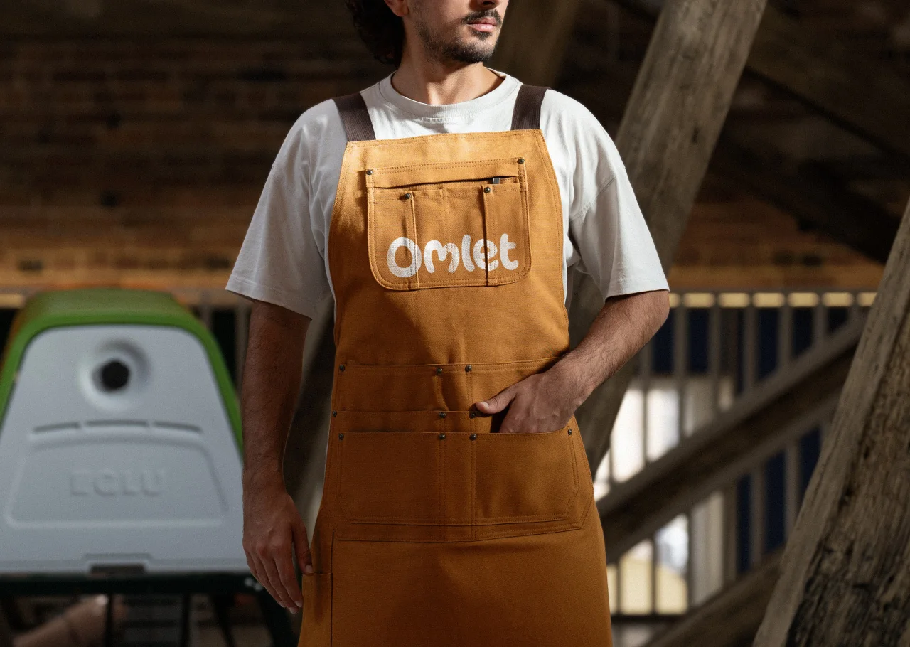
As for the colour palette, this was deliberately chosen to reflect the pets' habitats inside and outside the house. Ragged Edge settled on this as it further fosters a sense of connection and encourages deeper engagement with the brand.
The new design systems are being rolled out across Omlet's physical and digital channels, with the launch set to take place over the coming months. And thanks to the way it's been designed, Omlet will be able to scale the new identity seamlessly across all touch points without compromising its character or distinctiveness.
Johannes Paul, co-founder of Omlet, explained that Ragged Edge "profoundly encapsulated the core of our mission, breathing life into a brand that champions ingenuity and authenticity.
"The new Omlet brand propels us toward a future that celebrates the bond between pets and people, challenging people's assumptions about pet ownership around the world."
Editor's Picks





Trending






Latest Jobs
Design Director at Human After All
Full-time·London·£66k–£88k
Frontend Developer at Northern Artillery
Full-time·Leeds·£35k–£45k
Marketing Copywriter at ustwo
Full-time·London·£40k-£50k
Account Manager at Moxie and Mettle
Full-time·Cheltenham·Up to £35k
Head of design at Cog Design
Full-time·London·£55K
Project Manager at A Practice for Everyday Life
Full-time·London·£37k-£46k