Brand Brothers gives a healthy pet food brand an overhaul with 'chubby' custom type
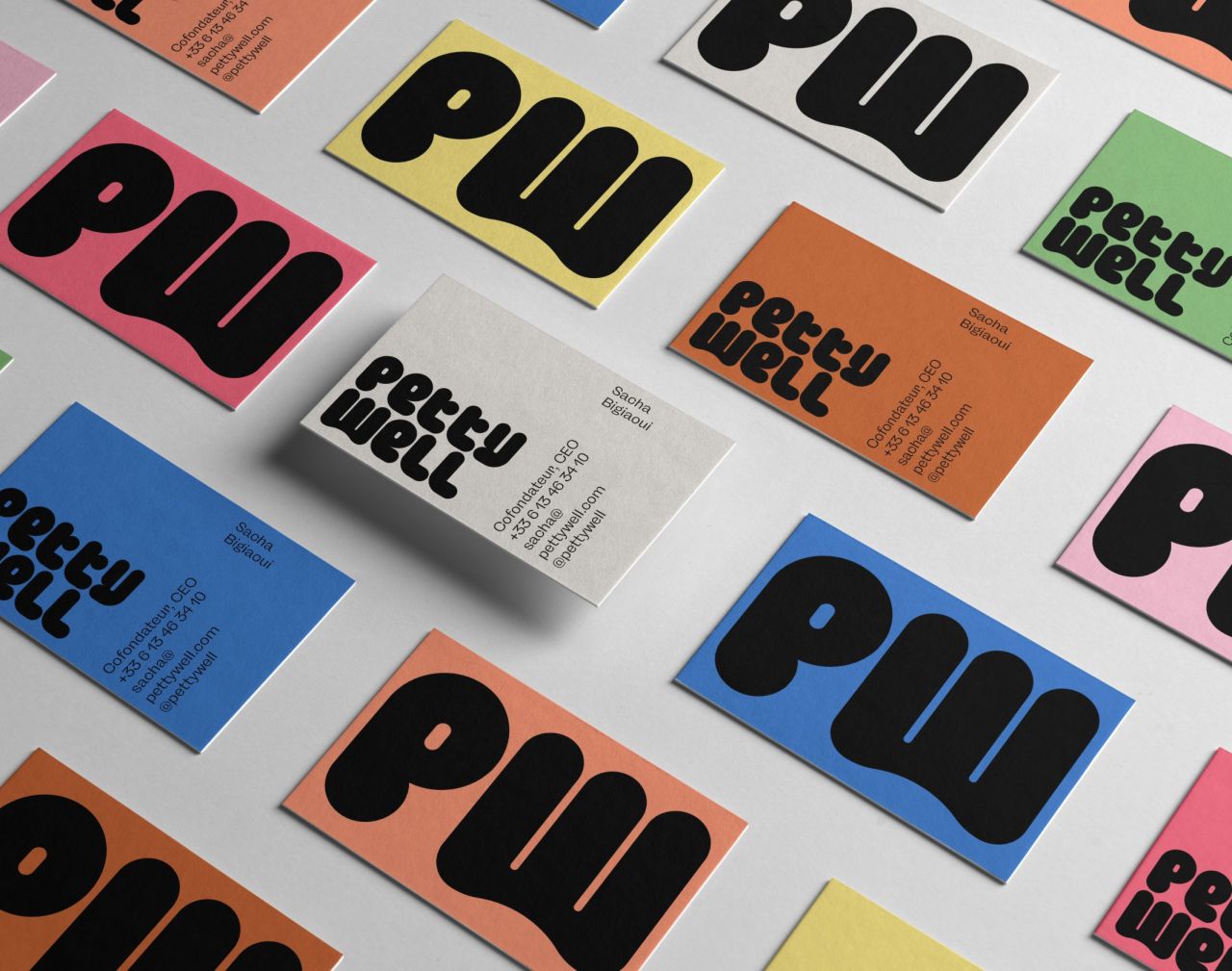
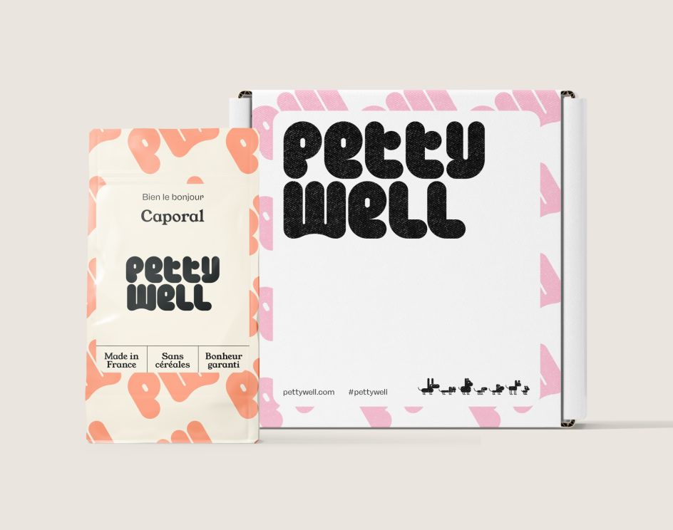
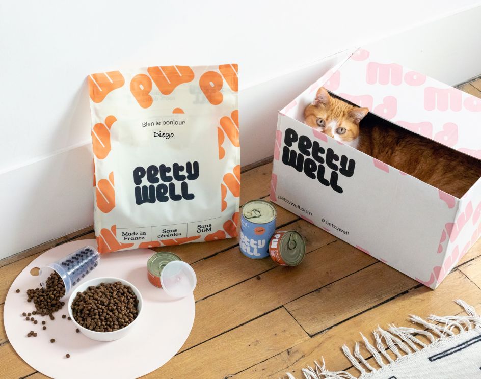
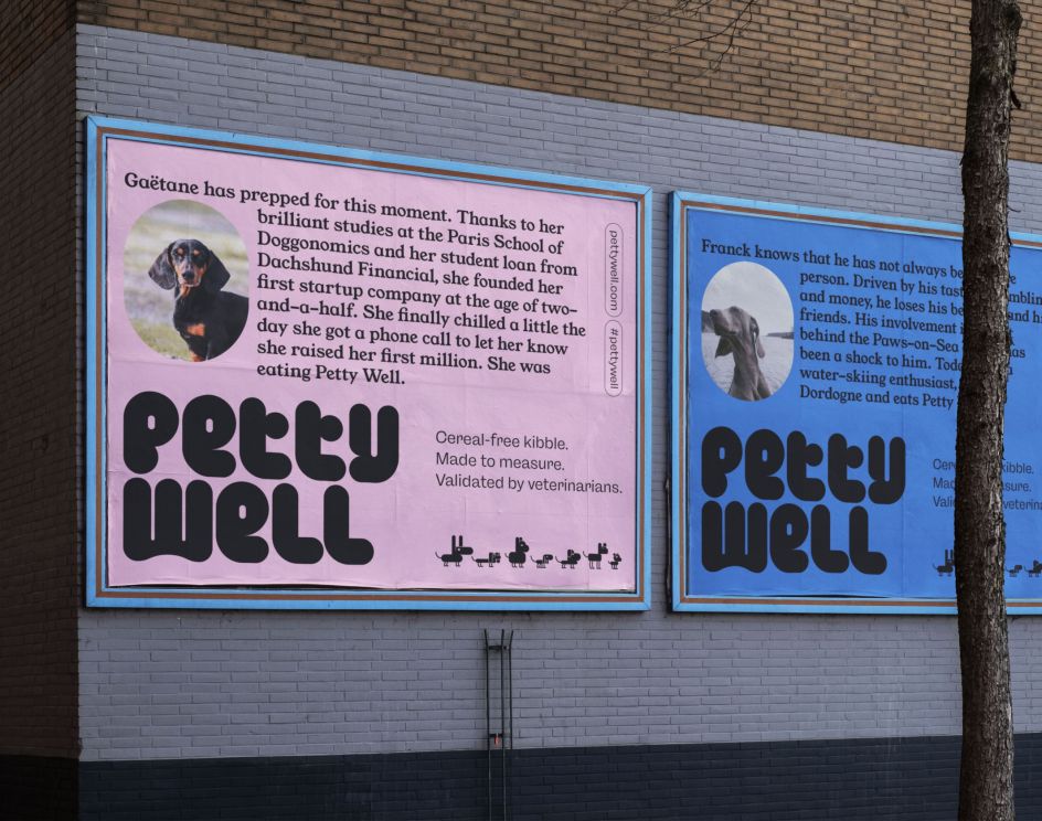
Petty Well, one of France's leading brands for healthy pet food, has appointed Brand Brothers to overhaul its identity after a successful launch. Thanks to the Parisian studio's support, it now has a new logo with "chubby" custom typography and a fun, bright colour palette.
The brainchild of Sacha Bigiaoui and Alexis Zalta, Petty Well began as a startup in 2018 after spotting a gap in the French market for natural pet nibbles and treats delivered directly to your door. The pair also realised that pet food was pretty generic, so they offered a service where you can get a custom-made menu after answering some questions about your cat or dog online. It's proved so popular that Petty Well raised nearly a million euros from investors last summer and today boasts over 4,000 happy customers.
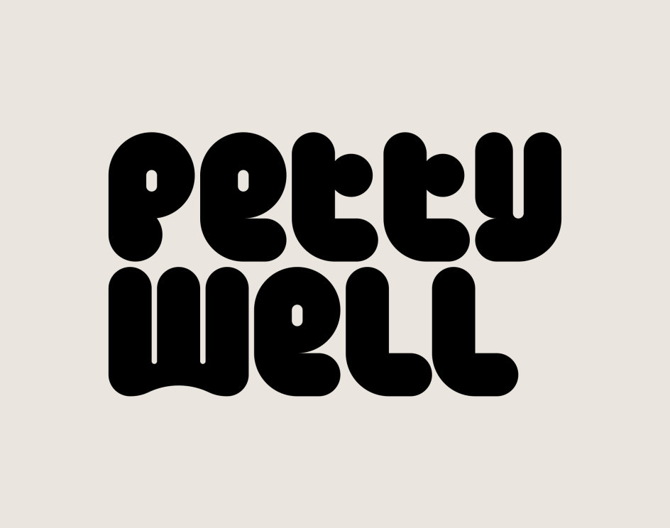
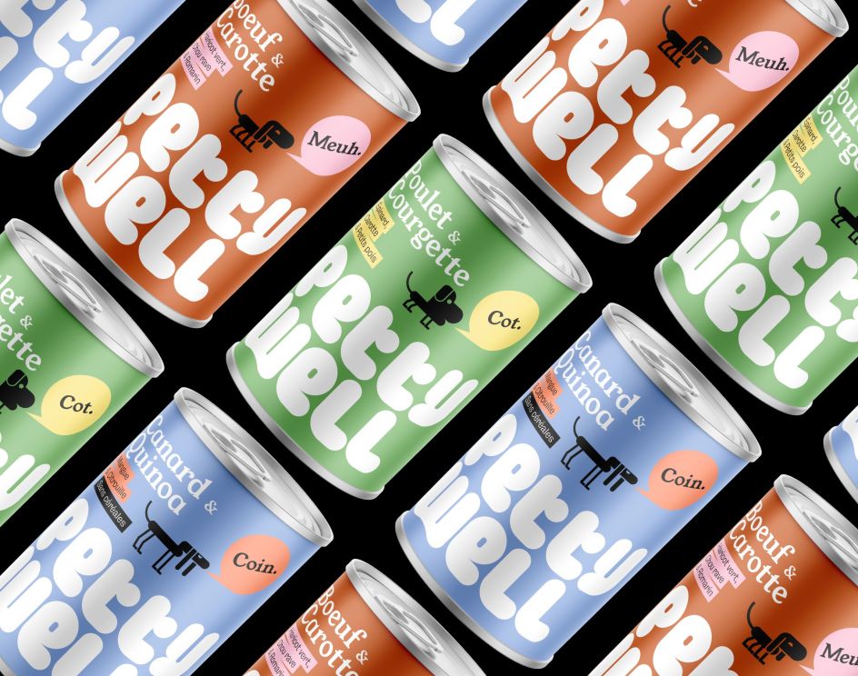
Brand Brothers created a new logo with an original typographic design, one that is "chubby and tasty" with a strong yet ordered structure. The logo represents the backbone of the visual identity: bright and colourful but with a raw and graphic feel set against monochrome backgrounds to add further impact. Accompanying typography comes with a mix of Young Serif, a typeface crafted in 2013 by French designer Bastien Sozeau, as well as Freigeist – the modern grotesk by René Bieder. It's a heady combination that balances out the logo with a more mature theme without losing the playfulness of the brand.
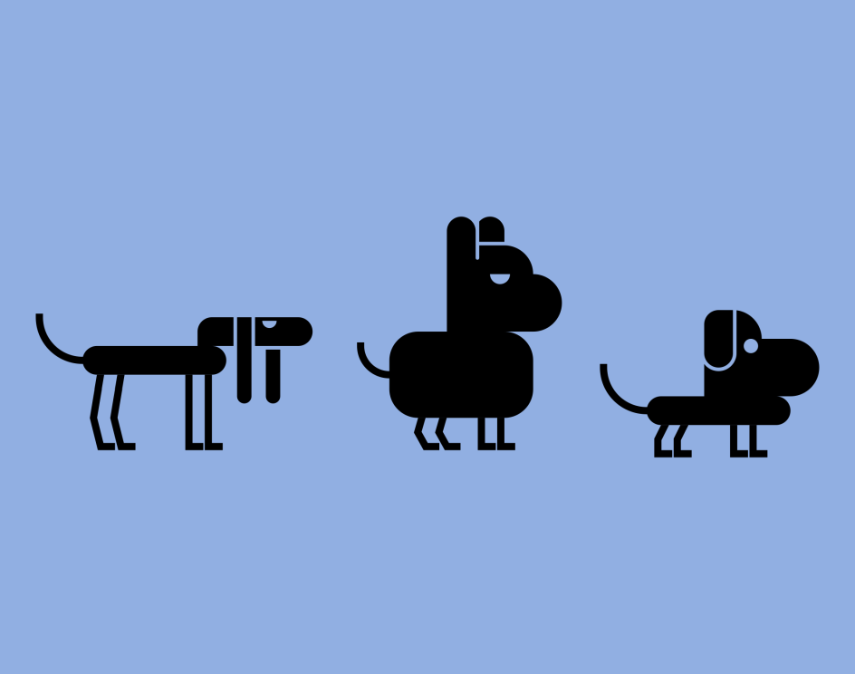
Brand Brothers also developed a collection of charming animal characters based on the logotype, which come to life on the various marketing materials, from print and packaging to web. The fresh identity launched earlier this year and further rollout will take place in the coming months.
Editor's Picks


Trending


](https://www.creativeboom.com/upload/articles/90/908fdb6378db1e95d12595416f54e6336d5e80b8_732.jpg)
Podcasts


Editor's Picks
Further Reading