Nice and Serious rebrands sustainable groceries company Good Club as Dizzie
Design studio Nice and Serious explains how it brought a mainstream appeal to reusable packaging in grocery shopping by reinventing Good Club as Dizzie.
We all need to play our part in reducing single-use plastic packaging. Here's a company that's doing exactly that and is going from strength to strength, thanks to a recent rebrand.
Good Club was formed in 2019 to change how people shop for groceries by delivering refillable products directly to your door in reusable pots. This year, they wanted to create a new brand identity and a new name – Dizzie.
To do so, they approached Nice and Serious, a B Corp creative agency based in London who are focused on using design as a force for good. Founded in 2008, they're known for crafting award-winning brands, campaigns and content for purpose-driven businesses like Innocent, Ben & Jerry's, IKEA, Unilever, Co-op and Macmillan.
Meeting the brief
To create mainstream appeal, the brand needed to move beyond its 'deep green' identity and improve desirability amongst a general audience. So Nice and Serious were challenged to reframe people's perceptions of the reusable packaging experience, shifting it from "faffy and inconvenient" to "easy and aspirational".
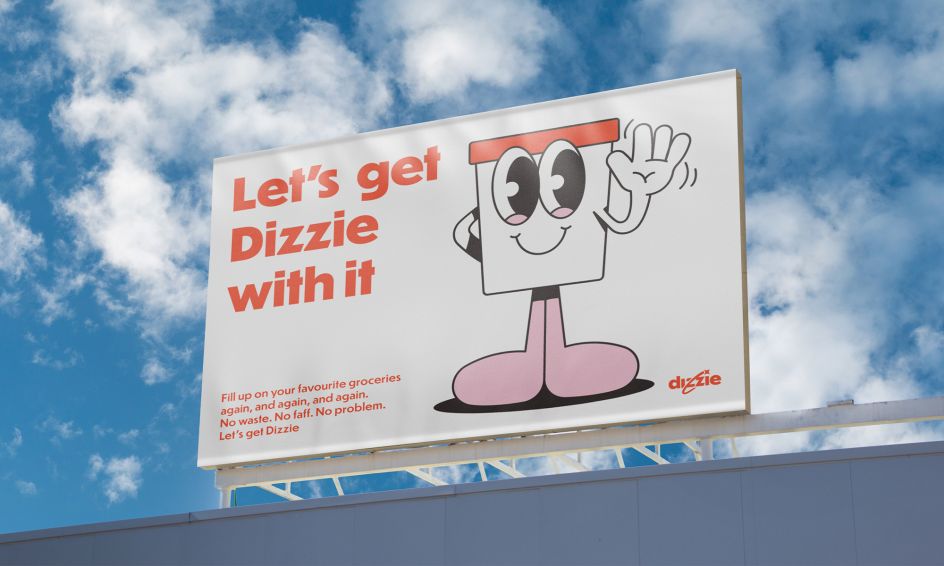
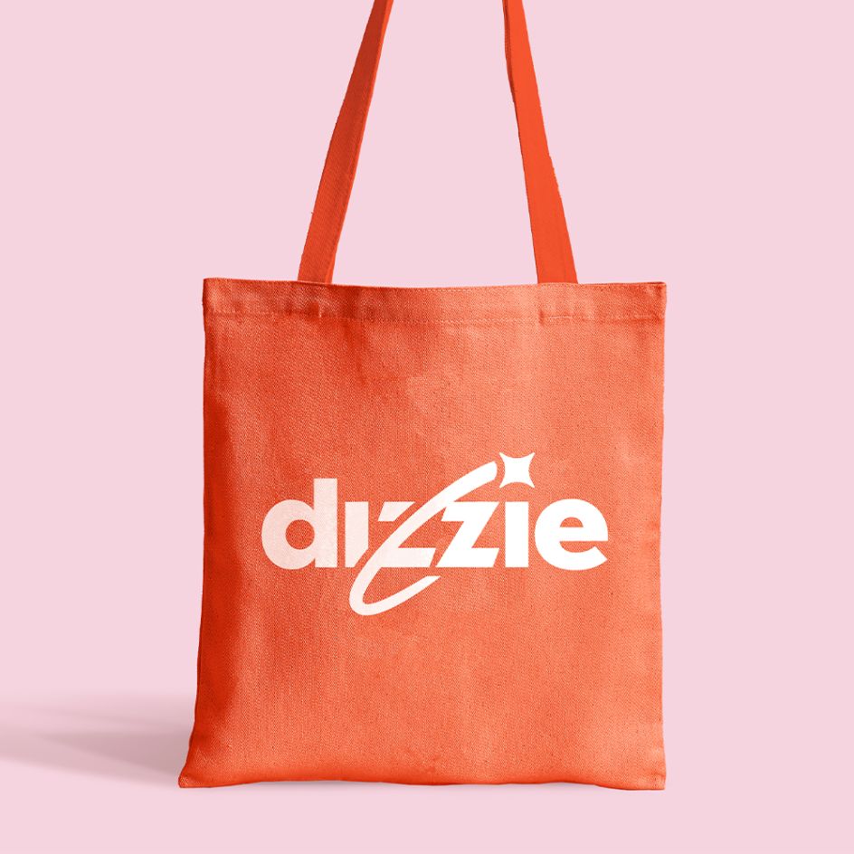
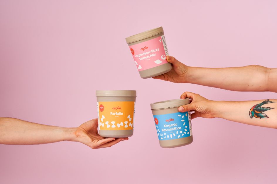
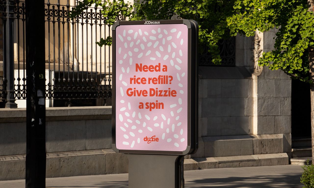
Built around the idea of 'groceries packed better', the new brand identity puts a joyful spin on the idea of refillable groceries. It neatly repositions the reuse experience by using language and visuals that are dynamic, positive and familiar.
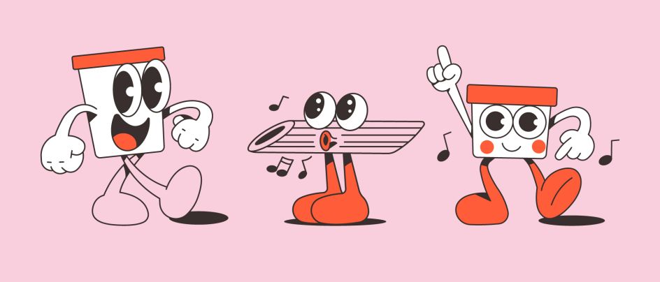
"From the simplified product illustrations through to the Dizzie' whoosh' and brand mascot, we've created an identity full of movement and character to bring the joy of refillable groceries to life," says creative director Peter Larkin. "We wanted to elevate the experience out of the eco-clichés and onto the shelves of everyday customers across the UK."
Warm palette
A warm, compact colour palette and a chunky typeface with retro stylings help build the foundation for the strong recognition Dizzie needs within the sector. Meanwhile, a trio of characters, illustrated by Anthony Orozco, helps personify the brand's joyful personality whilst also aiming to boost brand recall.
"For the tone of voice, we set out to conjure up those little joyful moments that are totally unique to the refill experience," says Peter. "So whilst being familiar – and sometimes frank – was important, it also meant using words to surprise and satisfy. Our motto was to channel 'written ASMR'."
Part of this approach centred on trying to capture the rhythmic nature of Dizzie's circular system, which goes around and around again and again. "We also used alliteration and onomatopoeia to mimic the sound of refillable goods being poured, pumped and replenished," adds Peter. "All of this came together in a principle where we encouraged the team to 'Get Dizzie with it'."
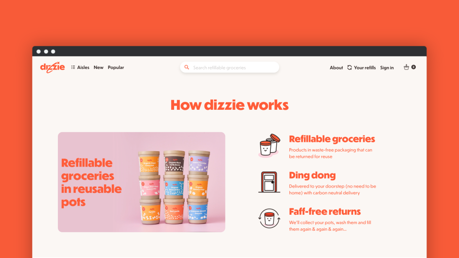
The new branding is live now across Dizzie's website and social media and will be rolled out across the full consumer experience.
Editor's Picks


Trending


Podcasts


Editor's Picks
Further Reading