Boom Brief #6: How you tackled our challenge to brand a refillable household range
From logos that double as measuring tools to reimagined ceramic objects, our community proved that sustainable design doesn't need to shout; it just needs to be beautiful, clever and worth keeping.
Maks Bołejko
January arrived with its usual promise of fresh starts. But for Boom Brief #6, we weren't interested in performative sustainability or virtue-signalling packaging. We asked our community to design a refillable household brand that makes reuse feel desirable, not dutiful.
The brief was REFILL, a modern take on everyday essentials like hand wash, shampoo and surface cleaner. Products designed to be refilled, reused, and left out on purpose. No greenwashing. No obvious eco clichés. Just smart design that people would genuinely want to live with.
The #cbbriefrefill hashtag quickly filled with thoughtful responses ranging from playful to minimal. What united the strongest submissions was a subtle shift in mindset: these weren't bottles designed to shout from the sink. They were objects shaped and finished to earn their place through form, texture, and restraint.
Again and again, designers tackled the same question: how do you make sustainability feel effortless rather than earnest?
Standout approaches
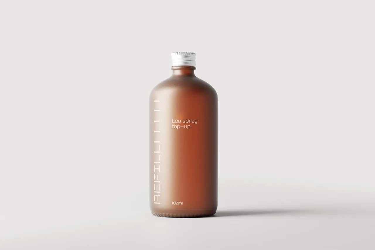
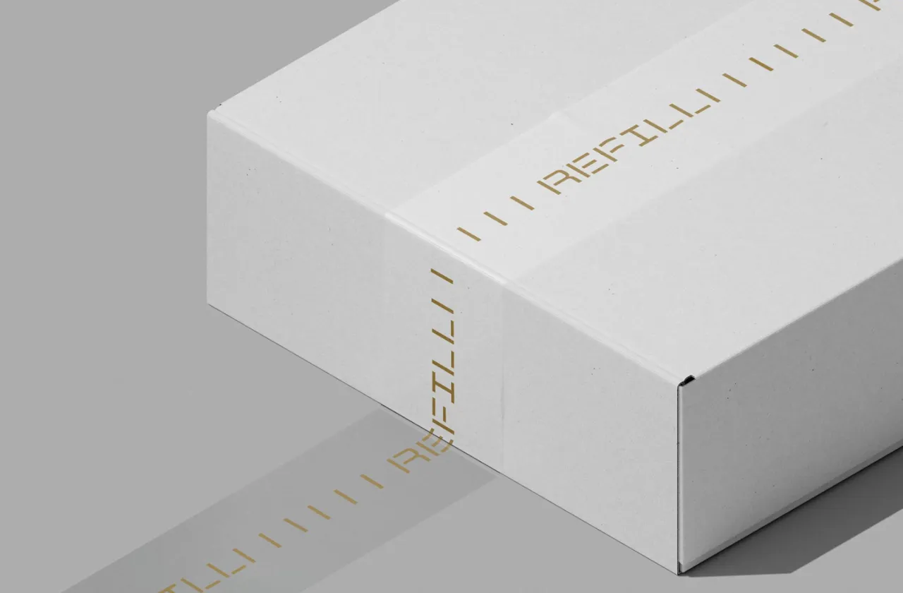
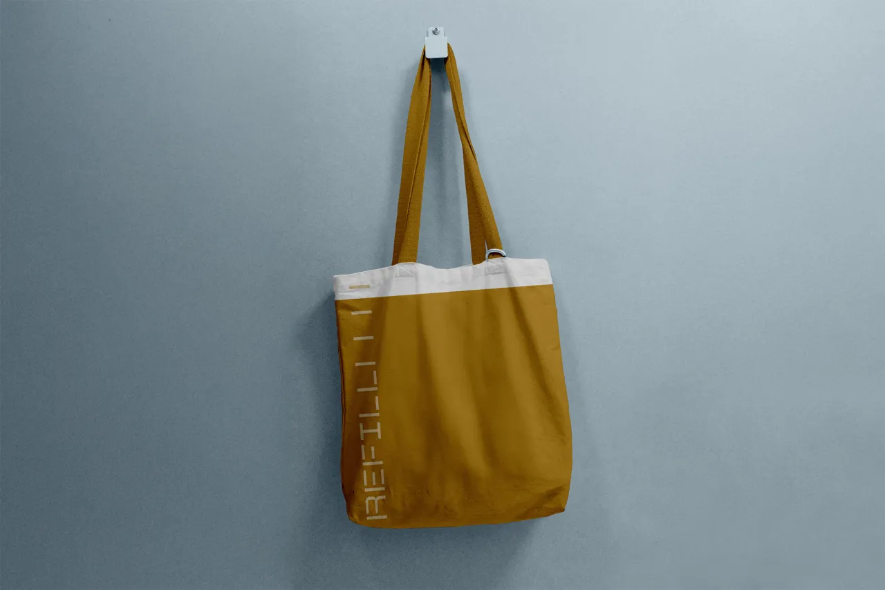
Trevor Thompson delivered one of the brief's most elegantly functional ideas: a logo that quite literally does the work. Within minutes of reading the brief, he conceived an identity where the REFILL wordmark doubles as a measuring tool. Built vertically from the bottom up, the stacked letterforms create clear refill increments directly on the bottle.
It's the kind of idea that feels obvious only after someone's had it. "I really liked that a logo could have a genuine practical use," Trevor explains. "A brand that asks one thing of you shouldn't be visually cluttered. It tells you what you need and nothing more."
The frosted amber bottle reinforces this approach: it's a piece of decor rather than just a utility item, something you'd hesitate to throw away even when empty. For a designer who loves solving branding problems, this brief proved that the most effective sustainability messaging often isn't messaging at all.
Lauren Jefferis took a distinctly tactile approach. Her custom logotype features an 'f' and 'i' that interact to reference refilling; clever without being overt.
"I was inspired by the 'cutting waste' line in the brief," she explains. "I then applied this to make shapes which have texture and 'cut' edges, directly referencing the tagline of 'clean cut care'."
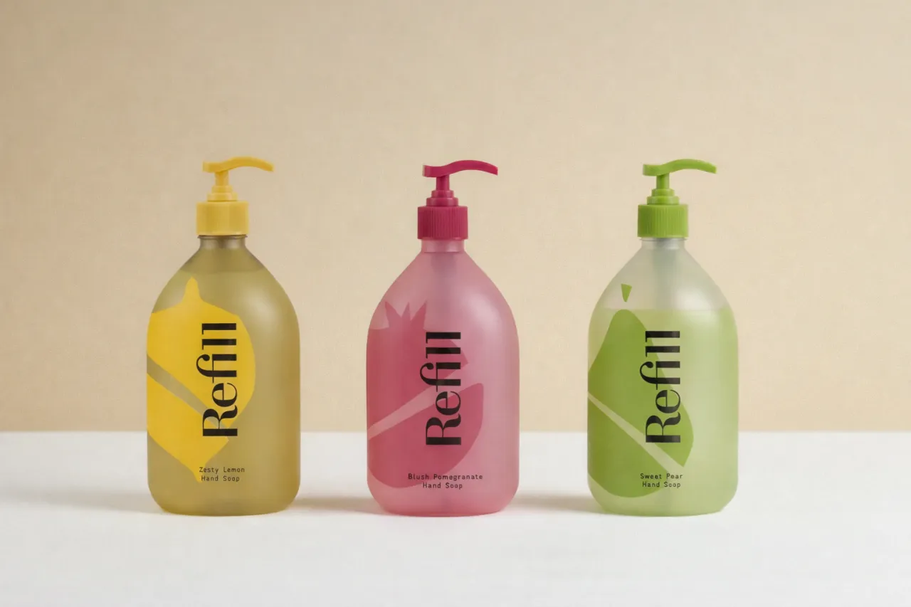
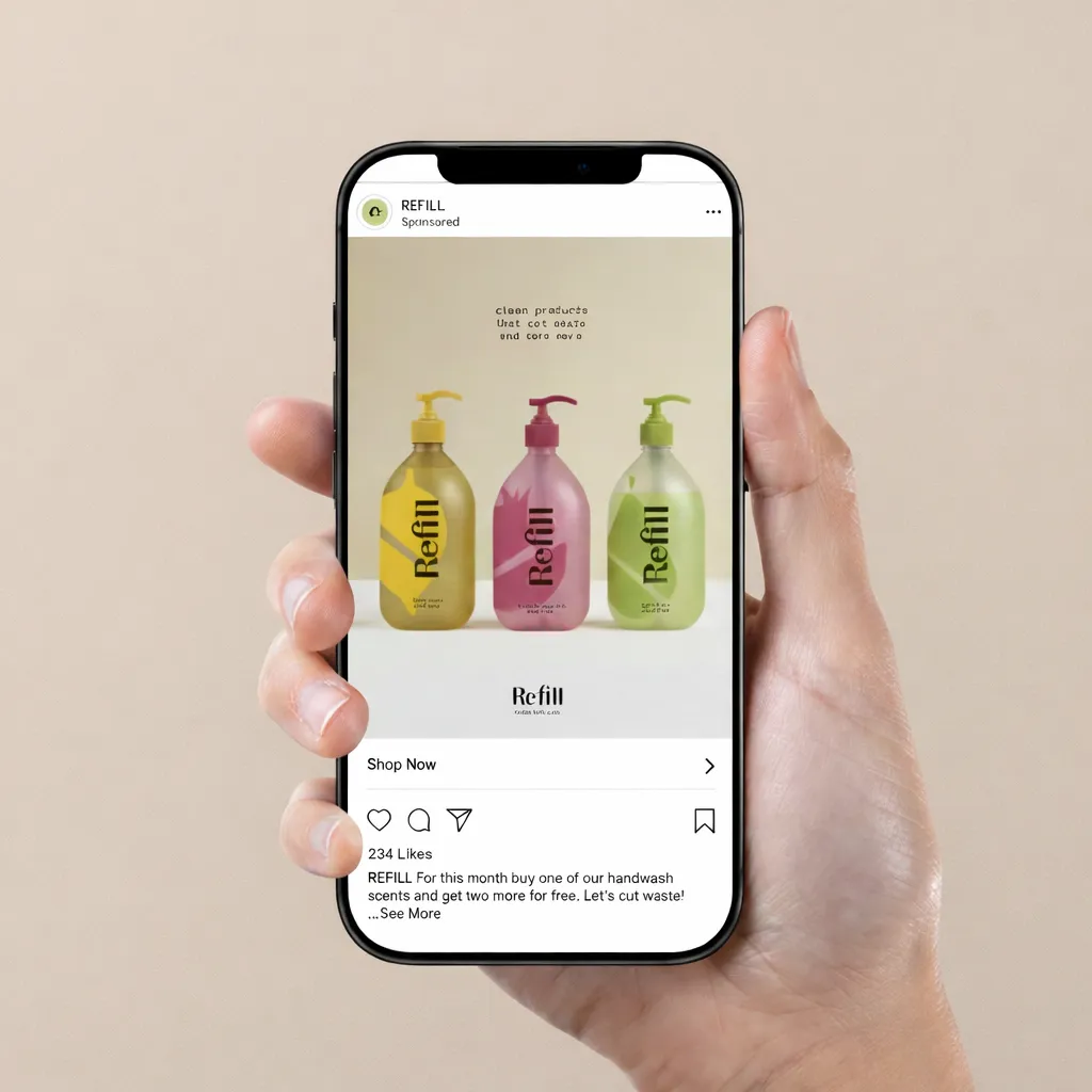
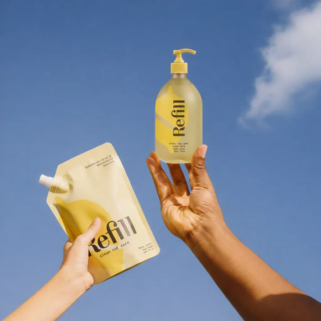
Tyson Edwards, Maks Bołejko, and Kate Spencer from Coffee & TV Design Studio took three distinct approaches. Senior designer Tyson used motion as a metaphor, building his identity from repeating shapes that embody reuse.
In motion, vibrant shards converge to build the REFILL logo, visualising transformation and positive action. Sustainability here isn't passive; it's dynamic and optimistic.
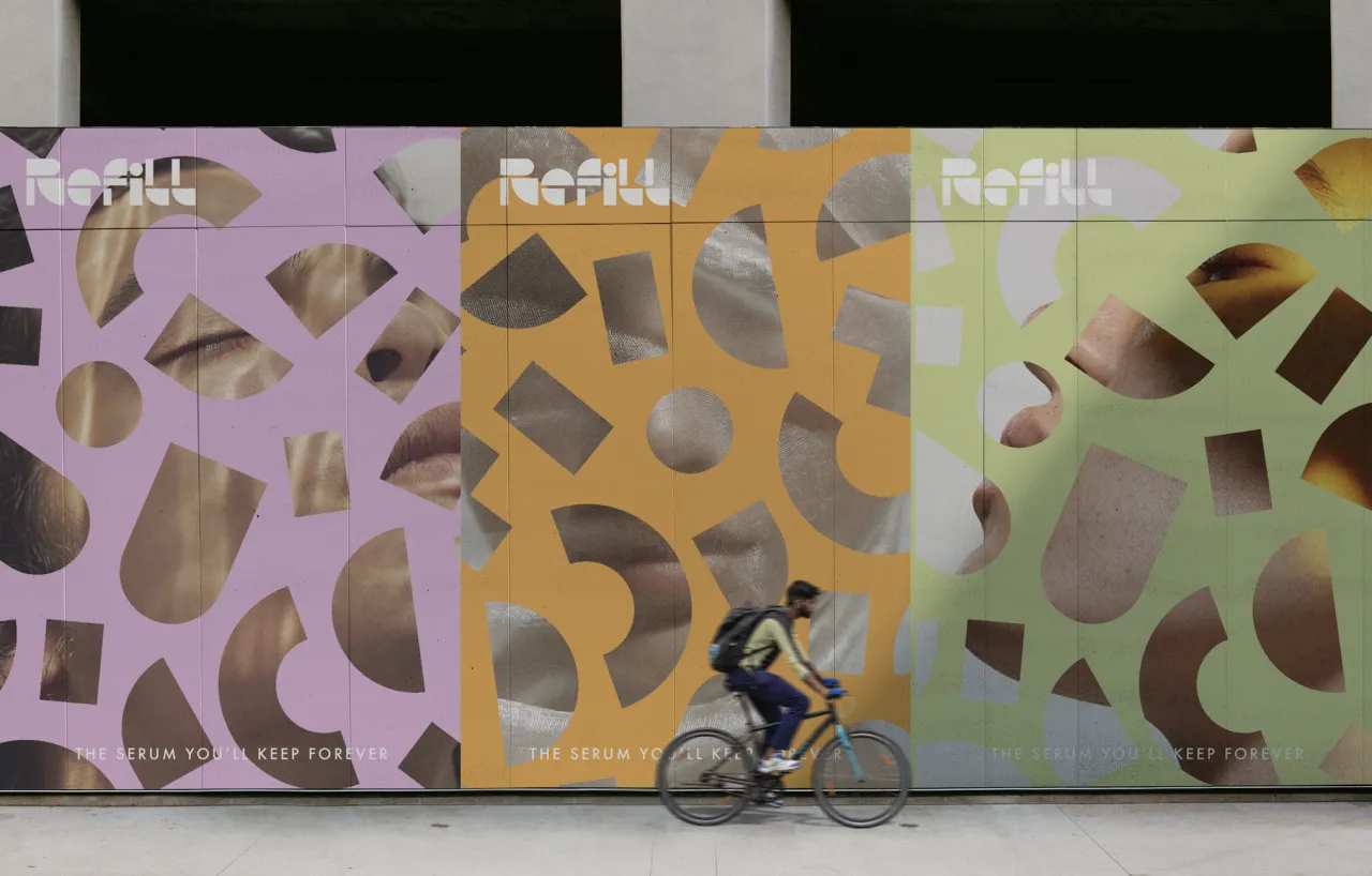
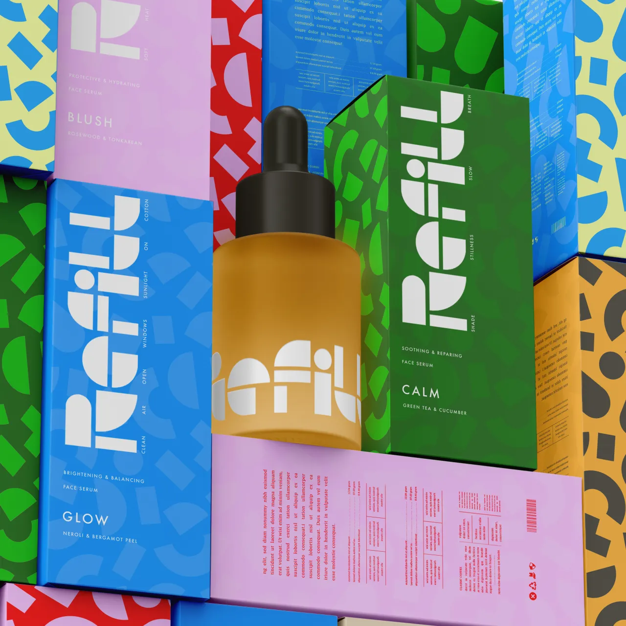
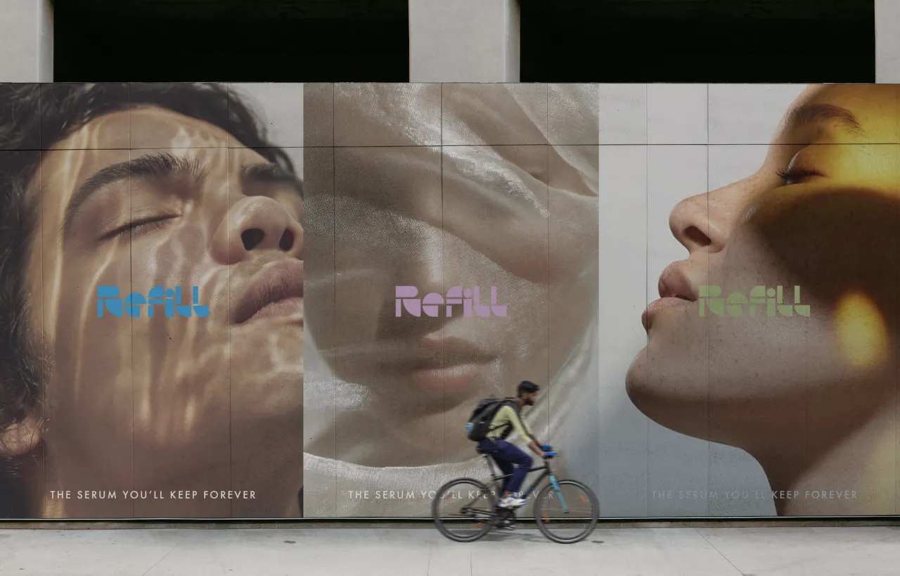
Maks developed packaging inspired by a reference Tyson shared: brightly coloured stacked baskets. "I wanted the packaging to feel chic while keeping the liveliness," Maks explains. The result is joyful rather than instructional—minimal type against busy backgrounds.
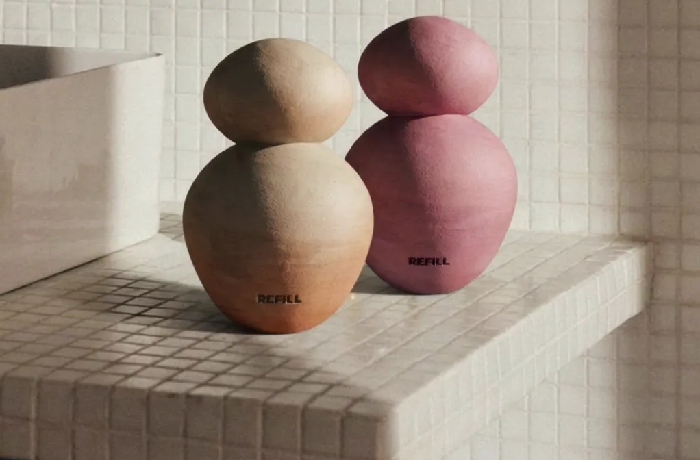
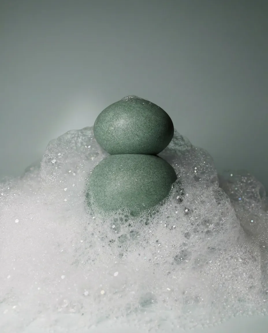
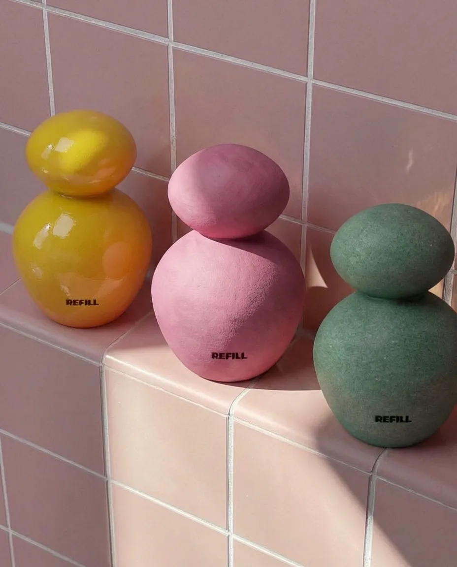
Kate questioned what refillable packaging could even be. Instead of bottles, she reimagined REFILL as a ceramic vase; an object designed to be kept and valued indefinitely. It was modelled in Cinema 4D, inspired by Helle Mardahl's signature Bon Bon designs.
"I wanted to make a product that makes sustainability feel desirable," Kate explains. "Something you'd want to keep on show." It's a provocation: what if the most sustainable packaging is simply designed so well that disposal feels absurd?
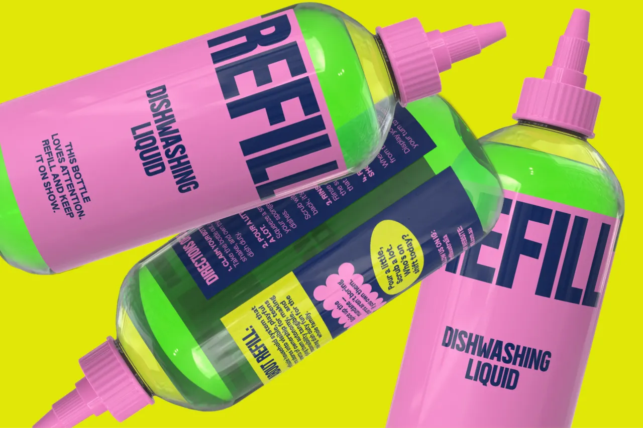
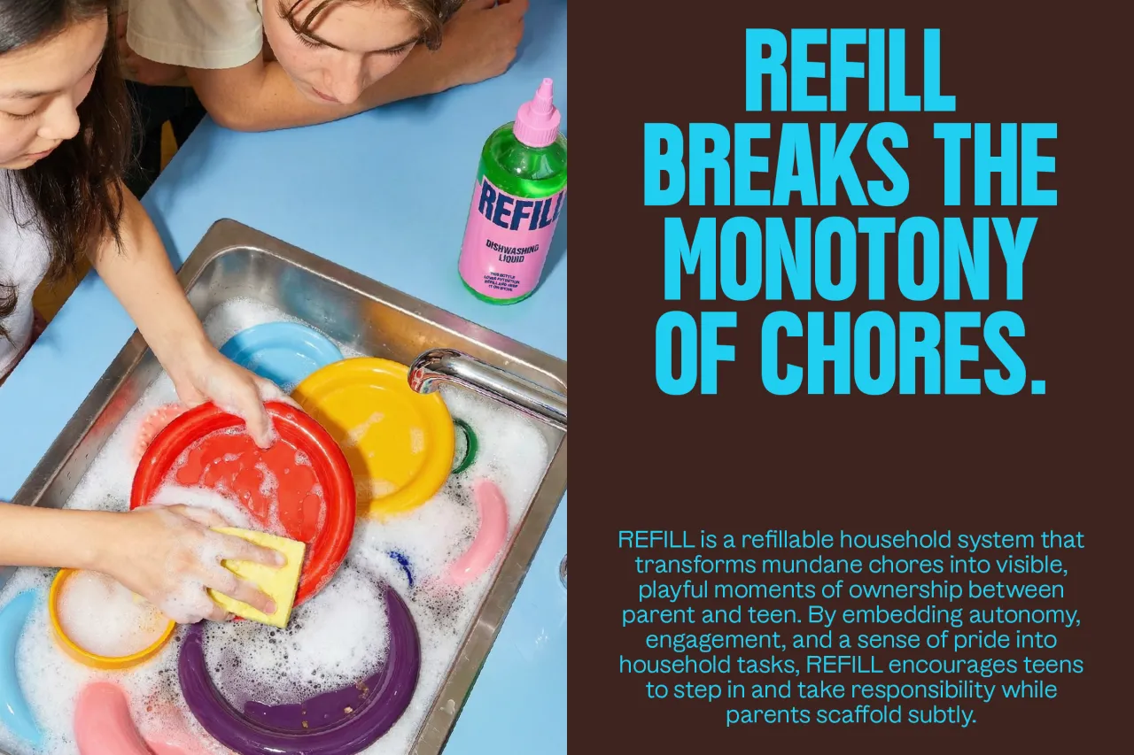
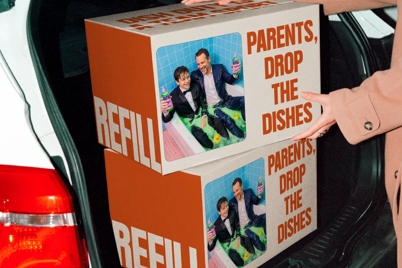
Sunnie approached the brief from an unexpected angle: teenagers and household chores. Most sustainable household products speak to adults with muted colours and soft minimalism, but what of the younger generations?
"REFILL reframes chores not as enforced tasks, but as visible moments of ownership," Sunnie explains. Her vibrant design is based on a chilli bottle form: an unexpected but familiar choice that breaks visual norms whilst remaining functional. The sharp colour palette deliberately contrasts typical "eco" aesthetics. Rather than soft greens or beige, the colours are vivid and assertive.
Beth Ewen started by imagining real homes. "I built up a library of references that helped me picture where these products would actually live: somewhere genuinely lived in," she explains.
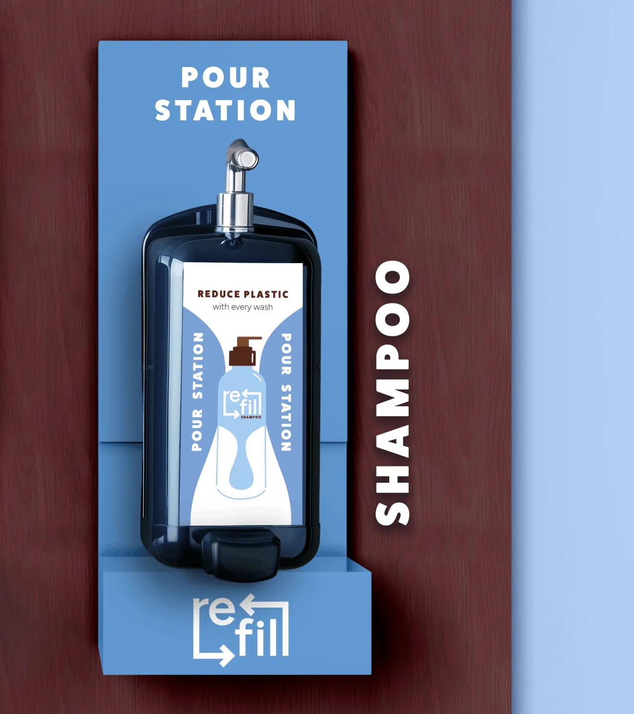
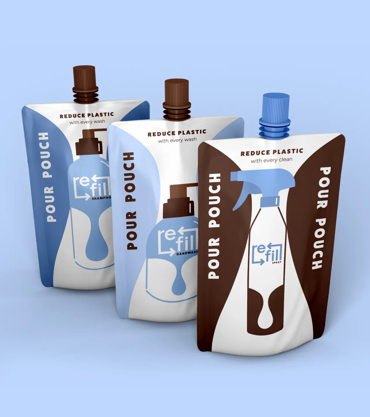
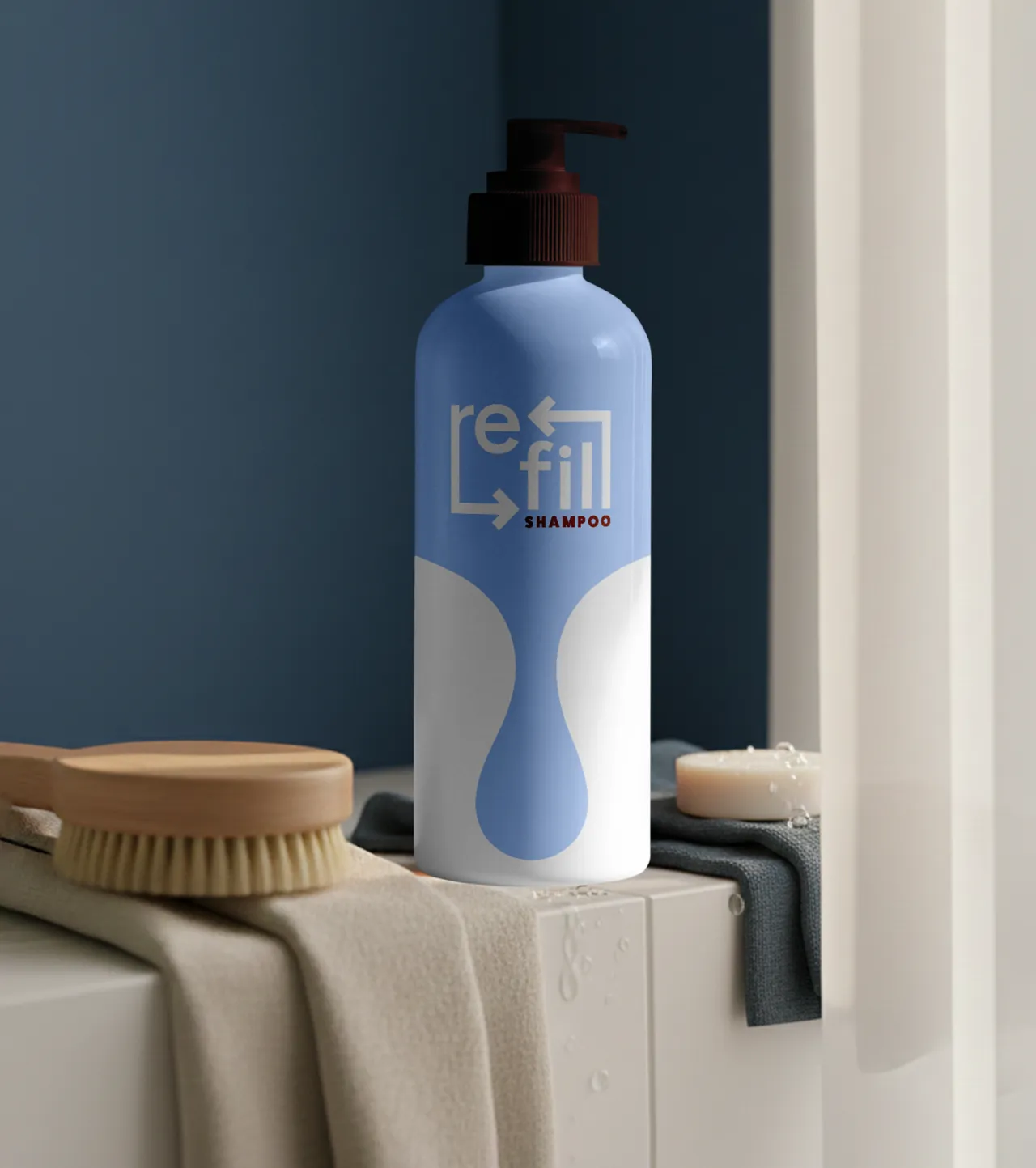
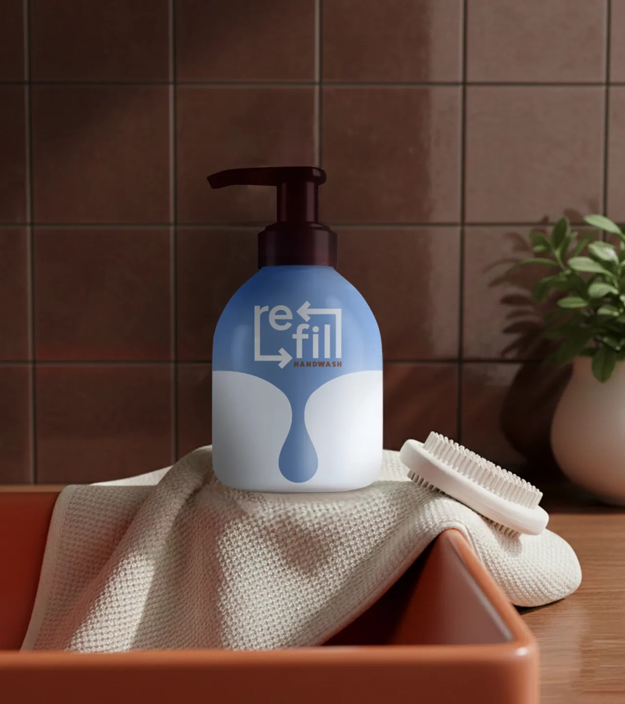
Walking down a cleaning aisle, Beth noticed the visual noise: loud colours, busy labels, typography competing for attention. She deliberately stepped away from that. Her limited palette of blue, white and brown feels quiet, functional and uncommon in this category. The logo is simple, with a gap designed to hold interchangeable product names. An enlarged drop motif acts as a gentle reminder to refill.
"I wanted something uncomplicated and considered," Beth says. "A product that would sit comfortably in a minimalist home whilst still standing out on the shop shelf." Having started freelancing at the beginning of 2026, this sustainably conscious brief resonated strongly with her healthcare background, where her work felt purposeful.
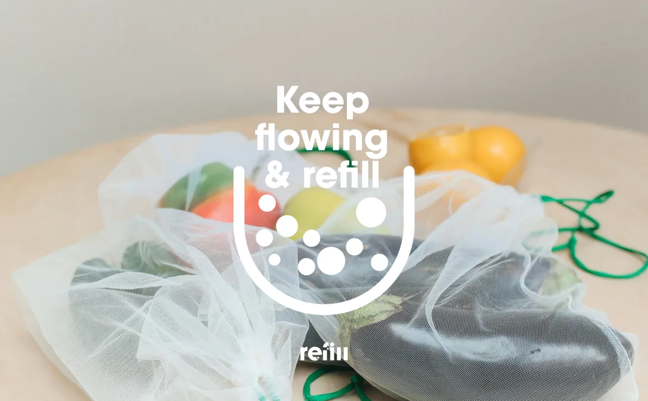
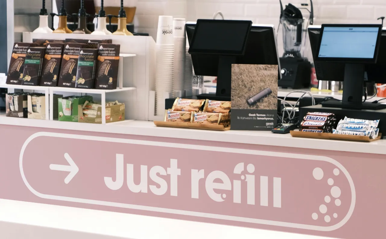
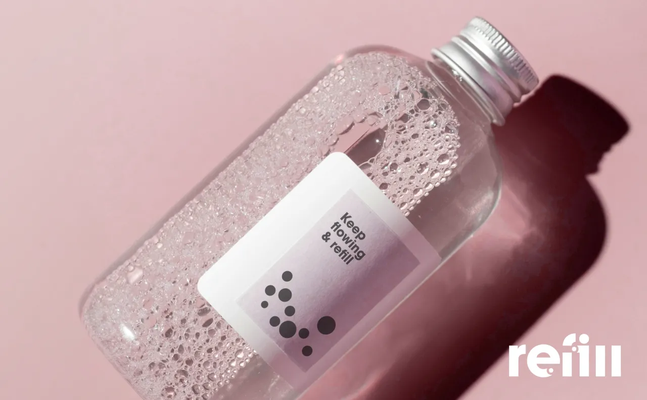
Sebastian Ferramondo drew inspiration from bulk goods shops where people buy by weight. "I think people can have reusable bags, bottles, or jars at home and change their shopping habits," he explains.
His design choices were straightforward: a clear, bold typeface that works across formats. He chose dots to represent products, originating from the dot in the letter 'i'. It's simple, recognisable and scalable.
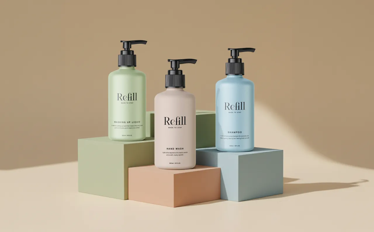
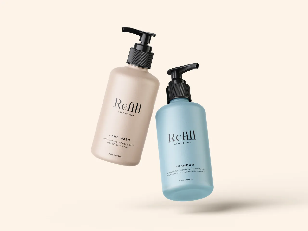
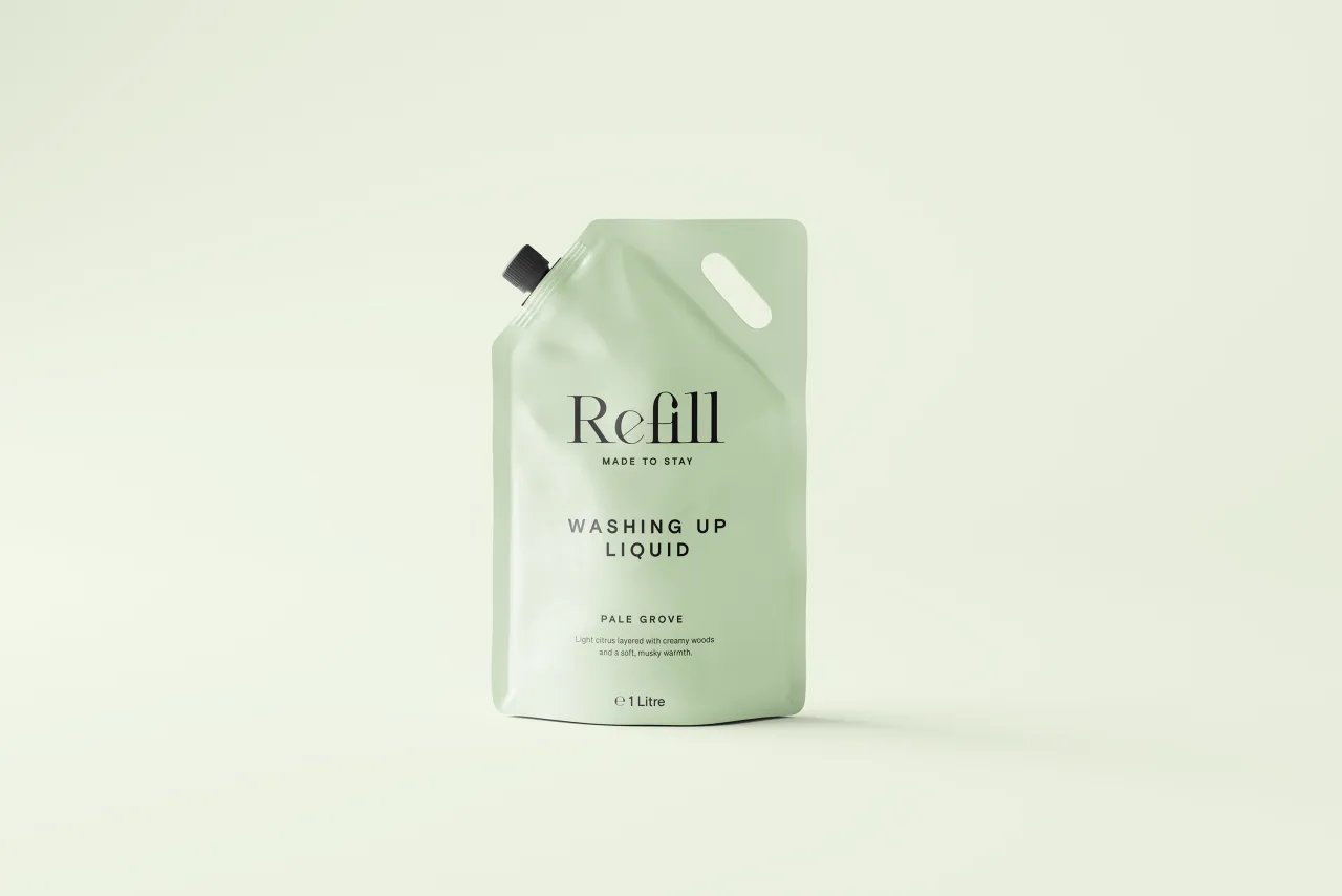
Mark Longson began by establishing the brand first. He selected Cesso, a display serif, and refined it to create an elegant mark. "The packaging is intentionally restrained and confident," Mark explains.
Minimal typography keeps communication clear, with generous white space. The colour palette is soft and muted; warm neutrals and gentle tones that sit naturally in homes whilst avoiding obvious "eco" cues. Each product is differentiated by colour, making the range easy to navigate.
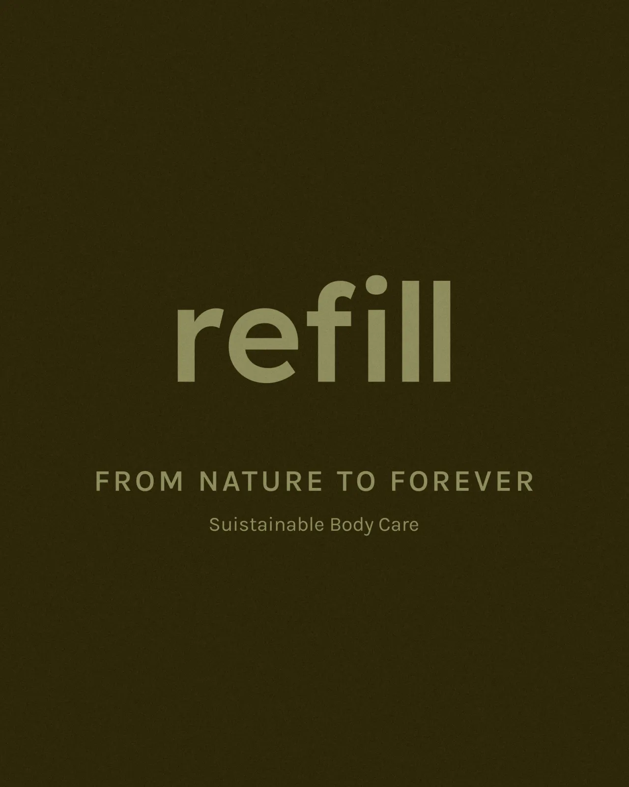
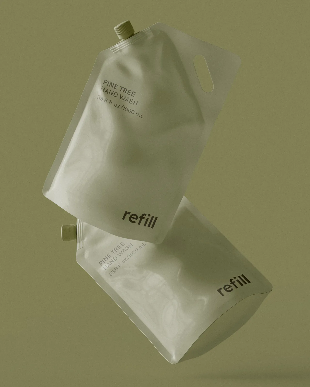
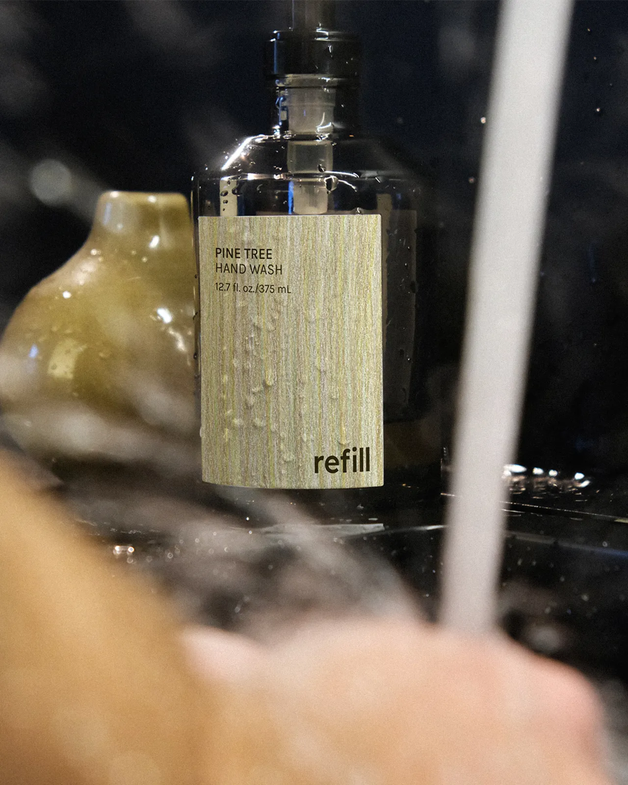
Nina Jancic began by establishing the brand first, drawing inspiration from natural textures. Hand-drawn textures on labels and grainy photography bring a raw, organic feeling, balanced by a bold graphic logo.
"Nature was not only a visual reference, but also the reason behind the project," Nina explains. Her green and brown palette echoes materials and imagery, tying everything to the natural world whilst maintaining a contemporary edge.
How to get involved
Missed REFILL? February brings something different. Boom Brief #7 introduces Petal & Stem, an independent florist founded by two best friends specialising in seasonal British blooms—no imports, no filler; just what's growing now.
The brand needs to feel warm but not cutesy, independent but not amateur, modern but rooted in nature. Think Sunday morning farmers' market energy meets confident design.
Head to Instagram @creativeboom to read the full brief. Use #cbbriefpetalandstem, tag us, and submit before Friday 27 February, 12pm GMT.

Editor's Picks





Trending




Latest Jobs
Designer, Marketing (Games) at The New York Times
Full-time·New York·$85,000 – $100,000
Senior Designer at A Practice for Everyday Life (APFEL)
Full-time·London·£40,000 – £46,000
Senior Lecturer in Fashion Communication at University of the Arts London
Part-time·London·£52,977 – £63,815 pro rata
Senior Creative Editor at Project Slingshot
Full-time·Remote·£45,000 – £55,000
Director, Head of Creative at Twitch
Full-time·San Francisco·$203,000 – $274,600
Communications Strategy Director at David&Goliath
Full-time·Los Angeles·$120,000 – $180,000