'It was an intense seven months': illustrator Linda Baritski on her globe-spanning work for Kiehl's
Linda Baritski, aka Season of Victory, reveals all about her seven-month stint as the latest Kiehl's Loves illustrator, working on bespoke artworks for 48 different global markets.
We creatives often talk about finding our' dream jobs'. But in London-based illustrator Linda Baritski's case, working for Kiehl's truly was. After all, when she'd originally applied to be represented by her agency, IllustrationX, she'd actually put Kiehl's down as a dream client!
So when the global skincare brand approached her last April via IllustrationX, she couldn't have been more excited.
"Travis Cain, the Kiehl's creative VP at the time, emailed me to see if I wanted to do a test for a Kiehl's Loves project," recalls Linda, who goes by the monicker Season of Victory. "I was already a huge fan of the company's use of illustration in marketing and packaging and was familiar with past versions of the campaign, so it was a huge YES."
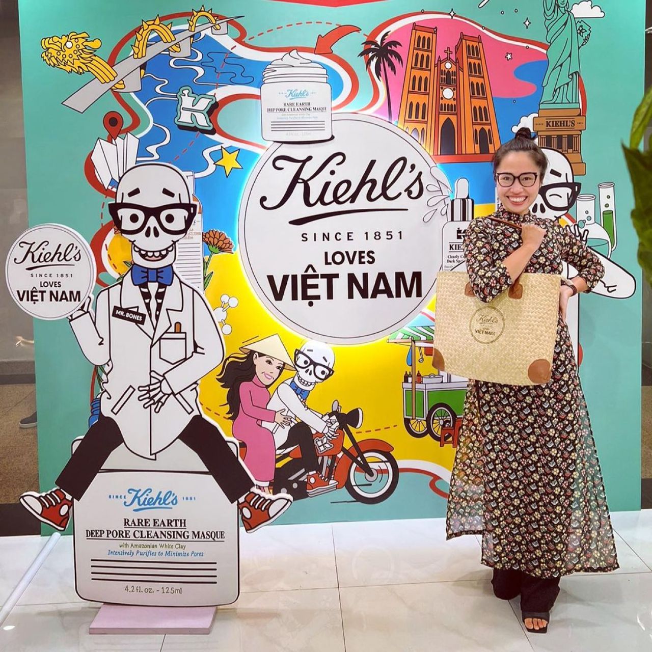
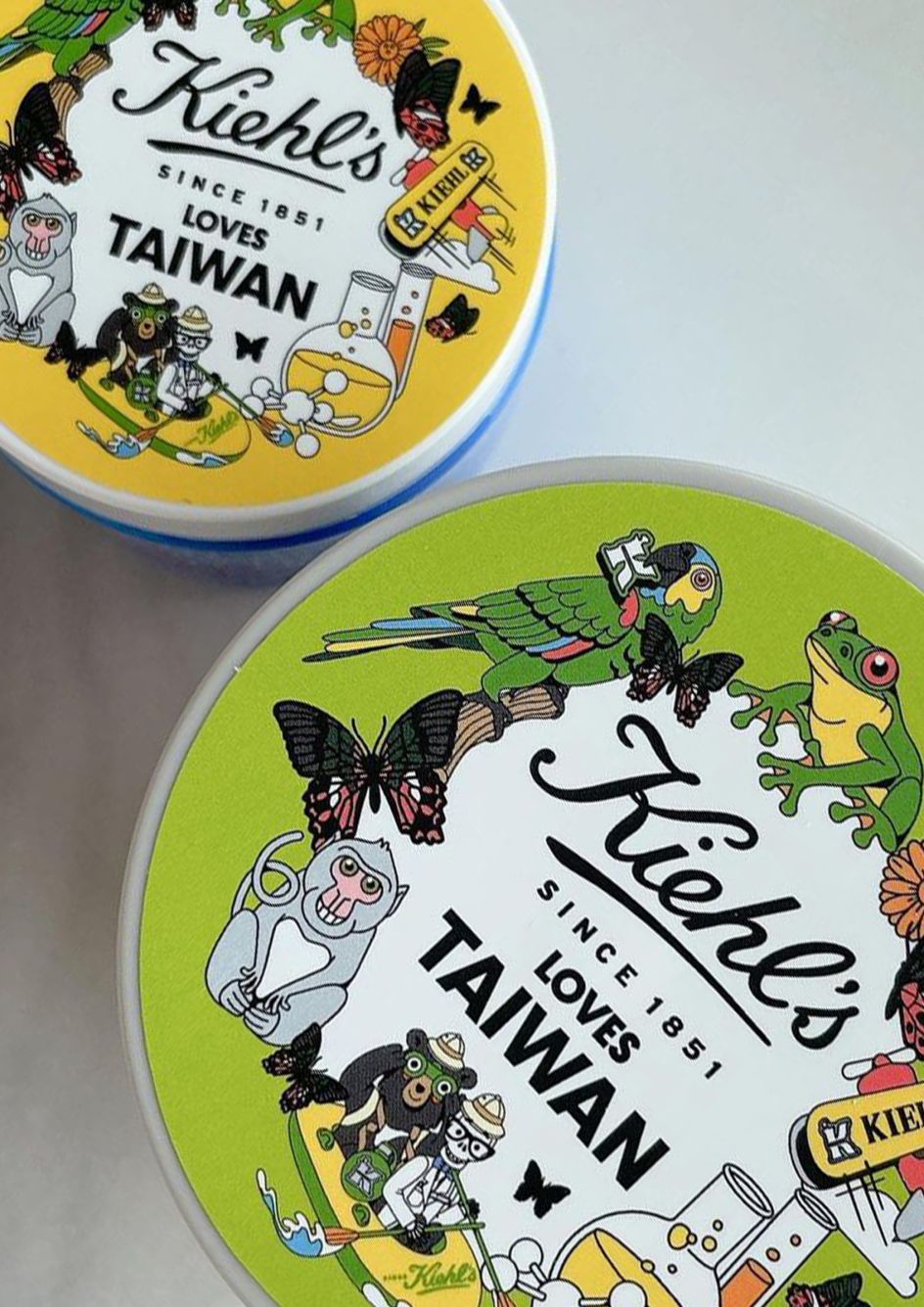
And this was not just a small job, either. In a seven-month collaboration with the skincare company, Linda was tasked with crafting bespoke artwork for 48 Kiehl's locations worldwide, emphasising distinctive aspects of local culture in her vibrant, graphical and eclectic style; from China to Guatemala, Britain to Japan.
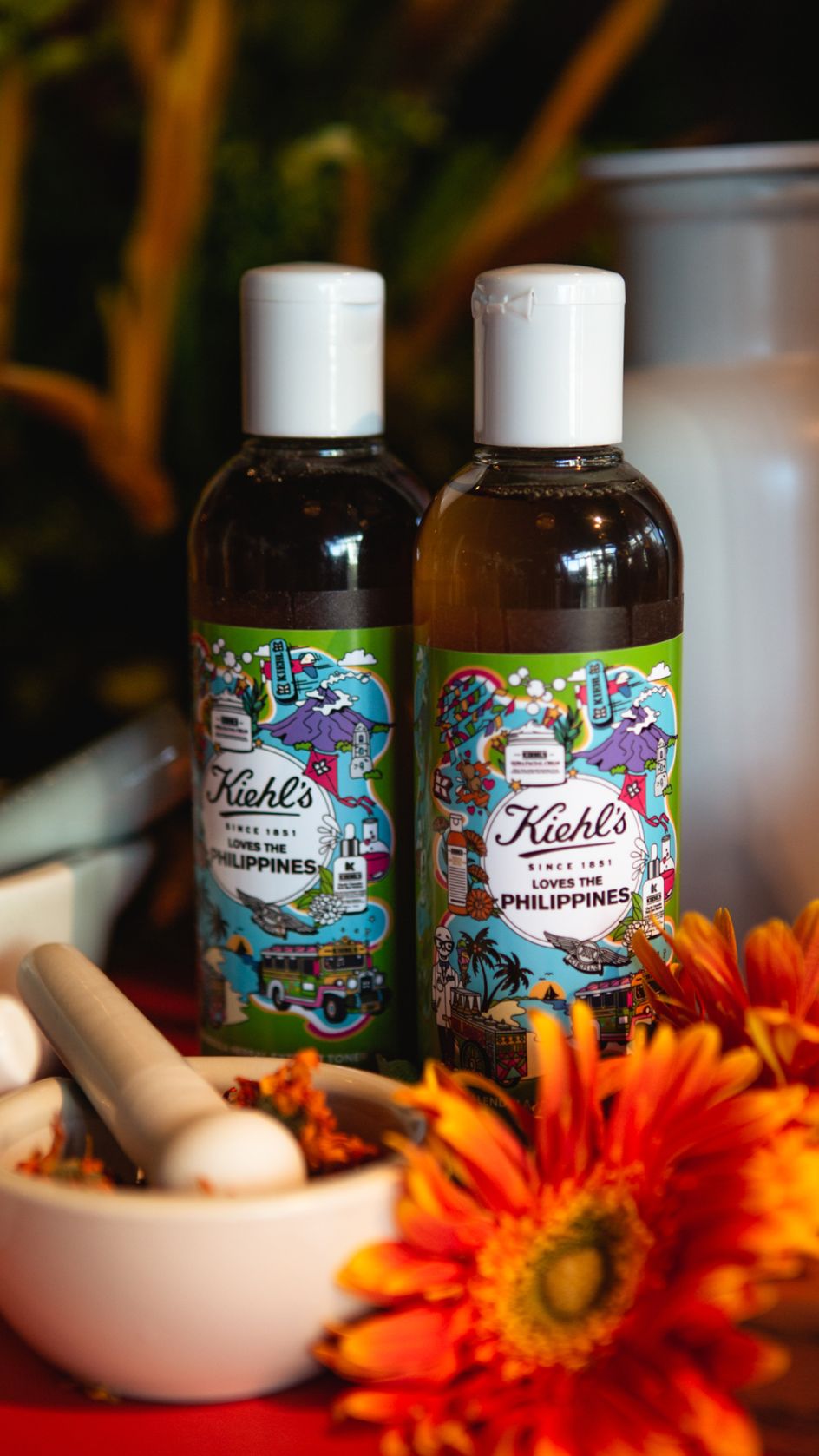

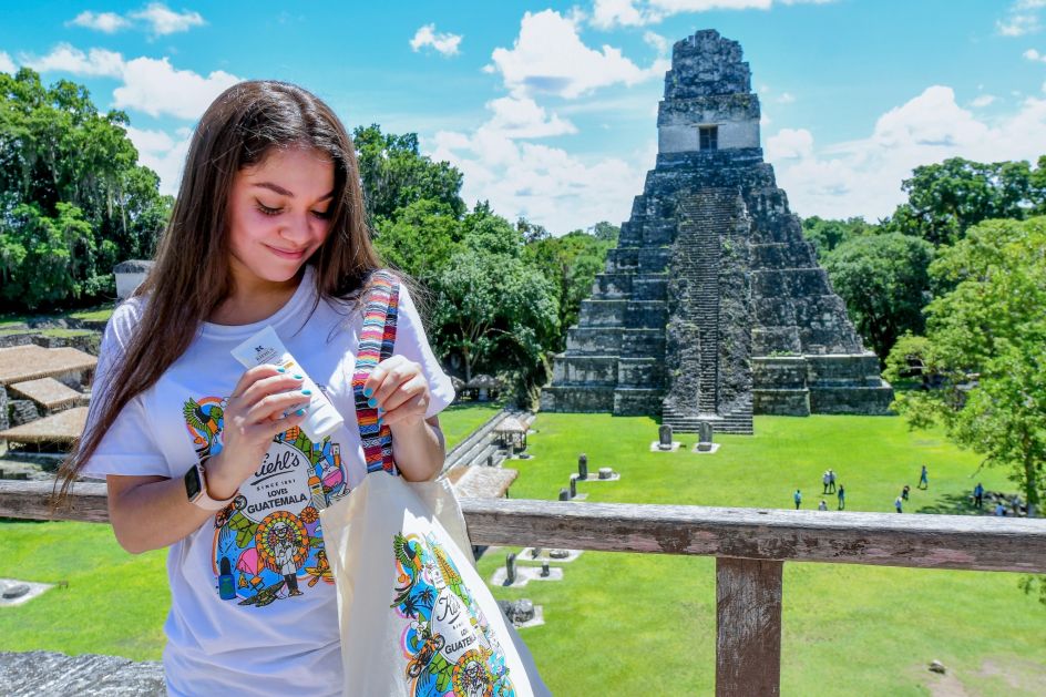
Read on as Linda tells us how she approached the brief and faced the challenge of working for a global branding giant across dozens of national borders.
Getting started
Linda first had to do a test illustration representing Hainan, an island province of China and its southernmost point. "I had a very tight turnaround, but it was exciting to create," she recalls. "It's turned out to be one of my favourite illustrations from the project, now that it's complete."
The client was happy too, and ready to embark on the project with Linda. Which meant that, from a personal standpoint, the pressure was very much on.
"Working with Kiehl's had been a dream collaboration ever since I began as a freelance illustrator in 2017," Linda explains. "I was a huge fan of their collaborations with some of my favourite artists and illustrators such as Craig & Karl, Peter Max, Aries Moross, Jeremyville, Simone Massoni and Ali Mac, so working on this project was amazing."
Fulfilling the brief
Linda explains how she approached the project in collaboration with Kiehl's. "We treated each location as a separate client," she says. "For each location, I was given a visual brief of interesting cultural references and colour cues to choose from. The local markets provided further details and background information that helped me understand their stores, upcoming projects, promotions and special dates on their calendars."
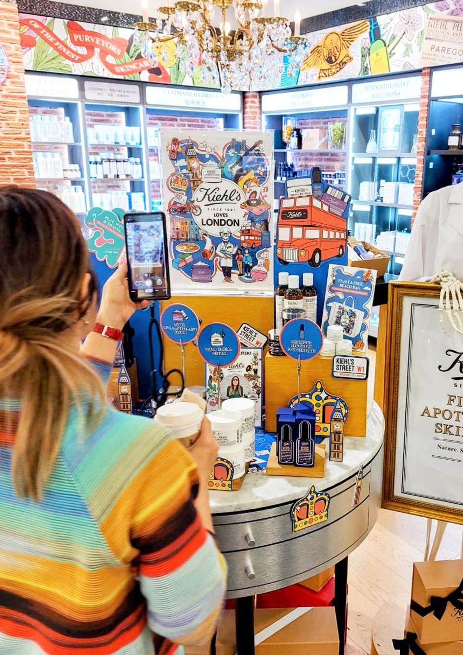
How detailed each brief was, though, varied from place to place. "Some locations had specific colours or one specific ground colour they preferred, while others were very open, allowing me to decide what imagery to develop from their list of possibilities," she explains.
Drawing on all of this for inspiration, working closely with Kiehl's creative leads, and carrying out her own research, Linda used her imagination to drive the imagery in her own direction. Through a creative process involving three revision rounds, she rendered everything in her trademark style, emphasising the vibrant colour and energy of each location, with a touch of humour for good measure.
"I wanted to be helpful to each local market by also providing them with illustrated tool kits," she says. "Each included illustrated Kiehl's products, a character mini kit for the Kiehl's mascot, Mr Bones, in different poses and expressions, icons and a variety of patterns specific to the local market."
Artistic influences
Linda lists her artistic inspirations as Patrick Caufield, psychedelic artwork, Peter Max, Pop Art, John Alcorn, Milton Glaser and Tadanori Yokoo. On this project, she was influenced, too, by the skincare brand's previous collaborations.
"I was a huge fan of their past projects with illustrators," she says. "They had a lot of energy, a bit of humour and vibrant colour, but they always allow each illustrator's unique style to shine too."
However, because of the tight deadlines, Linda had to adapt her normal process for creating illustrations. "Usually, I sketch first – just rough notes and ideas," she explains. "Then I create tighter sketches on my iPad before finalising them in Adobe Illustrator. However, for this project, because of our tight schedule, I went straight to vector to save time, and any adjustments were made in the revision rounds."

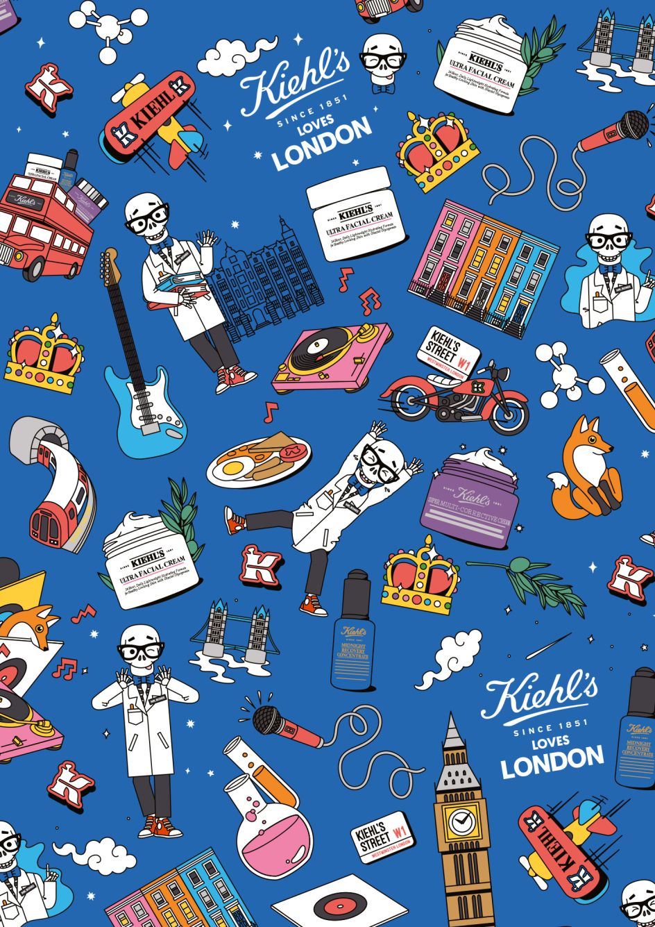
With three rounds of revisions for each location, Linda also had to spin a lot of plates. "As I was starting on some illustrations, I was working on corrections for others," she recalls. "Each location had a different consumer, so their feedback was important, and then I'd interpret it playfully."
And with the pressure piling up, it wasn't always plain sailing. "For each illustration, I went through a weird process of coming to a point where I felt like it wasn't going to work," Linda explains. "Then, usually late at night, it would suddenly come together for me visually."
Staying organised
Beyond that, simply staying on course over seven months was a real challenge, she adds. "Because there were so many locations involved and three rounds of revisions for each, we had to keep very organised. There's an old-fashion belief that creatives should be messy and unorganised, but you can't be with a project this size. Luckily, I worked with Emanuel Brown at Kiehl's throughout, and we were both methodical. Plus, I've worked on projects at this scale in past jobs, so I understood what was involved."
That said, there was some ebb and flow to Linda's workflow during the seven months. "Some weeks, when things were in review with the clients, I had time to do other projects or work on my paintings and take a rest from computer work," she explains. "However, in other weeks, lots of feedback came through, so scheduling was tighter.
"After the project ended, I took a month off and just relaxed and went on holiday," she adds. "It was intense for those seven months but fun as an illustrator."
Themes and favourites
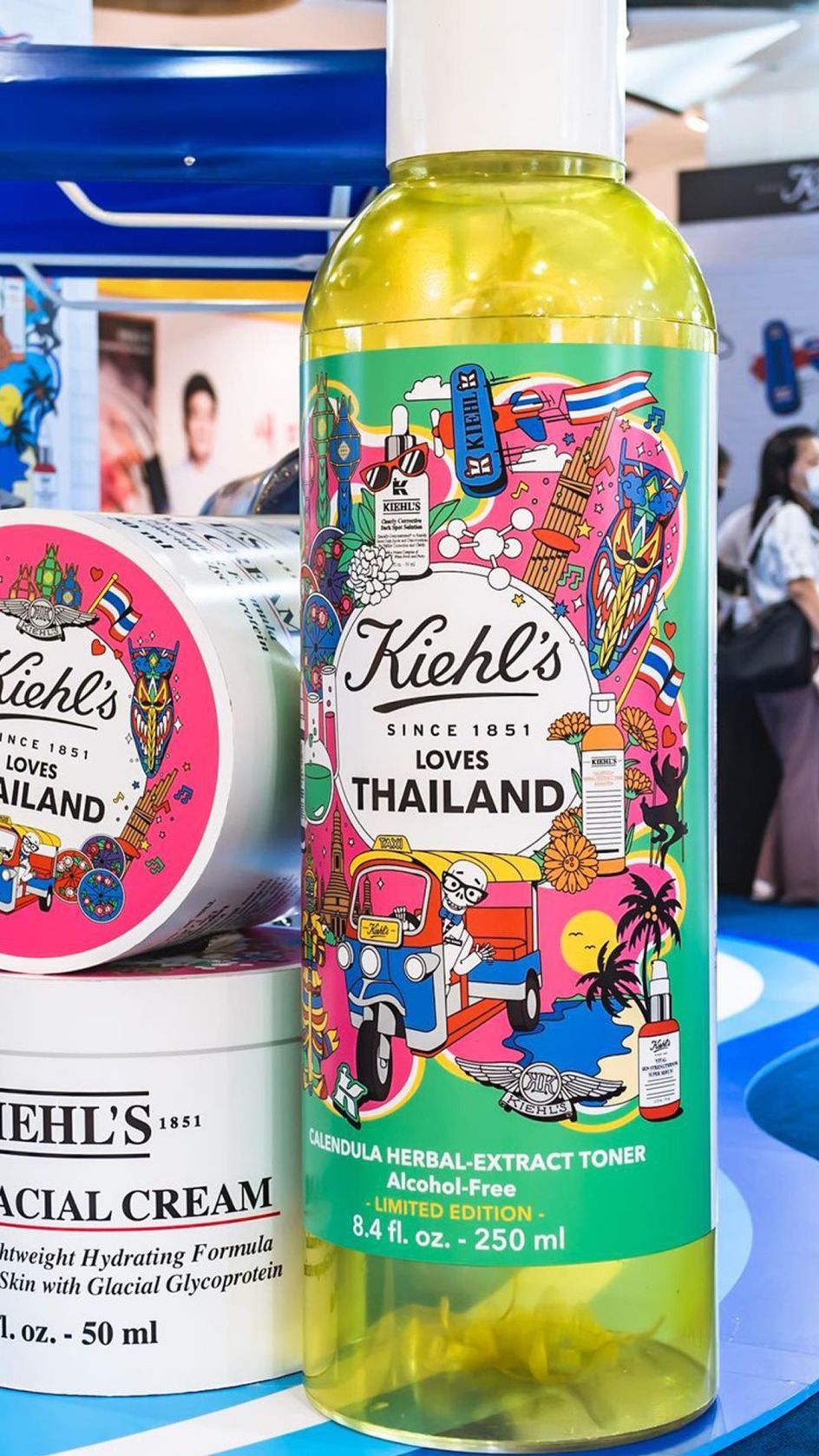
She's rightly proud of the work she created in the process: hundreds of illustrations, patterns and icons depicting a whole variety of people, landmarks, flora and fauna, food, musical instruments, historical artefacts, vehicles, maps, badges, flags and plenty more, all in her distinctive style.
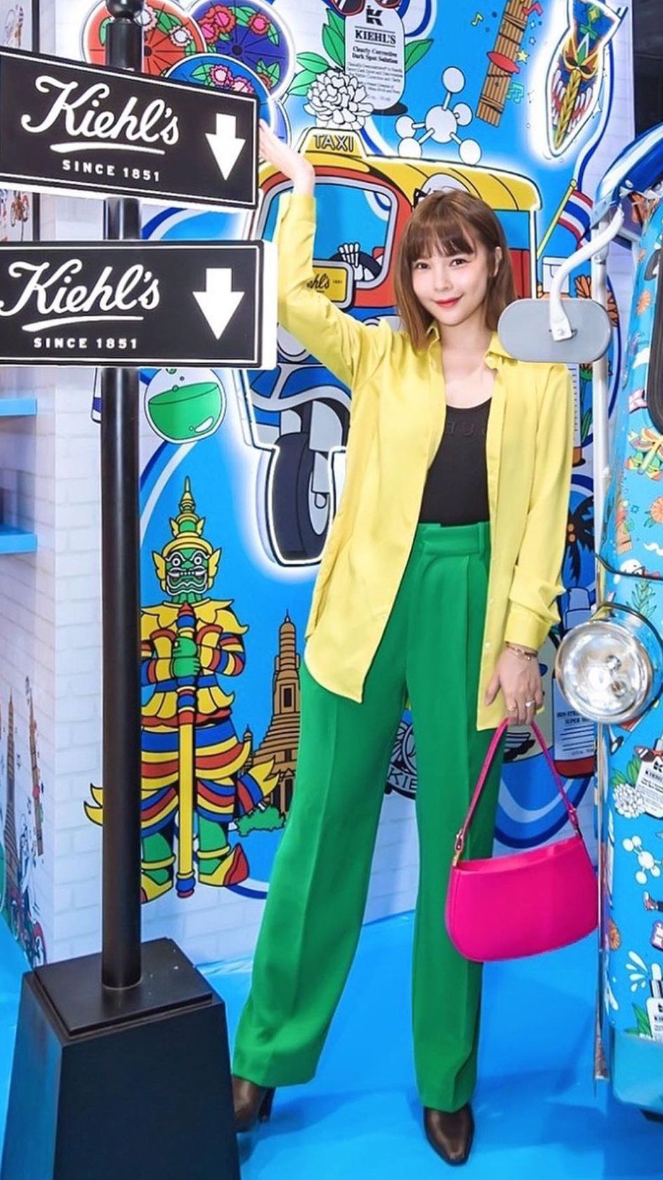
In front window displays, exclusive product packaging and point-of-sale displays, Linda's artworks give Kiehl's shops a whole new feel – something fresh and different to surprise and delight their customers.
In Thailand, for example, a tuk-tuk has been painted from top to bottom with eye-catching icons and characters. "These illustrations were a big favourite for me: I'm hoping to see some of the artwork on products when I visit there at the end of the year," says Linda.
"Paris had a lot of iconic imagery, too," she adds. "Hainan was the first one for the project, so was another favourite. I also loved the unique cultural elements of the South American countries – Guatemala, Puerto Rico, and Panama. I really had a chance to be very colourful with them."
But while each territory's illustration is distinctive and different, some themes link them visually, not least the skeleton character Mr Bones, who appears in each illustration.

"If you visit any Kiehl's shop, there's a Mr Bones dressed in glasses, a bow tie and a lab coat," Linda explains. "Every illustrator who has worked with Kiehl's has created their version of Mr Bones. When I created mine, I used some of my background in working with character art and licensing to make a mini character kit. I created several expressive heads, body poses, icons and patterns specific to the local market."
Cultural sensitivity
Perhaps most importantly, Linda's illustrations draw out key identifiers and cultural references for each city and country without ever resorting to negative or offensive stereotypes. How, we wondered, did she ensure she handled that sensitively?
"I think because I've had experience working with clients from many different countries and cultures, I'm always respectful of their input when it comes to imagery, and I'm always open to include or remove something," Linda responds. "I also understood the sense of pride each country would have for many of the elements. So I wanted to represent them respectfully but still reflect things in a vivid, lively style."
Now that she's fully refreshed after taking some time off, Linda has returned to work with a vengeance. "I'm working on a few client projects between now and the end of the year and spending time painting a bit more and creating some personal projects," she explains. "I'd love to collaborate on installation or site-specific projects, indoor or outdoor, or skin a bus, car or plane with my illustrations. Or maybe work with a beverage company on their next campaign. I would love to work on another project this size again."
London-based artist Linda Baritski is an illustrator represented by IllustrationX. She's known for her optimistic and playful illustration style, which combines dynamic colour, geometric patterns and graphical forms. Working in branding, packaging, editorial, events, murals, installations, homeware and more, some of her clients include Monocle, Adidas, Beefeater, Lush, Red Bull and The Salvation Army.
Founded in 1929, IllustrationX is the world-leading illustration agency, specialising in connecting clients with talented illustrators from diverse backgrounds around the world. Today it represents over 220 talented artists and animators, with offices across four continents. To find out more, visit www.illustrationx.com.




](https://www.creativeboom.com/upload/articles/a9/a95f8ea2748ccef642d39e253c9b7ba5f7253a4e_732.jpg)
