Arthur Stovell finds a greener side to money with new Deforestation-Free Finance brand identity
Freelance graphic designer Arthur Stovell has collaborated with Deforestation-Free Finance to create a new brand identity which brings together the imagery of money and climate awareness in a genius way.
Deforestation-Free Finance finds a new angle on a familiar concern
Shoreham-by-Sea-based designer Arthur Stovell was living the dream of many a graphic designer. He was living in London and working at Pentagram, which had served him well for ten years. But it wasn't quite enough for him anymore. He needed to pursue his own path, so he became self-employed in 2018 and hasn't looked back.
"Since then, I moved to the countryside in West Sussex and have been pursuing my intention to work with more socially and environmentally driven organisations and causes, as well as start-ups that may not have the budgets to work with big agencies," he tells Creative Boom.
It features a genius blend f iconography...
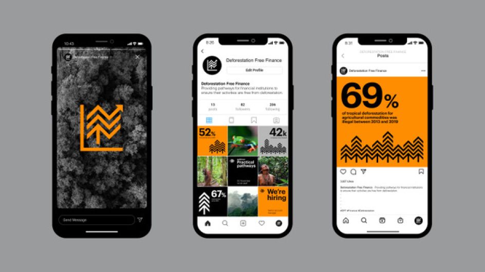
The branding appears online and out of home
...and an innovative use of colour
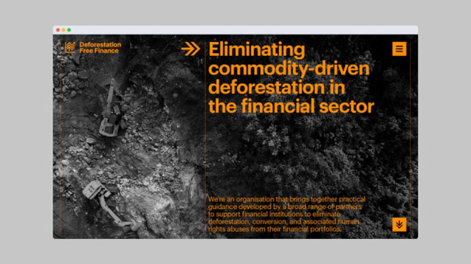
It's a noble cause and one that's seen his new studio Mondial team up with Deforestation-Free Finance, an advisory group which works with industry experts to provide practical guidance and ensures that financial institutions cut out commodity-driven deforestation from their portfolios.
In short, it wants to help businesses in the financial sector focus on their green credentials, which in this case means the environment and not their money. These two worlds can seem far apart, though, and often financial growth can appear to be intrinsically at odds with environmental sustainability, posing a tall order for Arthur. He had to somehow marry them together.
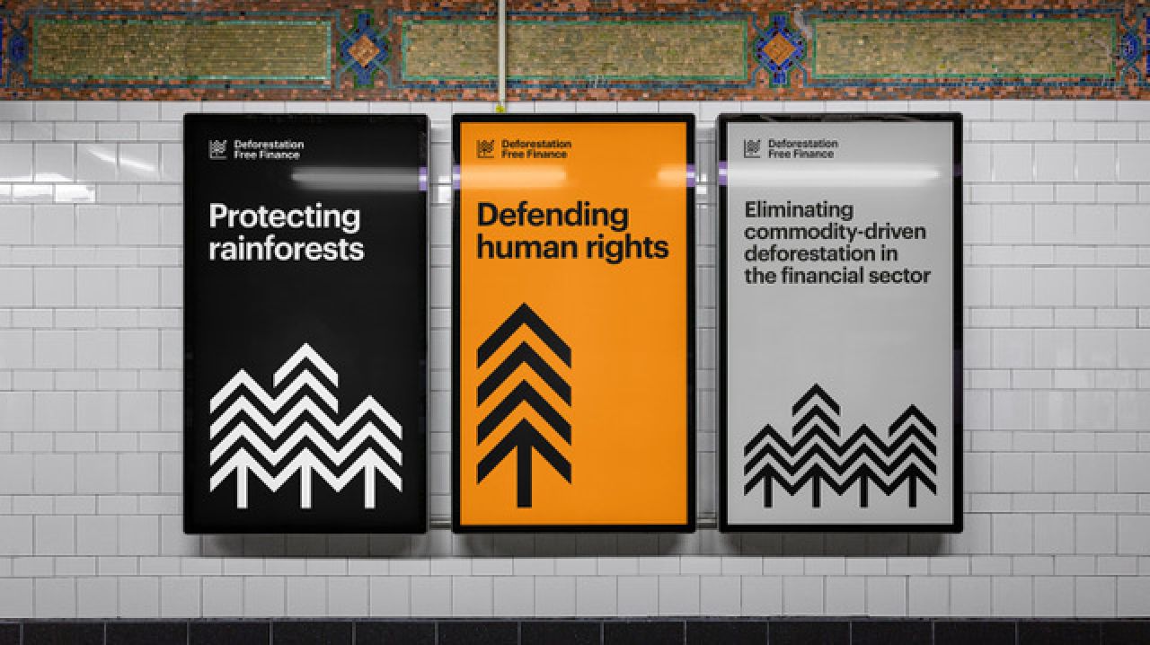
His design solution for the brief, though, is a genius one. By focusing on core images related to each sector and finding common ground, his brand identity sees an abstract tree shape merge with the image of a growth chart. "Bold and robust, this symbol forms the starting point of a graphic language that can be used in a variety of ways to form abstract compositions that convey forests in simple to complex tillable patterns," he explains.
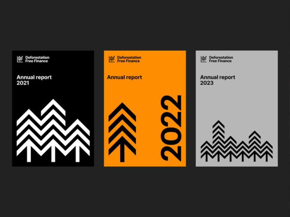
Clean, crisp typography and an orange colour adds a sense of urgency
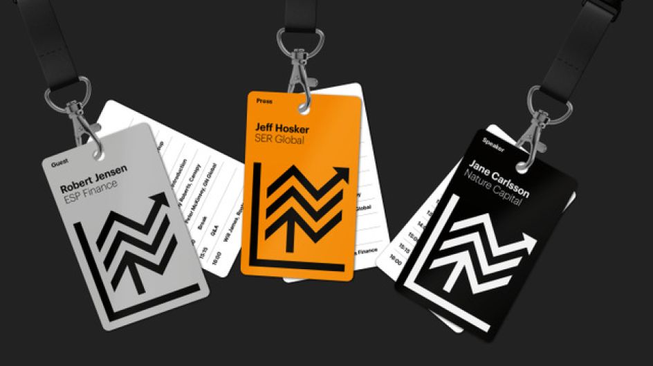
The tree/chart icon is both recognisable and flexible
Deforestation-Free Finance wants to achieve its goals by 2025, so time's running out
The tree image looks impressive when tiled
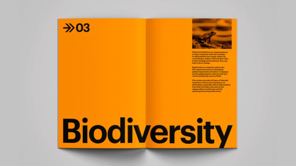
It's a deft piece of design and one that finds new ways to use familiar imagery. Instead of opting for a flowing green shape, Arthur chooses a more geometric approach that relies on rarely-seen colours in this sector. "The brand colour palette features a strong, vibrant orange to help convey a sense of urgency and immediacy," he reveals.
The result is a piece of design that is both meaningful and resonant. The angular shapes of the tree and graph suggest something of a sternness and a need for concern, looking like they'd be more at home in an industrial brand identity than one built around sustainability.
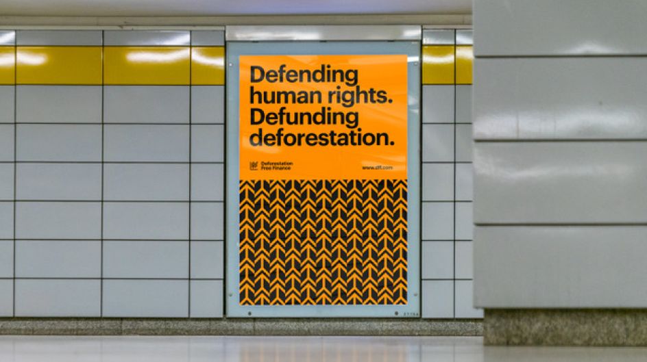
Striking both online and on out-of-home materials such as posters and lanyards, the colours and iconography are bolstered by plain, easy-to-read typography and a smart layout which appears to mimic governmental designs. If you stole a glance, the small positioning of the Deforestation-Free Finance logo could trick you into thinking you were reading state-mandated media.
And considering how climate change impacts all of us, hopefully, it won't be long until everyone else follows the example set by this identity.
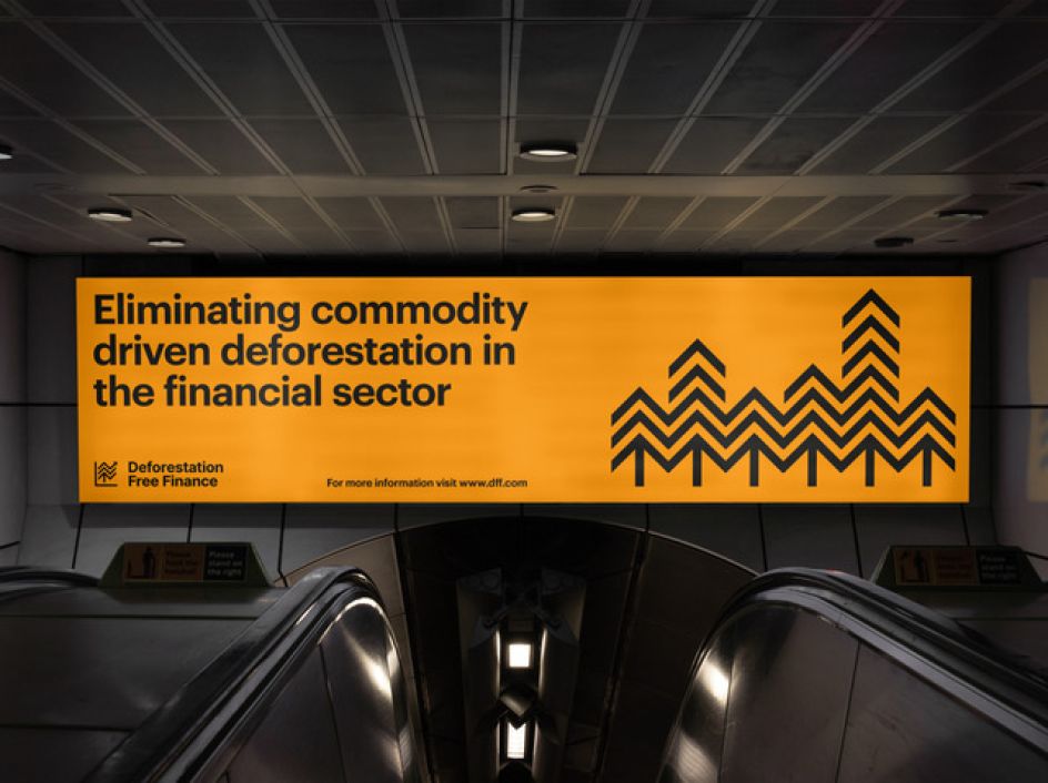
The arrow shape of the trees also suggests the theme of growth
Editor's Picks


Trending


Podcasts


Editor's Picks
Further Reading