F37 Britain: Seven new fonts inspired by what it means to be quintessentially British
If you could design a typeface that sums up modern Britain today, what would it look like? For Rick Banks and his foundry F37, today sees the launch of F37 Britain – a collection of seven characterful fonts that take their cue from Britishness. We find out exactly what inspired the new series.
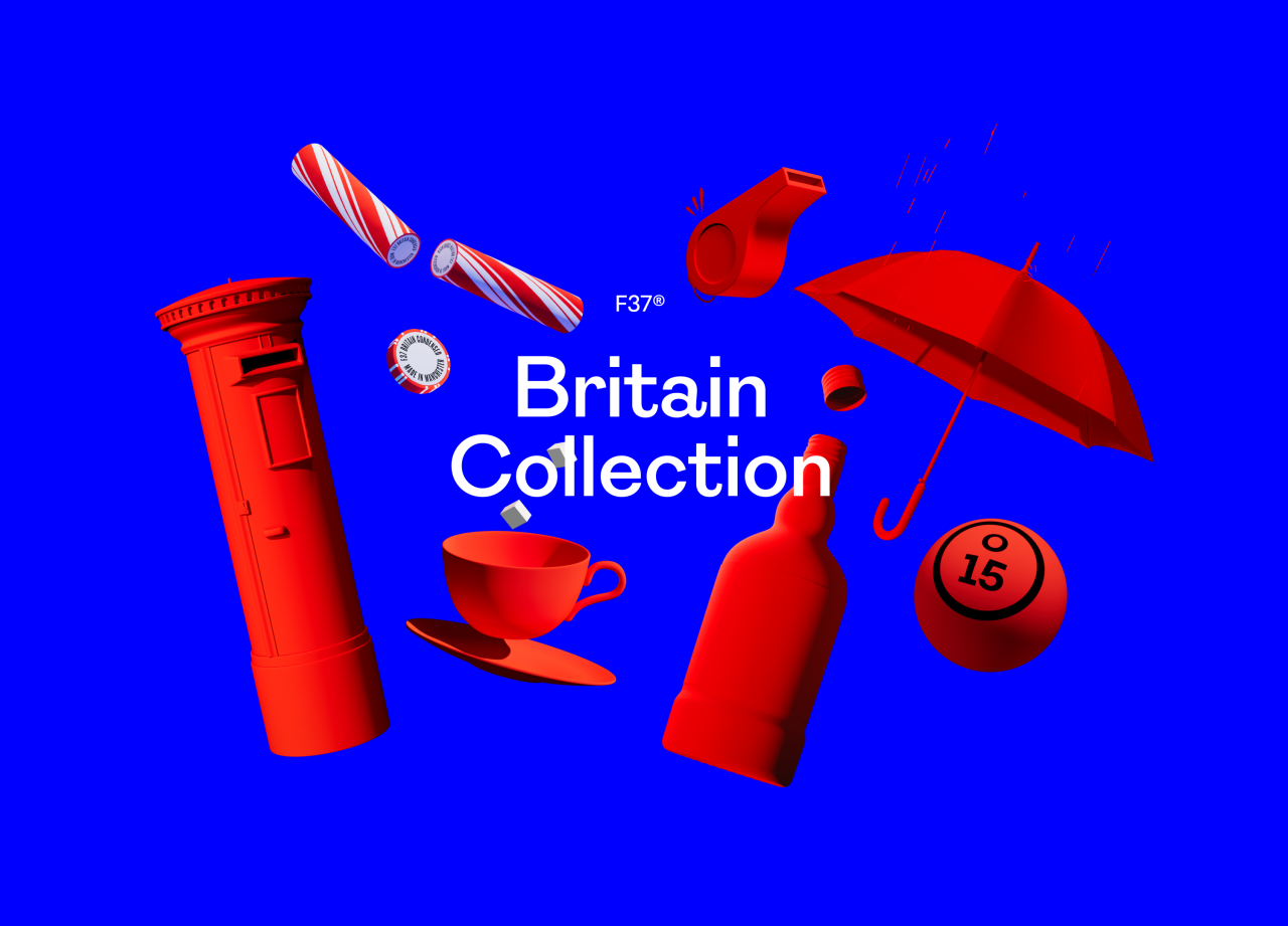
To understand Britain in the 21st century, one might look to the popular Very British Problems to learn more about our awkwardness, silly quirks and obsession with the weather. But how would the British Isles translate into type design?
Rick Banks and his team at the award-winning F37 foundry had always liked the idea of launching a collection of typefaces in this theme, but it was a chance occurrence that they noticed a theme within the references they'd collected for inspiration. "We took British classics and designed them with a modern twist," Rick tells Creative Boom. "We're proud to be British, and this collection is the perfect way for us to pay homage to that."
The F37 Britain collection has been in the making for almost two years and launches today, almost when it feels Britain is under the spotlight more than ever, given we've seen three prime ministers in less than two months as well as a new King. "It was serendipitous with the recent events in Britain," Rick says.
F37 Britain Scotch
F37 Britain Humanist
But recent chaos and upheaval aside, what does he think makes something British? "That's pretty hard to put your finger on because the nation's peculiar visual vernacular comprises thousands of small quirks and nuances," says Rick. "Many of these are so commonplace they go virtually unnoticed – they are around us on the streets, our homes, and objects that we use every day. They are taken for granted; they are just part of the national socio-cultural landscape."
Looking through the collection and the names of the seven different patriotic fonts, we get a clue of what those quirks and nuances might be. From Victorian theatre posters and antique maps to wood-type specimens and typewriter impressions, they reflect a land of hope and glory and "a nod to our past while looking stiff-upper-lipped into the future," as the description reads.
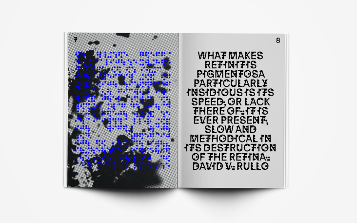
F37 British Sans, for example, takes its cues from the English grotesques of the 19th century, a period of type development where the Sans Serif genre was still in its infancy. "The typeface draws inspiration from type cut and cast by Vincent Figgins and Stephenson Blake, as well as more eccentric lettering found on English maps of the same era," says Rick.
F37 Britain Typewriter
F37 Britain Serif
F37 Britain Condensed
F37 Britain Humanist, meanwhile, is a distillation of many classic British humanist designs – from Edward Johnson's Underground typeface to Matthew Carter's Verdana. The typeface's subtle angles also reference the Union Jack, most notably in the titles of the 'i's and 'j's. "We wanted to use lots of inspiration and reference points from around the country," explains Rick. "The Serif is largely inspired by the type of Birmingham-born printer/type-maker, John Baskerville. While the Typewriter style employs letter shapes from a Leicester-based typewriter machine manufacturer and their advertisement ephemera from the 1950s."
Elsewhere in the collection is the F37 Britain Slab: "It's a chunky and charming design with its roots in antique types from the mid-19th century," says Rick. And there's F37 Britain Scotch that takes various Scotch faces from antique maps of Britain and gives them a fresh face.
And finally, F37 Britain Condensed applies a "contemporary aesthetic to a genre with its origins in compact wood-type from the mid-20th century," says Rick. It's inspired by the wood block type from the Victorian era. "It's a nostalgic British trip to the seaside. With a rigid, picket-fence structure of the condensed types from Stephenson & Blake, Thorowgood or De Little's wood types with the addition of rounded terminals to give it a fresh face." It's ideal for large display requirements that need to "pack a punch", so to speak.
F37 Britain Sans
F37 Britain Slab
Of the seven typefaces, does Rick have a favourite? "I love the F37 Britain Slab. "It has that lovely modern take on Clarendon style slab but with generous ball terminals. Something modern yet classic – the dreaded words of every client brief."
The F37 Britain collection launches today and is available to browse and purchase at f37britain.com. The entire series has been brought to life with 3D motion, sound design and flat visuals produced by Found Studio and flat graphic animations by Manchester's own Mike Ash. To find out more about F37, visit f37foundry.com.
Editor's Picks


Trending


Podcasts


Editor's Picks
Further Reading