This bouncy new bread branding makes wholegrain great again
The Swedish bread brand Hatting has been given a dynamic new look by IW Agency and illustrator Falko Grentrup.
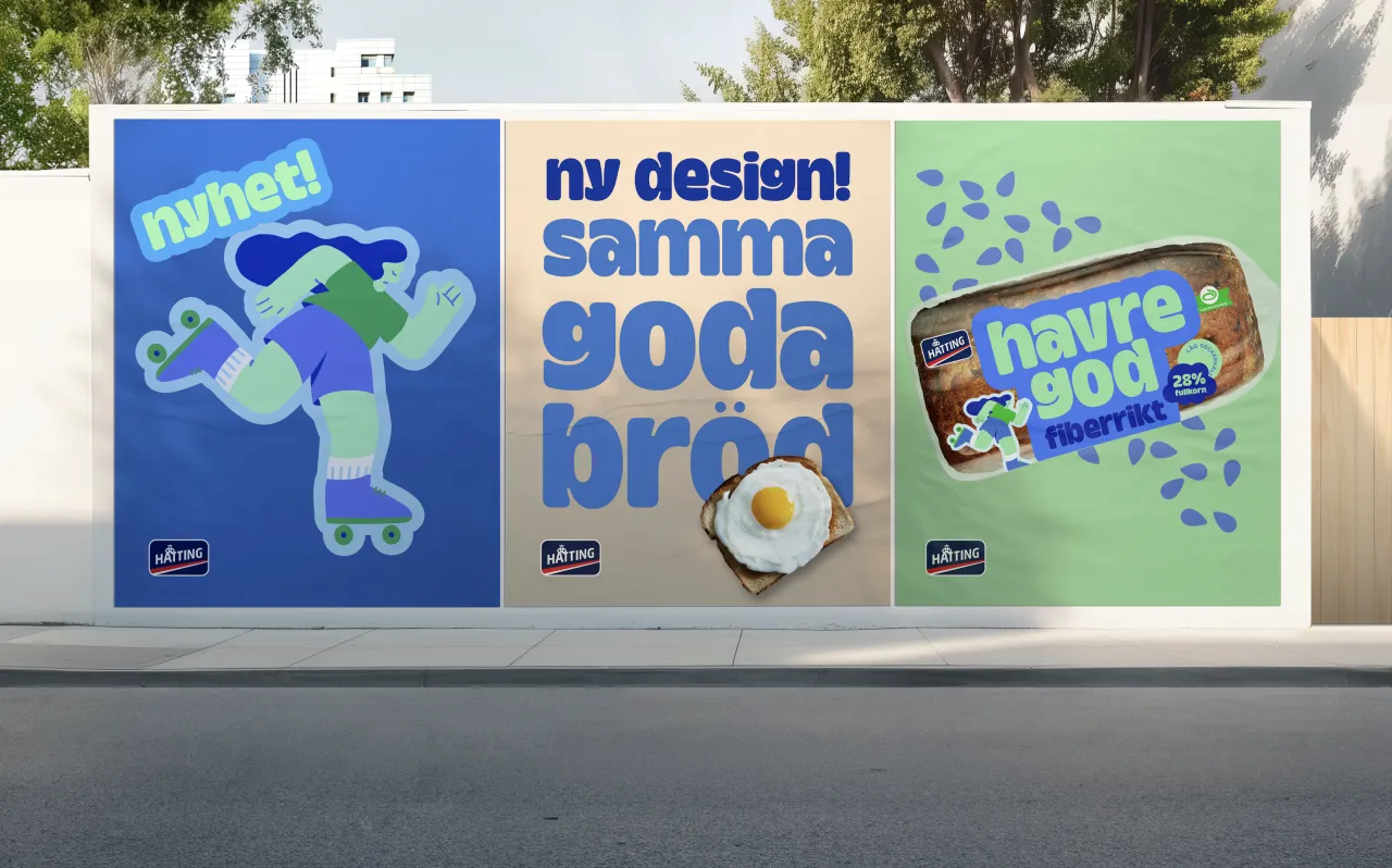
Your daily bread needn't be ordinary. Stockholm's IW Agency took that mindset into account as it developed a fresh aesthetic for Hatting bread. We're fully on board with the philosophy, and just looking at these loaves is making us peckish.
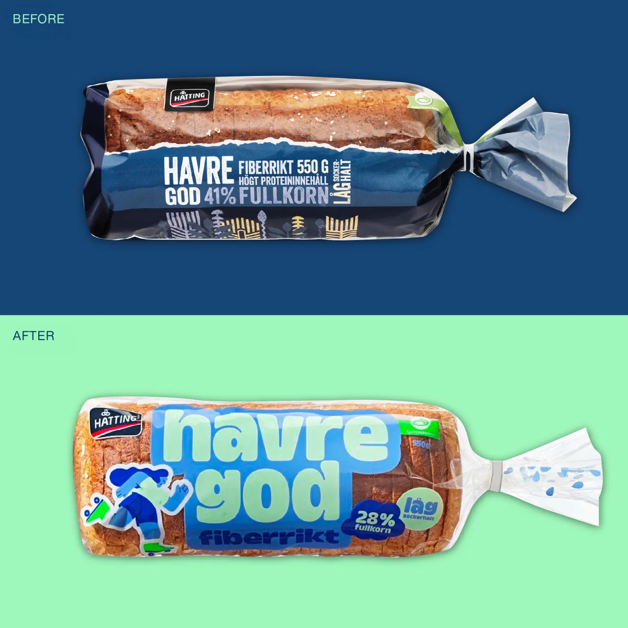
Design director Tatjana Dubovina Jokić explains the concept: "Early on, we realised that for Hatting to truly stand out in such a traditional bread aisle, it had to be bold. While many other categories have evolved visually, bread remains largely conservative. A key part of the brief was also to appeal to younger consumers and families with kids, so disrupting the shelf was essential to position wholegrain as relevant for a new generation."

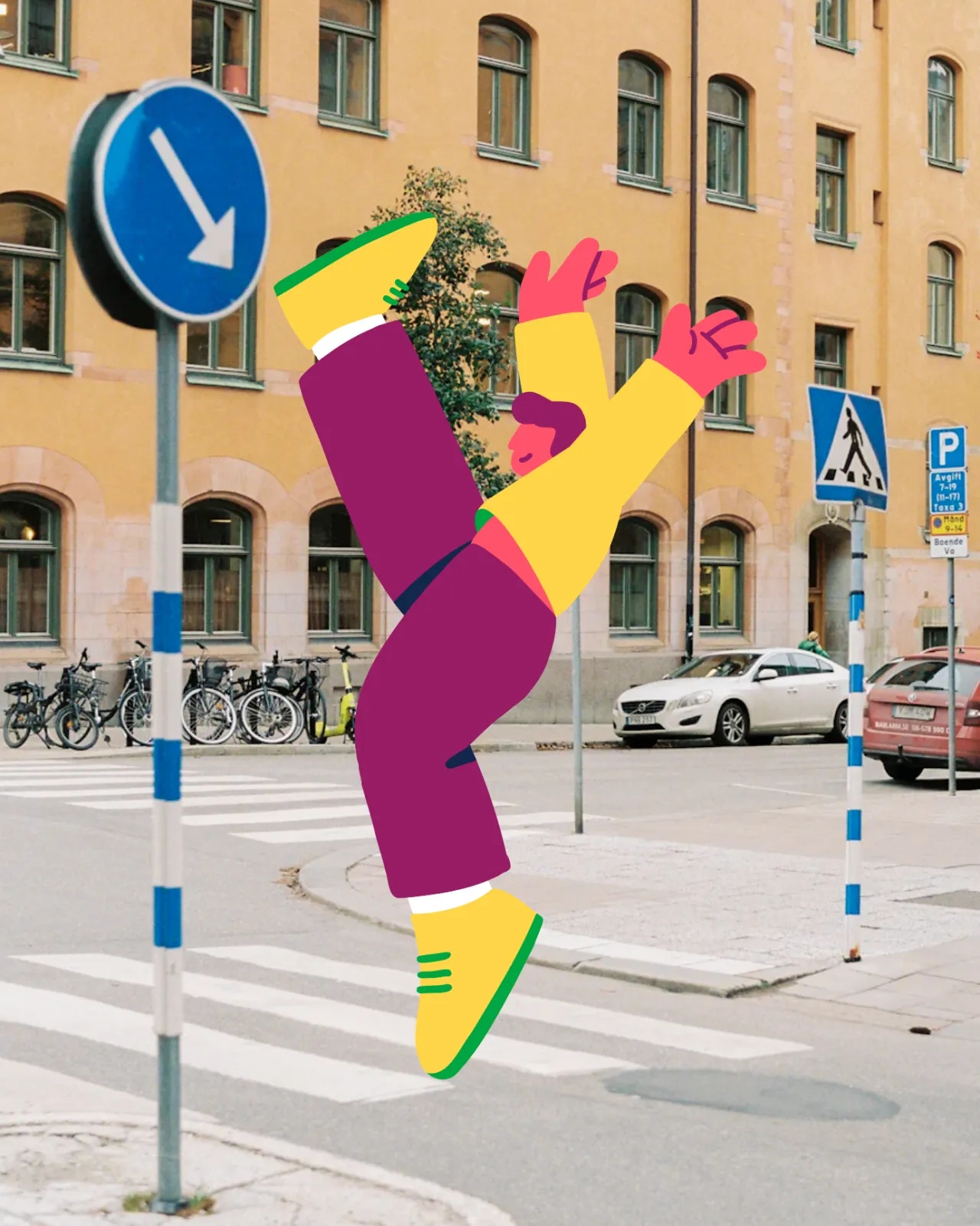
Yes, this is healthy eating, but with an injection of energy thanks to the colour palette, bold and playful typography, and characters that have a fun, contemporary vibe. The figures you see on the packaging were created by Swedish illustrator Falko Grentrup, who was given the visual direction to create 'expressive, playful and movement-driven characters with personality.'
One is leaping, another hula-hooping, a roller skater, a yoga-ist, and more—making the products feel active and alive. All eight characters were drawn in Falko's soft, thick, yet powerful contemporary style, and each locks in with one of the products. So far, seven have appeared on the shelves.
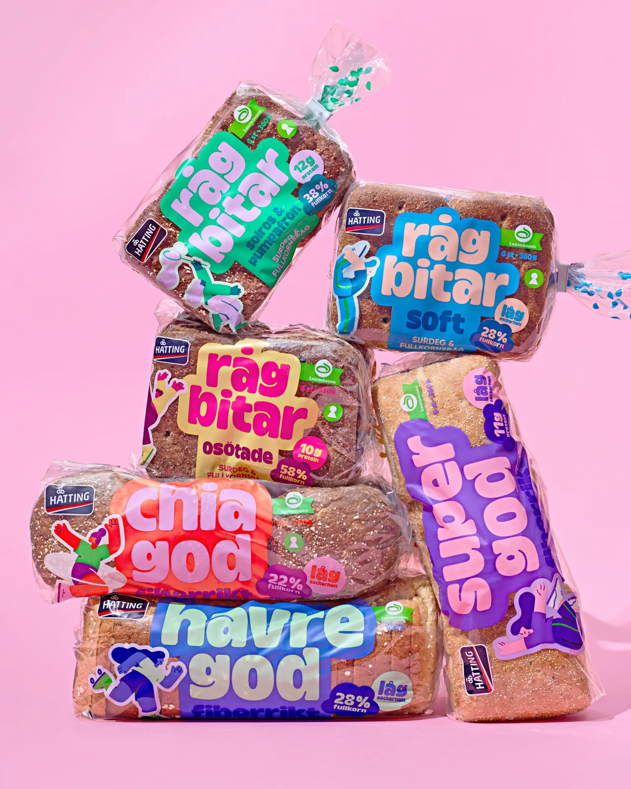
"Each character was developed to reflect the personality of a specific bread product," says Falko. "I created several sketch variations per character, exploring different variations of the poses, gestures, and movement."
He continues: "The final choices were selected by the IW design team and client based on what felt most energetic and expressive, reinforcing the idea of Hatting as a brand that celebrates an active, positive lifestyle."
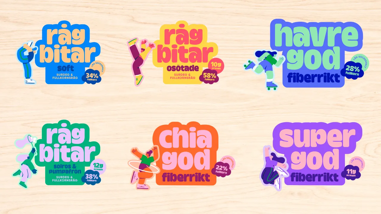
"Falko's style immediately aligned with the creative direction, and he brought energy and thoughtful input to the process," says Tatjana. "His work helped tie everything together into a cohesive, expressive visual world that feels both fresh and full of personality."
While many food brands have been simplifying their packaging and paring back the details, this approach goes against the grain by bringing characters and activities to the fore. So far, the reception has been positive, making these staple products pop off the shelf.
"Seeing the characters come to life on supermarket shelves and the impact they have has been really amazing," says Falko. "Character-led packaging like this feels pretty fresh in the bread aisle, so I hope it inspires more brands to embrace expressive and illustrative design like this."
Editor's Picks





Trending






Latest Jobs
Agent & Producer at The Jacky Winter Group
Full-time·London·£35k–£40k
Junior Project Coordinator at Colorido Studios
Full-time·Twickenham·£28k–£32k
Marketing Copywriter at ustwo
Full-time·London·£40k-£50k
Senior Digital Designer at 3800
Full-time·Sheffield·£40k-60k
Client Partner at Halo
Full-time·Bristol·£30k–£36k
Client Success & Growth Director at Revolution Growth
Full-time·Manchester·£60k-£70k