The Flower Collective branding is inspired by a 'cannabis-induced state of mind'
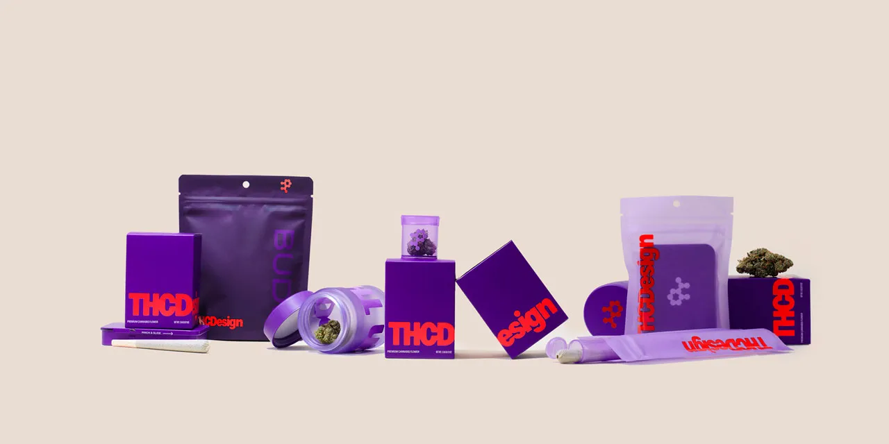
There’s no shortage of smart branding for cannabis products around at the moment since various legislation has been passed across the world, elevating weed culture from Monster Munch-eating slacker stereotypes to a lifestyle brand.
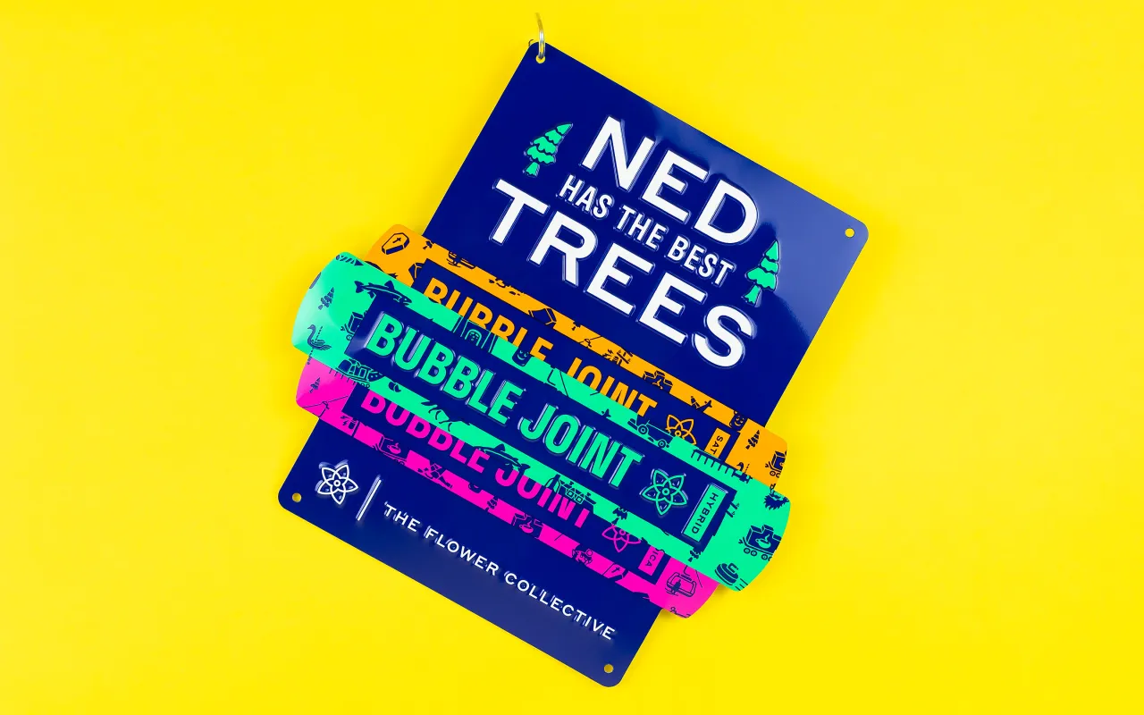
A new addition to the raft of smart, thoughtful brand design for cannabis products is here from Cast Iron Design for The Flower Collective.
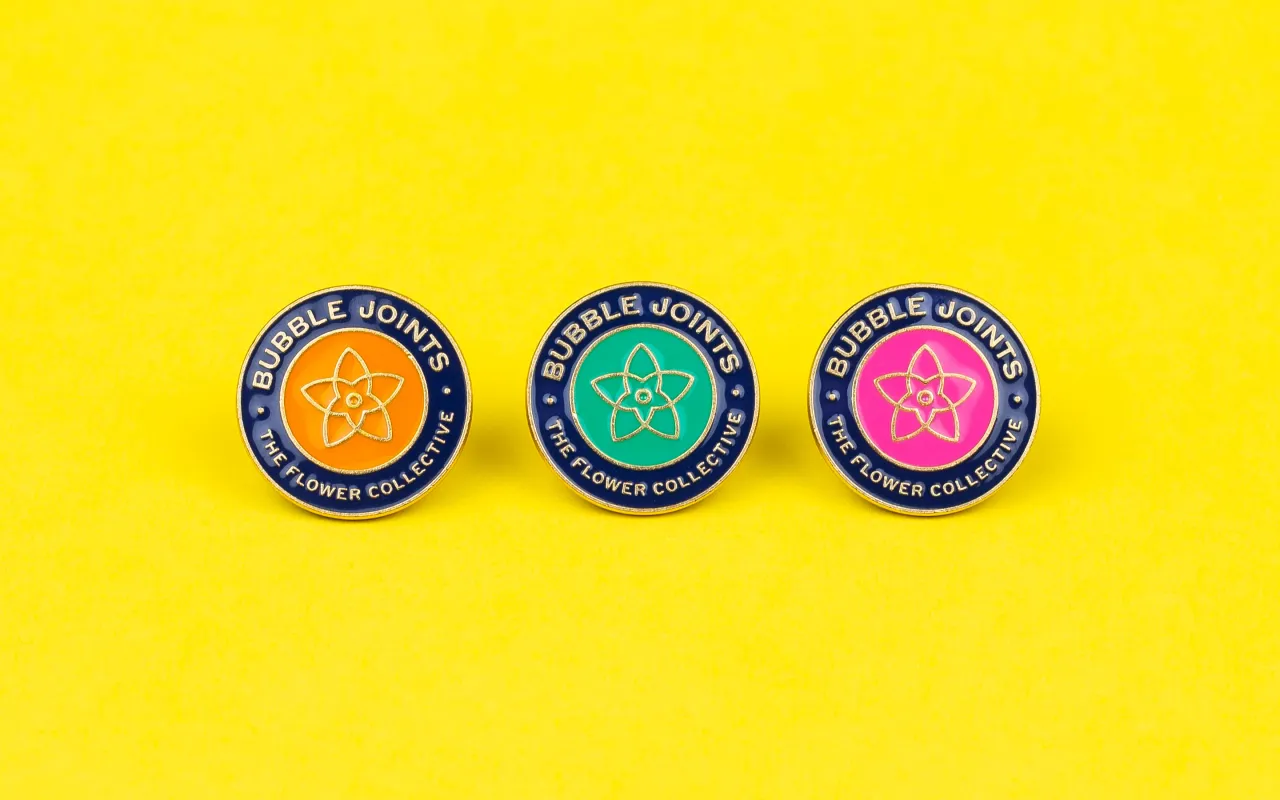
Based in the small mountain town of Nederland, Colorado, The Flower Collective is a cannabis company that recently transitioned from selling medical to recreational cannabis and needed new branding and packaging to not only underscore that shift, but that would help them stand out on the shelf and reflect their company’s values.
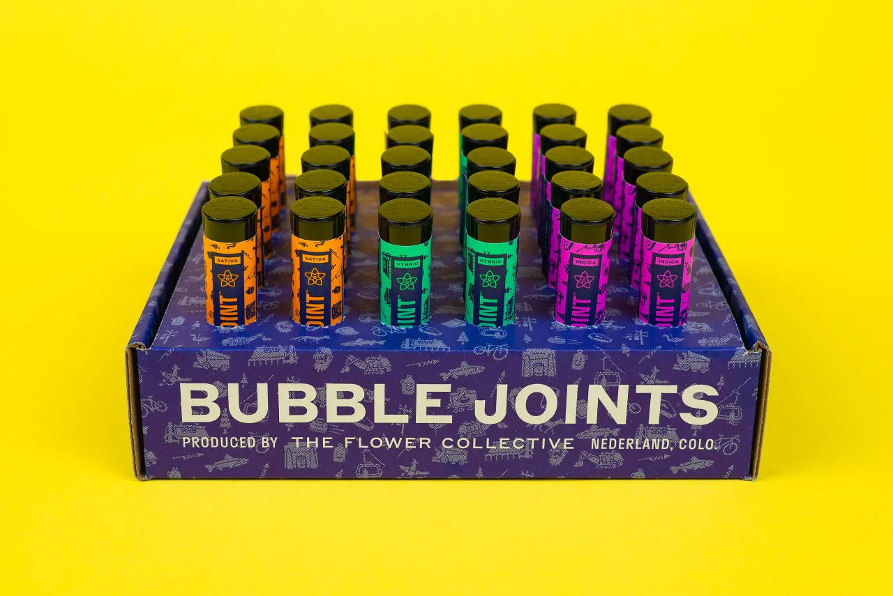
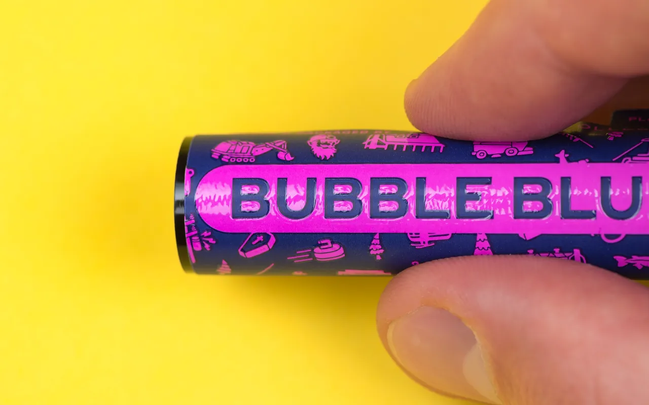
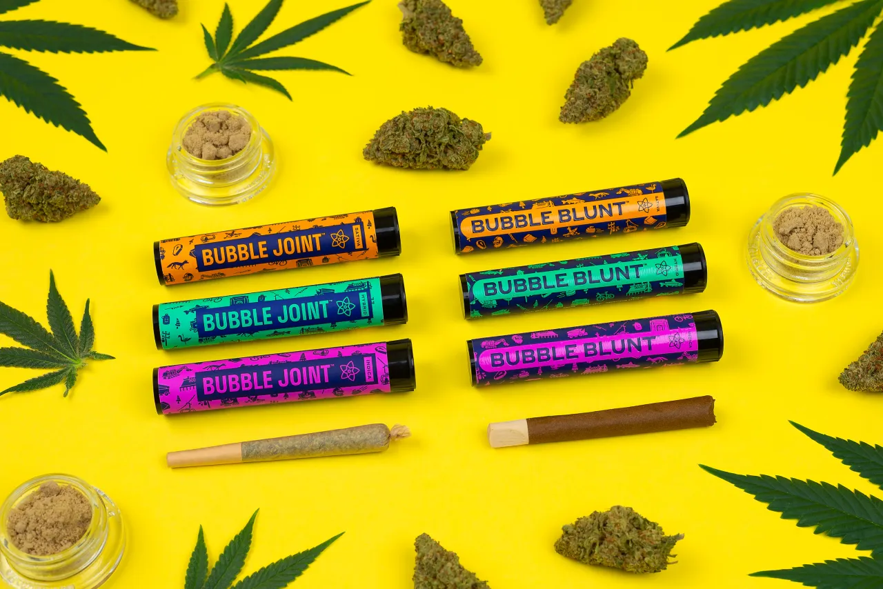
Cast Iron Design worked across an entirely new brand identity comprising copywriting, illustration, motion graphics, packaging designs, photography, print and web collateral and web development.
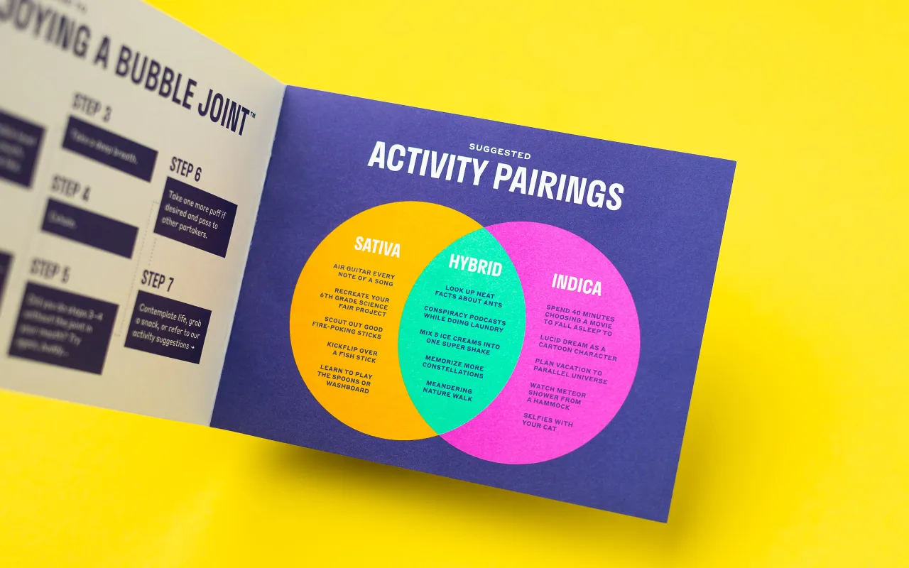
“The goal of the brand identity was to create an aesthetic that could quickly grab the attention of timid tourists while also establishing a rich personality for loyal locals,” says the agency. The new colour palette subtly draws on influences from 1960s blacklight posters, with ear-neon accents over deep cobalt. As such, it’s a subtle reference to the heady pot-hazed psychedelia of yesteryear; but with a modern twist that sets it apart from competitors and ensures it doesn’t veer into the territory of well-worn cliches.
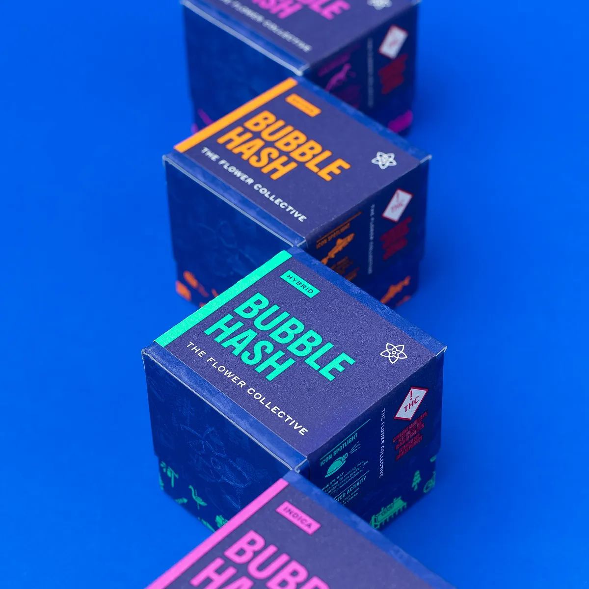
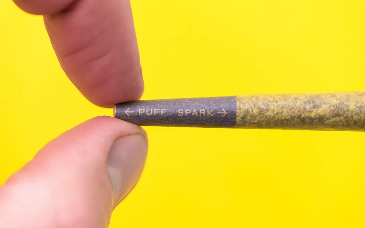
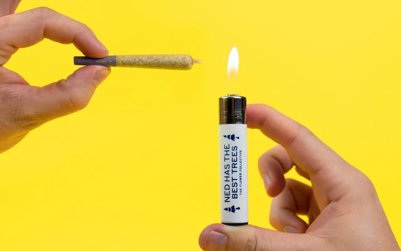
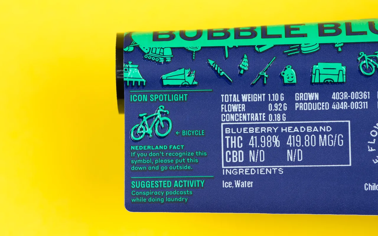
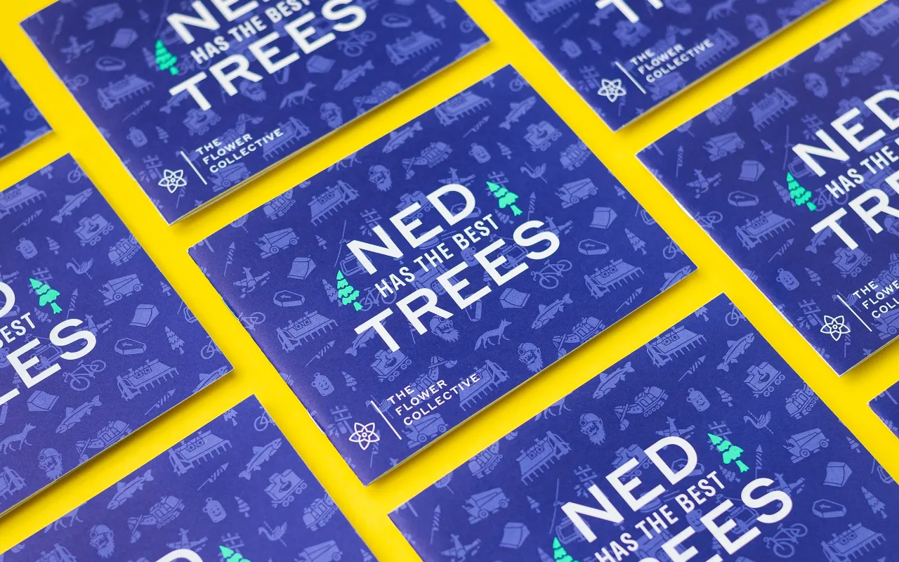
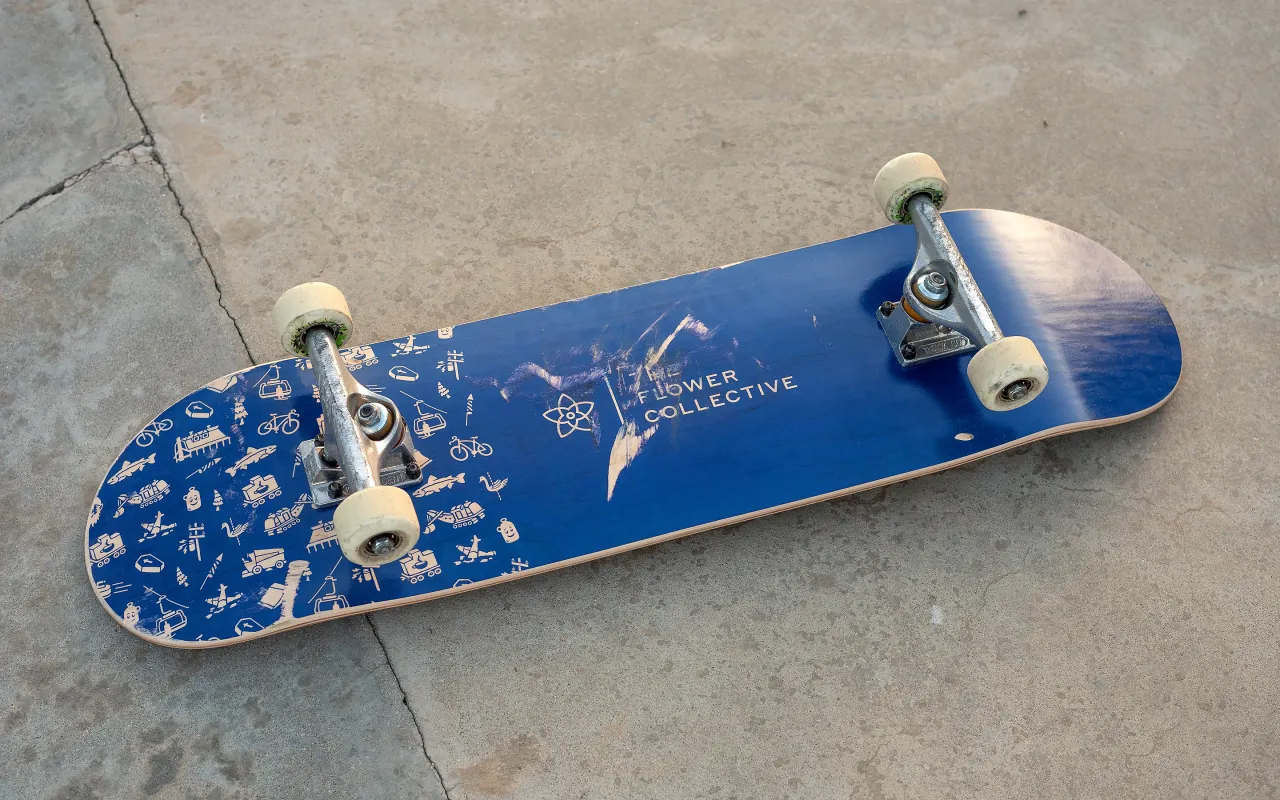
“The bold typography system, custom icons, and creative copywriting help express The Flower Collective’s unique location, product qualities, and sense of humour,” Cast Iron design adds.
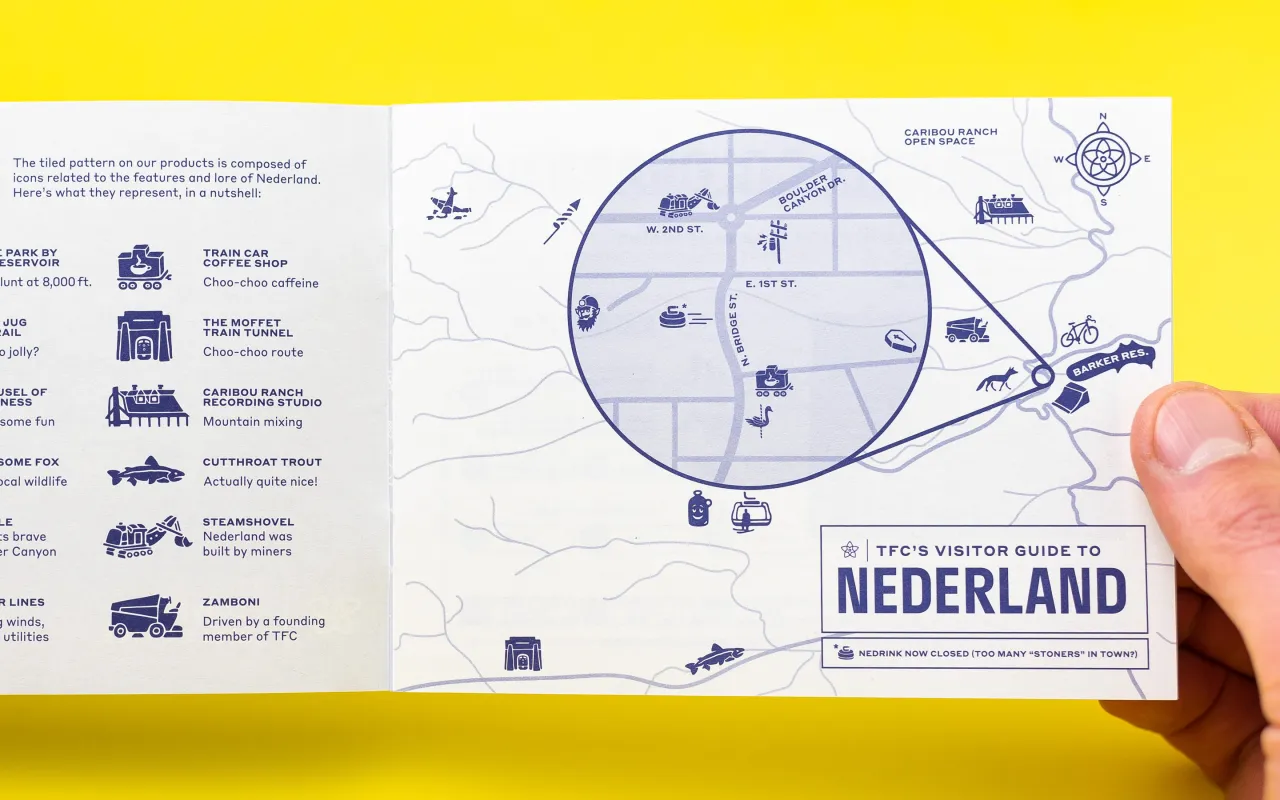
This icon system, created by illustrator Dan Lehman references Nederland itself – a town with just 1,500 residents nestled in the Rocky Mountains against a large reservoir. “It’s known for having a distinct culture and an abundance of character packed into a small area,” the agency explains. “We played off of their “Ned cred” by creating an icon set where each icon represents a landmark or characteristic of Nederland.”
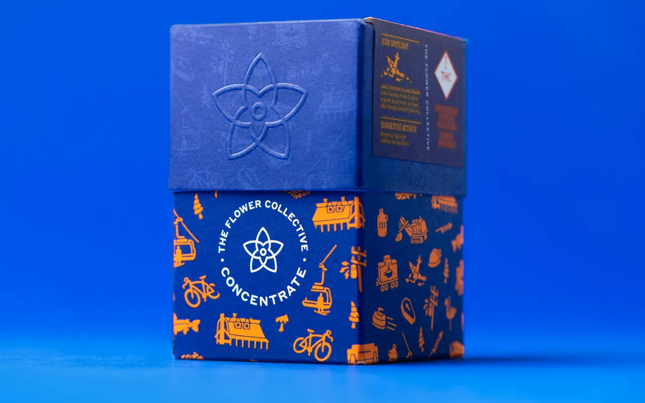
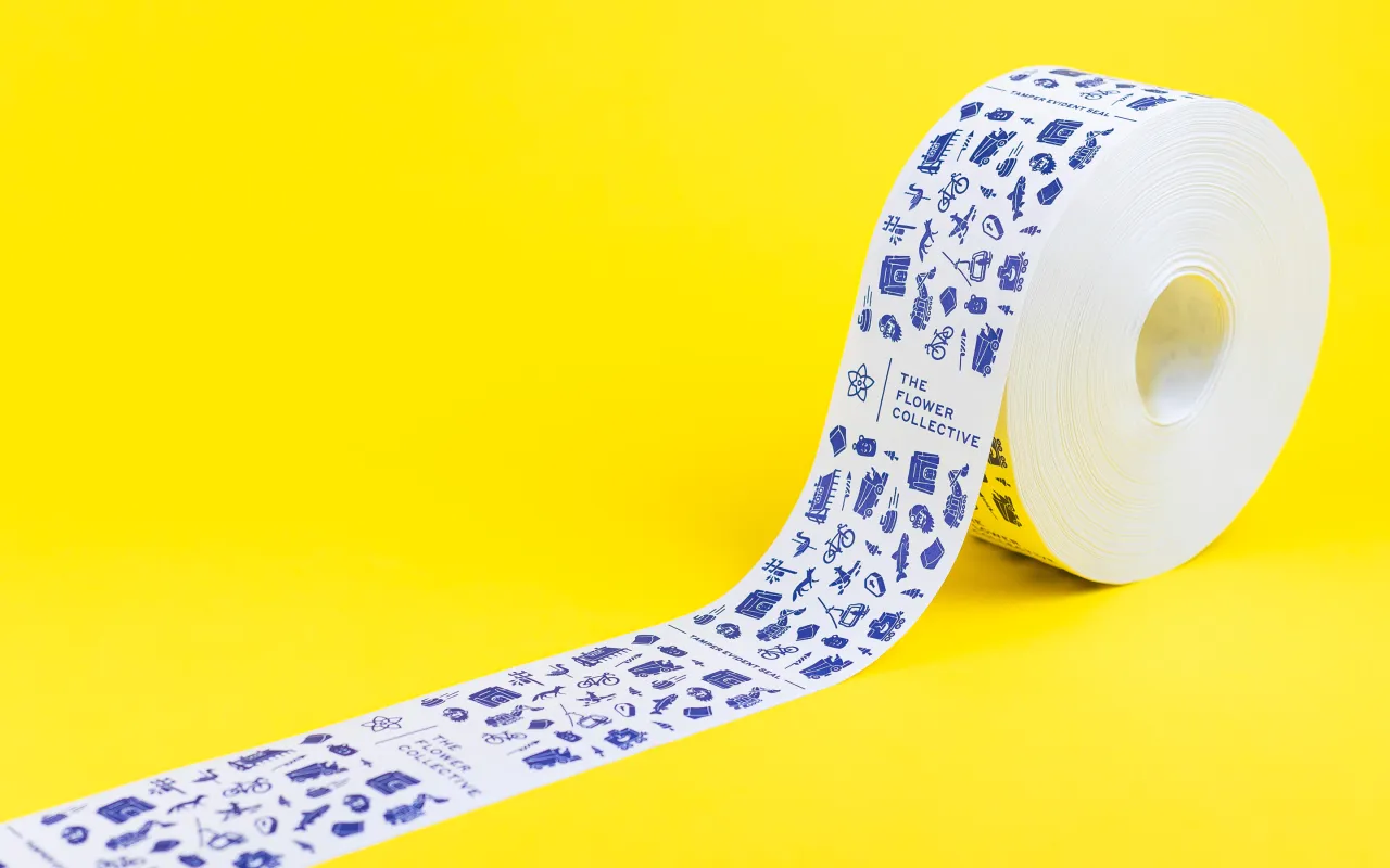
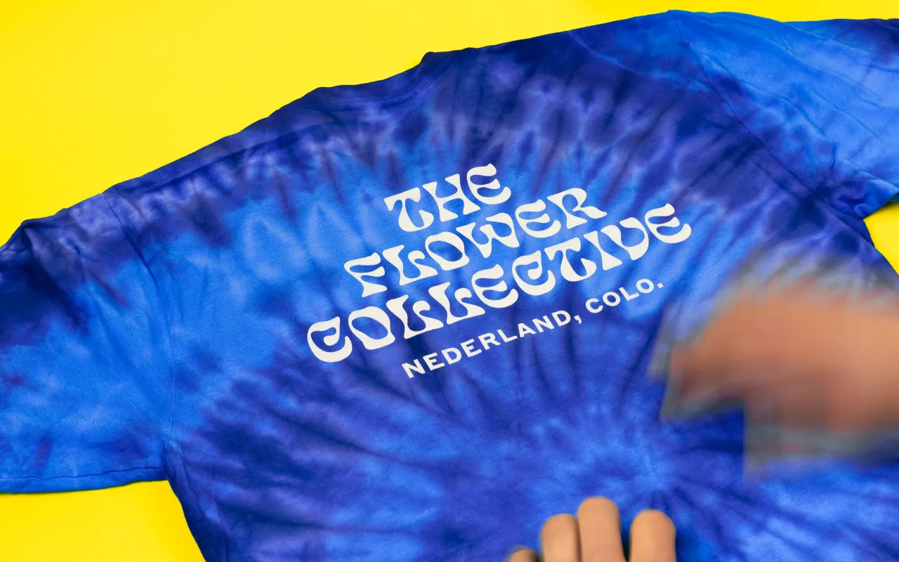
A key part of the design was to ensure the packaging was as sustainable as possible, so materials, processes, and production partners for print and promotional items were deliberately sourced as locally as possible to reduce the brand’s carbon footprint. Working with stateside vendors also “helps ensure employees are paid a more reasonable wage”, the agency adds, since “garment workers in developing countries are some of the lowest-paid labourers in the world”.
The weight of the products was also taken into consideration when it came to working towards more sustainable approaches.
The usual rigid box approach to premium products, such as with iPhone packaging, is inherently problematic since it adds extra weight; so Cast Iron Design used a folding carton for the structural packaging that’s made entirely from post-consumer recycled fibres. “For the label’s release liner (the coated paper that protects the adhesive, which is almost always not recyclable and therefore destined for the landfill) we specified a recyclable release liner made of unbleached kraft paper,” says the agency.
The designs were letterpress printed with rubber-based inks—another nice nod to tradition as well as sustainability.
Since text appears across most Flower Collective touchpoints, the approach to copywriting was to keep things short, “avoid negativity, and draw a little inspiration from a cannabis-induced state of mind,” says the agency, “with the hope of inducing a smile, smirk, laugh, or eye roll.” As such, the tagline plays on the forest-heavy landscape of Nederland; in that, apparently, “trees” is internet slang for cannabis.
Editor's Picks





Trending






Latest Jobs
Midweight Designer at All Purpose
Full-time·London·£30k–38k
Account Manager at BUILDHOLLYWOOD
Full-time·London·£34k–£38k
Senior Copywriter at Human After All
Full-time·London·£48k–£66k
Senior Brand Designer at Analogue
Full-time·Leeds·£38k-£45k
Midweight Designer at Catalyst Creative
Full-time·London·£32k-£36k
Account Director at How&How
Full-time·London·£73k-£79k