Lithuanian designer Tadas Karpavicius' striking print materials for Faust
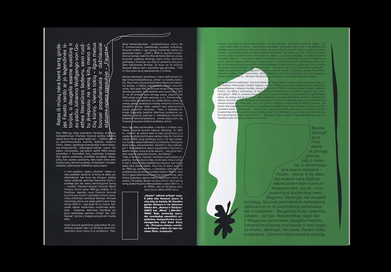
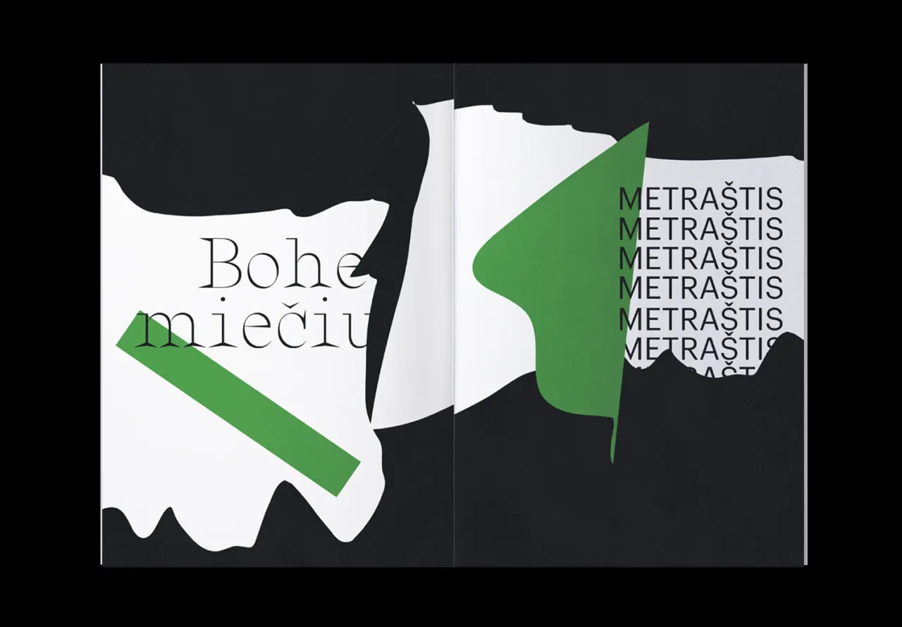
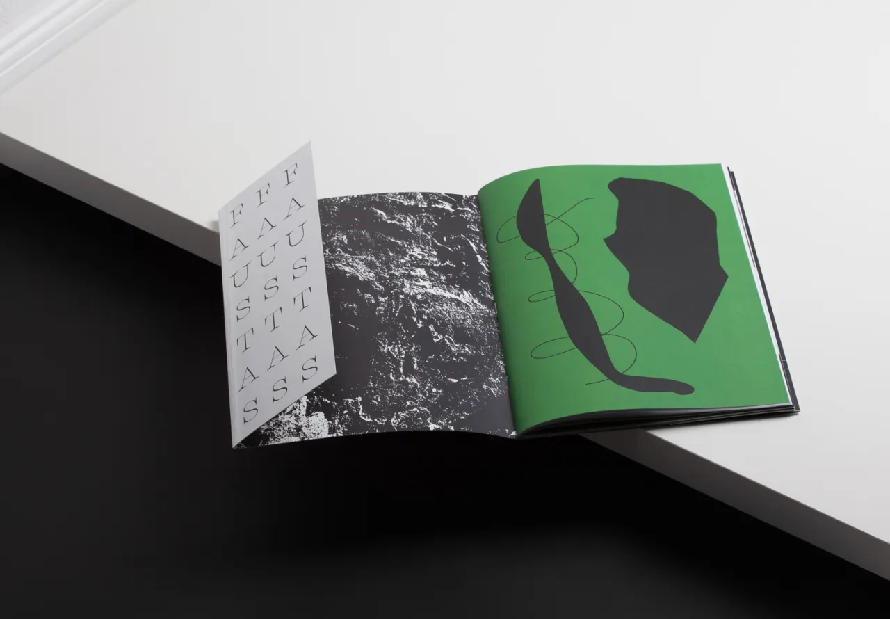
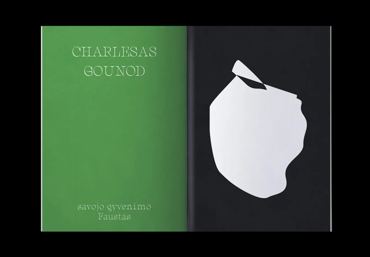
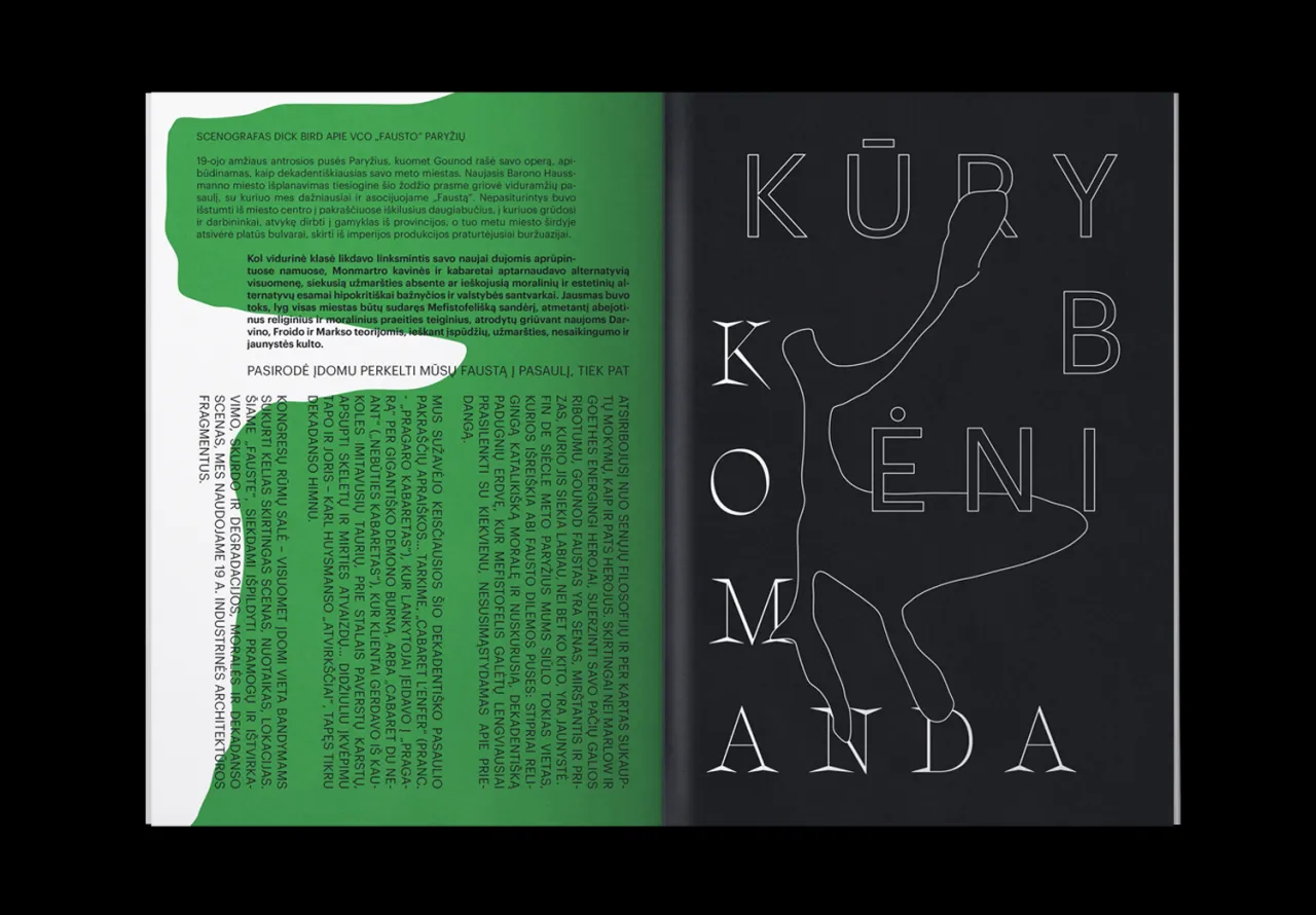
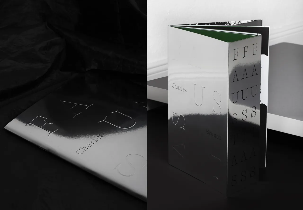
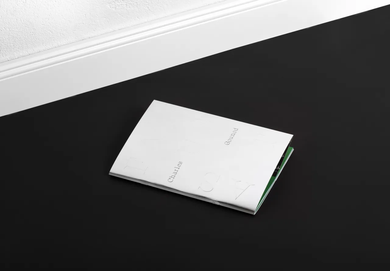
Taking an unusual mix of typefaces, an original approach to layout and a striking colour palette of bright green, black and white; theses designs for the Vilnius City Opera give a rather traditional art form a very contemporary twist.
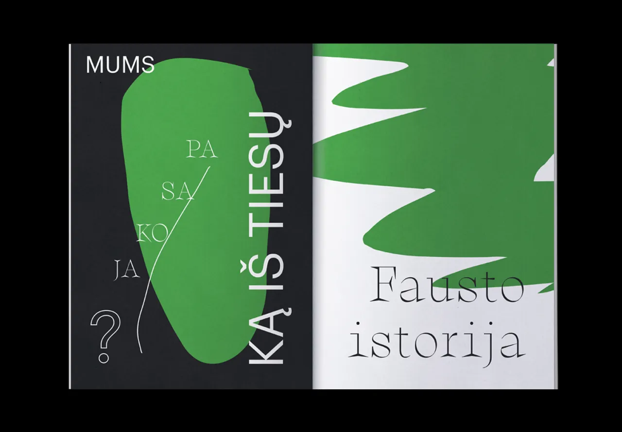
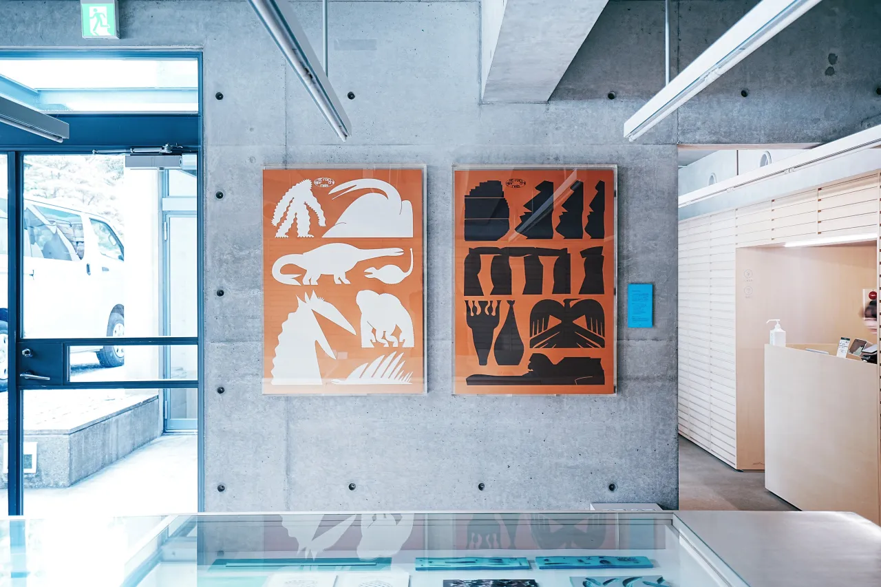
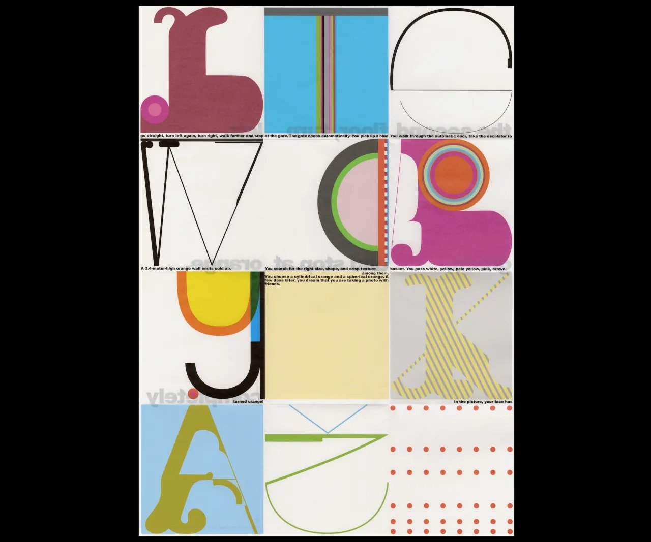
Lithuanian art director and graphic designer Tadas Karpavicius created these designs for the print materials accompanying Charles Gounod’s Faust production, and he says that the look and feel of the piece were inspired by the story itself and the characters within it. Cutout shapes pepper the pages, giving things a distinctly Matisse-like vibe.
Karpavicius works on projects for clients across art, fashion, culture and commerce sectors on books and publications, visual identities, editorial design, type design and exhibition design. You can take a look at his rather lovely Instagram here.
Editor's Picks





Trending






Latest Jobs
Midweight Graphic Designer at We Are Your Friends
Full-time·London·£36k–£44k
Senior Designer at Definition
Contract·London·£45k–£50k
Senior Creative Lead at Random Studio
Full-time·Amsterdam / Paris·€90k-€110k
Account Manager at Moxie and Mettle
Full-time·Cheltenham·Up to £35k
Senior Designer at Jubba
Full-time·London·£50k-£60k
Design Director at Koto
Full-time·London·£72k-£90k