Beautiful lessons in pared-back minimalism from Studio Studio, the agency so good they named it twice
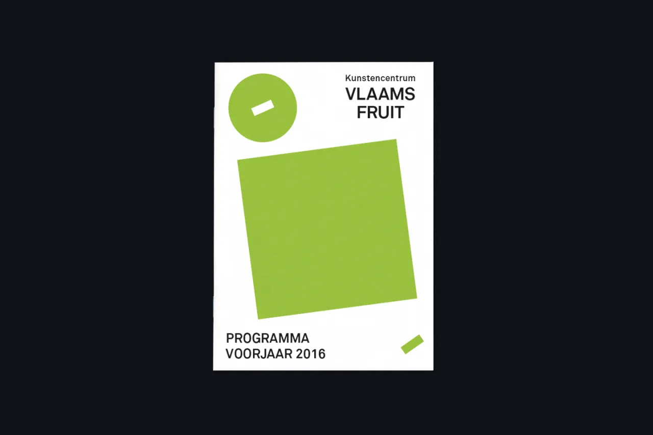
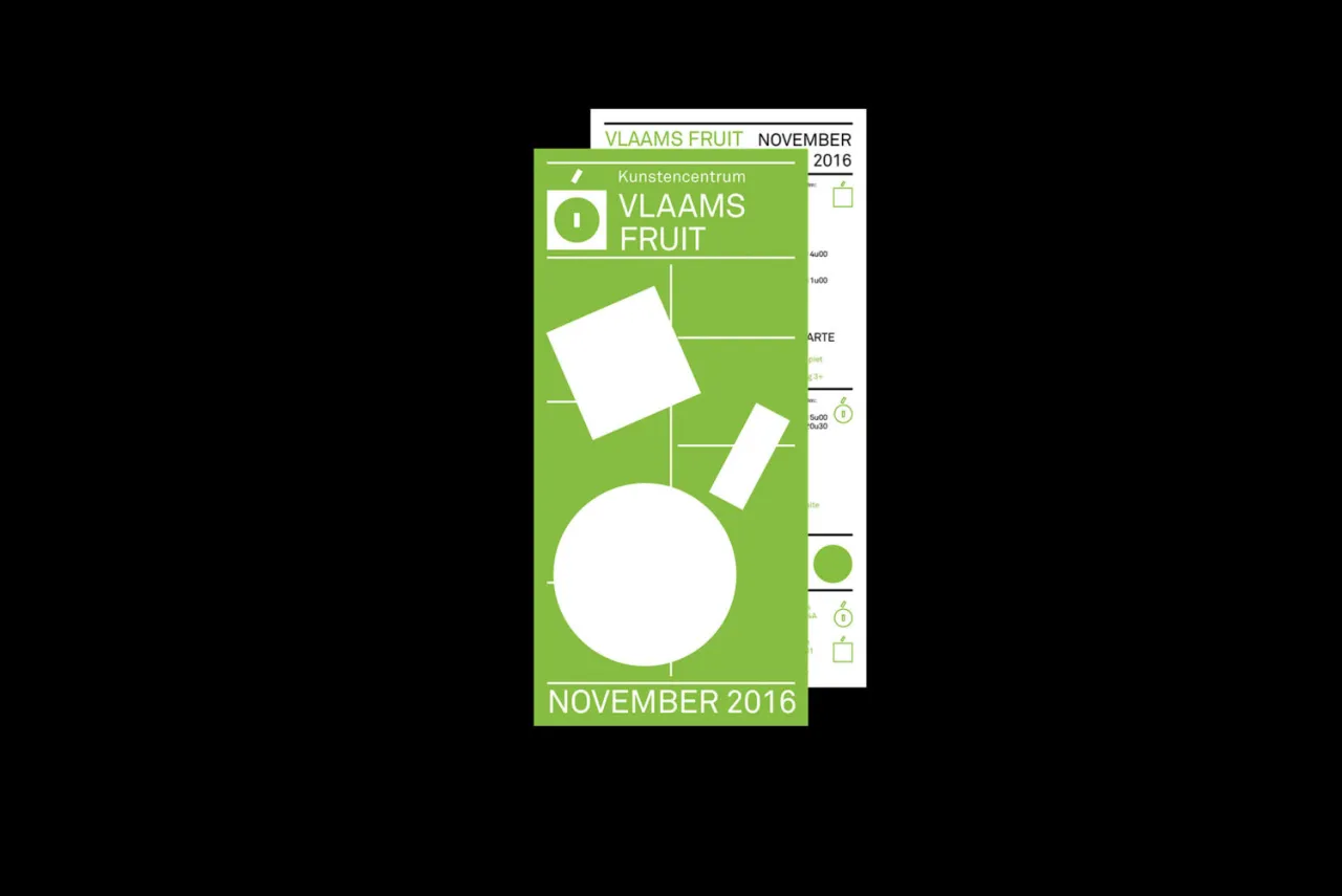
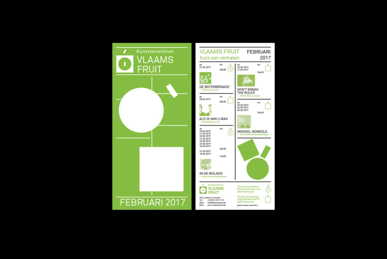
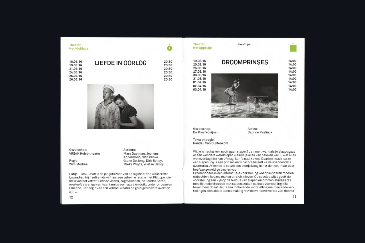
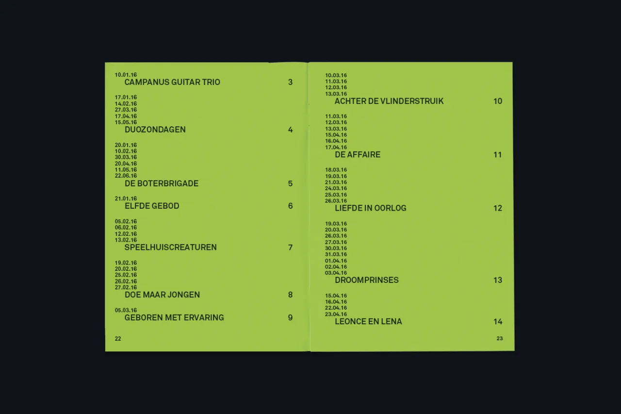
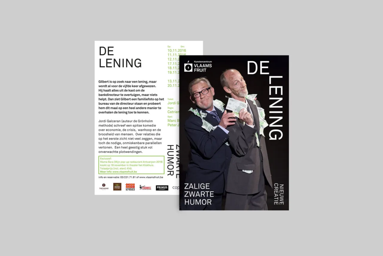
There’s something incredibly alluring about the blocky minimalism of Studio Studio’s identity for the art centre Vlaams Fruit: it manages to convey so much in just two colours and scant text.
The agency is based in Ghent, Belgium, and created the logo as one that can be constructed and deconstructed from various elements, which can be used in multiple variations across the centre’s two theatres and other programming.
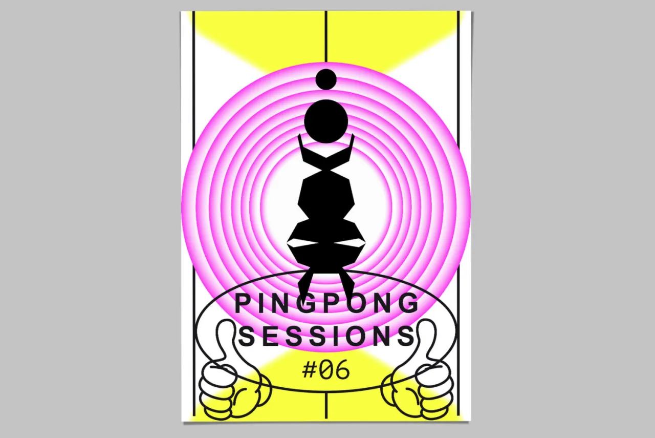
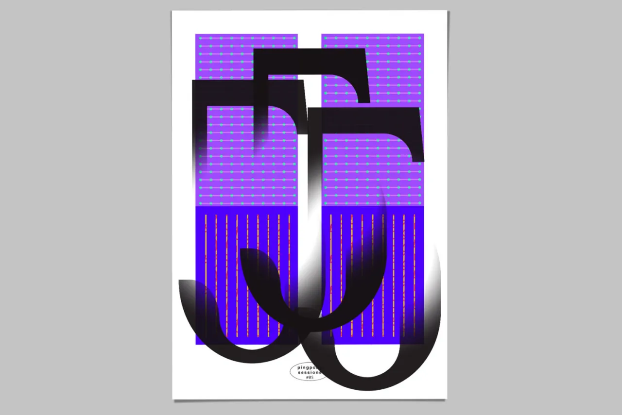
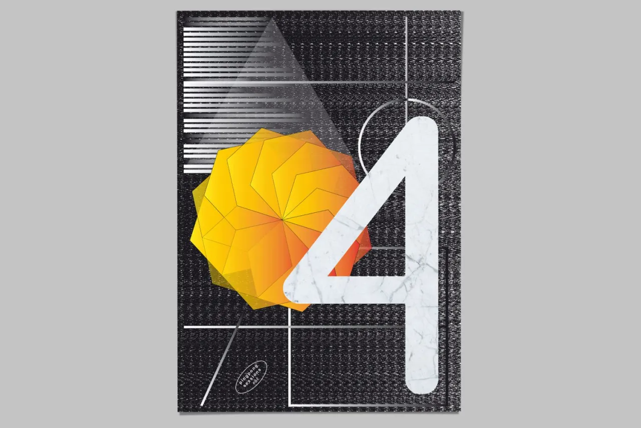
Elsewhere the studio’s posters for Graphic Ping Pong, created with graphic designer Nick Mattan, showcase a more experimental approach. The idea was to work on a self-imitated project and “create new work without rules or boundaries.” The designers went about this by making design into an ongoing game of ping pong: each side would react to input from the other about its work, creating unforeseen and unexpected results.
Editor's Picks





Trending






Latest Jobs
Growth and Client Development Director at 3800
Part-time·Sheffield·£60k-80k
Senior Brand Designer at Analogue
Full-time·Leeds·£38k-£45k
Graphic Designer at Crux Product Design
Full-time·Bristol·Up to £36k
Design Director at Human After All
Full-time·London·£66k–£88k
Senior Digital Designer at 3800
Full-time·Sheffield·£40k-60k
Brand Copywriter at Origin
Full-time·Porthleven, Cornwall·£35k–£40k