Jun Lin's Slow Forage shows a considered love of language, art and graphic design
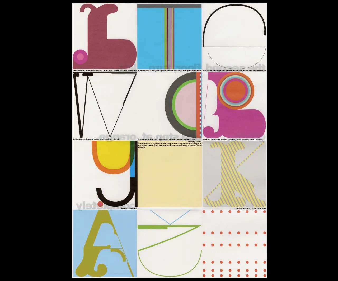
Los Angeles-based graphic designer Jun Lin has spent much of the pandemic experimenting and pushing the boundaries of her creative work. For her graduate thesis on code and steganography, she developed Slow Forage, a series of monochrome typographic art and illustration that resulted in a double-sided code-and-key poster.
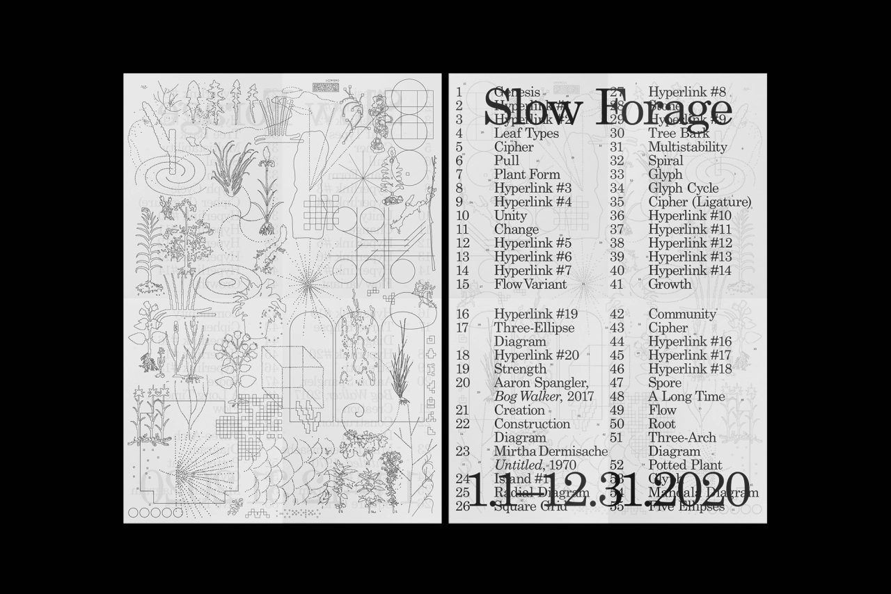
Inspired by the works of artists like Batia Suter, Amy Suo Wu and Mårten Lange, Slow Forage is "an observation and interpretation of the potential poetic and symbolic meaning of the visual patterns that surround and communicate to us on a daily basis," as Jun explains. And, just as its title suggests, it was also a slow and steady project.
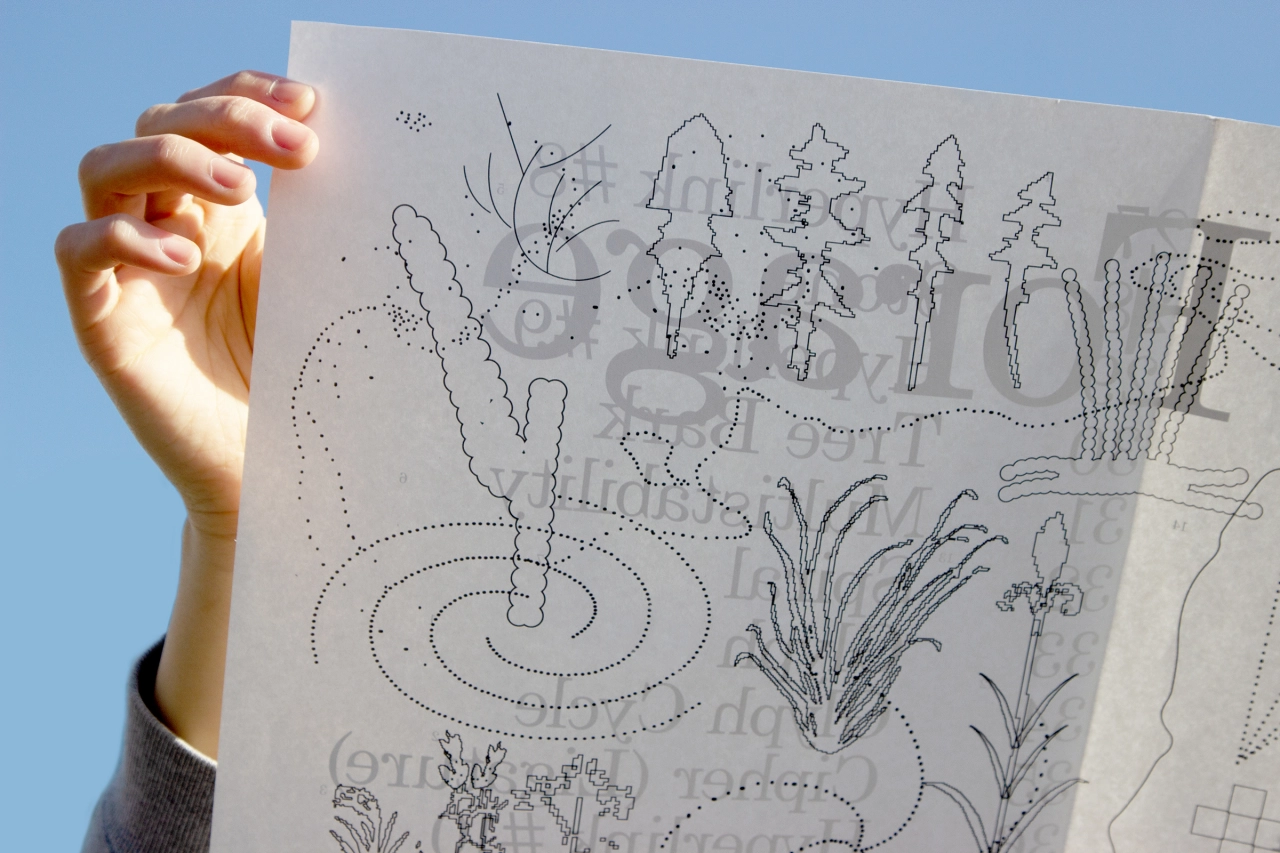
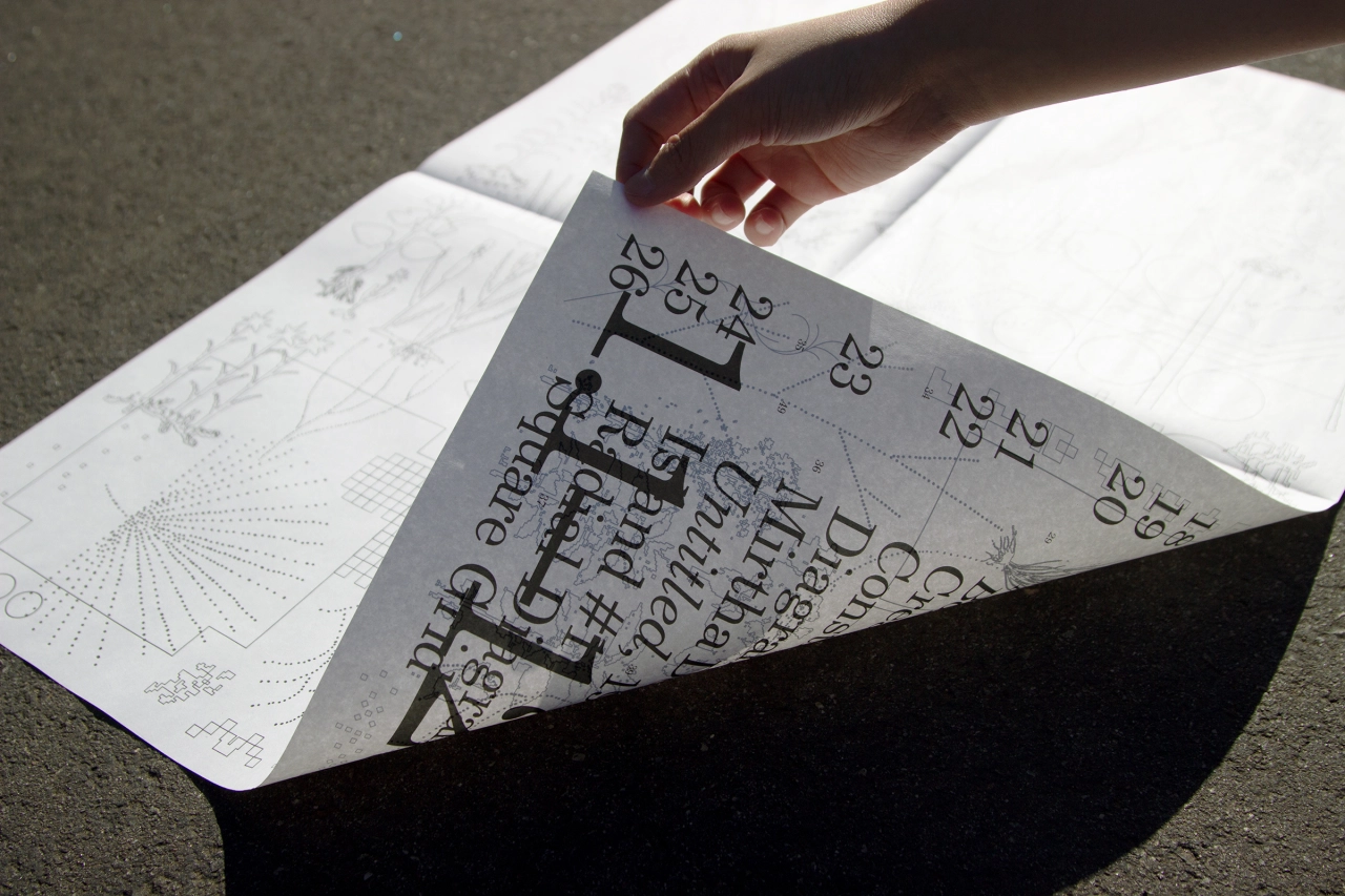
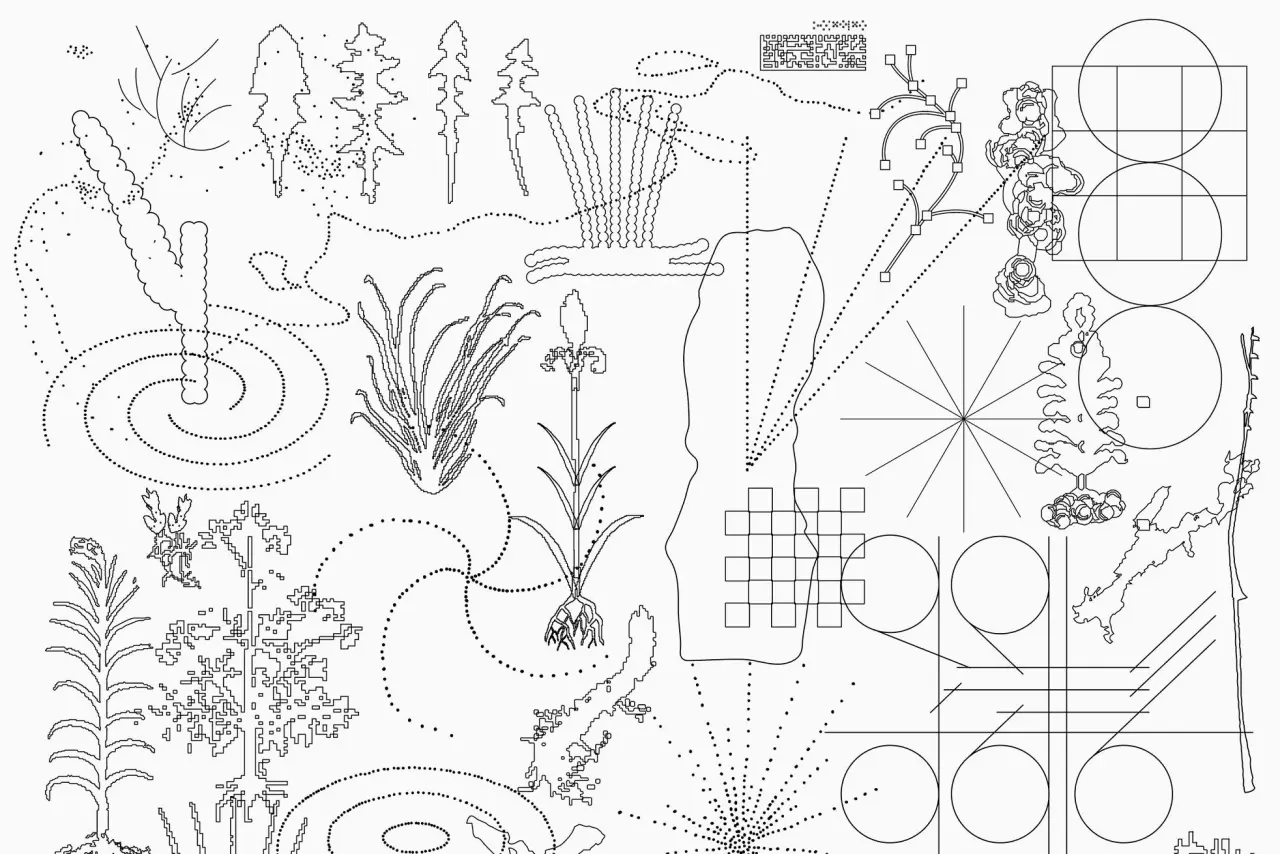
One side of the poster holds 55 ciphers and illustrations informed by natural/visual patterns, while the other serves as a typographic index. "With numerals that align with each illustration, we can reference illustration to index by holding the poster up against a light," Jun adds.
This is typical of Jun's focus. With a background in literature, she has always been intrigued by books – both in terms of their form and content and she also follows book designers and artists such as Julia Born, Studio ELLA and Wang Zhi-Hong. Originally from Taiwan, Jun is now based in LA, having recently graduated with an MFA in Graphic Design from ArtCenter College of Design in Pasadena, California. Developed over time, her visually pared-back work explores the layered nuances of language, poetry and art.
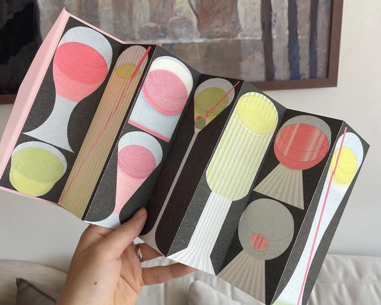
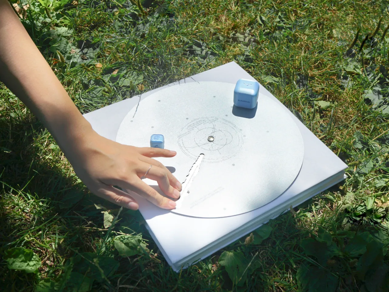
Other notable projects of late include Plantae, based on the language of plant common names, garden walks and poetry, and Format, a fictional publishing house specialising in "experimental and conceptual publishing" – something Jun says was "inspired by various conceptual works that explore print design and reading in the post-digital age".
The imprint's first publication, Scroll, is a 33-foot long print reproduction of the publisher's website. "It's an exploration of the idea of the infrathin ('inframince'), a concept coined by Duchamp that refers to the minute differences between experiences and perception," says Jun. "In this context, the publication demonstrates the experiential differences between digital scrolling and reading a printed scroll."
Format was recently awarded Gold in the Hermes Creative Awards and is currently working towards its next publication. For questions on future publications and collaborations, contact [email protected].
Editor's Picks





Trending






Latest Jobs
Head of design at Cog Design
Full-time·London·£55K
Design Lead at Madeo
Full-time·New York City·$85k–$120k
Account Manager at BUILDHOLLYWOOD
Full-time·London·£34k–£38k
Junior Project Coordinator at Colorido Studios
Full-time·Twickenham·£28k–£32k
Senior 3D Motion Designer at Art&Graft
Full-time·London·£50k-£65k
Creative Social Content Producer at Bompas & Parr
Contract·London·£32k–£40k