Vanderbrand looks to Sapsucker's Canadian roots to come up with a refreshing new identity
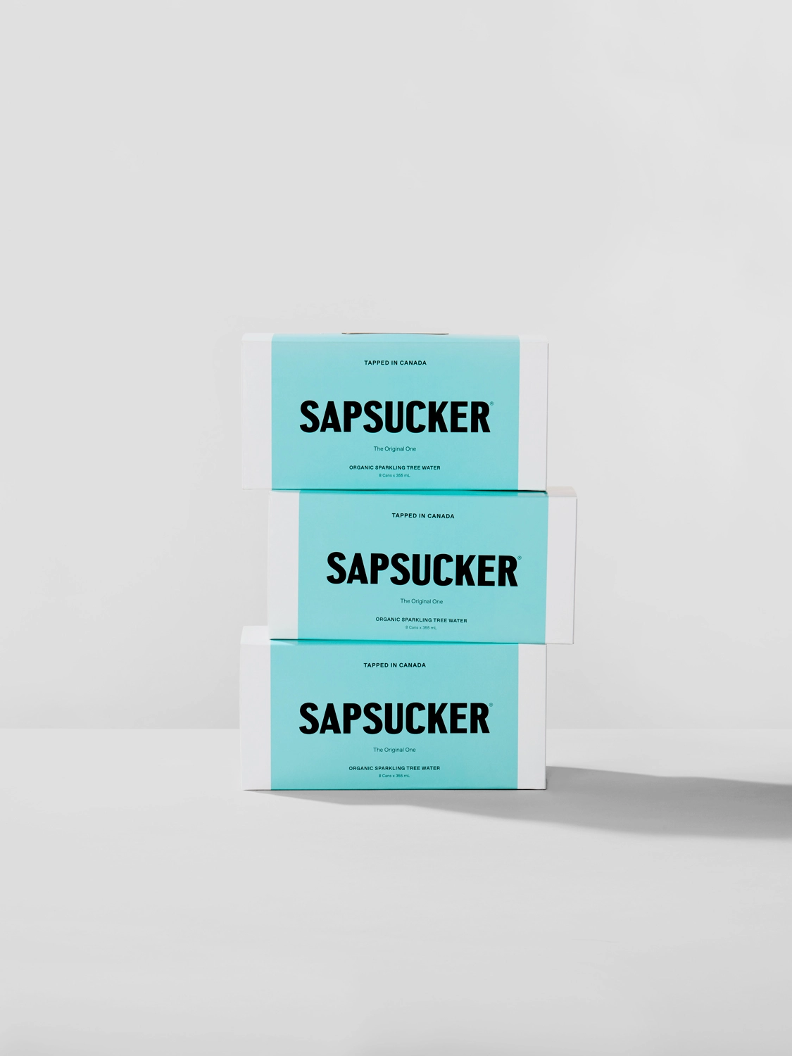
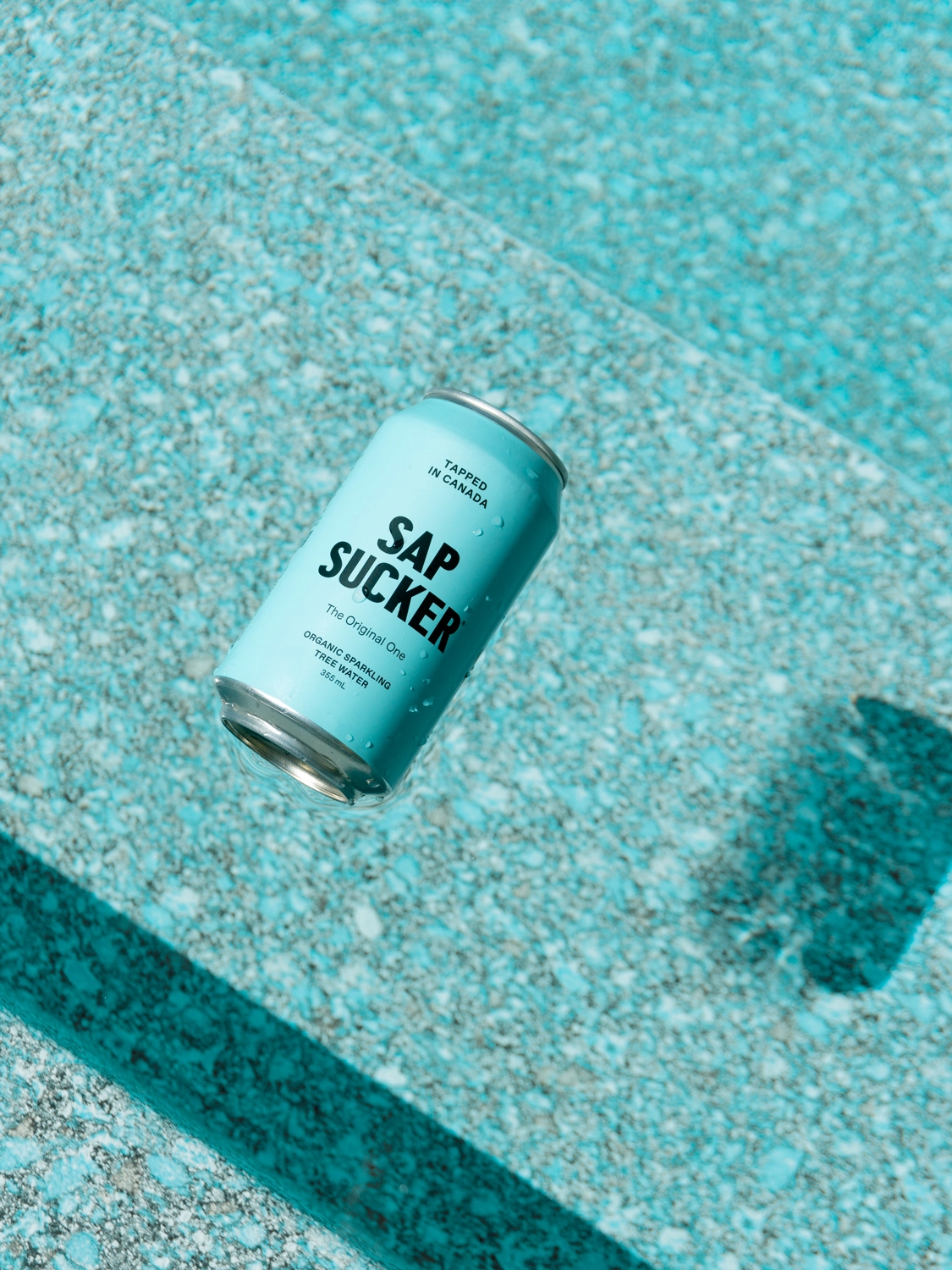
Toronto agency Vanderbrand (we like the catchy name) has come up with a simple but striking identity for Sapsucker, an "organic, plant-based, all-natural, and sustainably sourced tree water with no added sugar".
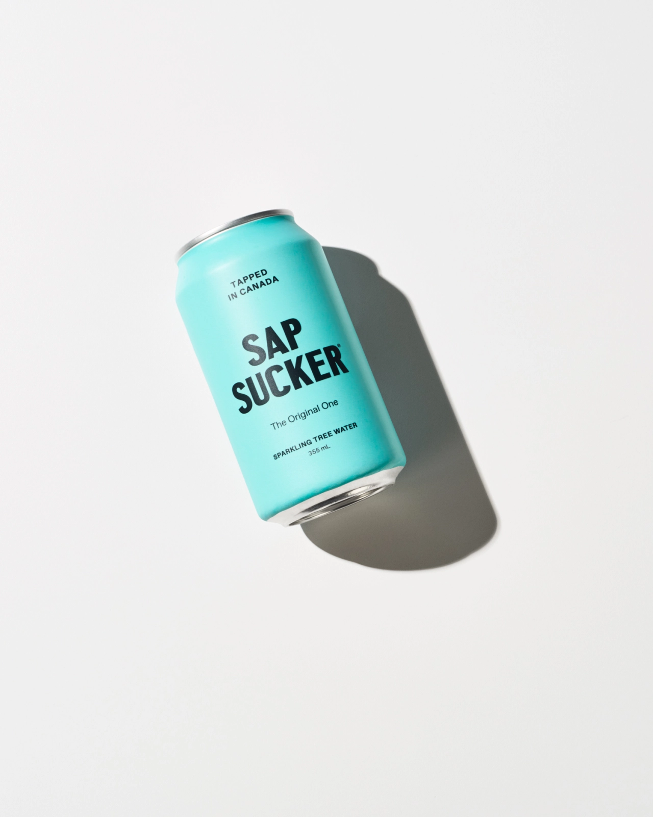
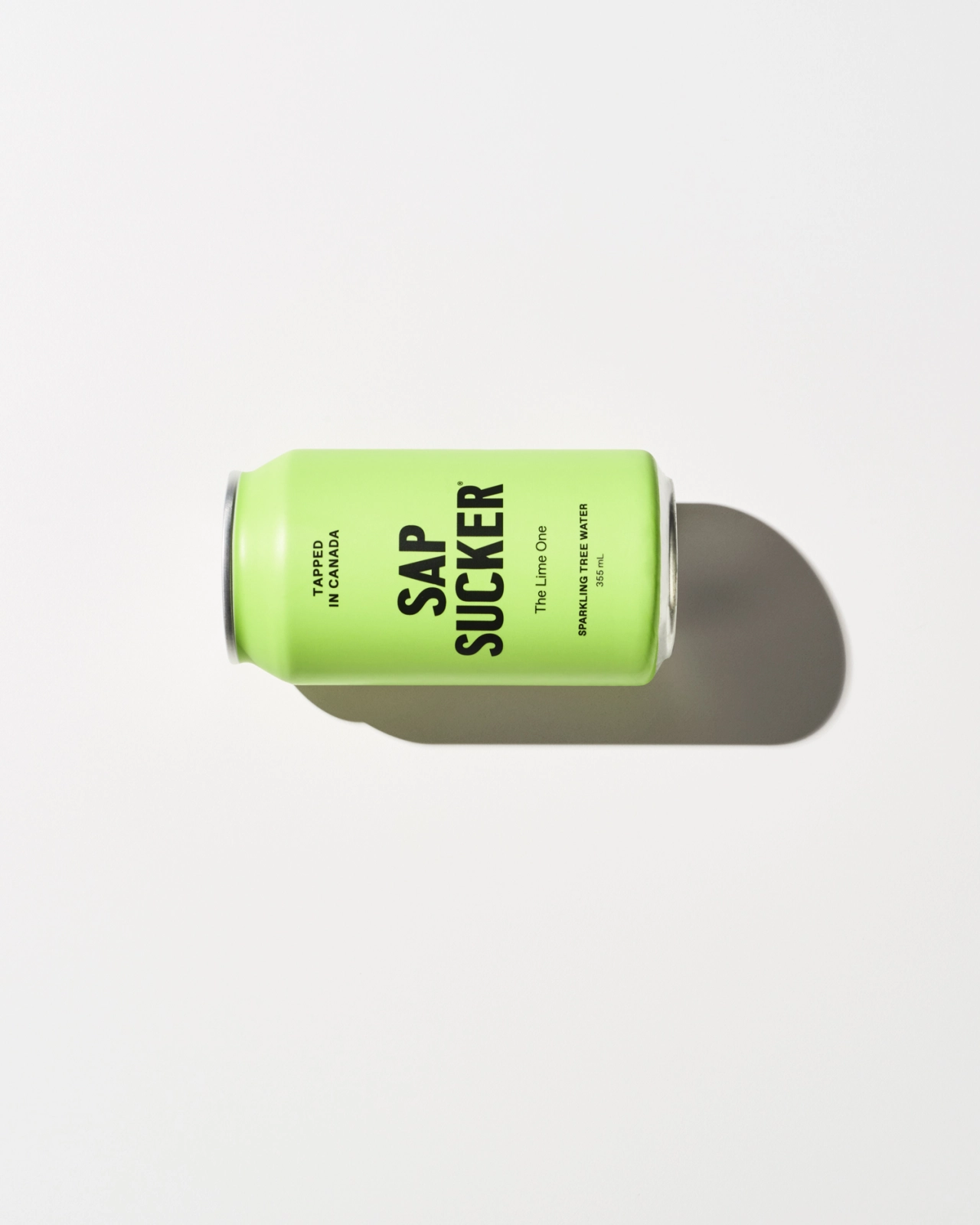
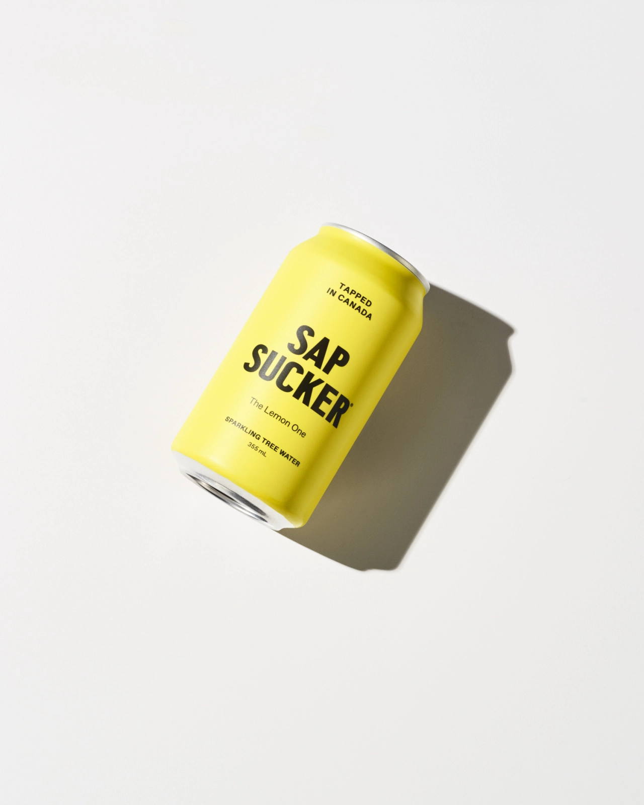
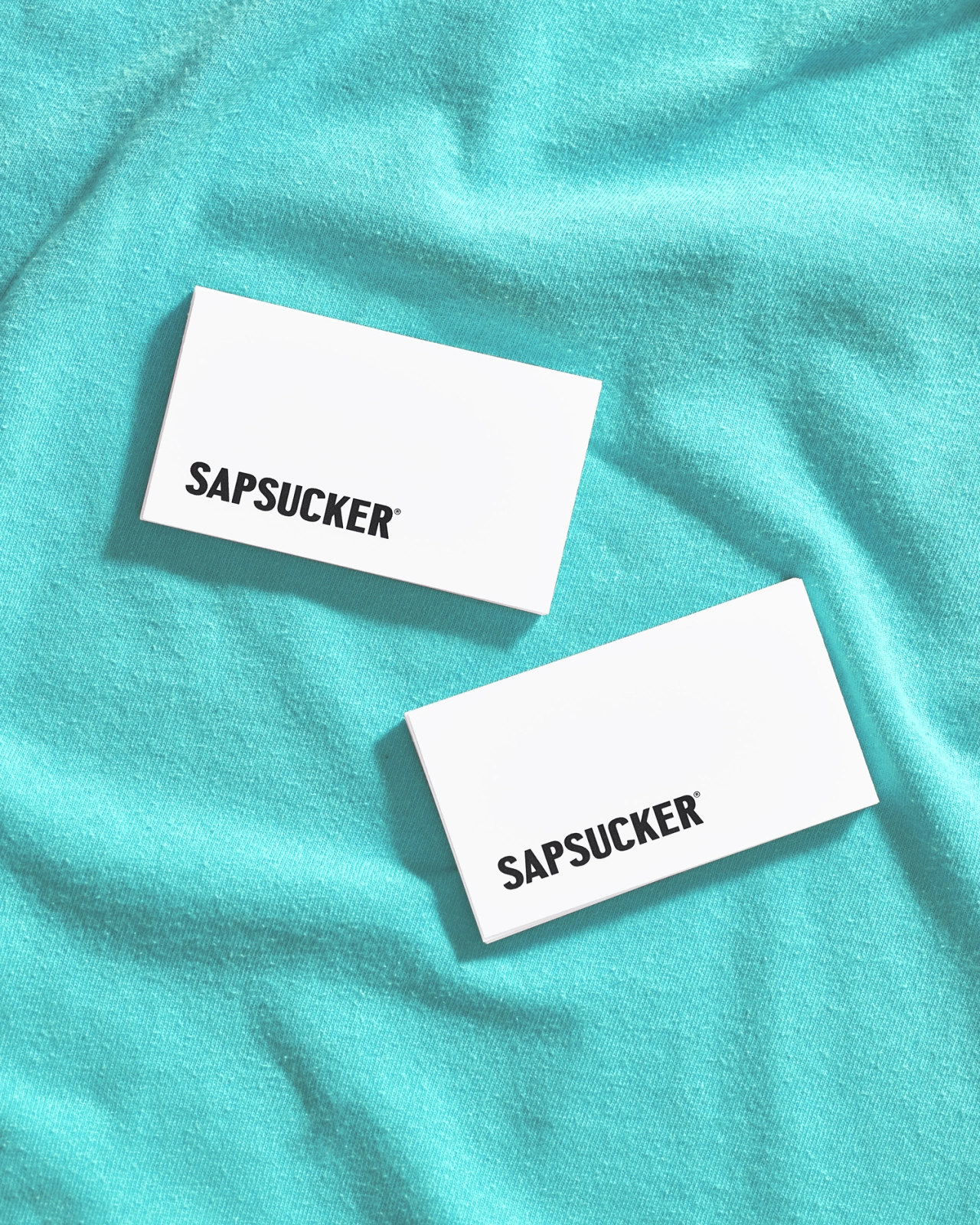
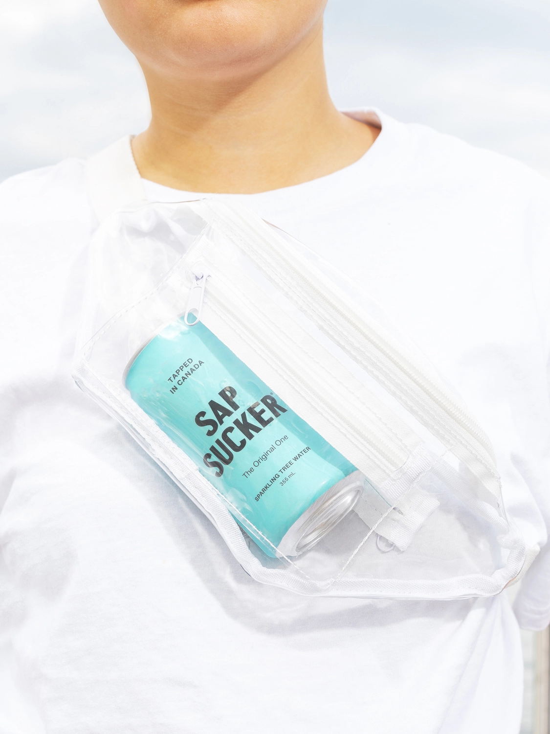
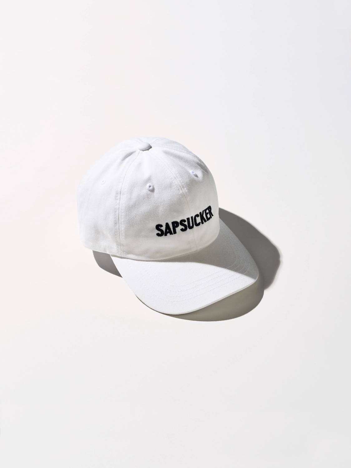
Working with the Lower Valley Beverage Company, Vanderbrand tapped into the drink's Canadian roots using cues from Canadian nostalgia (like local sportswear and retail packaging) to come up with a bespoke wordmark.
"Pairing the historically referenced typeface with a modern graphic language results in a visual system that is appropriate, distinctive, and flexible for varied scales and applications," says Olivia Rohner from the agency. (For those of you curious to know, they used Central Ave by Colophon and Favorit Std Family by Dinamo.)
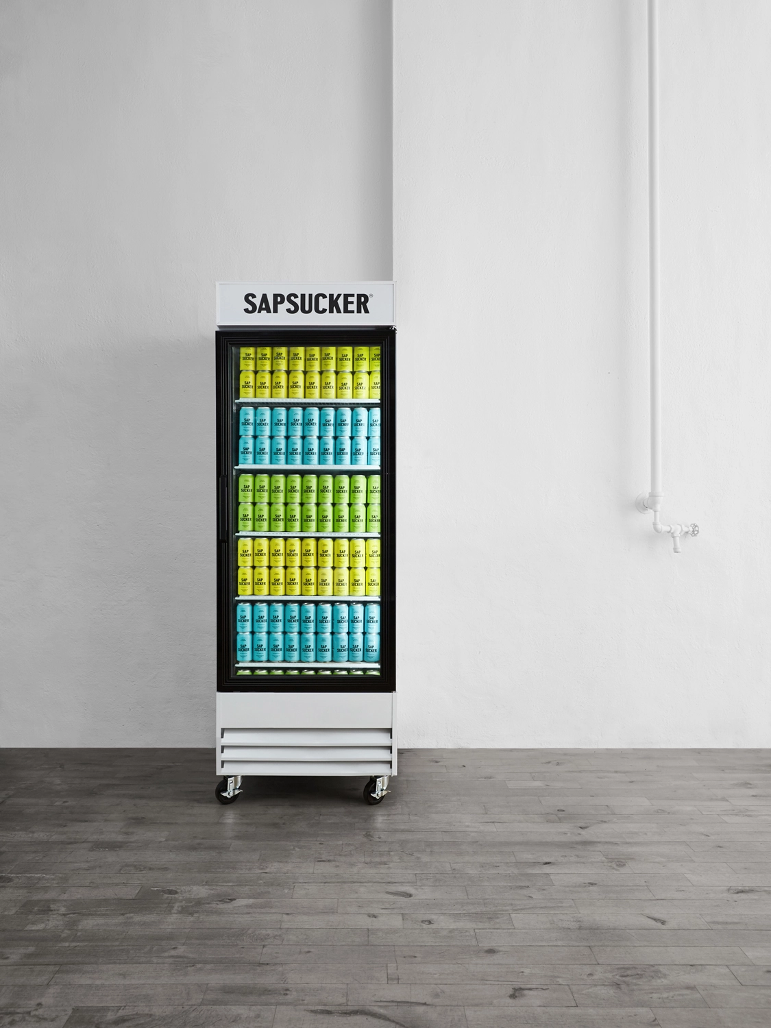
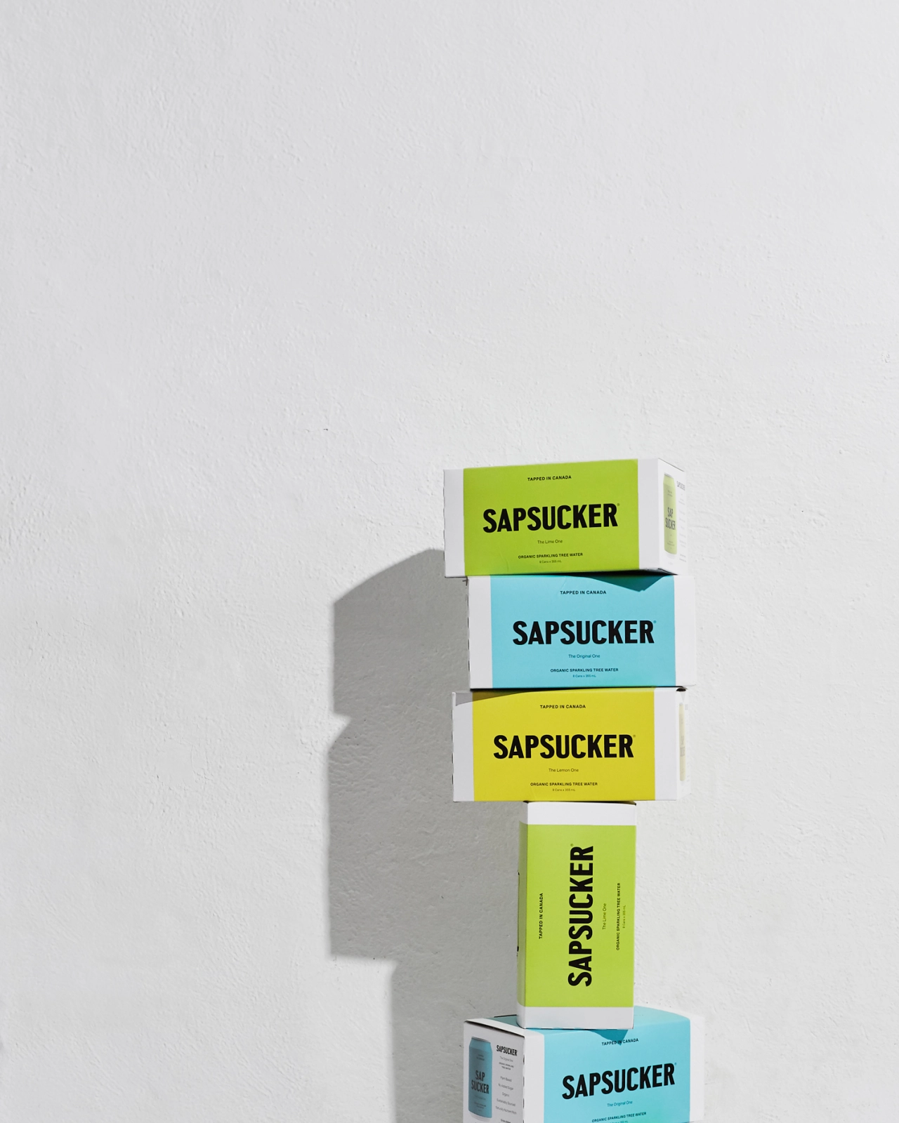
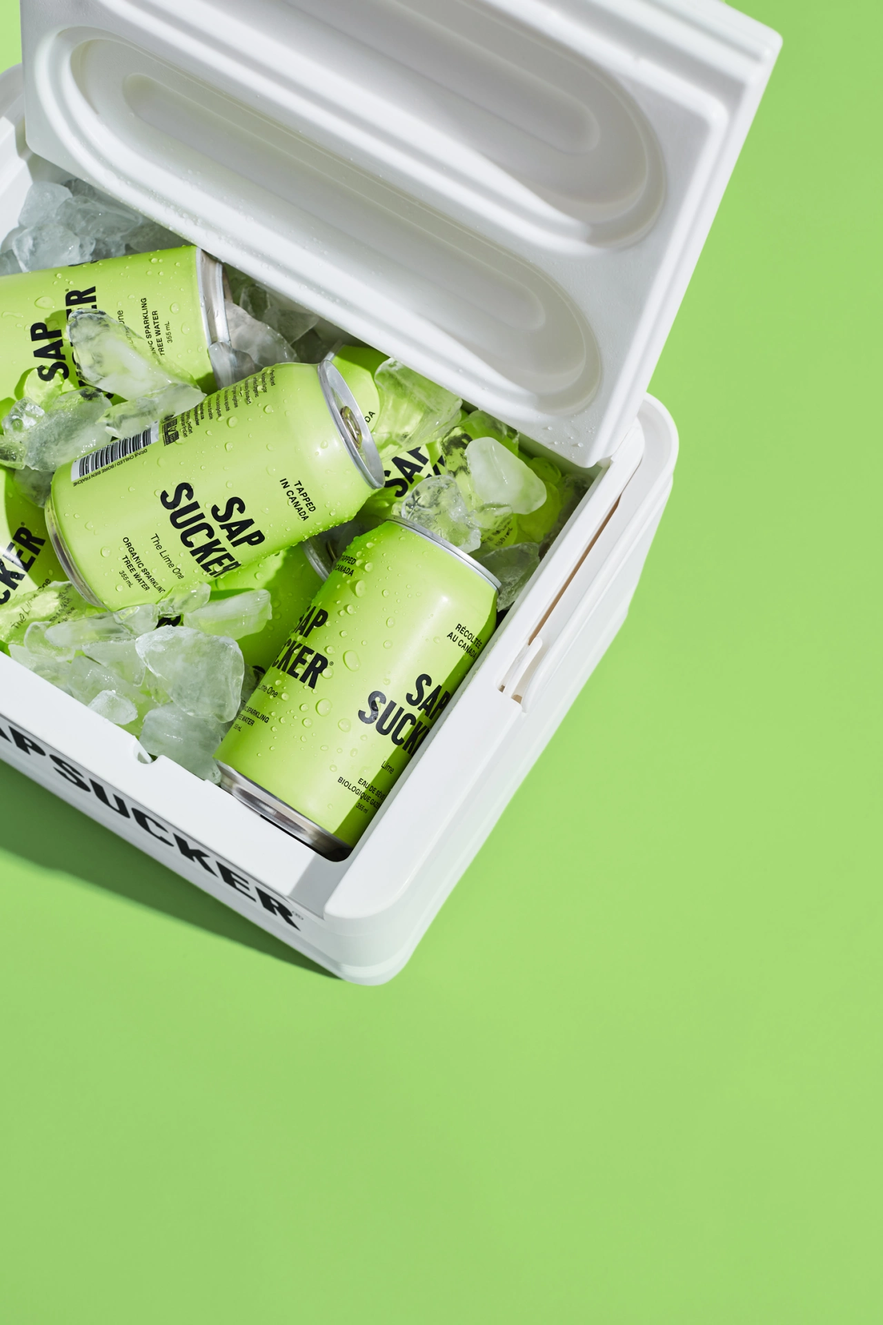
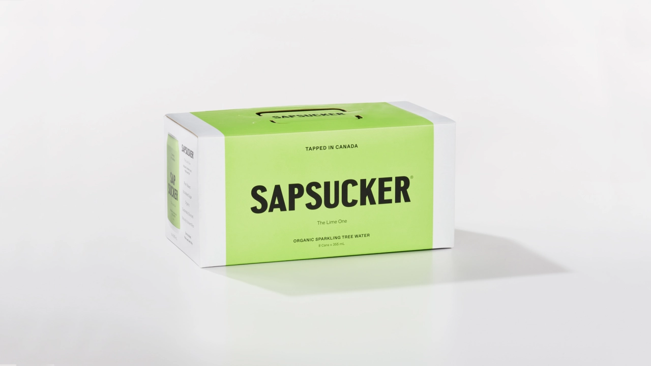
It's an eye-catching identity that certainly stands out in a competitive market, namely the health and fitness category. We also like its witty tone with a no-nonsense colour palette taking cues from three of Sapsucker's new flavours: The Original One, The Lime One and The Lemon One.
And as the brand is considered sustainable, Vanderbrand came up with an eight-pack foldable carrier that aims to be as recyclable as possible.
Editor's Picks





Trending






Latest Jobs
Principal Software Engineer at BBC Media Tech
Full-time·Glasgow·Up to £83,790
Art Director at SPOKE
Full-time·London·£55k-65k
Brand Copywriter at Origin
Full-time·Porthleven, Cornwall·£35k–£40k
Account Manager at Moxie and Mettle
Full-time·Cheltenham·Up to £35k
Midweight Full Stack Developer at Bureau for Visual Affairs
Full-time·London (Open to remote)·£35k–£50k
Midweight Designer at Catalyst Creative
Full-time·London·£32k-£36k