Nice and Serious' new BAFTA work looks to promote sustainability in the TV industry
London and New York-based studio Nice and Serious has worked with Albert, an organisation founded in 2011 and headed up by telly giants BAFTA.
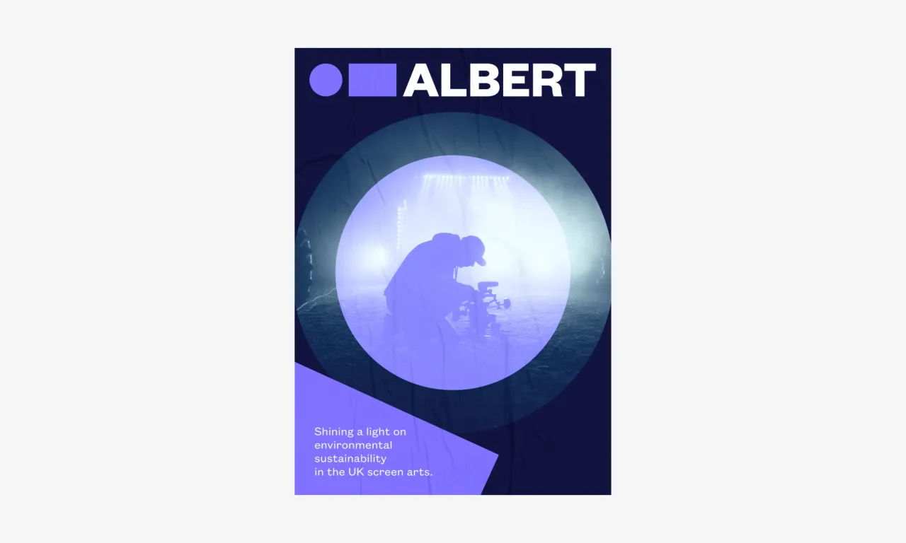
According to the studio, Albert is "the only organisation dedicated to providing solutions to environmental sustainability in the British TV and film landscape."
Since 2011, the conversation around climate crisis has (as it should have) reached new levels; with sustainability now a firmly embedded "hot topic" across everything from politics to art. The idea, then, behind the new designs for Albert, was to make the brand "feel contemporary and relevant while pleasing a passionate group of stakeholders," says Aaron Mathews, head of sustainability development at BAFTA, which he adds "was not an easy task."
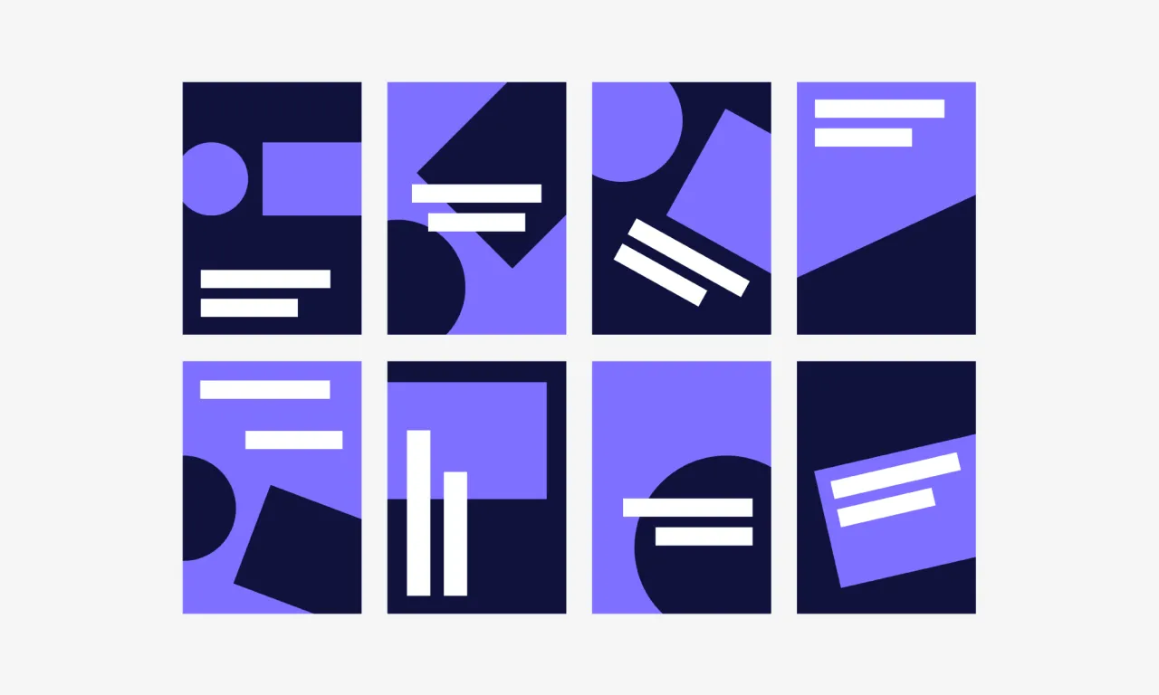
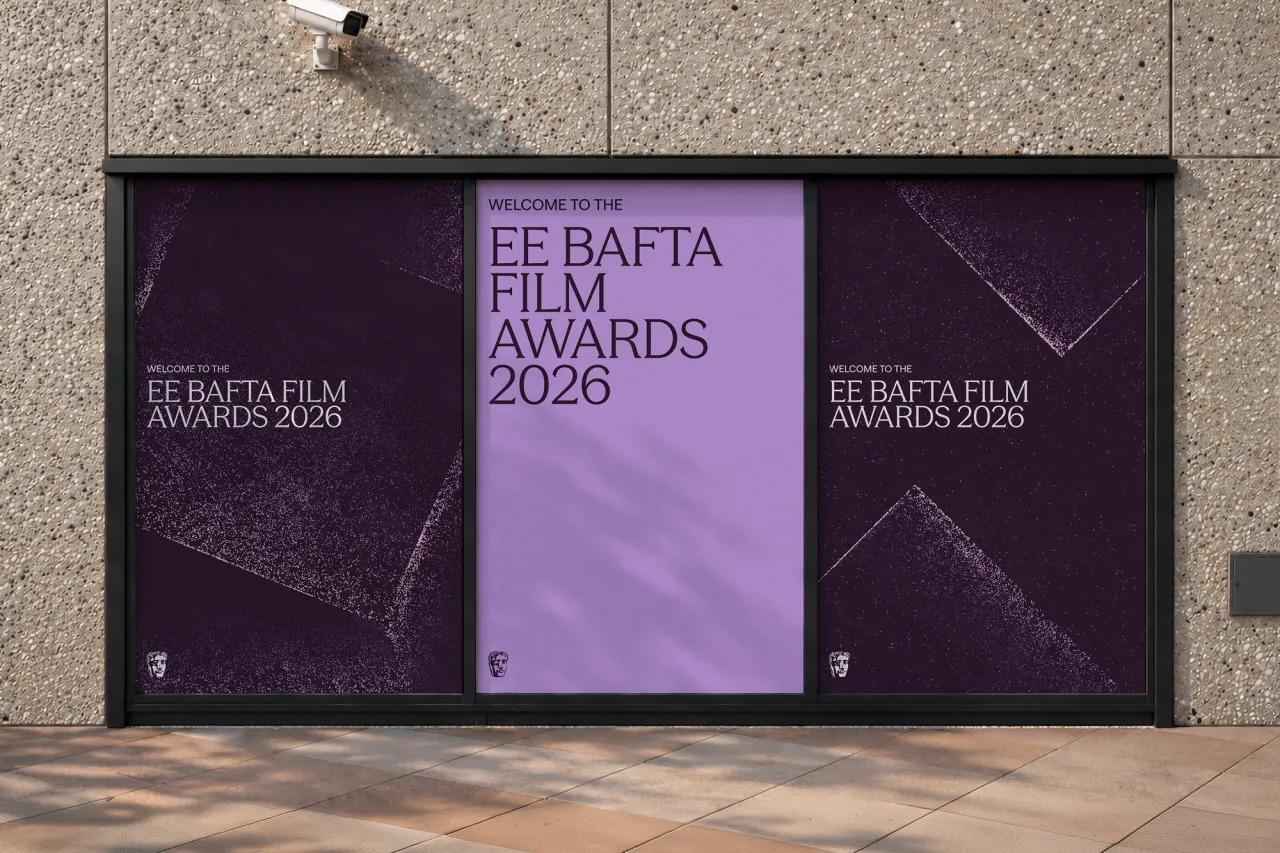
It was important for the teams to avoid the usual cliches of sustainability-centric branding—things like elements from the natural world; green and earthy colour palettes and the like. Instead, the new identity uses bold typography and a predominantly lavender-like, restricted colour palette.
The brand uses a deliberately "intimate" photography style that aims to capture "natural, candid moments which demonstrate a real connection between Albert, their collaborators and their vision of changing the screen arts industry in the UK," says Nice and Serious.
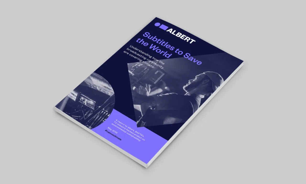
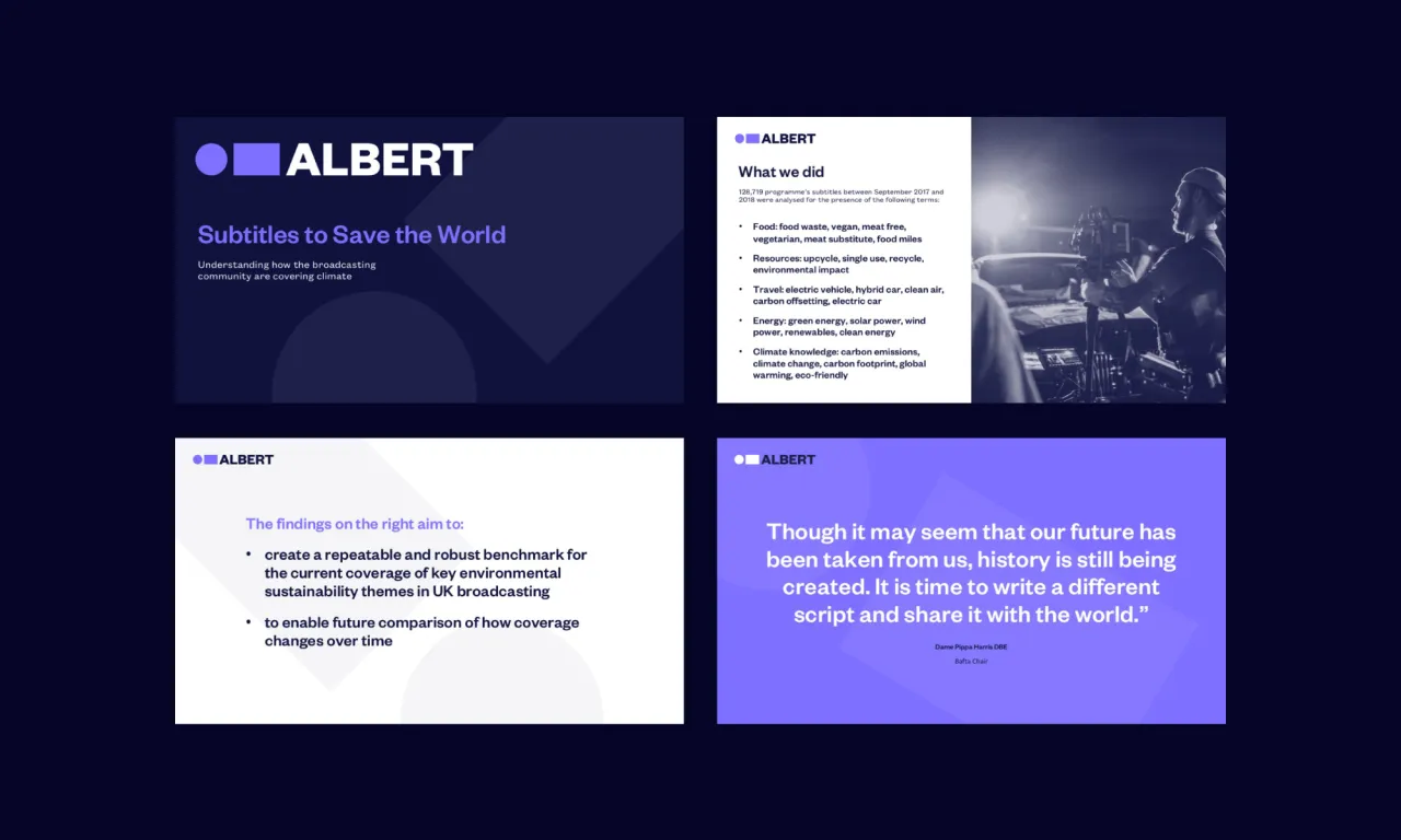
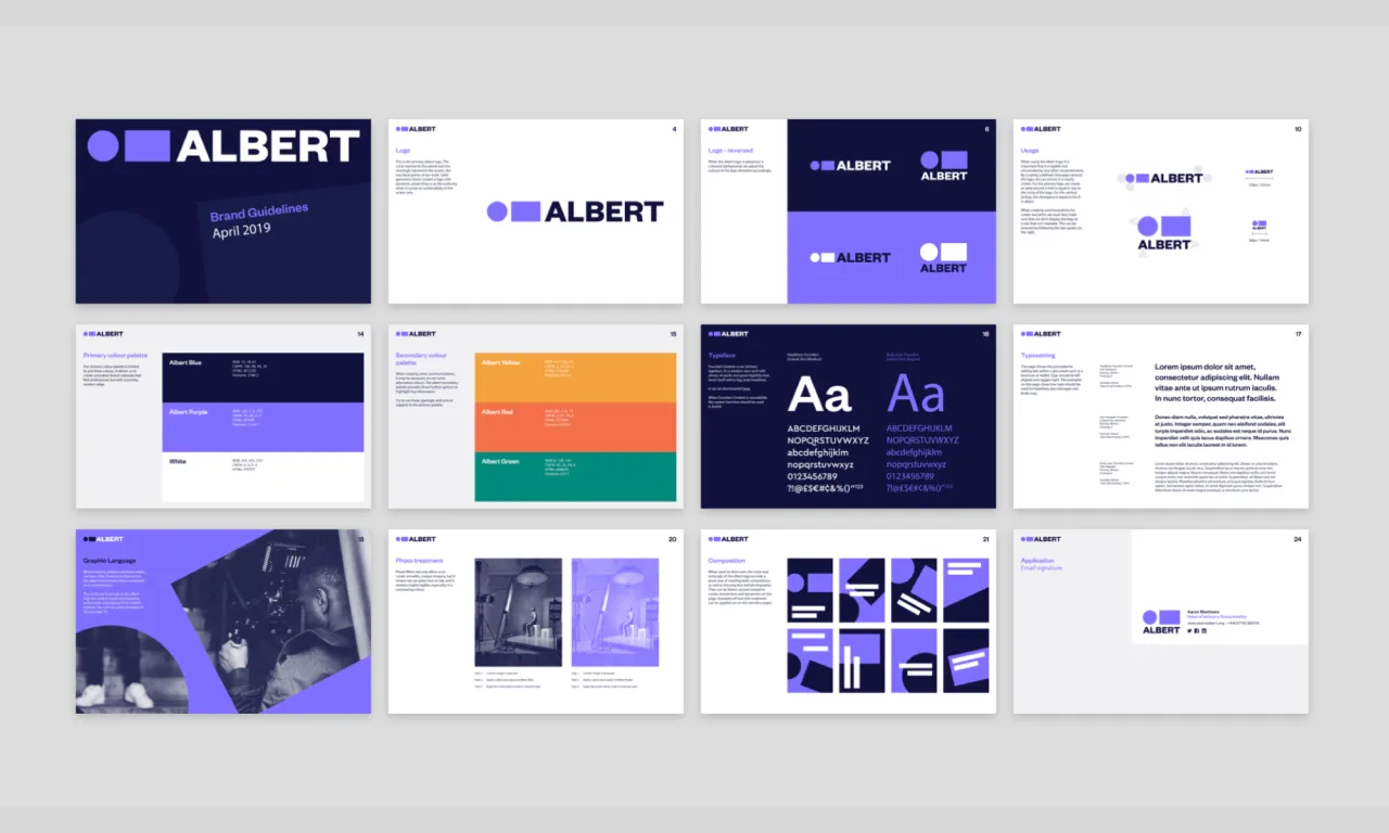
The concept behind the new branding work was to put Albert’s "commitment towards bringing people, ideas and innovation together in service of environmental sustainability at the heart of the identity," Nice and Serious says. As such, it introduced the brand idea of ‘Shining a light on the bigger picture’, which has been applied throughout all aspects of the identity.
The visual language uses a series of geometric forms that look to represent the screen arts and their relationship with the planet. "This language can be both visually expressive and functional," says Nice and Serious. It also forms the basis of Albert’s new logo; and can be used to house photography, create bold compositional pieces and set communications materials. A new website was also developed with Alchemy Digital.
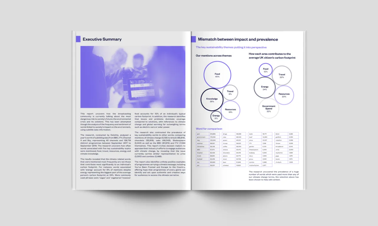
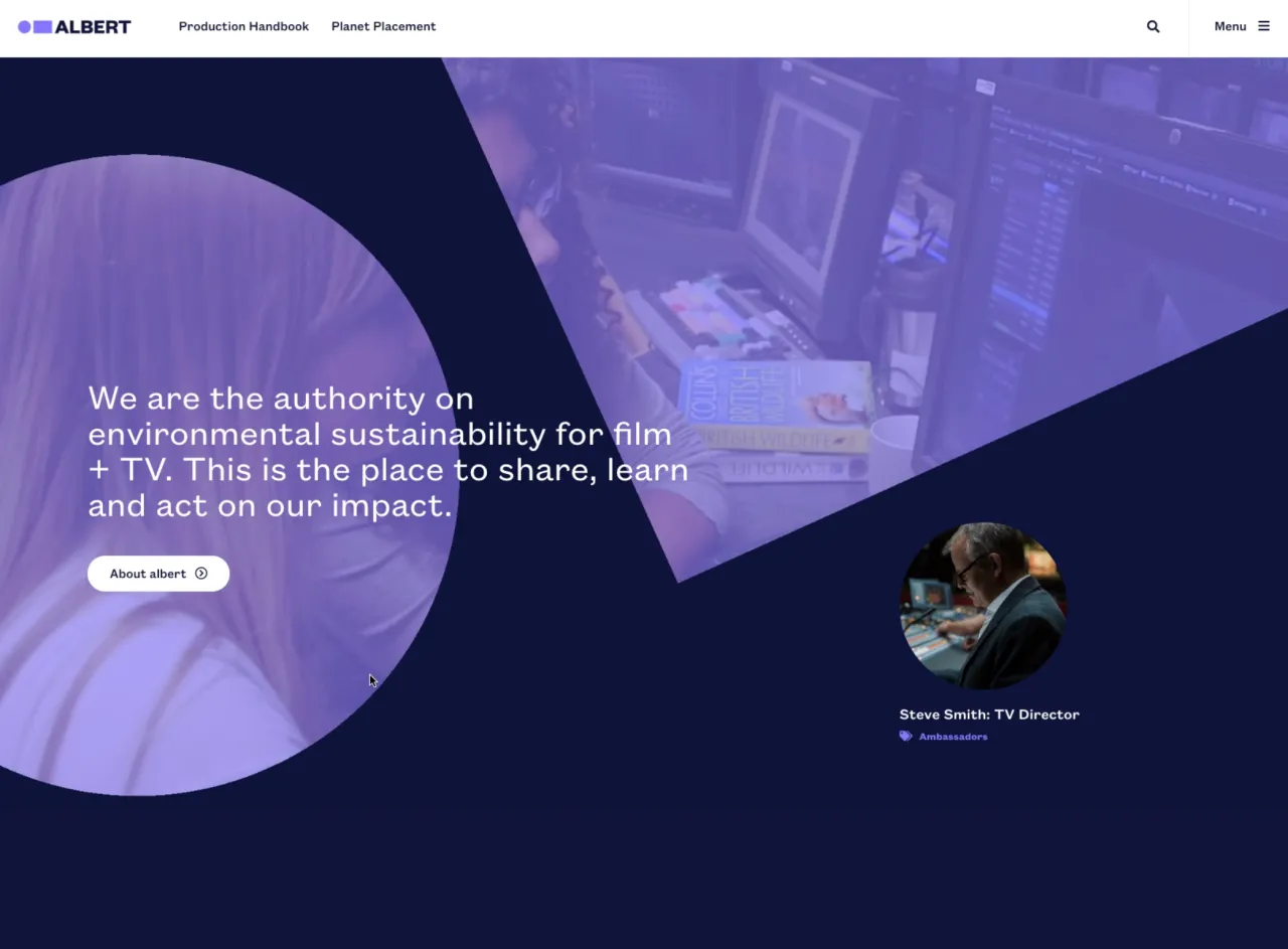
"A key focus while developing the identity was to create a system that could flex and scale based on the audience," says Nice and Serious. "The logotype can live on its own strength when required, but also quickly become inviting and lively when the shapes come into play. This is particularly useful for the ALBERT’s place on the end slate of television productions, which in certain instances needs to be a more subtle application of the identity."
Editor's Picks





Trending






Latest Jobs
Senior Designer at Definition
Contract·London·£45k–£50k
Frontend Developer at Northern Artillery
Full-time·Leeds·£35k–£45k
Senior Brand Designer at Analogue
Full-time·Leeds·£38k-£45k
Midweight Full Stack Developer at Bureau for Visual Affairs
Full-time·London (Open to remote)·£35k–£50k
Account Director at How&How
Full-time·London·£73k-£79k
Senior Creative Lead at Random Studio
Full-time·Amsterdam / Paris·€90k-€110k