How Studio Kiln built one 'particle' system to unify all four of BAFTA's awards
The London-based studio has given BAFTA's various ceremonies a single visual language: flowing coloured particles that gather into interesting shapes and forms. And they built it all in Cavalry.
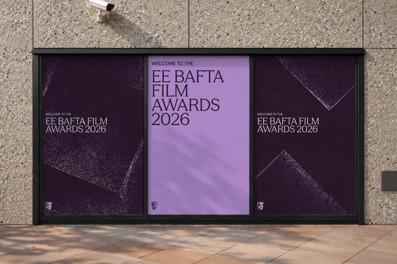
For every BAFTA we see awarded on the telly, it's humbling to know that every winner began with a rough idea. That might've been a scribble or draft, a half-formed concept that somebody then spent ages turning into a finished piece. It's this idea that Studio Kiln has built an entire identity system around.
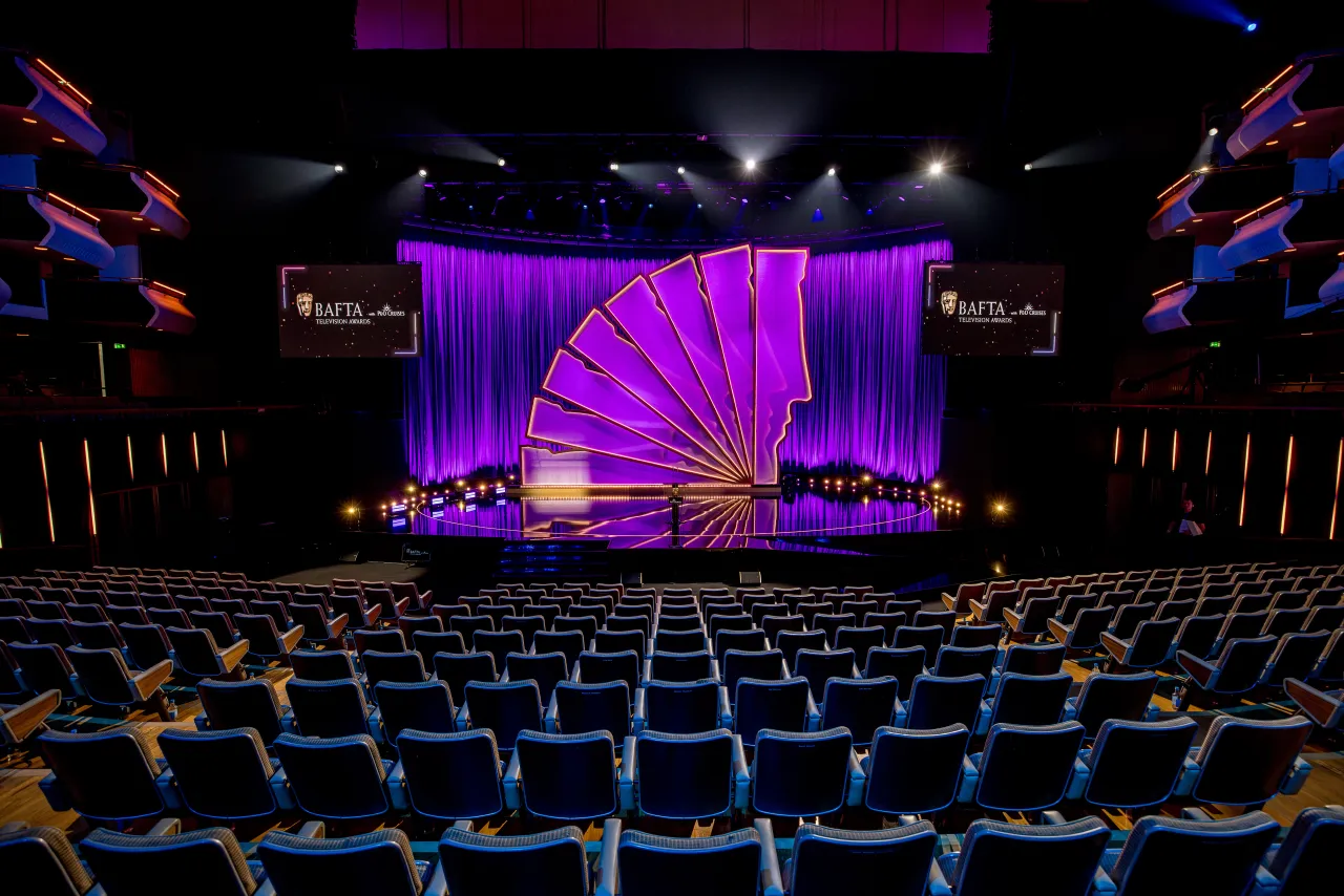
Since last October, the London studio has been working with BAFTA on a new identity that brings together its four separate awards ceremonies: Film, Television, Games and Television Craft. But without losing what makes each of them distinct.
It's all based on a particle system: flowing streams of coloured particles that form BAFTA's distinctive events, tracing that journey from initial idea to finished work.
Kiln built the framework in Cavalry, so a single adaptable system can generate motion, digital and print assets across every award and format.
Four ceremonies, one family
With four ceremonies, you get four very different worlds. So one identity had to serve them all equally – even though it would have been easy to let the glamour of Film quietly become the "main" approach. "The biggest challenge was making sure every ceremony felt equally refined and crafted, just in its own way," explains Megan Mardon, one of the designers on the project. "Film naturally lends itself to something cinematic and heightened, so there was a risk of that becoming the 'main' identity, with the others feeling like variations on it rather than standing on their own. The guests should feel like every award is just as special."
Kiln decided to keep the underlying story identical. That meant keeping the particle behaviour, movement, type system, and overall art direction the same, while letting shapes and colour do the differentiating. "They had to feel part of the same family, but shift enough that Games could feel complex and kinetic while Craft felt intricate and focused, without one award ever feeling less than the other," adds Megan.
For fellow designer Edoardo Albertini, the balancing act was as much emotional as technical. "The biggest challenge for us was really figuring out how to honour BAFTA's historic prestige while leaning into its more avant-garde, creative spirit," he says. Each award got its own system of "faceted shapes" and an expanded palette. And they were all tied together by a shared texture in the particle artwork and a strict typographic system. Not something that came easily: "We had to balance the raw, messy kinetic energy of our procedural particles with the sharp clarity of the artwork, making sure you could feel the energy forming those facets without one element drowning out the other."
Why Cavalry, not After Effects
So why build all of this in Cavalry rather than in After Effects like everyone else? That's probably what every motion designer wants to know.
"We went with Cavalry over more traditional motion software because it has this incredible ability to export versatile vectors right out of a procedural system," Edoardo explains. The team built a physics-based rig – manipulating forces and resistances – that could capture the concept's movement in a way that scaled across both screen and paper, and made everything feel alive.
"We could build our world of particles once, determining how they behaved, formed and moved, then let that same system generate everything from a 30-second film to a static poster, rather than rebuilding the idea from scratch for every touchpoint. The real joy of Cavalry is the balance it strikes between the control you have and the surprise of the outcome."
Of course, working this way means you don't fully control what comes out. Print was the hard part, though. The whole identity is built on movement, so how do you freeze it into a still image without killing it? "Central to this were the 'streams' we created," says Megan, "denser rivers of particles that felt intentional and alive." When choosing the still images, the team looked for the exact frames where those streams were most prominent, cutting through the linear facets and edges. Edoardo describes the same trick as capturing "all those underlying forces and the fluid nature of the motion inside a single freeze-frame". Either way, it took hours of tweaking the motion rig so that even the static moments still felt like they were breathing.
Handing over the keys
Alongside usage guidelines, Kiln provided a curated suite of artworks for each award, "ranging from quiet to more expressive," as Megan puts it, ready to drop into all sorts of formats rather than leaving BAFTA's in-house team to generate fresh variations every time.
The type system brings flexibility to the identity. It's simple and specific enough to flex either way, so the artwork can take centre stage. "That built-in flexibility from both sides meant the system could adapt to new formats and layouts without us, or the BAFTA team, needing to rebuild anything," she says. So BAFTA's team can keep building with the system themselves, long after Kiln has gone. It all rolls out this week.

Editor's Picks





Trending


Latest Jobs
Multidisciplinary Designer at Formation Games
Full-time·London·£40,000 – £50,000
Junior Graphic Designer at GIG Health
Full-time·Farringdon, London·£27,000 – £32,000
Director, Brand at KQED
Full-time·San Francisco·$125,547 – $165,000
Designer at Art Fund
Full-time·King's Cross, London·£37,456
Marketing Manager at Penguin Random House UK
Full-time·London·£40,000 – £44,000
eCommerce Web Designer at on/Sight
Full-time·$75,000 – $95,000