Get a blast of visual inspiration from these award-winning design projects
Want to win an award for your designs or just craft better work in general? Then check out our selection of winners from the third Indigo Design Award, which are all fresh and original, and sure to inspire you creatively.
The Indigo Design Award rewards projects that are unique in the fields of graphic design, digital, mobile, and branding. Held annually, the global contest is open to conceptual and completed designs that are five years old or less. You can enter work in any of five categories: graphic design, digital design: UX and UI, mobile design, branding, and design for social change.
Plus now, for 2021, a fifth category has been added: Branding. You can enter branding projects in a total of 37 subcategories, including food, banking, education, hotels, and others. And the organisers say they're looking for 'exceptional projects that shine with an uncommon artistry; a fresh new take on design inspired composition and layout'. There's even a sixth trophy that goes to a student winner, as part of Indigo's commitment to supporting emerging talent.
Don't hang about, though, because you only have until 17 February to enter. You'll find full details of how to do so here. In the meantime, check out some of the best work from last year's winners to inspire you.
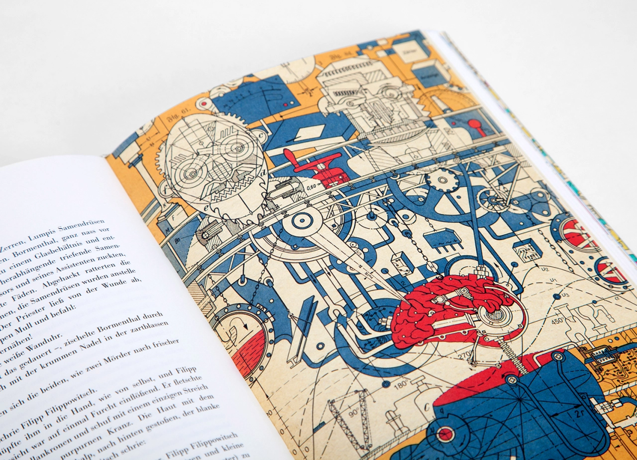
Graphic Design winner: Das Hündische Herz (Heart of a Dog) by Christian Gralingen
Mikail Bulgakov's novel Das Hündische Herz (Heart of a Dog) combines Faustian themes with Frankenstein, and parodies the idea of the 'new human being'. Design director Christian Gralingen brilliantly evoked these themes in his beautiful and colourful illustrations, inspired by the imagery of scientific publications, construction plans, technical drawings and the Russian avant-garde between 1920-1930.
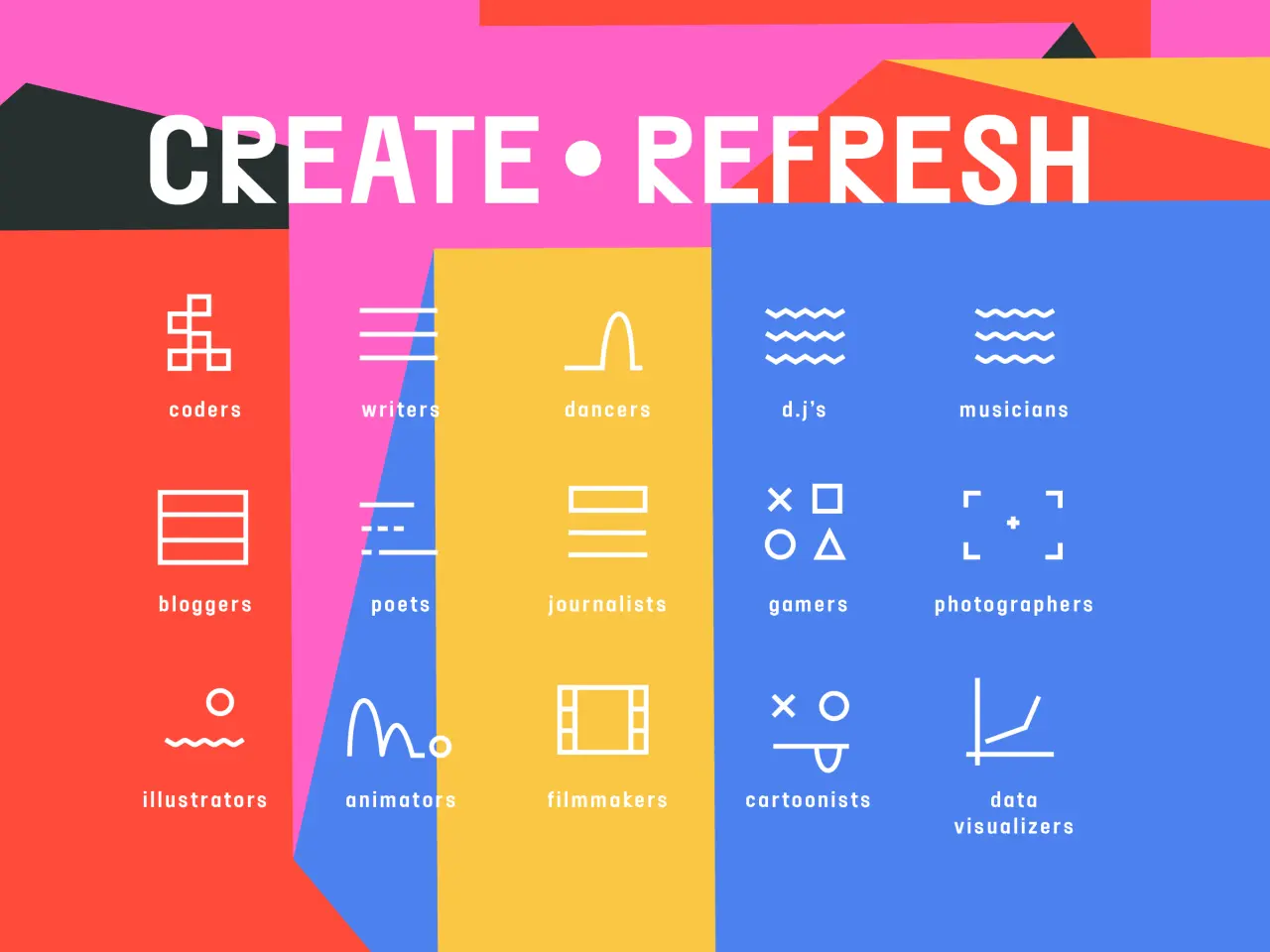
Design for Social Change winner: Create.Refresh by Purpose
Create.Refresh is an EU-based campaign to improve the public's understanding surrounding the implications to the proposed amendments to digital copyright laws. Purpose created the network, identity, and platform Create.Refresh, allowing a range of content creators across Europe to add their voices to the copyright debate.
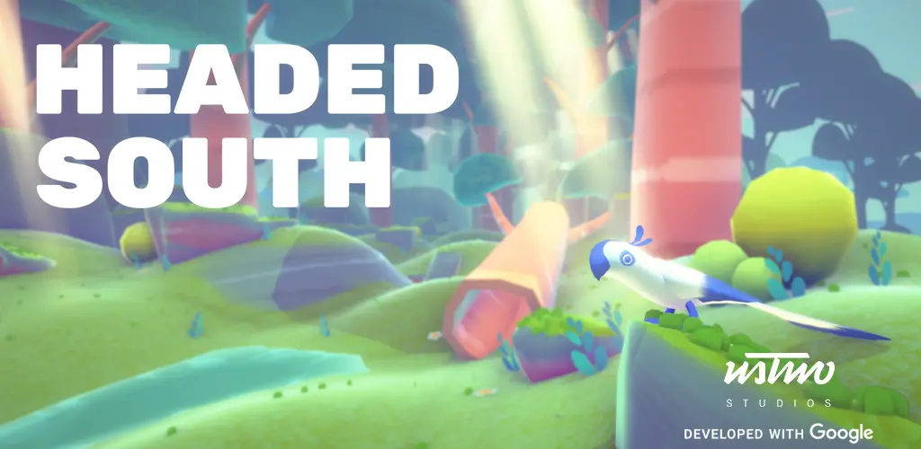
Mobile Design of the Year: Headed South: Bringing Motion Sense to Life Through Play by ustwo
A partnership between ustwo and Google, Headed South is an entertaining app that gracefully introduces Pixel 4 users to Google's new radar-powered Motion Sense technology. This allows users to control their mobile phone without touching the screen, via simple hand gestures like a swipe or wave. In the app, users play the role of a bird named Soli, learning tricks and new gestures as they fly with different flocks.
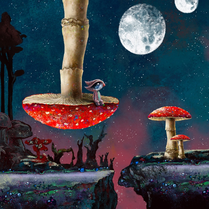
Game Design of the Year: Medulla Game by Lemondo Games
The Medulla is a puzzle-platforming adventure where the game's visual language revolves around the painting styles of contemporary artists. Some visuals reflect the surrealism art movement; others are infused with traditional methods and unique figurative styles that create an overall feeling of magic realism.
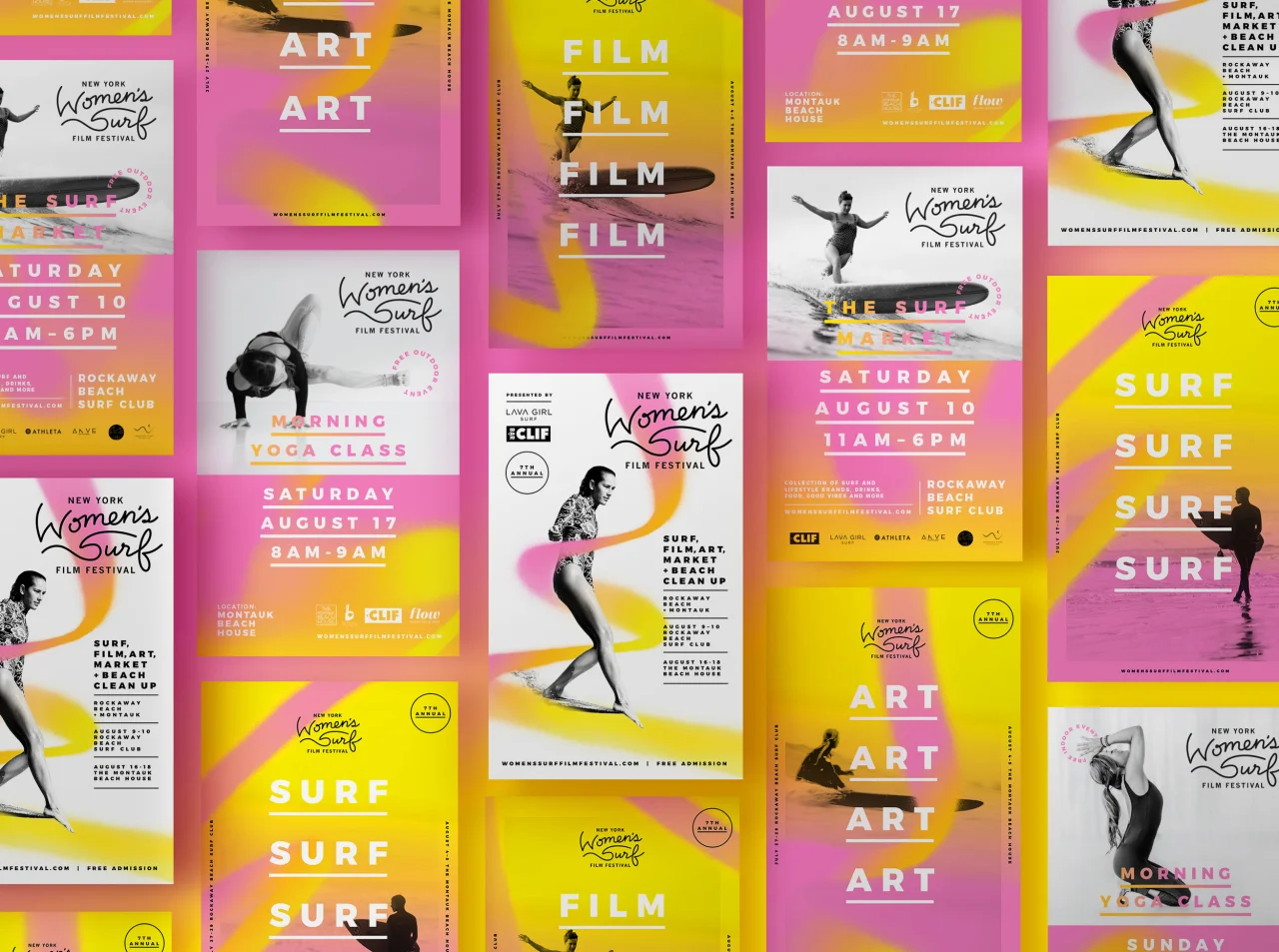
Branding (Gold award): New York Women's Surf Film Festival by Shanti Sparrow
The New York Women's Surf Film Festival celebrates the filmmakers and female wave riders who live to surf. To bring visual form to this year's theme of women's empowerment, graphic elements were created using spray paint. The expressiveness of the paint reflects the movement, energy and power of female surfers. These organic sprays were integrated with photography to reflect the idea of trailblazing and taking/making your own path.
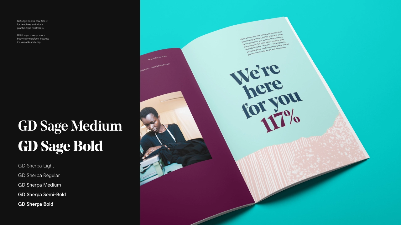
Branding (Gold award): GoDaddy Brand by GoDaddy
Domain and hosting provider GoDaddy examined every component of its brand to create an entirely new design system. To focus their thinking, they developed our Design Ethos, a guiding principle built on four core tenets (Good Design for All, Humanity + Technology, Thoughtfully Creative, Inspire Joy).
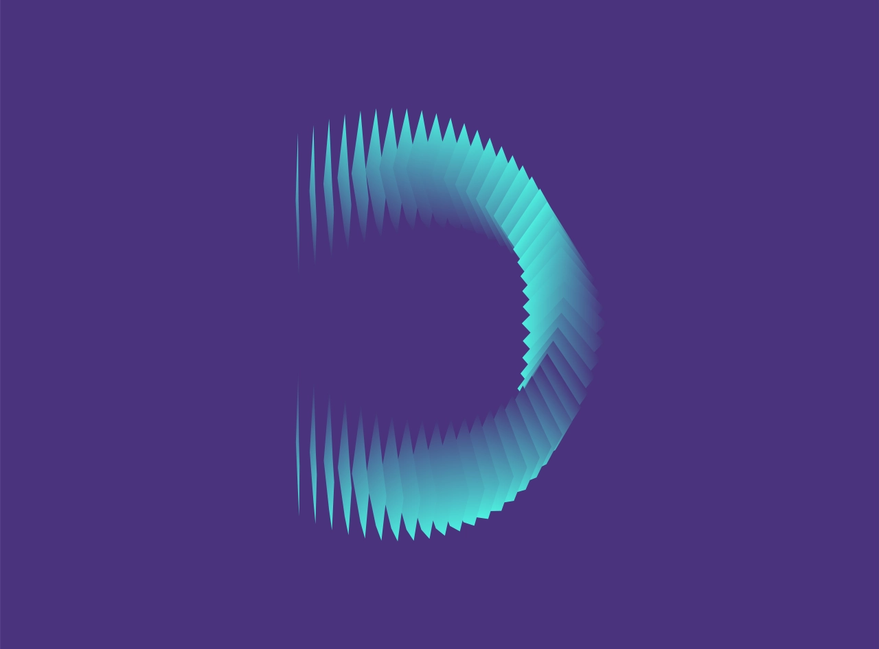
Branding (Gold award): Digital Design Days Rebrand by Jekyll & hyde
Digital Design Days is a global meeting point of the digital design industry. Jekyll & hyde's new logo for the event encompasses light, energy and movement, via squares that rotate and find a new place around the central focusing point. The result is a responsive sign, able to adapt to the dimension of usage by just changing the frequency of the single elements of which it is made.
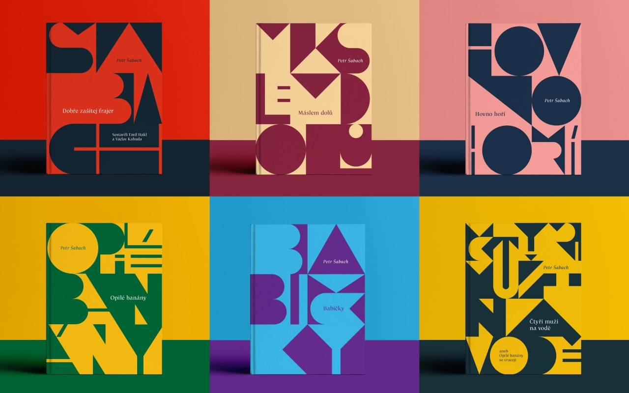
Book Design (Gold award): Book covers for Petr Šabachs novels by Code Switch
Paseka Publishing House asked Code Switch to design a new edition of novels by the popular Czech writer. Design lead Jan Sabach created a visual language of typographic construction, where each element depends on another and its surroundings.
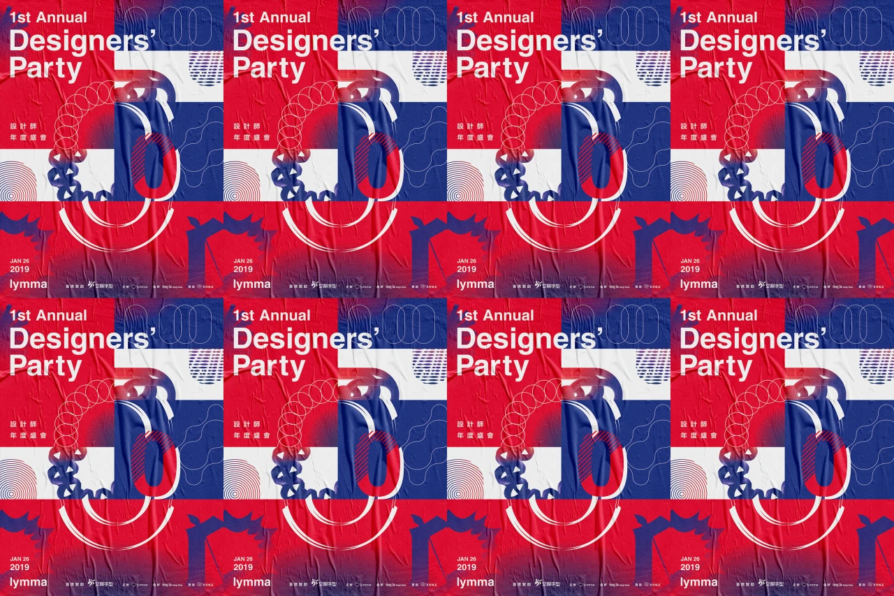
Integrated Graphic Design (Gold award): 1st Designers' Party by Hong Da Design Studio
Hong Da Design Studio for the 1st Designers' Party, neatly and creatively demonstrates how a cutting-edge, type-first approach can be used to produce a coherent, compelling vision. A perfect example of the power of typographical design.
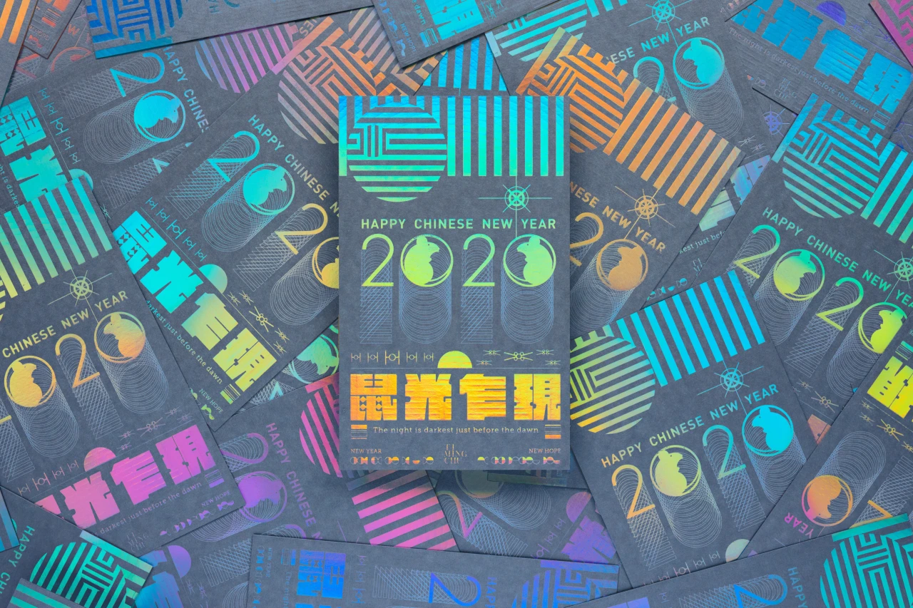
Integrated Graphic Design (Gold award): 2020 Chinese Year of Rat | Rat Year Rising Year by Ti-Ming Chu Workshop
2020 was the year of the rat, but this isn't the most popular of animals in the Chinese Zodiac as it's seen as dirty and associated with diseases. The use of light in this design softens that stereotype, and there are subtle echoes of the Star Wars saga in some of the graphics.
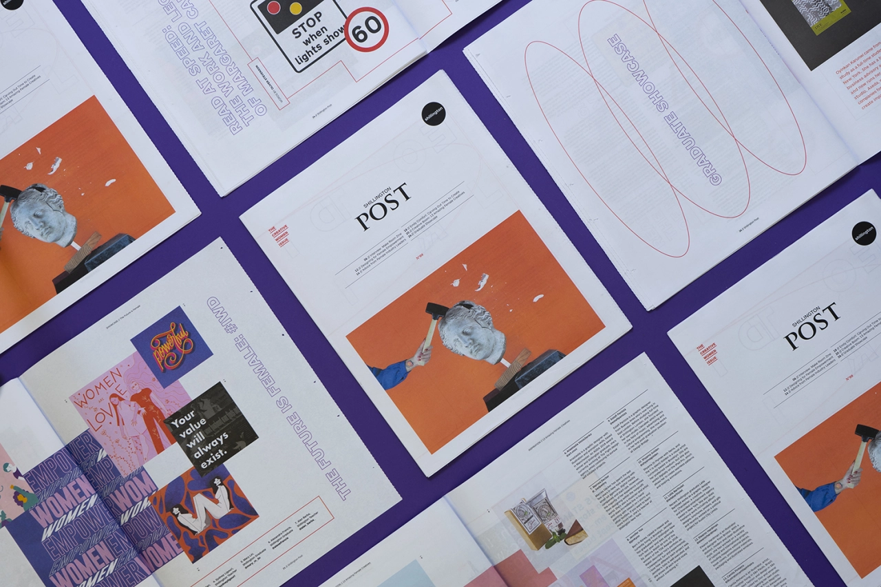
Magazine and Newspaper Design: Shillington Post 08 — The Creative Women Issue by Alan Barba Design
The eighth edition of the Shillington Post celebrates women's achievements both at Shillington and in the creative field. Alan Barba Design visually brought to life this empowering publication with alacrity and clarity.
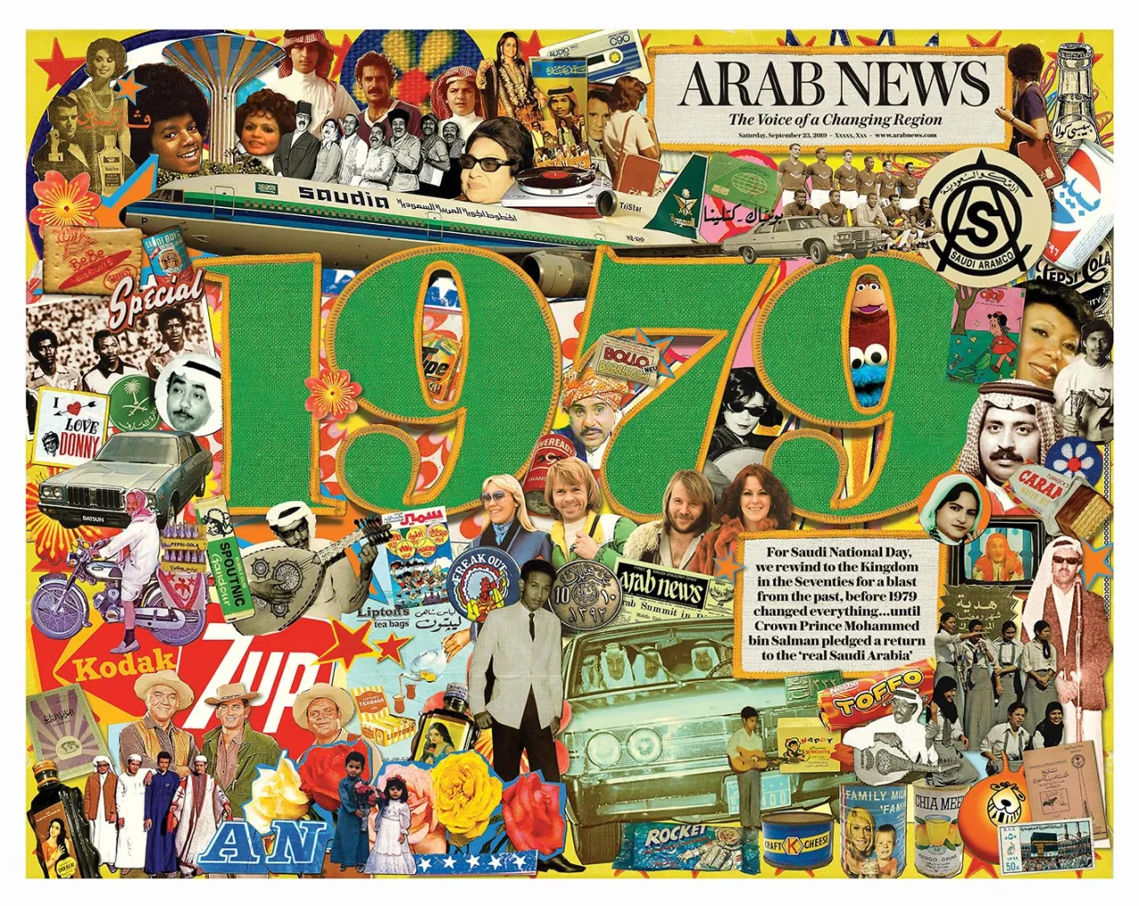
Magazine and Newspaper Design: Saudi National Day 2019: A Blast from the Past by Arab News
For Saudi National Day, Arab News wanted to own the event, and remind readers of a time pre-1979 before the Iranian revolution changed the region forever. They produced a special 28-page souvenir edition with a double-page cover-wrap illustration by Peter Quinnell; inside was a graphic showing key dates in the Kingdom's history.
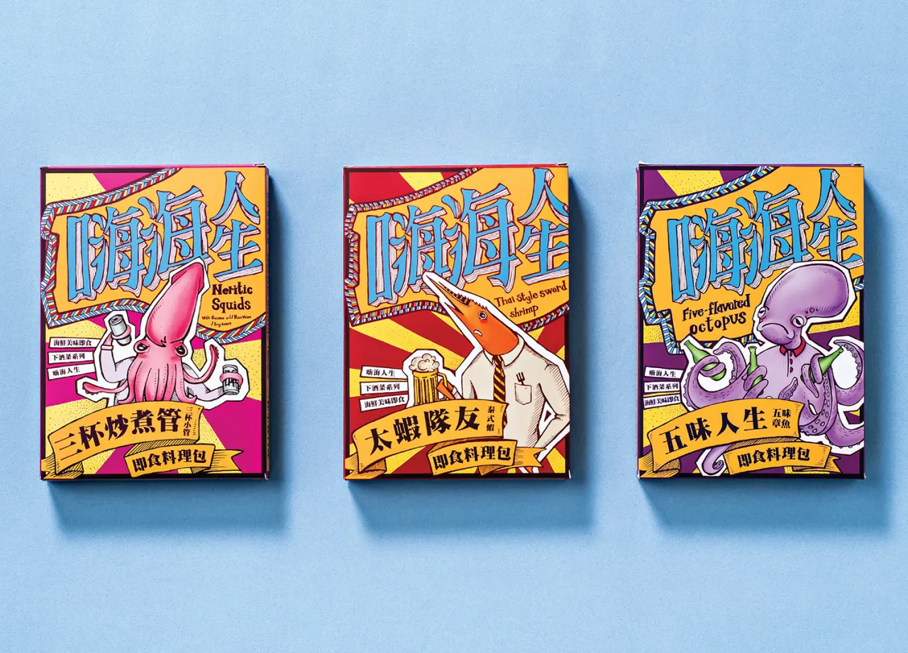
Packaging Design: Hai Hai Ren Sheng seafood by 3+2 Design Studio
Hai Hai Ren Sheng is a ready-to-eat seafood brand, whose products are made from fresh seafood in Keelung, north Taiwan's largest harbour. The branding use hand-painting to anthropomorphize squid, shrimp and octopus, along with references to local proverbs.
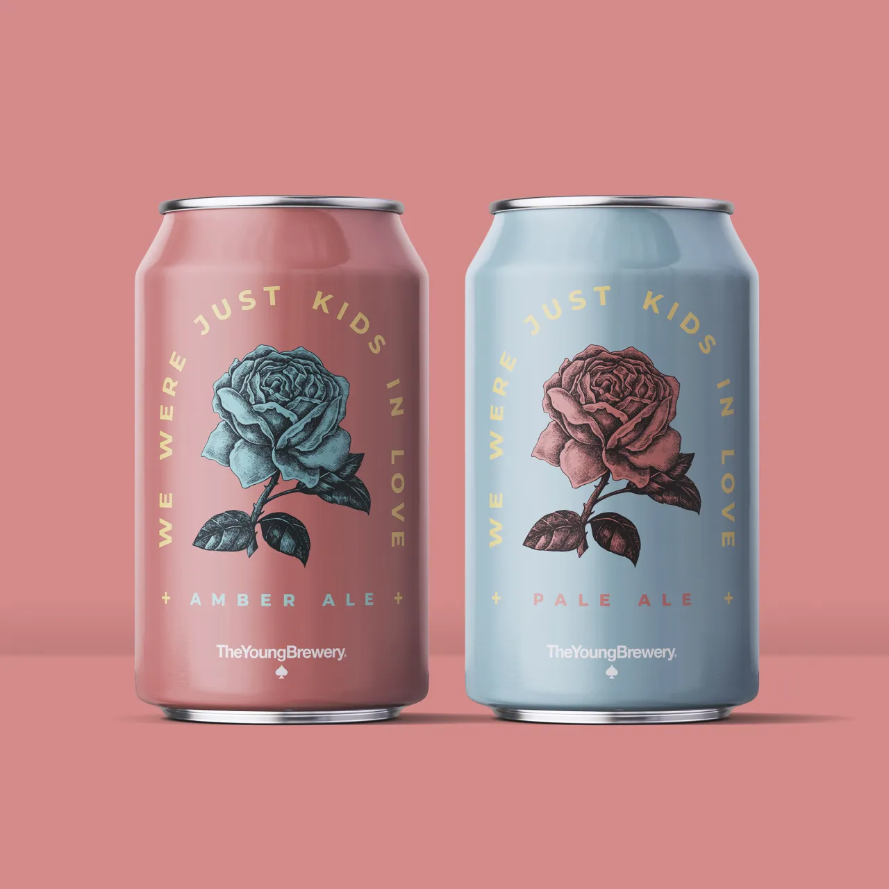
Packaging Design: We Were Just Kids in Love by Ian Wallace
Two beer proposals, for a pale ale and amber ale. The first is designed to gently remember moments of tenderness, walks and shameful laughter; a beer pleasant to the palate and represented with subtle and friendly colours. The second is designed for deeper, more passionate feelings represented by more dramatic and saturated colours.
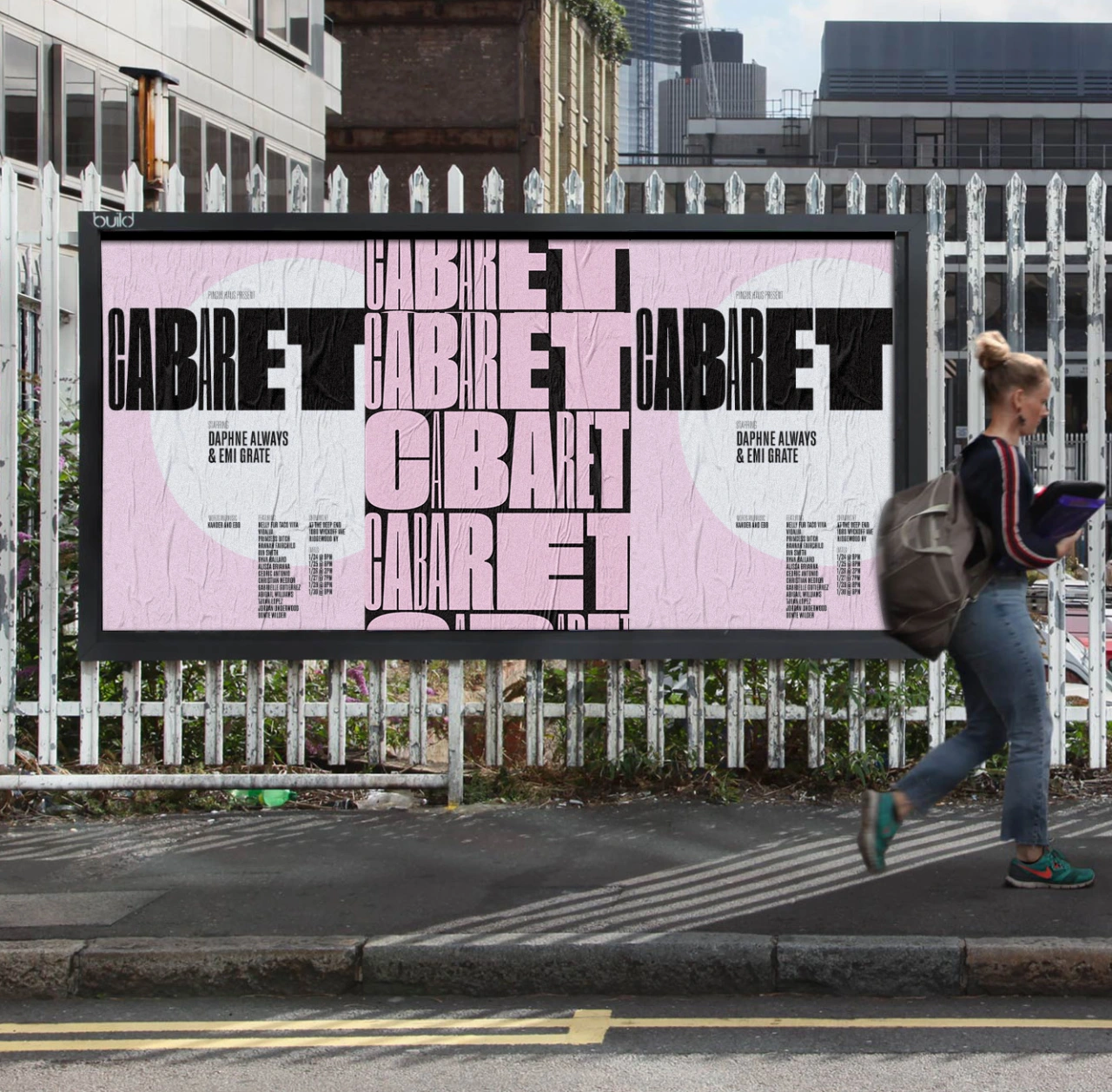
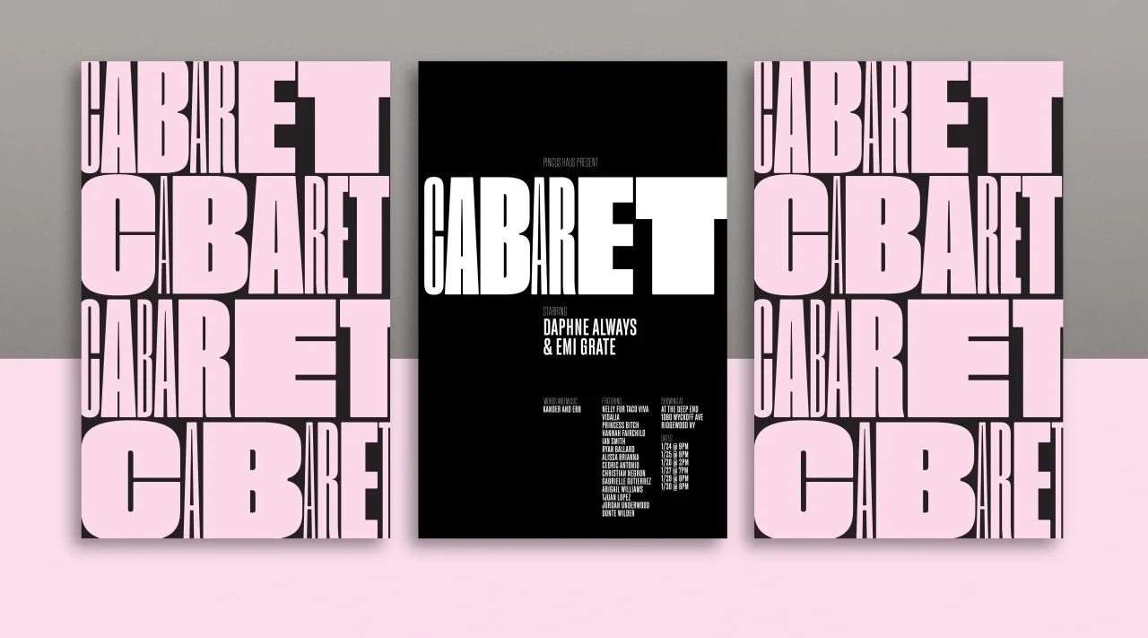
Typography: Cabaret by Anthony Wood Design
Anthony Wood Design took on branding and animation for the Pincus Haus production of Cabaret the musical: a devastating critique of apathy, and a terrifying look at totalitarianism. The variation of the typography through animation represents how quickly inaction can take a lighthearted situation into a deep and dark world of devastation.
Editor's Picks





Trending






Latest Jobs
Senior Creative Lead at Random Studio
Full-time·Amsterdam / Paris·€90k-€110k
Senior Designer at Creative Spark
Full-time·Manchester·£35k-£50k
Senior Graphic Designer at MoMA Retail
Full-time·New York·$72k-$80k
Digital Marketing Executive at Arise
Full-time·Sheffield·From £23,750
Account Manager at BUILDHOLLYWOOD
Full-time·London·£34k–£38k
Creative Project Manager at Analogue
Full-time·Leeds·£28k–£35k