Smith+Village puts sustainability first in its Fudge Kitchen rebrand
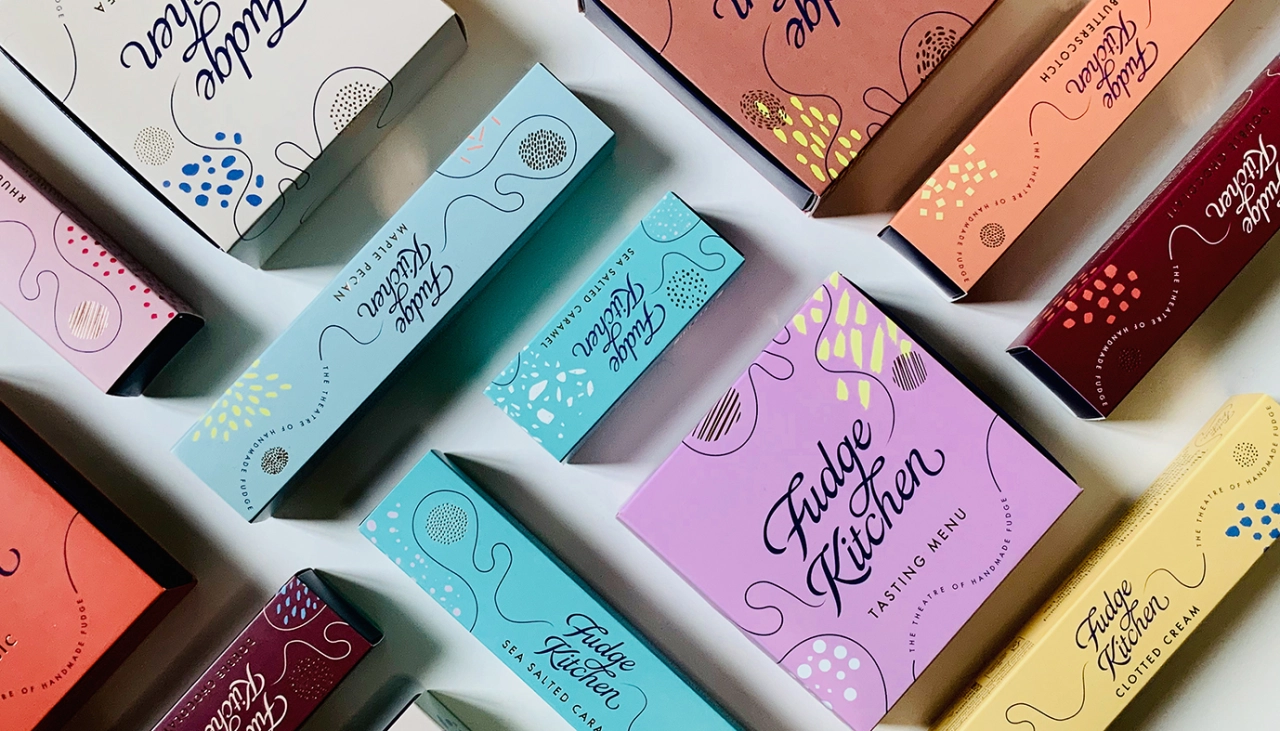
Creative consultancy Smith+Village has collaborated with the Fudge Kitchen to craft an enticing rebrand for the confectionery chain. As well as bringing together the entirety of the business and giving its packaging an exciting redesign, Smith + Village's rebrand has prioritised the Fudge Kitchen's commitment to sustainability.
If you've ever walked past a branch of the Fudge Kitchen, you'll probably know how tempting it can be. The sweet smell of the fudge as it wafts out from the doorway, the sight of delicious slabs sitting in the window, and the friendly staff giving you a taste of what to expect with free samples.
As with many businesses, though, the Fudge Kitchen was heavily impacted by the pandemic. But rather than resting on its laurels, the company took the time to reflect on how it operates. It soon realised that its wholesale and eCommerce arms were out of kilter with the personality of its high street shops, so a refresh was on order.
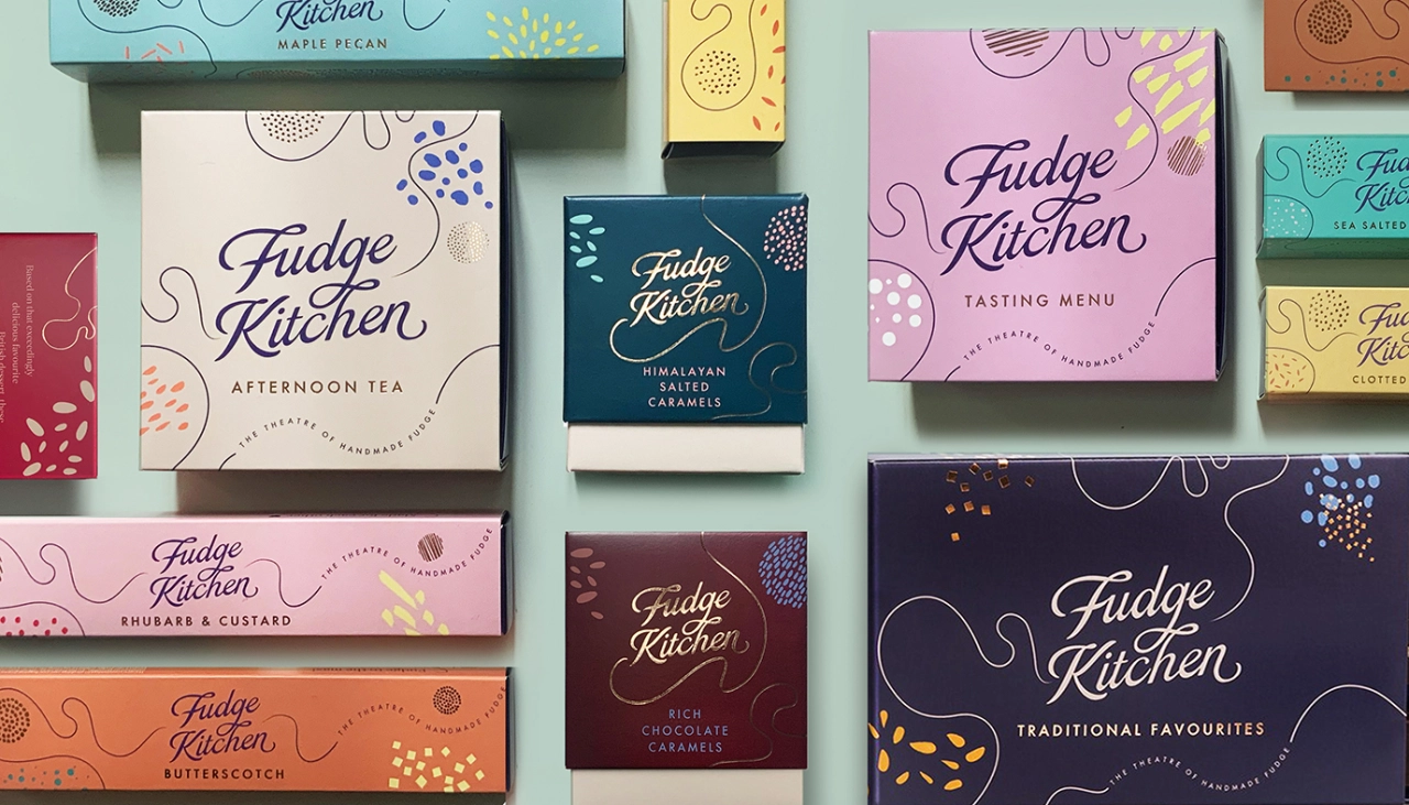
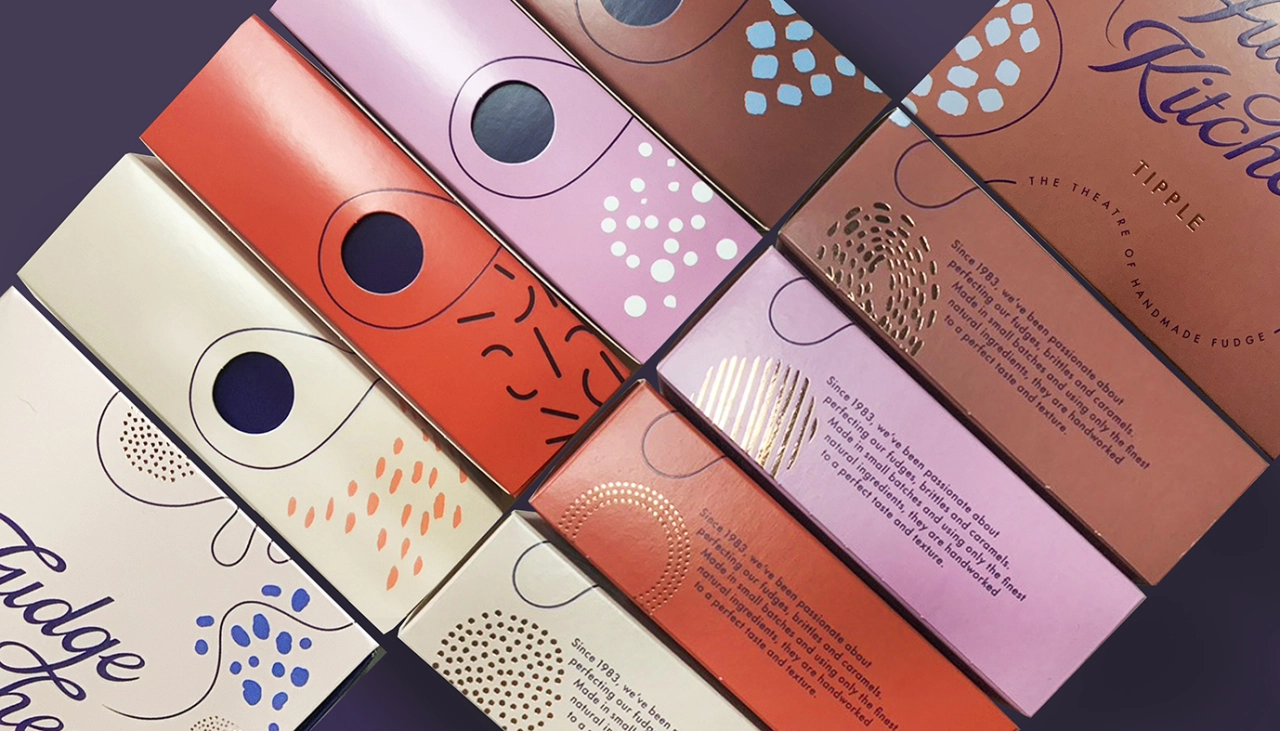
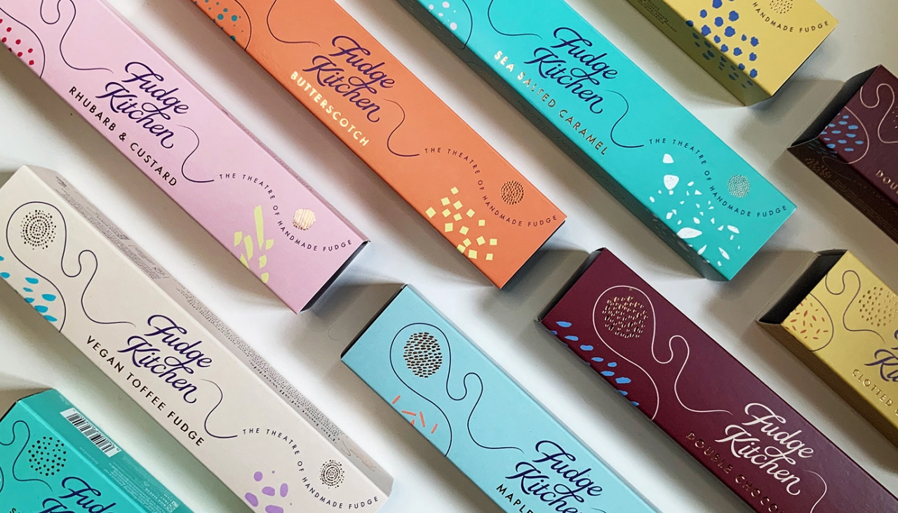
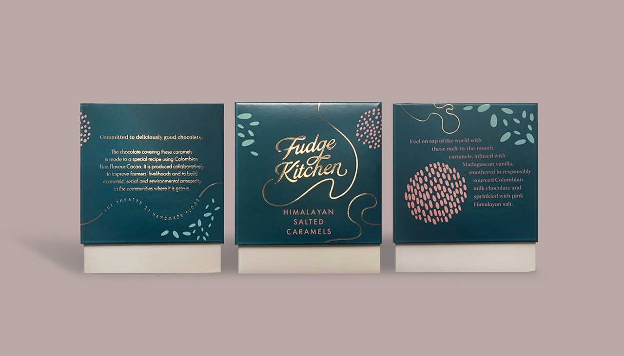
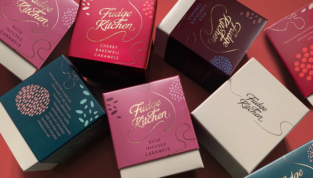
Turning to creative consultancy Smith+Village for help, the Fudge Kitchen was keen to redefine its identity from the ground up. It included a new branding colour palette, a more expressive tone of voice, and a sustainability-led approach to its packaging design. Gone are the specialist printing methods which can make recycling difficult, and in their place are FSC certified boxboards emblazoned with designs printed in the UK.
Summing up these changes is a new tagline developed by Smith+Village, which positions the Fudge Kitchen as 'the theatre of handmade fudge'. Placed within a swirling line that is evocative of the way fudge is made in stores, it's the perfect way to communicate the brand's spirit both visually and through words.
"The design was trying to capture the pouring of fudge and swirling and stirring, sprinkling ingredients and decorating with textures," says Smith&+Village Creative Director Debrah Smith. "It needed to have that kind of fluidity. We built in this curvy line that goes all the way around the pack and patterns that could be salt crystals or little flavour pops.
"Since we were stepping over into sustainable materials, there were not as many finishes as had been used to in the past. It was another reason to amp the colours up for a theatrical feel. We also banned brown – which obviously just doesn't work online. We changed it over to a bluey purple colour for the internal tray, which nicely sets off the fudge inside."
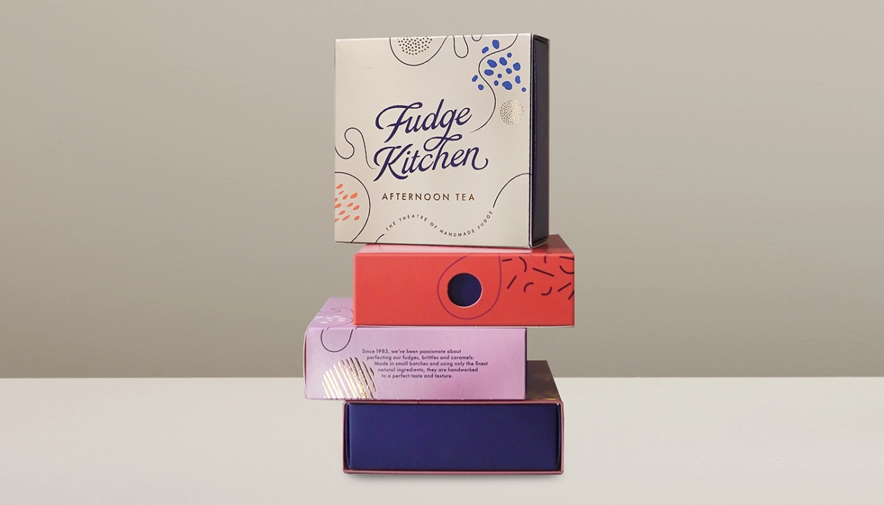
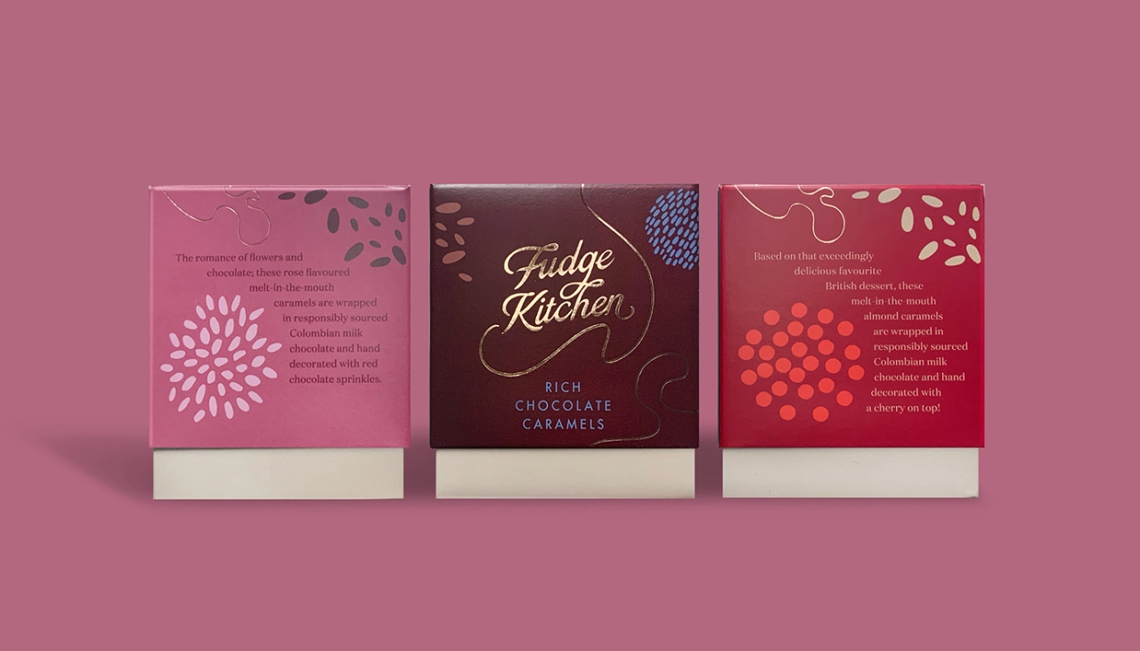
As well as sustainability, the experience of visiting the Fudge Kitchen shop underpins the whole rebrand. Smith+Village Strategy Director Richard Village explains that they studied what it means to pop into one of their stores and noticed that the performance is a hugely important part of that interaction.
"Fudge is made in front of you – it's all boiling away and being rolled out, and you're being tempted by people with free samples," he reveals. "This 'theatre of handmade fudge' is the element which gives Fudge Kitchen a uniqueness, and we drew on this to help them own the category."
Playful language is the backbone of the new tone of voice, which includes fun and expressive statements such as "Get the Fudge out of here" and "Thank Fudge, it's Christmas." These phrases can be found on packaging and in-store and aim to help motivate the customers.
According to Smith+Village, the new identity is going down a storm with shoppers, who are pleased that the sustainability-first approach has not compromised the Fudge Kitchen's energy and flamboyance.
"We wanted to communicate that we are a luxury gifting brand with a conscience," says Sian Holt, MD of Fudge Kitchen. "Smith+Village has helped us do this with a dynamic identity that has star appeal."
Editor's Picks





Trending






Latest Jobs
Account Director at How&How
Full-time·London·£73k-£79k
Senior Designer at Definition
Contract·London·£45k–£50k
Senior Designer at Creative Spark
Full-time·Manchester·£35k-£50k
Creative Social Content Producer at Bompas & Parr
Contract·London·£32k–£40k
Senior Digital Designer at Red Antler
Full-time·New York·$95k-$130k
Marketing Copywriter at ustwo
Full-time·London·£40k-£50k