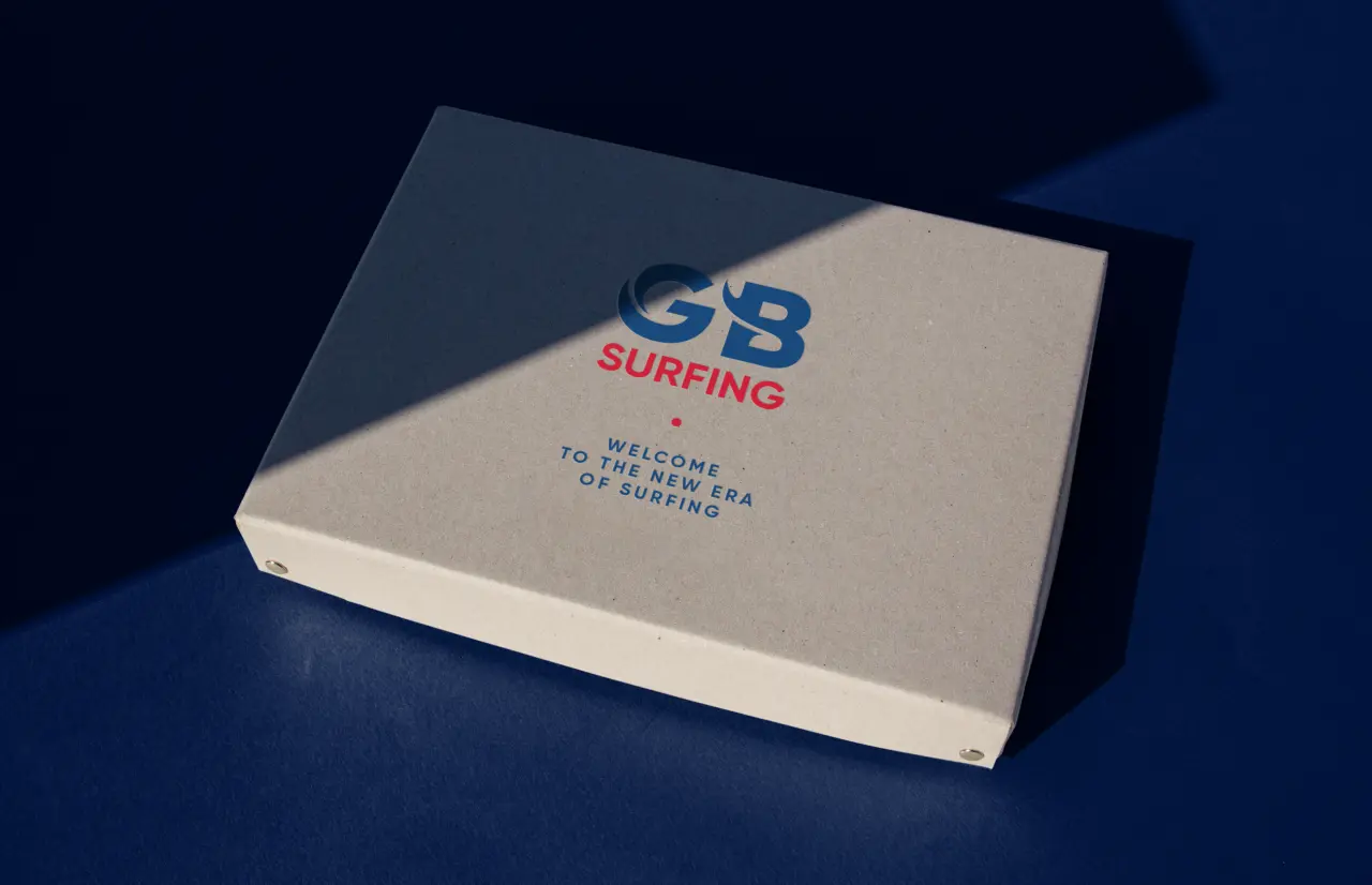
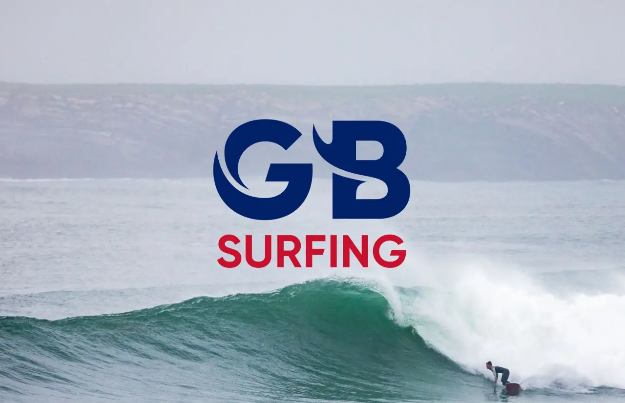
New logo for GB surfing by FORM Brands Studio captures the perfect wave
A good logo catches the eye, sums up a brand in seconds, and evokes an atmosphere. Here's a great example for the national body taking charge of elite surfing.
When you think about surfing, images of sun-drenched beaches in California and Hawaii come to mind. But true surfers don't care about picture-postcard weather: it's all about the quality of the wave. And so it's not surprising that the island nation of Britain has developed a passionate and successful surfing community.
GB Surfing is a non-governmental organisation dedicated to developing exceptional British surfing talent. Its role is to select and manage all competing GB surfing teams in preparation for Olympic qualifying events and the Olympic Games.
Until this July, the body was actually called British Surfing. It worked with FORM Brands Studio, a London-based design and branding agency, to create a new brand identity aligned with its ambition to make Great Britain a great power in international surfing.
FORM Brands Studio is relatively new on the scene: it was founded by creative director Alex Andlaw and communications director Beth Andlaw in 2022 and describes itself as a creative agency with "big hearts, bright minds, and bold ideas". The elite sports organisation chose to work with FORM following a competitive process as it looked to elevate its brand as the home of British Olympic surfing.
Brief and concept
FORM worked closely with the GB Surfing team and athletes to create a logo that would resonate with the surfing community while standing strong in the Olympic world.
Currently, around 50 million people surf worldwide, and over 1.1 million of them are in the UK. The new look had to lend longevity and feel fresh and exciting for the announcement of the first progression squad of potential Olympic competitors in October, ahead of the games in Paris 2024 and LA 2028.
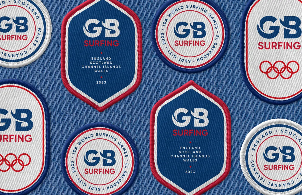
The brief set the challenge of keeping the red, white and blue of Great Britain while delivering a sense of waves and beach shacks alongside a highly-skilled, adrenaline-fuelled professional sport.
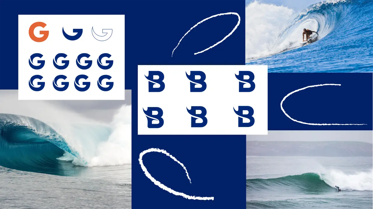
After in-depth research into industry, culture and governing bodies, FORM developed multiple initial concepts. They looked at symbols and wordmarks and explored a range of ideas, typefaces, forms and styles before refining a design that was tested among the athletes.
Shape and form
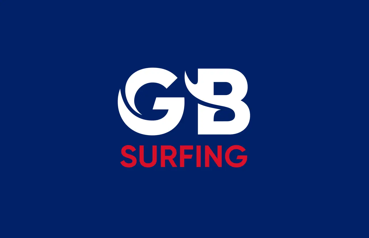
"We surf ourselves," explains co-founder and creative director Alex Andlaw. "So we loved the idea of getting the perfect wave carved into the logo. We looked at the shapes of breaks, cutbacks and tunnels of waves to find inspiration: every line, curl and curve was carefully considered to create the final design.
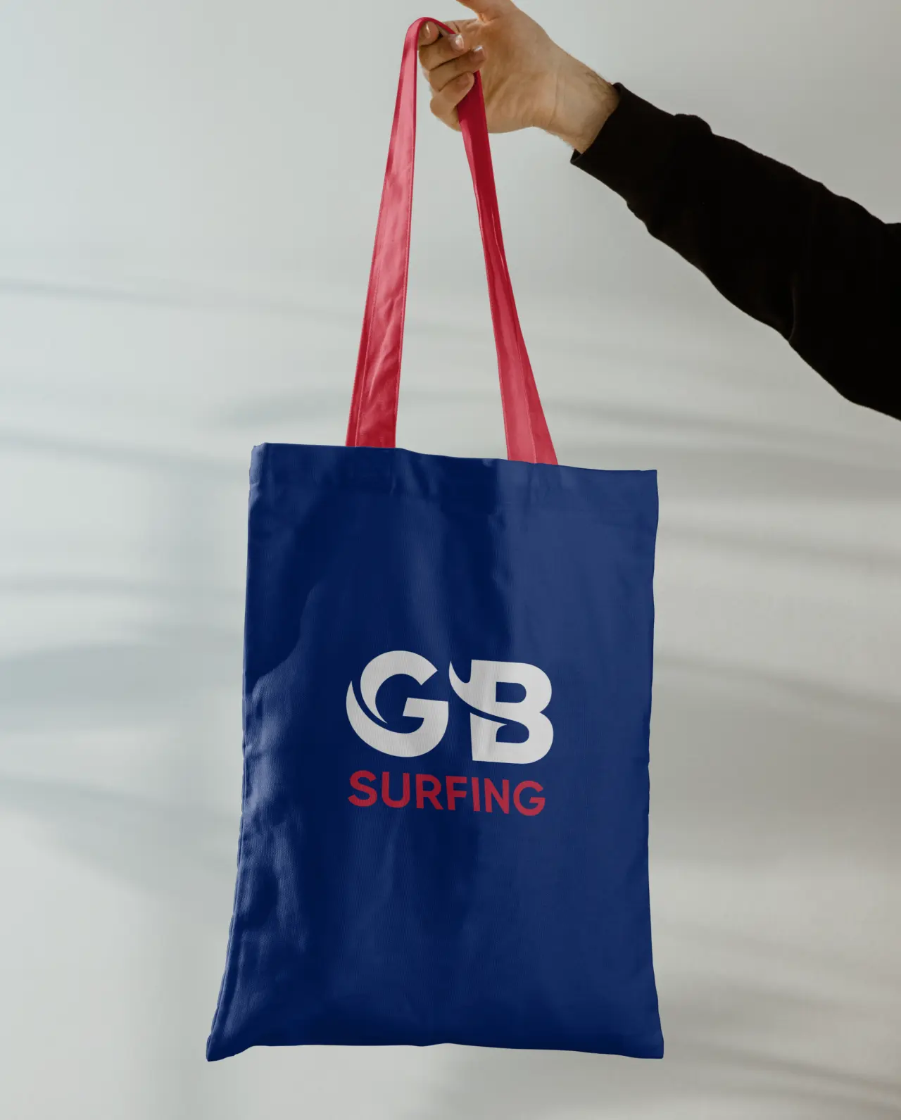
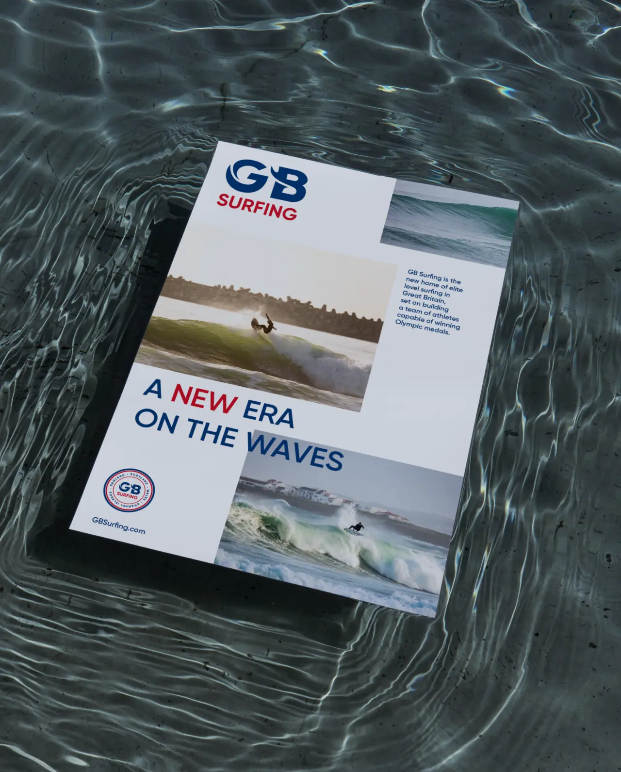
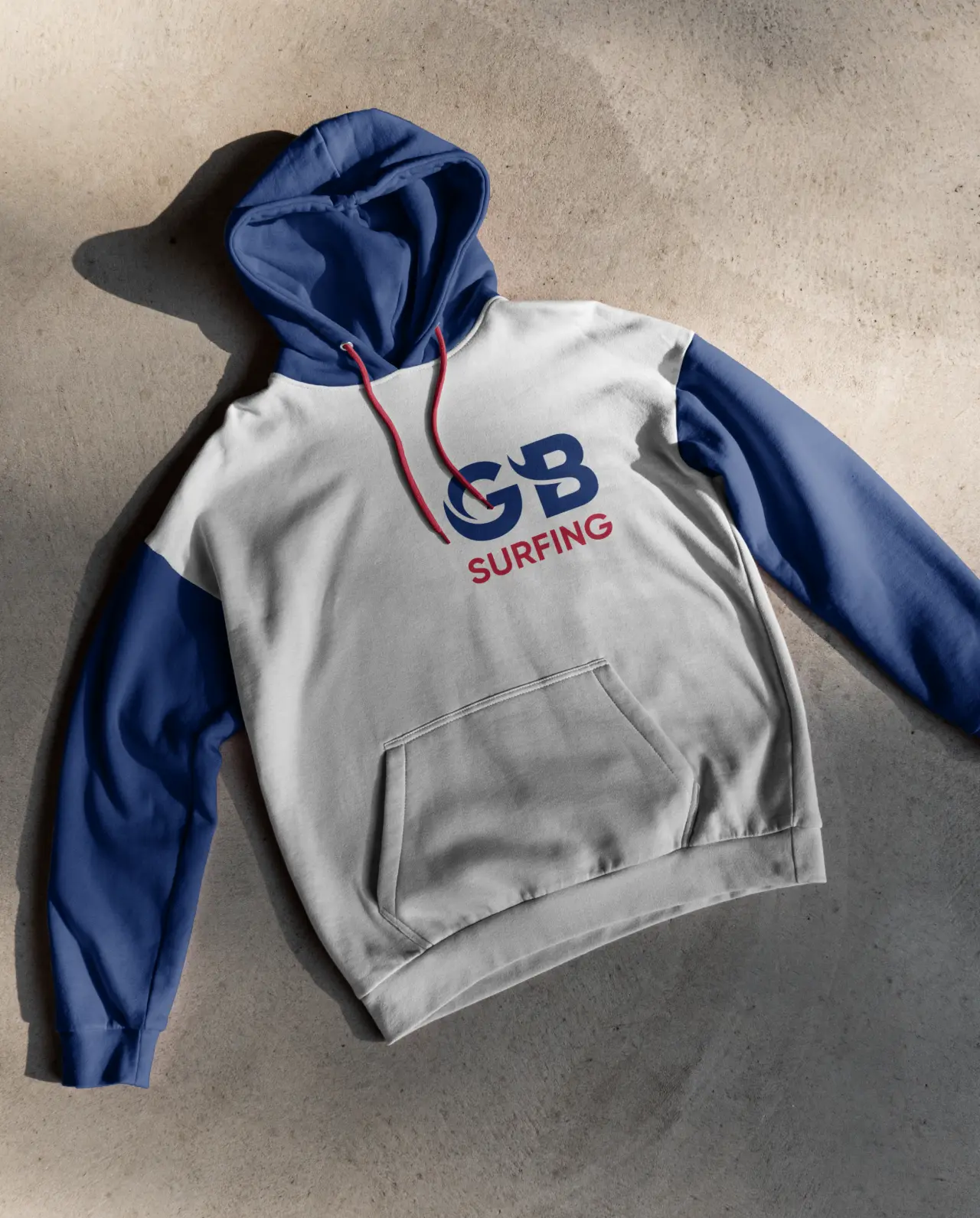
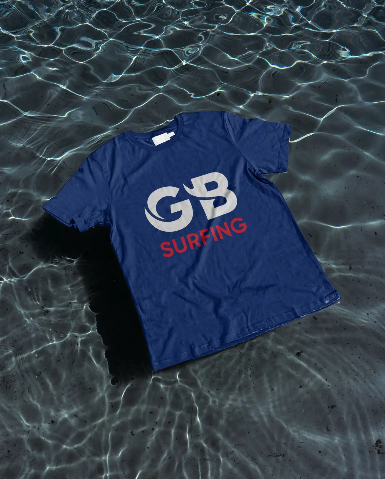
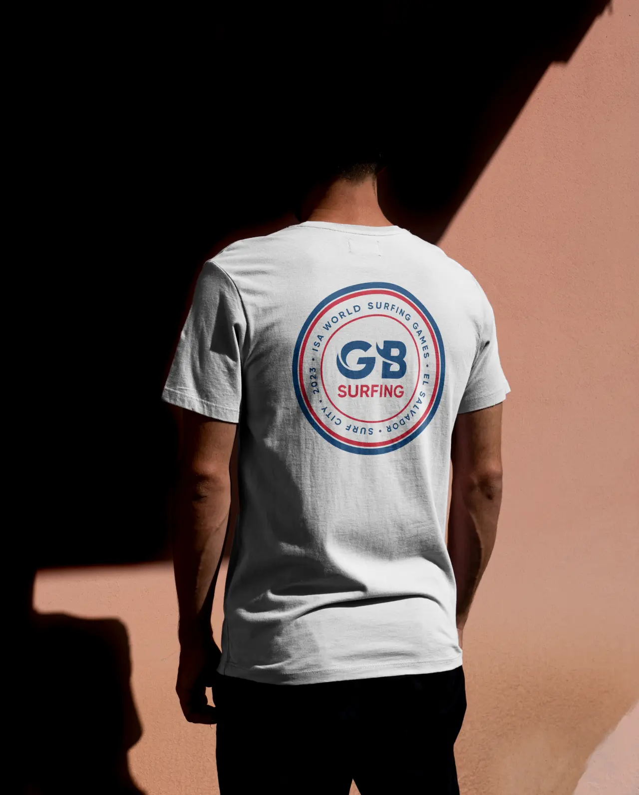
The result is a fresh new logo, beautifully crafted with letters that embody the form of a wave. The idea is a simple one, and yet the execution is original and inspired, marking it out as an eye-catching and atmospheric piece of branding work. "It was a great honour to work on this, and we can't wait to see the team ripping it up at competitions and the Olympics," says Alex.
"We empower our athletes to perform on the world stage and needed a powerful new brand to match our drive," says Victoria Gosling OBE, GB Surfing chair. "We're delighted with the work Alex and the team produced. The level of detail and research that went into the design showed they fully understood our brand and what we were after."
Editor's Picks





Trending






Latest Jobs
Creative Content Executive at Cognition
Full-time·Birmingham·£28k–£35k
Graphic Designer at Crux Product Design
Full-time·Bristol·Up to £36k
Creative Director at Koto
Full-time·London·£95k-£130k
Design Director at Koto
Full-time·London·£72k-£90k
Midweight Graphic Designer at We Are Your Friends
Full-time·London·£36k–£44k
Midweight Editor at Earworm
Full-time·Bristol·£28k-£32k