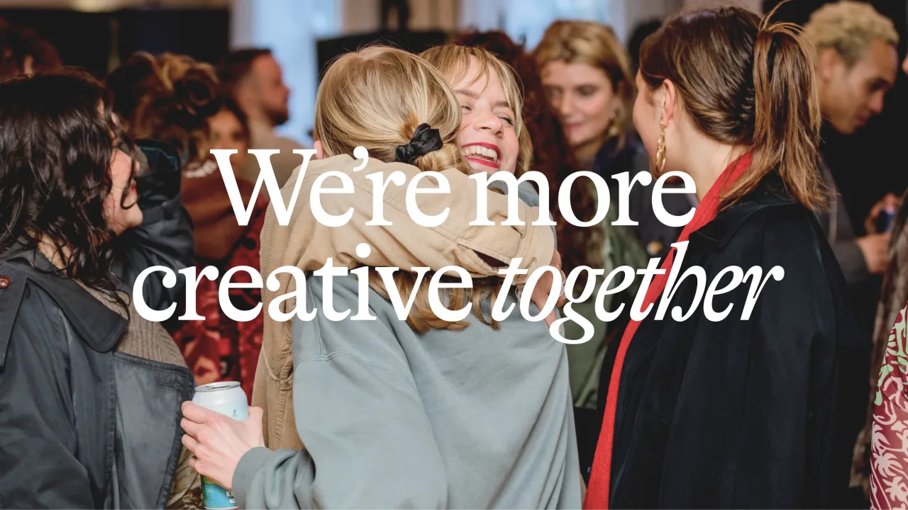
Fiasco's identity for coding bootcamp iO Academy has inclusivity at its heart
Coding bootcamp iO Academy is on a mission to help address the gender imbalance in the tech industry and give people the "training they need for a career they'll love". To help it achieve this, it realised its brand needed a refresh, so appointed Bristol's Fiasco Design for the overhaul.
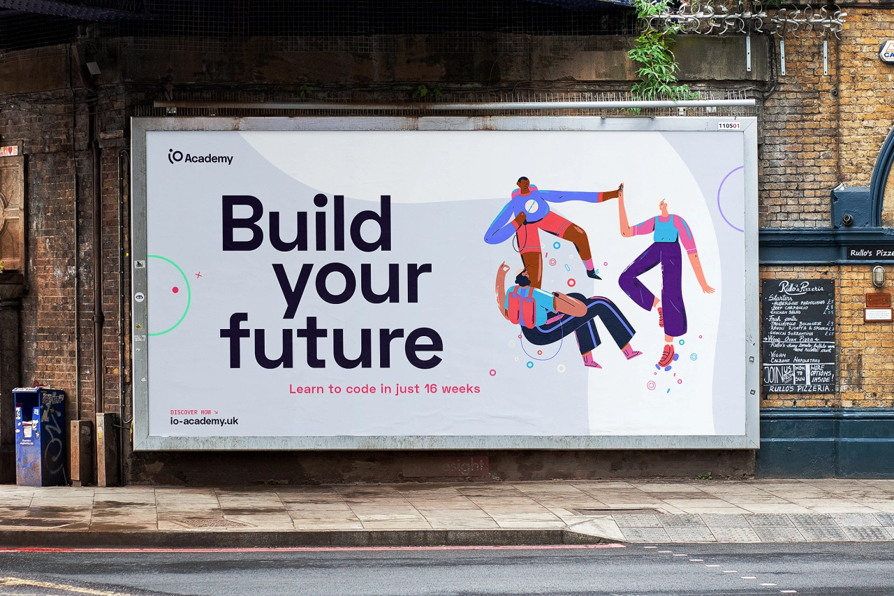
Based in the South West, the award-winning firm was established in 2015 as health tech company Mayden – not initially as a business, but as a way to "solve a problem". Like so many tech companies around the UK, it needed more developers to sustain its own growth. So a team of Mayden developers designed a programme that would train people with no coding experience to be industry-ready developers in just 16 weeks.
The Academy reached out to Fiasco at the beginning of 2020 to reposition the company and reflect its idea to solve a talent shortage. The aim was for a "fresh, future-proof identity that would appeal to a diverse range of prospective students and break down perceptions about the tech industry".
With graduates working in tech companies from Bath to Berlin, an even ratio of men and women trainers, and a strong work ethic towards diversifying the industry, Fiasco worked in collaboration with Mayden Academy to review its existing branding, as well as define its core values and company proposition.
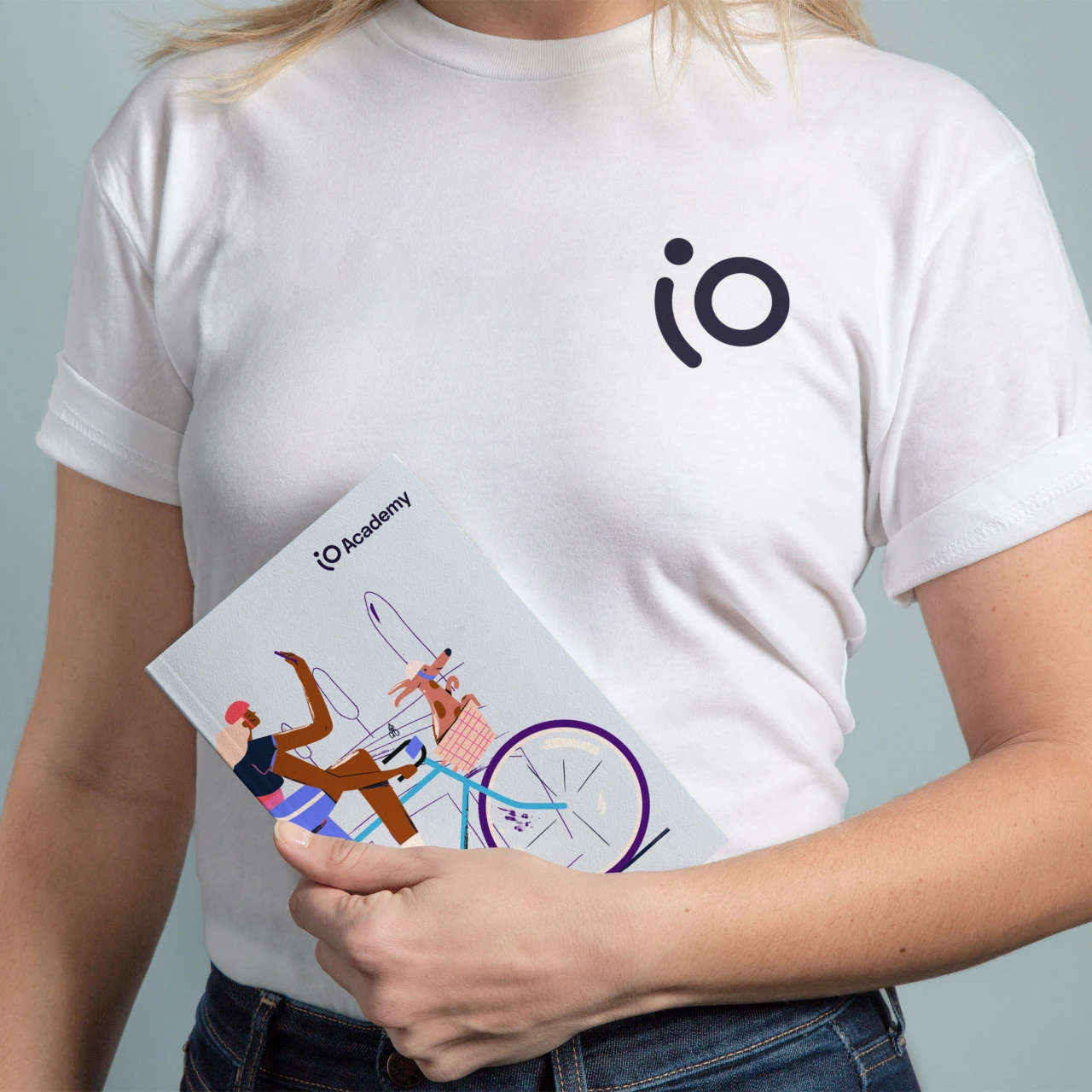
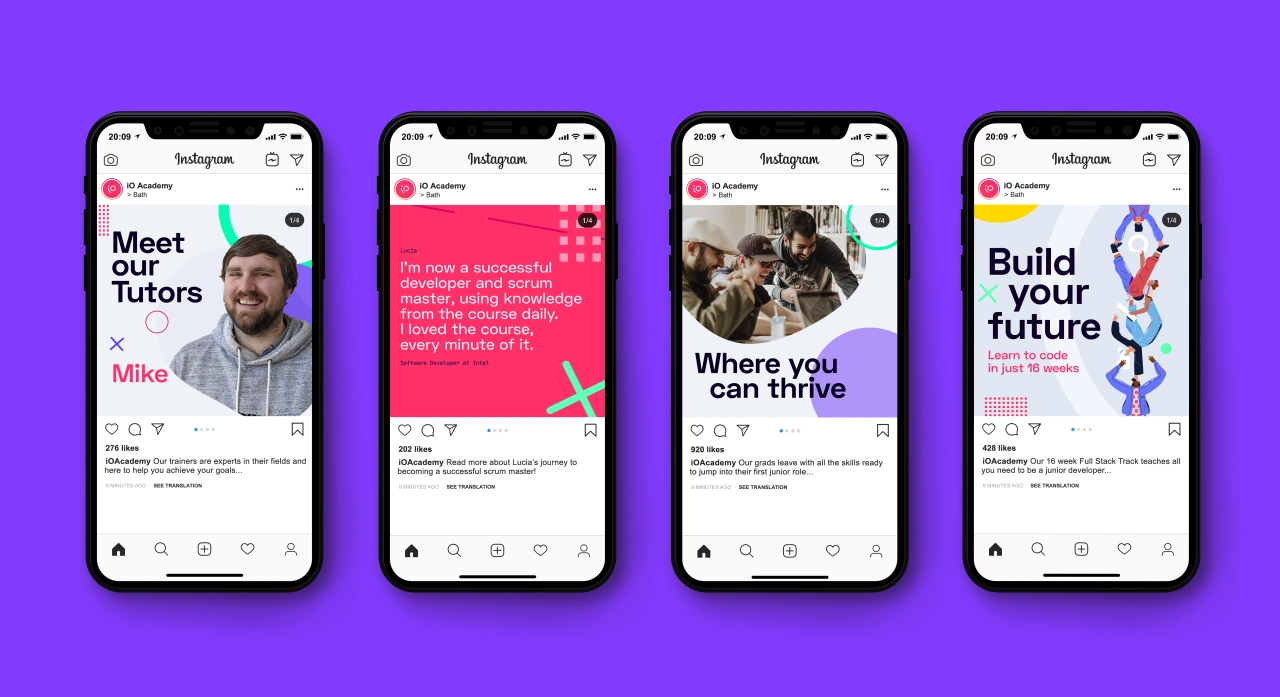
Through a number of workshops, a new brand name was created; iO Academy. "On the one hand, it's a clear nod to coding language – IO is shorthand for input/output in computer programming," explains Fiasco. "On the other, it's also the name of one of Jupiter's moons, which seemed a good metaphor for the brand's innovative, future-focused outlook."
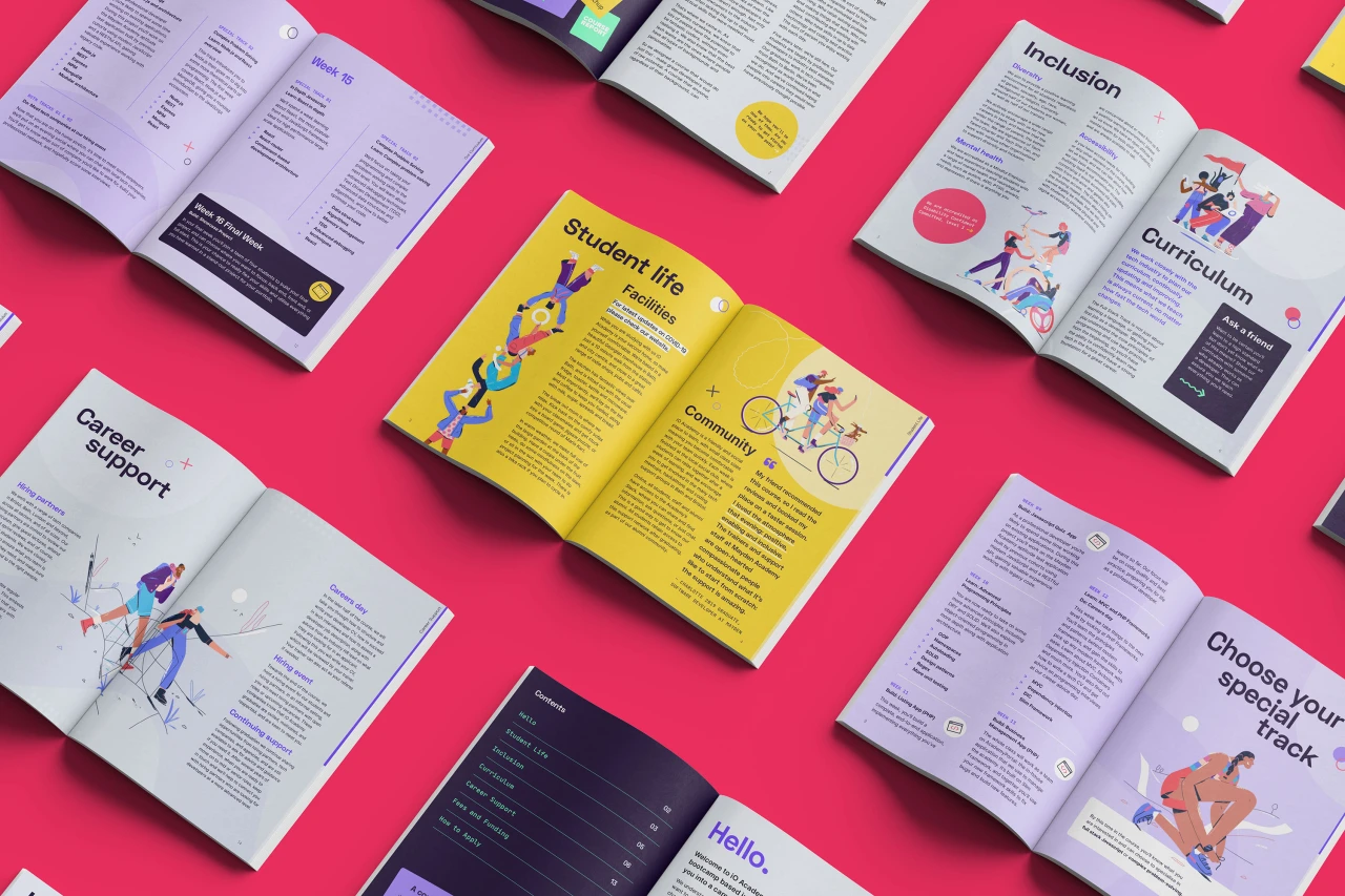
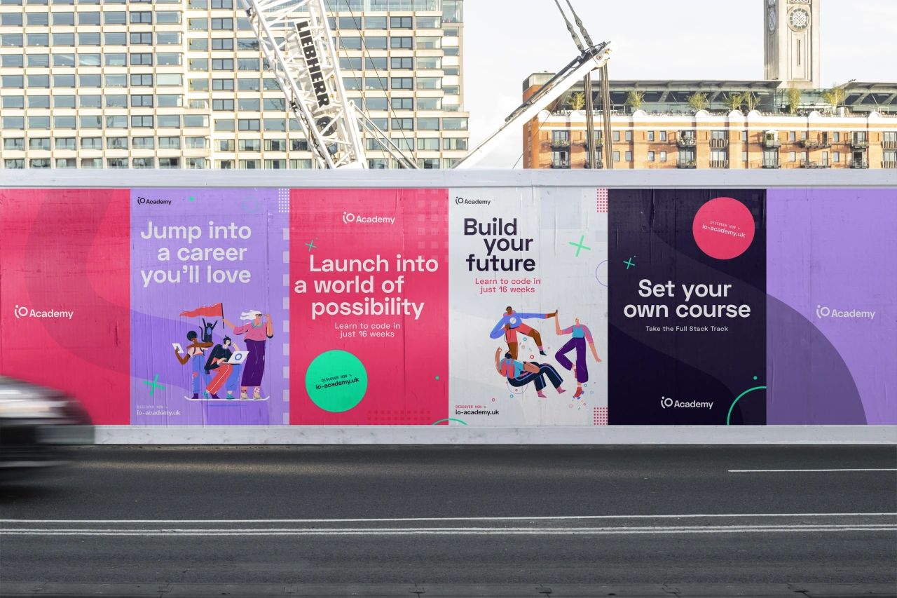
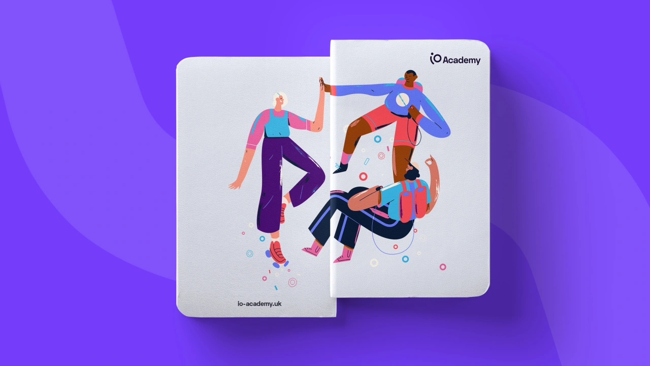
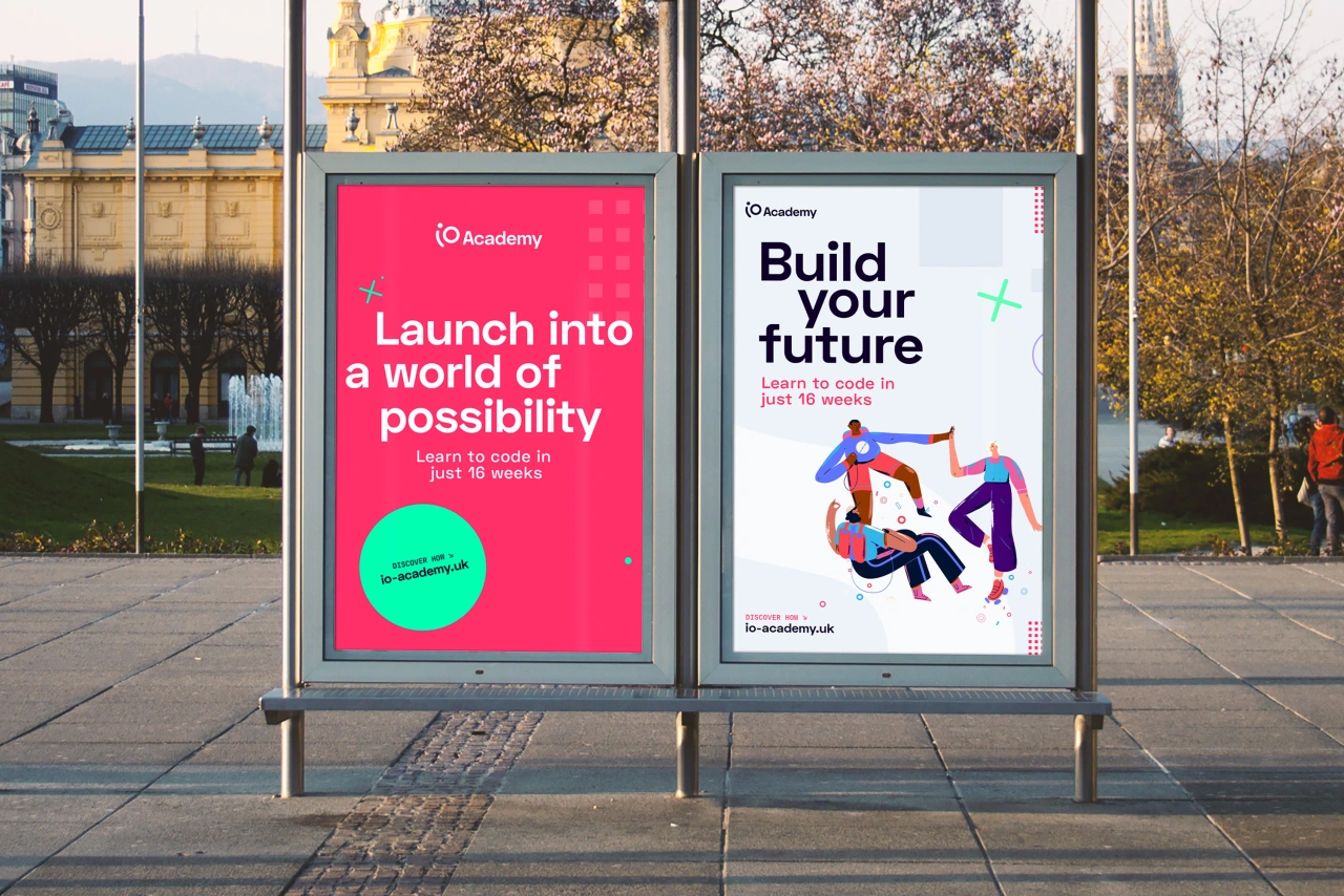
Following the name and proposition came a new visual expression for the brand. "The visual language is designed to reflect exploration, harnessing imagination and working towards a better future," adds Fiasco. "The graphic shapes give a sense of wayfinding, collecting badges and new skills following a creative pathway. Verbally the tone is positive, ambitious and empowering, and speaks to the curious and willing."
Fiasco worked with Belgium-based illustrator Soren Selleslagh to create a joyful suite of diverse and inclusive illustrations, depicting aspects of the student journey across the course and into their new careers.
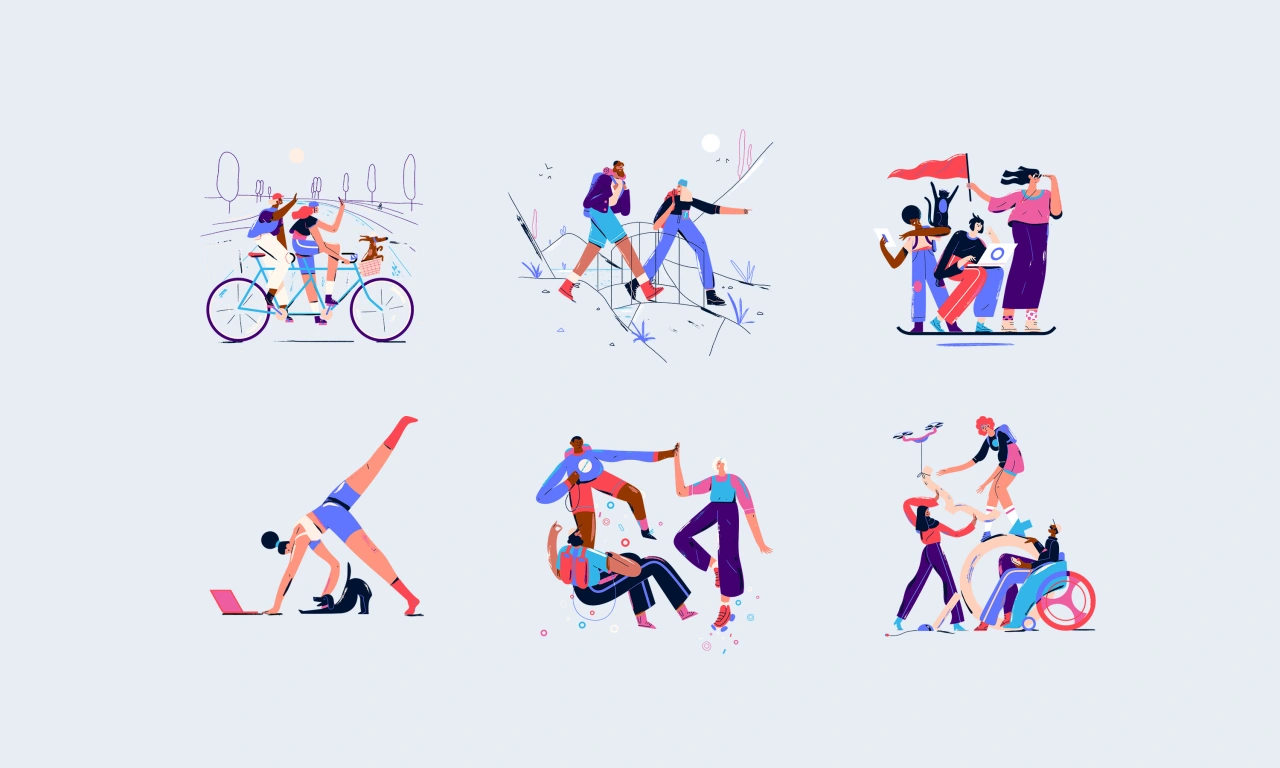

"It goes without saying that it's been a supremely challenging year for the business," says Ben Steers, founder of Fiasco. "That being said we've had our best year yet, thanks mostly to the hard work and resilience of our brilliant team.
"We've also been fortunate to work with some fantastic clients during lockdown and beyond, who have allowed us space to do some of our best work. Like everyone I'm looking forward to the new year in hope that we can get back to some kind of normal and focus fully on doing great work for great people."
Editor's Picks





Trending






Latest Jobs
Creative Content Executive at Cognition
Full-time·Birmingham·£28k–£35k
Principal Software Engineer at BBC Media Tech
Full-time·Glasgow·Up to £83,790
Mid-Senior Designer at Something Familiar
Full-time·Bristol·£32k–£40k
Midweight Graphic Designer at We Are Your Friends
Full-time·London·£36k–£44k
Senior Designer at BKC
Full-time·£50k-£60k
Client Partner at Halo
Full-time·Bristol·£30k–£36k