Design Bridge's Holsten beer rebrand draws on Hamburg’s 'rich industrial heritage'
Design Bridge has looked to restore local pride in Holsten, Hamburg's "most iconic beer", with a new look and feel drawing on the city's industrial heritage.
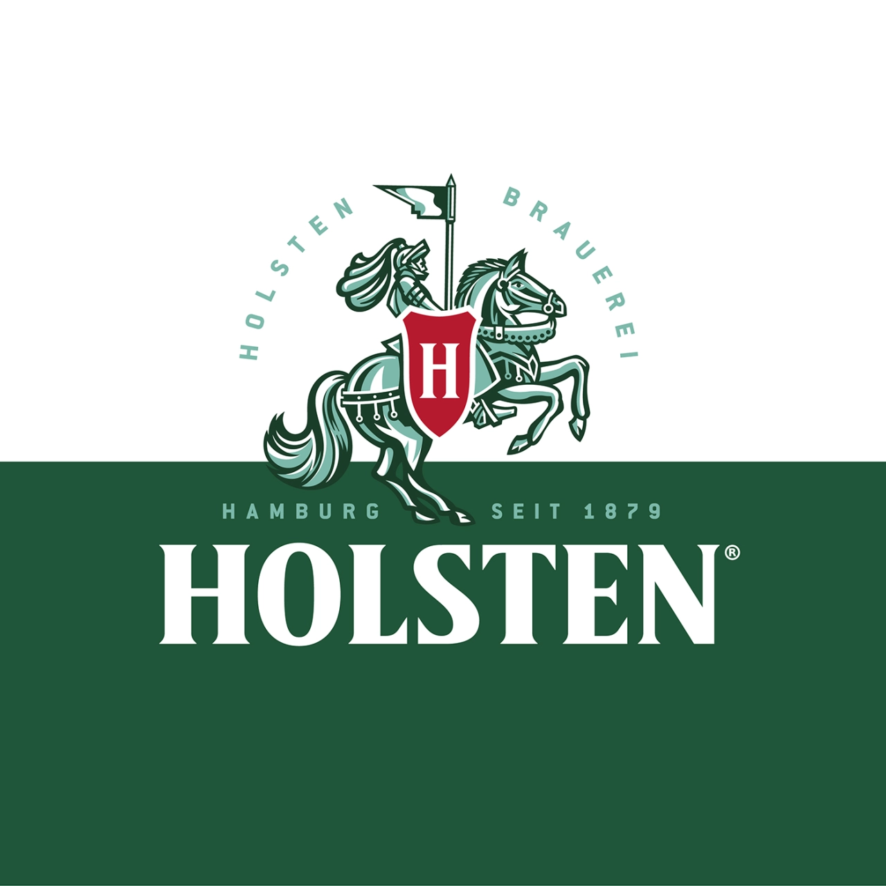
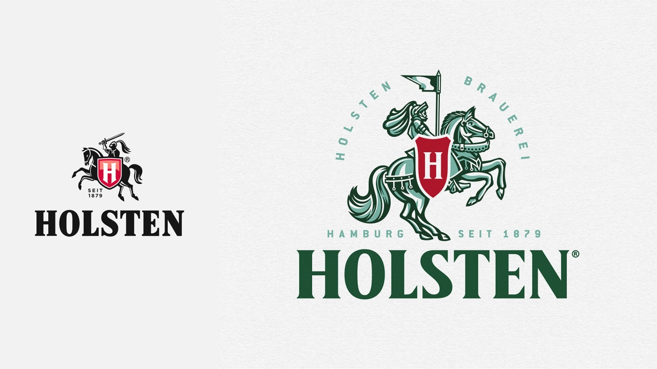
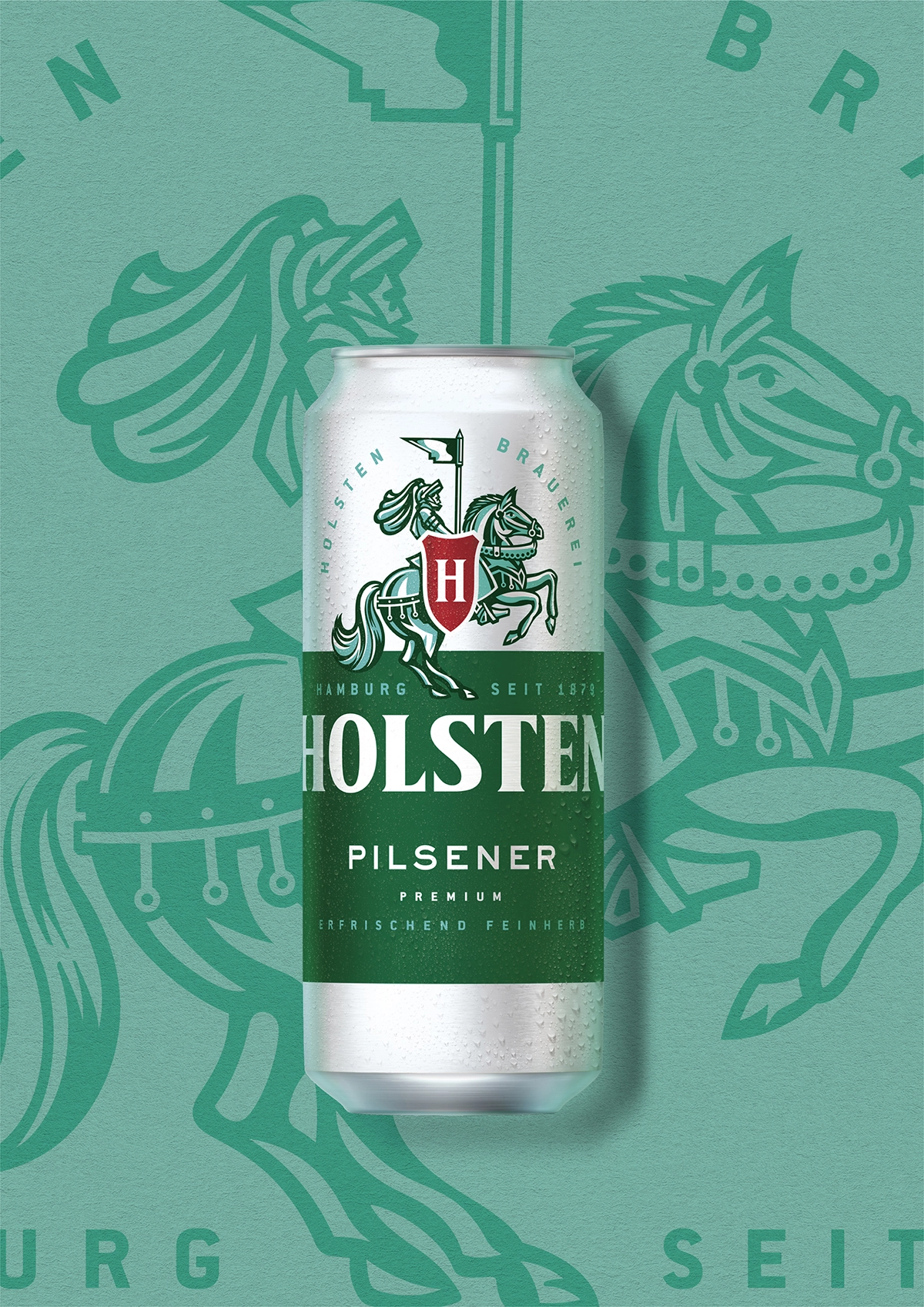
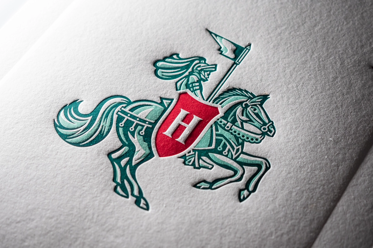
The rebrand uses a reworked version of the brand's knight symbol, used across all packaging and brand touchpoints.
Brought in to bolster the previously struggling beer, the idea was about reconnecting Holsten with its "honest, hardworking roots" by injecting a "new sense of craft" into the visual identity. Design Bridge says it's balanced "heritage with modernity" with its designs to herald a new era for Holsten as its perception has waned in the face of a new wave of craft beer brands.
"Holsten is one of Carlsberg's most consumed beers in Germany, and it's Hamburg's most iconic, synonymous with the everyday beer drinker," Mike Stride, creative director at Design Bridge London, says. "Despite its quality taste credentials achieved by generations of skilled, passionate brewers, Holsten's perception had shifted to a more industrial, mass-produced beer. Our challenge was to refresh the brand for the contemporary market without alienating the brand's existing loyal consumer base."
Ahead of the design work, Design Bridge went to Hamburg to discover more about its history and visit the Holsten brewery archives. It noted that the knight icon had been gradually sidelined and had become less impactful over the years through "an over-polished, mass-produced design approach," and so seized the opportunity to re-imagine this key brand asset.
The new knight has been recrafted to showcase more authentic historical details. "By turning the knight around he now proudly rides forwards – a significant shift from the previous outdated armed warrior to a progressive, flag-bearing beacon of leadership," says Design Bridge.
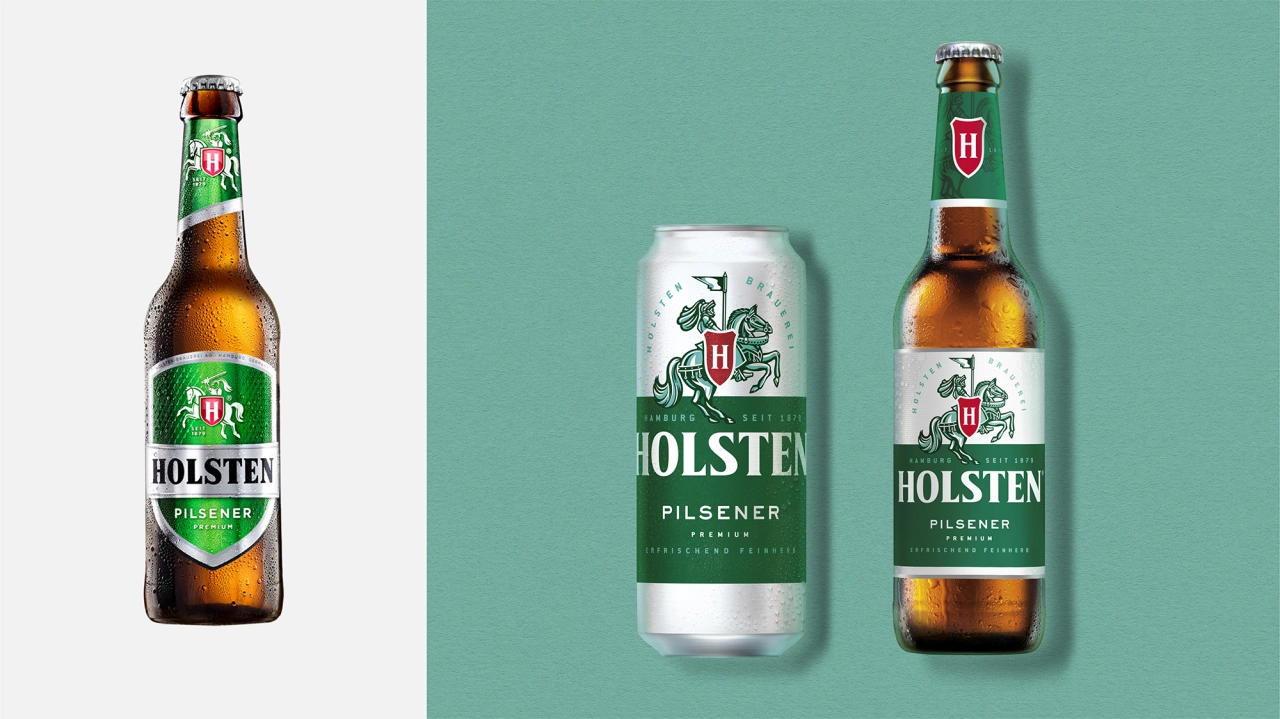
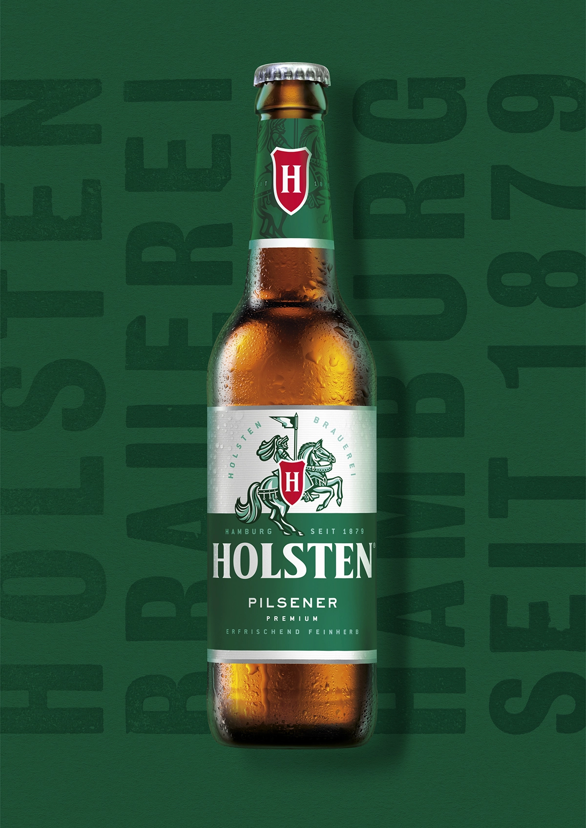
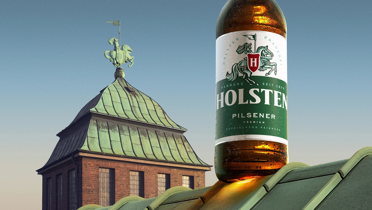
The agency also removed the shield-shaped label on the pack to further elevate the knight and introduced a "light and refreshing" teal shade into the colour palette. This references the oxidised copper of the knight statue that sits on top of Holsten's brewery tower.
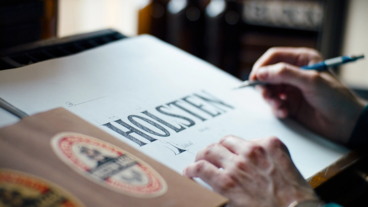
A new wordmark is inspired by the typography and labels found in the Holsten archives, as well as by Hamburg's rich architecture. "To evoke the merchant work ethic that built the port city, much of the new visual identity has been crafted by hand, creating a functional and proud brand that appeals to its loyal consumer base and everyday beer drinkers, as well as opening the brand up for new consumers to enjoy," says Stride.
He adds, "By drawing inspiration from Hamburg's harbour and the determined work ethic and Hanseatic directness of its people, the new design represents the brand's personality and authentic brewing heritage, as well as those who drink it, while granting Holsten a fresh appeal in the wider beer market."
Design Bridge's new designs are to be used across all on-trade and off-trade touchpoints, such as glassware, beer lenses, coasters.
Editor's Picks





Trending






Latest Jobs
Client Success & Growth Director at Revolution Growth
Full-time·Manchester·£60k-£70k
Design Director at Koto
Full-time·London·£72k-£90k
Growth Strategist (Ecommerce) at Tribe
Full-time·Exeter / London·£50k + Bonuses
Senior Digital Designer at Red Antler
Full-time·New York·$95k-$130k
Art Director at The New York Times
Full-time·New York·$120k–$130k
Growth and Client Development Director at 3800
Part-time·Sheffield·£60k-80k