LOVE revives Sol's heritage with a vibrant new global identity rooted in optimism
Manchester agency LOVE has unveiled a new visual identity and packaging system for Sol, reintroducing the Mexican lager's heritage through archive-led illustration and a renewed focus on youth culture.
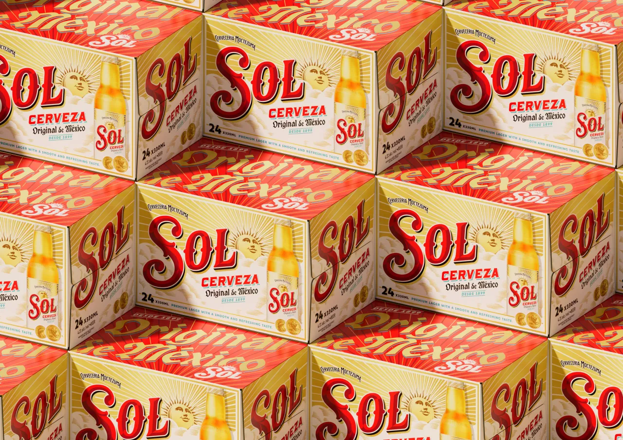
Sol has unveiled a new global identity, created by Manchester-based studio LOVE, that aims to reconnect the Mexican lager with a new generation of drinkers. The redesign positions Sol as a vibrant, optimistic, and culturally attuned choice for young adults who want brands that are authentic, substantive, and joyful.
The project marks a significant shift in Sol's marketing approach. Historically, the brand's communication has leaned on broad lifestyle messaging. Now, it's turning toward something more rooted in youth culture brand rather than hollow targeting.
For LOVE, that meant stripping things back to the foundations, and before Sol could look forward, it needed to look inwards.
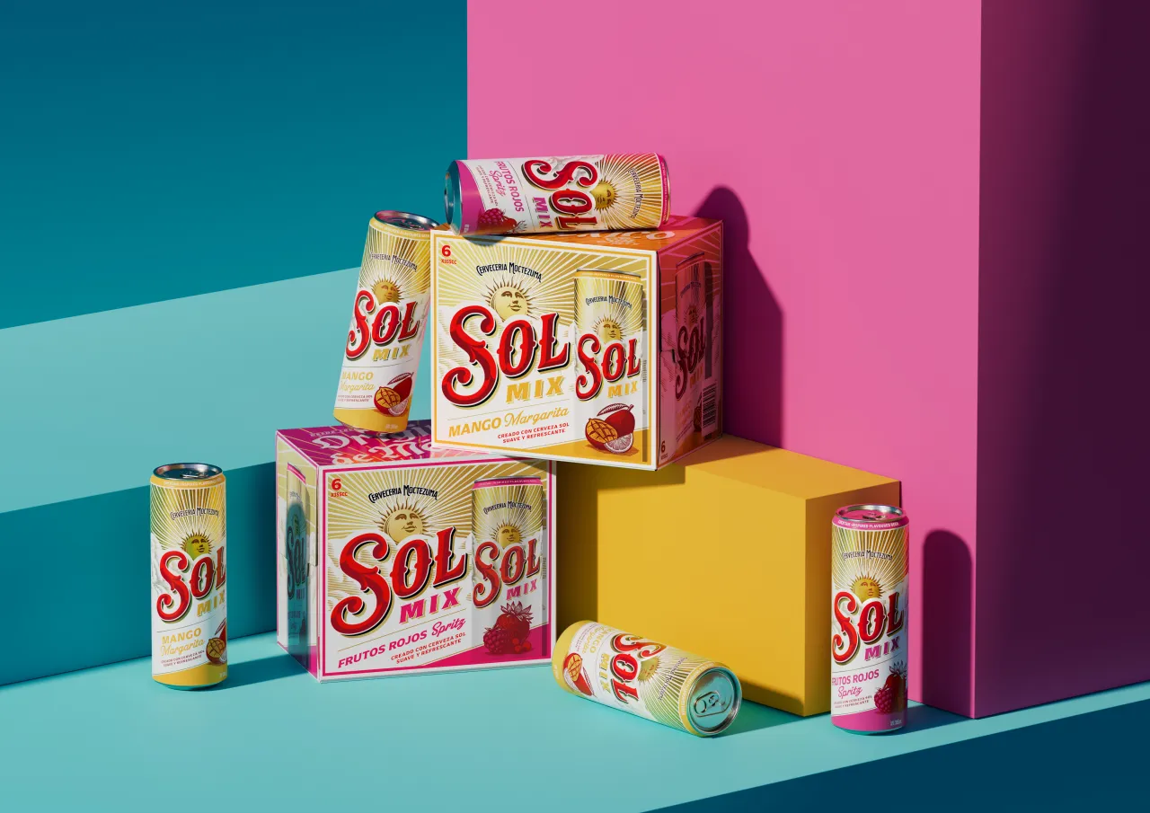
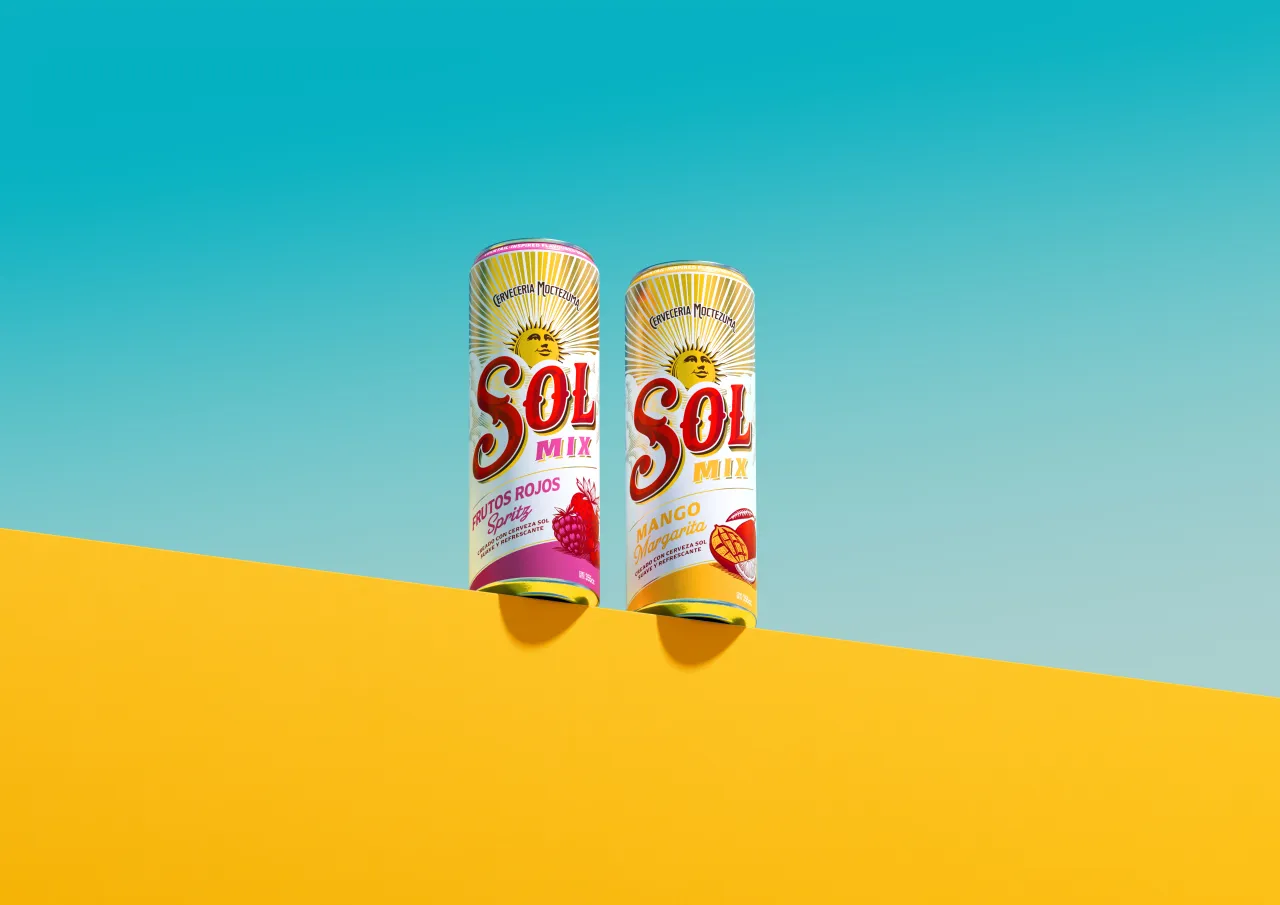
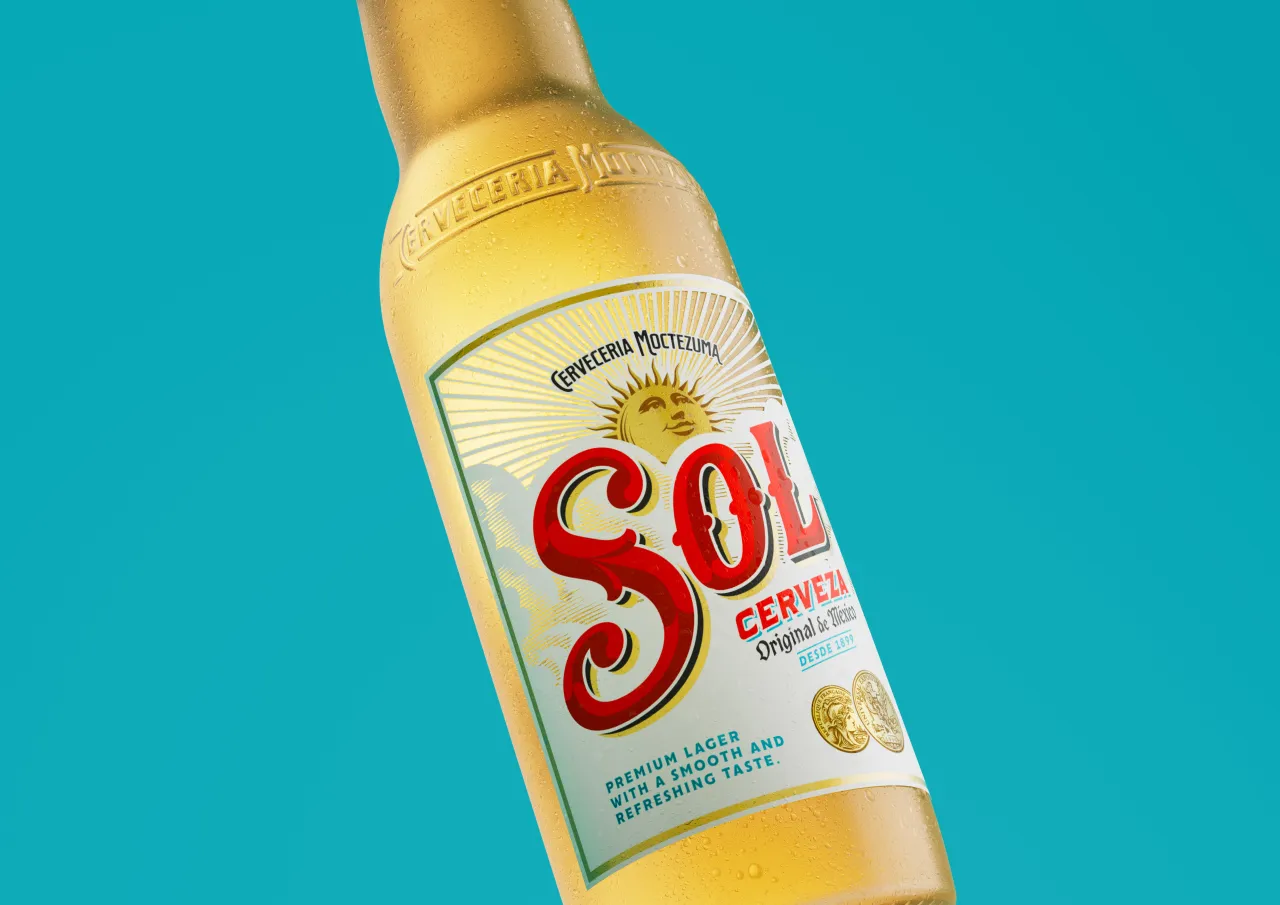
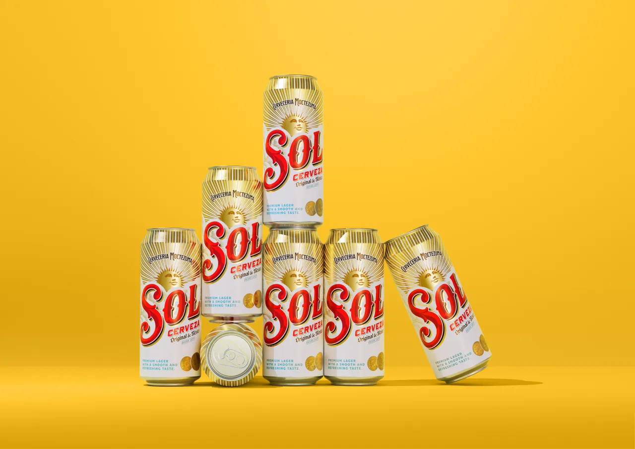
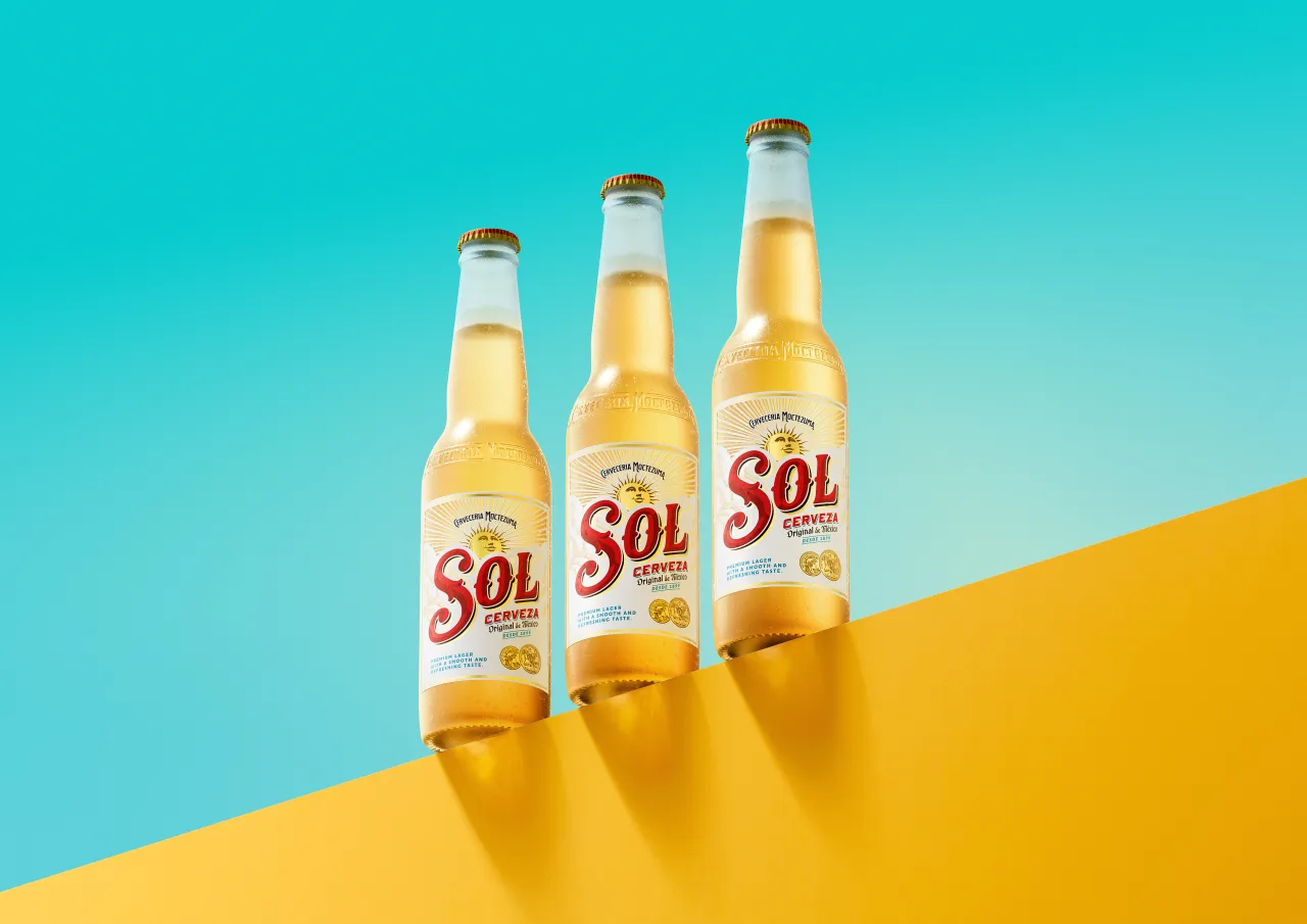
Originally brewed in 1899, Sol has a long history of celebrating provenance and craft, yet its visual language has drifted over the years, making it harder for the brand to stand out in an increasingly competitive drinks market. The new system aims to restore clarity and confidence, strengthening Sol's story for drinkers who prize originality and design credibility.
Eric Halgand, global brand lead for Sol, says: "Sol is the original Mexican lager, and features a unique history – and this striking new visual identity honours this heritage whilst staying true to its uplifting, sunny positioning.
"After meticulous development, we're thrilled to unveil the new look for the brand across the world, alongside the smooth, refreshing taste of Sol, perfect for consumers to enjoy whilst they unwind and recharge."
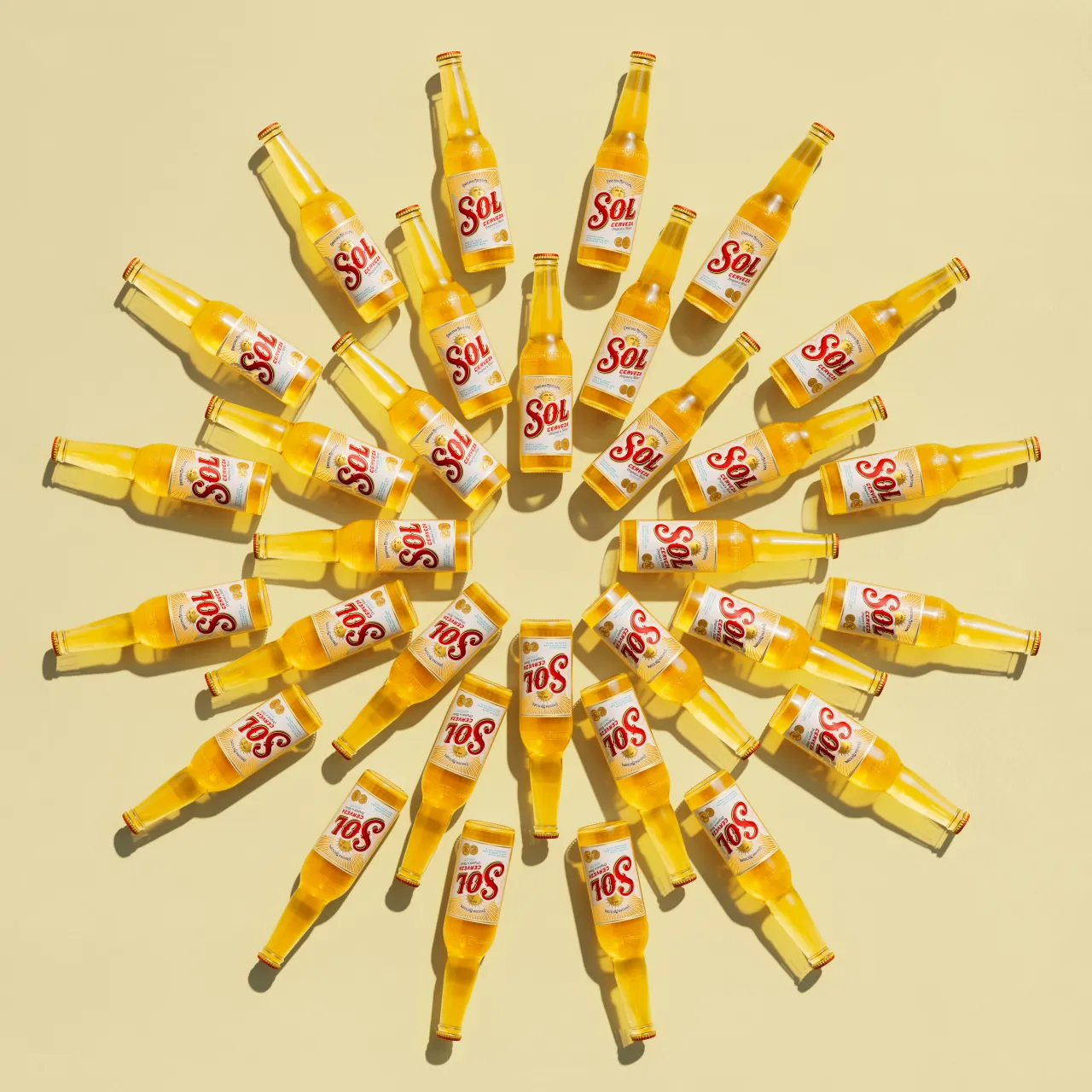
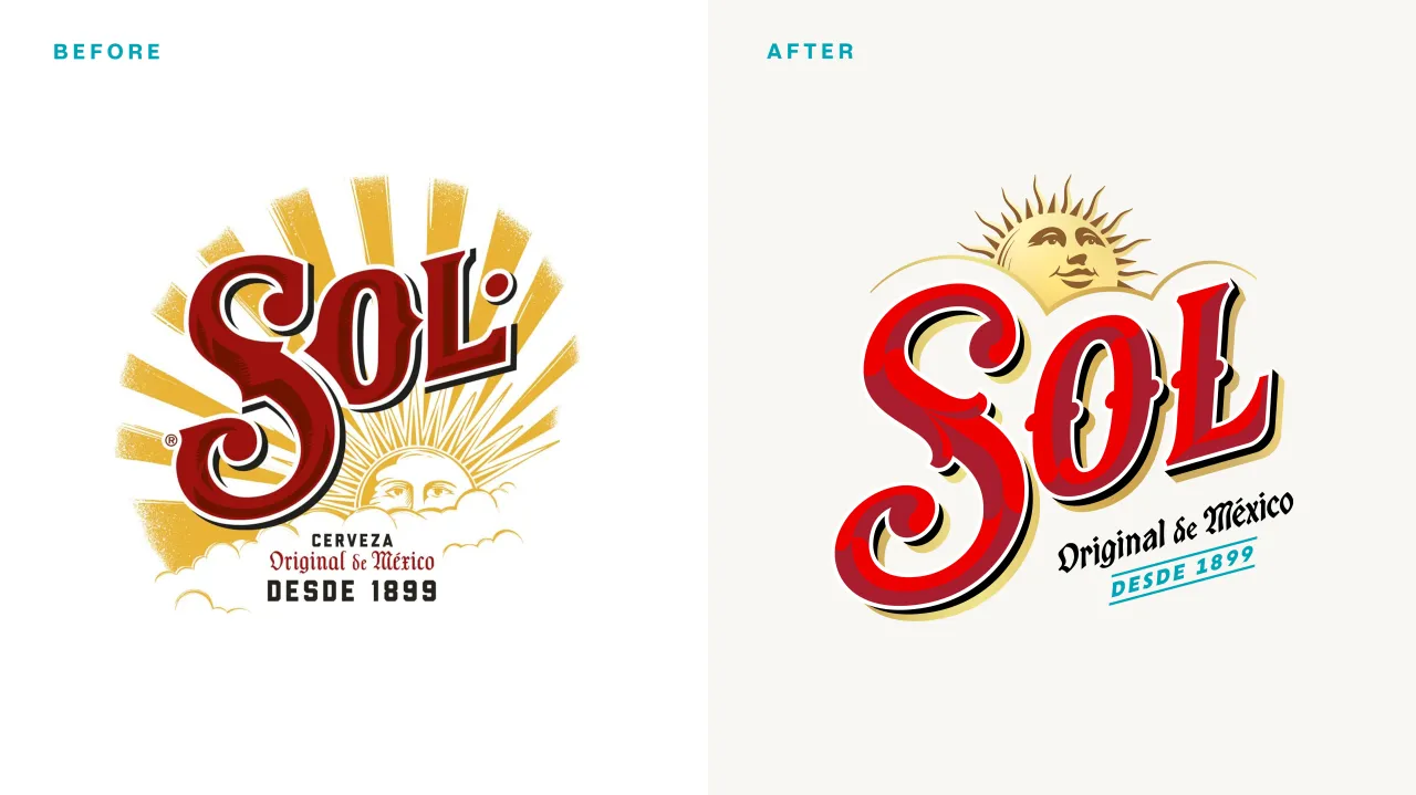
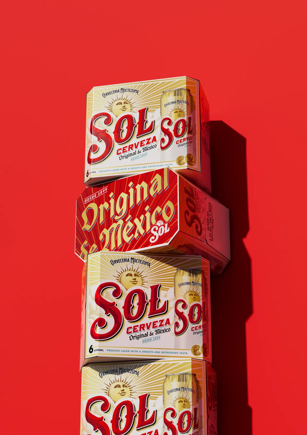
The idea of "uplifting" runs through every corner of the redesign, as LOVE sought to reposition Sol as a brand built on positivity, tapping into the way young adults navigate uncertainty with optimism and action. While it's tempting to lean into escapism with drink branding, it seems more about a visual world that feels energetic, confident, and culturally aware.
Eve Warren, design director at LOVE, explains: "The young adult consumer expects brands to be authentic, culturally relevant, and visually compelling.
"Leaning into young adults' appreciation of 'newstalgia' (using the past to inspire something new), we dialled up Sol's heritage, presenting it in a fresh, modern and more premium way."
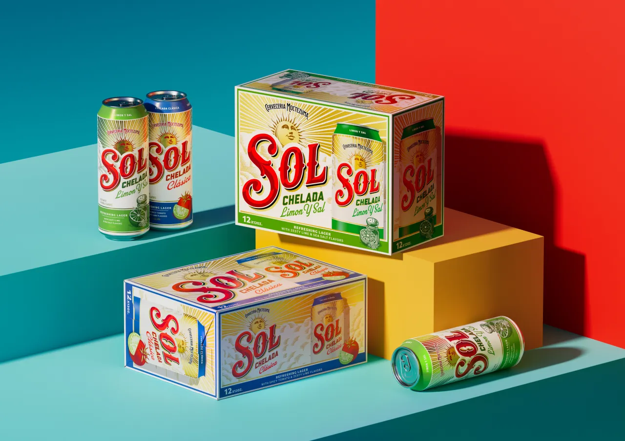
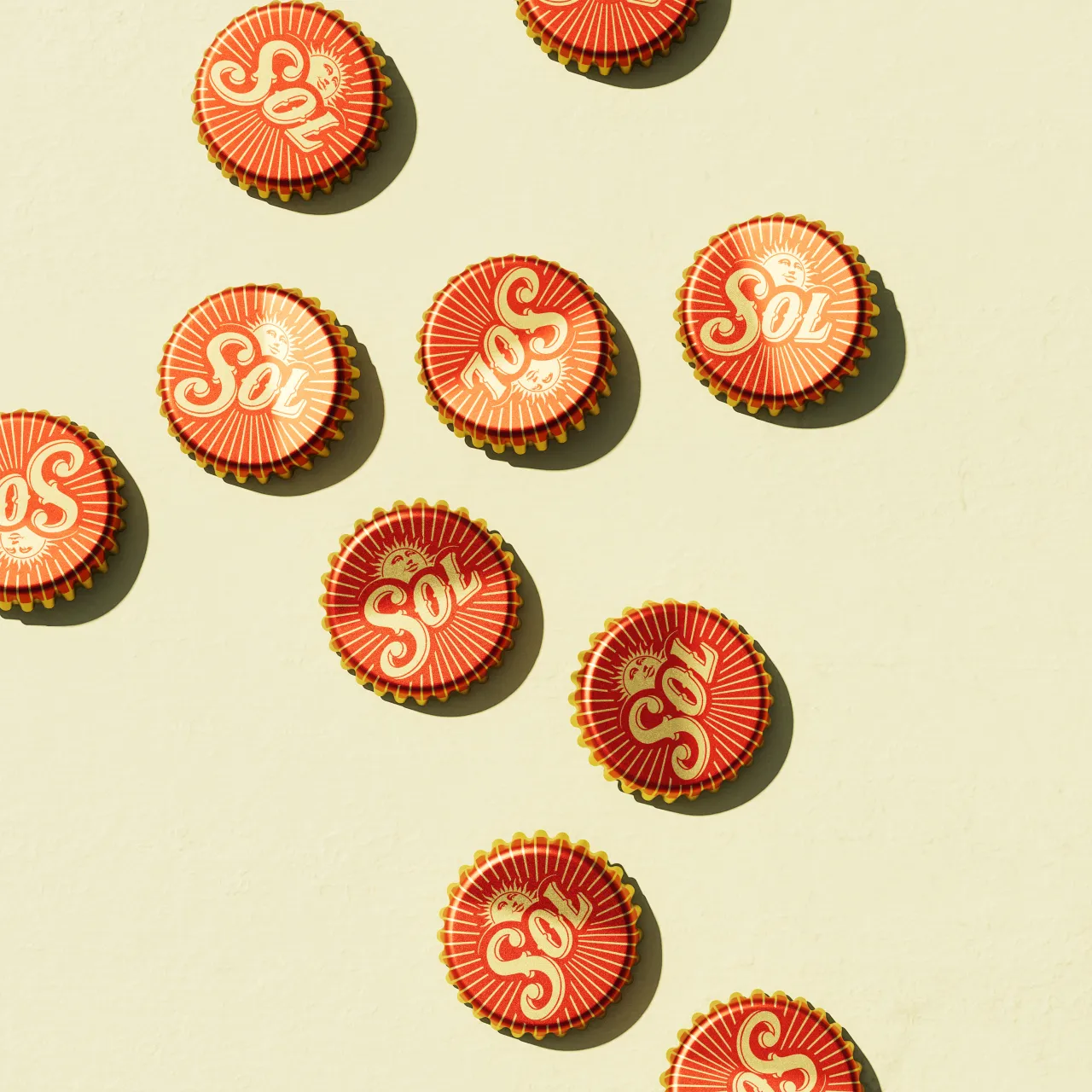
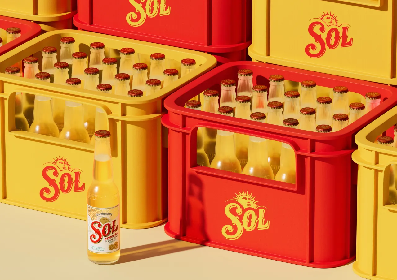
Of course, with any heritage brand, one of the best parts of the project is digging through the archives to find a few golden nuggets. For Sol, that included labels, early campaign artwork and faded signage, which revealed a trove of rich detail that had gradually been lost.
Those references formed the backbone of the new design system, which sees every key element redrawn by illustrator and lettering artist Tobias Hall. Working with LOVE, Tobias reimagined the wordmark, crafted new secondary lettering, revitalised the background cloud textures, and completely rebuilt Sol's iconic sun face.
The sun icon, once a subtle backdrop, now takes centre stage. Shown in full for the first time and illustrated with an open, upward gaze, it becomes a symbol of optimism, casting the entire design in a more expressive, emotional light.
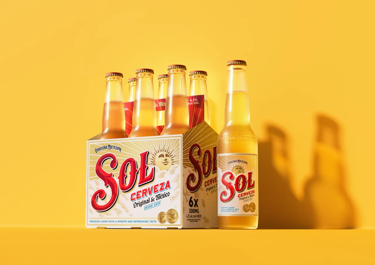
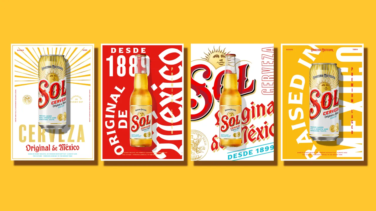
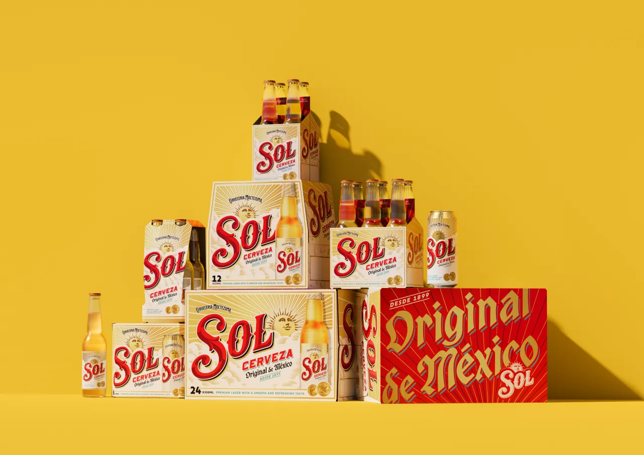
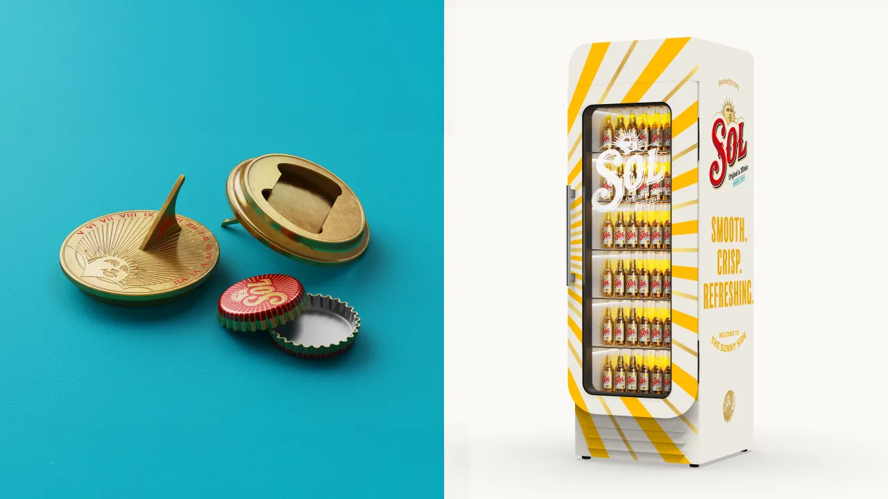
Sol's colour palette has also been refreshed and, while the familiar red and gold remain, a new teal hue introduces the crispness of a clear sky and the freshness of the beer itself. The overall effect is vivid and contemporary, while still anchored in the brand's Mexican identity.
Supporting typography draws inspiration from Sol's ornate archive labels, blending historic visual cues with modern clarity. Even the Paris Exposition gold medal – an early marker of Sol's craft pedigree – has been redrawn with finer detail, restoring its significance on pack.
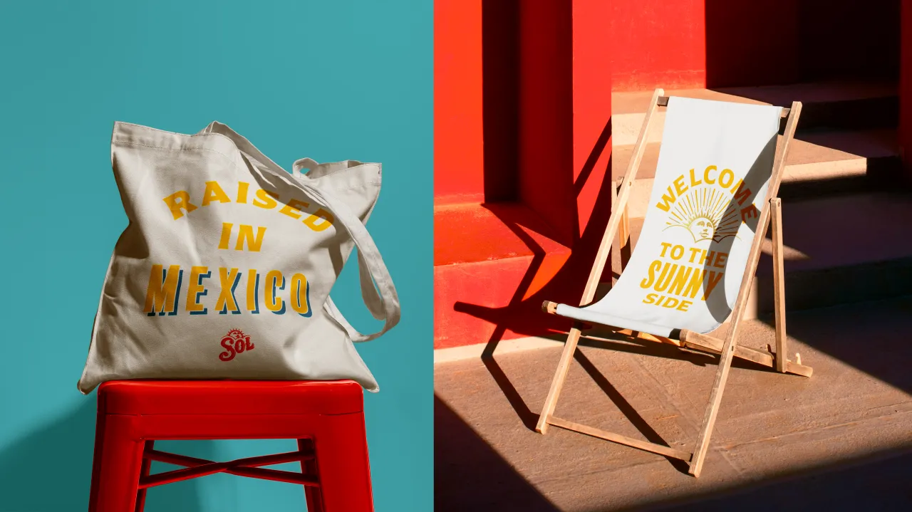
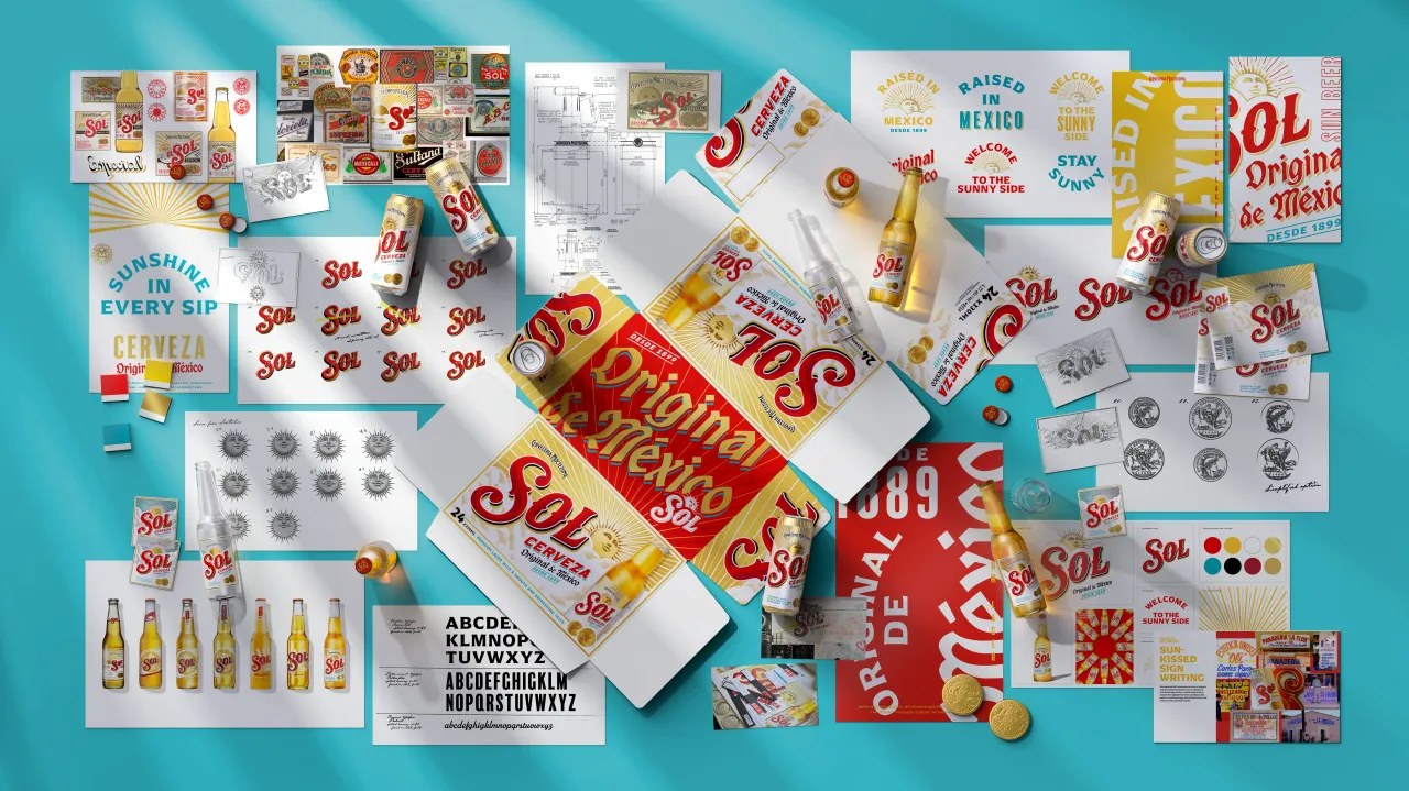
Crucially, the redesign extends beyond packaging. LOVE has also developed a holistic brand world that evolves with shifting consumer expectations. It's intended to feel flexible, expressive and premium without losing the relaxed charm Sol is known for.
"By focusing on design that is both emotionally resonant and commercially impactful, we aim to set Sol apart from competitors," Eve adds. "The new identity marks a bold return of Sol's authenticity and heritage, shaped for young adult beer drinkers."
Sol's new look will roll out globally across multiple touchpoints over the coming months, supported by market-specific launch activity and Sol's broader global campaign, Welcome to the Sunny Side.
Editor's Picks





Trending





Latest Jobs
Head of design at Cog Design
Full-time·London·£55K
Senior 3D Motion Designer at Art&Graft
Full-time·London·£50k-£65k
Design Lead at Madeo
Full-time·New York City·$85k–$120k
Senior Graphic Designer at MoMA Retail
Full-time·New York·$72k-$80k
Growth Strategist (Ecommerce) at Tribe
Full-time·Exeter / London·£50k + Bonuses
Junior Project Coordinator at Colorido Studios
Full-time·Twickenham·£28k–£32k