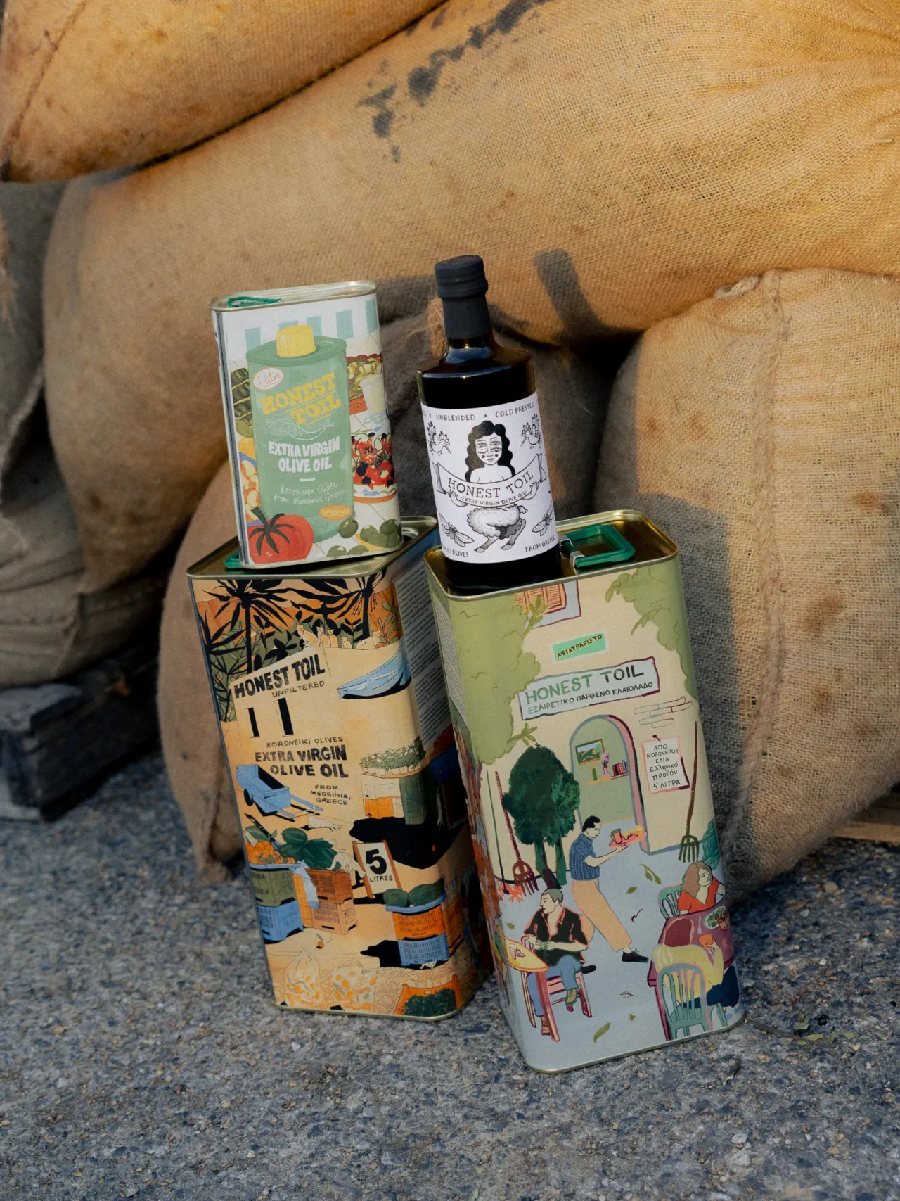
One of the biggest dilemmas in branding is finding a balance between giving people the reassurance they expect and delighting them with something new. Olive oil is a classic example. People expect to see sun-bleached labels. Line drawings of olive branches. Terracotta tones. Hand-lettered clues that the makers go through generations of the same family.
At the other extreme, they might be presented with something completely different. Sparse minimalism. Knowingly lo-fi packaging. Basic typography. All of which might look wonderfully cool and cutting-edge. Yet you wonder: will everyone just breeze past it on the supermarket shelf, unaware that it even is olive oil?
This is important because right now, olive oil is having a moment, with foodies talking about it the way they once talked about coffee beans, and chefs and writers comparing different products like fine wines. In this fevered atmosphere, how on earth can you stand out?
London branding agency Derek&Eric was tasked with crafting an identity for Drzzl, a new olive oil brand from Natalia Rudin, the author and recipe developer behind Nats Nourishments and its 1.6 million-strong following on Instagram. And what they've come up with is pretty unique.
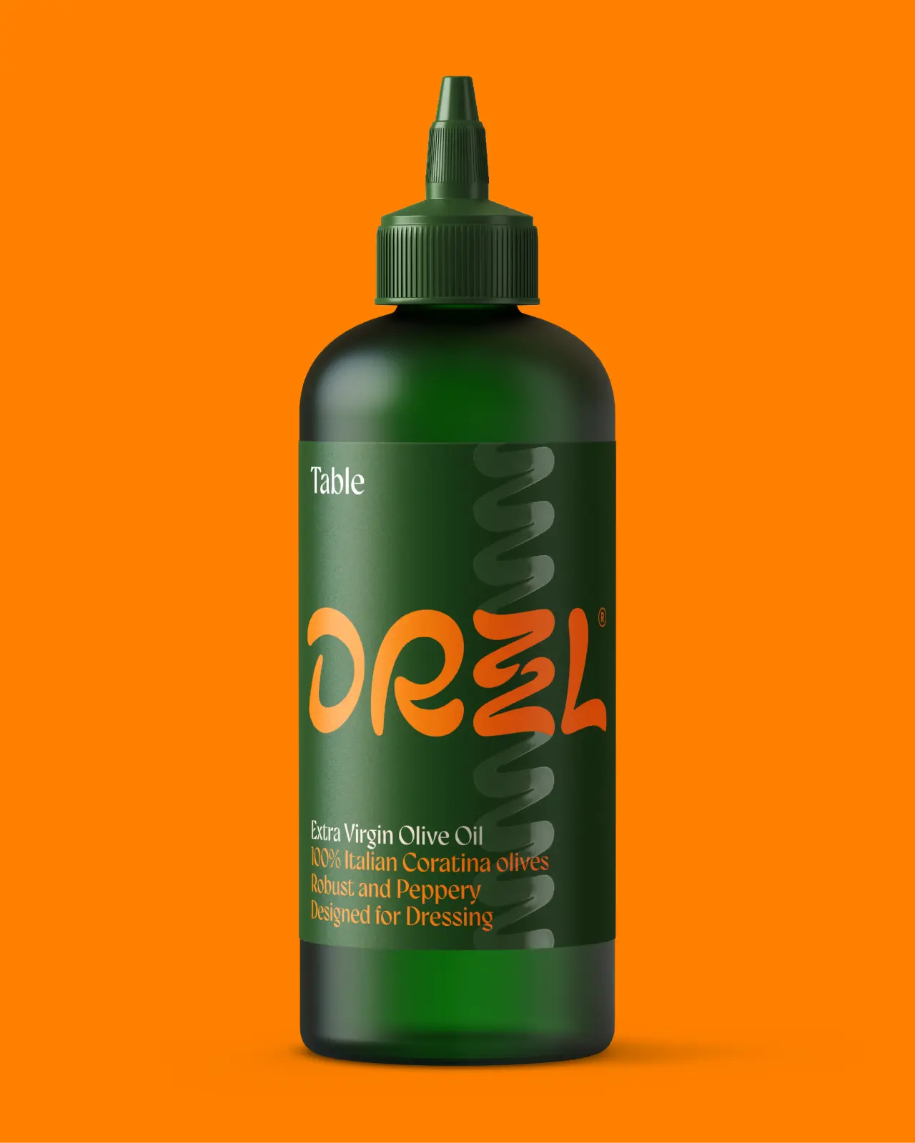
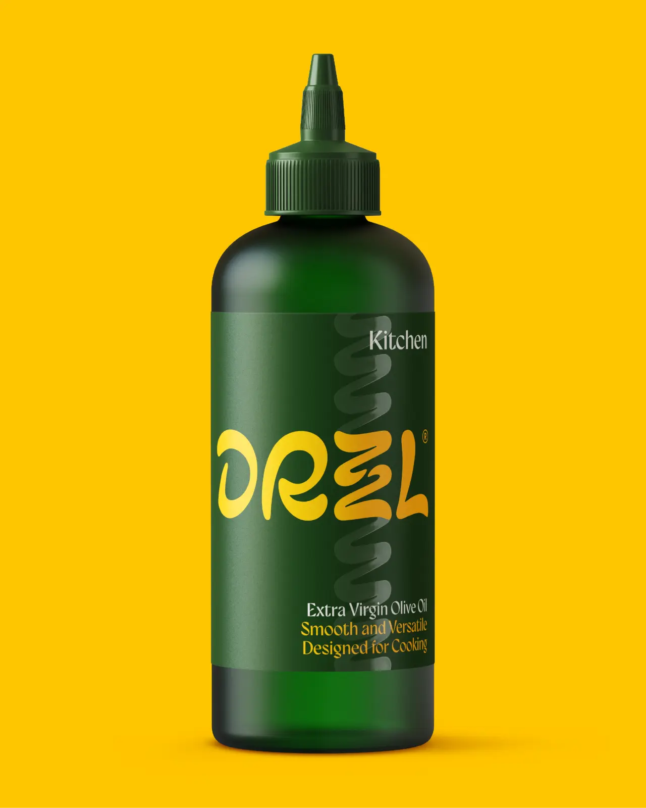
There's no ageing grandmother or rolling Tuscan hills. But there's also no stark minimalism, aching to be considered cool. In their palace, we see a squeezy bottle, a clash of citrus colours and a wordmark that looks like it's been poured. Not drawn.
Who's it for?
The audience for this brand is very specific: a growing movement of home chefs who take cooking seriously but not themselves. These food enthusiasts are seeking pantry staples that look as good on a dinner party table as they taste in the food.
"Olive oil has become a seriously crowded category, with lots of brands using the same visual ingredients," explains Adam Swan, creative partner at Derek&Eric. "We wanted to create something that felt completely different. Natalia had a fantastic product and bags of personality. Our challenge was to bottle that energy."
The oil is made from Italian Coratina olives, a variety known for being intense and peppery, and the agency set out to reflect that fiery character, tempered by a chef's sense of finesse.
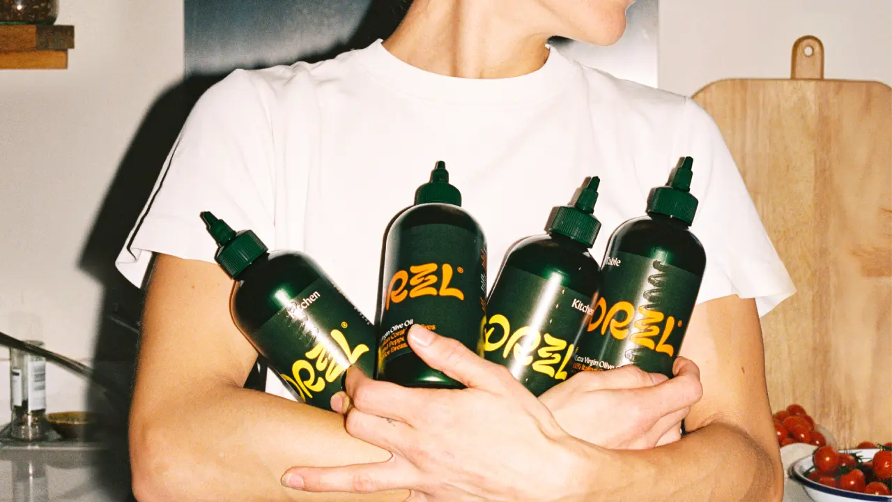
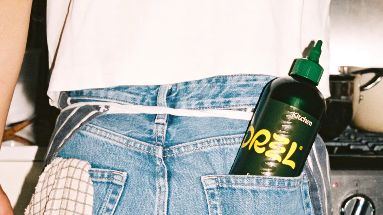
They began by stripping everything back and allowing the simple pleasure of drizzling great olive oil to inspire the entire identity.
Movement and rhythm
The centrepiece is the logo, created in partnership with typography specialists Studio Drama. It's built from loose, organic letterforms, with the two Zs stacked on top of each other to emulate the sense of oil leaving a nozzle.
That sense of fluidity can also be seen in the motif: a zigzag squiggle that runs down the side of each label, like a line of oil squeezed across a plate. It works brilliantly well, too, on custom packing tape.
The overall palette pairs a deep leafy green with zingy orange and yellow: a refreshingly distinct combo in a sector riven by sameness. There are two oils: Table, in orange, is "robust and peppery, designed for dressing", while Kitchen, in yellow, is "smooth and versatile, designed for cooking". It's a clearly defined split, and colour-coding it this clearly means you won't accidentally fry an egg in your dressing oil.
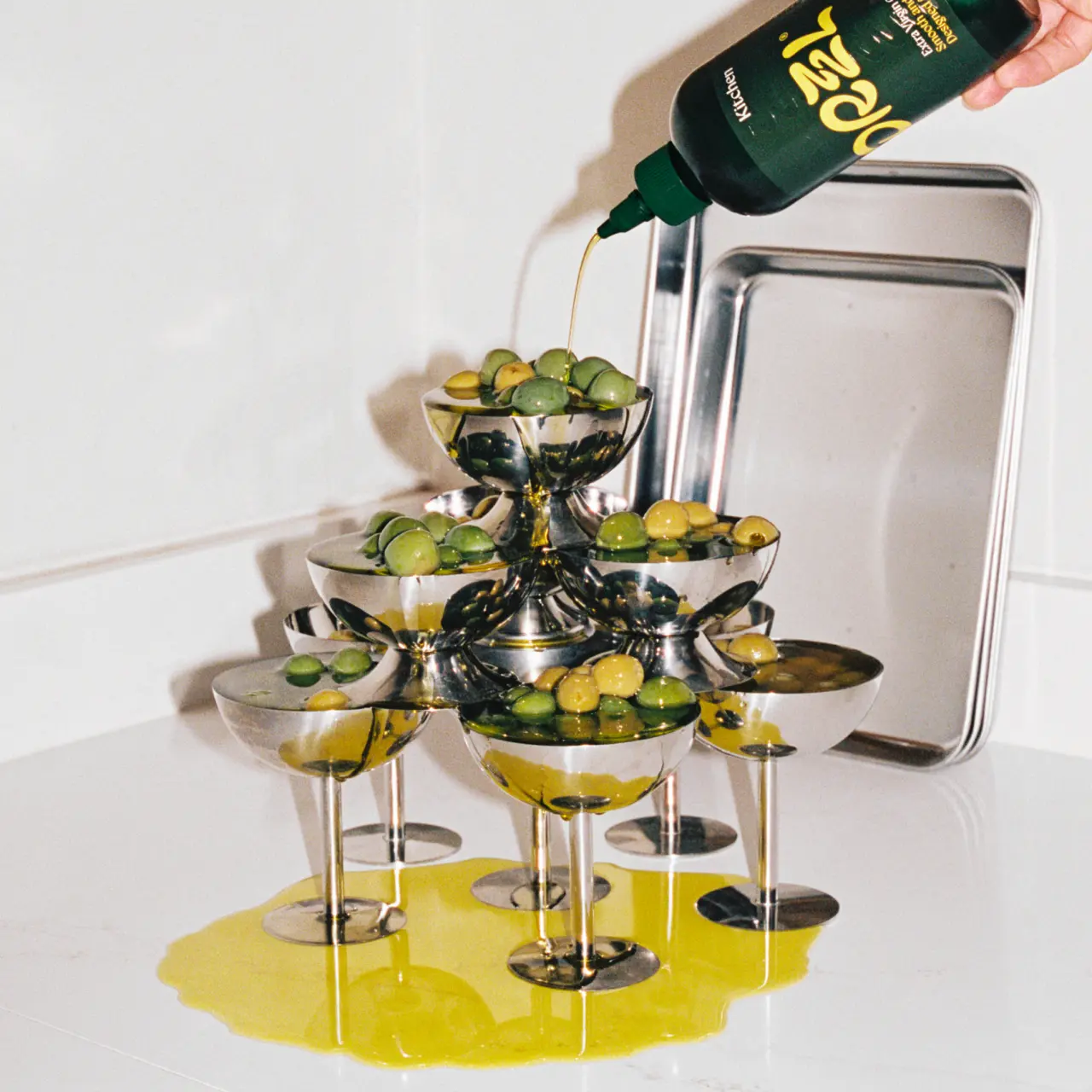
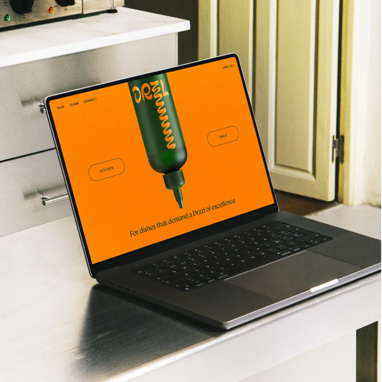
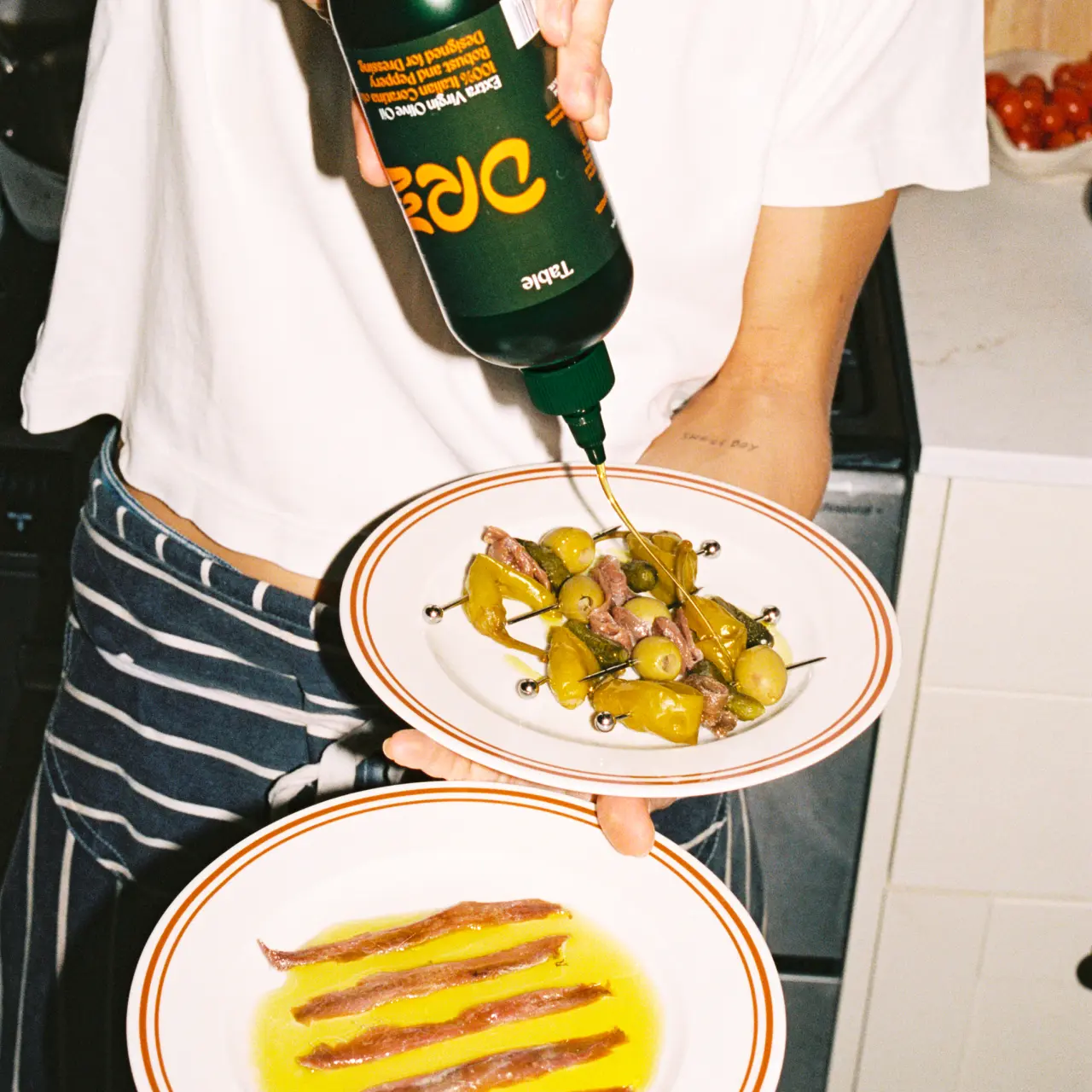
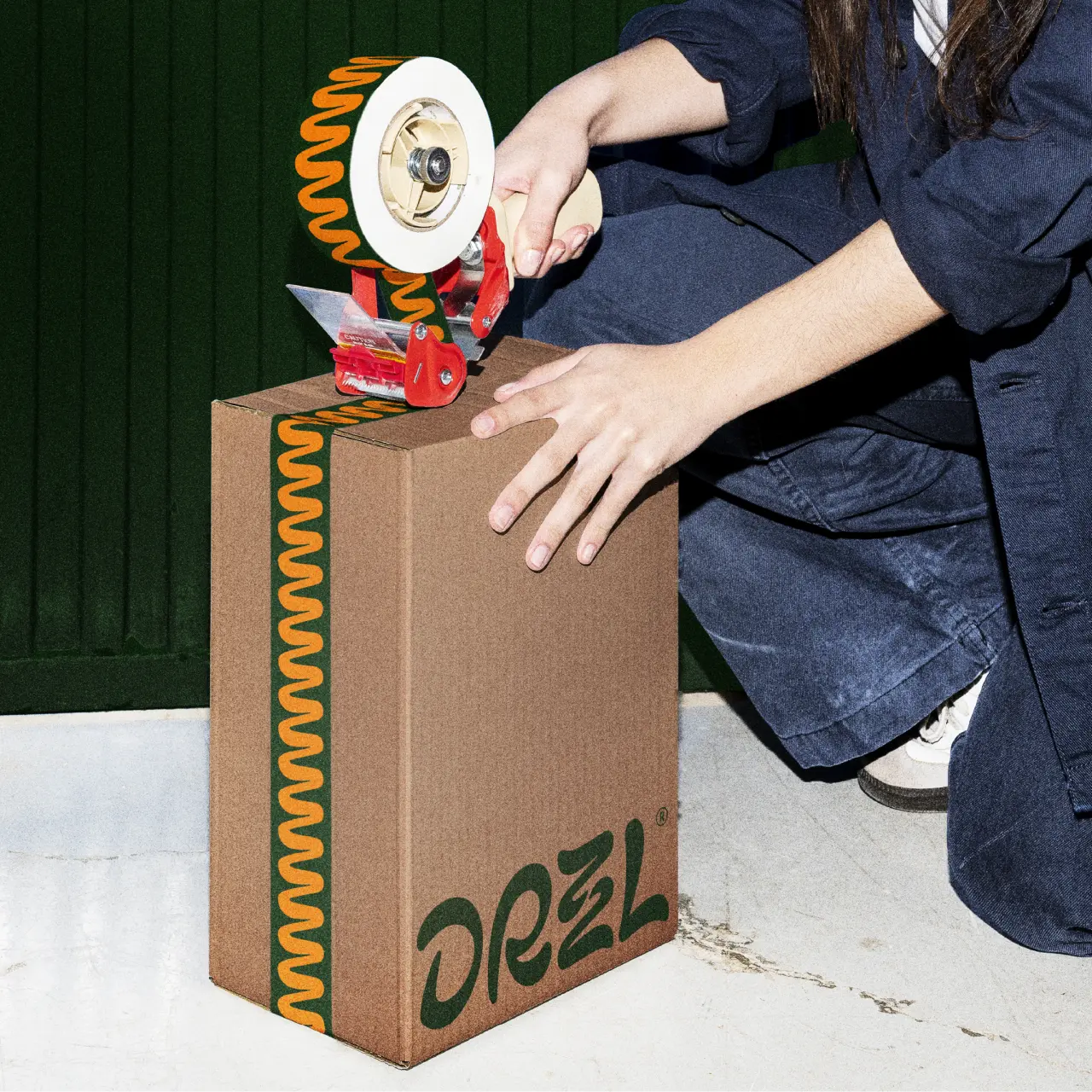
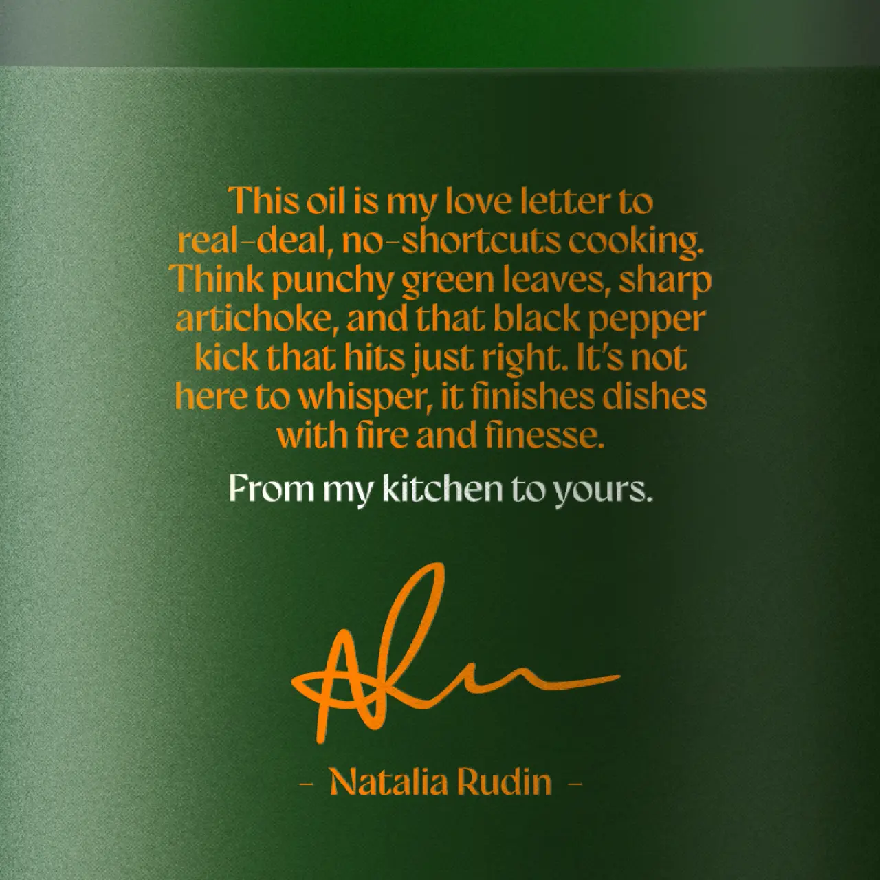
Balancing all the colourful energy is a classical serif typeface for product information, which gives a nod to Italian history and culture without overdoing things. There's also a personal touch on the back of the bottle: a short note from Natalie, "From my kitchen to yours."
Is squeezy cheesy?
The bottle design itself is sure to raise eyebrows among traditionalists. Squeezy bottles have long been standard kit in professional kitchens, but when you're selling an Italian dream to customers, glass has always been the obvious choice.
Putting premium extra virgin olive oil in a container many associate with ketchup feels like a swing; here's hoping the wider branding will cut through, and it won't be resisted. On the plus side, they're not the first brand to try this. US brand Graza made its name with squeezy bottles and a cooking-versus-finishing split, so we know the format can work.
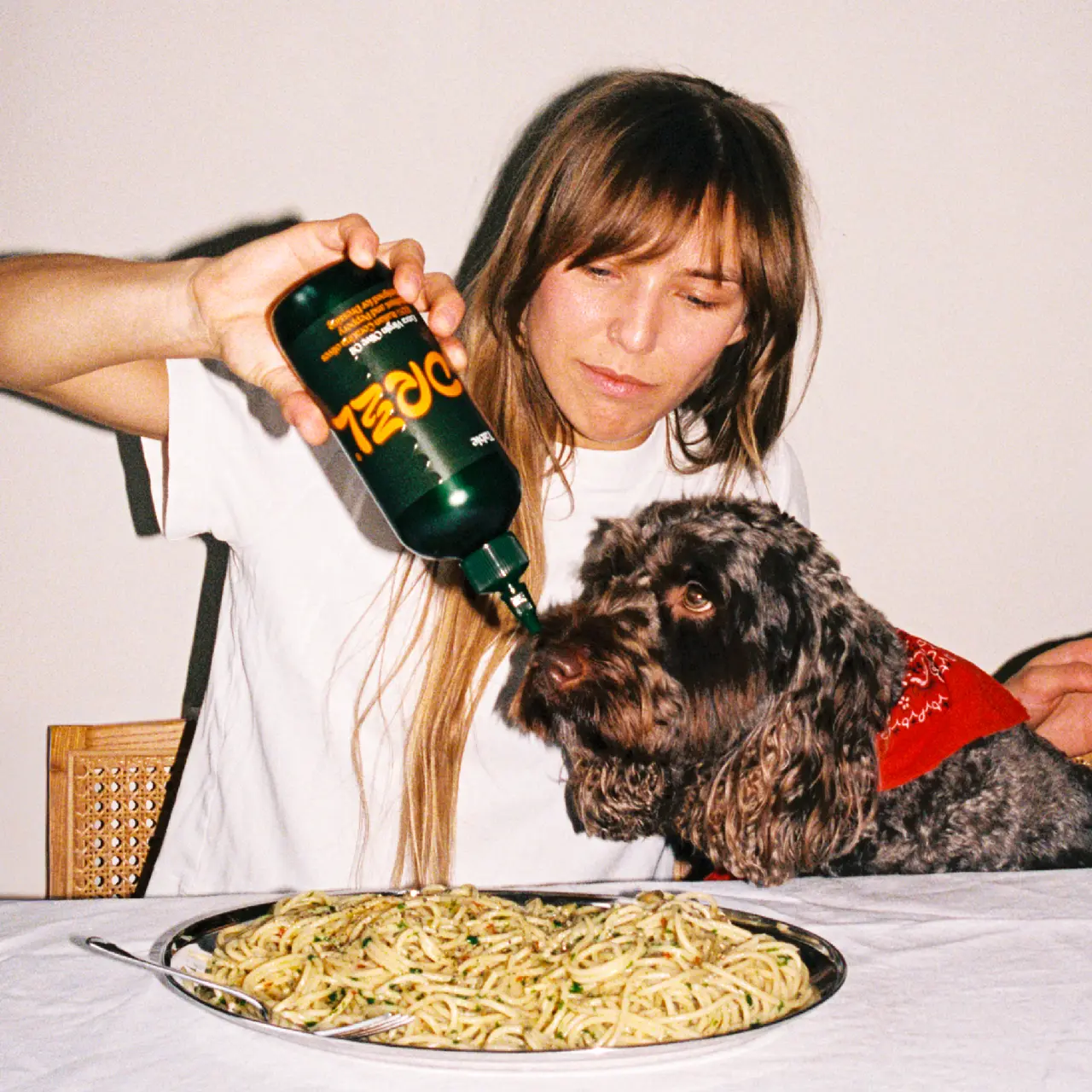
The photography certainly delivers the attitude they need to pull it off. Shot with harsh, on-camera flash and a grainy, filmic feel, we see bottles stuffed into a jeans back pocket, a curious dog sniffing the nozzle over a plate of spaghetti, and a tower of silver coupes filled with olives, overflowing into a glossy puddle. It's playful, chaotic and fun.
Natalie herself is happy with the result. "D&E perfectly captured the tone of voice and identity of our brand through design and have created something people genuinely connect with," she says. "They totally brought our brand to life, challenged us in all the right ways and created an identity that feels distinctive, premium and unmistakably Drzzl."
Editor's Picks





Trending
Latest Jobs
Art Director at SPOKE
Full-time·London·£55k-65k
Agent & Producer at The Jacky Winter Group
Full-time·London·£35k–£40k
Junior Creative Designer & Visual Researcher at Hollywood Secret Service
Full-time·Brighton·£26,000–£28,000
Senior Creative Lead at Random Studio
Full-time·Amsterdam / Paris·€90k-€110k
Associate Web Designer at Planhat
Full-time·London·£30,000 – £35,000
Creative Project Manager at Analogue
Full-time·Leeds·£28k–£35k